HolaTractor — Connected Agritech Ecosystem

Shreyansh Shrivastava

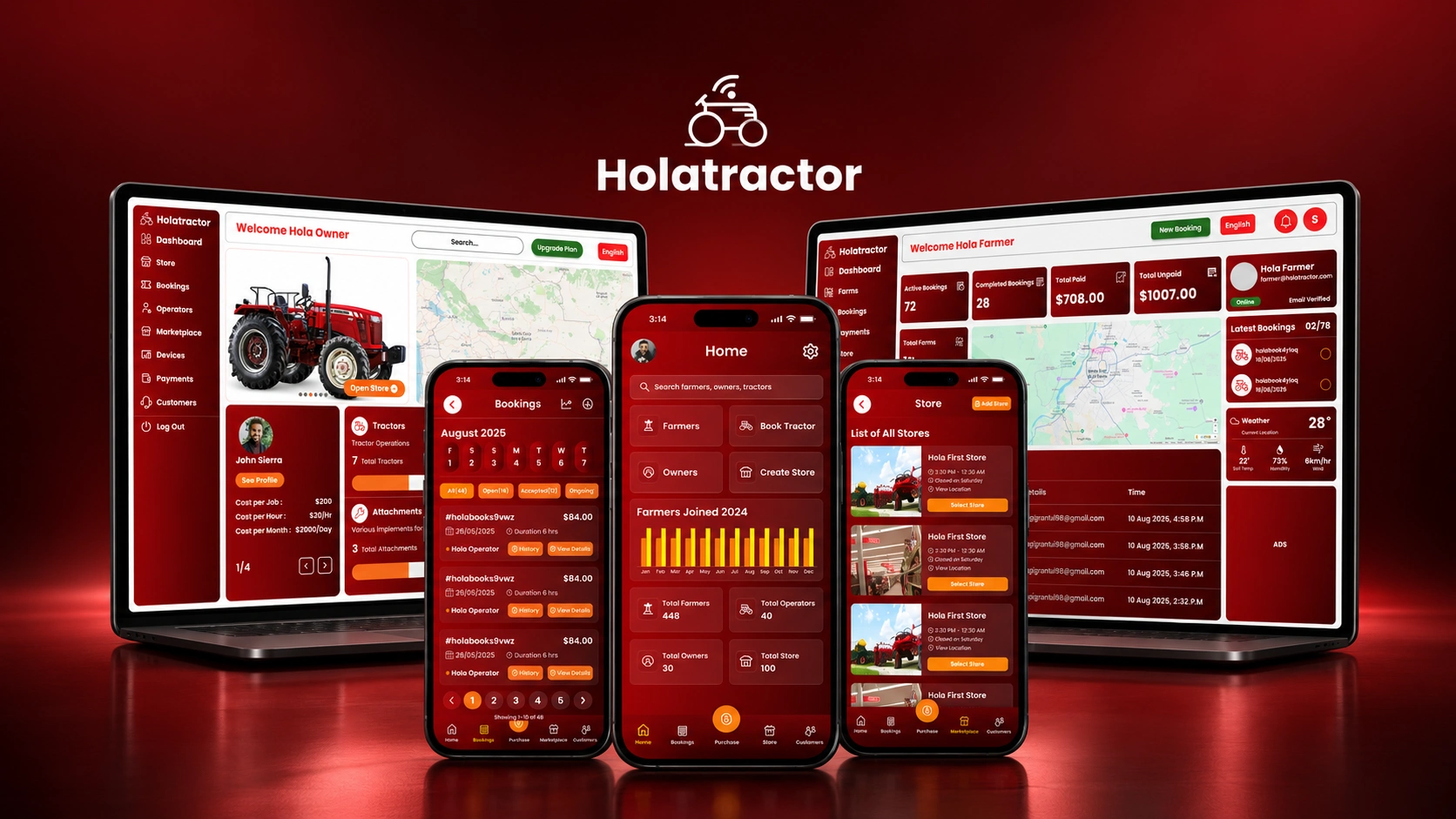
HolaTractor — Designing a Connected Agritech Ecosystem
Role: Product Designer
Client: HolaTractor
Tools: Figma
Timeline: May-September, 2025
Project type: UI/UX Design
The Project at a Glance
HolaTractor is a multi-sided agritech platform connecting farmers, tractor owners, agents, and businesses through a set of interconnected digital products.
I worked as the sole designer across the entire ecosystem — from research and user understanding through information architecture, interaction design, high-fidelity UI, data visualization, and a shared design system spanning four distinct products.
This wasn't a single-user app. It was a system.
The Challenge
One business. Four users. Completely different needs.
HolaTractor's operation involved people on different sides of the same marketplace — each with a different job to accomplish, a different context, and a different mental model.
Farmers needed to manage their agricultural activities without unnecessary complexity
Tractor owners needed visibility into their assets, operations, and financial performance
Agents needed fast access to frequent tasks and real-time operational coordination
Businesses needed broader management capability and operational oversight
Designing for one of them in isolation would have been straightforward. The real challenge was harder:
How do you build four products for four different users — and make the entire ecosystem feel like it belongs together?
The Ecosystem
Four products. One system.
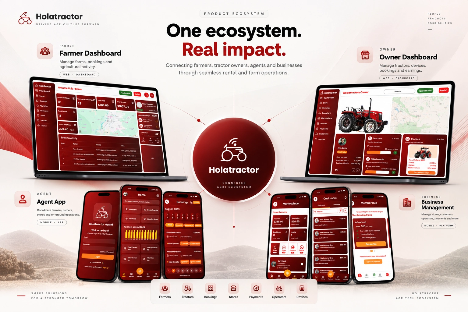
Each product served a different user. Each required a different information architecture, navigation pattern, and interaction priority. All four had to feel like they came from the same place.
My Role
I owned the complete design process across the HolaTractor ecosystem — not one product, all of them.
What I worked on:
User research and persona development
Problem definition and design strategy
Information architecture across four products
User flows and interaction patterns
Wireframing (low through high fidelity)
High-fidelity UI design
Responsive dashboard design
Data visualization
Prototyping
Design system (color, typography, components, data viz, responsive patterns)
Cross-product consistency decisions
The scope wasn't just execution. I had to keep decisions consistent across an expanding set of products — which meant every choice I made had to work at ecosystem scale, not just screen level.
Understanding the Users
The research made one thing immediately clear: these were not variations of the same persona. Their goals, workflows, and information requirements were fundamentally different.
Farmer — Agricultural context. Needs clarity over density. Information should surface what matters without requiring users to dig for it.
Tractor Owner — Asset and business management context. Needs a clear view of tractor availability, operational activity, and financial performance at a glance.
Agent — On-the-ground coordination context. Needs speed. Frequent actions should be immediately accessible. Operational context matters but can't slow down the core workflow.
Business — Management and oversight context. Needs breadth — the ability to navigate across operations, understand performance patterns, and act on them.
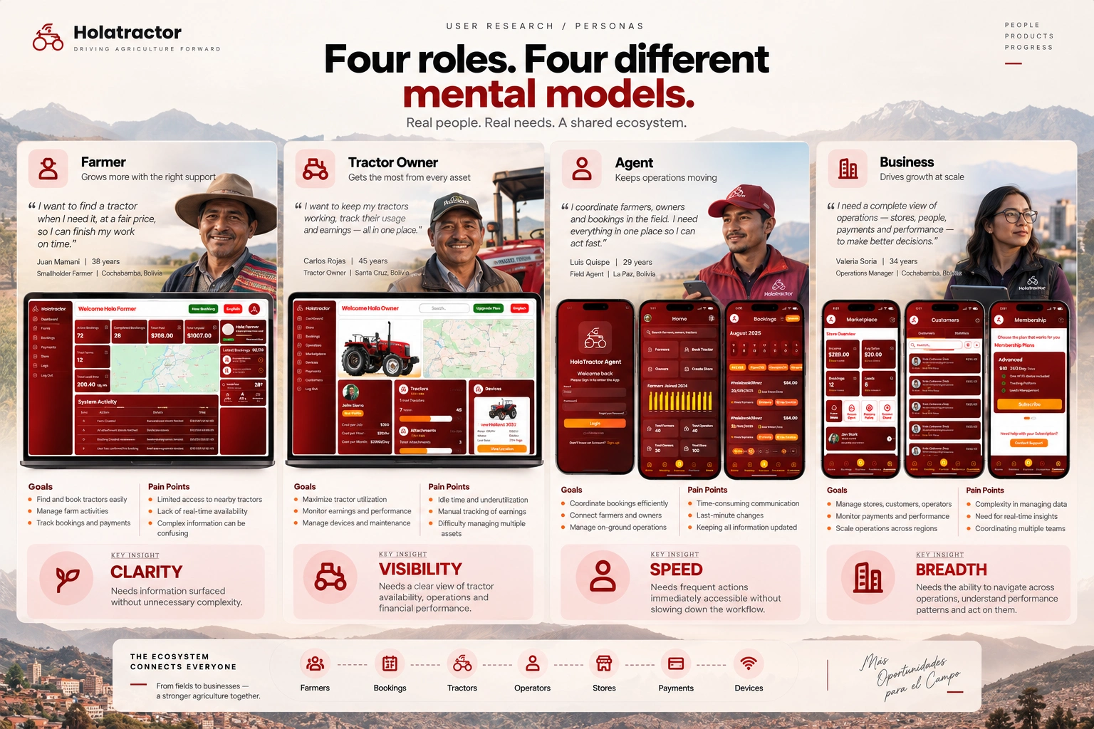
Treating these four users as one would have broken every product.
From Research to Product Decisions
Problem 01 — Information distributed across multiple operational activities
Design response: Build clear information hierarchies. Surface the most relevant information according to the user's role and context.
Problem 02 — Each user type requires a completely different workflow
Design response: Role-specific navigation and interaction patterns — genuinely different products built for how each user actually works.
Problem 03 — Dashboards could easily become information-heavy and unusable
Design response: Progressive disclosure, visual grouping, and hierarchy. The answer to complex data is not less data — it's better organization.
Problem 04 — Four separate products risked feeling fragmented
Design response: One shared design language that adapts across surfaces. Consistency through shared principles, not enforced identical layouts.
Designing the Agent Experience
Digitizing on-ground operations for a connected farming ecosystem
The Agent app was designed around the operational realities of agents coordinating activity within the HolaTractor ecosystem — people who move fast, need quick decisions, and can't afford friction in their tools.
The interface had to make frequent tasks immediately discoverable, reduce unnecessary steps, and provide enough operational context without overloading the screen.
Design focus: Information architecture → Agent workflows → Navigation patterns → Task flows → Mobile wireframes → High-fidelity prototypes → Interaction states → Final UI
The key decision here was prioritizing speed of access over completeness of information. Agents don't browse — they act. The navigation and hierarchy reflect that.
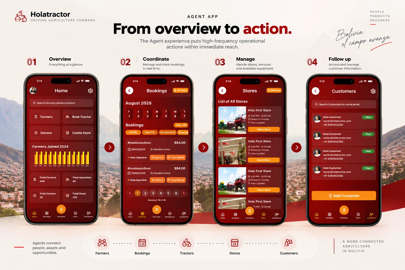
Key Screens
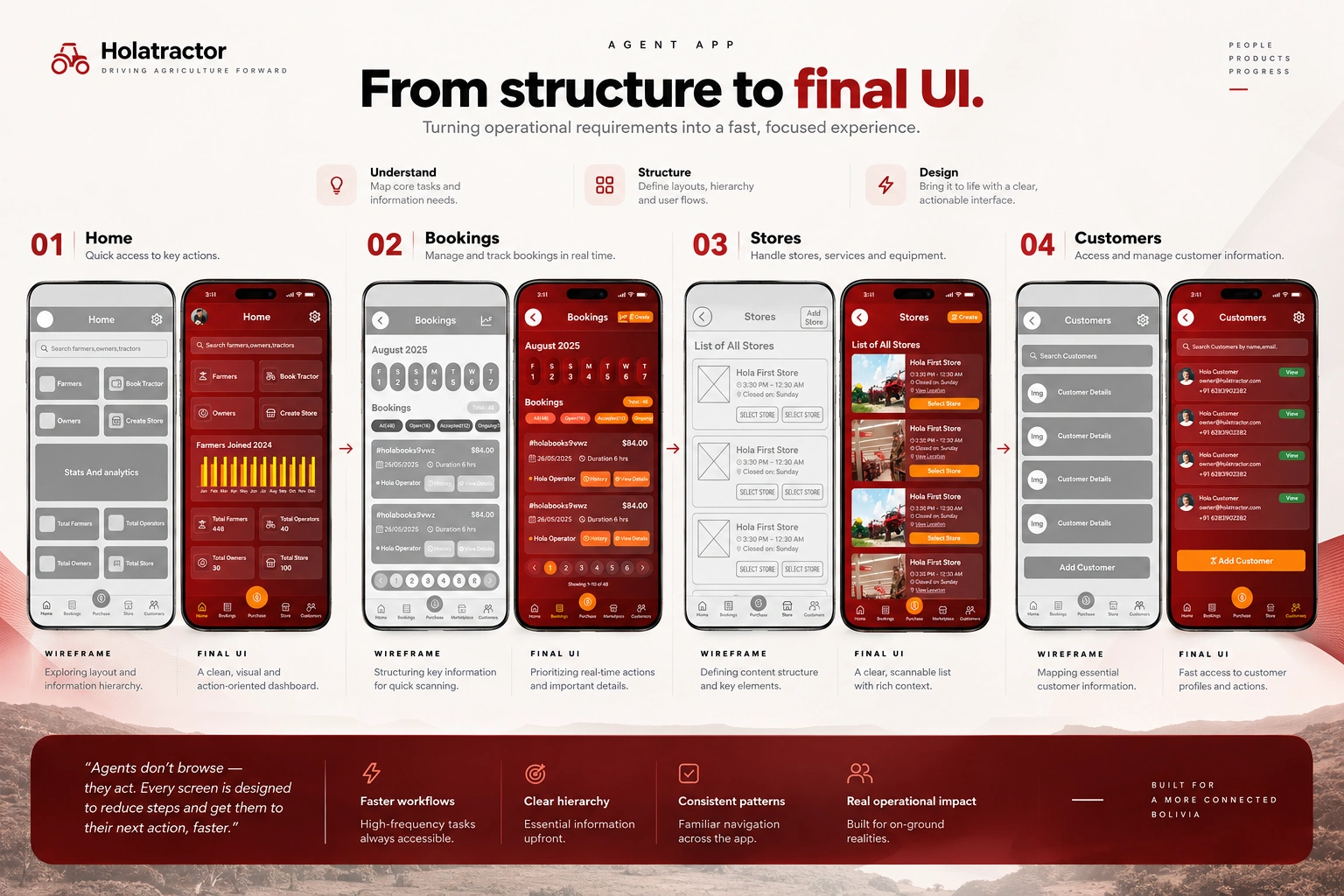
Wireframe to low-fidelity design to High-Fidelity Screens
Designing the Business Experience
Empowering operations with smarter business management
As the ecosystem grew, tractor operations required a dedicated management layer. The business experience needed to move beyond individual transactions and give operators a broader view of what was happening across their operation.
Design focus: Business overview → Operational information architecture → Tractor management flows → Data hierarchy → Mobile interface → Responsive behavior → Reusable component patterns
The key distinction from the Agent app: business users need breadth, not speed. They're making decisions across their operation, not executing single tasks quickly. The information architecture is fundamentally different as a result.
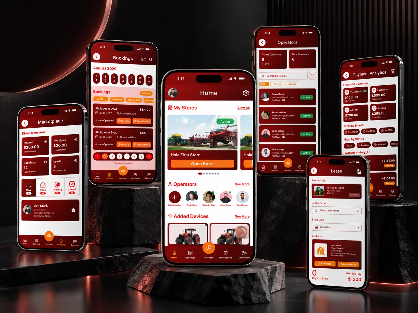
Designing the Owner Dashboard
Turning tractor operations into actionable information
Owners needed more than a list of tractors. They needed to understand the state of their operation at a glance — and then move from overview to individual tractor-level detail without friction.
Design focus: Overview → Tractor-level information → Operational data → Analytics and performance
The emphasis was on information hierarchy: what does an owner need to know first, what do they drill into second, and how does the layout support that sequence without making them think about it.
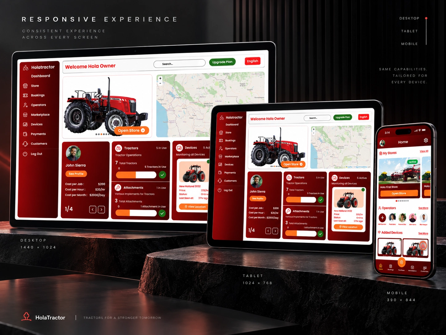
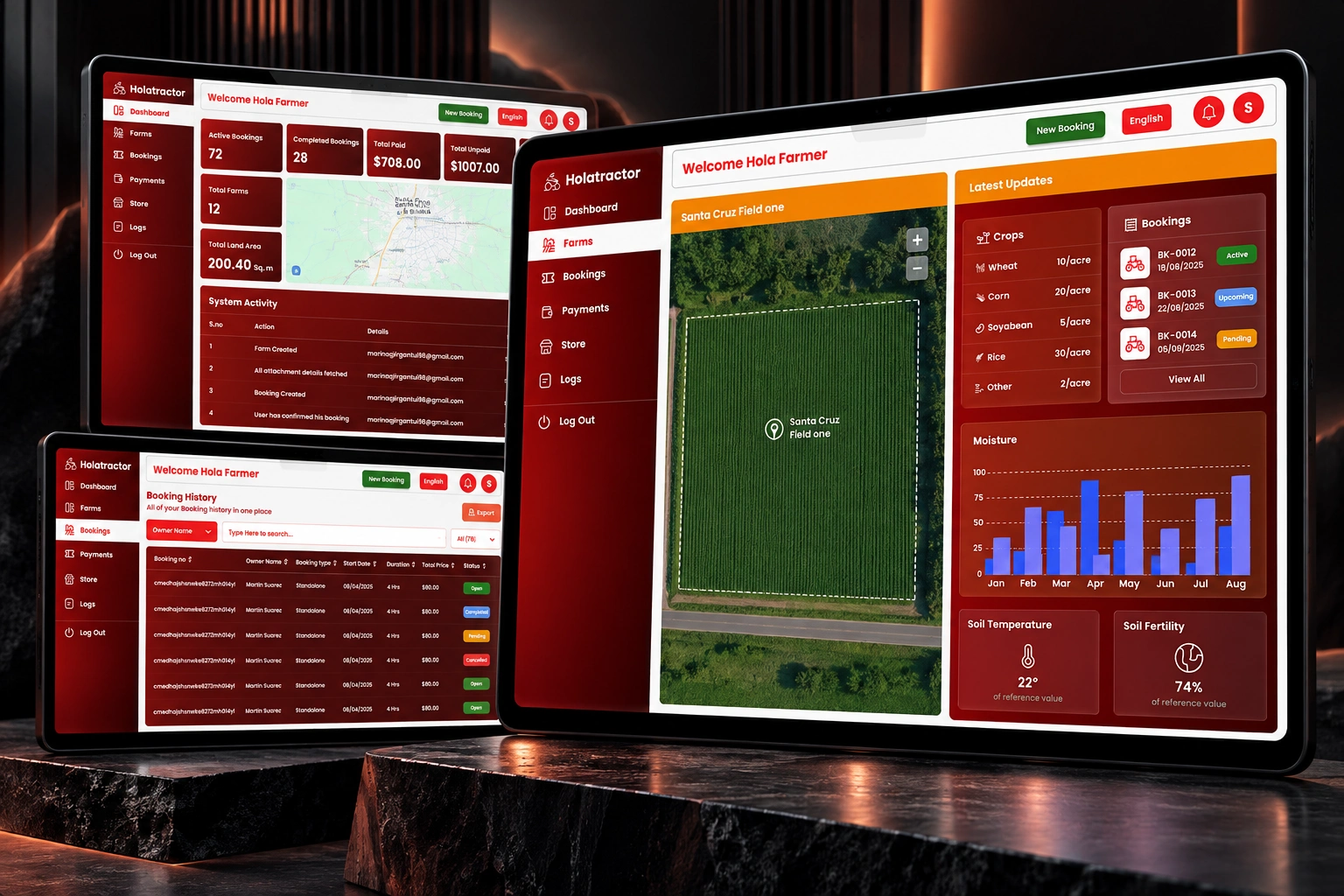
Designing the Farmer Dashboard
Making farm operations easier to understand and manage
Complex operational information across multiple farm activities → Structured dashboard hierarchy that surfaces what matters by role and context.
Need for geographic and location-aware information → Map-based information surfaces and contextually-relevant data.
Need to understand farm performance over time → Visual summaries and data visualization patterns designed for non-technical users.
Multiple operational records to manage → Structured tables and management views that reduce cognitive load.
Different users needing different information densities → Progressive hierarchy across dashboard sections, not a single flat layout.
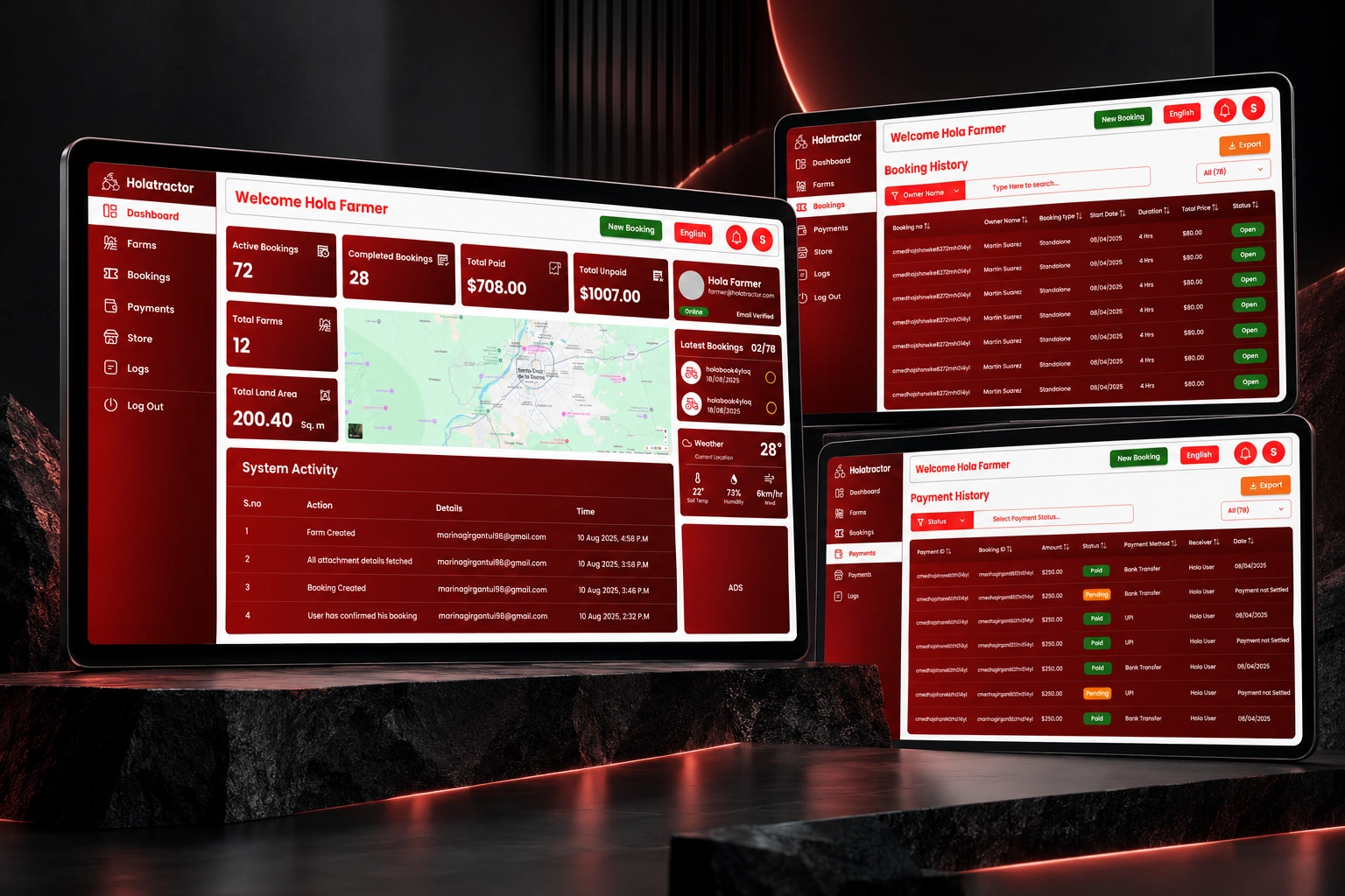
The Design System
One system. Four products.
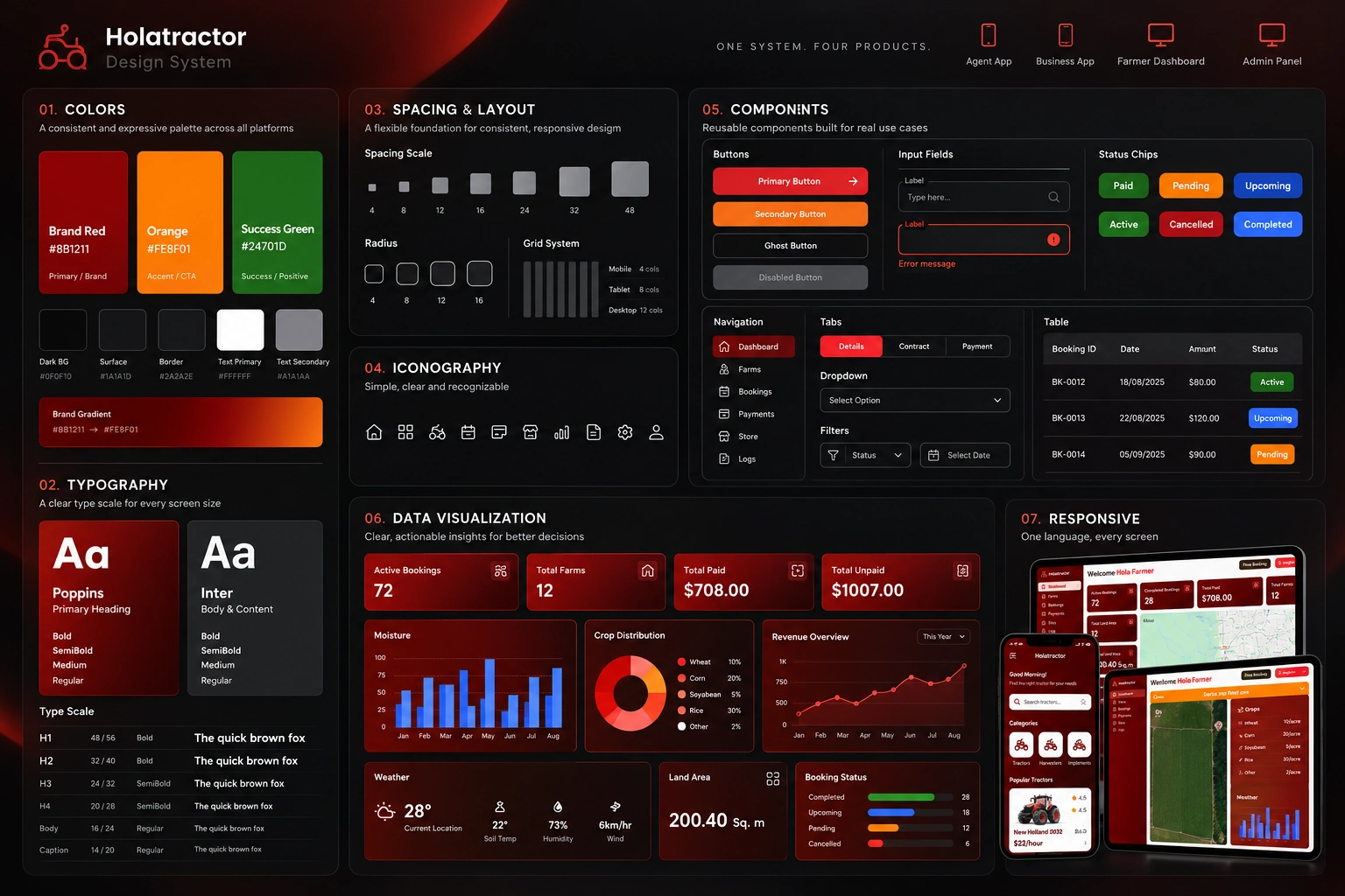
Designing four products independently would have created fragmentation. Instead, I treated the ecosystem as one design language — shared foundations that could adapt to different users, platforms, and information densities.
Color — HolaTractor's red-led identity applied consistently across mobile apps and desktop dashboards, with role-appropriate emphasis and hierarchy.
Typography — A unified type scale creating consistent visual hierarchy whether the user is on a mobile app or a wide desktop dashboard.
Components — Cards, navigation patterns, tables, forms, buttons, status indicators — designed once, adapted across contexts.
Data Visualization — Charts, operational summaries, and performance indicators designed to fit the overall visual language.
Responsive Behavior — The system had to work across mobile apps and desktop dashboards — rethinking layout, information density, and interaction patterns for fundamentally different screen environments.
Consistency wasn't about making every product look identical. It was about making different products feel like they belonged to the same ecosystem.
Designing Across Platforms
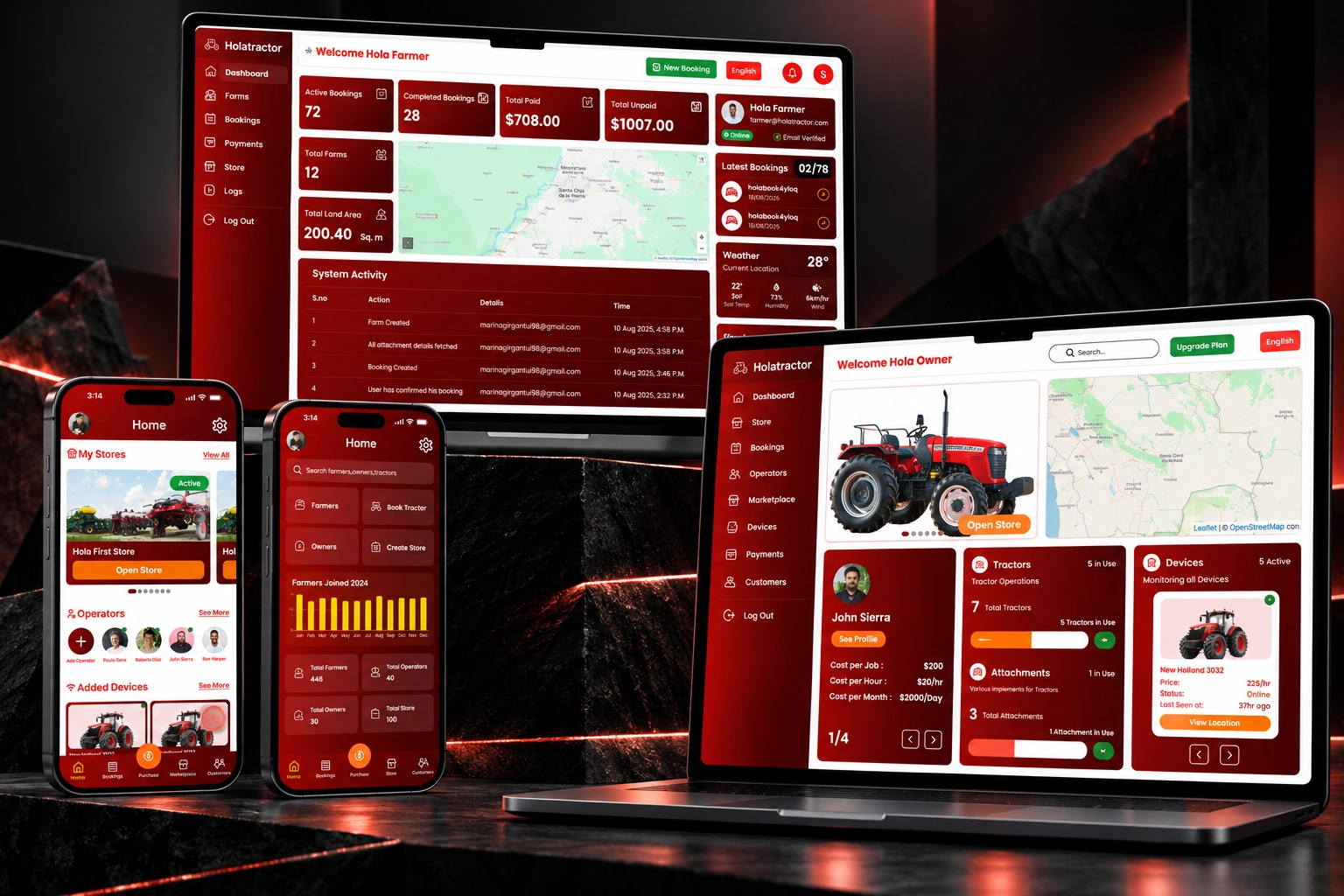
Same ecosystem. Different environments.
Mobile — Agent and Business apps: operational, task-driven, speed-dependent
Desktop — Farmer and Owner dashboards: information-rich, analytical, decision-supporting
A mobile operational workflow cannot simply be shrunk from a desktop dashboard. The interaction patterns, navigation structures, and information priorities are different. The design system had to provide shared principles without forcing identical layouts.
Key Design Challenges
01 — Designing for multiple mental models
A farmer, agent, owner, and business operator don't approach the same system the same way. Understanding each user type at a genuine level was the prerequisite for every good design decision.
02 — Complexity needs hierarchy, not simplification
The answer to complex operational products isn't removing information. It's organizing it so users can understand it progressively.
03 — Dashboards are decision-making interfaces
A good dashboard doesn't just display data. Its hierarchy tells users what deserves their attention — before they've read a single number.
04 — Design systems become more valuable as products multiply
The more surfaces HolaTractor introduced, the more critical the shared component library and visual principles became. Building a strong system early paid dividends across every new product.
05 — Consistency doesn't mean sameness
Four products can have different layouts, different navigation patterns, and different interaction styles — and still share a recognizable product language. That's what cross-product design actually means.
Outcome
One ecosystem. Multiple products. One design language.
HolaTractor evolved into a connected set of experiences serving different sides of the tractor-rental and farm-management ecosystem — four products, four user types, two platforms, one designer.
Working across the full ecosystem gave me the opportunity to think beyond individual screens: from research and user understanding through information architecture, responsive dashboard design, data visualization, interaction patterns, and the shared system connecting all of it.
Designed the HolaTractor ecosystem as the sole product designer, spanning mobile applications, operational dashboards, and management interfaces across farmer, agent, owner, and business workflows.
The hardest part wasn't designing any single product — it was keeping four products coherent as they grew. Every decision had to hold at ecosystem scale. That's the kind of design problem I want to keep solving.
Like this project
Posted Sep 23, 2026
Sole product designer across a 4-product agritech ecosystem — farmer, agent, owner & business apps unified by one design system.
Likes
0
Views
0
Timeline
May 22, 2025 - Sep 26, 2025
Clients
HolaTractor