First Impression — Dark Portfolio & Case Study System

Shreyansh Shrivastava


First Impression — Dark Portfolio & Case Study System
A free Framer portfolio system built to help designers make the right first impression.
01. Project Overview
The Template That Treats Free Like Premium
Why should free mean less thoughtful?
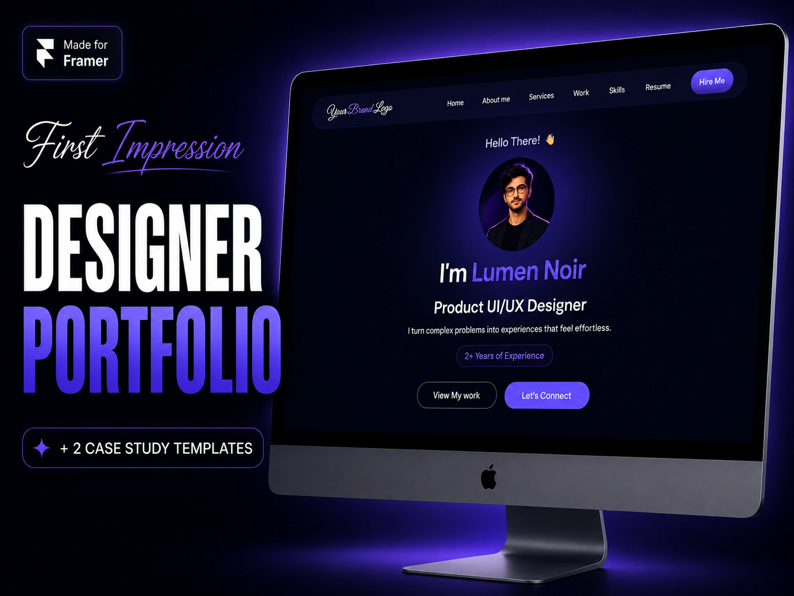
First Impression is a free Framer portfolio template built for UI/UX designers, product designers, and creative freelancers who want to present their work with editorial precision. The brief I set myself was simple: build a complete portfolio system — not just a homepage, but a full case study infrastructure — and give it away for free. No shortcuts on craft, no stripped-down layouts. The result is a dark-mode portfolio system with a homepage, a UX case study page, a redesign case study page, and a 404. It's available on the Framer Marketplace and free to remix by anyone.
02. The Problem
Most Free Templates Are Starting Points That Never Finish
Designers deserve a system, not a skeleton.
Free portfolio templates typically suffer from the same three problems: they stop at the homepage, they have no real case study structure, and they lack the design system thinking that makes customization feel effortless. Designers end up either paying for a premium template they don't fully understand, or struggling to retrofit a free one into something presentable. First Impression was built to close that gap — to be a genuinely usable, complete portfolio system that costs nothing but delivers premium quality.
03. Goals
What I Was Building Toward
A free template that earns its place in a designer's workflow.
01 — Build a complete system, not a page. Homepage alone isn't enough. Designers need case study layouts baked in from day one.
02 — Make dark-mode feel intentional, not just aesthetic. Dark portfolios are everywhere. First Impression needed to feel editorial and deliberate, not just dark for the sake of it.
03 — Keep it flexible without making it complex. Reusable components, organized design system, clear sections — customizable without requiring Framer expertise.
04 — Release it as a genuine community contribution. No lite/pro split. No stripped features. Full system, free remix, clean license.
04. What's Inside the System
A Complete Portfolio Infrastructure
Four pages. One cohesive system.
First Impression ships with four production-ready pages:
Homepage — Hero with animated skill ticker, About, Services grid, Selected Works, Design Process, Tools, Experience & Education, and Contact form with service selector.
UX Case Study Page — Structured narrative flow: Overview, Problem Statement, Goals, Research & Discovery, Design Process, Key Decisions, Outcomes, Learnings, Next Steps, Closing Reflection.
Redesign Case Study Page — Before/After comparison system with data slots (pre/post metrics), Design Decisions section, and structured learnings — built for designers who do redesign work as part of their process.
Custom 404 — Branded error page so the portfolio feels complete even at its edges.
05. Design Decisions
The Thinking Behind the Dark System
Every detail was a decision.
Dark as editorial, not atmospheric. The dark palette was chosen to make project work pop without competing with it. Off-blacks and muted neutrals keep the template from feeling "gamer dark" — it reads premium and editorial.
The skill ticker on the hero. Rather than a static list of services, a horizontal scrolling ticker communicates breadth immediately and adds motion to what would otherwise be a static above-the-fold.
The redesign case study format. Most portfolio templates skip redesign work entirely. First Impression has a dedicated page structure with Before/After comparison slots and pre/post metric panels — because redesign case studies are one of the most powerful things a UI/UX designer can show.
Reusable component logic. Every repeating element — service cards, work grid items, process steps — is built as a Framer component, not a copied frame. This means a user can update one instance and have it cascade across the whole template.
06. The Case Study Page Architecture
Built to Showcase Thinking, Not Just Aesthetics
A portfolio is an argument. The case study is the evidence.
The UX Case Study page follows a deliberate narrative arc: context → problem → research → decisions → outcomes → reflection. This mirrors how actual design work unfolds and gives designers a structure they can fill without rewriting from scratch.
The Redesign Case Study page adds a layer specific to redesign work — data before and after the intervention, a Before/After visual comparison system with up to 5 sections, and a Design Decisions module that explains the why behind visual changes. The goal was to give designers a format that could stand up to client scrutiny, not just look good in a portfolio.
07. Responsiveness & Performance
A Template That Works Everywhere
Dark and fast. No trade-offs.
First Impression is fully responsive across desktop, tablet, and mobile. Every layout section adapts without breaking the visual hierarchy. Framer-native components keep performance clean — no bloated libraries, no layout shift. The template was also built with SEO-friendly structure out of the box: proper heading hierarchy, meta description setup, and semantic page sections.
08. What I Kept Out (And Why)
Restraint Is a Design Decision
The best systems know what not to include.
First Impression is intentionally focused. No blog, no shop, no multi-page CMS setup. The decision to keep it to four pages was deliberate — a portfolio system should be learnable in a single session and customizable in an afternoon. Every addition I considered got tested against one question: does this help a designer get hired, or does it just add complexity?
The free price point also shaped the scope. Rather than a lite version of a paid template, First Impression is a complete version of a deliberately scoped system.
09. Deliverables
What's Included
✅ Designer Portfolio Homepage — full single-page layout with 8 sections
✅ UX Case Study Page — narrative-arc structure with 10 sections
✅ Redesign Case Study Page — Before/After comparison system with metric panels
✅ Custom 404 Page — branded, on-system error page
✅ Fully Responsive Layouts — desktop, tablet, mobile
✅ Reusable Framer Components — built for easy customization
✅ Organized Design System — colors, type, spacing all documented
✅ Smooth Interactions & Animations — scroll effects, hover states, ticker
✅ Contact Form with Service Selector — Framer-native, no third-party required
✅ Documentation & Setup Guide — step-by-step customization walkthrough
10. Reflection
On Building Something Free With Full Effort
"Free shouldn't mean less considered. First Impression exists because I believe every designer — student, freelancer, or career-switcher — deserves a portfolio system that doesn't make them look like a beginner before they've had a chance to prove otherwise."
The real value of building First Impression wasn't the template itself — it was the systems thinking practice. Designing for a fictional designer forced me to make every decision generic enough to be remixable but specific enough to feel real. That tension is exactly what makes template design hard and interesting. Every component choice, every section order, every dark-mode color decision was made knowing a stranger would inherit it and need to make it their own in under an hour.
First Impression is available free on the Framer Marketplace. For a free release, community reach is the metric that matters.
Like this project
Posted Sep 22, 2026
A free Framer portfolio system built for UI/UX designers — complete with homepage, UX case study page, redesign case study page, and 404.Zero cost.
Likes
0
Views
2
Timeline
Jun 1, 2026 - Jun 26, 2026