Built with Framer
Website Design and Development for Vantage Studio
Bright Ajiboye
Vantage Studio
Overview
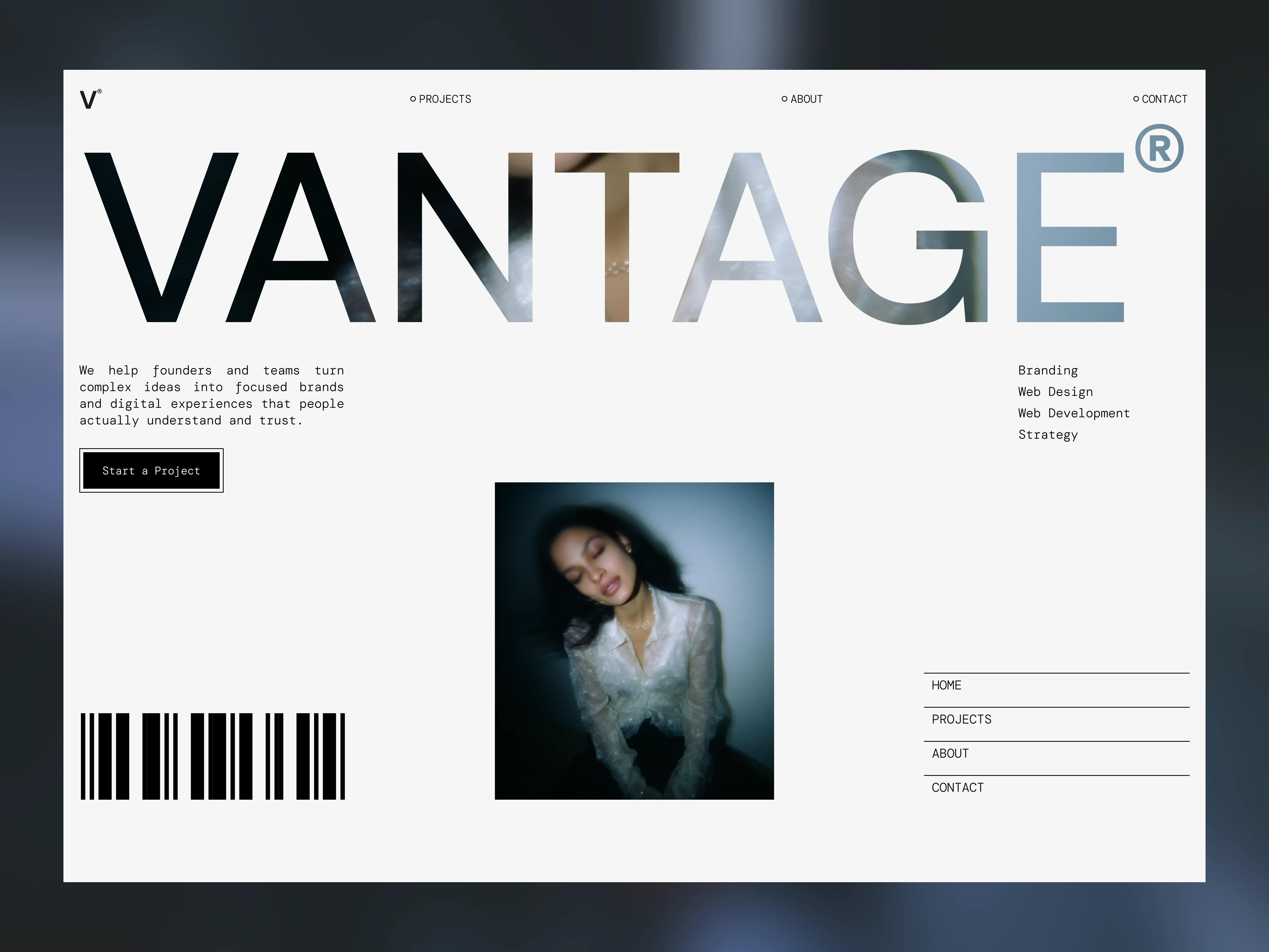
This project involved designing and building a bold, elegant website for a modern design studio focused on brand and digital systems.
The goal was simple but demanding:
Create a website that feels confident, minimal, and strategic — while clearly communicating value and converting high-quality clients.
The website needed to:
Position the studio as premium
Communicate clarity within seconds
Showcase work without visual noise
Support storytelling
Be scalable inside Framer
The Challenge
Most agency websites fall into one of two extremes:
Over-designed and trend-heavy
Generic and template-driven
The challenge was to build something that felt:
Minimal but not empty
Bold but not loud
Elegant but not fragile
Strategic, not decorative
Additionally:
The value proposition needed to be immediately clear
The site had to feel credible without relying on fluff
The structure had to guide users naturally toward conversion
Objectives
Establish a strong, outcome-focused headline
Communicate value within the first scroll
Design a scalable system for case studies
Create clear hierarchy and breathing space
Build everything natively in Framer
Ensure easy future customization
Strategy
1. Clarity-First Positioning
Instead of leading with “We are a creative agency,”
the homepage leads with a direct value statement:
Designing clarity for ambitious brands.
The messaging focuses on outcomes:
Communication
Structure
Scalability
Growth
Not services. Not tools.
2. Strong Typographic Hierarchy
The visual system is built primarily on:
Structured grid layout
Confident headline scale
Controlled use of whitespace
Minimal color palette
Typography does the heavy lifting.
Decoration is kept secondary.
3. Intentional Pacing
The homepage flow was designed as a narrative:
Hero → Trust → Value → Work → Philosophy → CTA
Each section answers a silent question the visitor is asking:
Who are you?
Why should I trust you?
What makes you different?
Can you prove it?
What happens next?
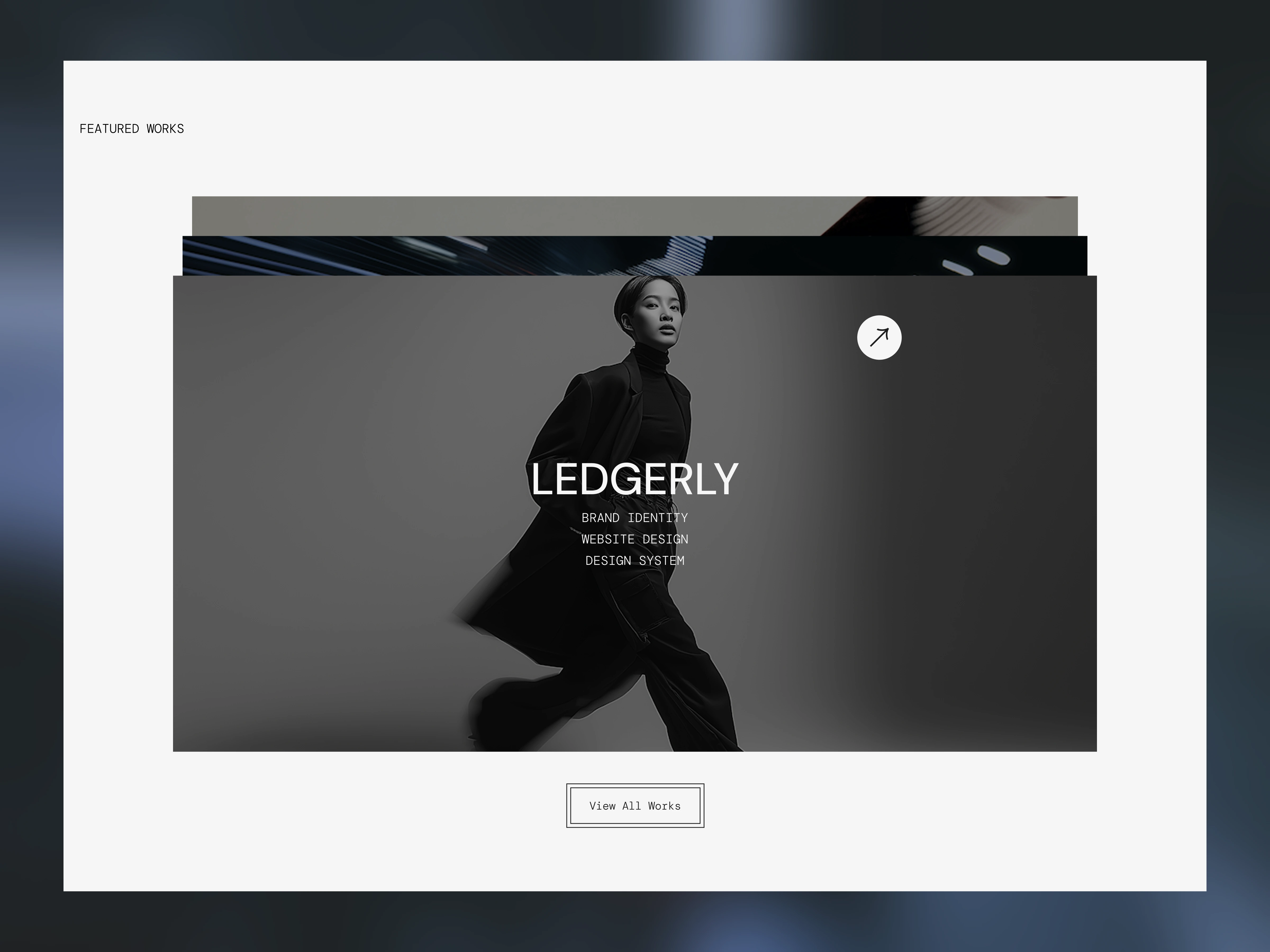
4. Modular Design System
Instead of designing fixed pages, the website was built as a scalable system:
Reusable content blocks
CMS-powered case studies
Flexible testimonial layouts
Editable global styles
Structured spacing system
This ensures long-term usability — not just launch-day polish.
Execution
Full UX structure mapping
Brand-aligned typography system
Component-based layout system
CMS configuration for projects
Responsive optimization
Subtle performance-friendly animations
Conversion-focused CTA placements
Everything was built directly in Framer for flexibility and ease of iteration.
Results
The final website:
Clearly communicates positioning within seconds
Feels premium without being over-designed
Guides users naturally toward project inquiries
Scales easily with new case studies
Reflects the studio’s strategic mindset
The design reinforces the message:
Clarity is the advantage.
Key Takeaways
Strong positioning reduces the need for excessive visuals.
Minimalism works when structure is strong.
Narrative flow matters as much as aesthetics.
A scalable system is more valuable than a beautiful layout.
Clarity converts better than complexity.
Tools Used
Figma
Framer
Jitter
Like this project
Posted Mar 1, 2026
Designed a bold, elegant website for Vantage Studio, built to communicate value clearly, showcase expertise, and convert high-quality clients with confidence.