Built with Framer
Chill Bites & Drinks — Framer Website Development + Branding
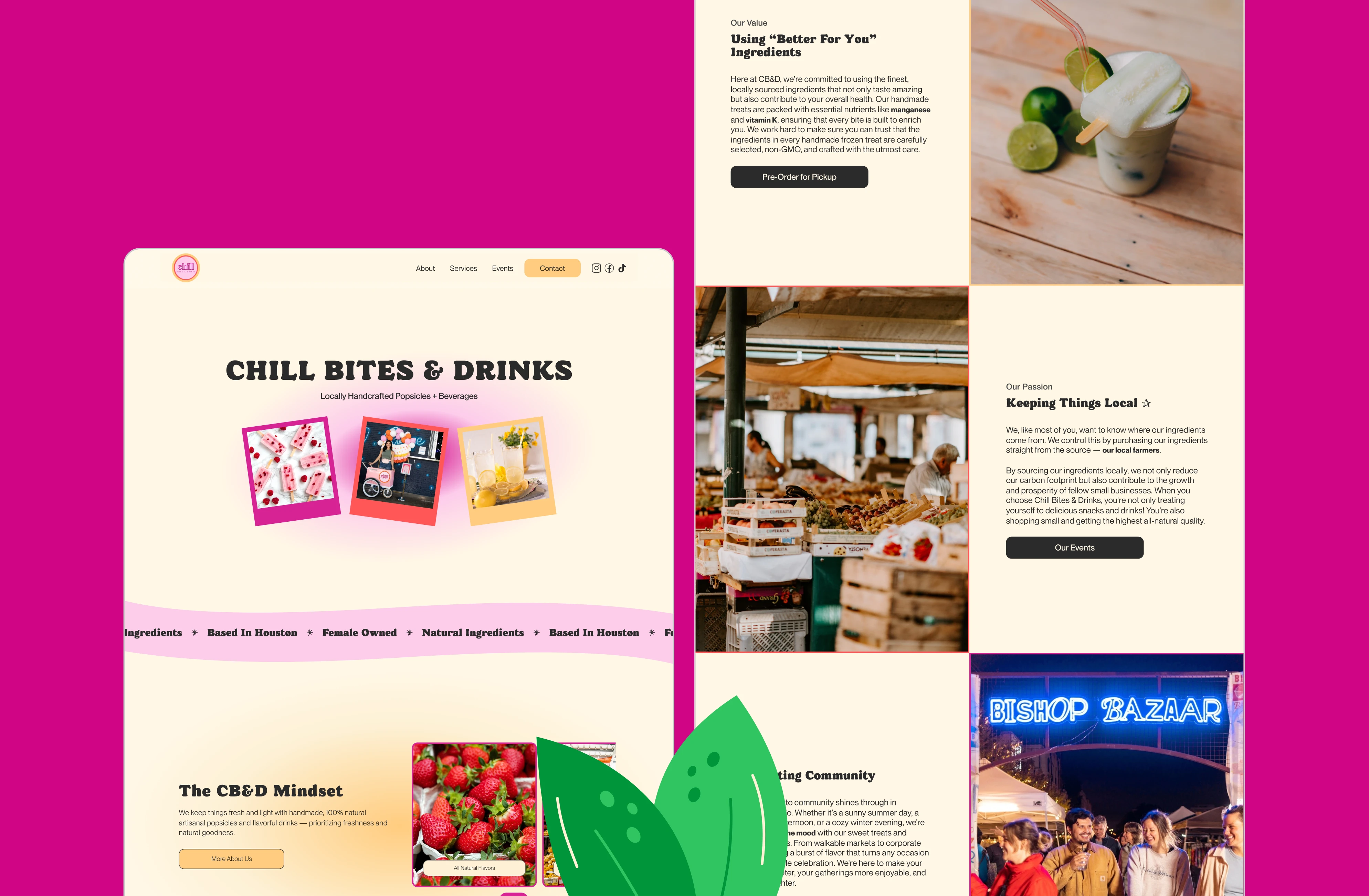
The Brief
Chill Bites & Drinks (CB&D) has been dedicated to offering delightful, locally sourced, and health-conscious sweet treats that not only please the palate but also foster a sense of community. As an artisanal popsicle and drink company rooted firmly in the local Texas market, CB&D faced significant challenges in positioning itself distinctively and enhancing customer engagement without an objective to ship products nationwide.
Project Focus
Our primary role in this project was to refine CB&D's marketing strategy to better target their intended audience, establish a cohesive and resonant brand voice, and design a website architecture that was visually striking and optimized for user engagement. We aimed to emphasize CB&D's community-oriented brand ethos and their commitment to quality and freshness.

CB&D Community
Design Strategy
The design ethos for CB&D was dictated by its vibrant and youthful brand persona, curated by Luz, the owner, whose philosophy centers on chill vibes and the essence of eternal summertime. The website needed to reflect this persona, incorporating a color palette that grabs attention while avoiding clichés that might alienate the intended youthful demographic.
Visual Elements:
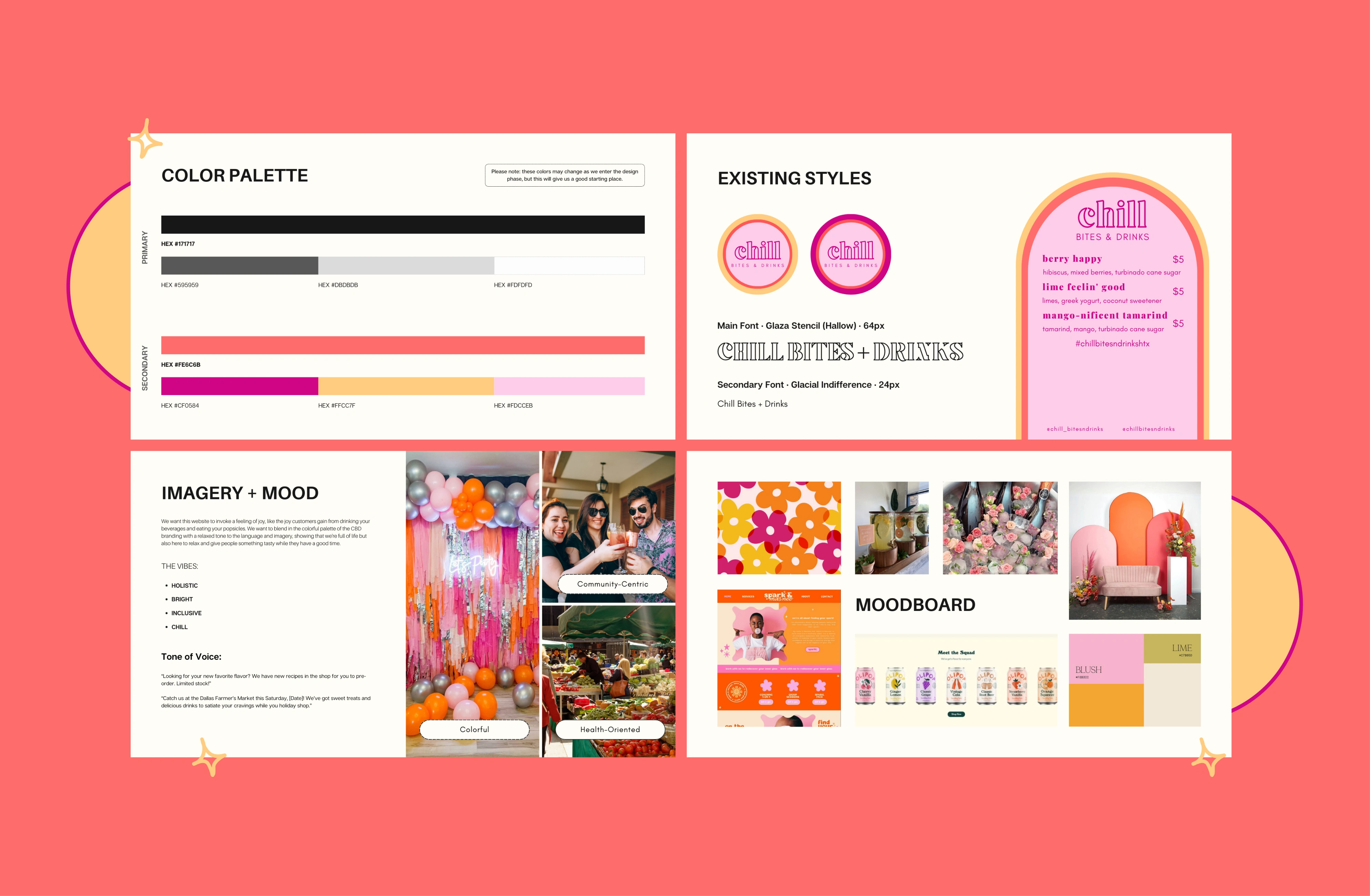
Color Palette: We selected muted, lower opacity shades of CB&D's vibrant, eye-catching brand colors, expanding the palette to fully invoke the feeling of summer joy and chill vibes.

Color Palette
Graphics: Utilizing bespoke graphics, we captured the essence of summer with visuals that had a cute pop that resonated with CB&D's audience and highlighted product offerings in a brand-appropriate way. We wanted to invoke that summer-sweet feel, shooting for a design that was colorful and bright but anti-cheugy.

Typography: Playful yet readable fonts were used to maintain the fun yet professional tone of the brand.

Accessibility:
WCAG Compliance: The site was rigorously designed to adhere to the WCAG criteria even with the bright color palette and active interactions, ensuring it was accessible to all users.
User-Friendly Navigation: Simplified navigation and intuitive interface design were prioritized to facilitate an effortless user experience.
Development Strategy
The website was developed using Framer, chosen for its versatility and support for highly customizable designs. We employed a loose-bento grid layout to provide a structured yet flexible visual arrangement.
Key Features:
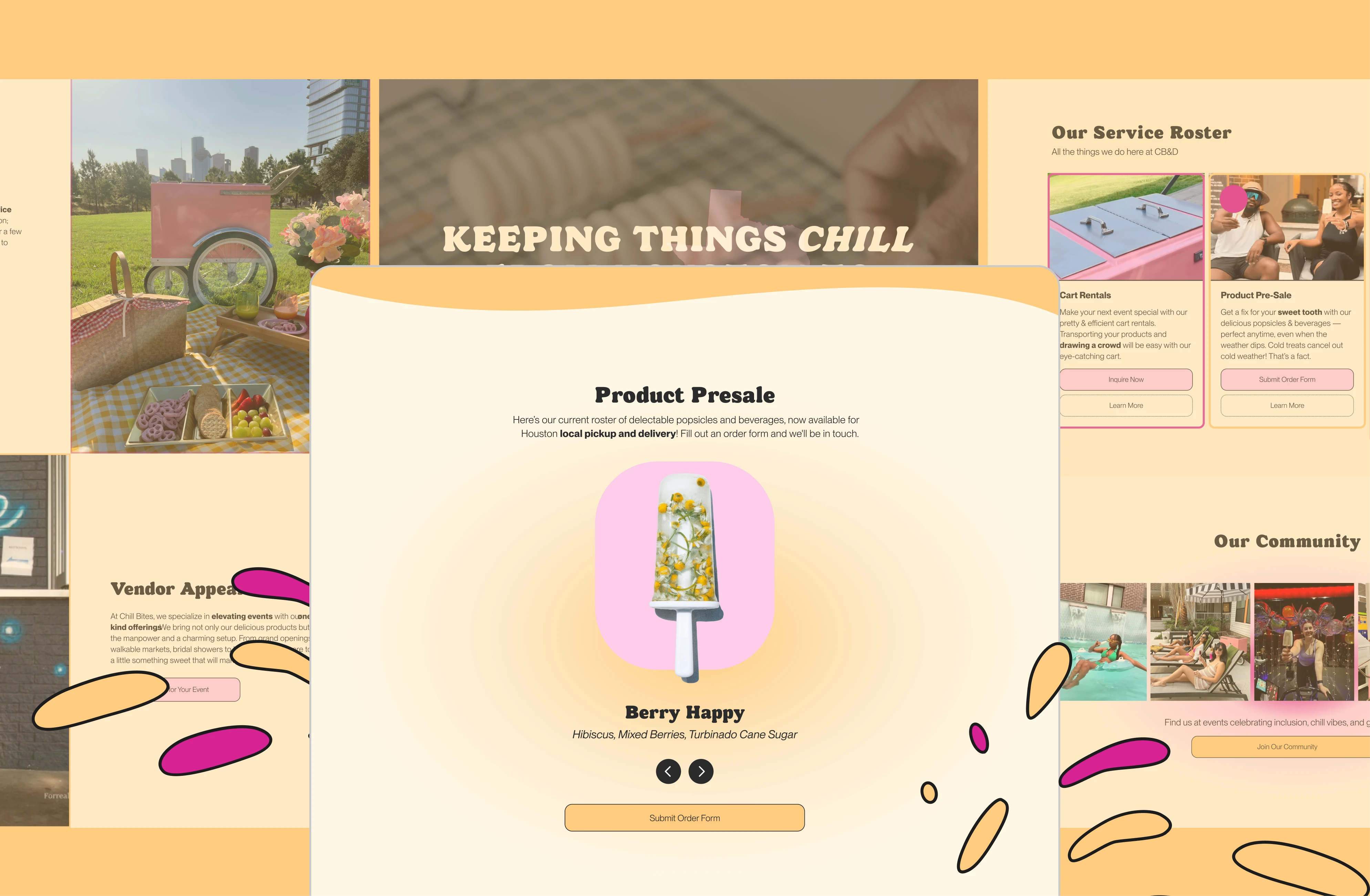
PNGs and Carousels: These were integrated to showcase the vibrancy of the products in a dynamic and engaging manner.
Customized Sliders: Developed to feature CB&D’s events prominently, allowing for easy updates and highlights of upcoming gatherings and offerings.
Event Showcasing: Special attention was given to CB&D's array of services, including pop-up vendor opportunities, private event hosting, and cart rentals. Each service was prominently displayed in an interactive and informative manner.
Performance and Scalability:
Optimized Loading Times: Ensured through streamlined code and optimized media assets to enhance user experience across devices.
Scalable Architecture: The backend was structured to accommodate future expansions and feature integrations without disruptions.
From the Client
“From start to finish, Madi provided her expertise and creative vision while developing my brand's website. Her detail-oriented processes made the entire experience seamless, ensuring that I was in tune with every step of the way. Madi's genuine interest and support for Chill Bites & Drinks made me feel like she was an extension of the team. She's a keen listener who combines creativity and efficiency in all that she does.”
— Luz V., Business Owner
Preview the Site
Like this project
Posted Aug 9, 2024
Revamped CB&D's website with a vibrant website designed in Framer, enhancing brand engagement, pop-up event attendance, and rental inquiries.
Likes
141
Views
3.7K

