Refined Wilderness Landing Page Design
Oluwatobi Adetunji
Refined Wilderness, A modern Hiking Gear Brand
Overview
Refined Wilderness is a conceptual premium hiking gear brand built around intentional exploration.
The goal was to design a landing experience that felt calm, curated, and emotionally grounded avoiding the aggressive, adrenaline-driven tone commonly seen in outdoor commerce.
The brand chooses to sell reflection instead of intensity.
The Problem
Most outdoor gear brands rely on:
High-energy photography
Heavy contrast color palettes
Aggressive CTAs
Performance-first messaging
While effective for extreme sports, this approach alienates a growing audience of mindful explorers, people who hike for clarity, not conquest.
The Challenge
Design a gear, community focused landing page that:
Felt premium and restrained
Communicated durability without shouting
Balanced storytelling with commerce
Maintained strong visual consistency
Strategic Direction
I positioned the idea around one idea "The journey is the product"
This decision heavily influenced:
My typography pairing
Illustration choices
Color Palette
Layout rhythm
Copy tone
These made the design feel intentional and not promotional
Visual System
Typography
Instrument Serif; For emotional depth, luxury feel and editorial tone
SN Pro (Rounded); For approachability and accessibility
Color Palette
Muted Earth tones
Deep forest green
Sage backgrounds
Warm Light gradients
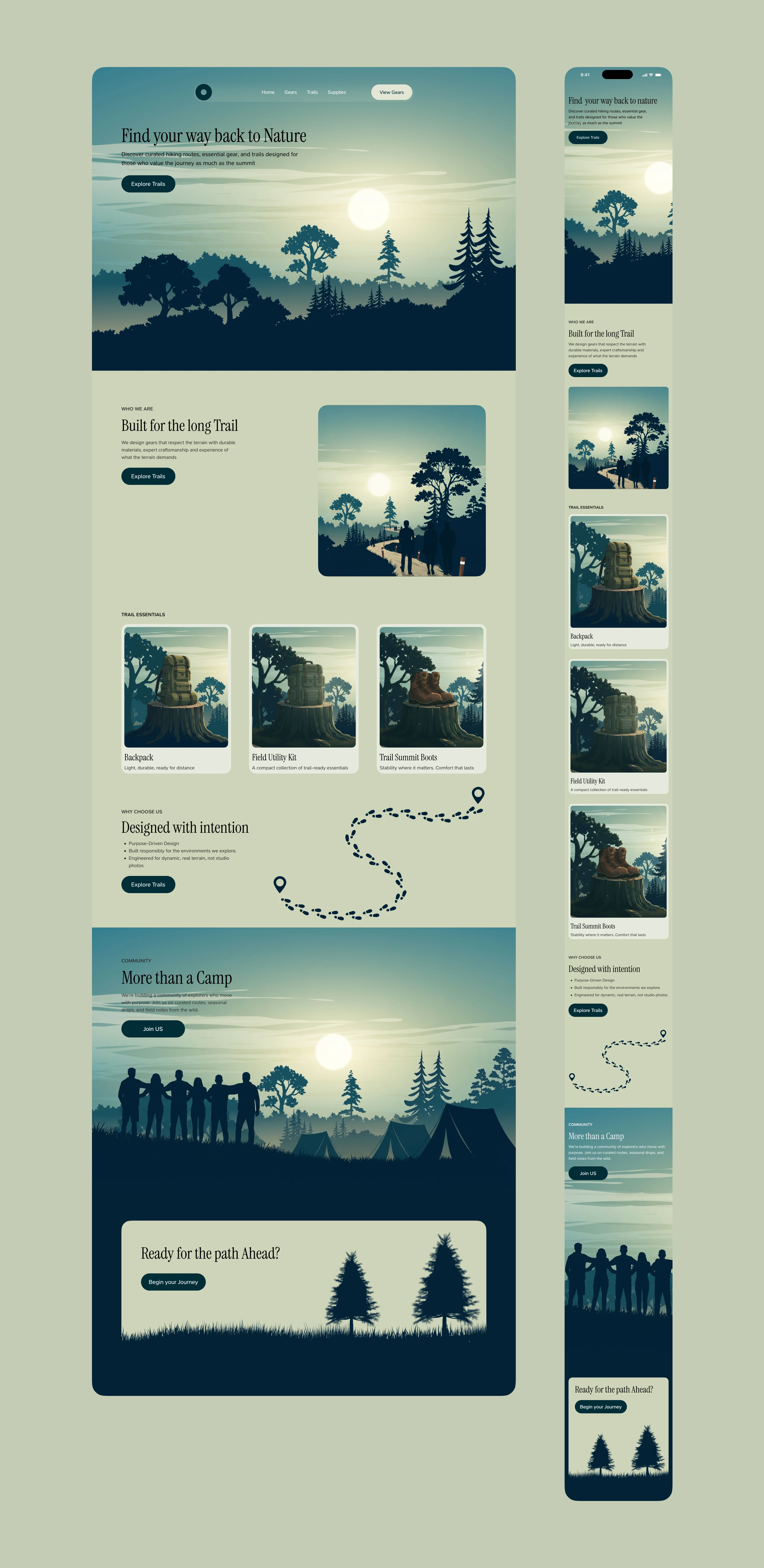
Spacing and Layout
Sectional padding (web) 140px to maintain generous whitespace and rhythm
I intentionally avoided harsh dividers heavy card borders or loud drop shadows
Product Strategy
Rather than overwhelm users with specs, the product section emphasizes:
Emotional positioning
Essential benefit statements
Clean product framing
The featured products, backpack, boots, and field kit represent foundational trail equipment, reinforcing the brand’s “essentials-first” philosophy.
Each product card uses:
Minimal copy
Strong object focus
Subtle hierarchy
Outcome
The final result is a landing experience that:
Feels cohesive and restrained
Balances storytelling and commerce
Establishes a premium outdoor identity
Demonstrates typographic discipline and system thinking
This project showcases my ability to:
Translate positioning into visual systems
Maintain tonal consistency across sections
Design for brand depth, not just UI aesthetics
Create hierarchy through restraint rather than noise
Like this project
Posted Feb 26, 2026
Designed a calm, cohesive landing page for Refined Wilderness, without leaning into intensity, adrenaline or extreme performance messaging
Likes
2
Views
23