
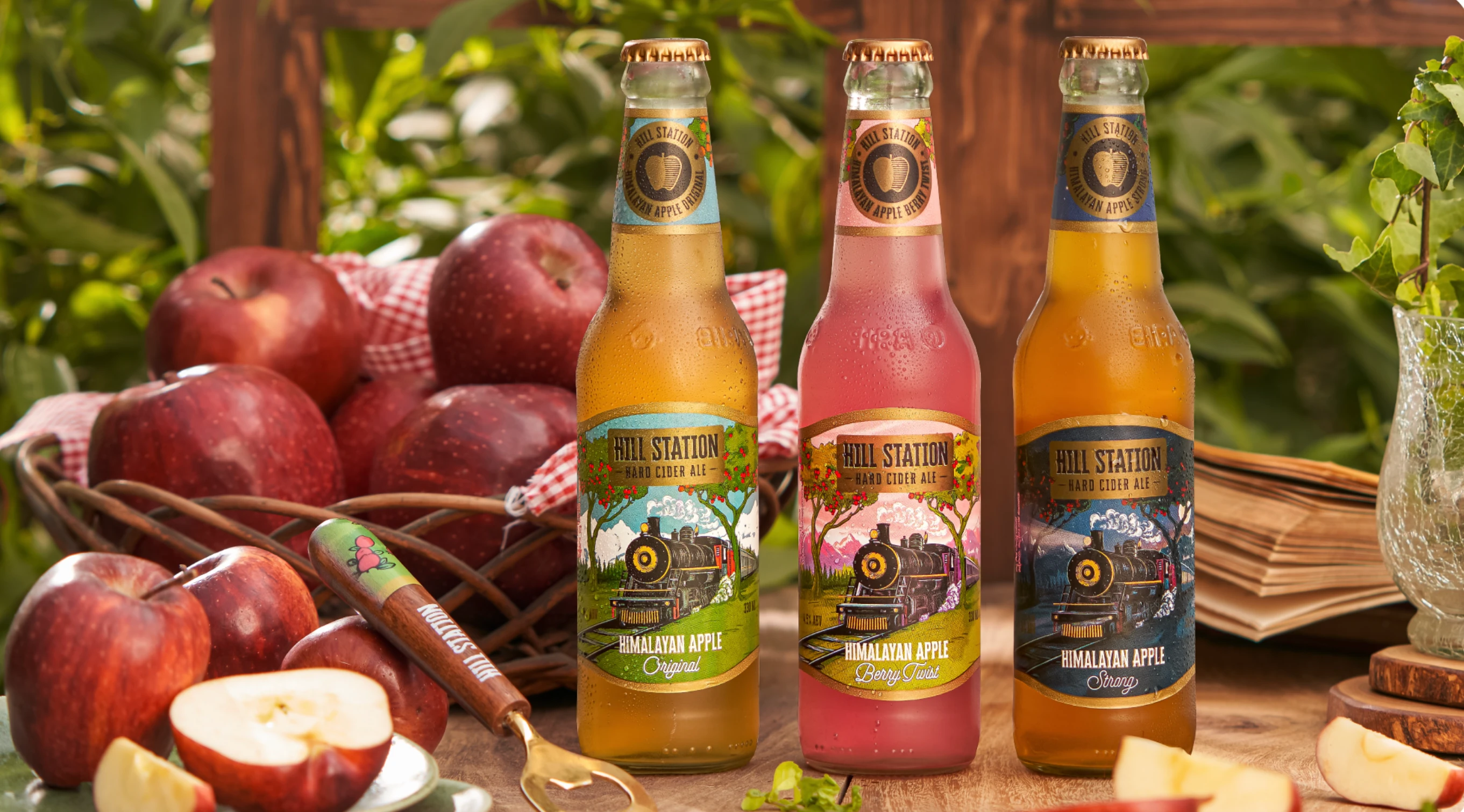
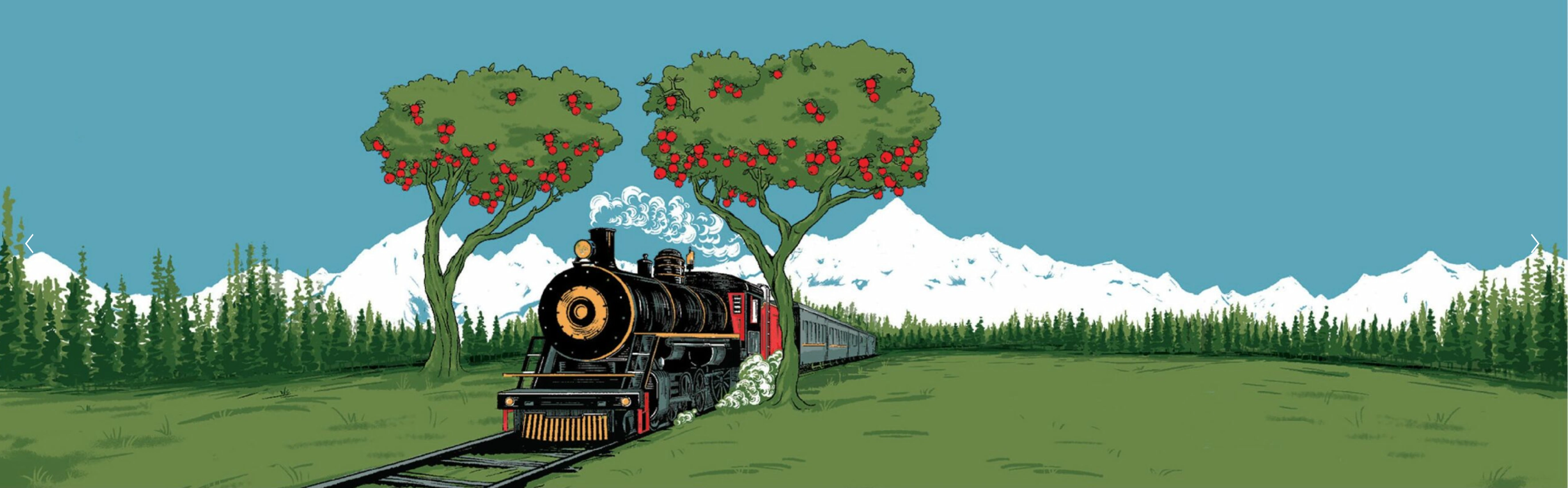
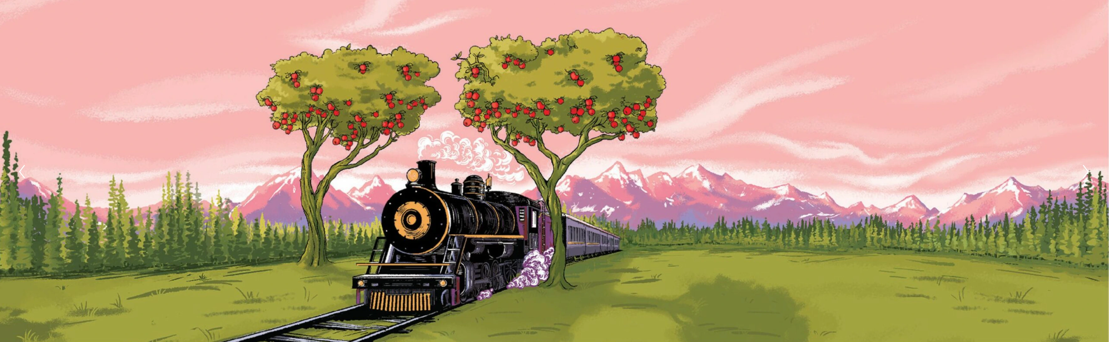
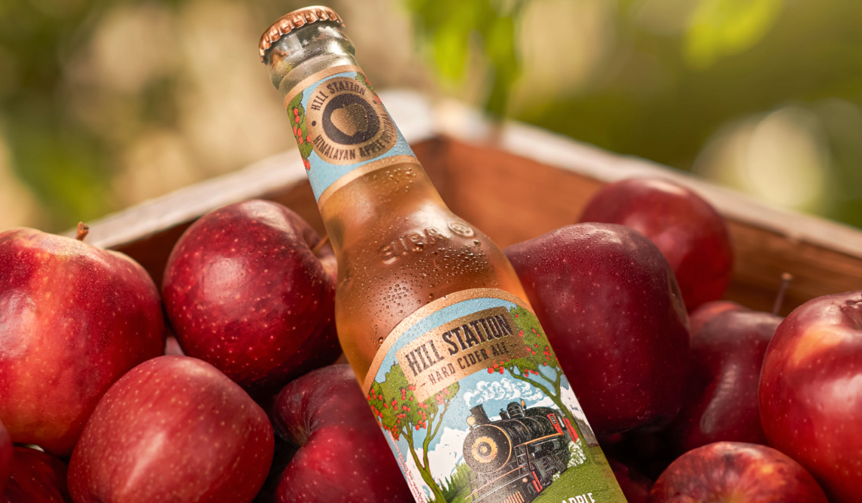
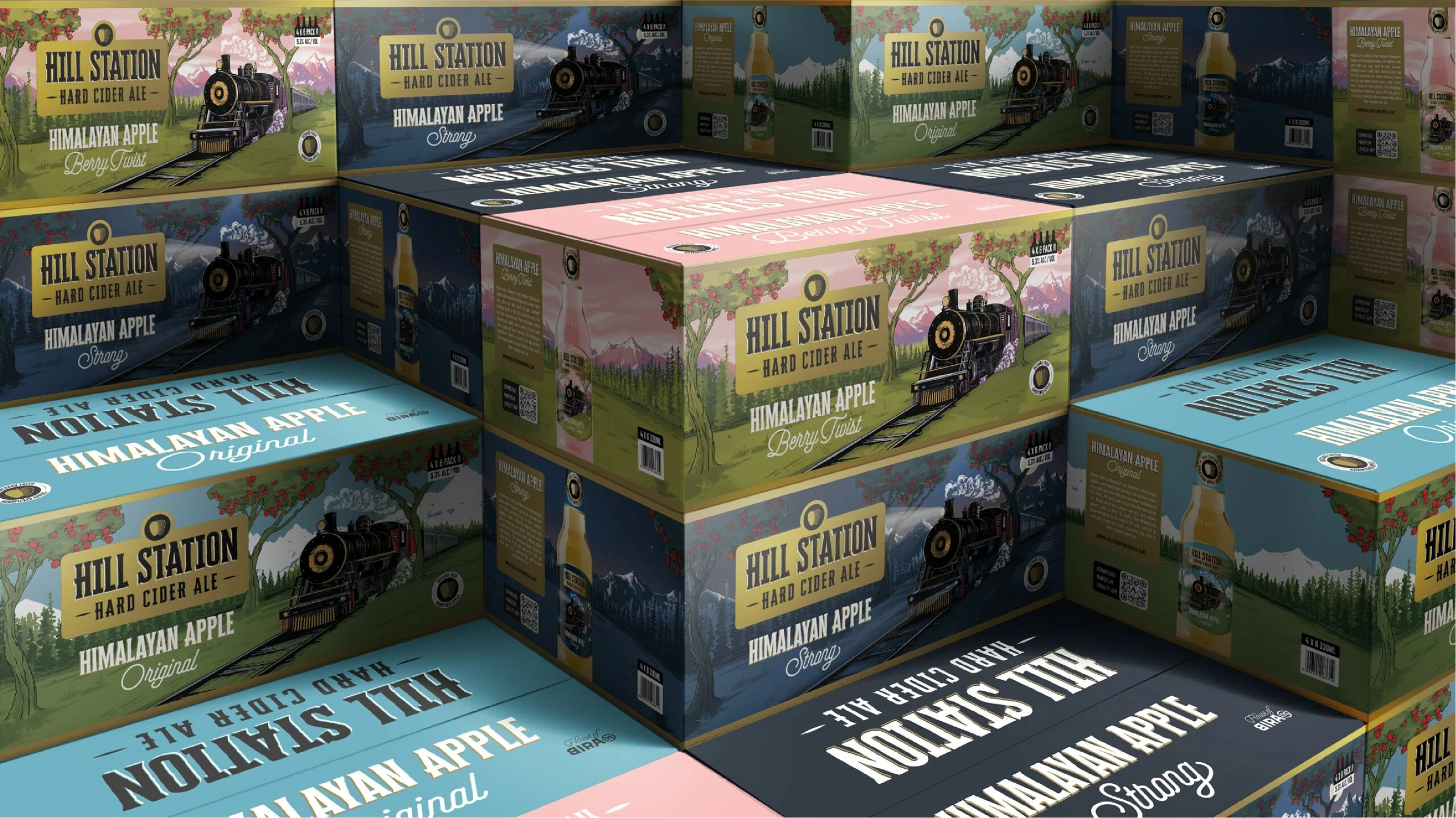
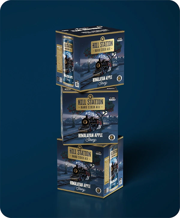
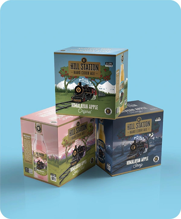
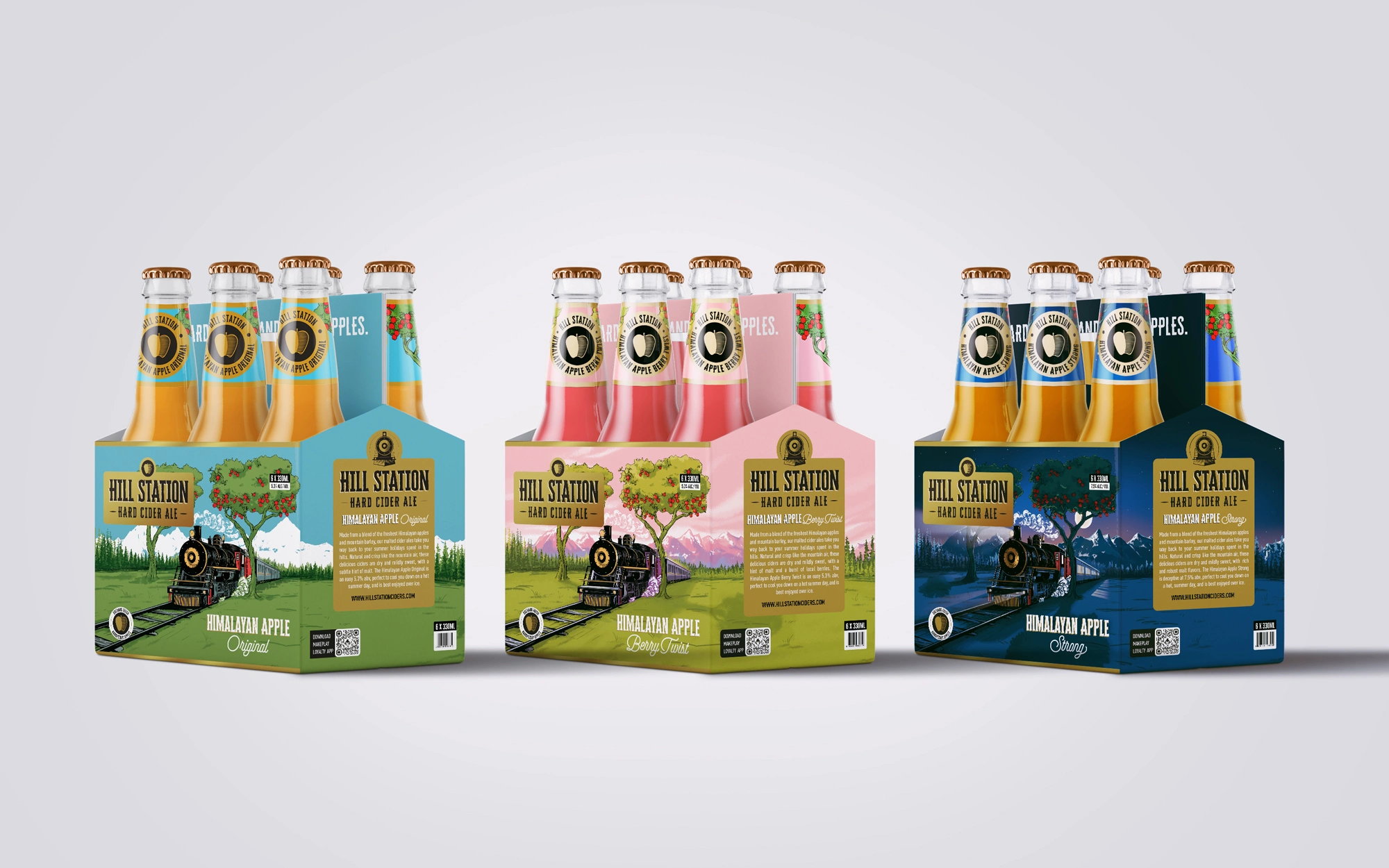
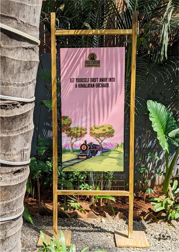
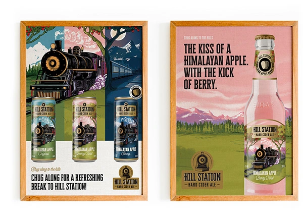
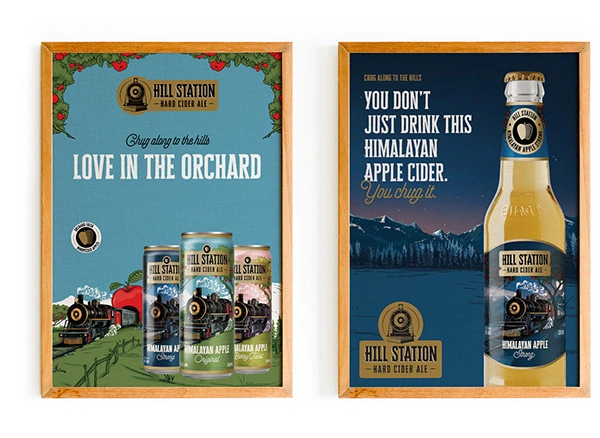
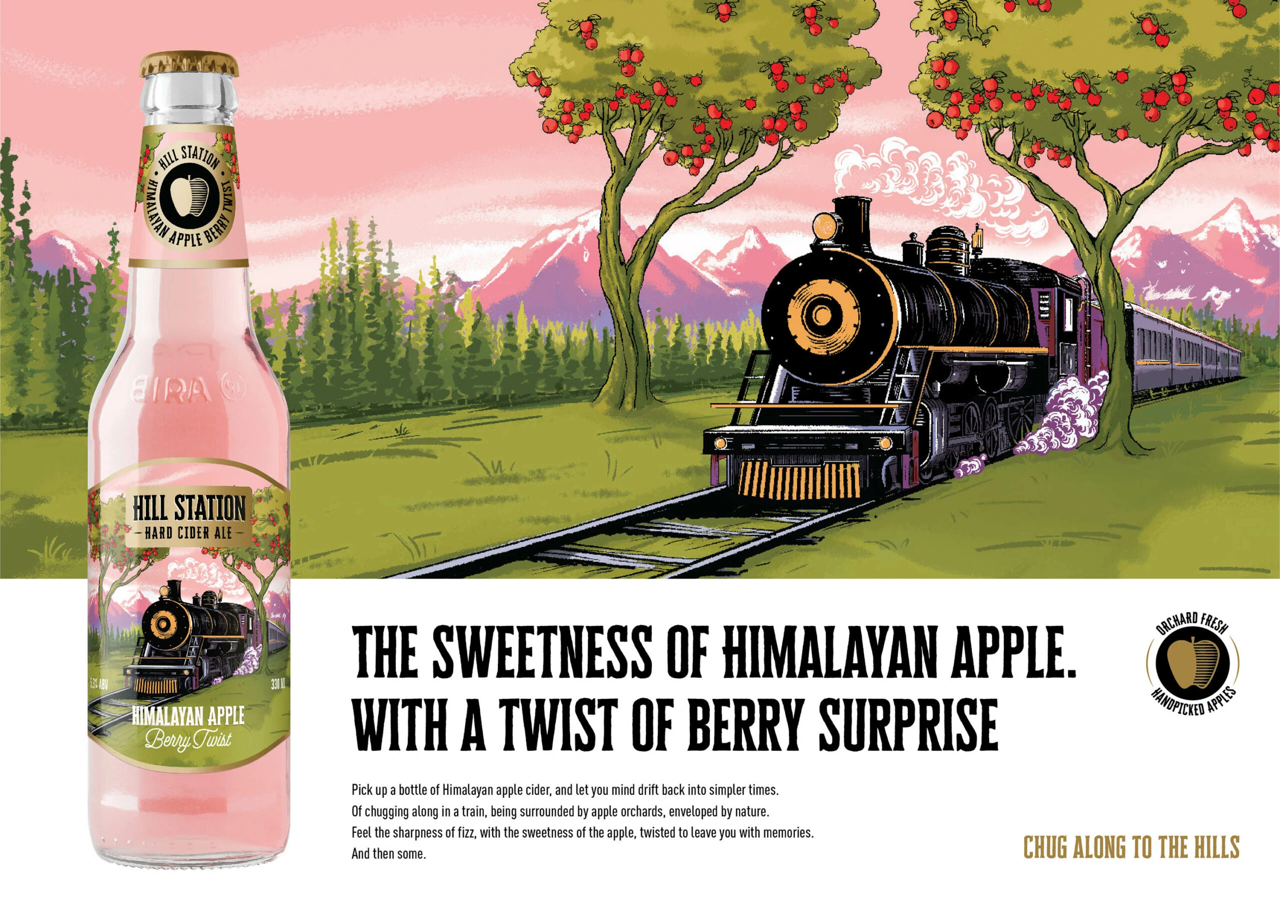
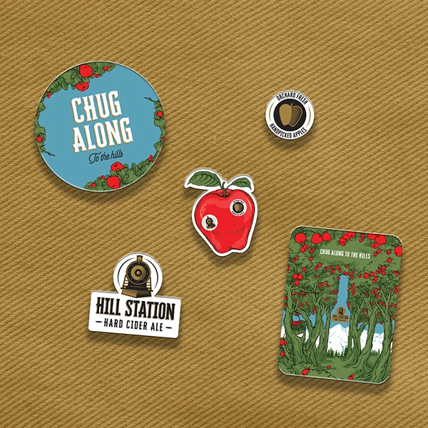
The label designs for the 'Hill Station Hard Cider Ales' showcase a story of a train journeying through the hill station and apple orchard, presented in a vintage style that captures the enchanting atmosphere of the hills. The illustrations are expertly crafted to invoke feelings of nostalgia and freshness, highlighting the use of handpicked orchard apples. Each product flavor is distinguished by a different color of the sky, creating a unique visual identity that is reflected in both the packaging and communication materials.

Extending Beyond Packaging
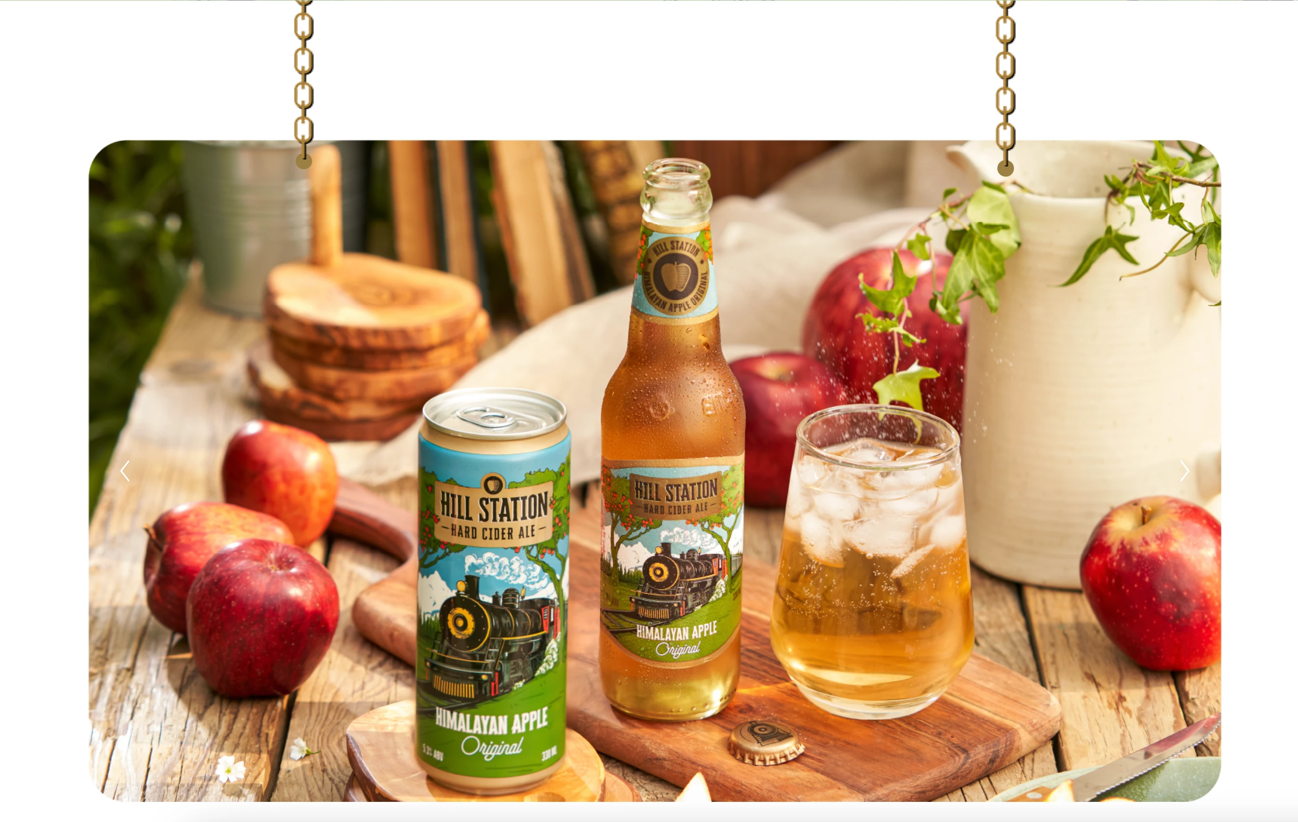
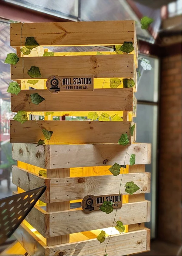
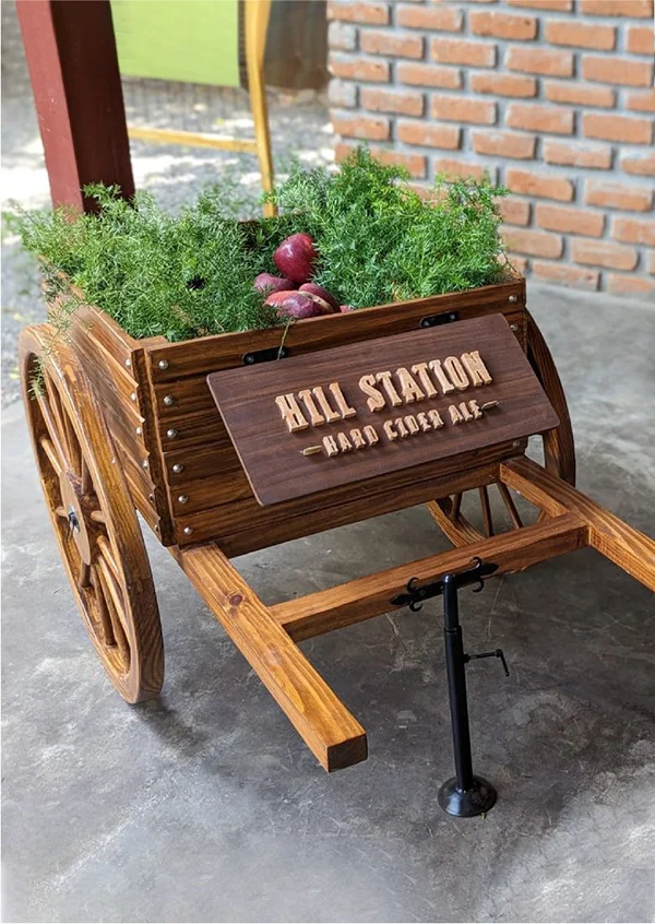
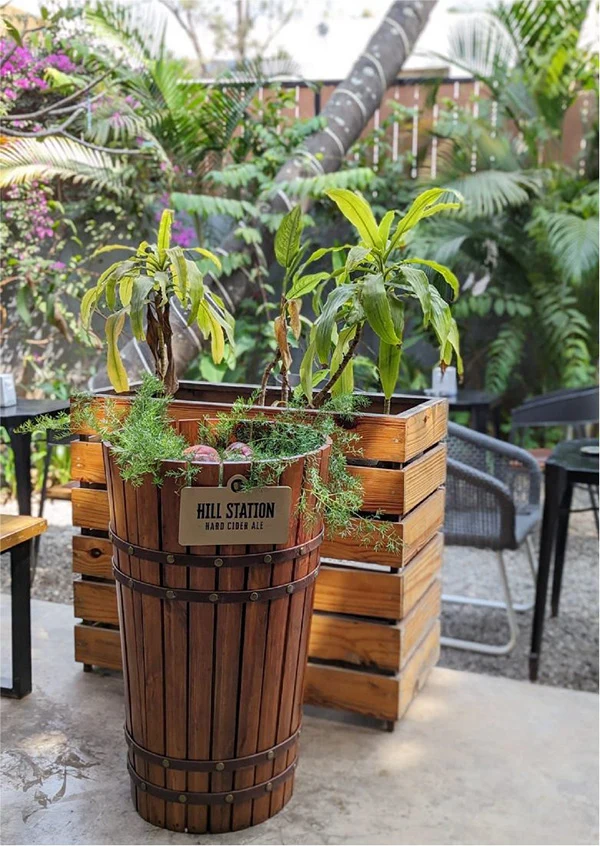
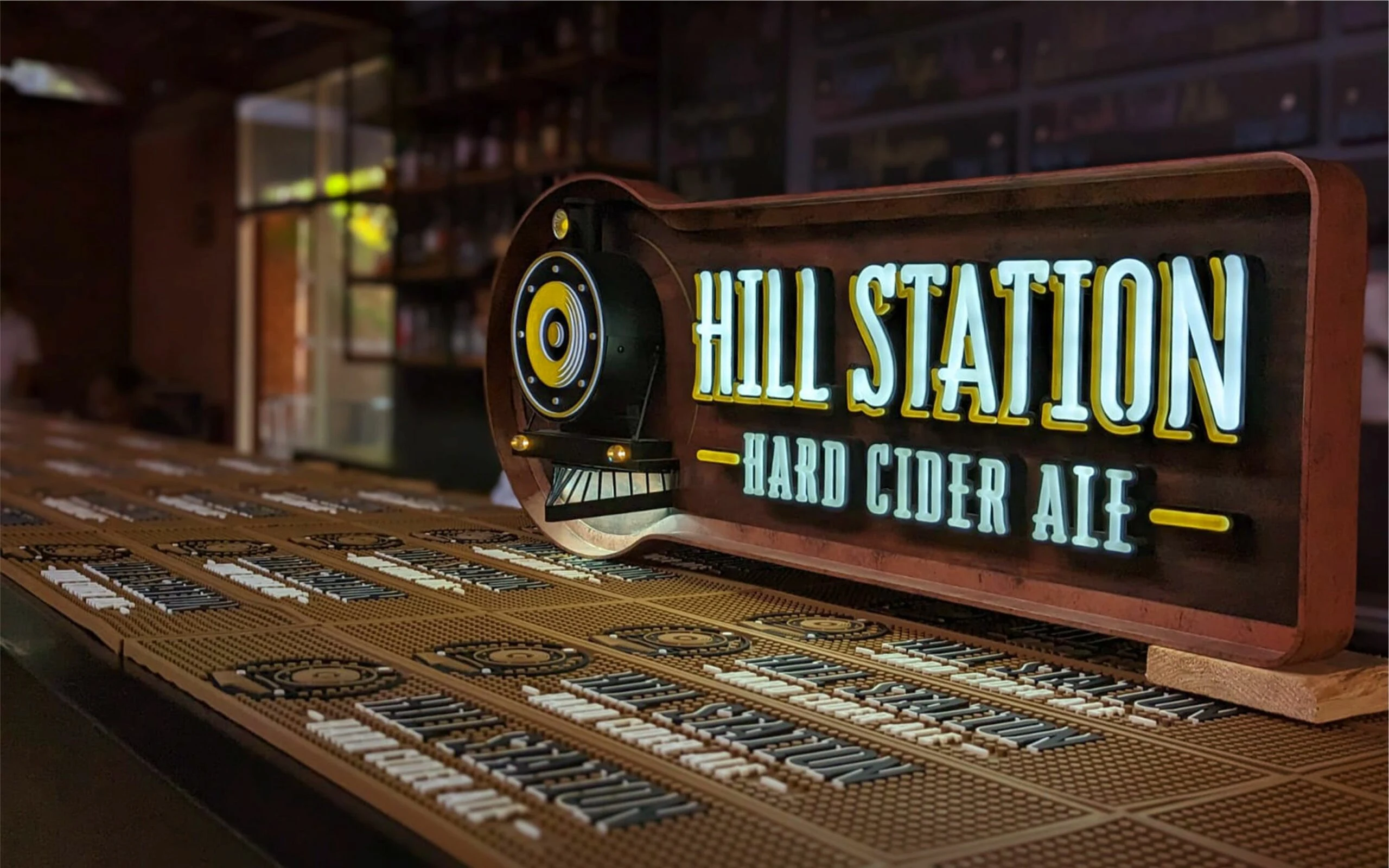
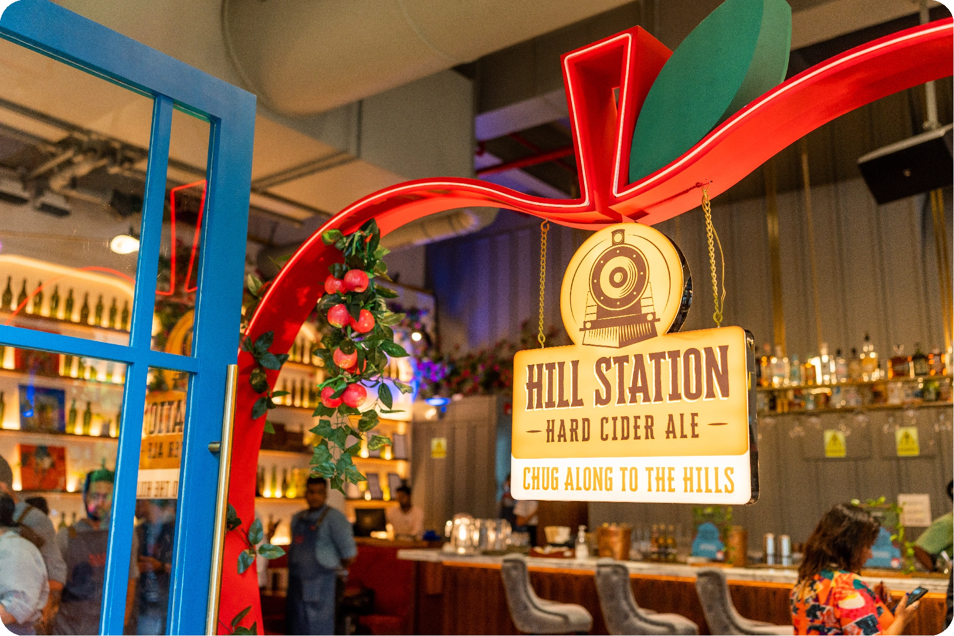
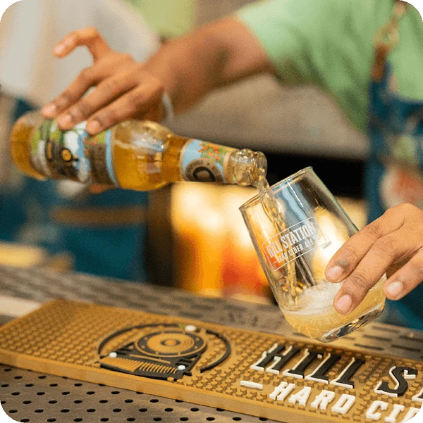
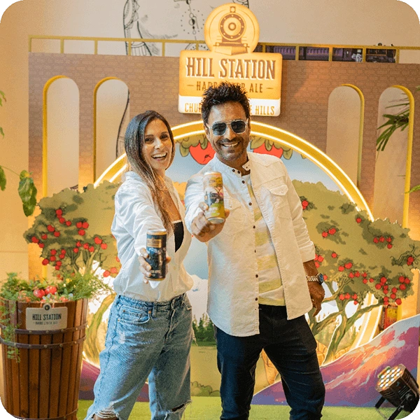
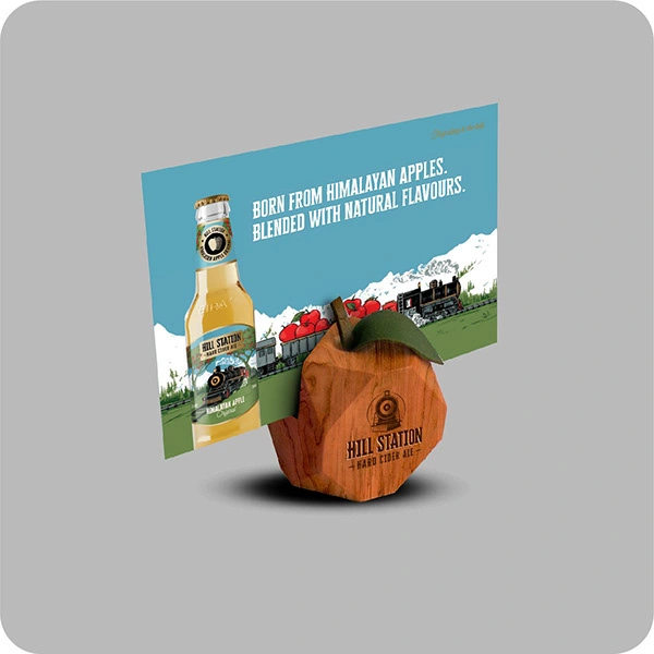
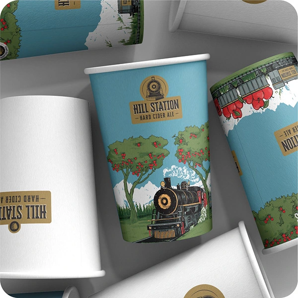
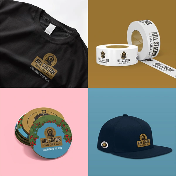
To create a cohesive brand experience across various touchpoints, the sales collateral and point of sale materials need to convey a sense of freshness and nostalgia. This can be achieved by using elements such as apple crates, metal, and wood to evoke the feeling of the Hill Station.

0 likes · 12 views · Jun 16, 2026
The label designs for the 'Hill Station Hard Cider Ales' showcase a story of a train journeying through the hill station and apple orchard.

