Built with Webflow
TYTO Lock System
Devin Fountain
Design
Overview
Jordan reached out to me on a Friday and asked me to redesign and build the TYTO website. Their team was unhappy with the previous designer's work and wanted a system they could edit themselves to change copy or add more features. Jordan was a friend's fiance so I gave him the friend discount, but still treated the project like I would for any client. And ultimately delivered my fastest build to date.
Goals
Jordan implicitly stated three goals:
The website needs to clearly explain and sell external companies on the TYTO lock system.
It needed to be easy to make changes. The previous site was built on Wordpress and couldn't be easily changed without the developer's help.
The copy didn't feel like it was telling a story and only gave the reader pure facts. It needed to rewritten for sales, not as a statistics sheet.
Colors and Type
Jordan provided me with a slide deck that included their brand colors, logo, and a deep explanation of the product. The provision of colors and tone gave me a foundation to choose a typeface and reduce the color palette to a manageable selection.
I provided Jordan with four options for color and type combinations that could be mixed and matched. The colors were based on the slide deck with slight modifications to enhance accessibility and color contrast.
After presenting the options, he chose option four with Manrope from Google Fonts and the lighter palette.
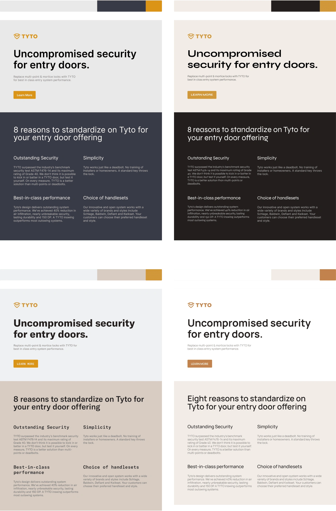
The four color and typography options for the website.
Medium Fidelity Wireframes
Just like the other projects on my profile, thanks to the base we've created with the type and color choices, I was able to jump right into the medium fidelity version of the site. The copy already existed on the previous website so it was used as the placeholder copy for the wireframe. Content always comes first!
The newest intent on the website would be acquiring potential customers to sign up to learn more about the product and to get them on a mailing list for when more information was released.
The slide deck talks about how great the product is with statistics and I noticed the old website didn't take advantage of that. When it did, it was buried in a lot of text. I decided to surface it at the top so that it was one of the first things you see, drawing you down the page to learn more.
The previous website used the feature section as a list article and I wanted to treat it more like a feature set you'd see on a tech startup website. With iconography and a tighter grid, it felt more parsable.
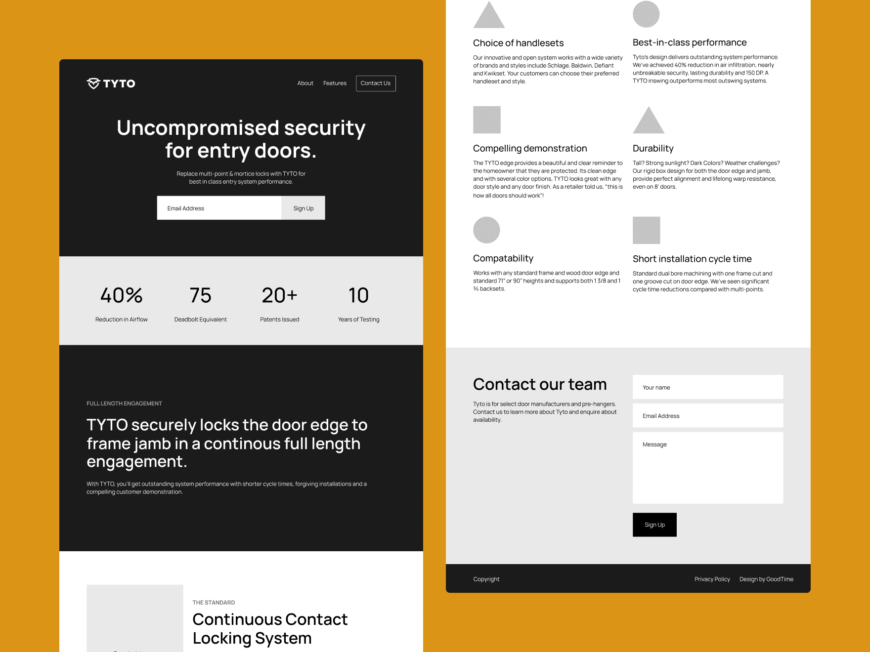
The black and white medium fidelity mockups for the landing page.
High Fidelity Mockups
High-fidelity was completely skipped over due to time and money constraints. Jordan was okay with this and in exchange, I'd use the client-first system from F'in Sweet to speed up the development process and immediately have a site in hours, not days.
Copywriting
Occasionally I work with Molly Stubbs, a copywriter I can trust for client projects. Her work is consistently thoughtful and takes the client's and the designer's needs into consideration. In her own words, Molly said this about the copy:
I reworked the copy on the landing page to reflect the client's goal of reaching a B2B audience while capturing the industry innovation of their product.
Illustrations
To save time on iconography to go with the website, I opted to use Noah Jacobus Icon set: Chunk. It provided the sturdy look I wanted from an icon set to match the strength of the lock system and none of the compromise from using an icon set. I paired it with octogonal containers to differentiate the style from standard bullet points.

The Chunk 2.0 icons used for TYTO
Development
In the high fidelity paragraph, I mentioned using F'in Sweet's Client First system to build the site. It ended up being my fastest build yet, turning around all responsive sizes with animations and illustrations in a single day.
Custom animations are used in the loading state and when scrolling including a parallax section for added depth on an otherwise flat page.
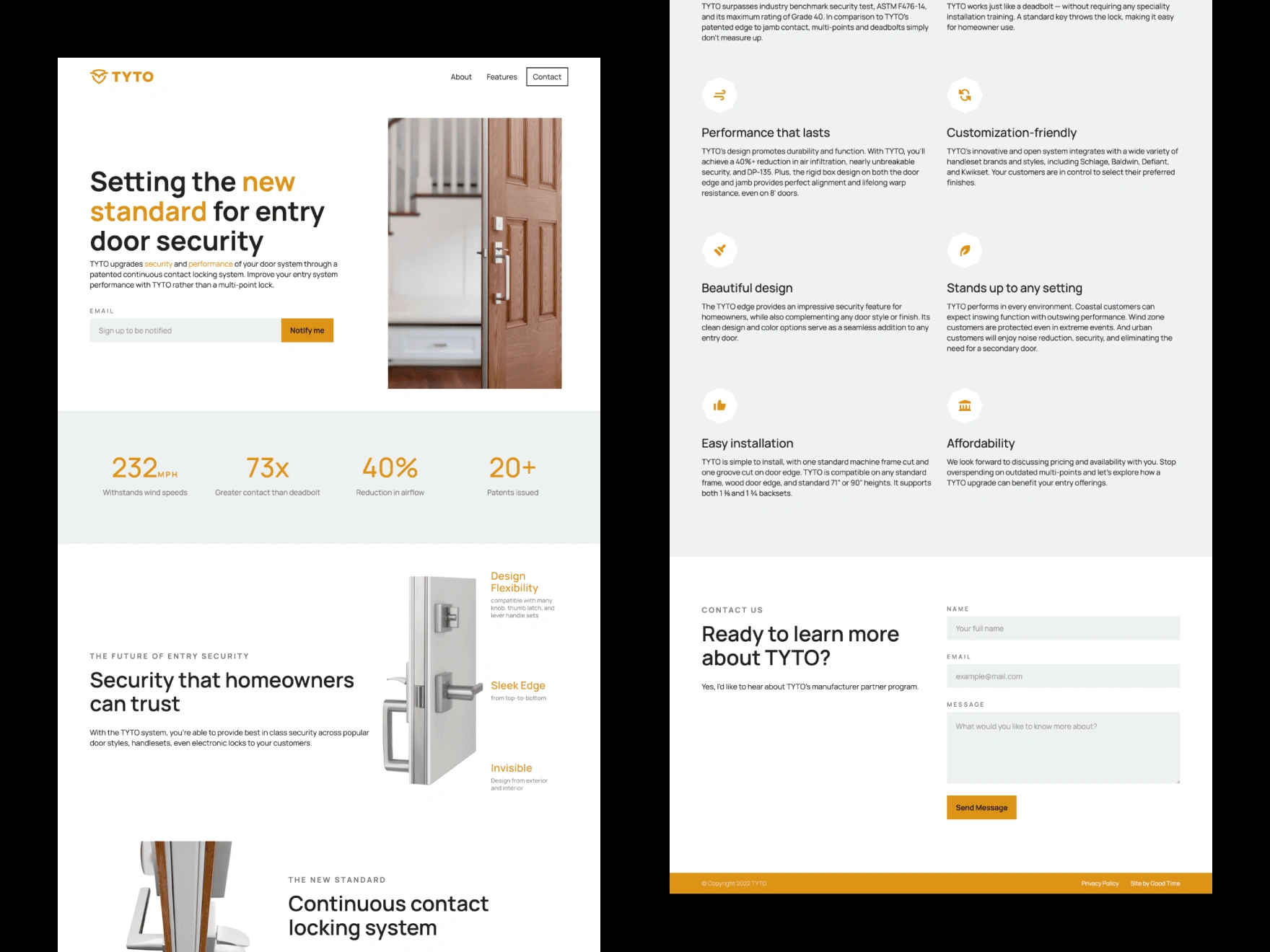
A screenshot of the homepage top and bottom.
Conclusion
I've finished this project feeling satisfied with the delivery time, quality of work, and communication with the client. After finishing the landing page, Jordan commented that he's excited for when clients purchase the product so that we can do a higher budget website with more storytelling.
Here's what Jordan had to say when asked what he liked about working with me:
Everything. High quality work, responsiveness, and most of all Devin had very valuable feedback and advice that we appreciated. - Jordan Jadallah
Like this project
Posted Apr 11, 2022
The TYTO website was designed and developed in a single day using Webflow and F'in Sweet's Client First system.
Likes
0
Views
249