Guud Energy: Energy Drink Can Redesign

Mehmet Turan
Guud Energy is an organic, zero-sugar energy drink from San Diego. It positions itself as an energy drink for healthy aging, built around ErgoGold™, a golden oyster mushroom extract rich in ergothioneine, often called the longevity molecule.
The drink was already on shelves, but the can wasn't helping it. This energy drink can redesign was about one thing: making a good product easy to read, and making it look as considered as what's inside.
What was wrong with the original can?
Three things, mostly.
Legibility. White type on bright yellow and orange gradients. The Yuzu Bloom can was the hardest to read; Tropic Zing wasn't far behind.
Too many messages. A tagline at the top, a glowing emblem, two lines of ingredient claims and a row of badges strung along a waveform. Everything competed, so nothing landed.
A buried story. ErgoGold is the reason this drink exists, yet on the can it was one word in a list.
Our rule for the redesign was simple: if it can't be read from a fridge shelf or a phone thumbnail, it isn't working.
Three directions, three different ideas
The founding team chose a full exploration over a single recommended route. This was the brand's first serious presentation, and it would be seen by investors. We explored a lot internally and presented three distinct directions a week after kickoff, each shown across the full flavor range so the client was judging a family, not a single can.
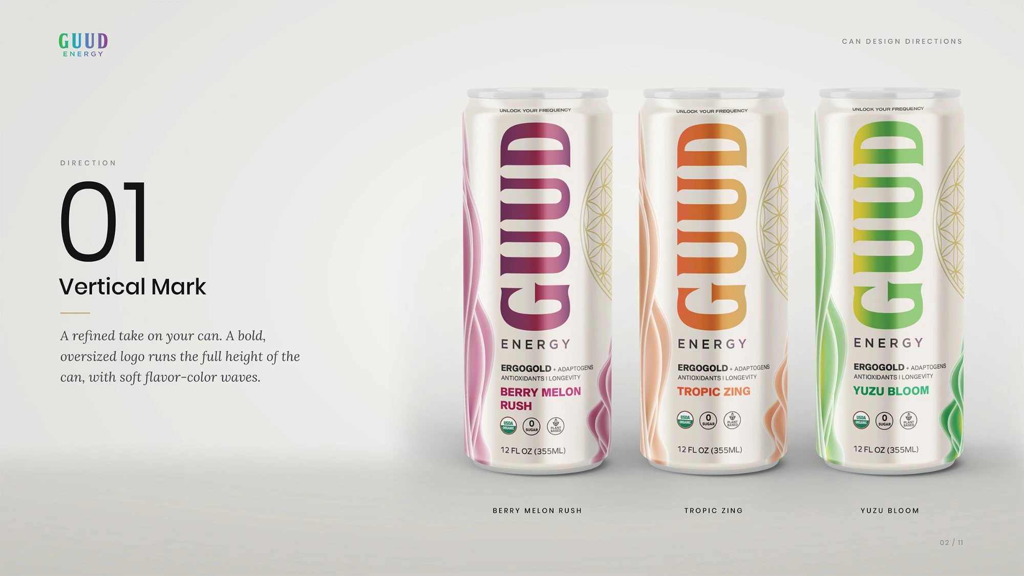
Direction 01, Vertical Mark: oversized vertical GUUD logo on an ivory can with flavor-color waves
Direction 01, Vertical Mark: an oversized logo running the full height of the can, with soft flavor-color waves.
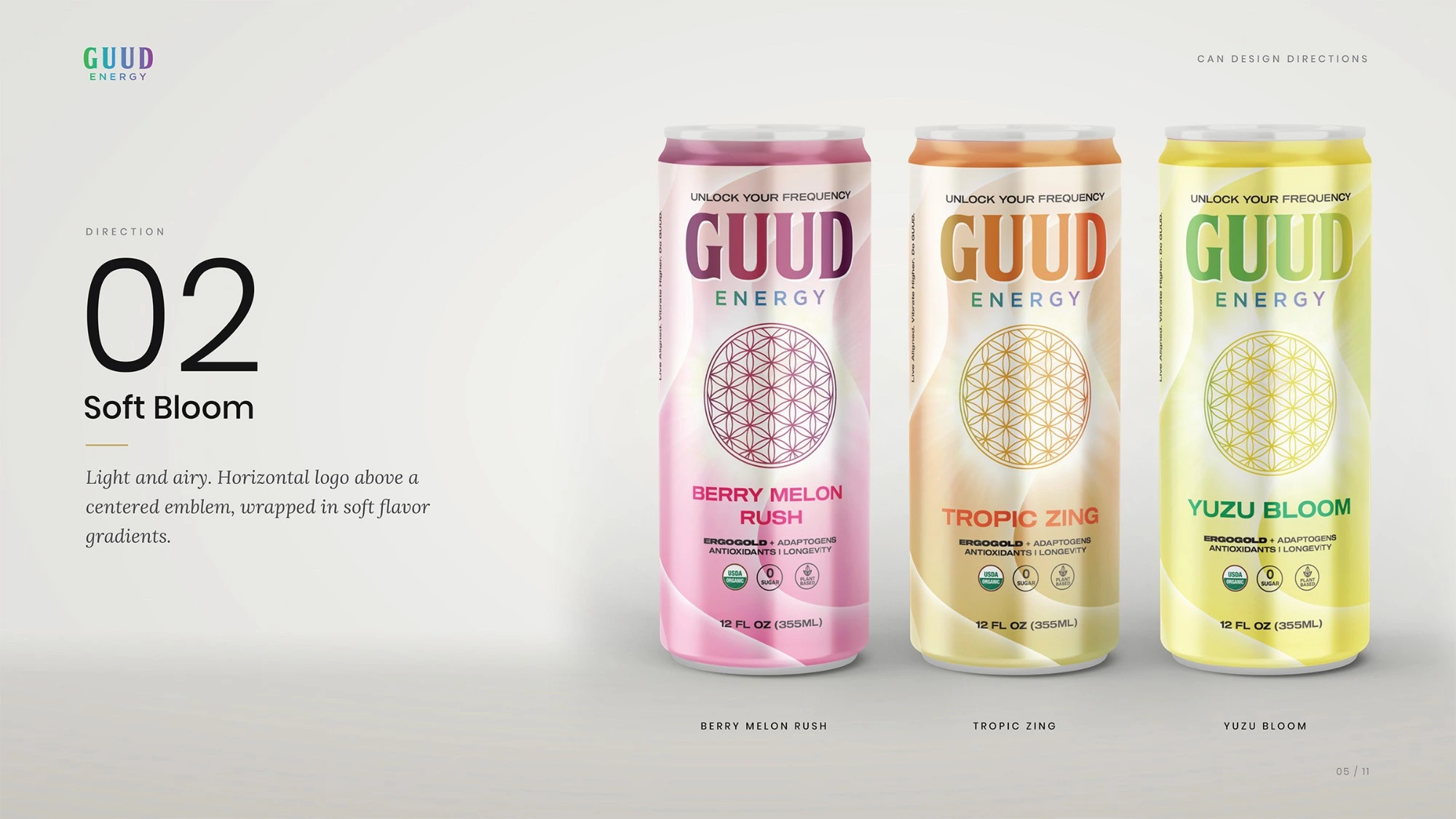
Direction 02, Soft Bloom: horizontal GUUD logo above a centered Flower of Life on soft gradients
Direction 02, Soft Bloom: light and airy, with a horizontal logo above a centered emblem.
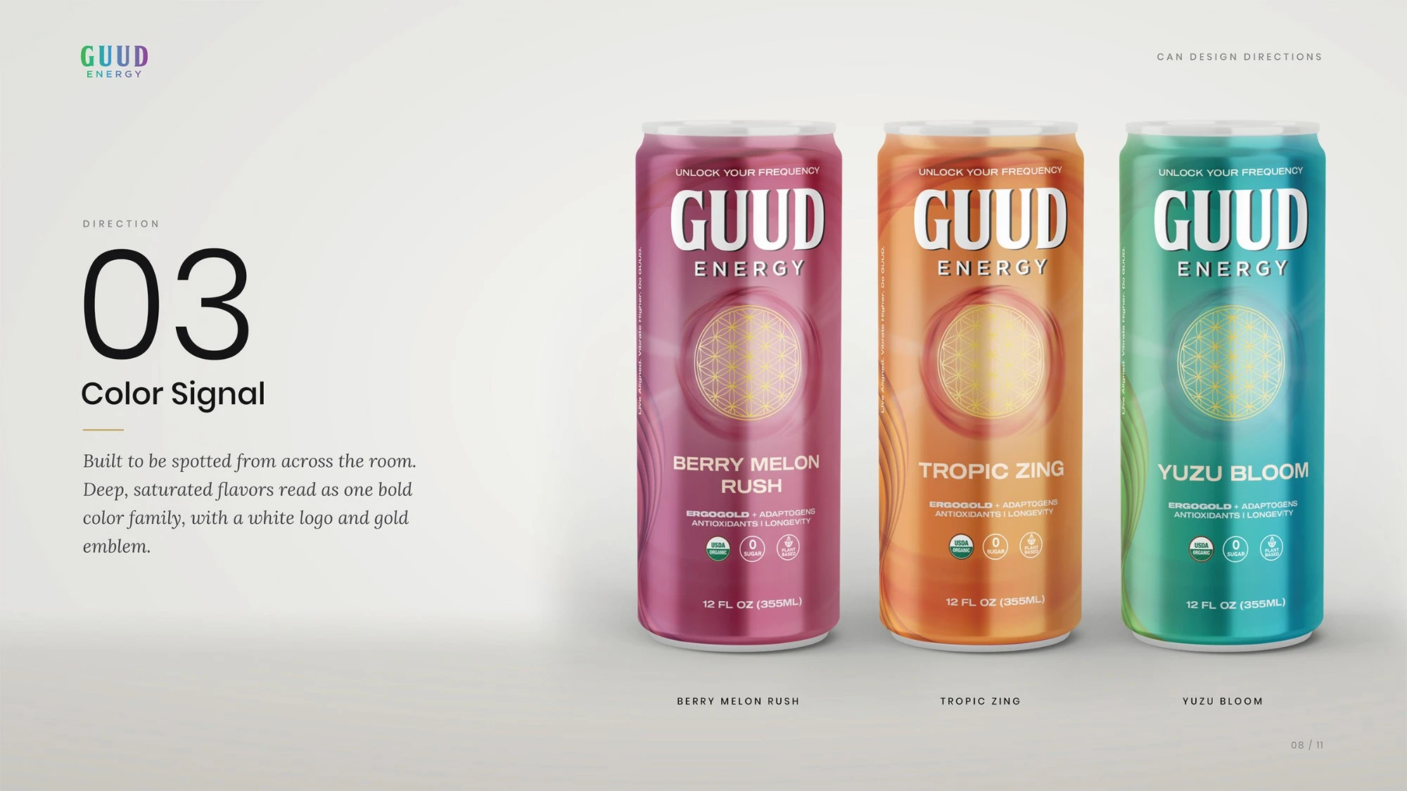
Direction 03, Color Signal: deep saturated cans with a white GUUD logo and gold emblem
Direction 03, Color Signal: deep, saturated flavor colors built to be spotted across a room.
Why the vertical logo won
The client picked Vertical Mark, and so would we. Turning the logo on its side gives the can a shape no one else in the fridge has, and it frees the lower third for the flavor name and key claims.
During revisions, the question came up of switching the logo back to horizontal. We explained why that wasn't a small change: the whole layout, from the color waves to the spacing to the hierarchy, is built around a vertical mark. Rotate the logo and you're designing a new can. The vertical system stayed.
Refining the system
The front of the can was reduced to a clear order:
GUUD, large and vertical, with "Powered by ERGOGOLD®" above it, replacing the old "Unlock Your Frequency" line
The Flower of Life in champagne gold, secondary to the wordmark
The flavor name, prominent in the lower third
Three short benefits: 180 mg plant-based caffeine, 5 mg ergothioneine, zero sugar
USDA Organic, centered, and 12 FL OZ
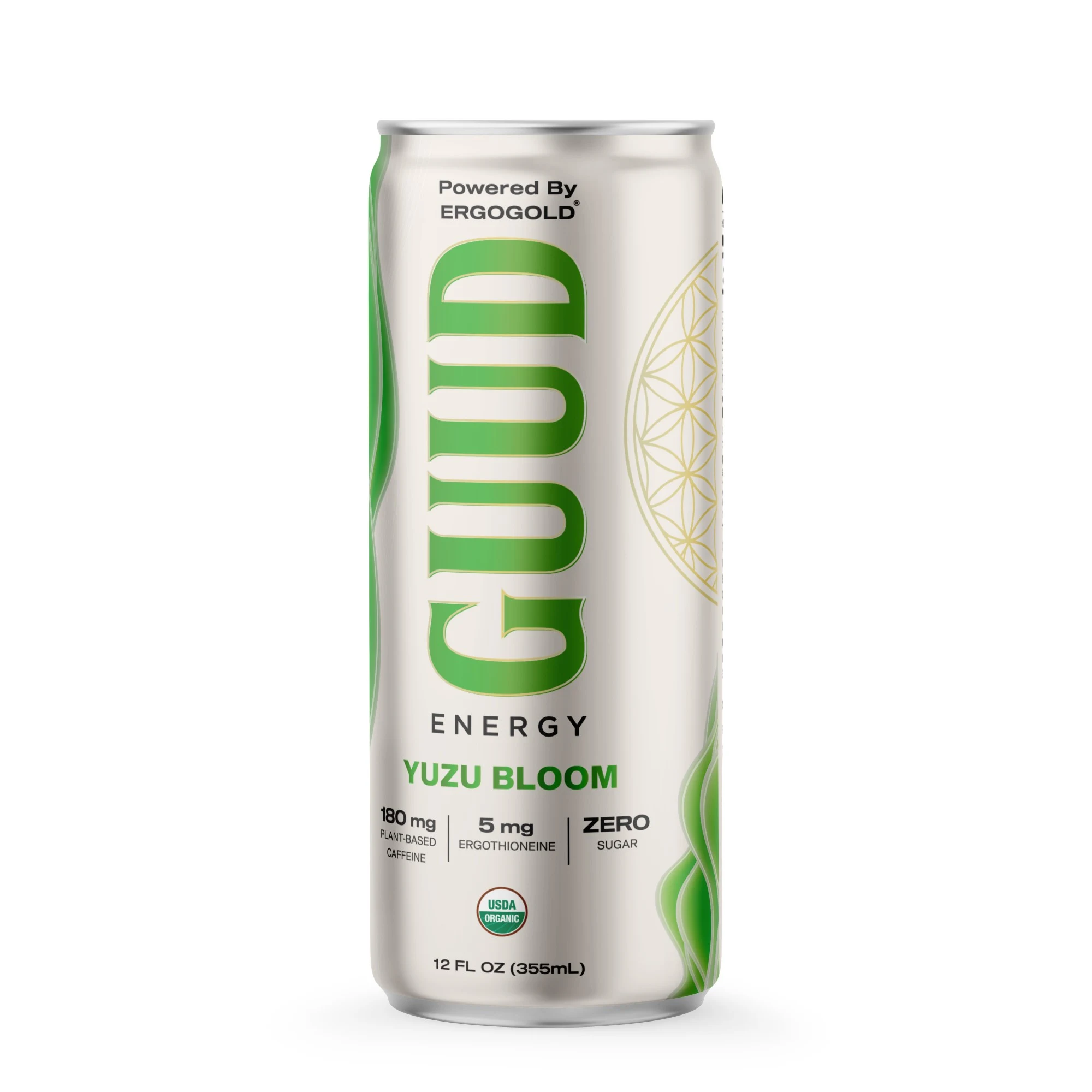
Final Yuzu Bloom can front with vertical GUUD logo, Powered by ERGOGOLD and three benefit callouts
The final Yuzu Bloom front: one mark, one hero ingredient, one flavor name.
Everything else moved to the side panels: the brand story, the ingredient breakdown, and a QR code linking to Guud's daily ritual guide.
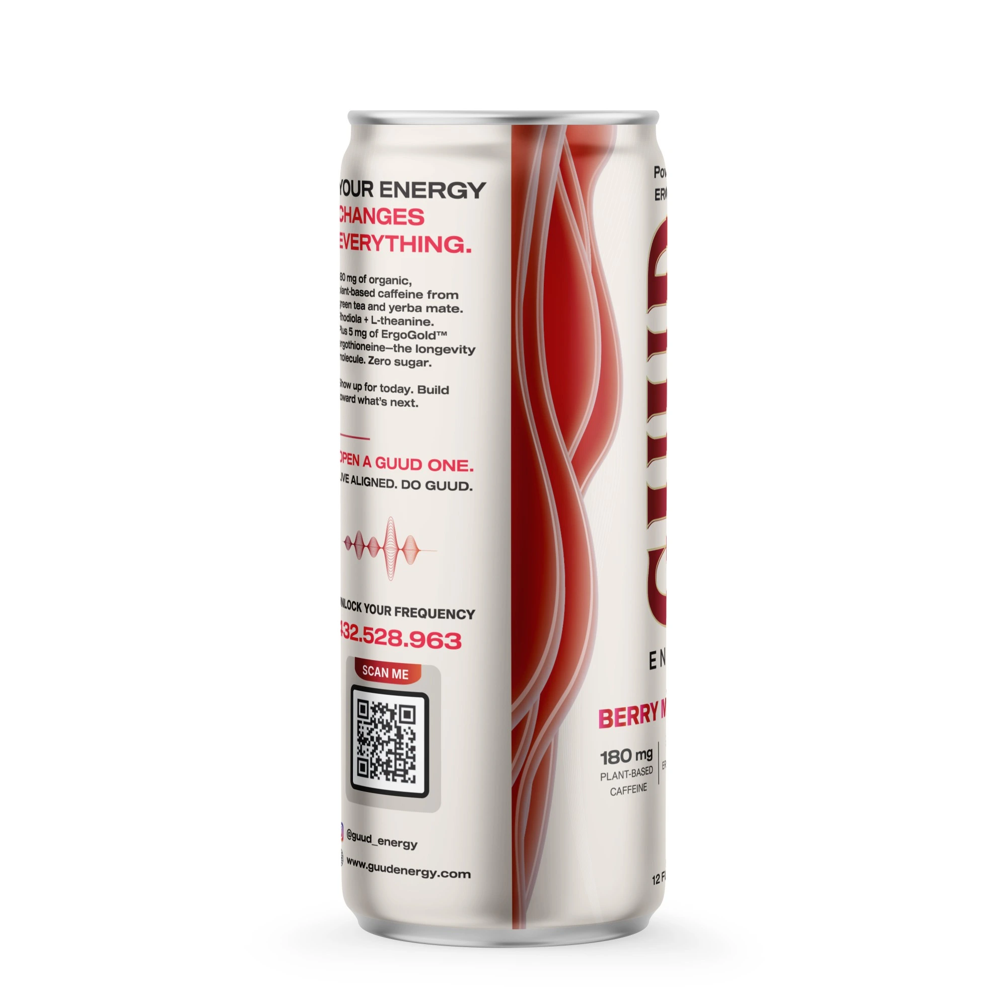
Berry Melon Rush side panel with the brand story, frequency code and QR code
The story panel carries the brand voice and the QR code, so the front doesn't have to.
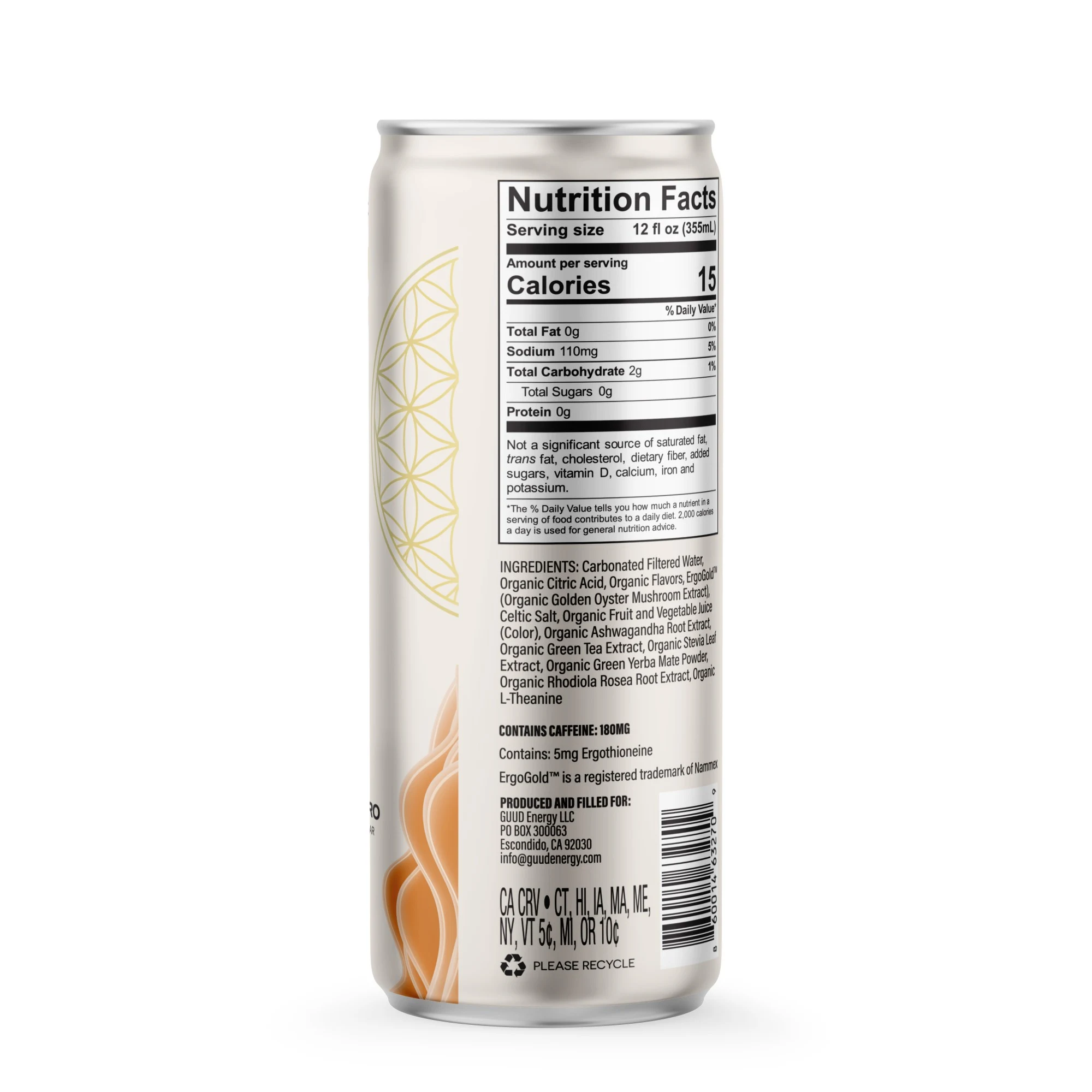
Back panel with nutrition facts, ingredients and barcode
Nutrition facts, ingredients and legal copy sit together on the back panel.
Color took a few rounds. Berry Melon Rush moved to a deeper red to match its strawberry and watermelon profile. The Yuzu Bloom logo had a subtle yellow-to-green gradient; we removed it so all three logos use the same flat-color treatment. The base became a warm matte ivory across the range, with each flavor's color held to the waves and the logo.
Designing for a shrink sleeve
Guud's cans are wrapped in shrink sleeves: clear film, reverse printed, then heat-shrunk onto the can. That brings its own rules. The top and bottom of the sleeve distort the most, so all type, the logo and the QR code sit on the straight body of the can. The seam stays clear of anything important.
The finishes are part of the design, not decoration added at the end:
Matte varnish across the whole sleeve
Spot gloss on the GUUD logo and flavor name, so they catch the light
Metallic PANTONE 871 C on the Flower of Life and the logo outline
White flood behind the artwork, so the colors don't turn see-through on clear film
We delivered the final artwork on the printer's own dieline, with each finish on a separate, correctly named plate, plus a print file guide written for both the client's team and the printer. The whole project, from brief to print-ready files for three flavors, took about two weeks.
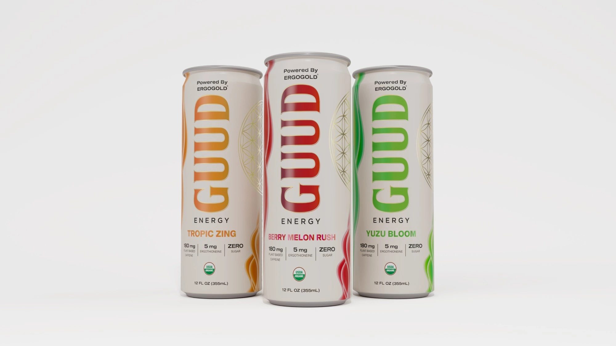
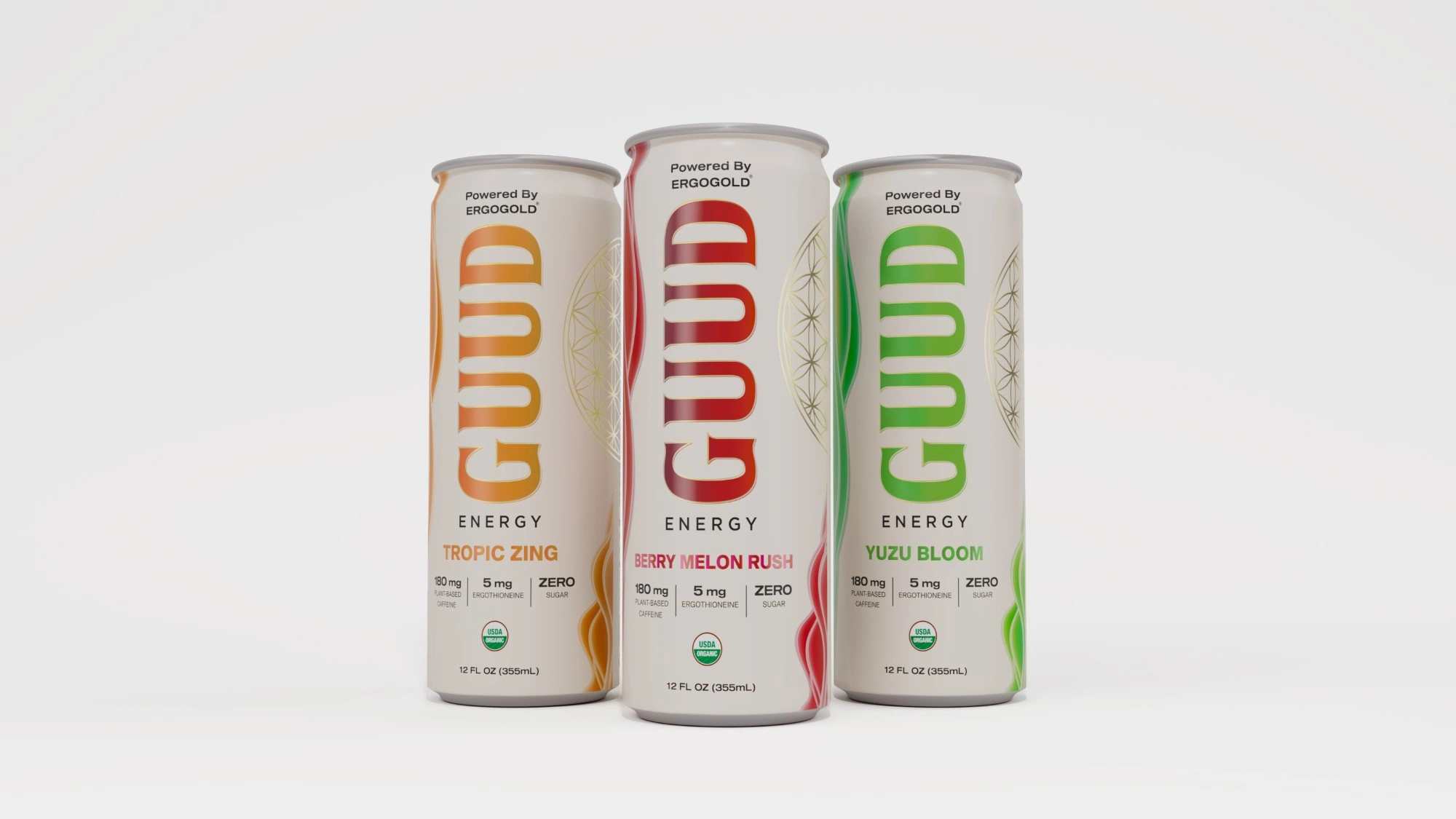
Final Guud Energy can lineup: Tropic Zing, Berry Melon Rush and Yuzu Bloom
The final range: Tropic Zing, Berry Melon Rush and Yuzu Bloom.
The takeaway
Most packaging problems aren't about adding something clever. They're about deciding what the can is for and removing whatever gets in the way. For Guud Energy, that meant one bold mark, one hero ingredient and a flavor you can identify in a few seconds.
If you're working on a beverage launch or a redesign, we're always happy to talk.
Like this project
Posted Nov 5, 2026
How we turned a busy, hard-to-read energy drink can into a clean three-flavor system built around one bold vertical mark and one hero ingredient.