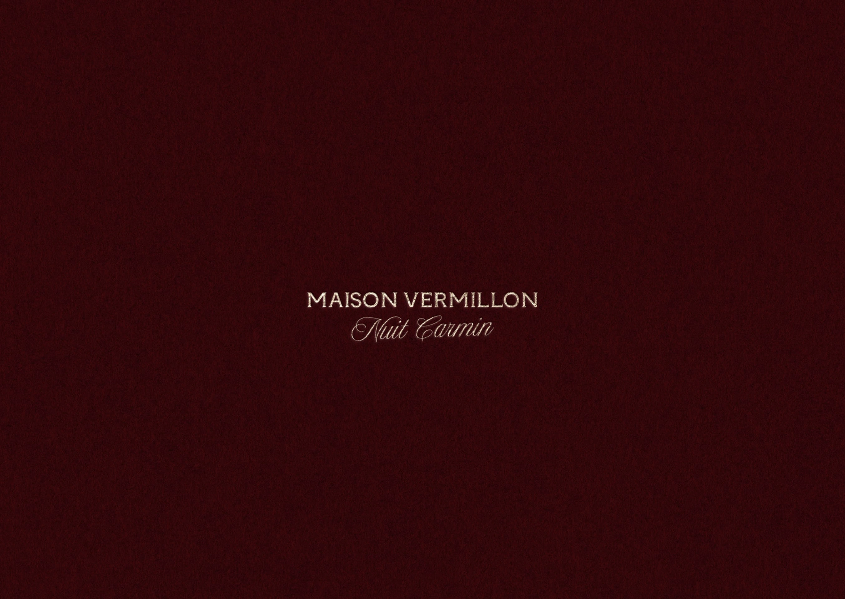
Maison Vermillon Brand Identity & Packaging
Elodie Fontaine
The Project
Maison Vermillon is a perfume house rooted in ritual and emotion.
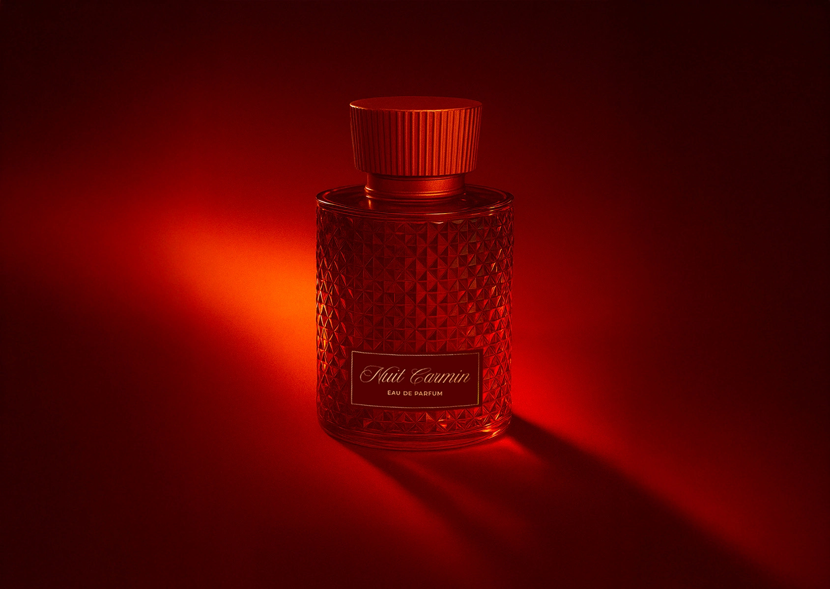
The concept: a fragrance that captures the duality of intensity and intimacy, blending fire with quiet elegance.
The brand needed an identity capable of carrying this story into a premium, international context.
The Process
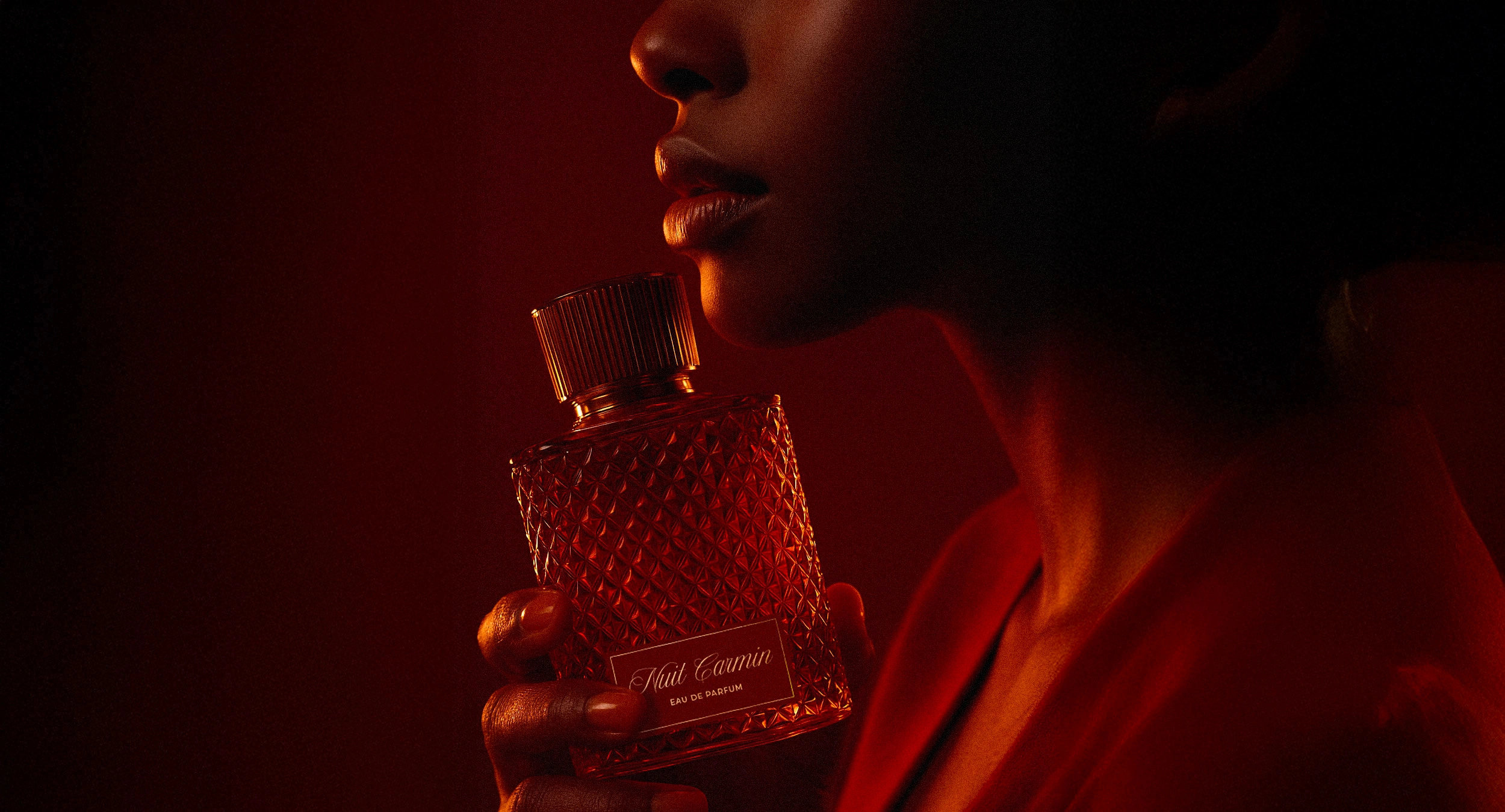
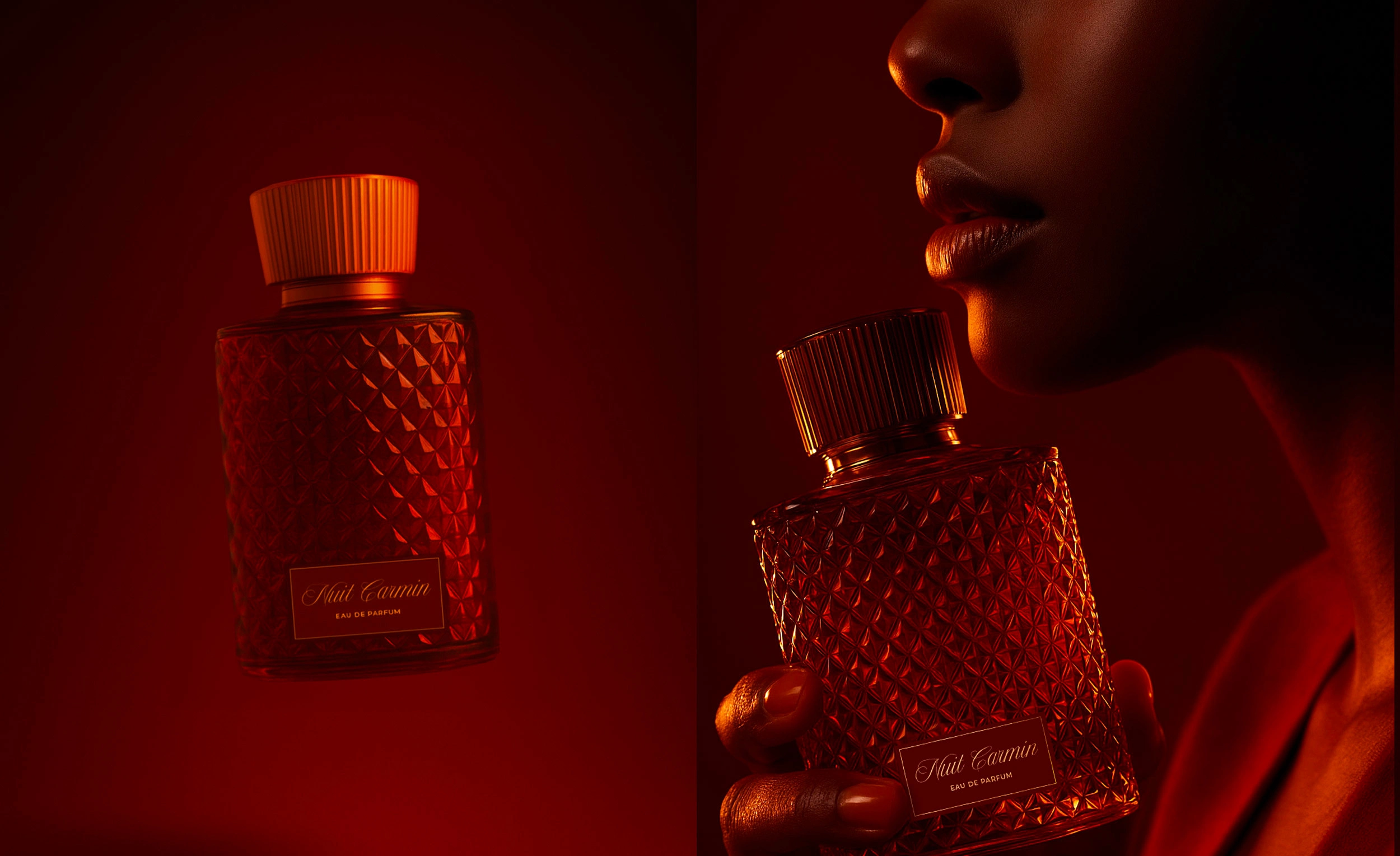
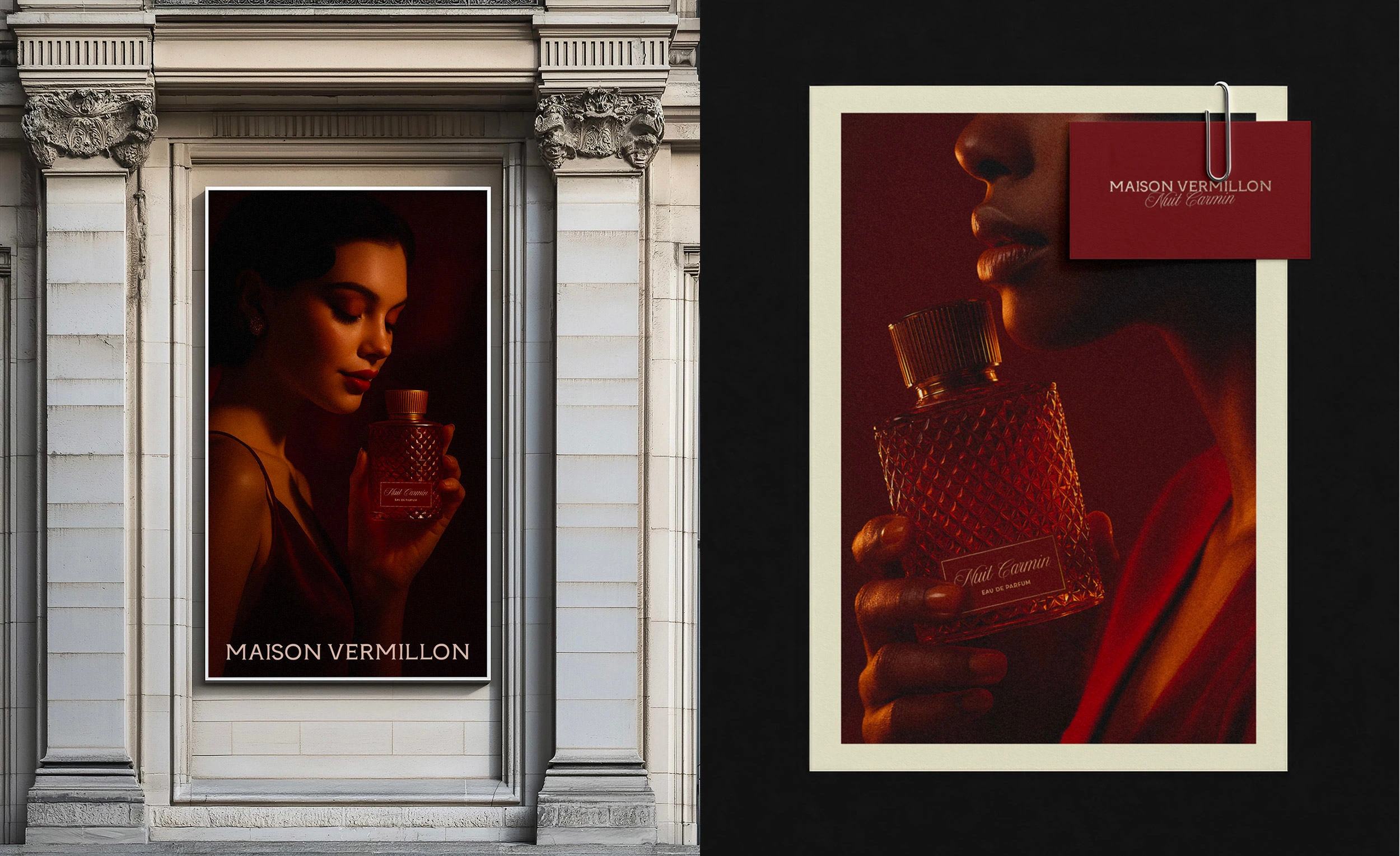
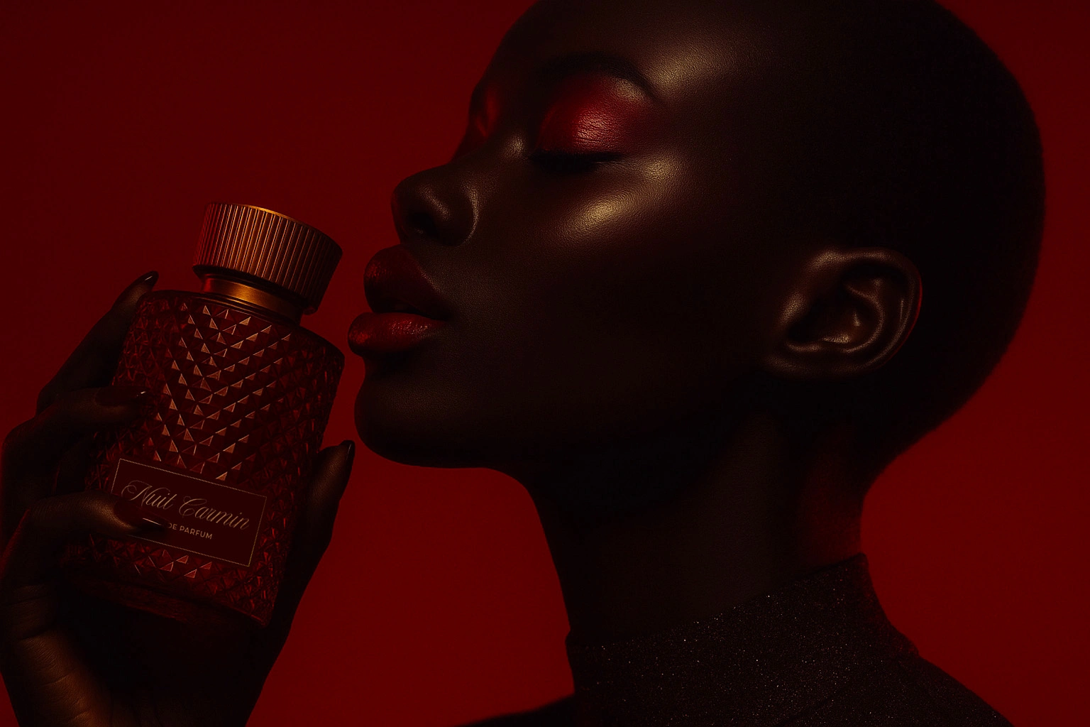
The creative direction began with the name itself: Vermillon, a word evoking both color and heat. We built a visual world around depth and contrast: bold vermilion accents and refined serif typography. The logo was designed with sharp yet fluid lines, echoing the interplay between structure and sensuality. Packaging explored tactility. Art direction placed the bottle at the center of an editorial narrative, photographed like a sculptural object, surrounded by shadows, textures, and slow movements.
The Result
Maison Vermillon emerges as a fragrance identity that feels timeless yet contemporary, poetic yet powerful.
The result is more than a perfume brand: it is a sensorial world, inviting its audience to experience the luxury of restraint and the warmth of memory.
Like this project
Posted Oct 14, 2025
Developed the brand identity and packaging for Maison Vermillon’s premium fragrance line — refined, sensorial, and timeless.