Aylesford Football Club
Steve Sinyard
Aylesford FC
Crest Modernisation Case Study
The Challenge
Aylesford FC approached me with a challenge familiar to many grassroots football clubs: their beloved crest had served them well for years, but it was struggling to work effectively in the modern world. The existing blue and white badge, while carrying significant heritage and emotional connection for the club and its supporters, was designed for a different era when football branding had simpler requirements.
The primary challenge was technical: the original crest was too detailed and complex for today's diverse application needs. What worked adequately on traditional printed materials and basic signage was failing dramatically when applied to digital platforms, social media profiles, small-scale merchandise, and modern kit production methods.
The crest needed to function across an enormous range of sizes—from tiny social media avatars and app icons to large-scale stadium banners and everything in between. The existing design simply couldn't scale effectively, losing crucial detail at small sizes while looking dated and cluttered at larger applications.
Modern kit production presented particular challenges. Whether screen-printed or embroidered on jerseys, shorts, and training wear, the crest needed to reproduce clearly with limited colours and simplified details. The original design's complexity made it expensive to produce and difficult to execute consistently across different manufacturing methods.
Perhaps most critically, the club needed to maintain the heritage and recognition that supporters associated with their traditional colours and visual identity. This wasn't a complete rebrand—it was a careful modernisation that needed to honour the past while preparing the club for its digital future.
The Solution
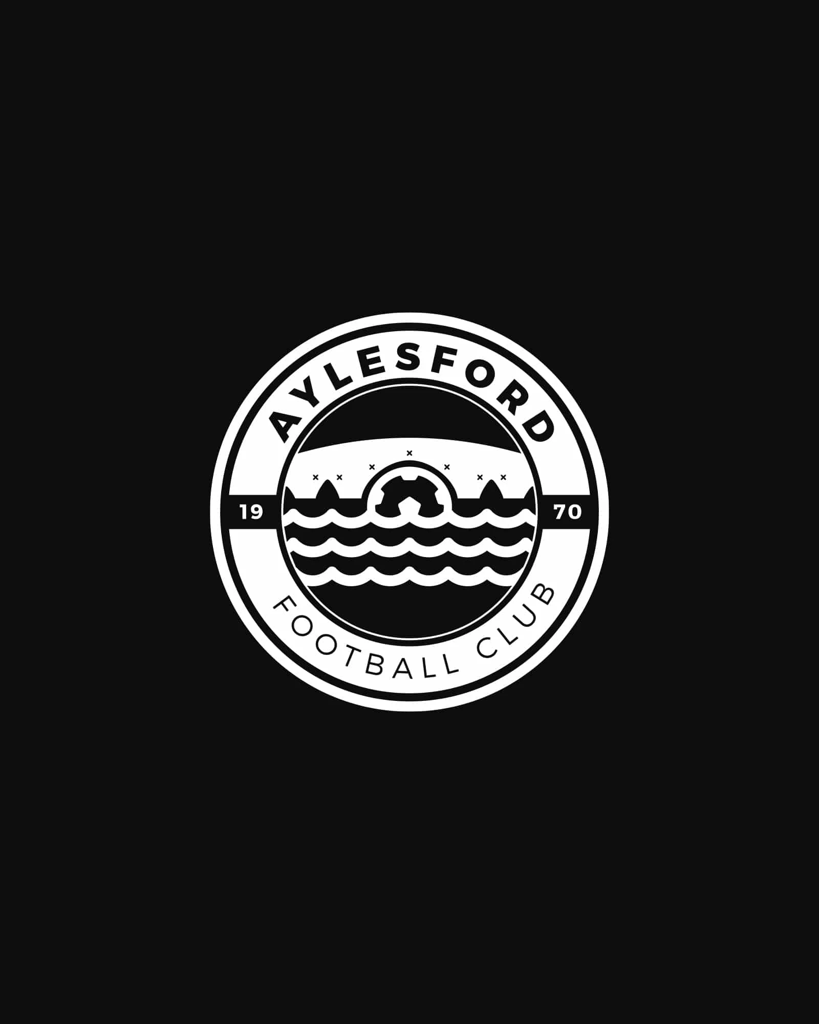
Heritage Analysis & Preservation I began by analysing what made the Aylesford FC crest distinctive and meaningful to the club's community. The blue and white colour scheme was non-negotiable—these colours were part of the club's DNA and supporter identity. The challenge was preserving this heritage while creating something that could work in today's media landscape.
Technical Modernisation The redesign focused on creating a crest that would work flawlessly across all modern applications. This meant simplifying complex details, optimising the colour palette for both digital and physical reproduction, and ensuring the design remained recognisable at any size from favicon to billboard.
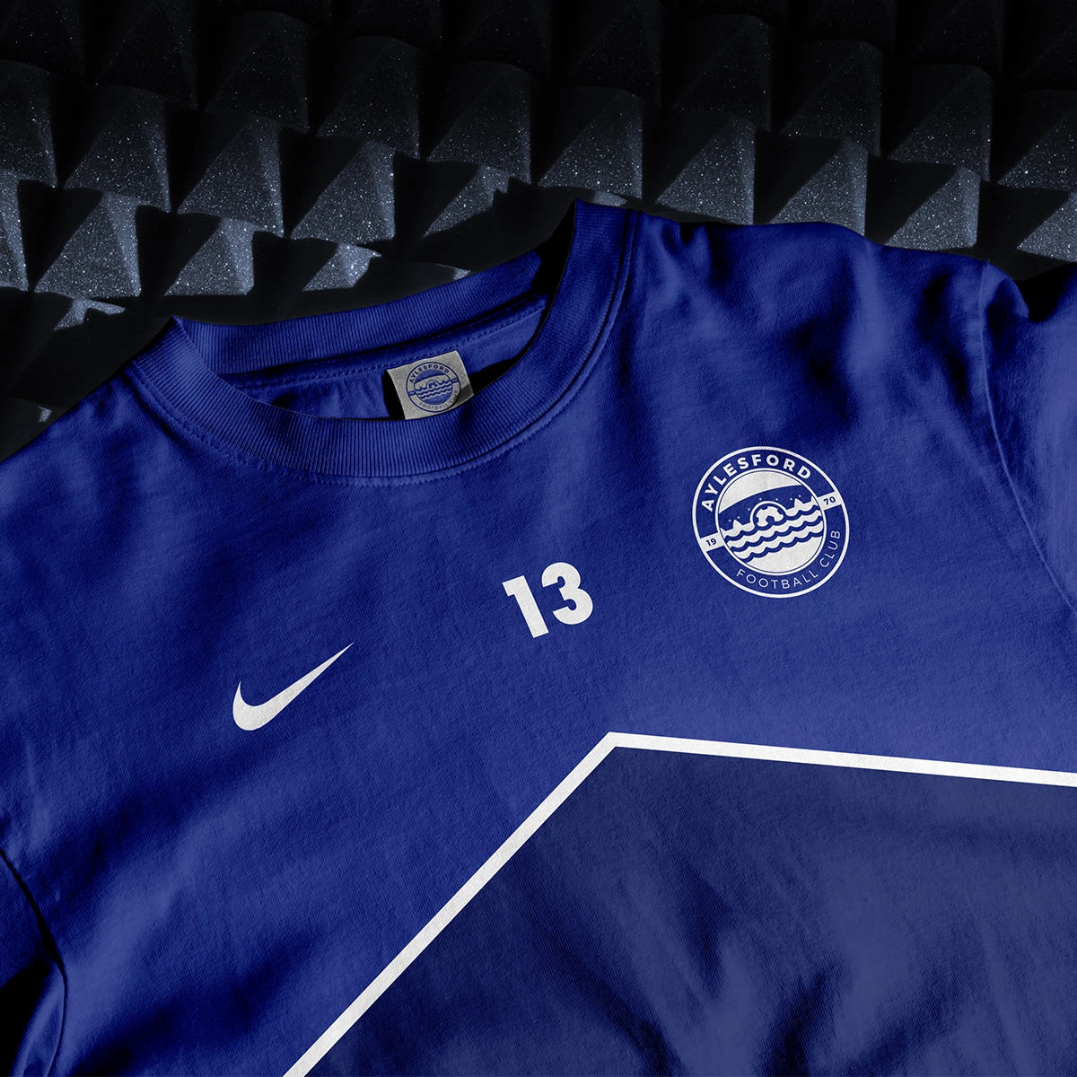
The new crest was designed with vector precision, ensuring crisp reproduction at any scale. Every line, curve, and element was optimised for clarity and impact, whether viewed on a smartphone screen or emblazoned across a player's chest.
Production Versatility Understanding the practical realities of grassroots football, the redesigned crest was specifically optimised for cost-effective production methods. The simplified design reduces screen-printing costs while ensuring embroidery reproduction maintains clarity and detail. This practical consideration helps the club manage costs while maintaining professional appearance across all applications.
Digital-First Approach The modernised crest was designed to excel in digital environments where much of today's football engagement happens. It works perfectly as social media profile pictures, website headers, and mobile app icons—applications that didn't exist when the original crest was created but are now crucial for fan engagement and club communication.
Scalable Colour System The blue and white palette was refined to work consistently across different media and reproduction methods. The colours were optimised for both digital displays and physical printing, ensuring brand consistency whether fans encounter the crest online or on matchday merchandise.
The Outcome
The modernised Aylesford FC crest successfully bridged the gap between heritage and modernity, giving the club a visual identity that honours its past while embracing its future.
Key Results:
Heritage preservation that maintained supporter recognition and emotional connection
Technical optimisation that works flawlessly across all modern applications
Cost-effective production compatibility for screen-printing and embroidery
Digital-first design that excels in social media and online environments
Scalable design system that maintains clarity from tiny icons to large banners
Professional appearance that elevates the club's overall brand perception
Practical Impact: The redesigned crest immediately solved the club's practical challenges. Kit production became more straightforward and cost-effective, while digital applications finally looked professional and clear. The club could confidently use their crest across all platforms without worrying about reproduction quality or legibility issues.
Community Reception The modernisation was well-received by supporters who appreciated that their club's heritage was respected while acknowledging the need for contemporary functionality. The familiar blue and white colors ensured immediate recognition, while the cleaner execution felt fresh and professional.
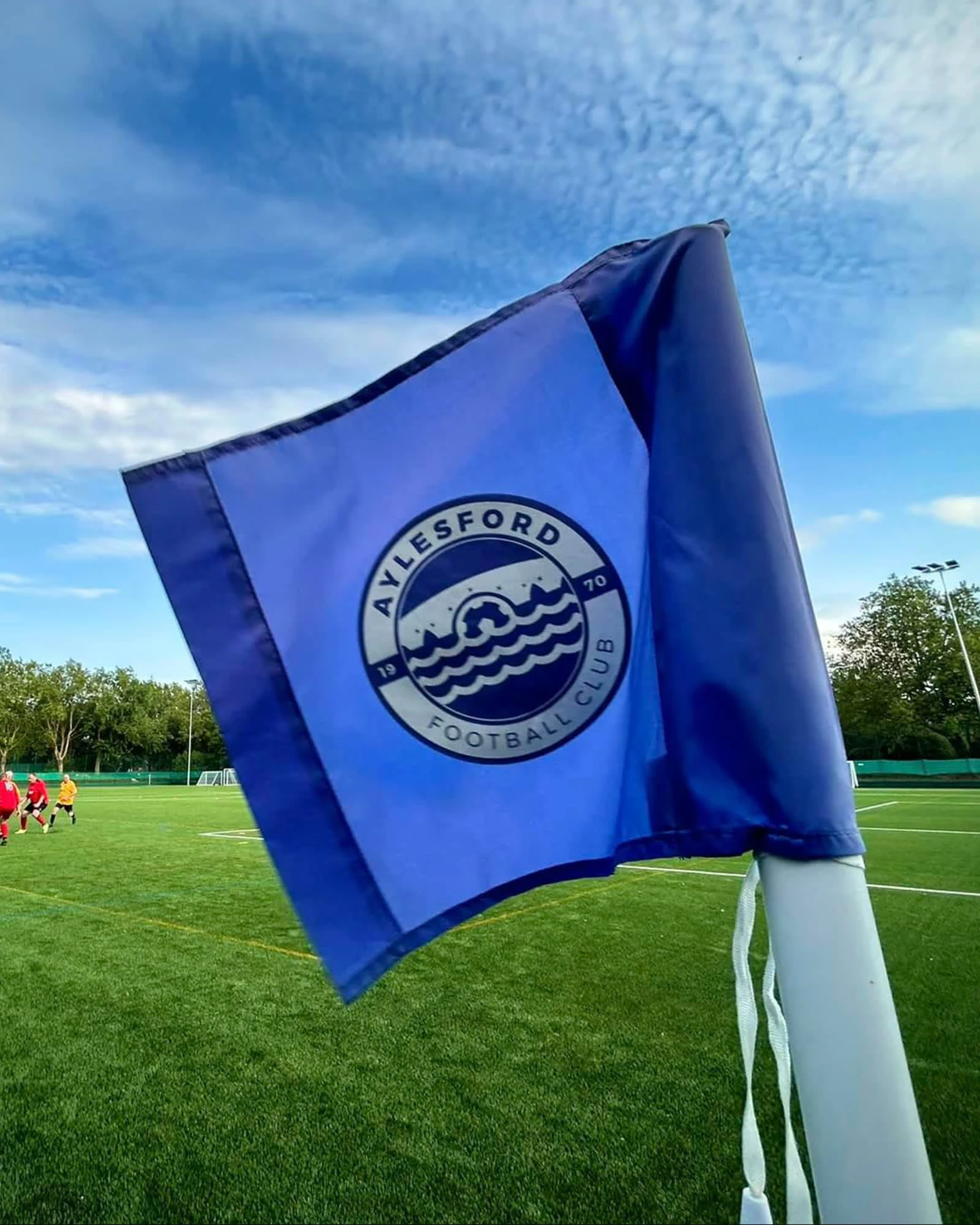
Versatility Success The true test of the redesign came in its real-world applications. The crest performs equally well embroidered on training jackets, screen-printed on supporter scarves, displayed as social media avatars, and featured on official club communications. This versatility gives Aylesford FC the flexibility to maintain consistent branding across all touchpoints.
Long-term Value Beyond solving immediate technical challenges, the modernised crest positioned Aylesford FC for future growth and professionalisation. The design provides a solid foundation for expanded merchandise, digital content, and promotional materials as the club continues to develop.
Technical Excellence This project demonstrated the importance of understanding both design aesthetics and production realities. The successful modernisation required balancing heritage preservation with technical optimisation—ensuring the final result honoured the club's history while meeting contemporary functional requirements.
This project exemplifies how thoughtful modernisation can preserve what matters most about a brand while adapting it for contemporary needs. When heritage and functionality work together, the result is a visual identity that serves both emotional and practical purposes effectively.
Services Provided:
Heritage Analysis & Preservation Strategy
Logo Modernisation & Redesign
Technical Optimisation for Multiple Applications
Production Method Compatibility Testing
Digital Asset Creation & Optimisation
Brand Guidelines for Consistent Application
Like this project
Posted Jan 28, 2024
Crest redesign to modernise the crest of Aylesford Football Club