App UX Redesign for Universidade do Porto
Juliana Eisenhardt Escaleira
UNI App – UX Redesign from an Interaction Design Perspective
UNI is an institutional mobile application for FEUP (Faculty of Engineering of the University of Porto - Portugal) to facilitate students' and faculty members' access to academic resources. Its primary objective is to provide streamlined access to personal and institutional information, including class schedules, exams, assignments, and links to platforms like Moodle.
However, the original version of the app exhibited several usability challenges, such as:
Confusing navigation that hindered efficient information retrieval.
An outdated interface lacking modern design principles.
Limited interactivity, especially concerning campus maps.
Insufficient documentation, leaving users without adequate support.
These issues adversely affected the user experience for both students and faculty members.
Design Process Overview
To address these usability challenges and deliver a more effective, user-centered experience, was implemented a structured five-phase interaction design process:
1. Understanding the Problem
The project began with an in-depth PACT analysis (People, Activities, Context, Technologies) to frame the problem space and guide design decisions.
People: Personas were created to represent key user types — international students, local students, and faculty with varying levels of digital fluency — each with distinct goals, pain points, and usage contexts.
Activities: Primary actions were mapped, including checking academic schedules, managing deadlines, accessing educational content, and receiving institutional updates.
Context: The app is used in dynamic environments (on the go, in class, or at home), requiring responsive, mobile-first interactions.
Technologies: UNI integrates with platforms like Moodle and Sigarra, supports offline features, and needs to perform reliably even on limited connections.
2. Design Analysis
A quantitative survey with 120+ students was conducted to understand usage patterns, app perception, and desired features. This was paired with a heuristic evaluation based on Nielsen’s 10 usability heuristics, uncovering usability issues such as:
Lack of system feedback
Unintuitive navigation
Inconsistent interaction models
Visual clutter and outdated aesthetics
3. Prototyping
In response, a high-fidelity prototype was developed in Figma, centered on solving core pain points and enhancing key workflows. The design focused on clarity, feedback, multilingual accessibility, and user control. The new version presents upgraded core screens:
Agenda Screen 📅:
A centralized space where students can view and manage all academic commitments (classes, exams, assignments). Users can:
Enable/disable reminders for each event
Add new assignments or exams
Edit events they’ve created
Access their course Moodle directly from each entry
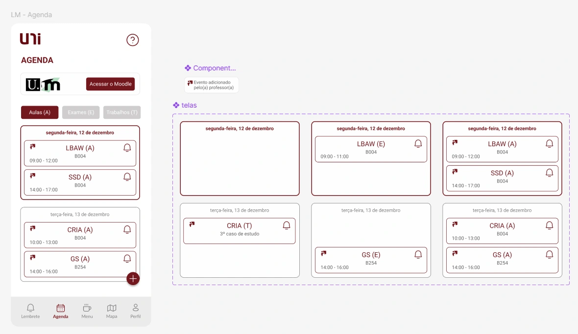
Agenda Screen
Reminders Panel 🔔:
A dedicated view for active reminders linked to events in the agenda. Users can:
Check off completed tasks
Instantly undo accidental deletions with a visible cancel button
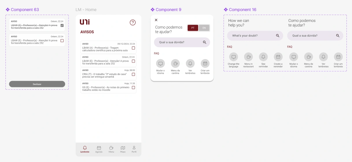
Reminder Panel and Help Button screens and components
Help Button❓:
Available on every screen, the contextual help button provides:
Language switching between Portuguese and English
A searchable FAQ
Quick access to common questions, ensuring user autonomy and clarity
4. Usability Testing
The prototype underwent usability testing with a representative sample of students performing real-world tasks, such as disabling reminders, editing events, and changing the app's language. Metrics analyzed included:
Task completion time.
Success rates.
Error frequency.
User satisfaction, measured using the System Usability Scale (SUS)
Feedbacks
5. Evaluation
All System Usability Scale (SUS) scores exceeded 65, with an average above 80 and a maximum score of 100, clearly validating that the redesigned interface delivered a significantly improved user experience. These results reflect high levels of user satisfaction, perceived efficiency, and ease of use across key interactions.
Like this project
Posted May 7, 2025
Redesigned app for FEUP (Faculty of Engineering of the University of Porto) to improve user experience and usability.
Likes
1
Views
11