White Horse Real Estate
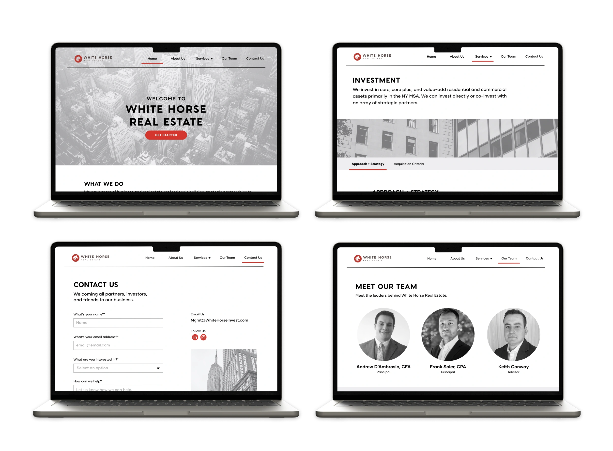
Redesigning a website for a real estate investment and advisory business.

Problem
5/5 of my interviewees felt unclear about the company's services and target audience.
Research Goal: Due to lack of information and design inconsistencies, the current website wasn't fully serving the business or user needs. I want to observe how users navigate the website to see what they are looking for. By doing so, I hope to uncover pain points users come across when interacting with the website, as well as, opportunities to enhance the user's experience. In doing so, it would build value for users, increase engagement, and increase brand loyalty.
Solution
Create a fuller picture by adding dedicated pages about their services, team headshots, and more details about who they are as a company.
The usability rating went up 77% from the old website to the new website.
COMPETITIVE ANALYSIS
The competition offered more context about their business, stronger visual hierarchy, and more effective information grouping.
The competitors ranged from larger, more established companies to smaller, newer companies. While they included a lot of information on their websites, they used visual hierarchy and information architecture to make the text-heavy sections more digestible.

USER INTERVIEWS
My interviewees felt that the website lacked important information to determine whether to work with them or even reach out.
Research Questions:
“What is your first impression of this website?”
“At first glance, what is this website about?”
"Which three words that you would use to describe this website?"
heuristic evaluation
The website violated the heuristics of error prevention, consistency and standards, and aesthetic and minimal design.
(1) Unexpected Errors
The placement of external links under “Our Capabilities” and signup button under the “Contact Us” section on the homepage could lead to unexpected errors and user confusion.
(2) Visual and Typographic Inconsistencies
Improve consistency by establishing a design system with clear visual hierarchy, adjusting the layout for readability (left- aligned text), and using photographs with consistent styles.
KEY INSIGHTS FROM AFFINITY MAP
Theme 1: The website needs to instill trust.
5/5 participants valued trust.
5/5 participants felt there wasn't enough information on the website.
5/5 interviewees didn't expect to see so many external links on the website.
Theme 2: The value proposition is unclear.
5/5 participants felt unclear about the company's services and target audience.
3/5 participants mentioned that the mission/vision statement was unclear.
POV STATEMENT AND HMW QUESTIONS
POV
I’d like to explore ways to help new clients to better understand how White Horse Real Estate can support their investment journey so that they can feel confident and informed when making real estate investments.
HMWs
How might we increase awareness of the services and value that White Horse offers users?
How might we make users feel confident and informed about their real estate investment decisions?
USER PERSONA
Raj, the first-time investor
Motivations:
View real estate as a safer, more stable investment than stocks.
Interested in long-term investments with good returns.
Many of his friends are buying investment properties.
Pain points:
When it comes to finances, it's important to him to work with a company he trusts.
Doesn't want his money to sit in the bank or invest in stocks due to volatility.
SITE MAP
To better organize and clarify the content needed on the website, I created a site map to visualize the heirarchical organization.
TASK FLOWS
With a better understanding of my users, I defined three key task flows that addressed their motivations and frustrations.
USER FLOWS
Before wireframing, I created clear and precise user flows that provided me with the necessary information to make informed decisions regarding the placement and organization of each screen in the interface.
LOW-FIDELITY WIREFRAMES
Based on the user flows and task flows, I sketched the key screens.
At this stage:
Explored potential layouts and UI elements on the screens.
Mid-FIDELITY WIREFRAMES
Created mid-fidelity wireframes of the key screens and expanded the design to include necessary screens for each flow.
At this stage:
Created more comprehensive and realistic UI components
Evaluated content structure based on visual hierarchy and layout
Set placement of images and icons
BRANDING
White Horse Real Estate had an established brand kit, which included brand logos, colors, and typography.
UI COMPONENT LIBRRARY
To get ready for the hand-off to the developer, I created a component library to show the various states and functions of UI elements.
HIGH-FIDELITY WIREFRAMES
Before and After of the Website
At this stage:
Added the "About Us," "Investment," and "Advisory" pages.
Made the CTA buttons more prominent and differentiated.
Original homepage
New homepage
Original "Our Team" page
New "Our Team" page
Original "Contact Us" page
New "Contact Us" page
New "About Us" page
New "Investment" page
New "Advisory" page
USABILITY TESTING
Success metric: Can the user complete each task with a usability rating over 4.0?
Task flow 1: Navigating the website
Average usability rating of 4.6/5
Task flow 2: Sending a message on the "Contact Us" page
Average usability rating of 4.6/5
Task flow 3: Comparing the new website with the old website
Users gave the old website an average usability rating of 2.6/5
Users gave the new website an average usability rating of 4.6/5
USABILITY TESTING
Key results
All users completed all the tasks.
The usability rating went up 77% from the old website to the new website.
Key findings
5/5 users gave positive feedback saying the new website was an improvement.
3/5 users didn't click on the team's photos or names to see longer bios.
3/5 users wanted to see names and titles under team photos on the homepage.
2/5 users suggested moving the "Subscribe" CTA from the footer to its own section on the homepage.
ITERATIONS
My recommendations for iterations
Increase the affordability of the photos, names, or titles on the "Meet the Team" page.
Increase the visibility of the "Subscribe" CTA on the homepage.
Improve the CTA buttons by updating the verbiage and design treatments between primary and secondary buttons.
Add CTA buttons on the services pages, so users can go to the "Contact Us" page directly from there.
FIRST IMPROVEMENT
Added a CTA button and increased the opacity of the image in the hero section.
Users previously had to scroll to see CTA buttons, so I brought the main CTA above the fold.
SECOND IMPROVEMENT
Increase the visibility of the "Subscribe" CTA, which was overlooked in the footer.
The change in placement made the CTA more clear and visible to users.
THIRD IMPROVEMENT
Added more opportunities for users to click the CTA button by including them on the services pages.
In doing so, there are multiple ways for users to navigate to the "Contact Us" page.
fourth IMPROVEMENT
Changed the button style treatment and increased the image opacity for greater contrast and visual hierarchy.
The CTA button is more eye-catching than in the previous iteration.
fifth IMPROVEMENT
Increased the affordability of the links for team members, so users are more likely to click on them for more details.
3/5 users didn't click on the team's photos or names during usability testing, which indicated to me that the affordance of the links were low.
FINAL SOLUTION AND DESIGNS
Final Mobile Design
FINAL SOLUTION AND DESIGNS
Final Desktop Design
CONCLUSION
Next steps
As White Horse Real Estate builds their portfolio and clientele, 4/5 users voiced that they wanted to see testimonials and a portfolio page on their website.
Like this project
Posted Feb 15, 2024
Redesigning a website for a real estate investment and advisory business.
Likes
0
Views
9
Featured on


