Island Britt E-commerce Website Redesign
Shay Delagarza
Island Britt
A warm, story-led e-commerce redesign that connects users with the meaning behind crystal jewelry
Island Britt is a woman-owned small business based in Taipei, offering handmade crystal jewelry, Reiki healing sessions, and educational wellness content. While Island Britt had an existing WordPress website, it was overall still in its early stages and had a fragmented path to purchase. Due to a lack of clear structure, the site made it difficult for users to understand the full range of offerings or feel confident making a purchase from the site. This project focused on redesigning the website experience to better support product discovery, trust-building, and conversion, while staying within the constraints of a small business MVP.
Island Britt's website made it difficult for users to confidently discover and purchase crystal jewelry. Unclear navigation, education about the items not linked to the product pages, and a lack of trust-building storytelling meant the site didn’t reflect the care, authenticity, or values behind the brand. This led to missed conversion opportunities.
I redesigned the website to balance education, storytelling, and commerce. By clarifying navigation, highlighting crystal benefits and sourcing, and elevating the visual design, the new experience helps users feel informed, emotionally connected, and confident in supporting a woman-owned small business.
Island Britt was the first client to respond when I put myself out there. But what made me want to do the work well was Britt herself. She had a woman-owned small business built around sharing what brings her balance, through crystal jewelry, Reiki, and education about them. That kind of generosity of spirit made the design feel meaningful beyond the deliverable.
Research for Island Britt began differently than most projects - with the client herself. Through early conversations with Britt, I gained a clear understanding of her offerings, brand values, and goals before speaking to a single user. Together we aligned on an MVP focus: improving product discovery, trust, and conversion. With that foundation in place, research expanded outward. Since the site lacked an existing shopping flow, the focus was on understanding small-business artisan and crystal e-commerce behaviors: what builds trust, what drives purchase confidence, and what sends users away. Methods included competitor analysis, secondary research, user surveys, and user interviews.
Storytelling emerged as a key trust signal when shopping from a small business. Users wanted to understand the maker’s story, values, and craft before purchasing, and when that narrative was clearly communicated through the site, they felt more confident investing in higher-quality, handmade products.
These insights shaped the redesign by positioning storytelling as a functional part of the experience. By weaving Britt’s story, process, and values into the homepage and shopping flow, the site supports trust, differentiation, and conversion while remaining aligned with Island Britt’s purpose.

Lola, a spiritually-minded English teacher
She values wellness, authenticity, and supporting small, women-owned businesses. She wants an intuitive, modern shopping experience that clearly explains crystal benefits and sourcing so she can shop with confidence and intention.
Research showed that users want clear, authentic product details (including sourcing, quality, and healing properties), along with modern, intuitive navigation to help them find what they need more easily. At the same time, they value the unique, handmade feel and personal story that small businesses provide. Addressing these issues presented an opportunity to build trust, improve usability, and communicate Island Britt’s authentic story. This will ultimately support sales, loyalty, and community growth.
With research findings in hand, the design direction became clear: this wasn't just a visual refresh. It was a trust-building exercise. Users needed to feel informed, connected to the maker, and confident before committing to a purchase - and the existing site wasn't delivering any of that. Every design decision that followed was filtered through one question: does this help a first-time visitor feel safe enough to buy?
I studied four crystal jewelry sites across different scales - two large recognized brands, one mid-sized retailer, and one small independent. The size range was intentional: larger brands benchmarked the polished, familiar design language users associate with trust, while smaller brands revealed where gaps in professionalism were quietly driving customers away. Across all four I focused on two things: how crystal education was integrated with product pages, and how filtering worked. User interviews had made clear that slow or confusing filters meant abandoned sessions.
I also studied how brands with strong storytelling wove founder narratives into the shopping experience. Users were significantly more likely to purchase when they felt aligned with the person behind the business.
This research led to two specific UX decisions: product page pop-ups as an alternative to automatic redirects, and a side add-to-cart drawer, both keeping users on the shop page and open to further browsing.
With clear problem statements, HMW questions, and project goals established, research insights were translated research insights into a focused MVP redesign of Island Britt’s homepage and crystal jewelry shopping flow.
The work prioritized clearer navigation, stronger brand storytelling, and easier product discovery to help users build trust and move confidently toward purchase.
While the educational content itself was not redesigned within this scope, the updated experience intentionally connects learning with shopping, creating a smoother path from curiosity to conversion.
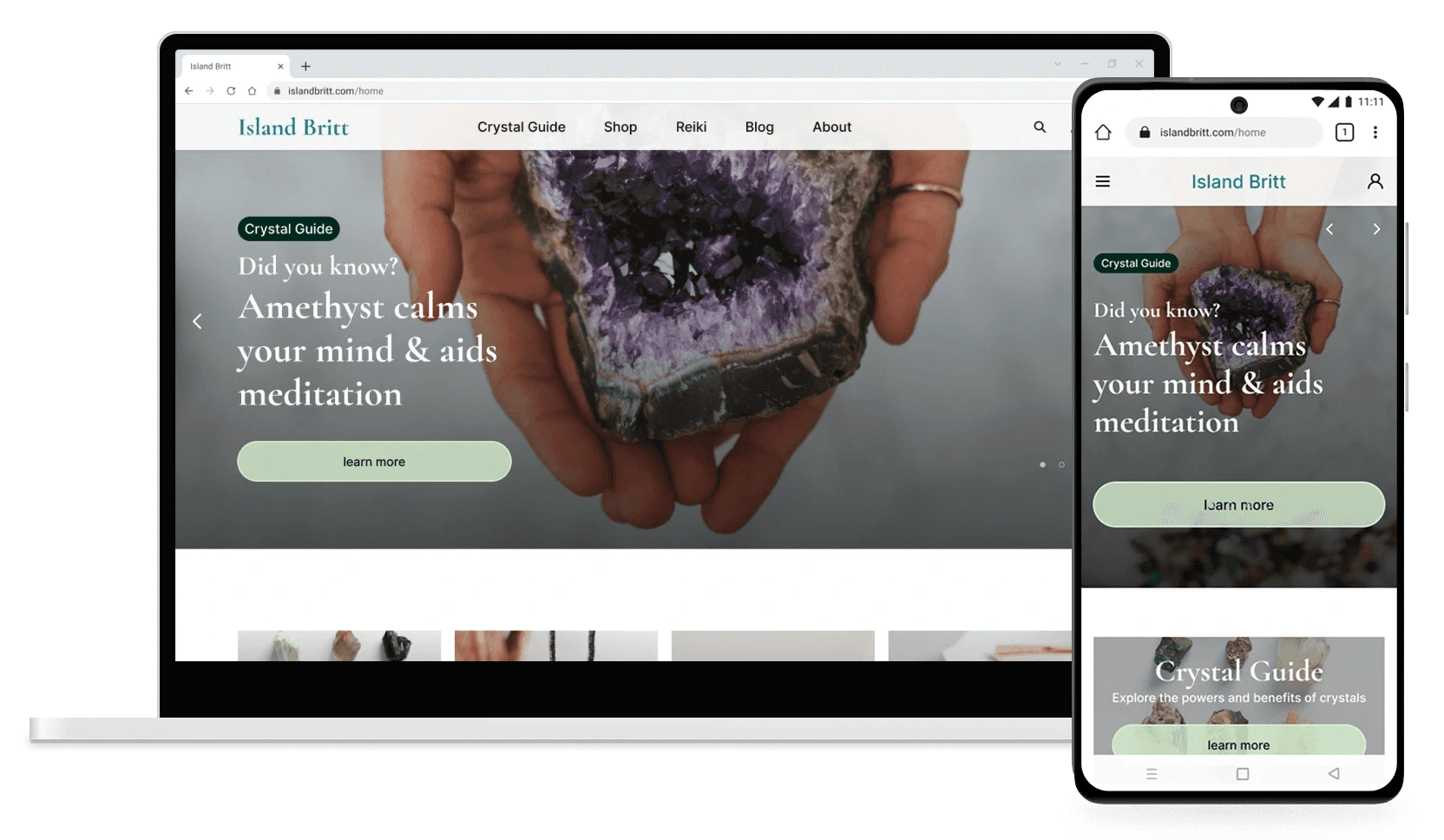
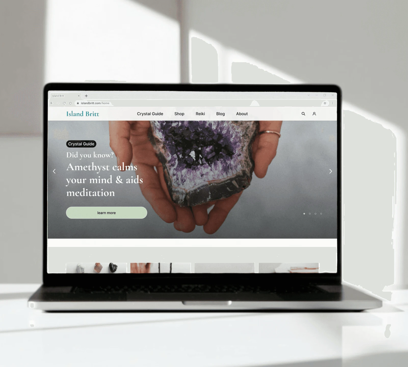
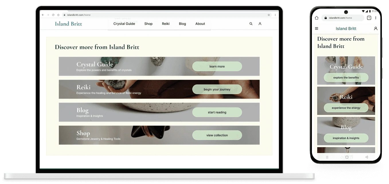
The homepage was redesigned to immediately communicate Island Britt’s purpose, values, and credibility.
By centering Britt’s story and clarifying how education and shopping coexist on the site, the homepage now helps users feel oriented, informed, and confident enough to explore further.
redesigned homepage
redesigned homepage flow
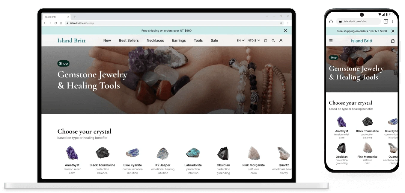
The redesigned homepage transforms what was previously a single-image layout with no About section or direct shop links into a clear, trust-building entry point for Island Britt.
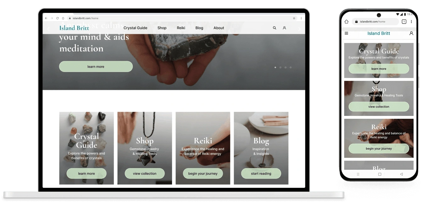
responsive homepage
A rotating hero carousel highlights her core offerings, supported by intuitive navigation and visual cards with direct CTAs to guide exploration.
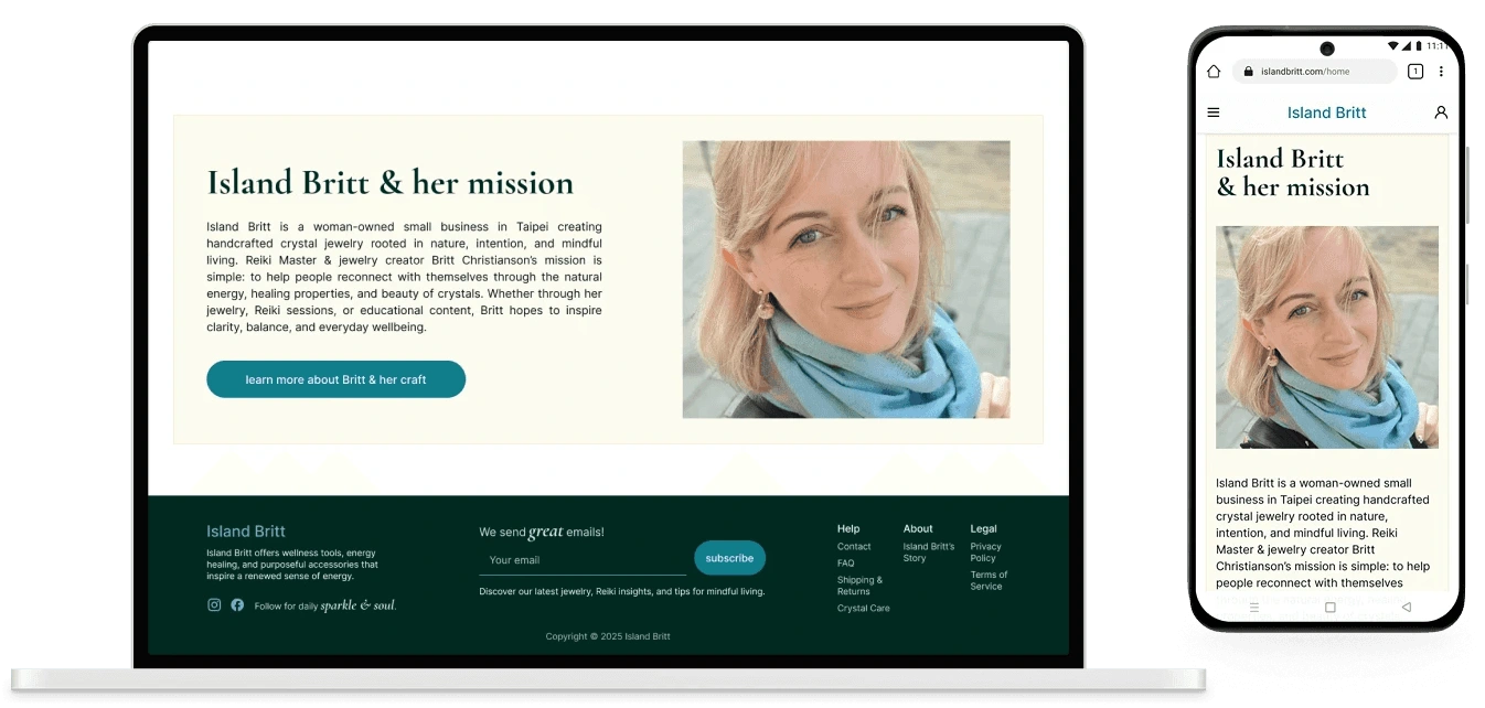
responsive About section connecting Britt to her users
An introduction to Britt’s story and a new testimonials section were added to build warmth and credibility, responding directly to user feedback that social proof is essential before committing to a purchase from a small business.
After aligning with Britt on priorities, product discovery and crystal education took the front seat. Her story was important but secondary - enough of it needed to live on the homepage to build connection, with a full About page deferred to a future phase.
And in the shopping flow featured below, a row of benefit-style cards circulated users through Britt's broader offerings: her story, crystal education, Reiki services, and her crafting process. Each card has a clear CTA, keeping the experience connected without overwhelming the primary shopping flow.
The shopping flow redesign addressed the core usability challenges uncovered in research: unclear navigation, confusing filters, and friction in product discovery.
By aligning crystal education with shopping behaviors, the updated flow makes it easier for users to find what they’re looking for and feel confident completing a purchase.
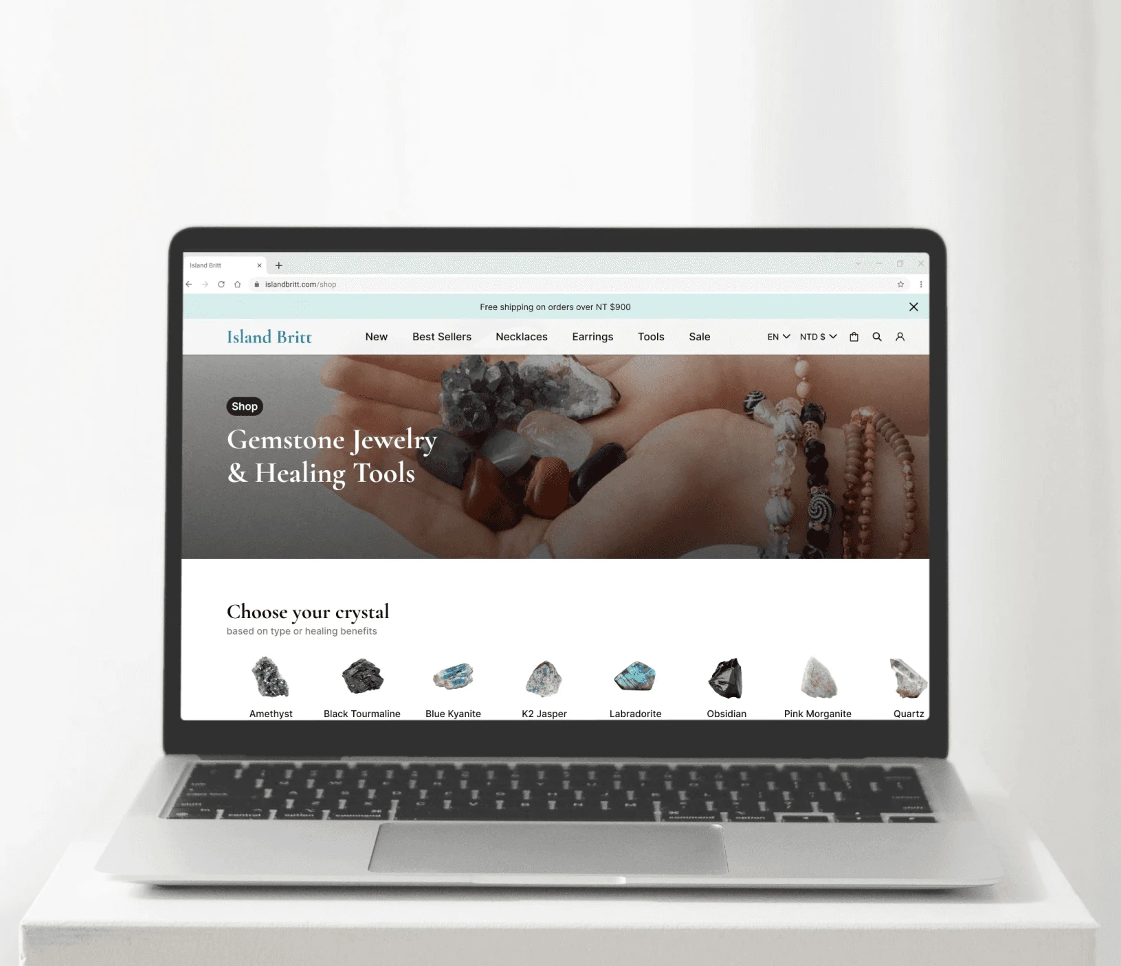
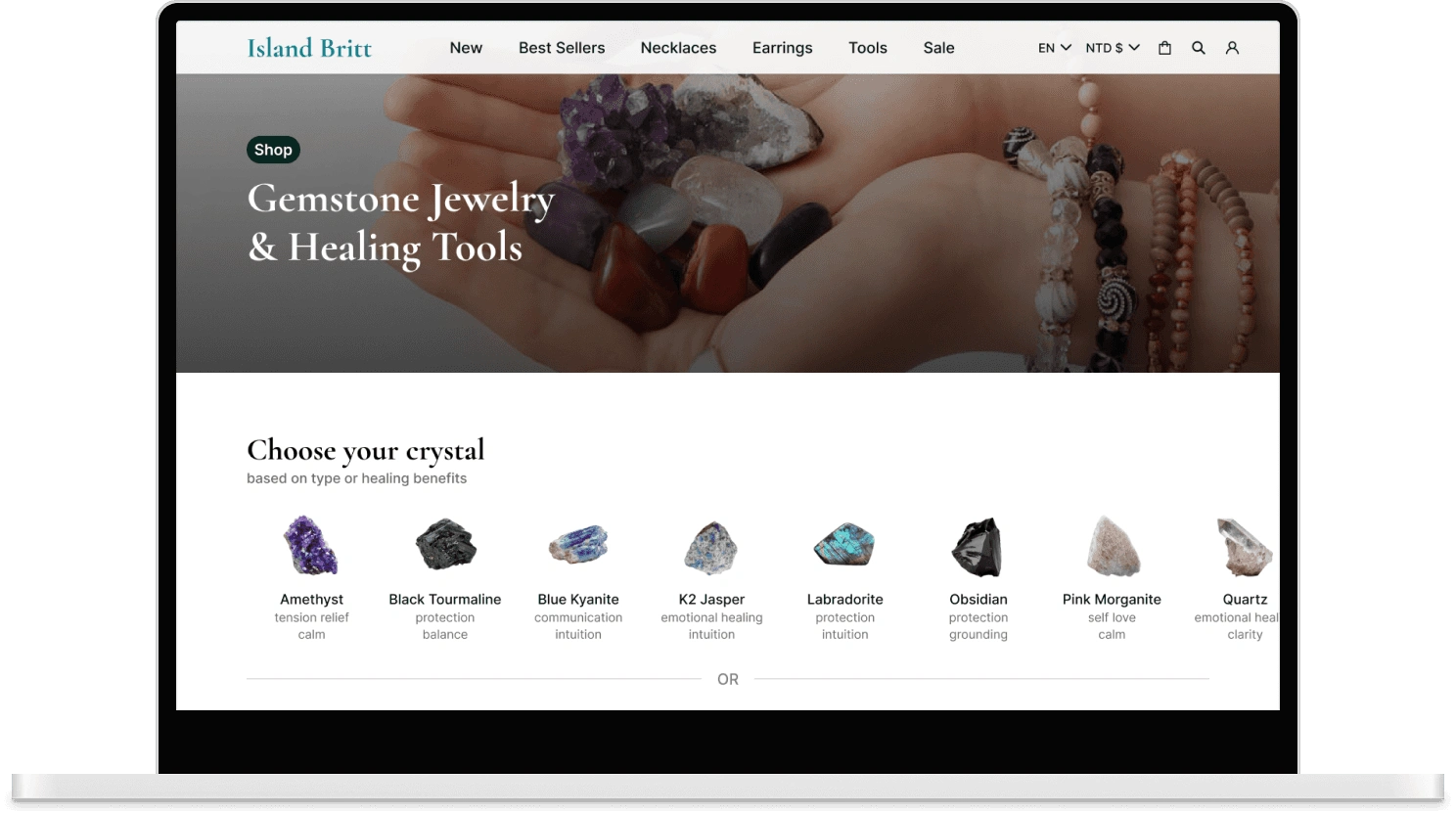
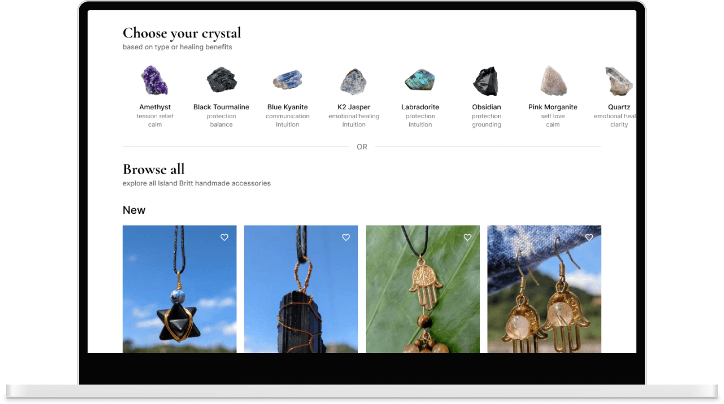
Shop page redesign
original shop page design (no checkout process)
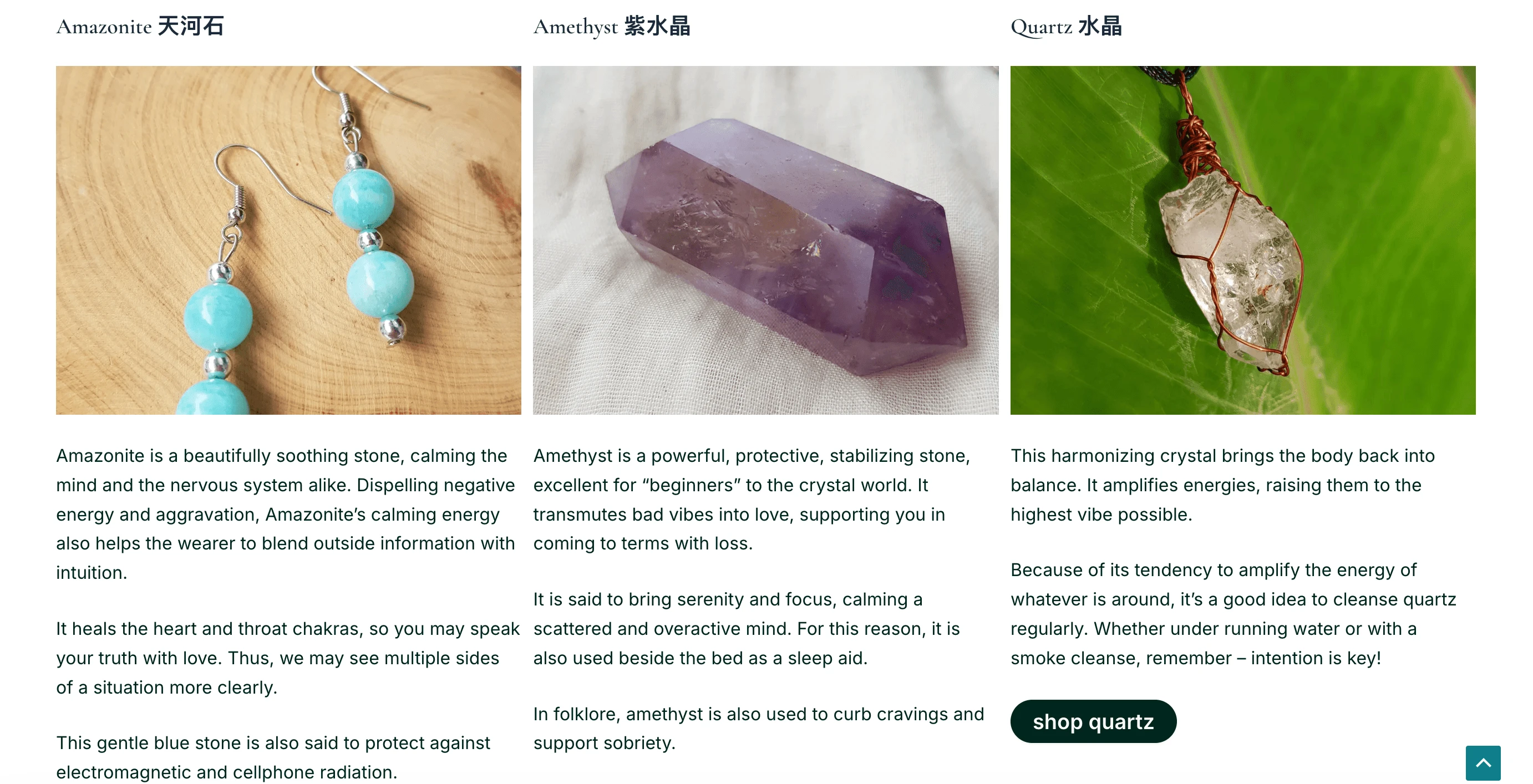
Previously, users had to navigate through a long crystal education page before reaching any products...
original shop page design (no checkout process)
...making it difficult for those who simply wanted to browse or shop first.
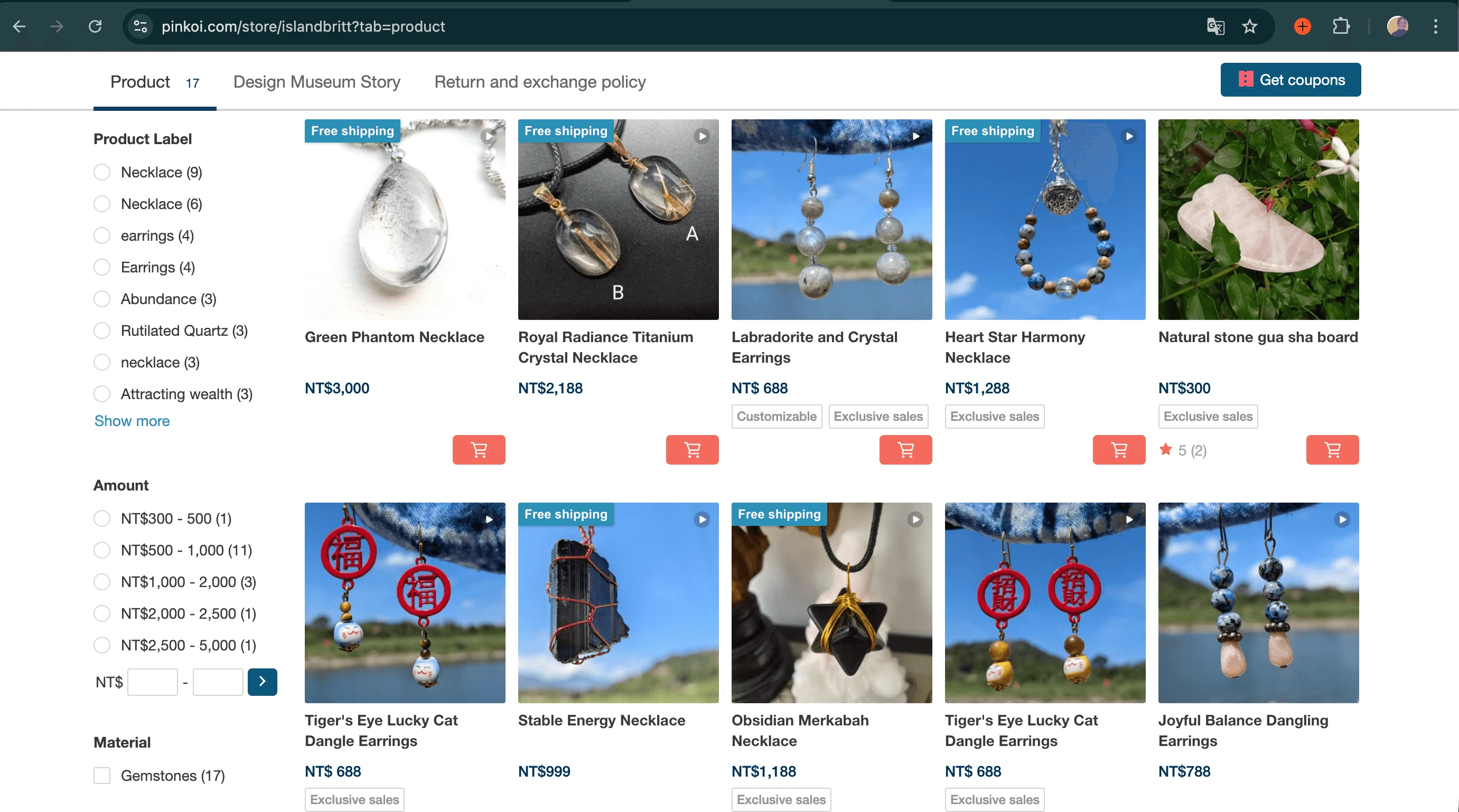
previously users were redirected to a third-party site (Pinkoi) to make purchases
Purchases were completed through a third-party platform, Pinkoi, where an overabundance of filters made product discovery feel overwhelming. This extra friction broke the shopping flow and reduced purchase confidence.
Shop page redesign
The redesigned experience separates Crystal Guide and Shop into distinct but interconnected paths accessible directly from the homepage.
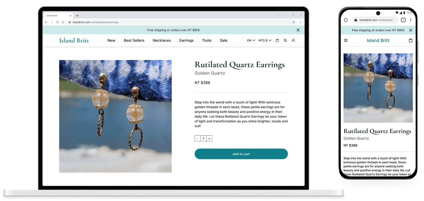
Product page design (new)
Users can browse products immediately, then choose to learn more about a crystal from any product page, or start with education and shop from there.
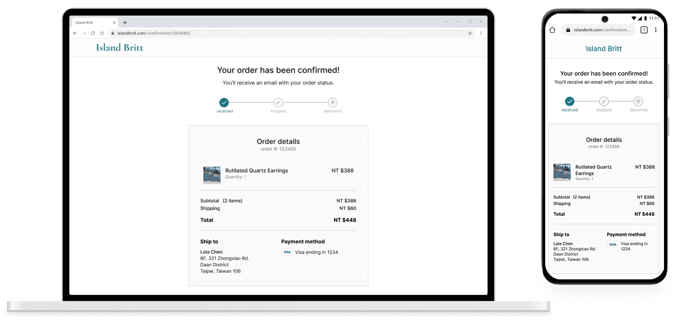
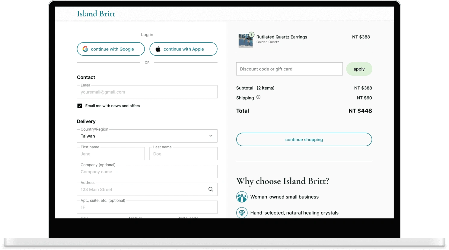
Checkout page design (new)
Checkout now happens entirely on Britt’s site, removing third-party friction entirely.
section connecting users to Britt's other services (new)
Throughout the flow, users are also gently reintroduced to Britt’s story and other offerings, reinforcing trust without disrupting the shopping experience.
shopping flow redesign
The redesign focused on streamlining the shopping flow while preserving access to educational content, creating a familiar, trustworthy path from product discovery to checkout.
The existing site used a left-side text filter panel - familiar, but overwhelming and visually disconnected from the products. Since many users weren't familiar with all the crystals, a visual filtering approach made more sense: showing the actual stones alongside their healing properties to serve both discovery and education simultaneously.
I moved to horizontal filters at the top of the page. My first version had two rows (crystal type and jewelry type) but this created its own cognitive load. I simplified to one primary row of visual crystal tiles and moved jewelry type filtering to the top navigation.
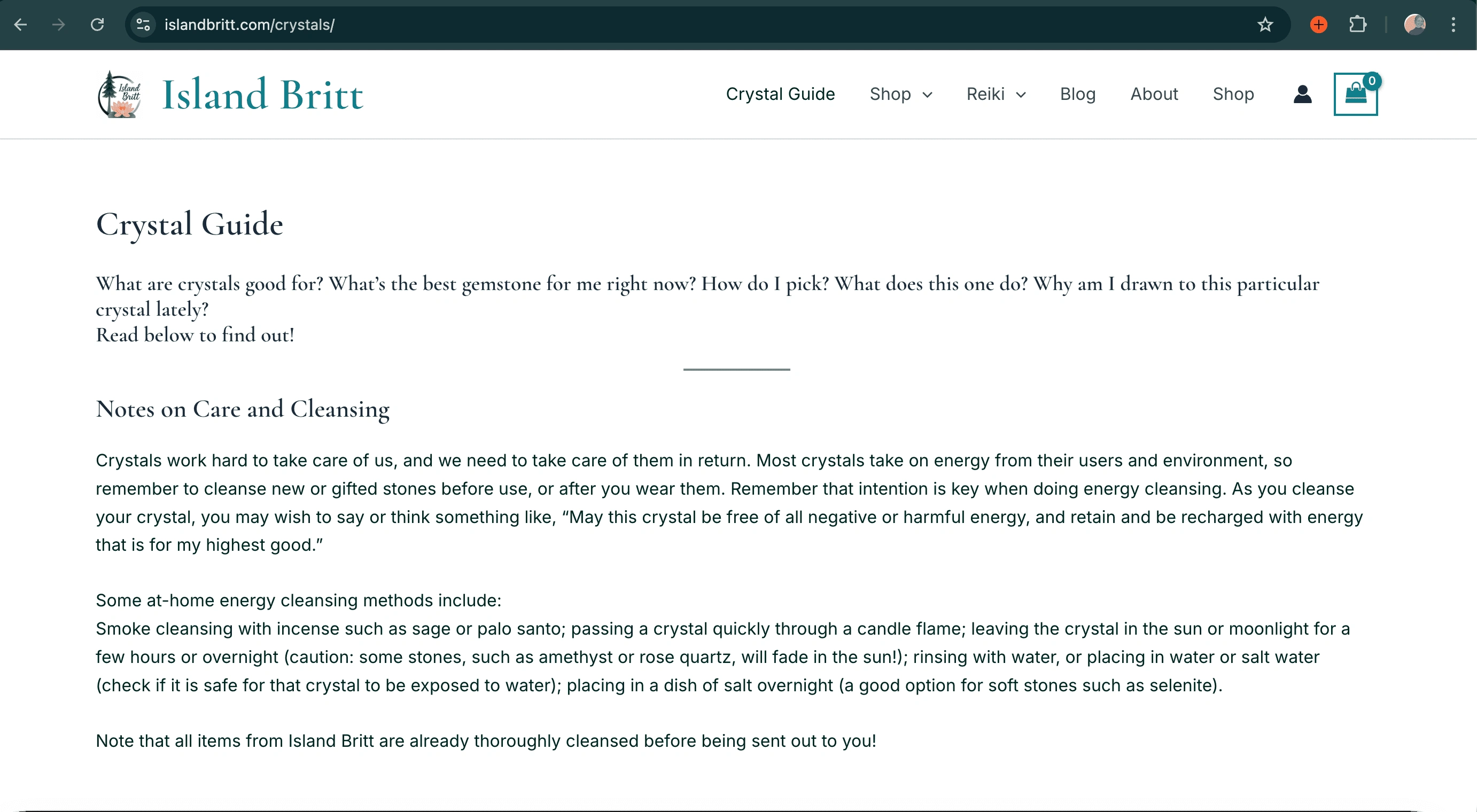
A usability testing insight drove one more iteration: filtering on the same page wasn't obvious enough - users couldn't tell it had happened. The solution was a dedicated page per crystal type, which also created space for deeper educational content, directly connecting the research insight about education driving purchase confidence to a structural design decision.
Usability testing was conducted across low- and high-fidelity prototypes. Participants completed key tasks including browsing crystal jewelry, using filters, and moving through checkout, with sessions focused on navigation clarity, filter discoverability, and trust signals throughout the flow.
problem
solution
solution
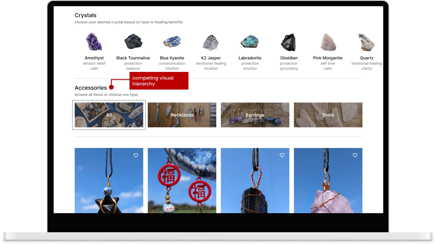
Problem: The crystal filter wasn't immediately recognized as interactive and visually competed with the accessories filter. Solution: Headings were clarified, visual hierarchy strengthened, and accessory filters were moved to the top navigation as anchor links, organizing items by section rather than layering filters, which better matched the size of Britt's product range.
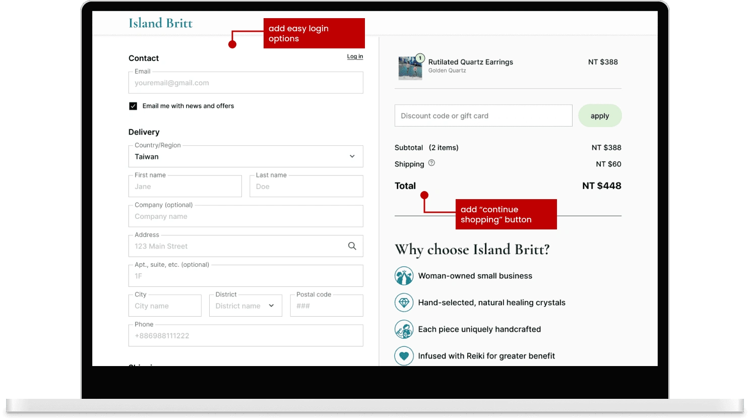
problem
solution
Problem: The checkout page made logging in and continuing to browse feel cumbersome. Solution: Google and Apple login options were added for faster sign-in, along with a "Continue Shopping" button to encourage last-minute exploration before completing a purchase.
five users independently praised the UI as clean, elegant, and professional
100% of users said they would buy in real life, against an 80% target
The redesign improved trust, usability, and product discovery. Users felt informed, emotionally connected, and confident enough to purchase - which was the goal from the start.
The most consistent challenge was working within the rhythms of a real client relationship. Island Britt is a passion project alongside a demanding day job, which meant momentum naturally ebbed and flowed. The project is currently paused while I wait for the opportunity to transfer the Figma design to her WordPress site. The harder design challenge was working around missing assets. Users consistently asked for product imagery showing pieces to scale and being worn, as well as short videos from multiple angles - both meaningful trust-building elements in e-commerce. Britt understood their value, but creating them wasn't within her bandwidth at this stage. Working with assets outside your control is a real tension in client work. In future projects I'd establish clear asset expectations upfront - a small conversation that saves significant friction mid-project.
This project challenged my initial assumption that visual polish and a familiar checkout process alone drive trust. While both proved important during testing, the deeper insight was more nuanced: storytelling, authenticity, and connection to the maker are functional parts of a small business shopping experience, not decorative ones. Every interview and testing session reinforced that the emotional side of e-commerce is just as important as the structural side.
Coordinating design work around evolvign client assets was the biggest practical challenge. When materials weren't available on my timeline, I adapted by using placeholder visuals to keep momentum. Next time I'd establish clearer asset expectations upfront - a small conversation that saves significant time mid-project.
Future work would focus on fully building out the crystal education pages to deepen the link between learning and shopping, and expanding the Reiki section to create a more complete experience that reflects the full breadth of what Island Britt offers.
THANK YOU FOR EXPLORING MY WORK ~
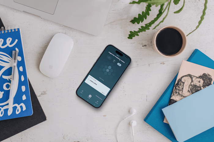
exploring other projects of mine: ClearMind
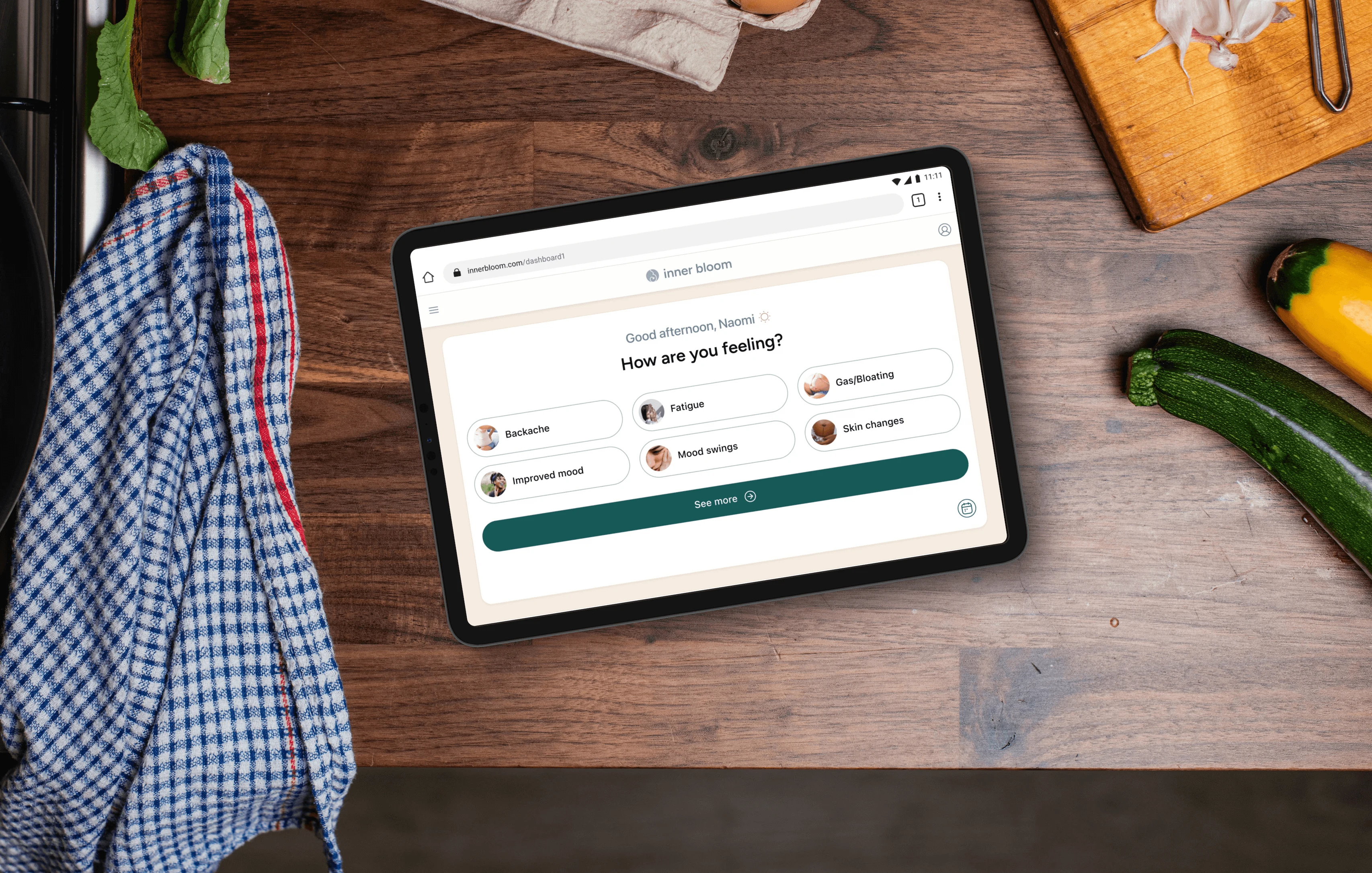
exploring other projects of mine: Inner Bloom
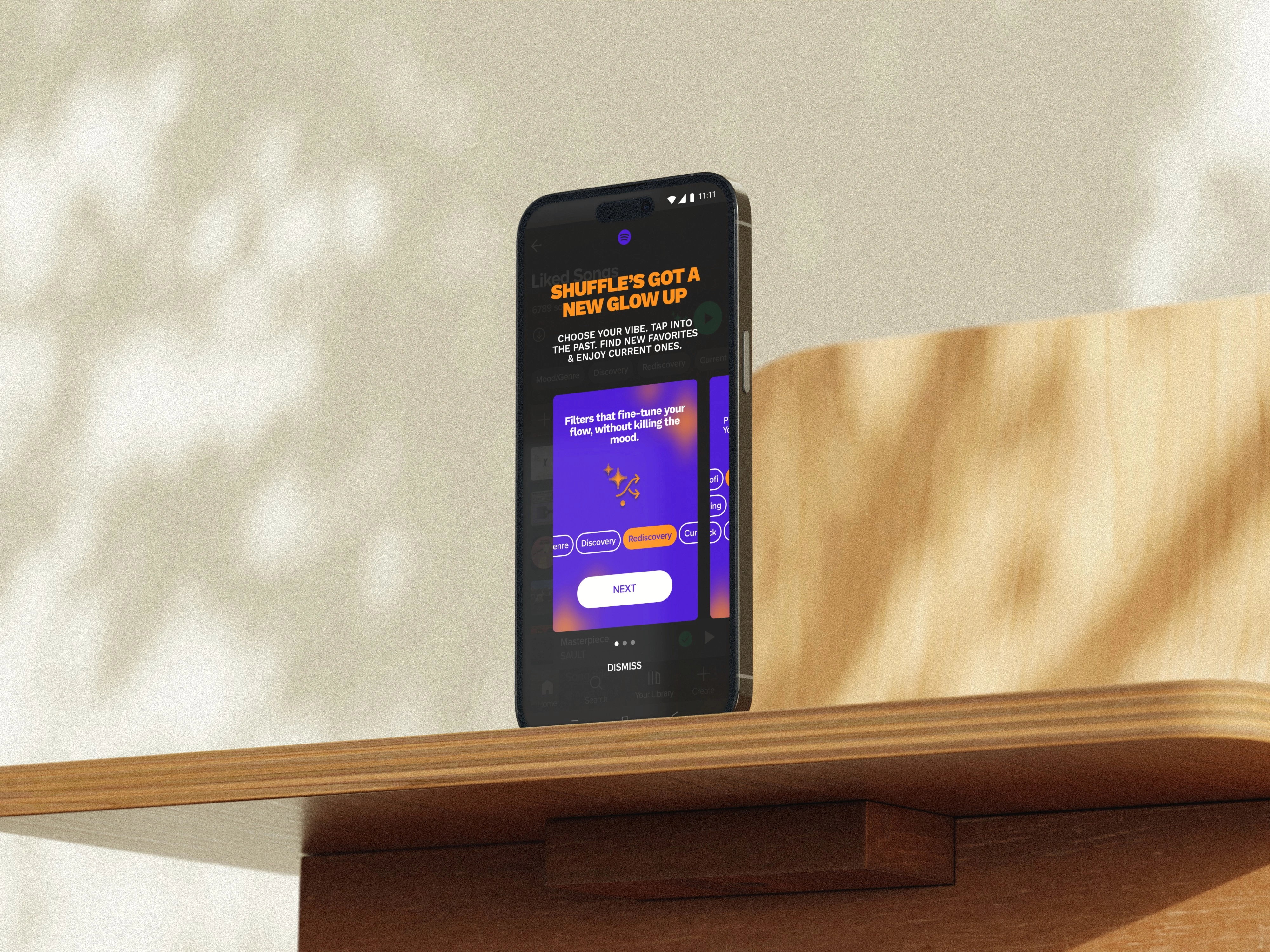
exploring other projects of mine: adding a feature to Spotify
Like this project
Posted Mar 31, 2026
Redesigned Island Britt's website to enhance product discovery and build customer trust.
Likes
0
Views
2