ClearMind ADHD Task Management App Design (conceptual)
Shay Delagarza
ClearMind
A guided task prioritization app designed to reduce cognitive overload for ADHD users
Adults with ADHD struggle most with prioritizing tasks, getting started, and staying emotionally regulated while working. When faced with competing tasks, they experience mental clutter and decision paralysis, making it difficult to know where to begin. This often leads to avoidance, stress, and shame spirals rather than progress.
ClearMind is a task management app for adults with ADHD, designed to reduce overwhelm before action is required, and support prioritization, task initiation, and emotional regulation. It is built around two core features: Brain Dump and Focus Mode.
Brain Dump helps users quickly unload tasks without overthinking, then uses lightweight inputs (urgency, importance, time, energy) to intelligently prioritize their day, while keeping users in control.
Focus Mode removes distractions by surfacing only the current microtask, using a calmer visual palette, positive time framing, and subtle progress feedback to support sustained focus and momentum.
I have ADHD. I navigate a neurotypical world daily, and I know firsthand how disorienting that can be - the mental clutter, the decision paralysis, the shame that follows when a productive day slips away despite every intention to have one.
When I set out to design ClearMind, I wasn't just curious about productivity tools. I wanted to know whether the specific struggles I experienced were shared - whether other adults with ADHD were hitting the same walls, or whether the experience was more varied than I assumed. The research answered that question clearly: the pain points were consistent, well-documented, and largely underserved by existing tools. That gave me both direction and motivation.
This wasn't an abstract design challenge, it was a chance to build something genuinely useful for a community I'm part of. I wanted to make the daily experience of living with ADHD feel a little lighter, starting with the moment you sit down to figure out what to do next.
ADHD users don’t need more productivity features, they need clear guidance, calm structure, and encouragement that reduces shame while helping them move forward.

Eleni, a remote freelance content writer with ADHD
She values flexibility but struggles with task initiation, prioritization, time blindness, emotional overwhelm, and invisible progress. She needs a way to unload mental clutter, know what to focus on first, and feel supported, not pressured, while working.
The research pointed clearly to three interconnected challenges: overwhelm from too many tasks, paralysis at the point of starting, and the emotional spiral that follows when things don't go as planned. These became the foundation for the project's goals and MVP scope, ensuring the core experience tackled the most impactful barriers first.
With the research findings clear, I knew I wasn't designing a traditional to-do list. I was designing something emotionally sensitive, built around the specific ADHD pain points users described: the overwhelm of starting, the shame of falling behind, the difficulty of transitioning between tasks, and the disorientation of time blindness. The structure needed to feel supportive, not demanding.
I began by sitting with the competitive landscape and asking one question of each app: what does this ask of the user the moment they open it? Most productivity tools front-load complexity with things like due dates, tags, and priority levels before the user has even offloaded what's in their head. For ADHD users, that friction is enough to close the app entirely.
The direction became clear: dump first, details later.
With clear problem statements and project goals in place, research was translated into a focused MVP that addressed overwhelm, prioritization, and task initiation first.
These were designed to reduce the friction between intention and action for users who already who what they need to do, but struggle to begin.
Users can freely unload tasks without overthinking, then receive gentle guidance to organize and prioritize what matters most. This makes it easier to choose one task and begin.
Brain Dump feature
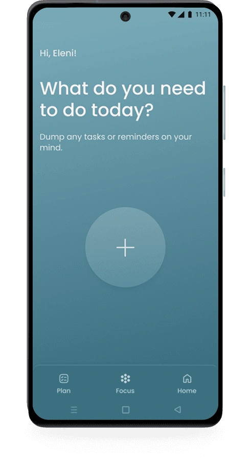
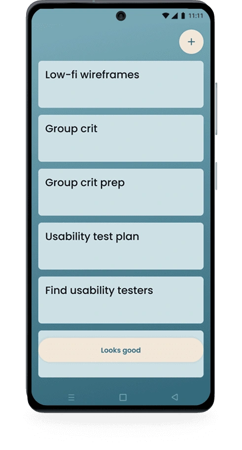
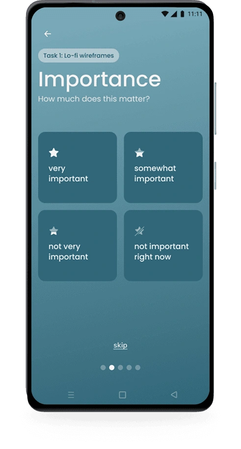
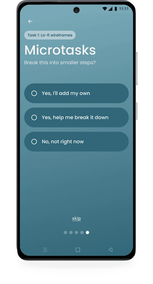
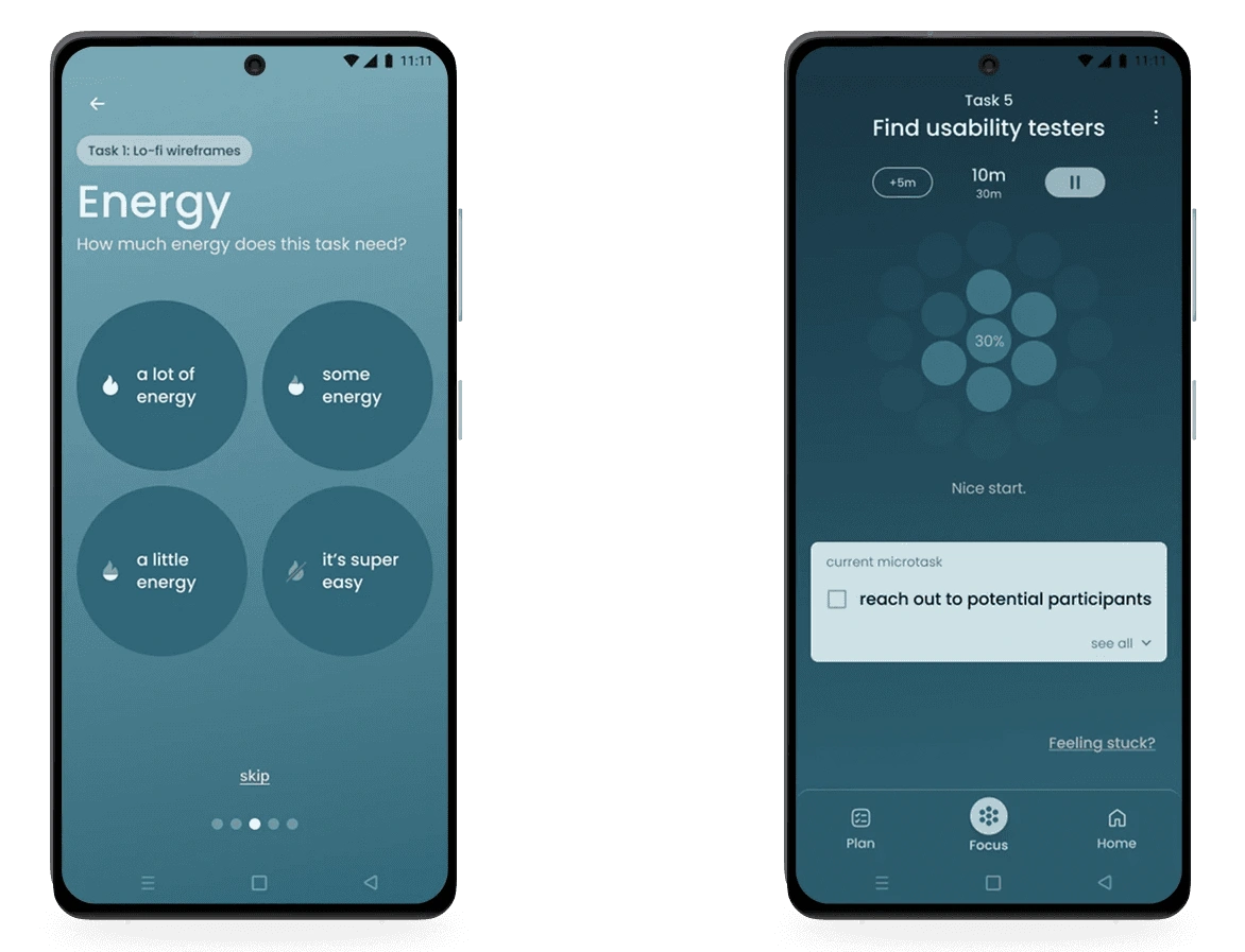
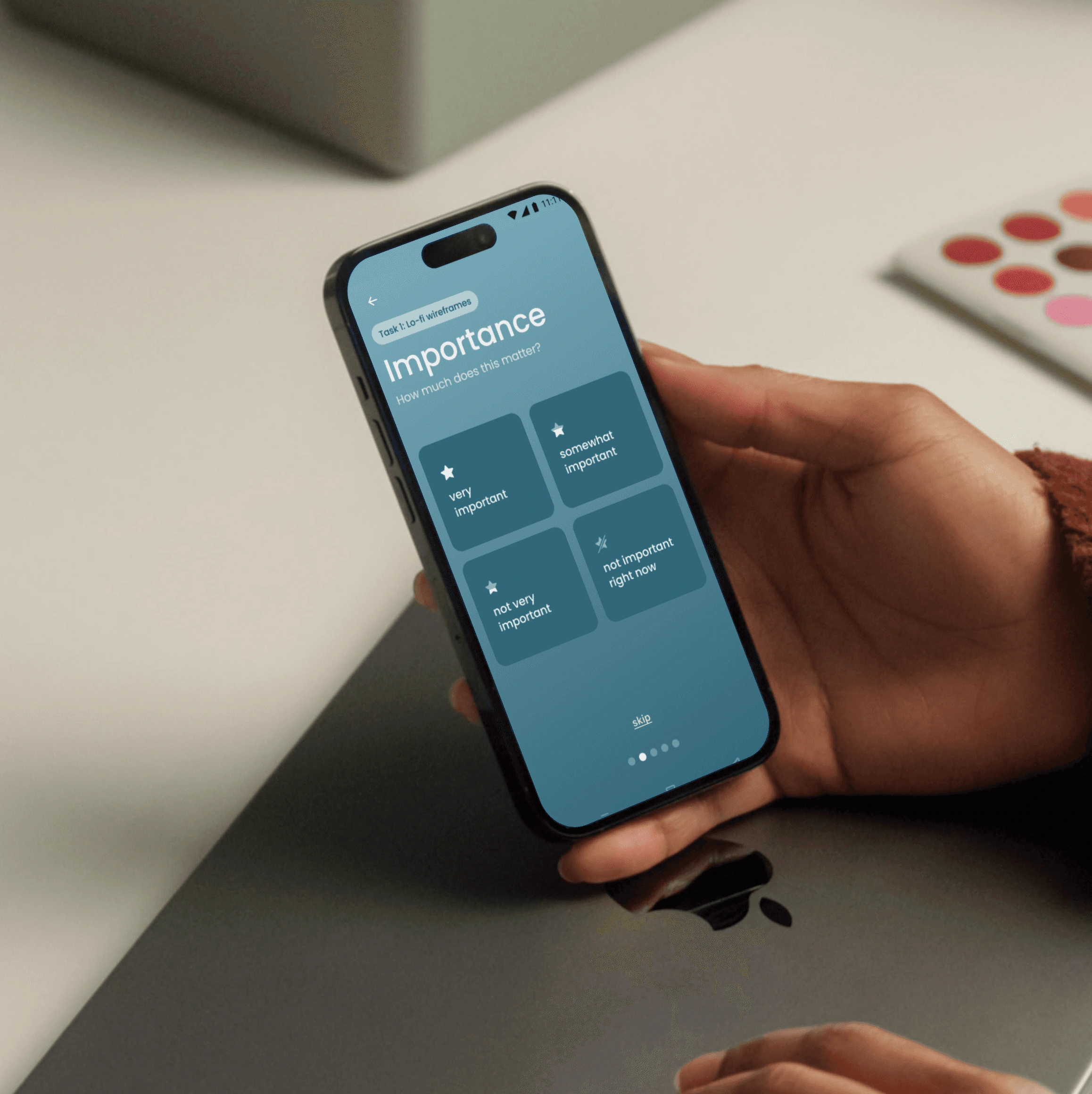
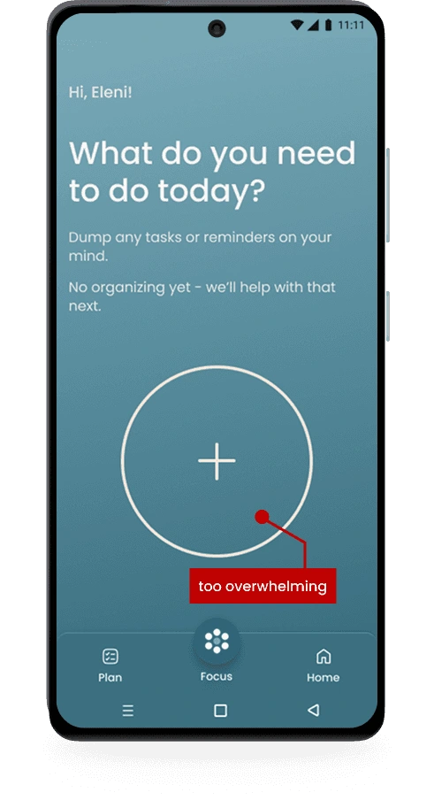
Users begin by unloading everything that’s been floating around in their head, adding light details to each task (urgency, importance, energy, and time) only if it feels helpful. They also have the option to break tasks into microtasks or skip ahead to Focus Mode entirely.
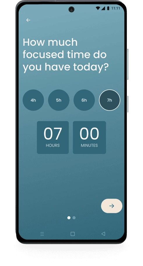
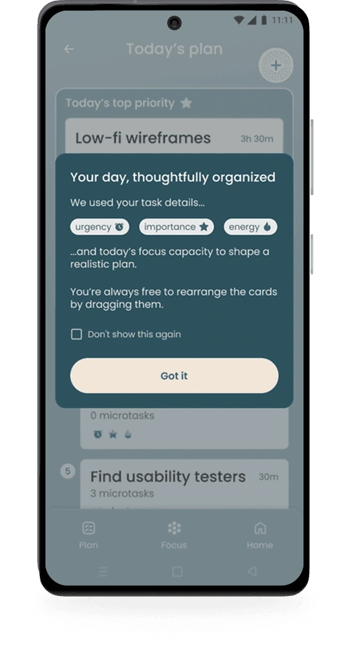
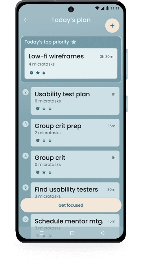
From there, users check in on their available time and energy for the day. The system uses this context to generate a realistic plan and surface the single most relevant task to start, leading naturally into Focus Mode.
The one-question-per-screen model was a deliberate iteration from an earlier version that asked for all details at once. Removing visual clutter from each input screen wasn't an aesthetic choice, it was a direct response to how ADHD users process information.
Brain Dump flow
My first version asked users to fill in all task details on one screen: urgency, importance, energy, estimated time. Early feedback made clear this replicated the exact overwhelm I was trying to eliminate. I moved to a one-question-per-screen model, keeping each input fully focused and distraction-free.
The number of options per question went through its own iteration - five felt like too many, three not nuanced enough. Four became the middle ground. AI helped articulate each level in language that felt calm rather than clinical.
Microtasks emerged from user interviews. Breaking tasks into smaller steps felt more manageable, and each completion moment carries a real dopamine reward for ADHD users. Making microtasks optional kept the experience flexible, never rigid.
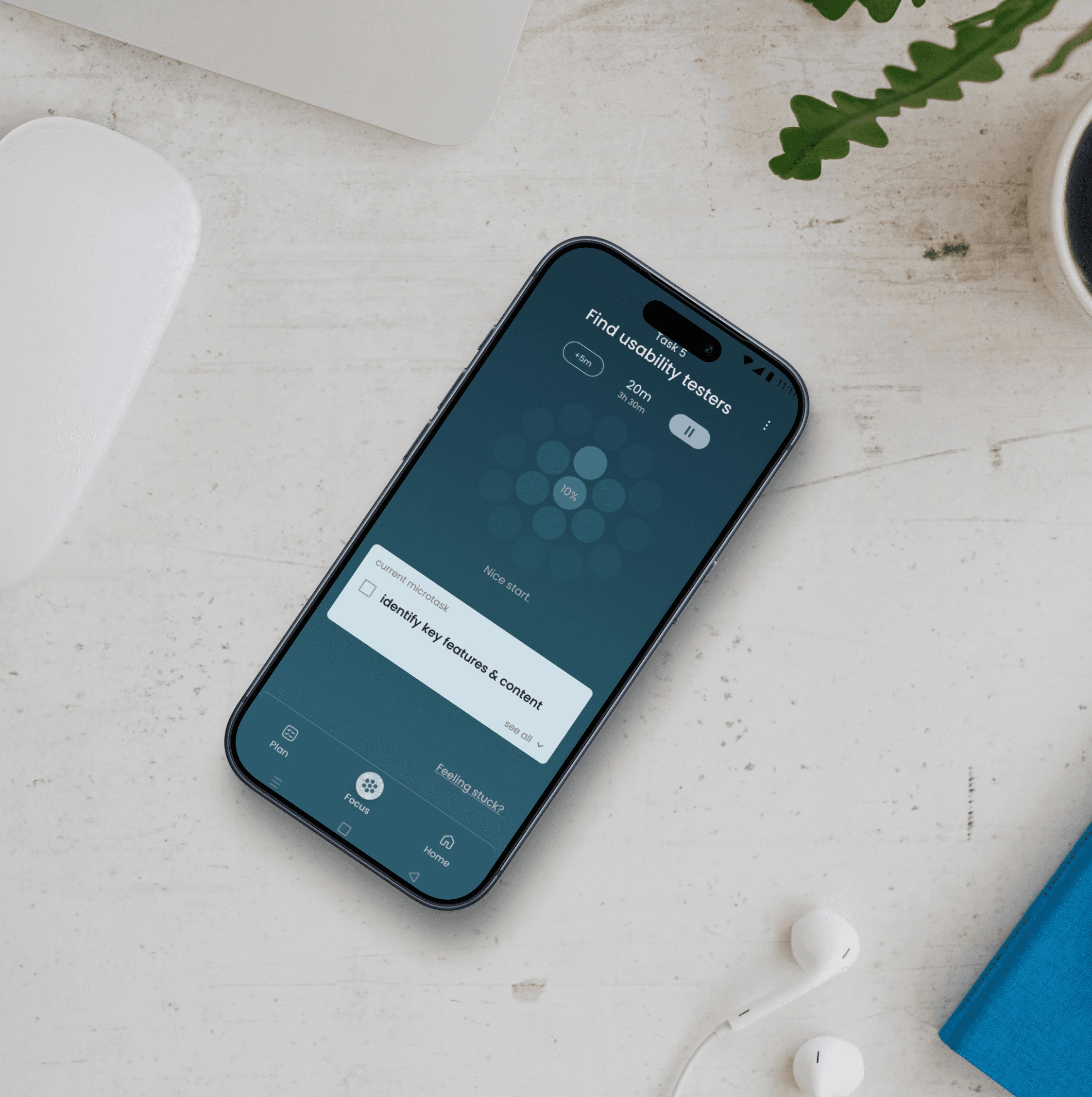
Focus Mode creates a calm space for working on one task at a time, keeping attention anchored and progress visible.
This helps users stay engaged, build momentum, and move forward without pressure or self-judgment.
Focus Mode feature
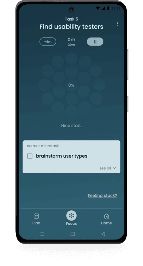
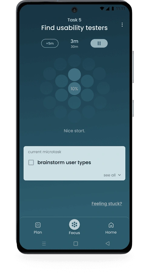
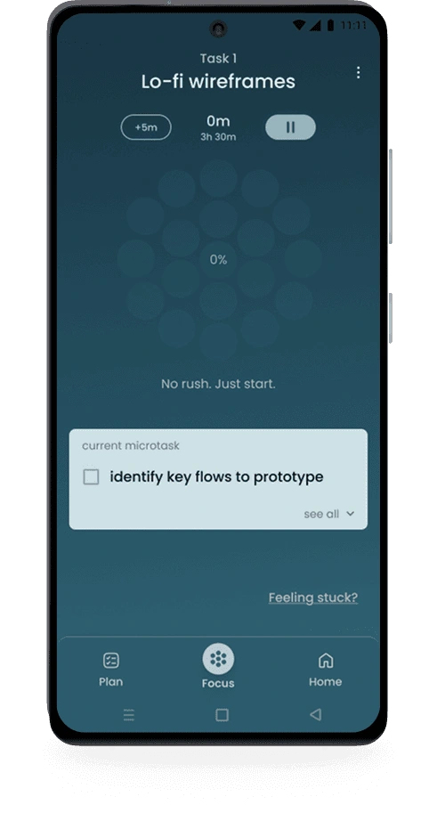
Once users enter Focus Mode, a subtle progress visualization sits at the top of the screen - bold in shape, slow-moving by design - giving users a peripheral sense of momentum without pulling focus. The current microtask occupies the visual center, set in light color against a dark background to draw the eye naturally. Gentle motivation messages shift as progress continues (no rush / just start / still on track...), present enough to encourage, subtle enough not to distract.
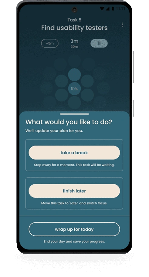
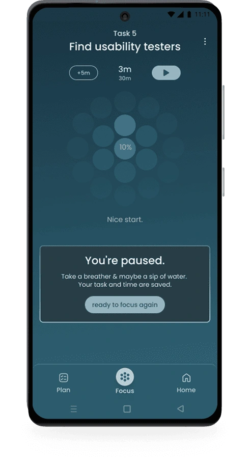
If overwhelm arises, the pause button surfaces three options ordered from least to most disruptive: take a break, finish later, or wrap up for today. The third option uses a secondary button style (visually quieter) to gently discourage closing the app without removing the choice.
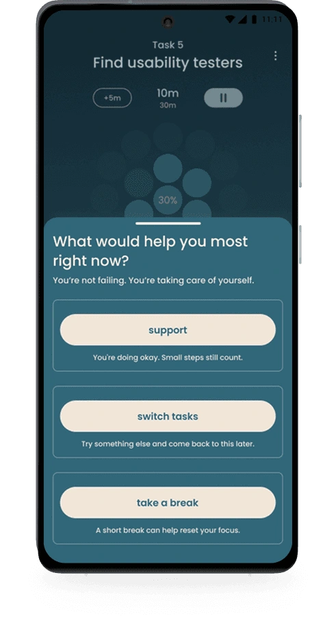
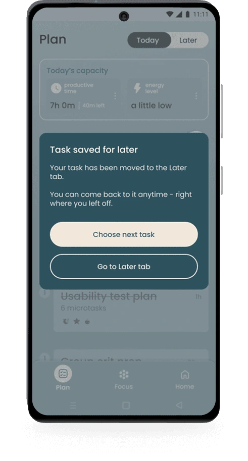
The 'Feeling stuck?' link sits subtly in the corner, opening a drawer that leads with 'You're not failing. You're taking care of yourself before offering any action. 'Options follow the same intentional order: support first, then take a break, then switch tasks. Both interactions (pause/stuck) share one goal: preserve momentum without pressure.
Focus Mode flow
Focus Mode needed to keep users anchored to the task at hand while gently reinforcing that they were making progress, all without overstimulating them in the process.
I explored several progress indicator approaches, balancing screen real estate against distraction risk. The visual direction came from data visualization inspirations - specifically minimal color palettes, bold graphic shapes, contrast doing the work instead of color variety. Interesting but not stimulating.
The indicator I landed on was bold in shape but slow-moving - something to glance at, not watch. The current microtask sat just below, set in a light color against a dark background to draw the eye naturally. Short motivational messages shift as progress continues - no rush, just start / momentum unlocked / still on track - refined with AI assistance to feel encouraging rather than performative.
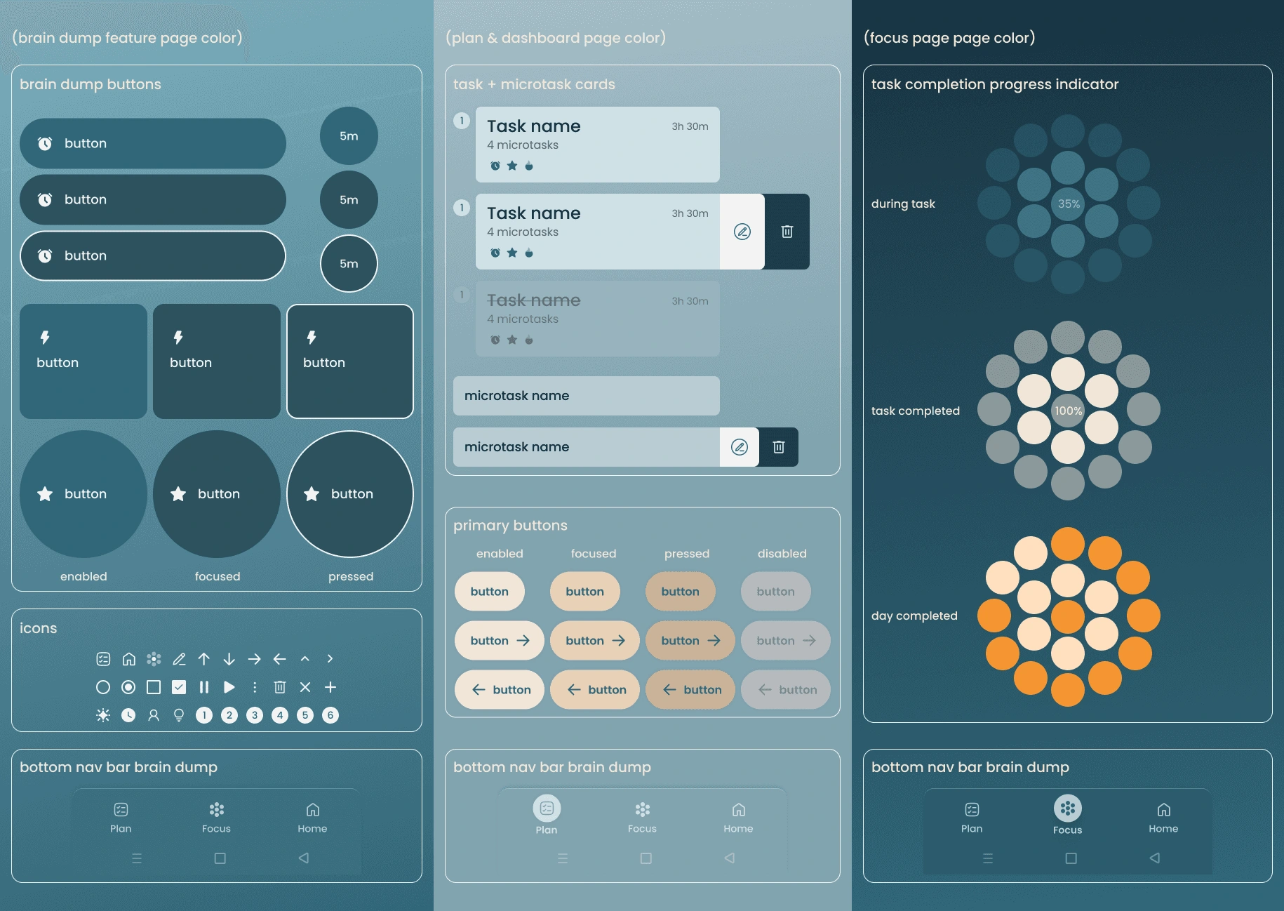
UI component system
The component system prioritizes clarity and reduced cognitive load throughout by using minimal color, bold shapes, and subtle feedback that rewards without overstimulating.
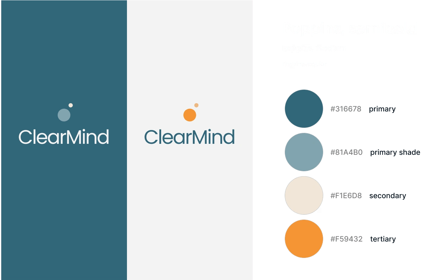
branding
The name ClearMind reflects the app's core goal: moving from mental clutter to clarity. The logo suggests a head with a lighter thought rising outward - a visual metaphor for mental release. The color palette supports focus and emotional regulation, and typography was chosen for warmth and readability above all else.
Moderated usability testing was conducted with five participants: adults with ADHD or general focus difficulties. Sessions evaluated whether ClearMind successfully supported users in clearing mental clutter, prioritizing tasks, recovering when stuck, and feeling encouraged without pressure. Testing also assessed whether the UI felt calming and supportive rather than cognitively overwhelming.
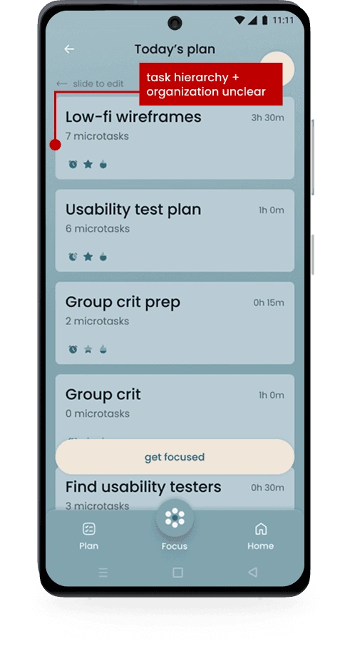
problems: - users were unclear how tasks were being organized - users weren’t sure which task to start with due to limited visual hierarchy solutions: - added an explanatory modal to clarify the system - visually emphasized the top priority task for the day
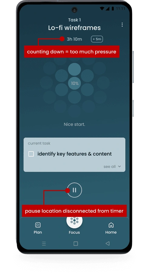
problems: - viewing only the remaining time increased pressure - the pause button felt visually disconnected from the timer solutions: - reframed time as elapsed to promote encouragement - moved the pause control closer to the timer for easier, calmer access
users consistently described the experience as calming, supportive, and confidence-building
“Feeling stuck?” was repeatedly cited as successful in helping users avoid shame spirals and safely re-engage
Task switching felt non-punitive and hopeful, reducing tool abandonment risk
The central design challenge was holding four competing requirements in balance: emotionally sensitive, hyper-focused, subtly interesting, and visually calm. Too much warmth and the app feels precious. Too much restraint and it feels cold. Too much visual interest and it overstimulates the very users it's trying to help. This was a Goldilocks project: everything had to be just right. The biggest expression of that tension was the Brain Dump detail flow. Moving from all task details on one screen to one detail per screen was a risky call - each screen had to be fast, frictionless, and clear. The language had to guide without over-explaining, and the visual design had to feel worth the journey. Focus Mode presented a similar challenge: determining what deserved the user's primary attention at every moment, and making that hierarchy feel intuitive rather than imposed.
Effective ADHD design relies on reducing cognitive load, not adding features. By replacing assumptions with continuous user feedback, prioritizing restraint and clarity in a focused MVP proved to create a more resonant experience than a feature-rich one ever could have.
Next time, I would validate low-fidelity concepts earlier to catch visual hierarchy issues sooner. This project reinforced that hierarchy and tone are critical foundational decisions that require rapid early iteration, not high-fidelity polish.
Future iterations would address time blindness through adaptive time estimation that learns from user behavior over time. Additional features could include micro-celebrations for task completion, body-doubling accountability, progress analytics, and location-based support for coworking.
THANK YOU FOR EXPLORING MY WORK ~

exploring other projects: Island Britt
exploring other projects: Inner Bloom
exploring other projects: adding a feature to Spotify
Like this project
Posted Mar 31, 2026
Designed the ClearMind app to aid ADHD users with task prioritization and emotional regulation.
Likes
0
Views
2
Timeline
Sep 1, 2025 - Dec 31, 2025