Branding Amekop
Jonas Leupe
This project showed how storytelling and design can blur the lines between fiction and reality—building a world you almost wish you could drink your way into.
—
When a popular Belgian television series needed a fictional beer brand for on-screen use, I was asked to design something that felt like it had always existed. The challenge: build a brand identity that could pass as a heritage Belgian beer—rooted in tradition, but with a subtle narrative wink that would resonate with the show’s tone.
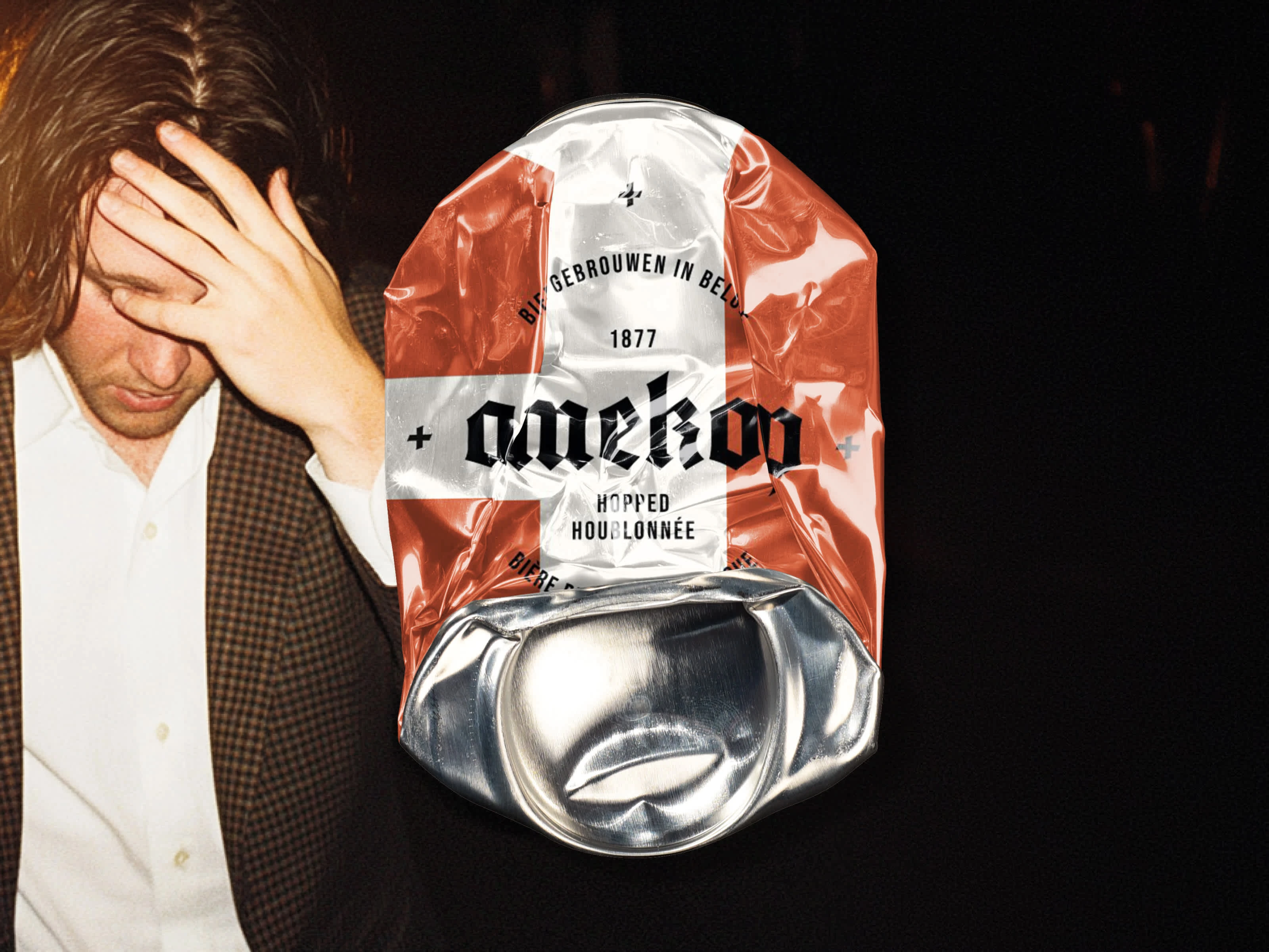
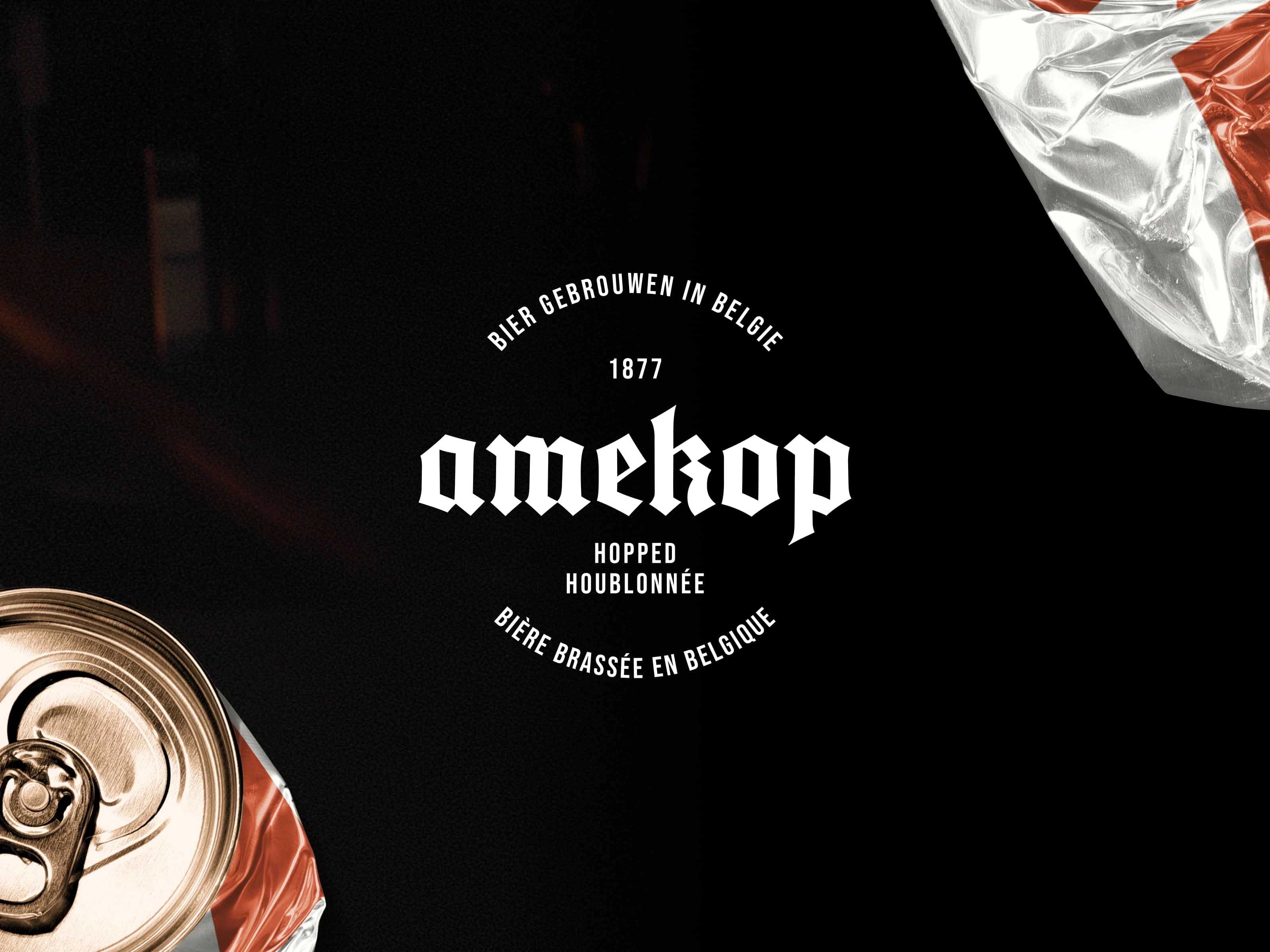
The result was Amekop—a name inspired by local slang and bar culture. I designed everything from the wordmark to the can visuals to evoke a familiar yet entirely invented brewery legacy.
To sell the illusion, I crafted a visual language that combined gothic typography, gritty textures, and deadpan realism. The design needed to survive close-ups on set, hold up under scrutiny, and still feel like something you'd find in a real Belgian bar. The brand was never meant to exist outside the scene—yet it sparked off-screen interest and became a talking point with fans of the show.
Tools used:
Midjourney · Visual Electric · Photoshop · Illustrator
Like this project
Posted Mar 24, 2025
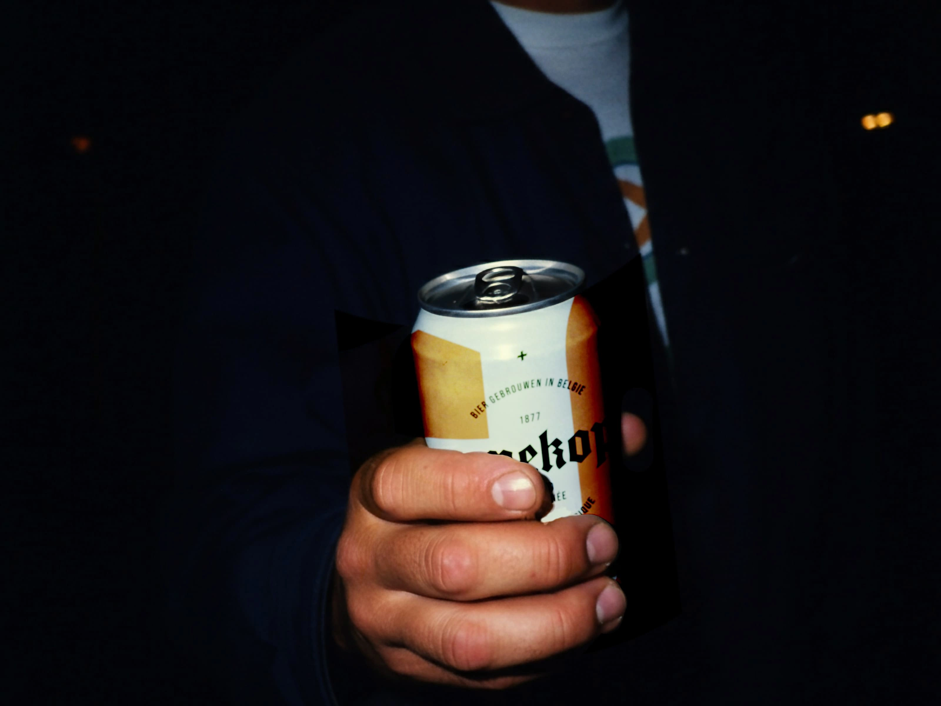
Amekop debuted on the show as a fully realized beer brand, seamlessly fitting into the narrative and environment.
Likes
0
Views
41
Clients
VRT