Branding The Kitchen (Antwerp)
Jonas Leupe
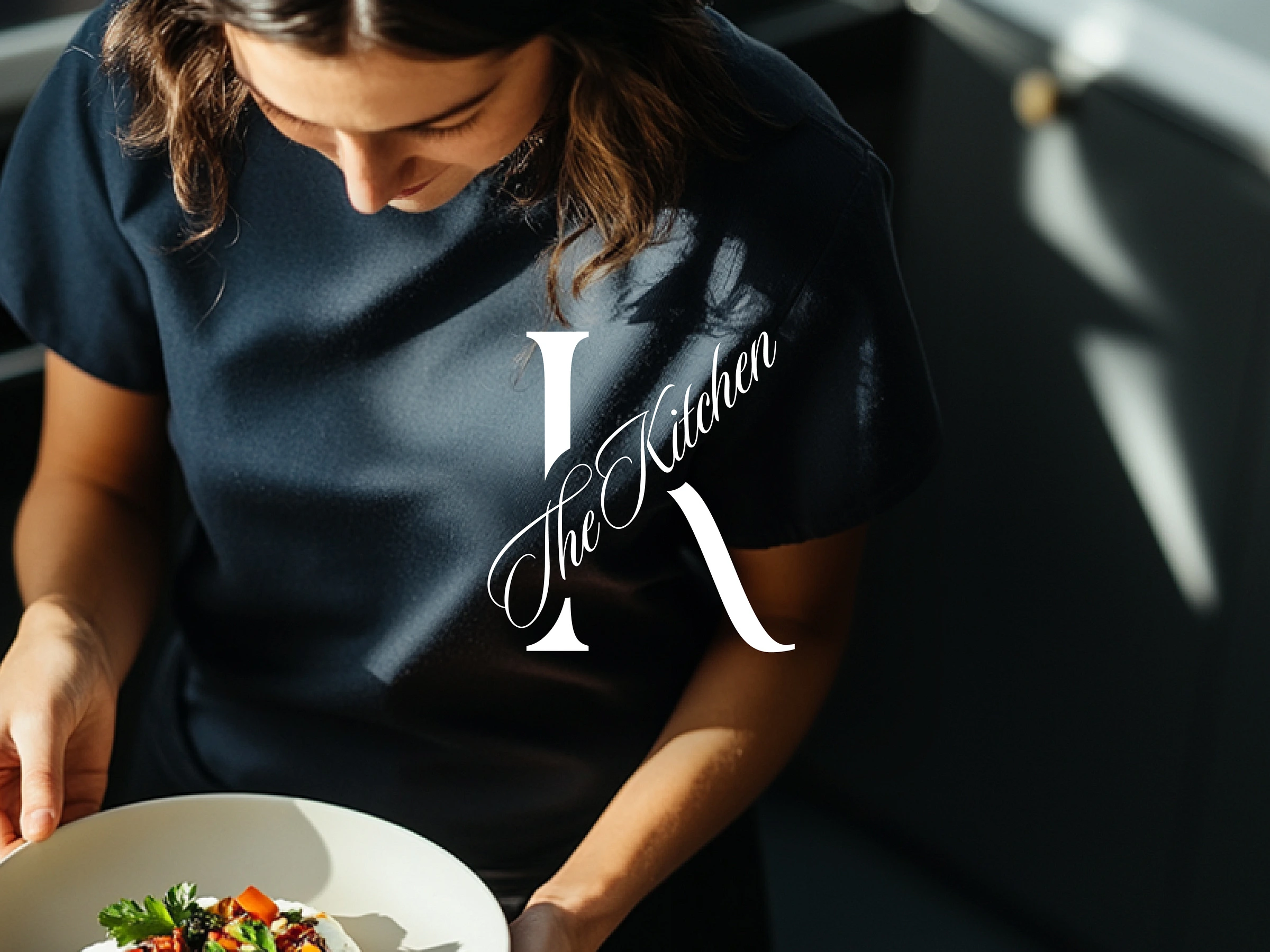
The Kitchen Antwerp started as an idea: intimate catering rooted in local ingredients and quiet elegance. Sarah, the founder and chef, had already built something beautiful in the kitchen—what she needed was a brand that felt as considered as her menus.
She came to me with an early draft of a logo she made in Canva. It had the right instincts, but it didn’t yet carry the refinement or clarity her audience would expect from a premium, personal dining experience.
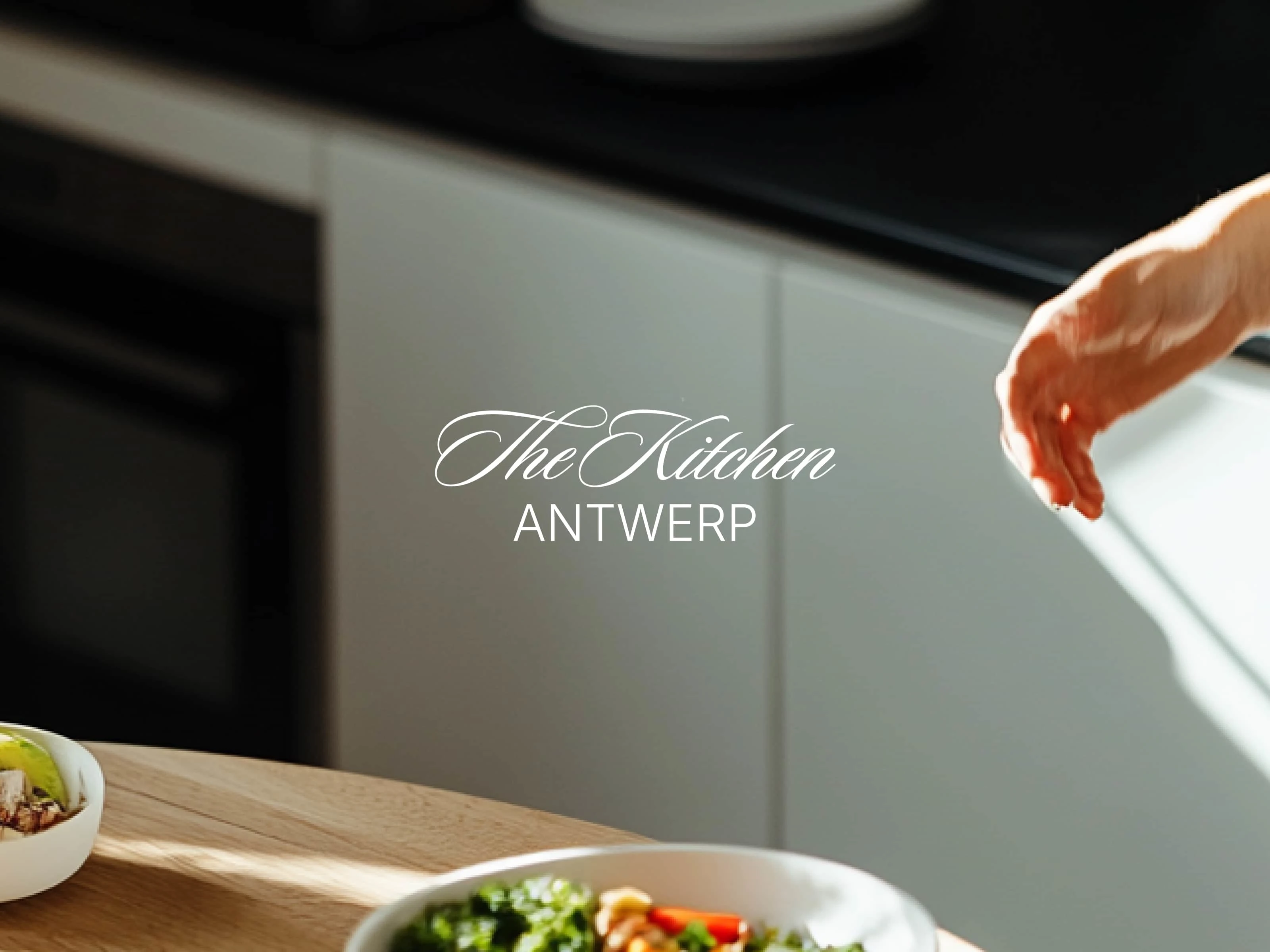
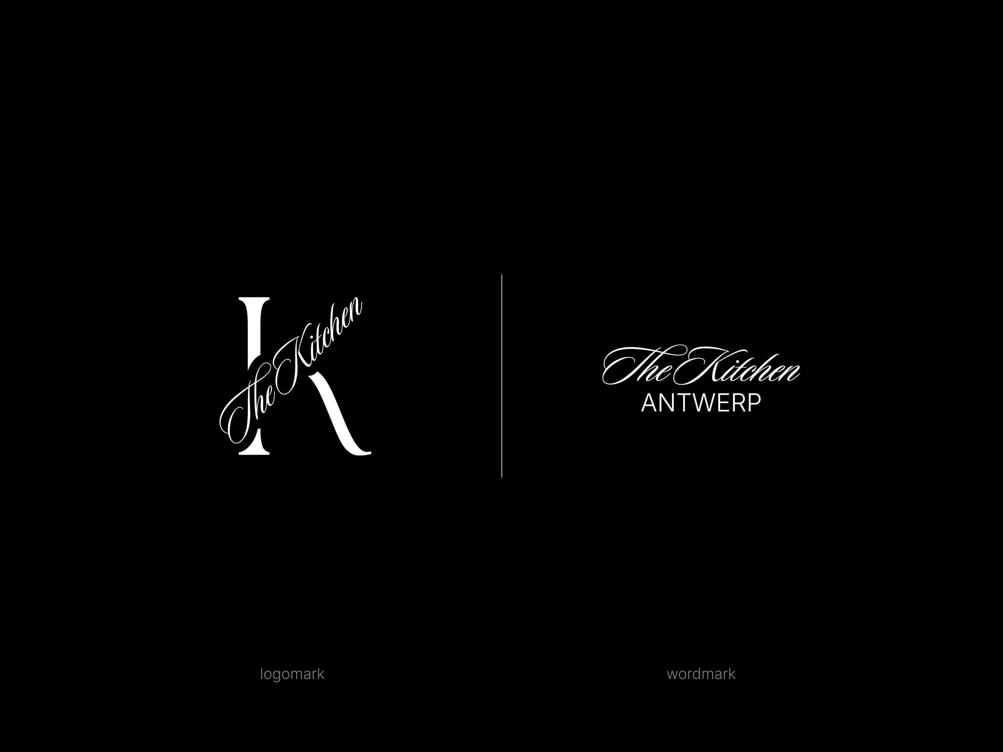
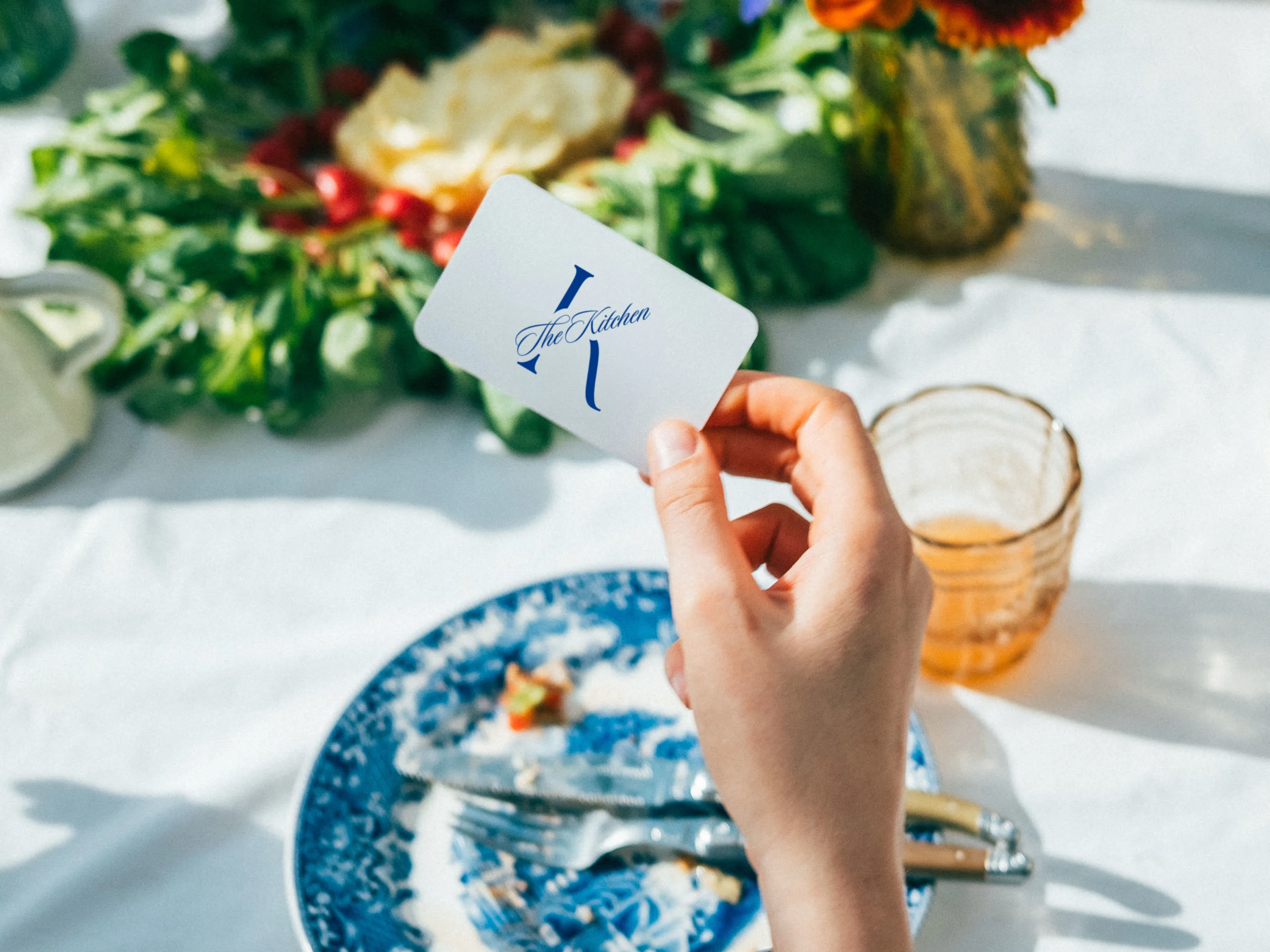
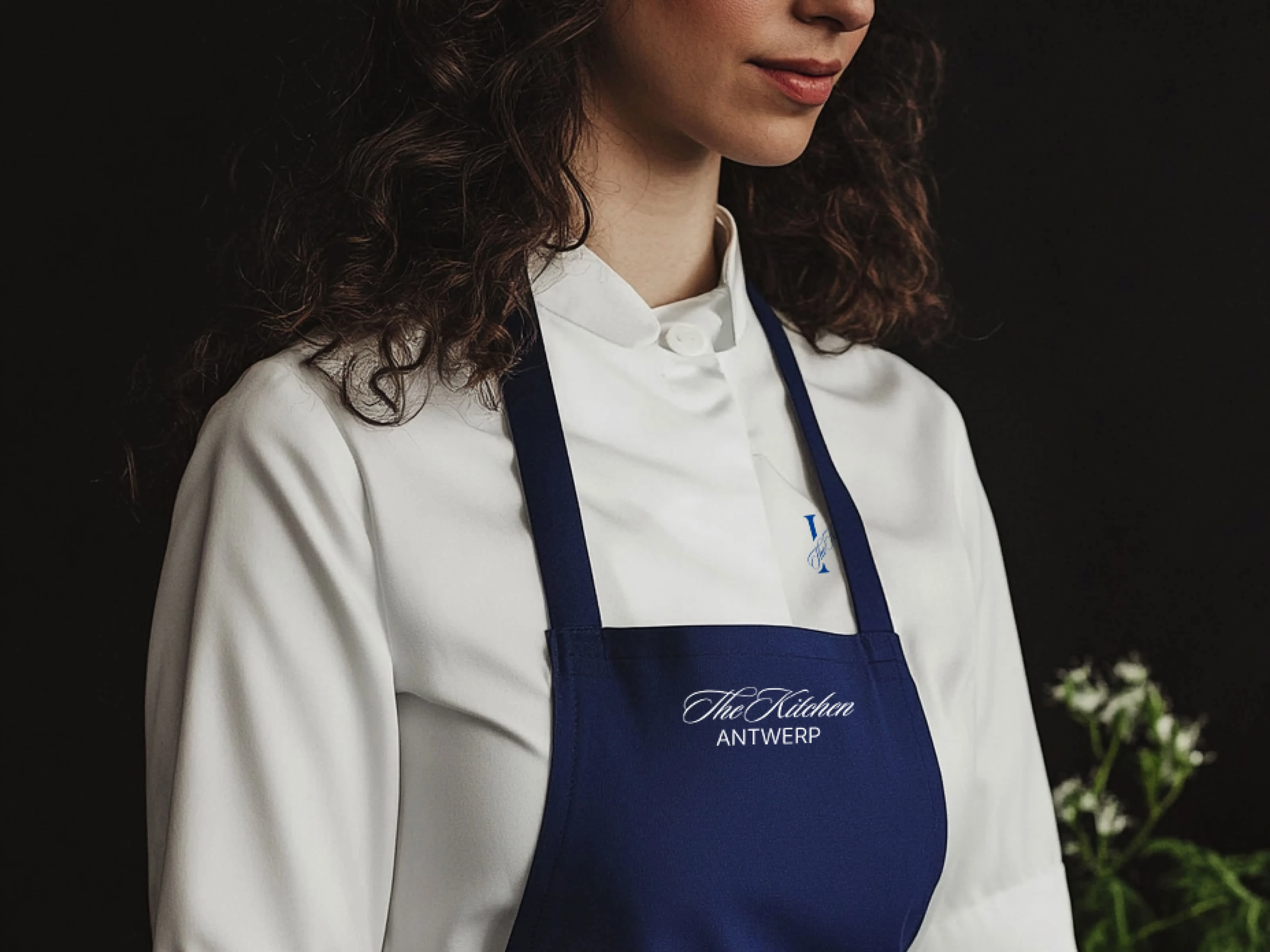
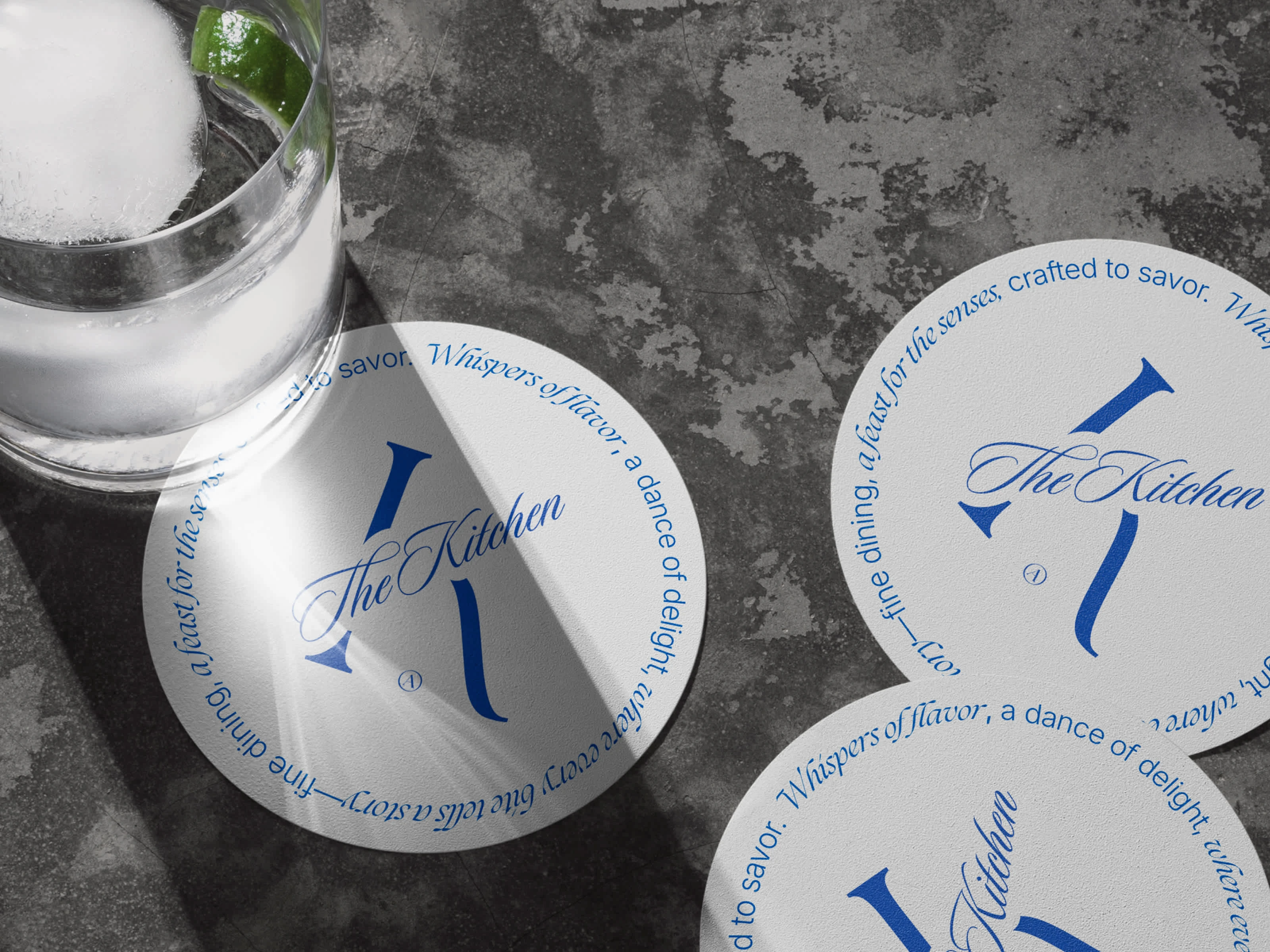
Together, we reimagined the brand from the ground up. I designed a typographic system centered around a custom ‘K’ monogram—both soft and sharp, traditional but fresh. Paired with a romantic wordmark and understated color palette, the brand now evokes exactly what she serves: attention to detail, restraint, and a sense of occasion.
The final result didn’t just look better—it changed how people perceived her. Clients began responding to the aesthetic before even tasting the food. It created trust. It felt intentional. In her words: “It finally feels real.”
Tools used:
Midjourney · Visual Electric · Photoshop · Illustrator
Like this project
Posted Mar 24, 2025
Meet The Kitchen—where creativity meets culinary perfection. 🍽️ Custom catering made with love.
Likes
0
Views
9
Timeline
Feb 3, 2025 - Mar 24, 2025