Rental car
Niloo Fathipour

Increase user engagement on the Europcar website (rental car)
Overview
Europcar is a major French car rental company, offering traditional car rental services and Car-sharing platforms globally.
Problem statement
Significant drop-off rate among international users on the choose vehicle page when using the https://www.europcar.com website.
Have you ever faced a rental car challenge?
I am a student at Unina University, Italy, and participated in the Iceland workshop. For a short trip there, students suggested renting cars from a website. So I got this idea for this case study.
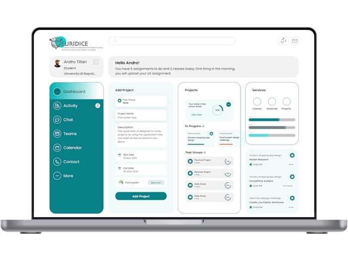
What’s been done?
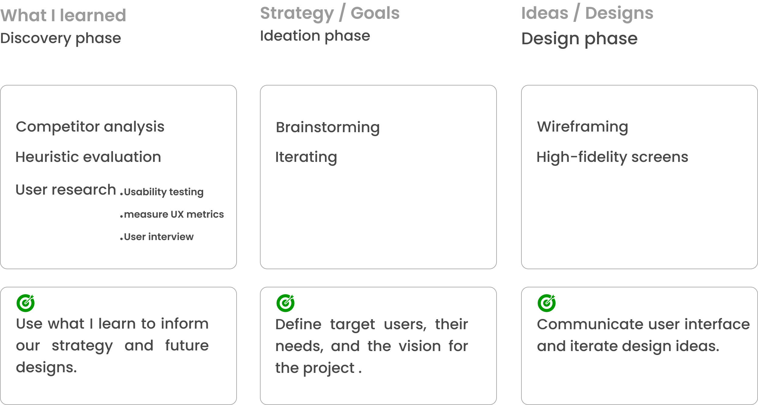
Expected outcome

Metrics for improving

Competitor Analysis
To see what competitors are doing in the rental car service, I had a competitor analysis for the Avis and Dollar companies. It allows me to take an in-depth look at how others solve the same design problems.
The result is summarised as a SWOT profile below.
Strength: wide vehicle selection and airport availability
Weakness: complex pricing structures and hidden fees
Opportunities: offers competitive pricing and focuses on the budget segment.
Threats: high competition from local and app-based rental platforms
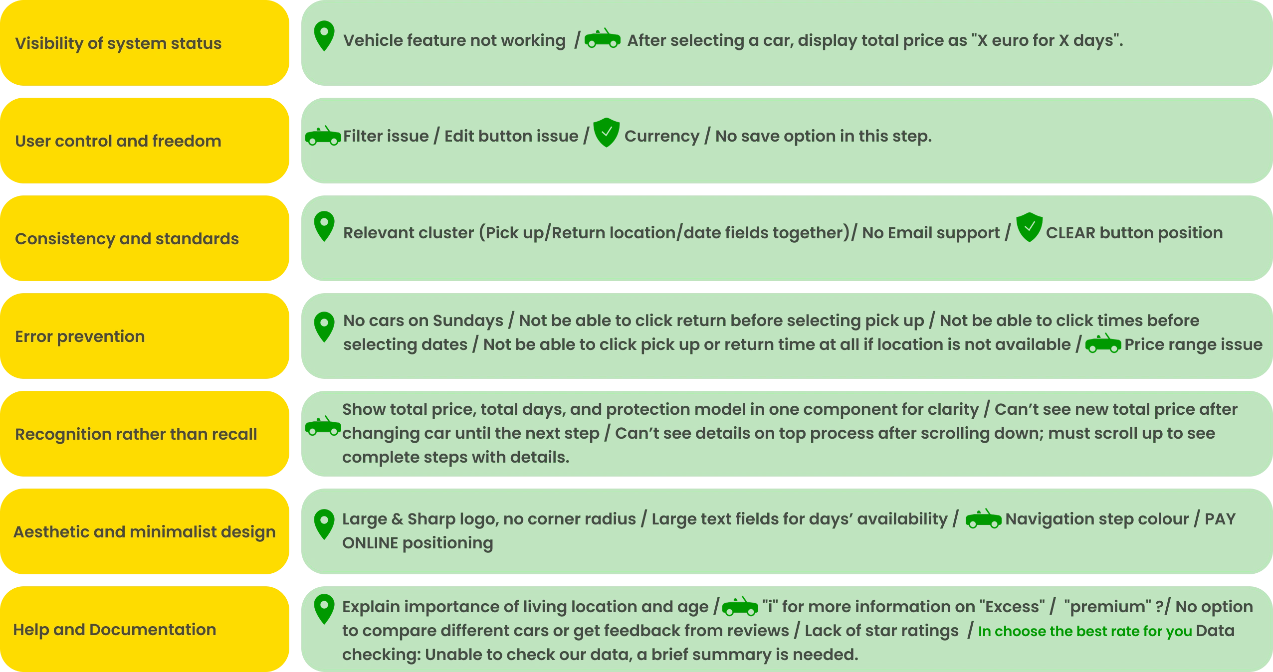
Heuristic Analysis

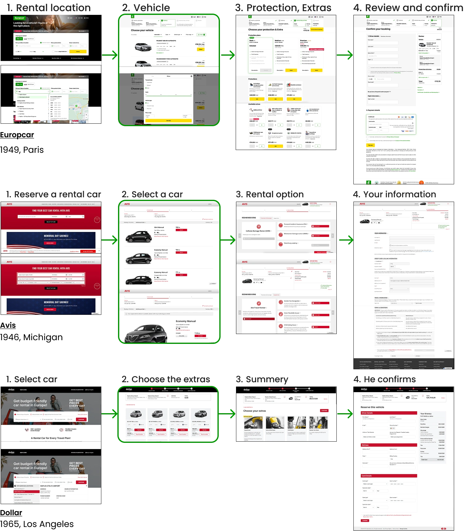
Europcar current flow
Usability Testing
I employed a usability testing method for evaluation, with 10 participants completing one task flow. It quantified user feedback, providing measurable data to improve Europcar’s usability and optimise the overall user experience.
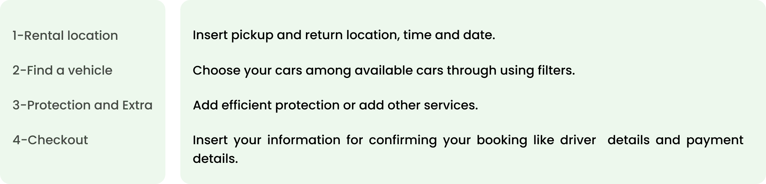
Task Flow for participants
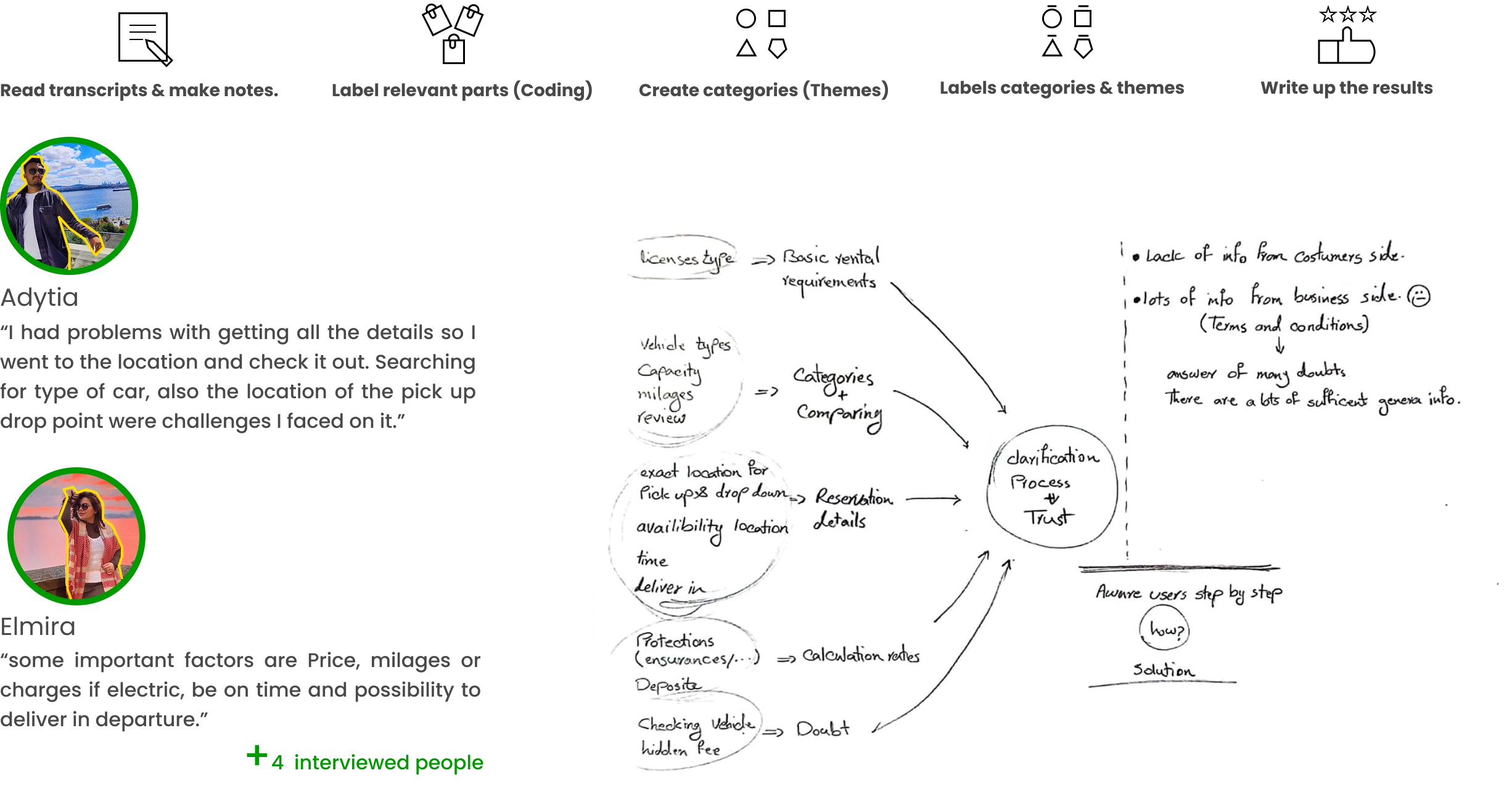
User Interview & Qualitative Analysis
Then, I conducted interviews with 6 people from different nationalities (Indian, Iranian, Italian) who are living in European countries. It was 12 questions in total, and I found over 13 keywords.
Interview questions

Thematic analysis
User Persona
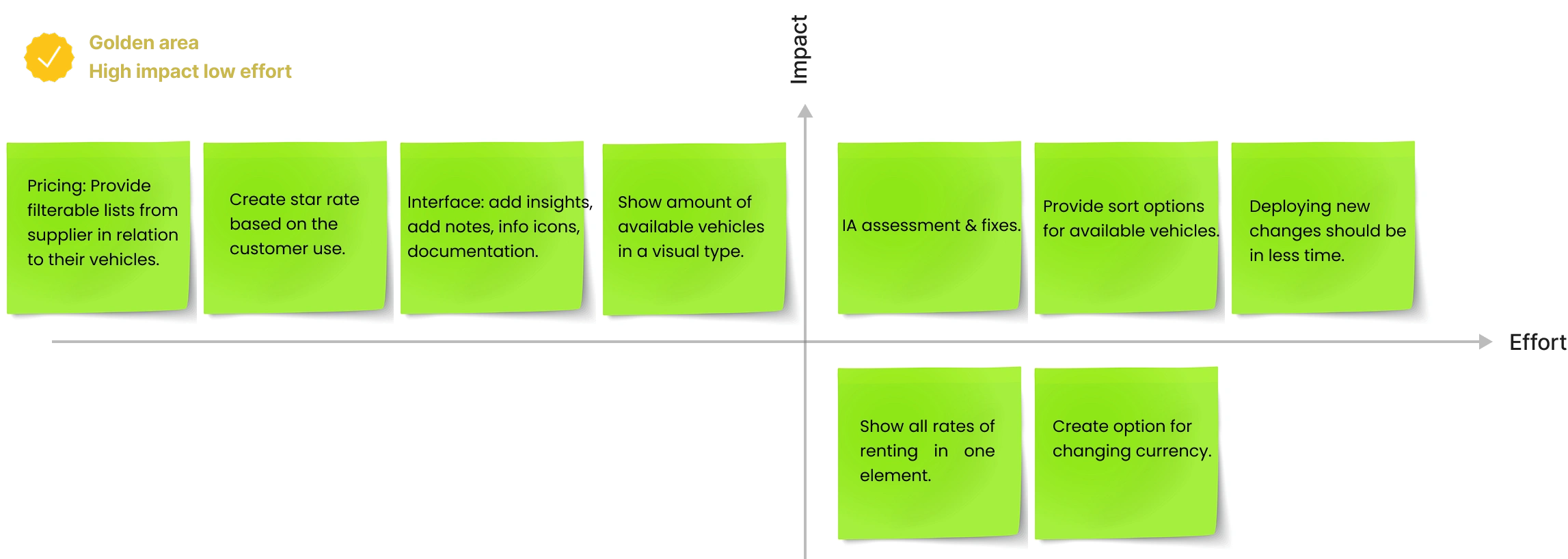
Brainstorm
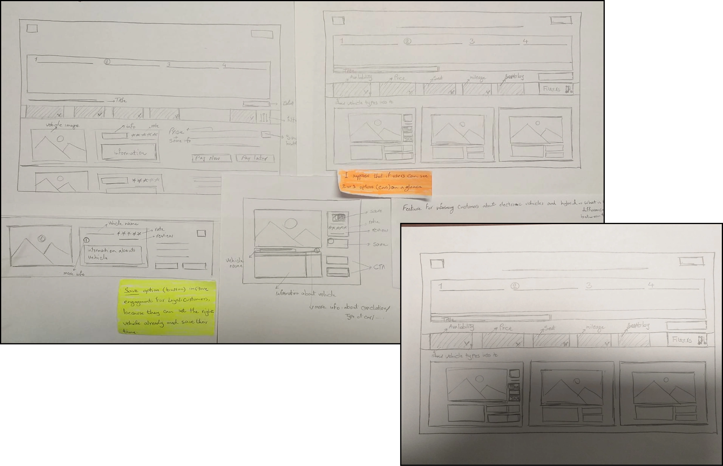
Sketches
Through sketching, I reorganized the homepage, aligned categories based on user mental models, added edit CTA, and prioritized key information on cards in the second step of the user journey to support faster decisions and reduce cognitive load.
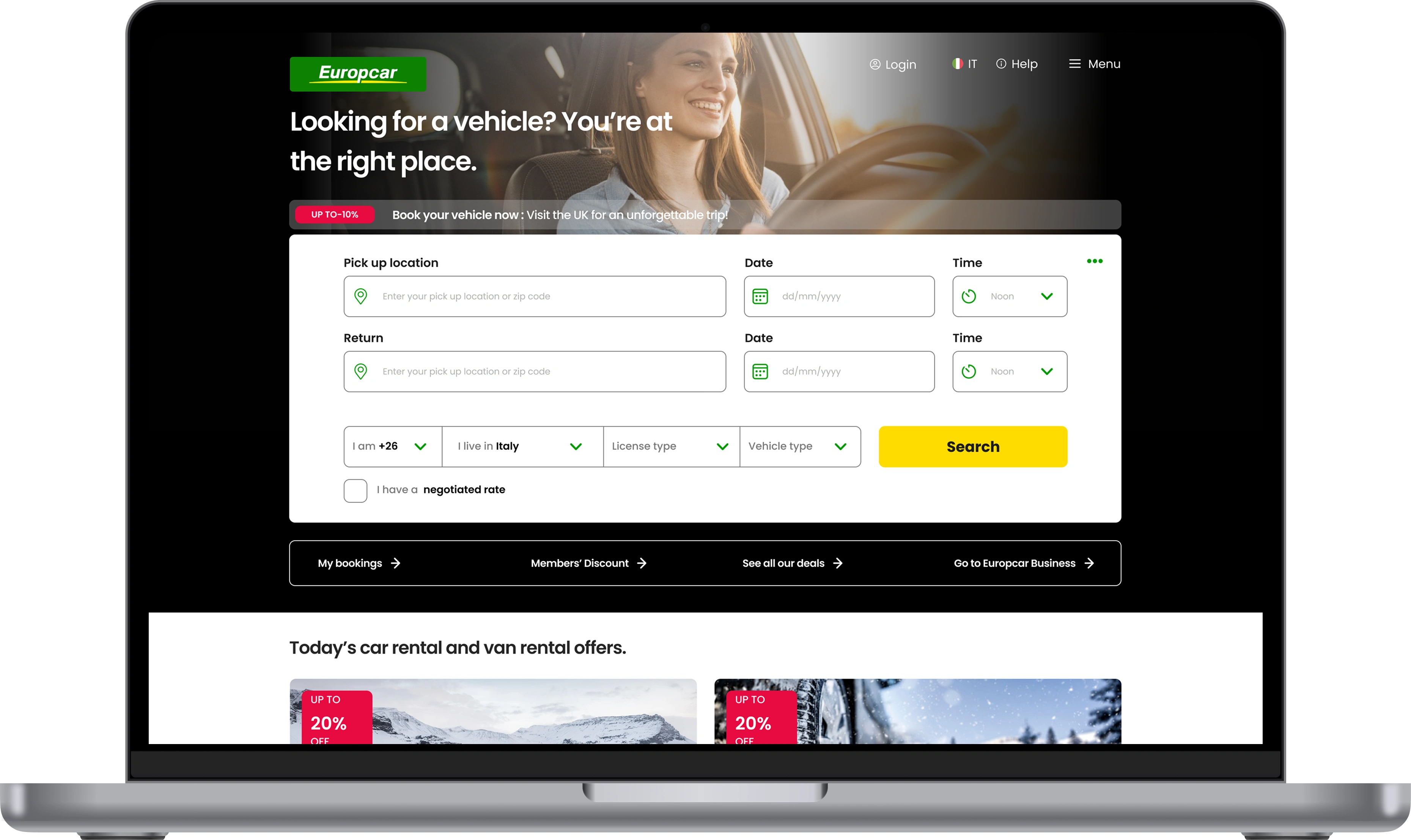
Final design
Like this project
Posted Oct 28, 2025
Increase user engagement on the Europcar website.
Likes
0
Views
21