Skedulo
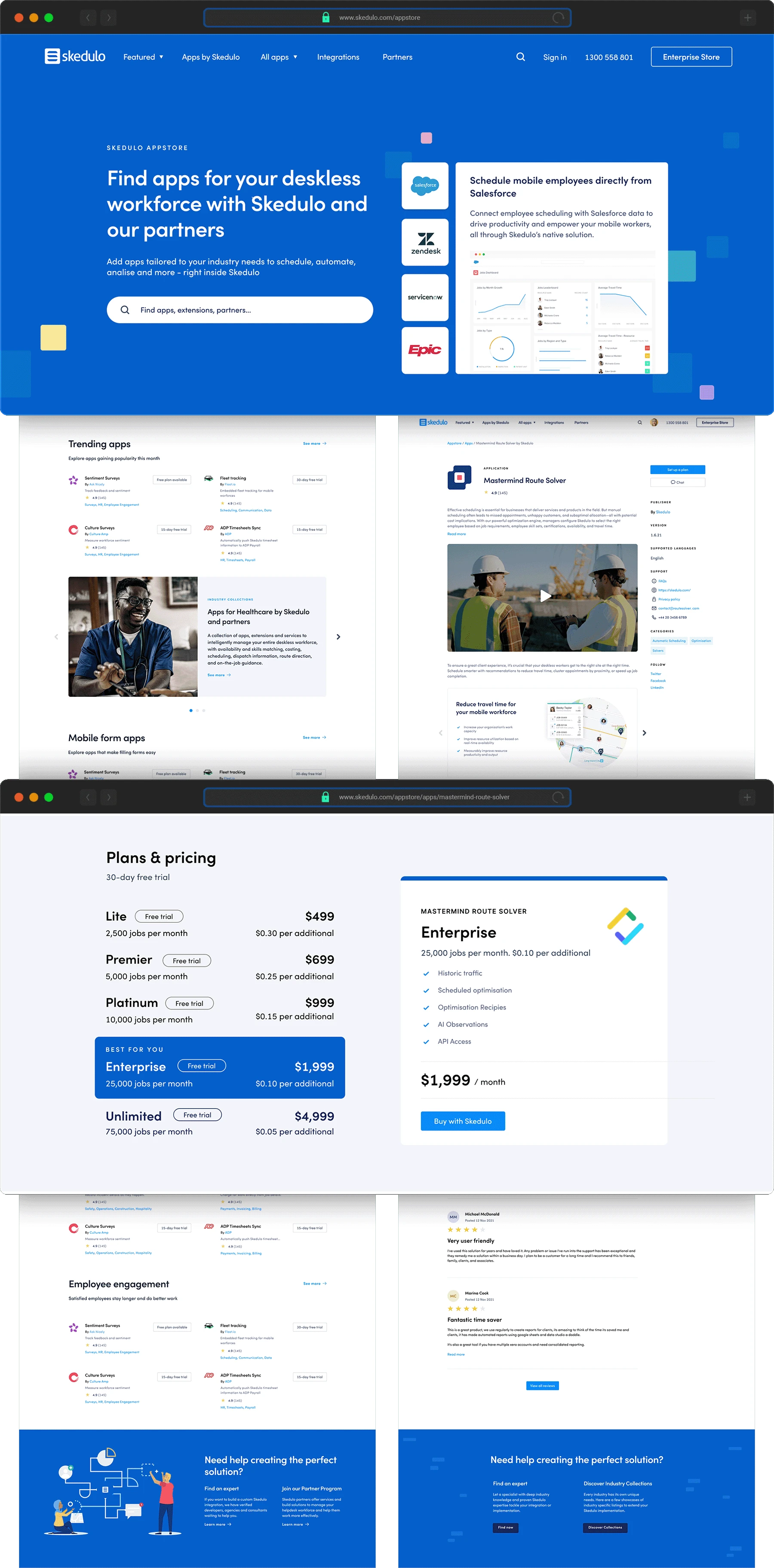
Wireframed, storyboarded, and prototyped a user-friendly app store experience, highlighting the seamless user journey from landing on the homepage to app installation within Skedulo.
Skedulo creates cloud-based software to allow any company in any industry to schedule, manage, engage, and analyse their deskless workforce.
In today’s world, deskless workers outnumber desk-based workers four-to-one. Yet these workers have been overlooked by technology providers and are still largely organised using paper, spreadsheets, and substandard technology.
That’s why they’re building The Deskless Productivity Cloud, the powerful, scalable, and flexible technology platform to help organisations manage their mobile workforces, engage employees, and delight their customers.
Whilst at Skedulo I was asked to design the Skedulo App Store.
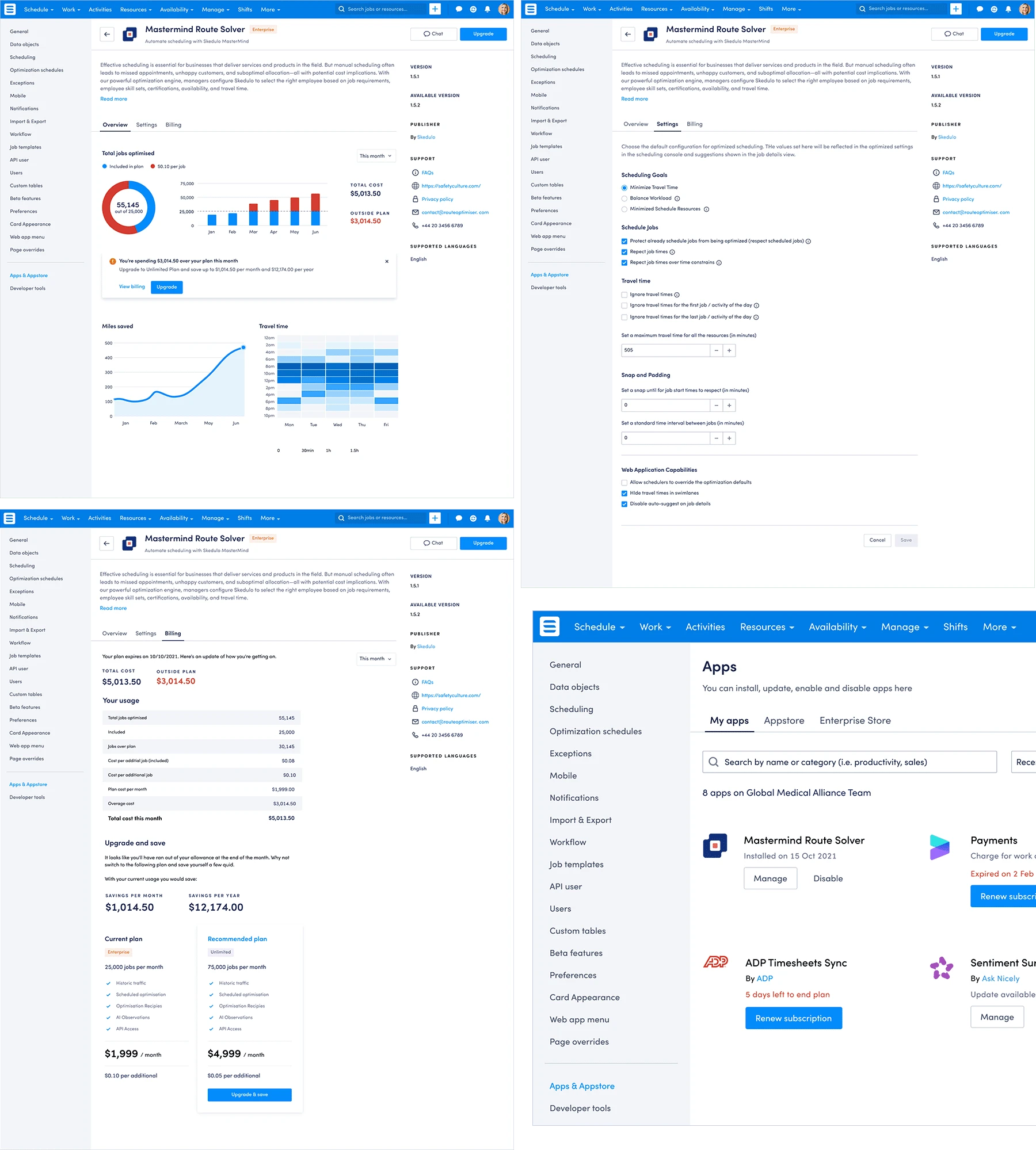
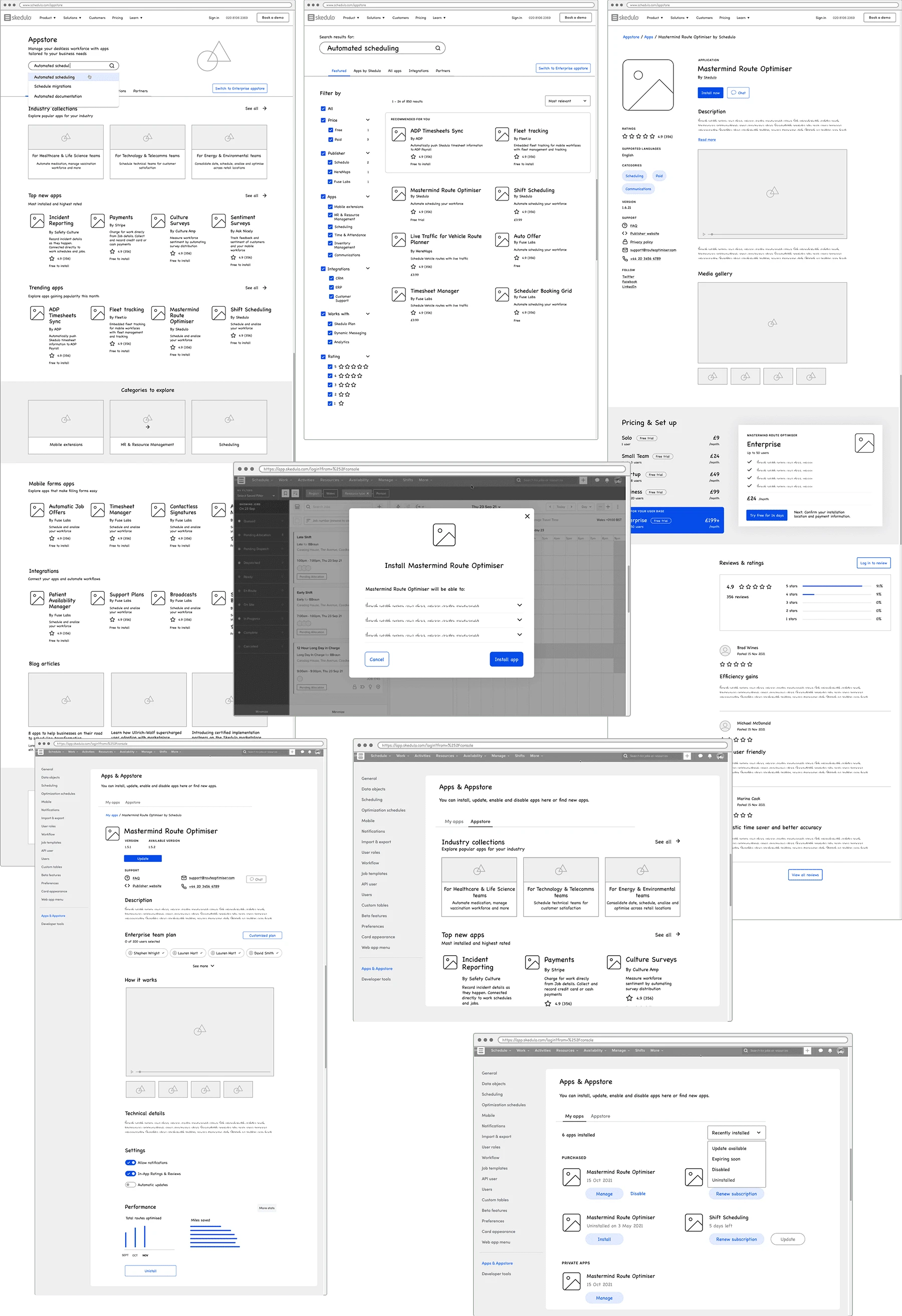
Working closely with the UX Lead and the Director of Product Enablement, I wireframed, storyboarded, designed and prototyped a happy-path user flow on Skedulo’s proposed appstore. The objective of this project was to explore how a specific use case persona would land and browse the appstore homepage, make a search for an app, filter down search results, browse the app detail page, select a plan, install the app and finally be able to access this app within Skedulo. On this second part of the journey within Skedulo’s platform users would be able to modify the app’s settings, see an overview of usage, see other apps already installed under ‘my apps’ and also access the appstore.
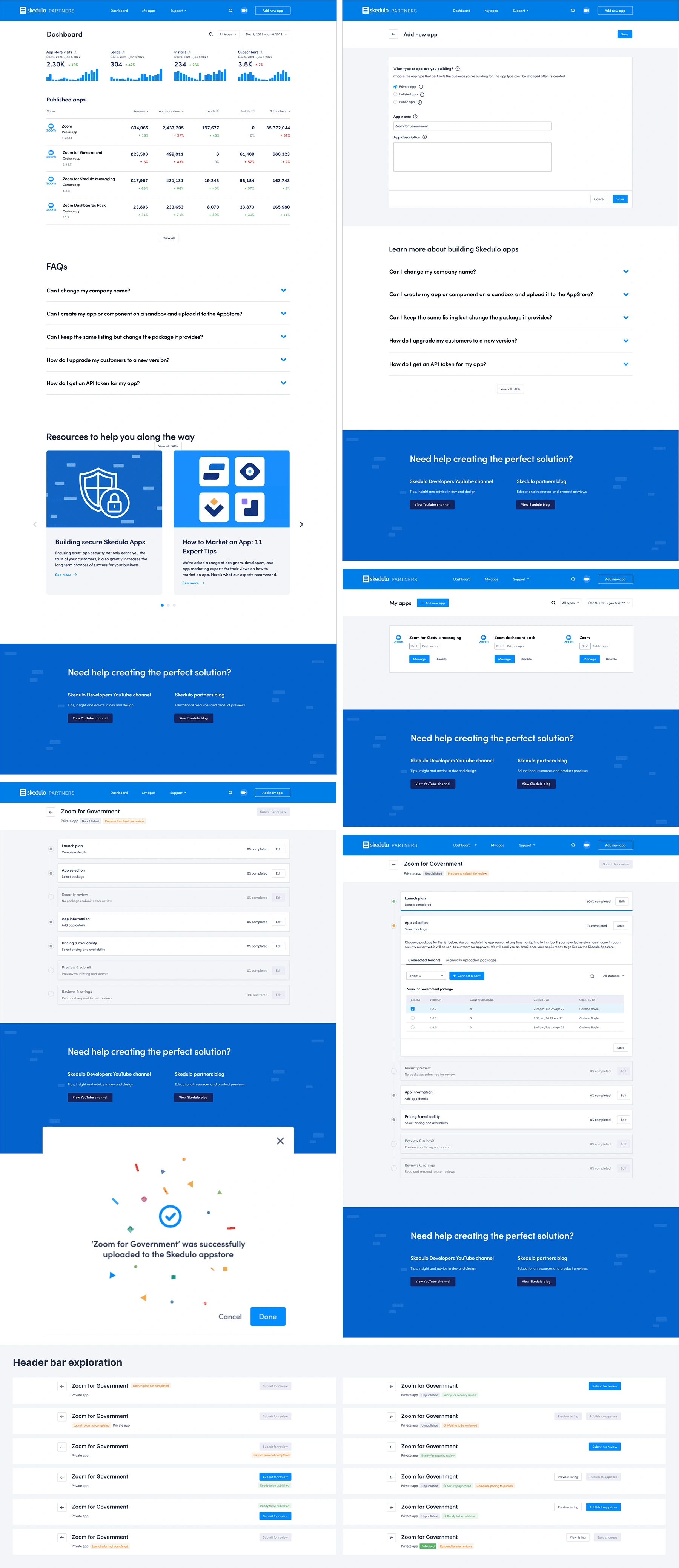
Later on, I was tasked to design the other side of the coin of this journey: how an app creator would go about publishing an app to the Skedulo store. For this journey I iterated a series of wireframes and flows that resulted in a dashboard landing page, ‘My apps’ page template and the ‘add new app’ user flow which included several steps and different statuses. The challenge was to inform the user of their progress and completion rate of each one of those steps, as well as giving the ability to save and come back to each one of those at any point. I iterated a number of different layouts and sign posts until we achieved the desired solution and made look simple a fairly complicated process.
Skedulo App Store
Skedulo Dashboard
Skedulo App - App store journeys
Wireframes

Like this project
Posted Apr 10, 2024
Wireframed, storyboarded, and prototyped a user-friendly app store experience, highlighting the user journey from landing on the homepage to app installation.
Likes
0
Views
5

