Brand Identity and Guidelines for Haven

Bhumanyu Kamboj


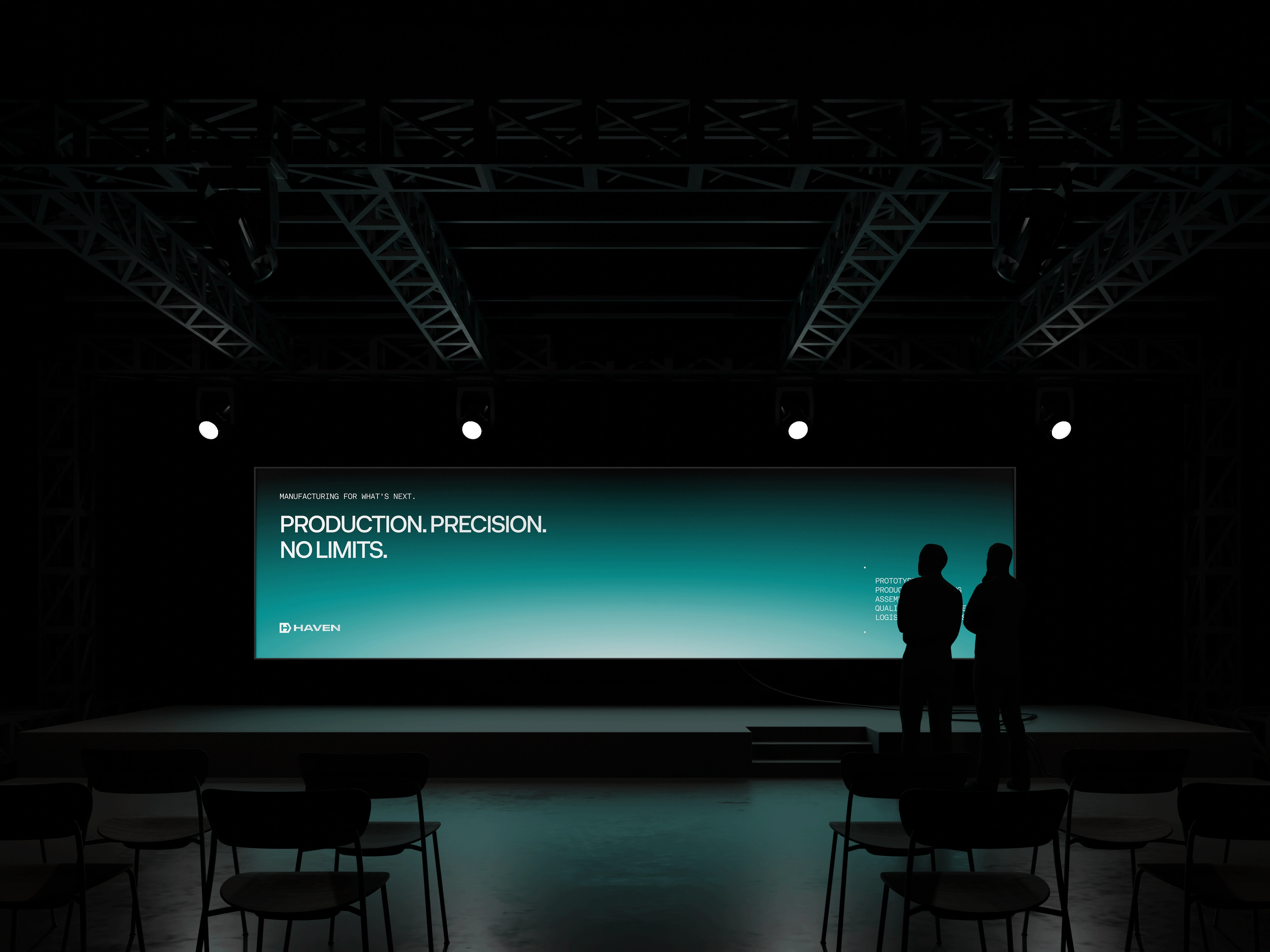
Brand Identity and Guidelines for a Global Manufacturing Partner
Overview
Haven is a Los Angeles-based outsourced manufacturing company with operations across North America, Asia, and Europe. Built by manufacturing engineers, Haven serves innovators in housing, automotive, robotics, and heavy industry with end-to-end production support, from rapid prototyping and sourcing to quality compliance and logistics. The project involved building a complete brand identity and guidelines system that communicates Haven's core strengths: precision, speed, and trust.
Problem
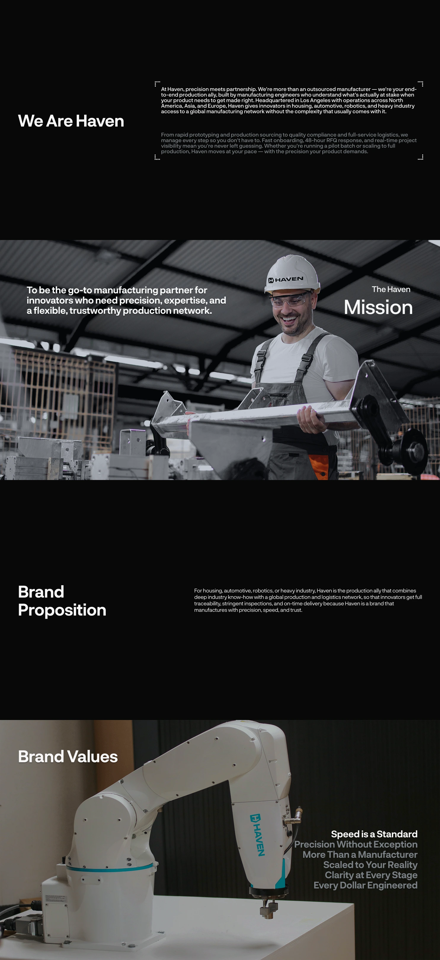
The manufacturing industry is crowded with generic, interchangeable brand identities that fail to communicate genuine expertise or build confidence with high-stakes clients. Haven needed a distinct visual identity that positioned it not just as a vendor but as a production ally, one that speaks the language of engineers while remaining approachable and forward-facing.
Challenge
How might we build a brand identity for Haven that reflects its engineering-first culture, communicates precision and reliability at every touchpoint, and differentiates it clearly within a competitive global manufacturing landscape?
Design Approach
Brand Strategy First
Haven's brand values, speed, precision, partnership, scalability, clarity, and cost efficiency, were defined upfront to ensure every design decision was rooted in strategic intent rather than aesthetic preference.
Visual Language Rooted in Manufacturing
Typography, colour, iconography, and pattern systems were all drawn from industrial references, including technical schematics, engineering blueprints, and raw material textures, to give the brand authentic authority.
Systematic Thinking
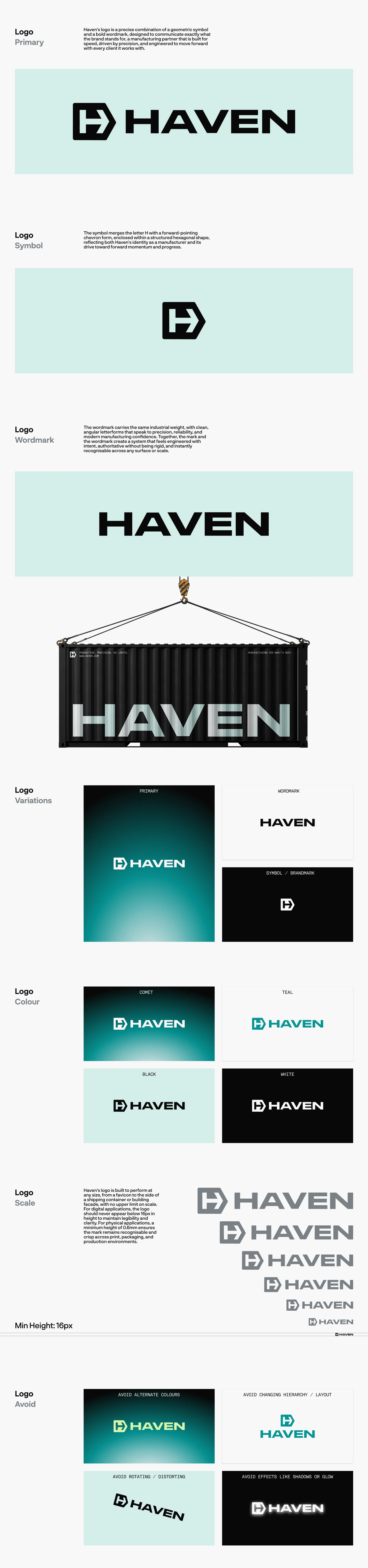
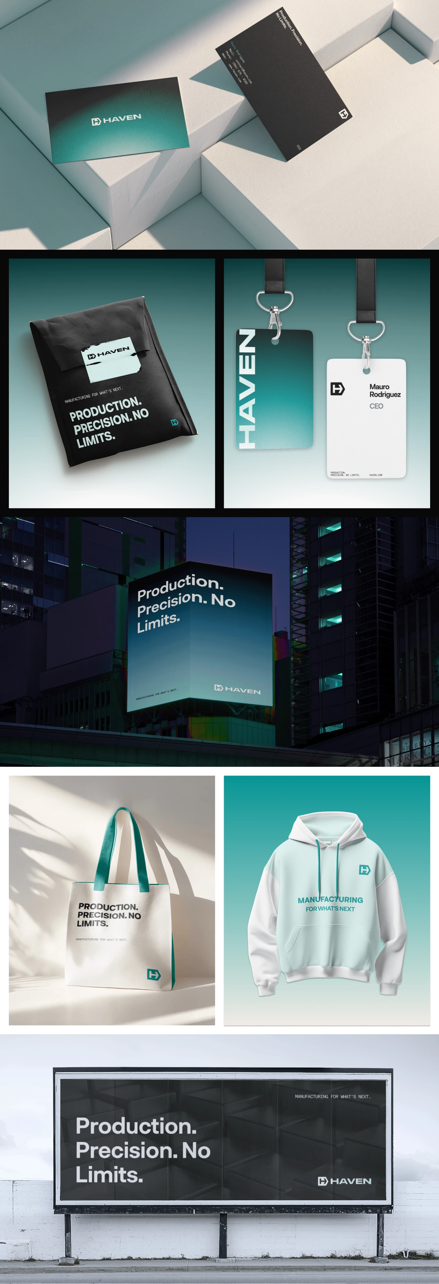
The identity was designed to perform across every surface and scale, from a 16px digital favicon to the side of a shipping container, ensuring consistency whether Haven appears on a pitch deck, a product label, or a warehouse facade.
Testing Across Contexts
Every element of the brand system was validated across dark, mid, and light applications to ensure flexibility without losing brand recognition or consistency.
Solution
Logo System
A geometric symbol merging the letter H with a forward-pointing chevron inside a structured hexagonal form was developed alongside a bold industrial wordmark. Together, they communicate precision, forward momentum, and manufacturing authority.
Typography System
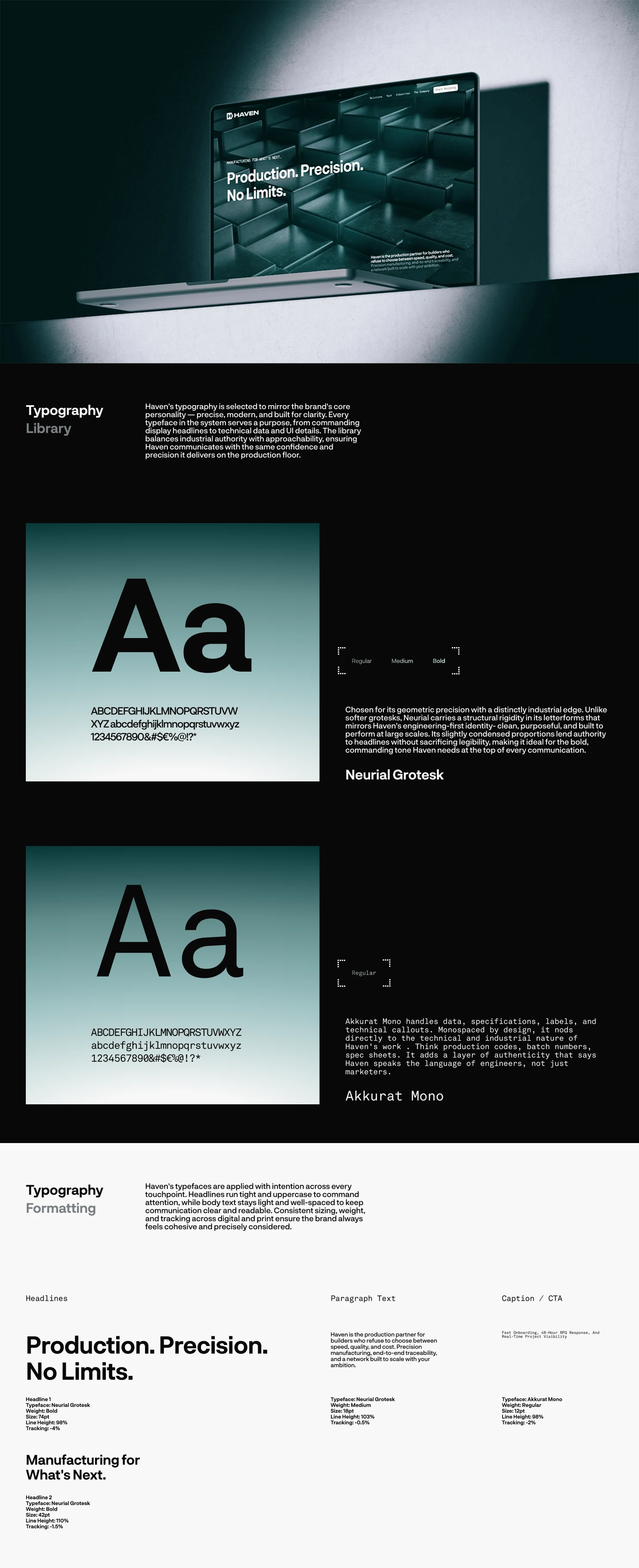
Neurial Grotesk was selected for headlines, with its structural rigidity and condensed proportions lending authority at scale. Akkurat Mono handles technical callouts, data, and specifications, reinforcing Haven's positioning as a brand that speaks the language of engineers.
Colour Palette
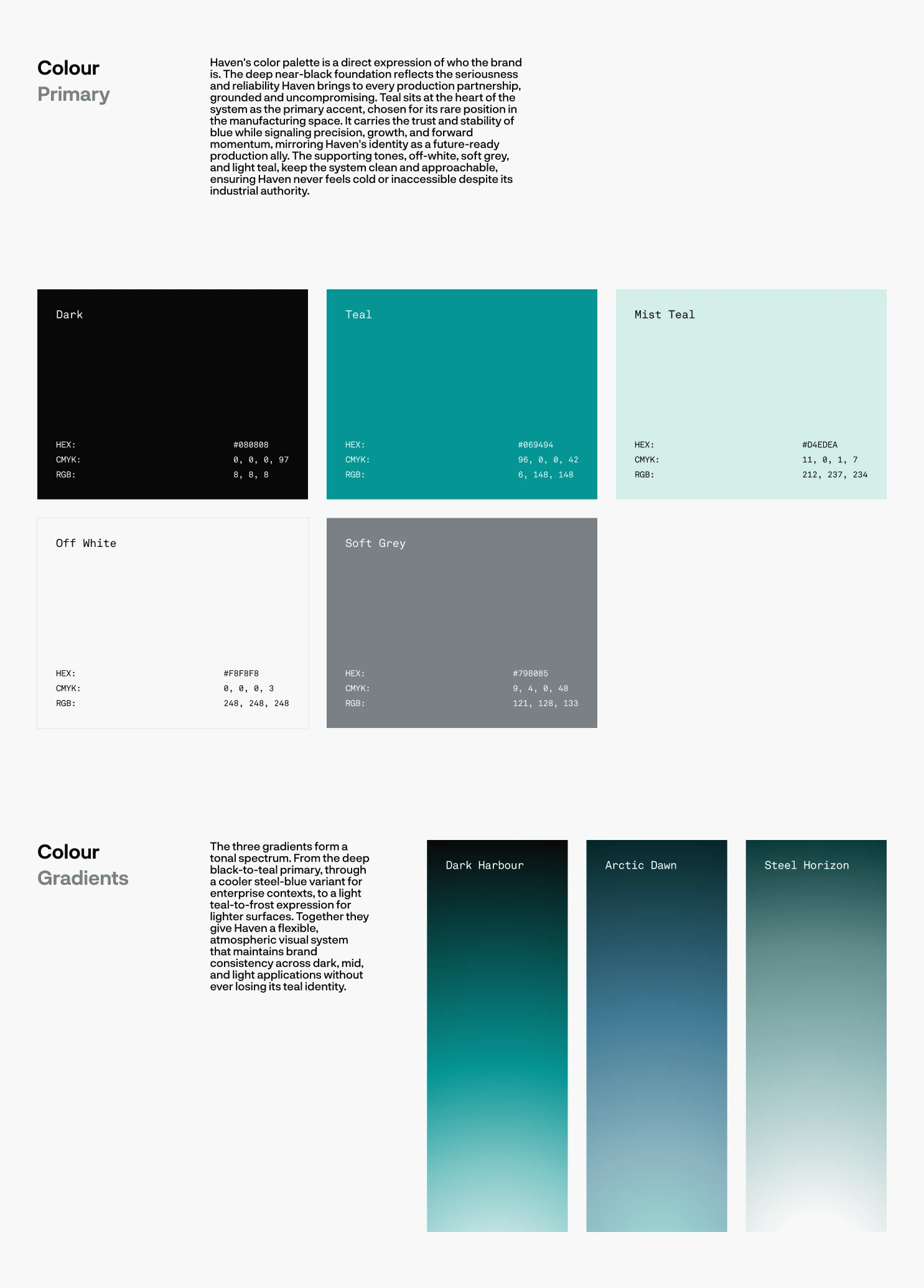
A deep near-black foundation paired with Comet Teal as the primary accent creates a palette that is both industrial and forward-facing. Supporting tones, including off-white, soft grey, and light teal, keep the system approachable without compromising authority.
Brand Guidelines
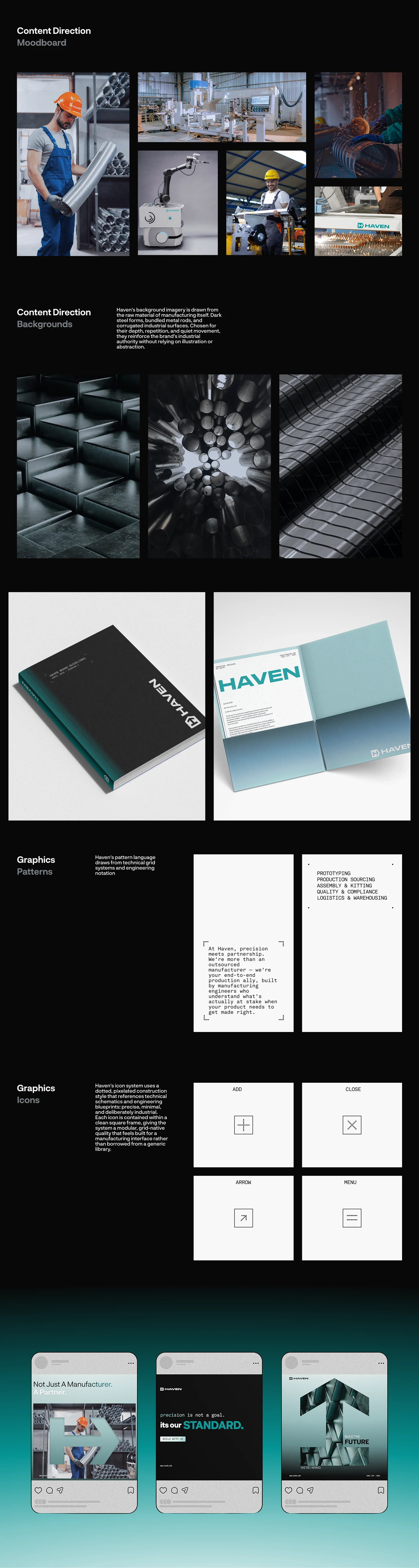
A comprehensive set of guidelines covering logo usage, colour application, typography formatting, gradient system, background imagery direction, iconography style, and pattern language ensures consistent and precise brand execution across all touchpoints.
Like this project
Posted Jun 8, 2026
Branding case study- brand strategy, visual identity design, typography system, colour palette, and brand guidelines built for precision, trust, and scale.
Likes
0
Views
14
Timeline
Apr 27, 2026 - May 1, 2026