Onward Logistics Logo & Brand Identity Design
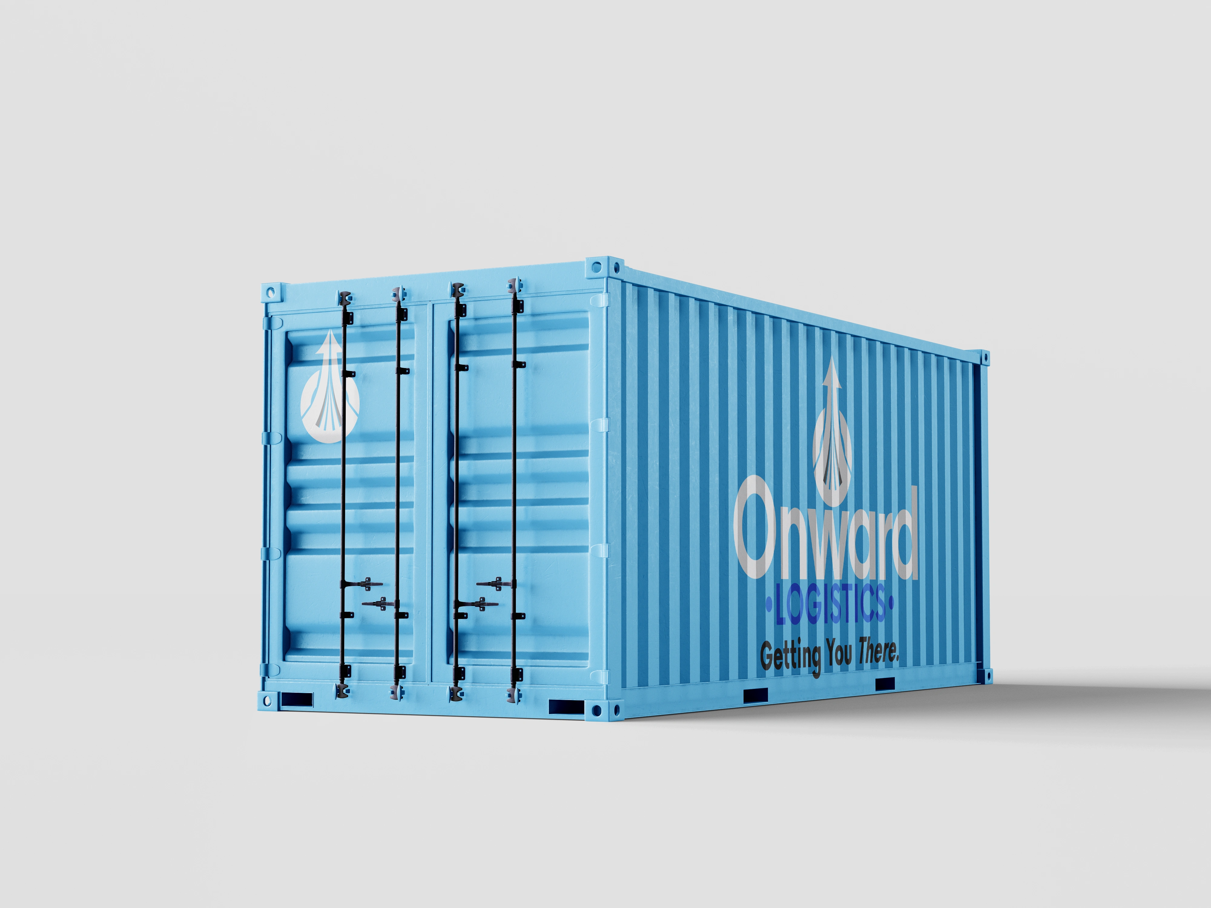
Onward Logistics operates as a worldwide container shipping enterprise, providing advanced logistical and analytical data services alongside dependable shipping containers. I developed their distinguishing corporate identity that reflects their comprehensive network that spans over 100 countries, establishing a swift and trustworthy presence across the primary global trade routes.
Onward is committed to delivering efficiency and assurance in an ever-evolving business landscape. Leveraging their vast global network and consequential equipment commodities, they support their clients' prompt necessities and contribute to sustaining the seamless flow of multinational commerce.

Logomark
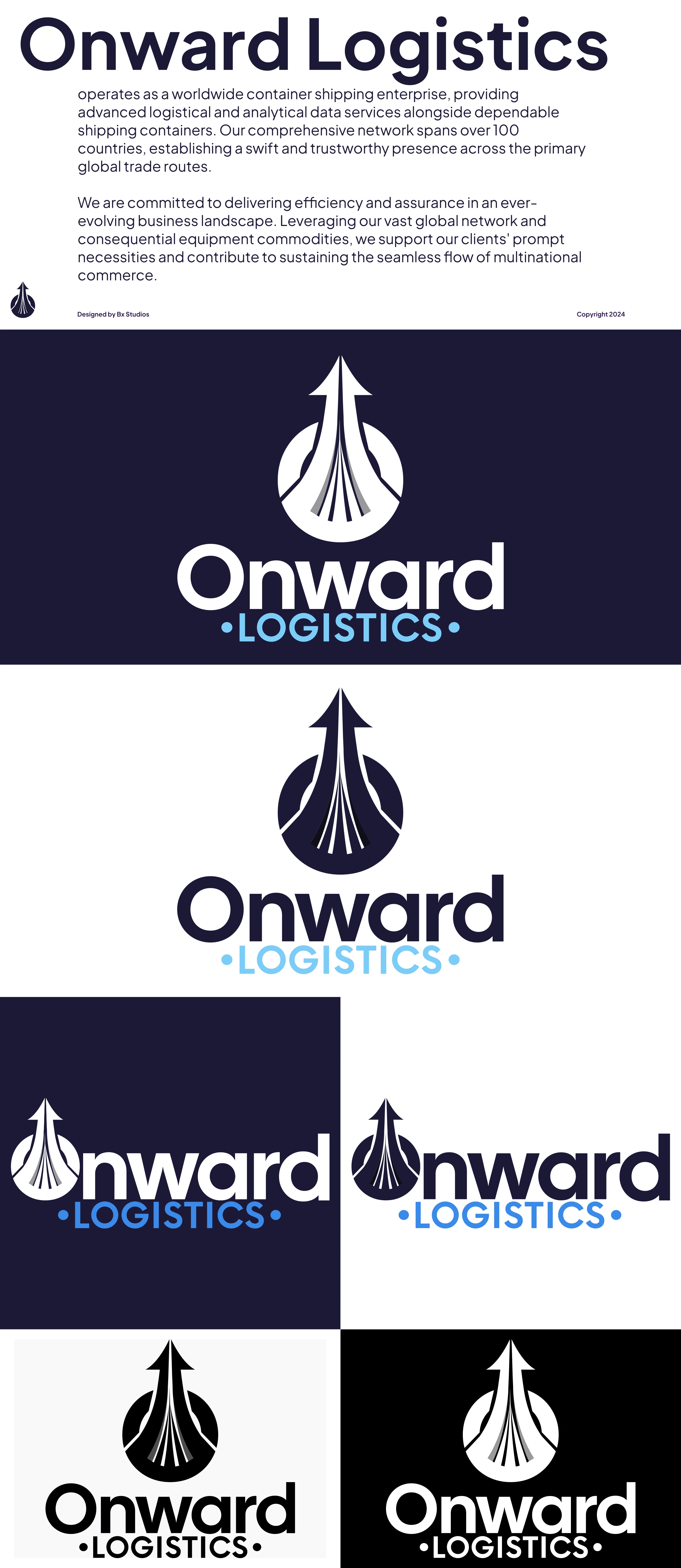
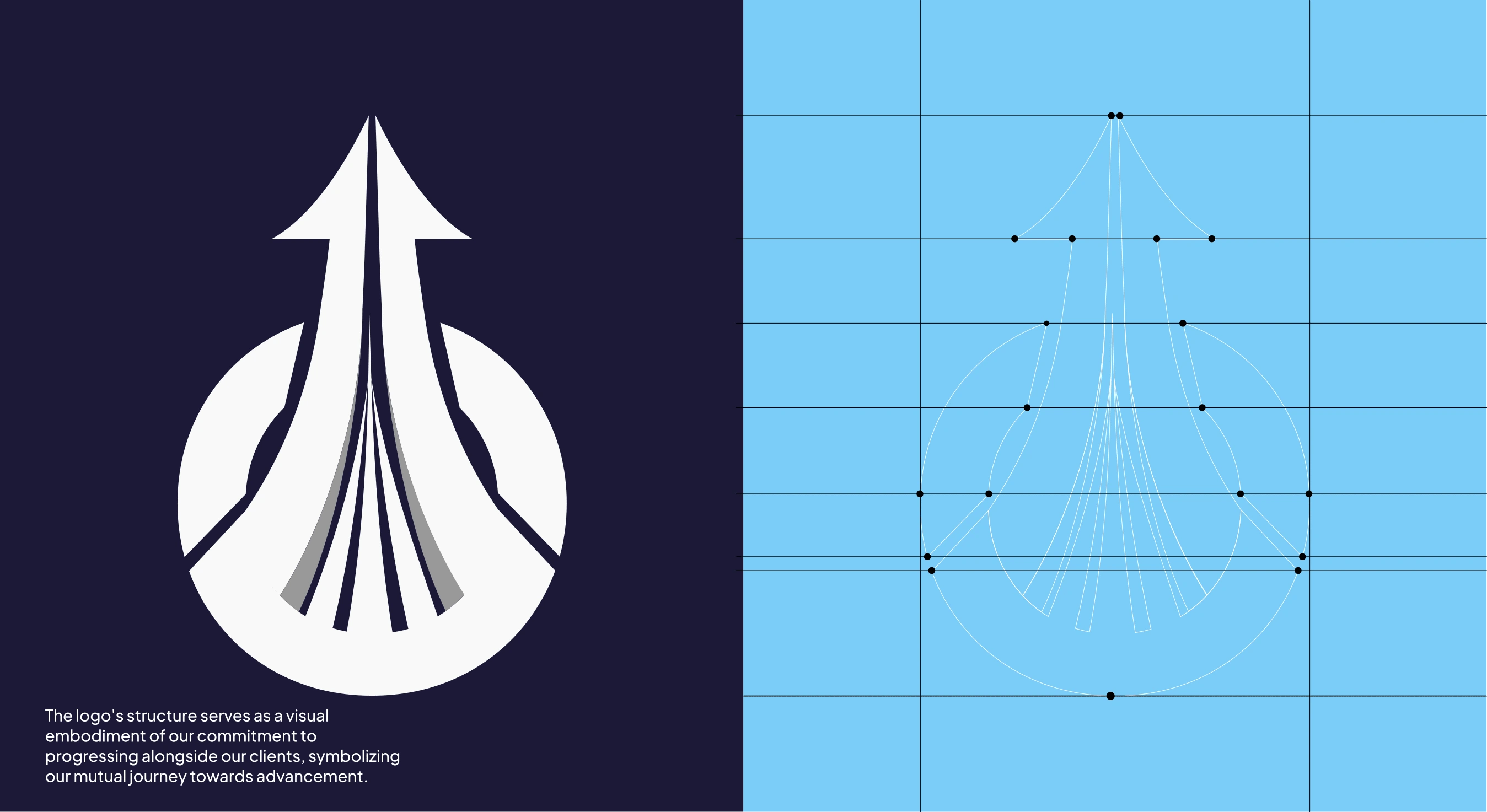
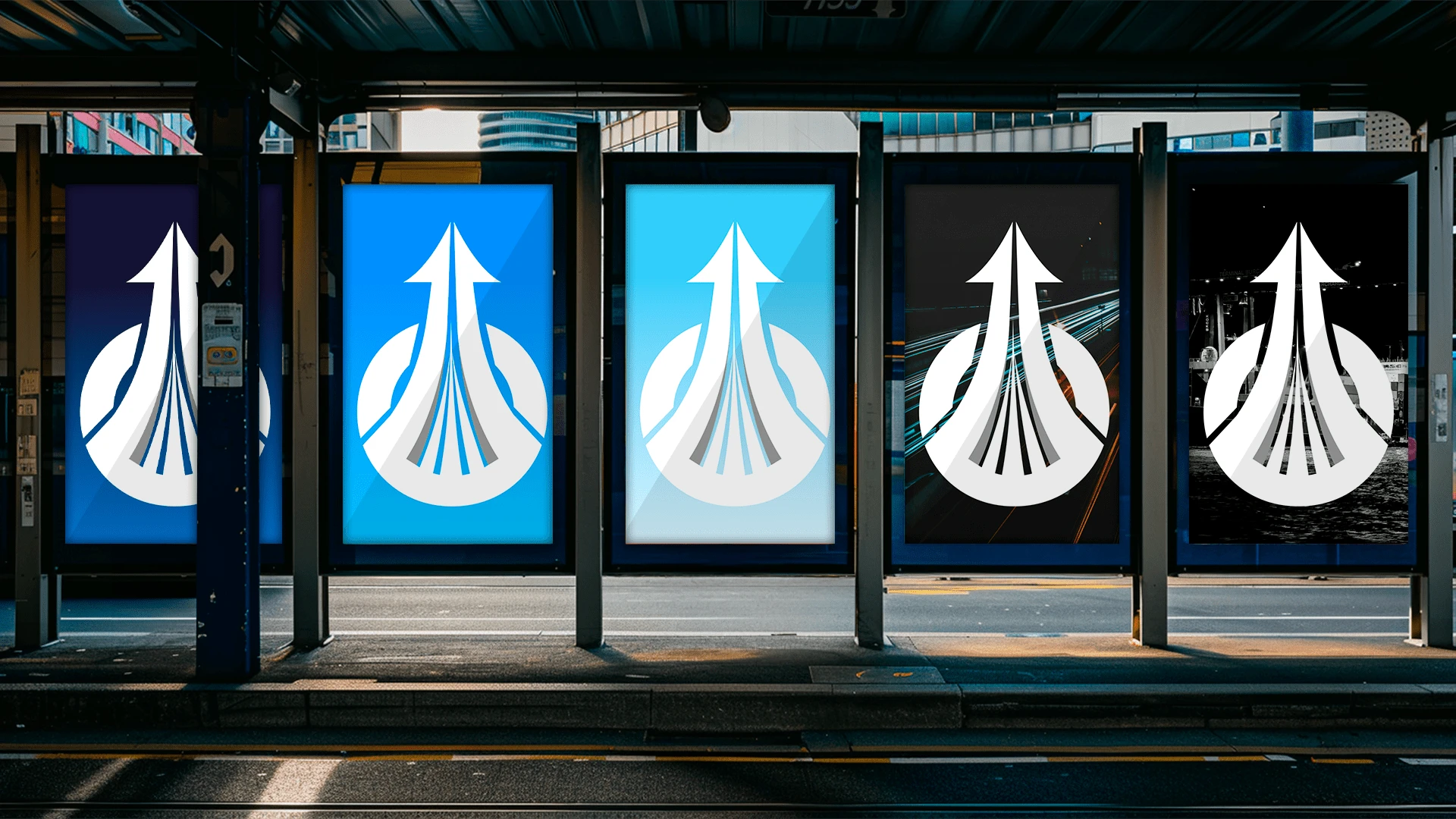
The logo's structure serves as a visual embodiment of Onwards' commitment to progressing alongside their clients, symbolizing their mutual journey toward advancement.
Typeface
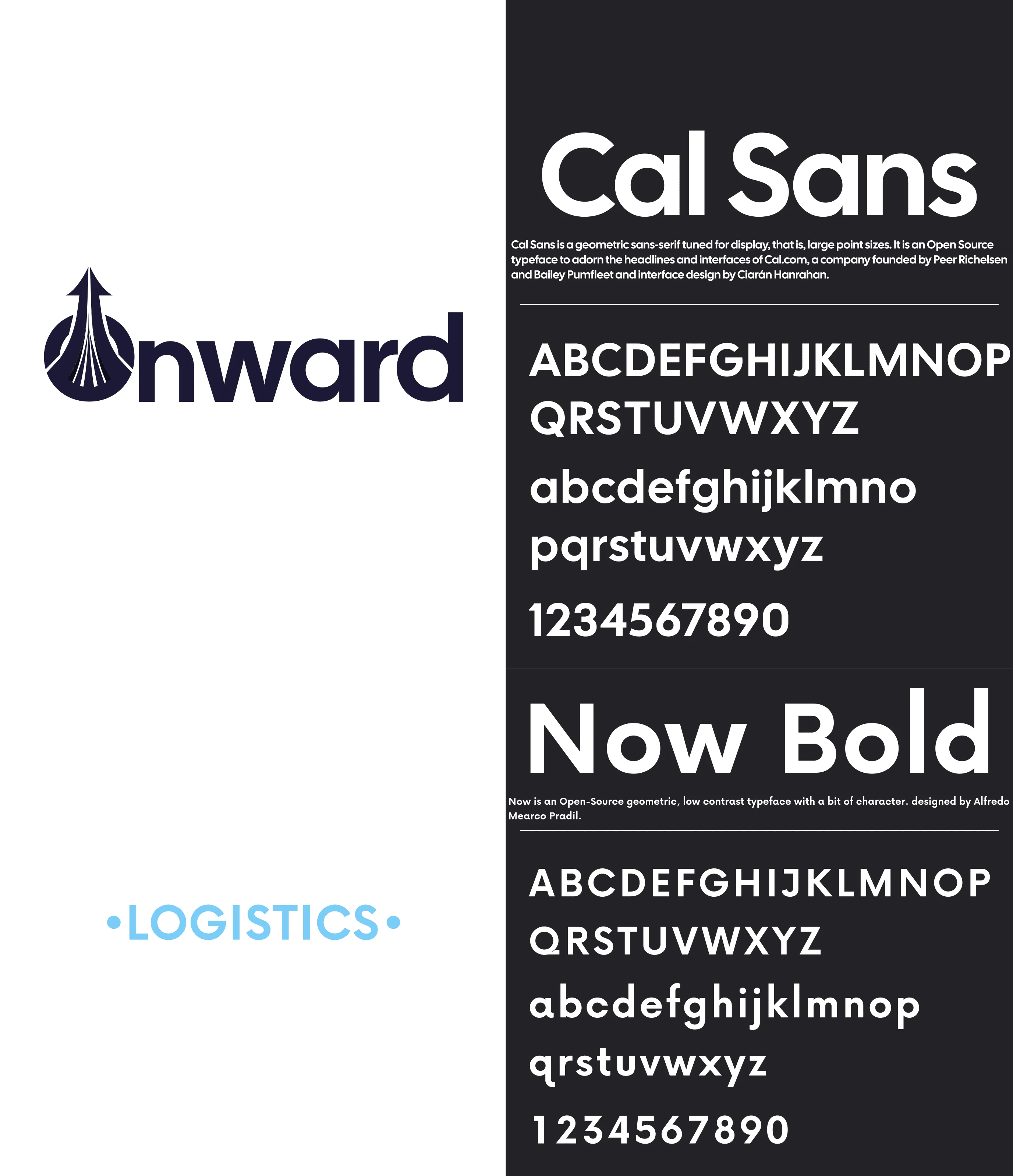
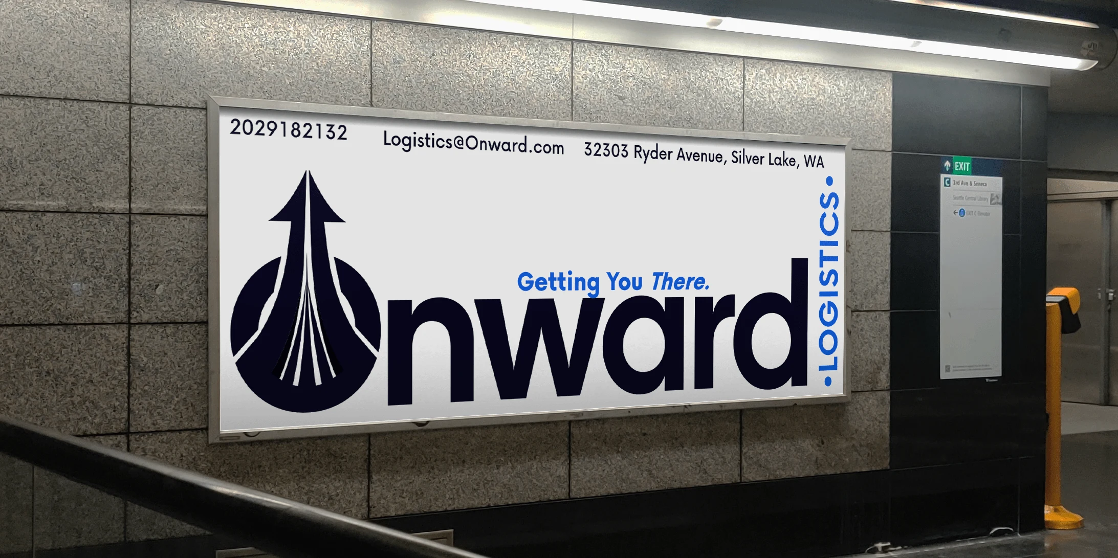
In order to maintain the essence of the logomark, I made the decision to utilize a geometric sans-serif font that would preserve its large point sizes when used as the main headline for "Onward." Additionally, I carefully considered the option of replacing the letter O with the logomark to create a secondary logomark specifically for use in a horizontal format.
Color Palette
I chose three different types of blue to evoke specific feelings and associations of Onward Logistics.
The first type of blue I selected calls to mind feelings of calmness and relaxation Onward brings to supporting their clients' immediate needs and contribute to maintaining the seamless flow of transnational commerce. Thus tying in the peaceful, tranquil, secure, and orderly guidance in delivering efficiency and assurance in an ever-evolving business landscape. This shade of blue represents loyalty, honesty, trust, responsibility, calm, commitment, wisdom, and serenity, Onwards' core goals as a worldwide container shipping enterprise.
The second type of blue I chose complements the first by adding depth and richness to the overall color scheme, while the third type of blue serves as an accent, providing contrast and visual interest.
By incorporating these different shades of blue, I aimed to create a sense of harmony and convey a message of trustworthiness, dependability, and serenity in an ever-evolving business landscape.




Brand Identity design / Creative strategy : Bx Studios
Like this project
Posted Oct 9, 2024
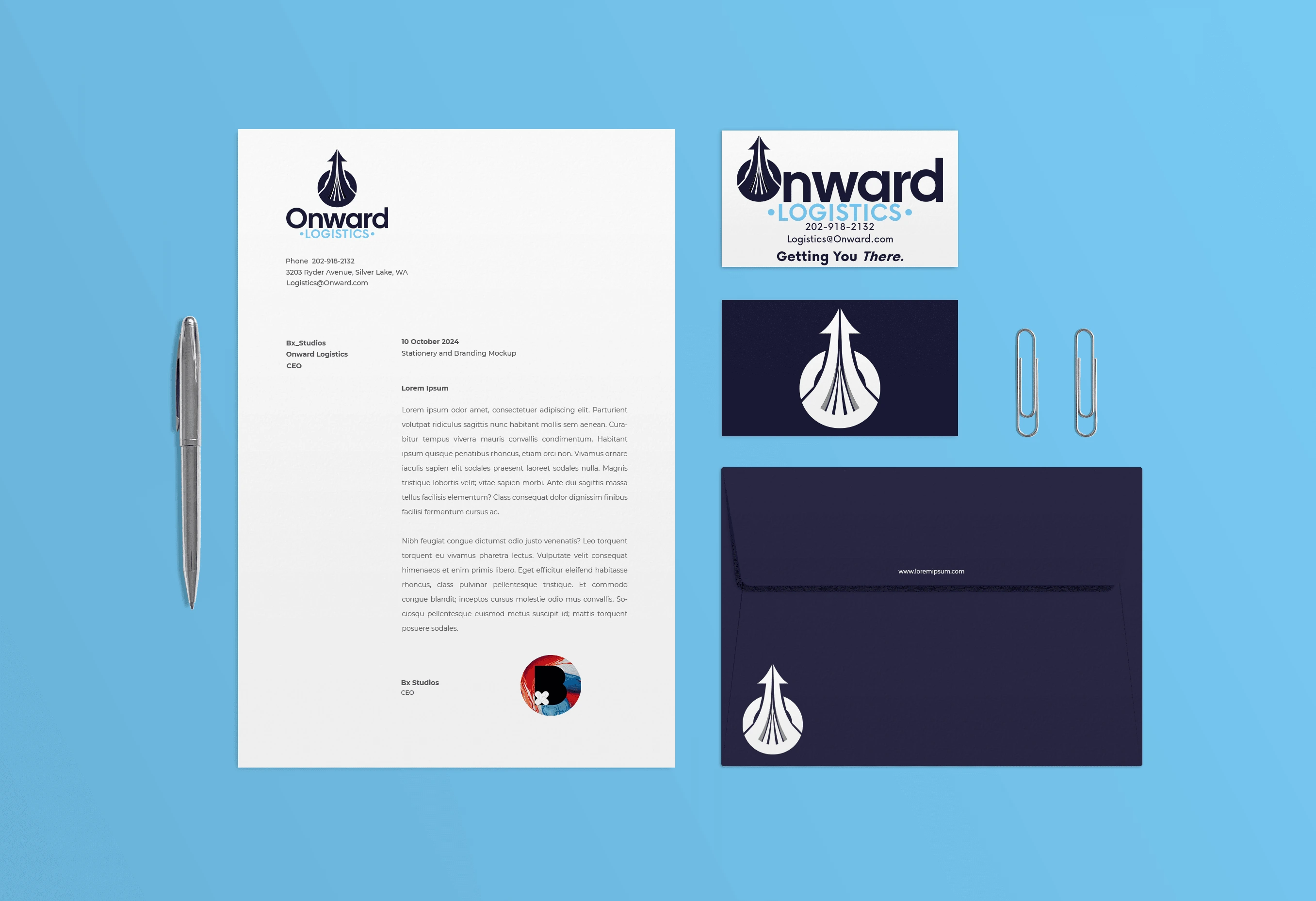
Brand identity system for Onward Logistics, a global shipping enterprise & logistical data analysis company. Includes logomark, brand colors, typography, etc.
