Personal Rebranding | Bx_Studio
Bx Studio
| The Pre- |

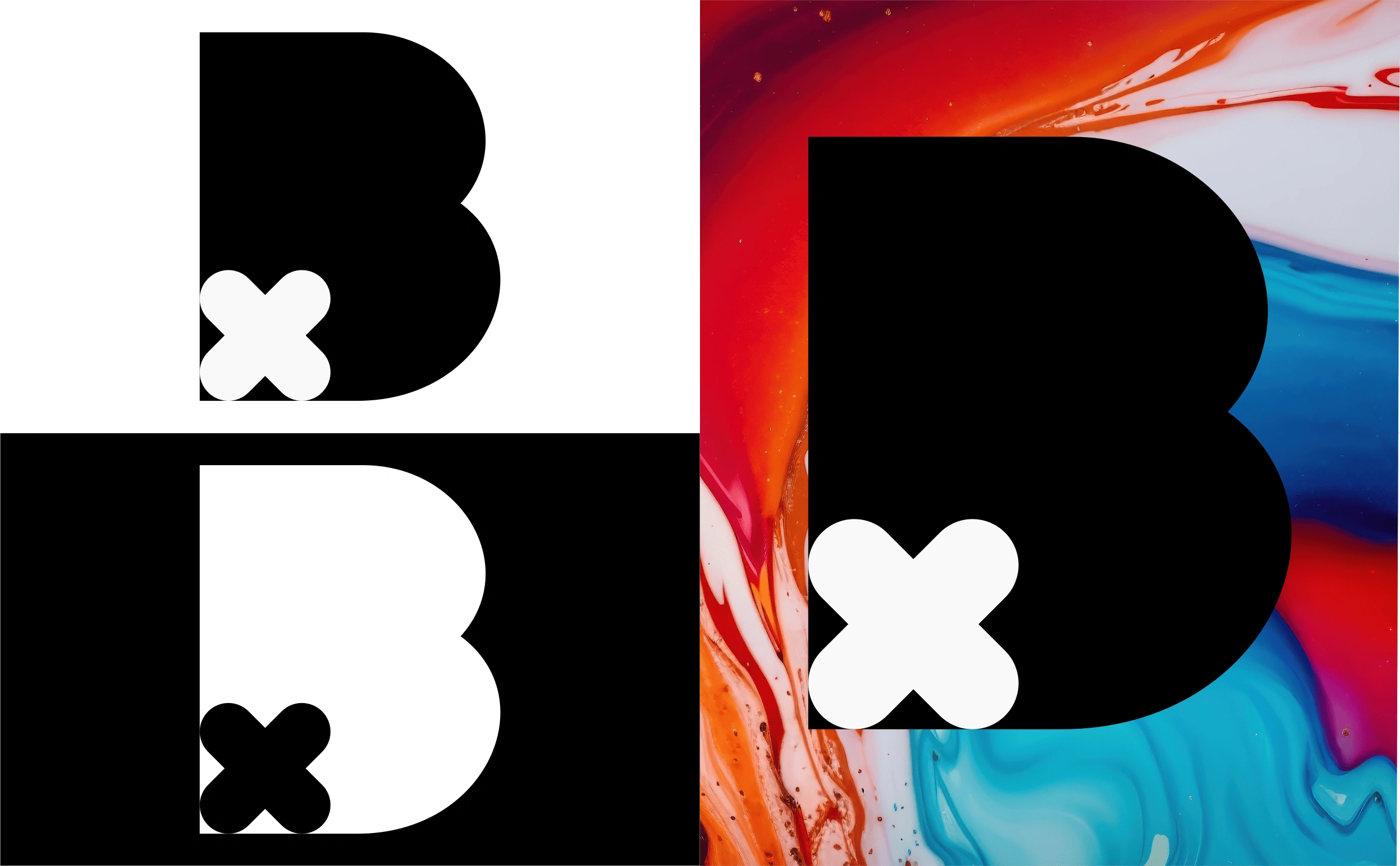
Old Bx Studio Logo Mark
When I initially conceived this logo, it began as a hazy and indistinct image swirling around in my mind. As a designer, the challenge lies in bridging the gap between this intangible vision and the deadline by transforming it into a concrete, optimized, and polished logo that will endure the passage of time...or at least until the emergence of a fresh concept.
|THE SHIFT|

Update Bx Studio Logo Mark
The change in design direction yielded a significant impact. Departing from the traditional white-on-black palette, I pursued a fresh color and shape scheme. By refining the harsh lines of its predecessor and curving the main logo components, a more approachable yet highly professional aesthetic was achieved, contrasting with the heightened seriousness of the previous iteration. Embracing the challenge, I ultimately selected a liquid marble background after multiple attempts. Surprisingly, this background both competes with and complements the logo marks, enhancing the overall composition.
| IN ACTIXN |
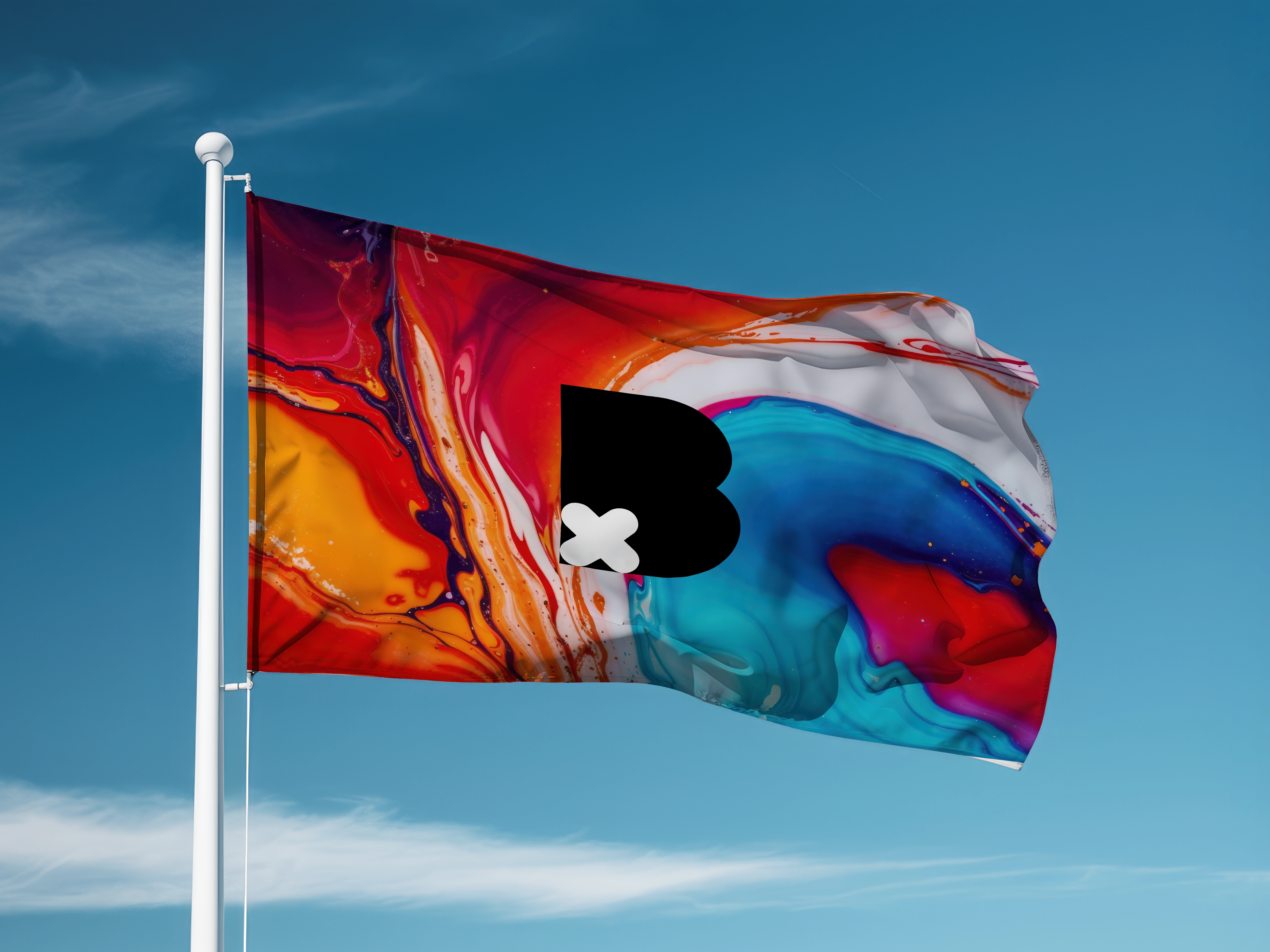
Logo Mark On Flag
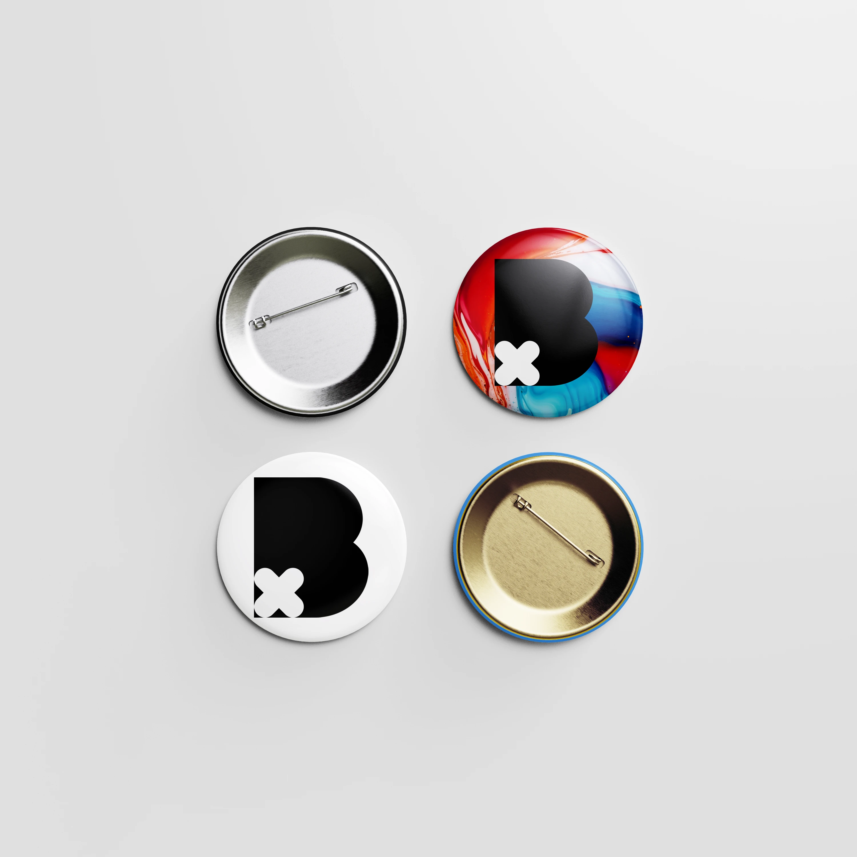
Logo Mark on Pins
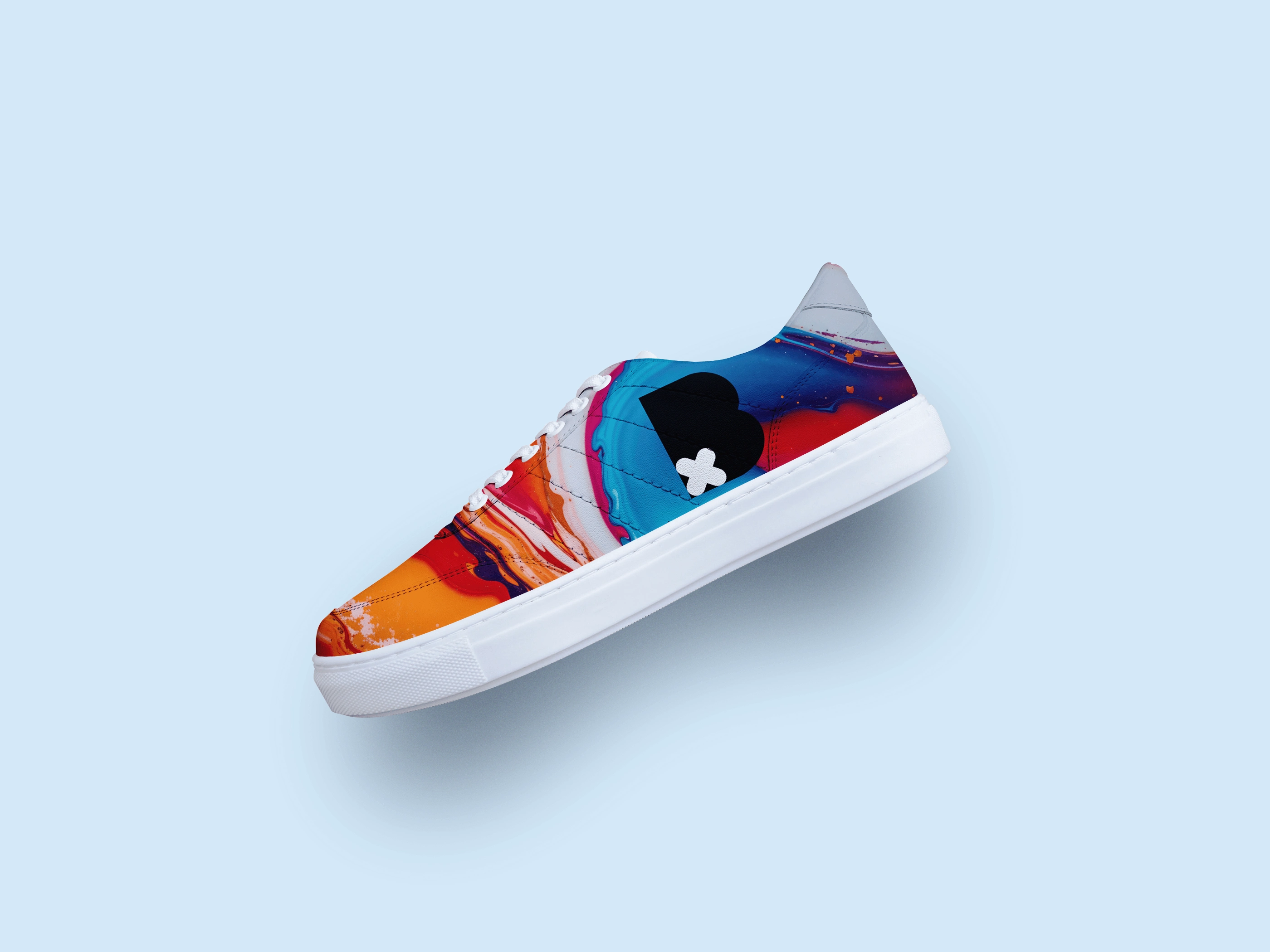
Logo Mark On Sneaker
Like this project
Posted Jul 7, 2024
My rebranded old logo mark with a new iteration that embraces a vibrant and optimistic future.