Generation Sport - Brand Identity Project
⭐️ The Brief
For Generation Sport’s brand identity project, I developed a dynamic visual identity that resonates with their core mission of empowering young female athletes. The brand identity reflects boldness, inclusivity, and confidence, aligning with their commitment to creating sportswear that promotes body positivity and comfort both on and off the field.
👉🏽 Design Requirements
The design requirements for Generation Sport’s brand identity centered around creating a bold and rebellious aesthetic, steering away from a “winning is everything” mentality. They wanted the brand to feel empowering and inclusive, with a focus on confidence and individuality, while maintaining a fun and approachable vibe.
Bold
Rebellious
Empowering
Inclusive
Fun, but not competitive-focused
☝🏽First Step
Nina, the founder of Generation Sport, has chosen our Brand Identity package. This package includes a 3-hour long Brand Strategy Workshop with Nina and her co-founder that occurs before we begin the design phase. During the workshop, I facilitated the process of clarifying their brand, ensuring they understand their ooand positioning, and helping them nail down their messaging in order to attract their target audience.
We've got a few pages from their Brand Strategy Summary that really helped us move forward with the design process, allowing us to create a well-thought-out brand identity for Generation Sport.
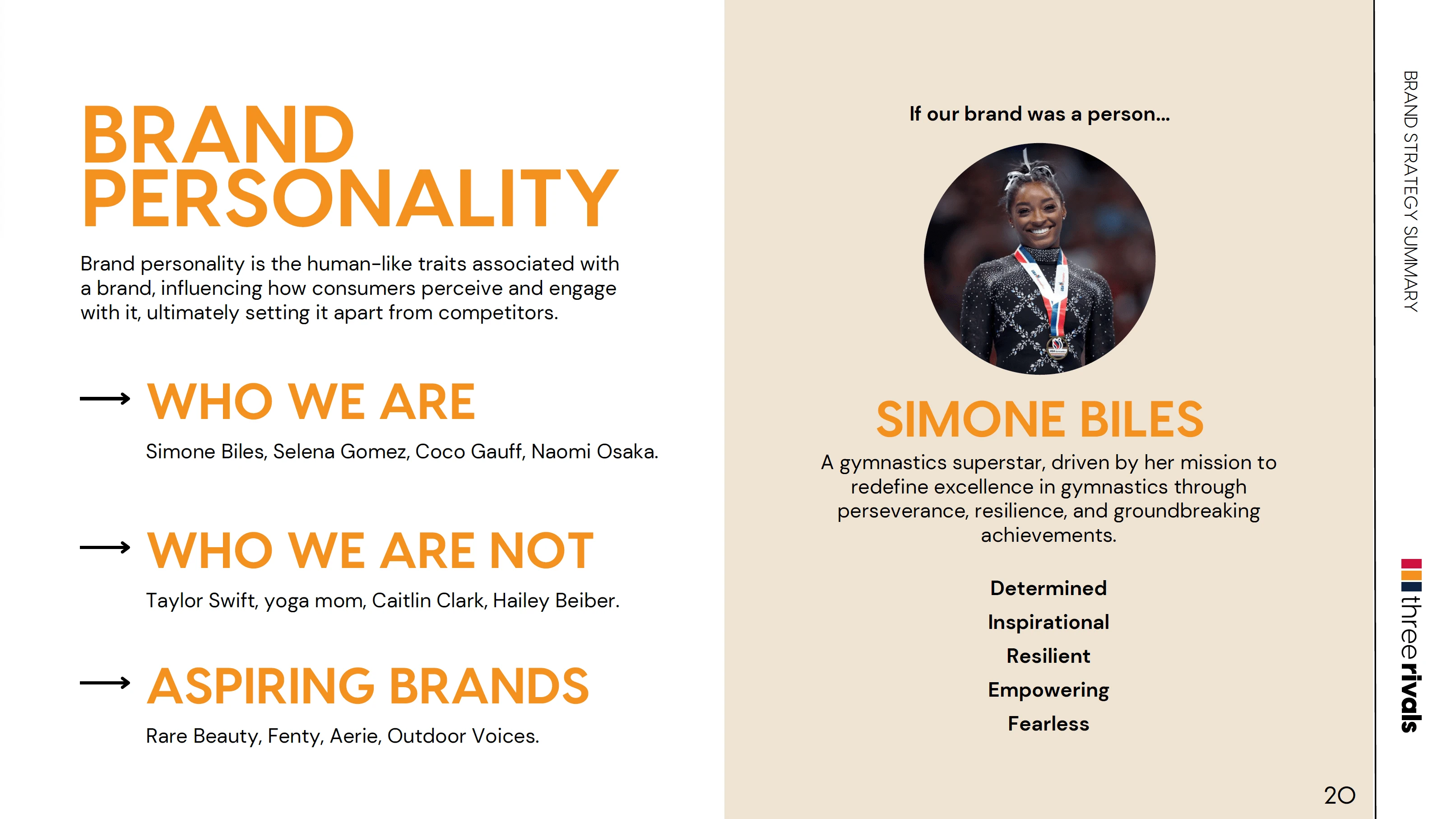
Screenshot of Generation Sport's brand personality that was clarified during the Brand Strategy Workshop.
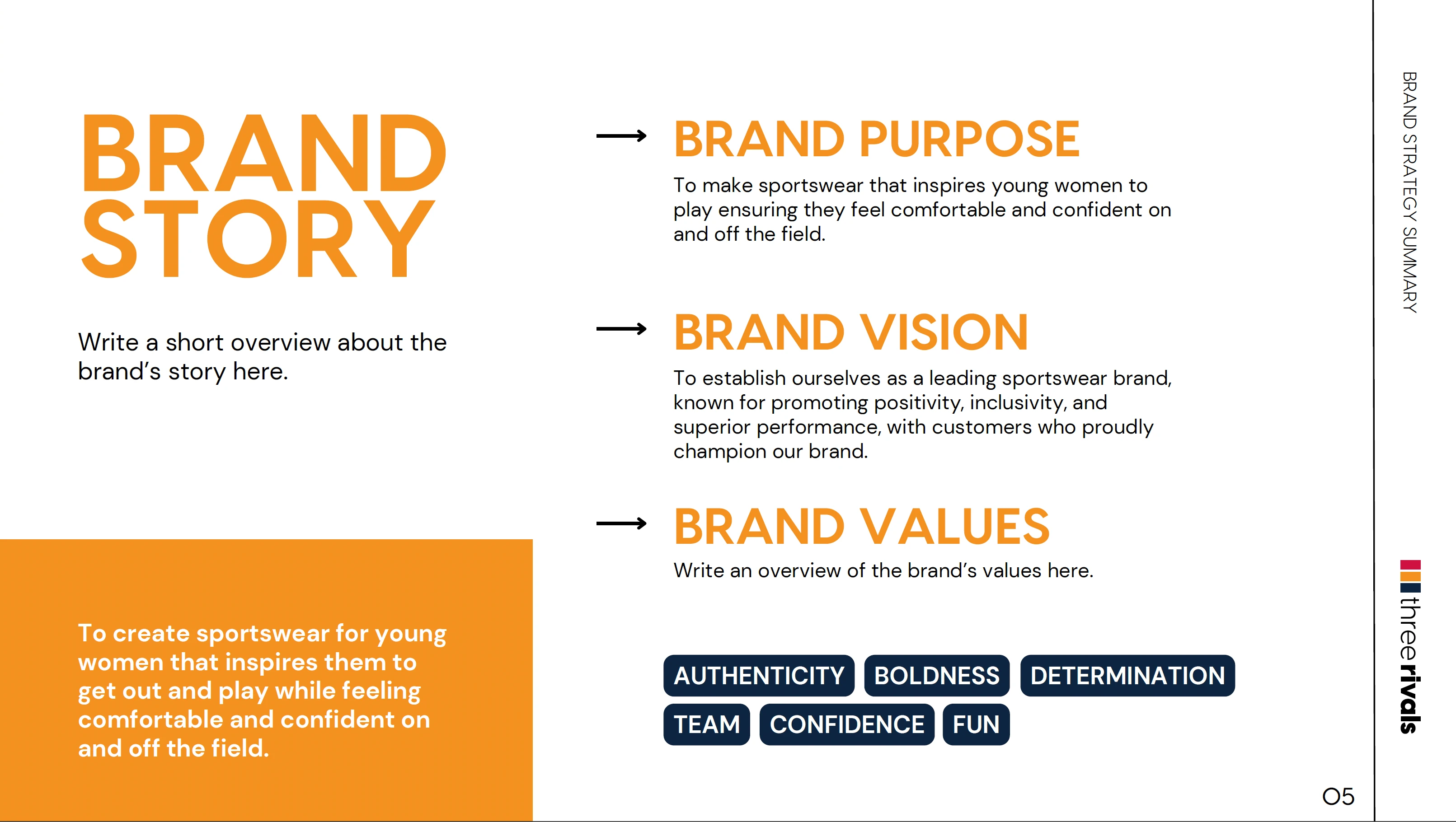
Screenshot of Generation Sport's Brand Story listing their purpose, vision, and values.
✍🏽 Creative Directions
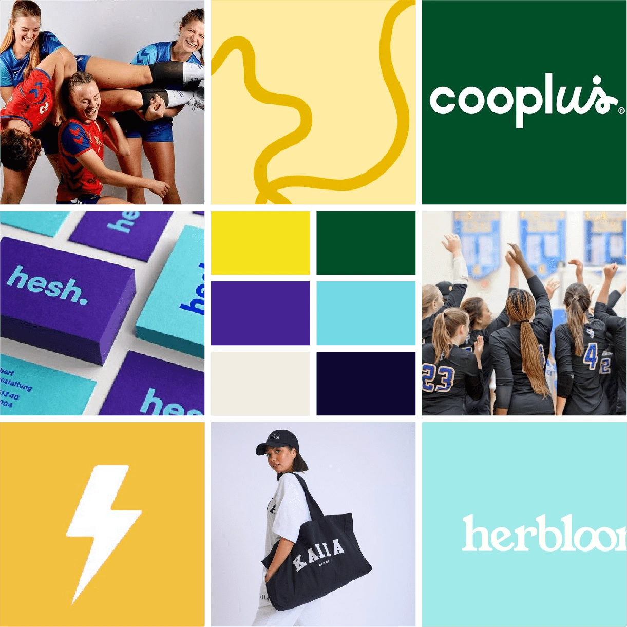
The creative direction presentation for Generation Sport outlined four distinct options, each reflecting a different aspect of the brand’s core values. These directions ranged from a bold, team-oriented identity with modern and inclusive design elements to playful and rebellious concepts that embraced imperfections and confidence. Each mood board showcased varying color palettes, typography choices, and visual styles to help Generation Sport select a direction that best aligned with their vision of empowering young female athletes.
Here is the mood board they have approved and selected for our project:
✍🏽 Iterations
There were a lot of elements on their selected mood board that I was excited to implement. This included the wavy lines, bright colors, and lightning bolt. They mentioned on the Brand Strategy Workshop that a lightning bolt is something they're interested in, however, they were worried it may be too obvious or cliché.
Here are some of the initial sketches I started with:
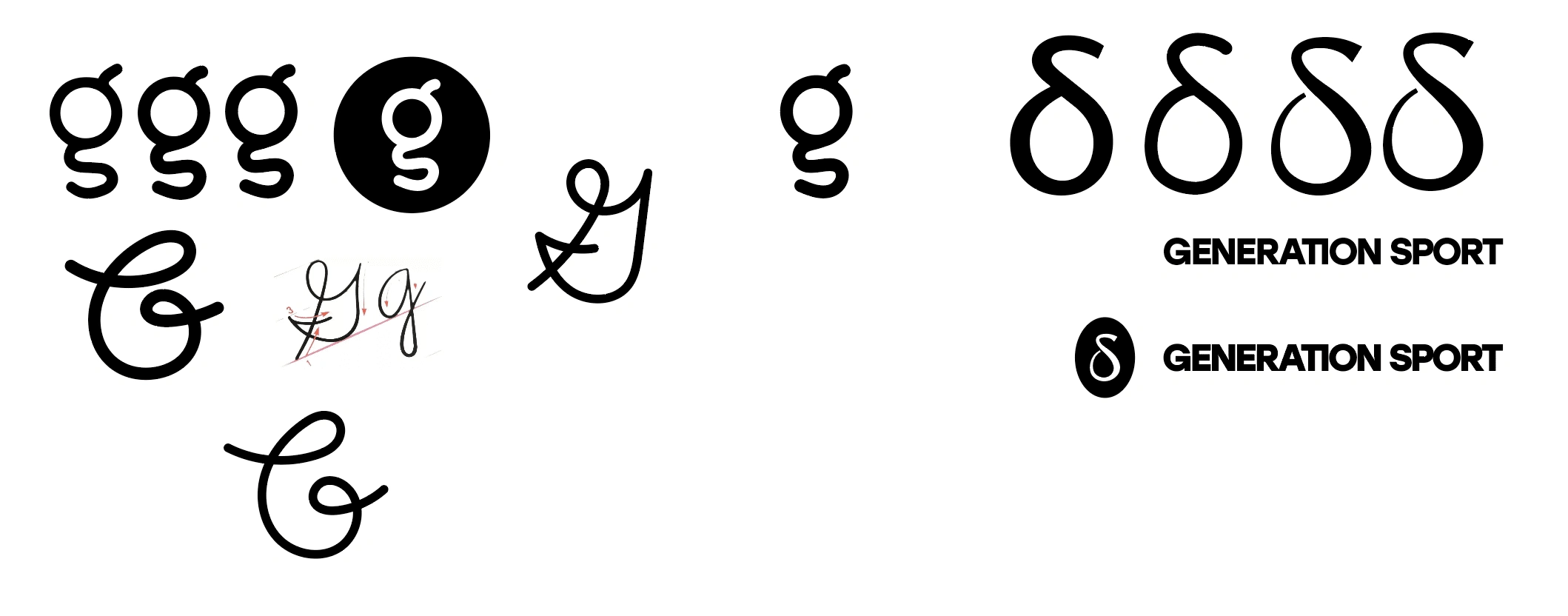
The other direction they were curious about was adding "delta" as a noun. A delta can represent change, and Generation Sport is positioning itself to be a breakthrough sportswear brand for young female athletes. Their products are designed to make customers feel comfortable while still performing at their best.
In the end, the delta symbol did not really resonate with them as much as they had hoped. So, we moved on to another concept.
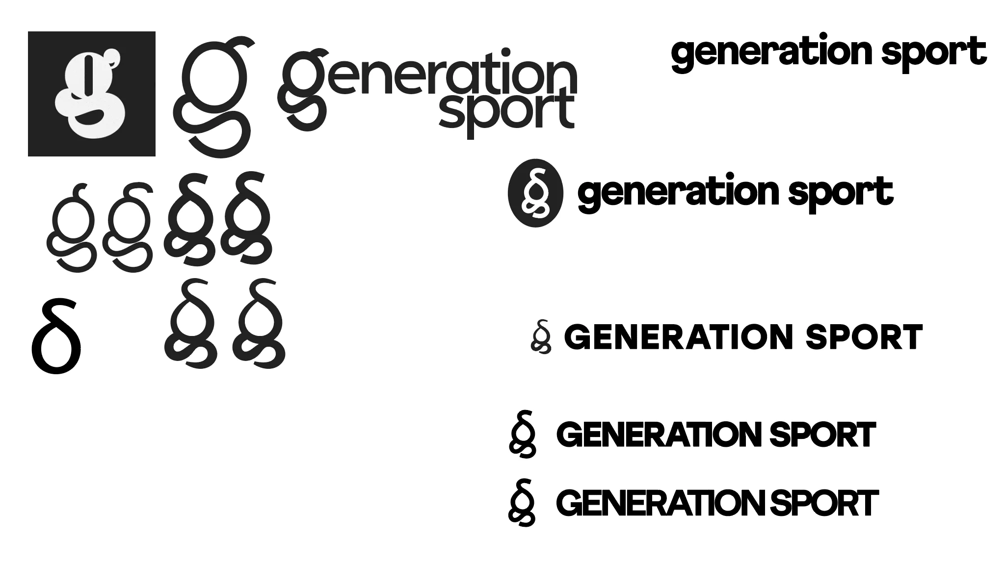
The sketches above were inspired by an idea I had while reviewing their Brand Strategy Summary. I included a subtle delta symbol, but also realized that I could incorporate lowercase 'g' and 's' without making it obvious. I didn't want it to be too apparent, but rather a hidden storytelling element of their brand for the discerning consumer. Here's a breakdown of how I envisioned it:
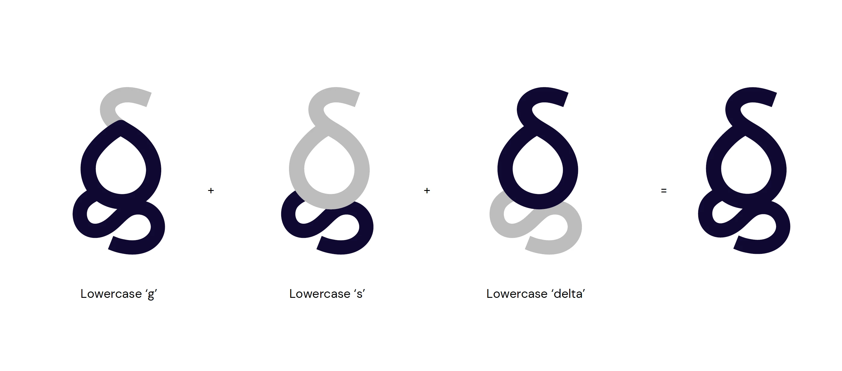
However, they were still not sold on having a delta, so we completedly moved away from including a delta symbol in their logo.
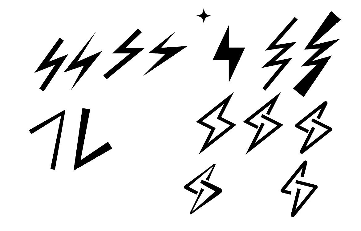
So, I moved on with going back to the lightning bolt idea and it did spark some interest in them. Here were the few sketches that were shown:
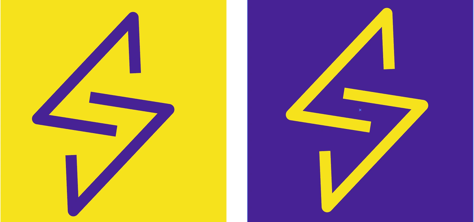
They eventually landed on an icon that they truly loved and resonated with their brand - to their surprise, it was the lightning bolt all along!
👏🏽 Supporting Graphics
The logo can be the most challenging aspect of any design project to approve, as it is the most important!
After finalizing the logo, we proceeded with the supporting graphics, which was relatively easy because they already knew what they wanted, as listed in the mood board - the wavy lines!
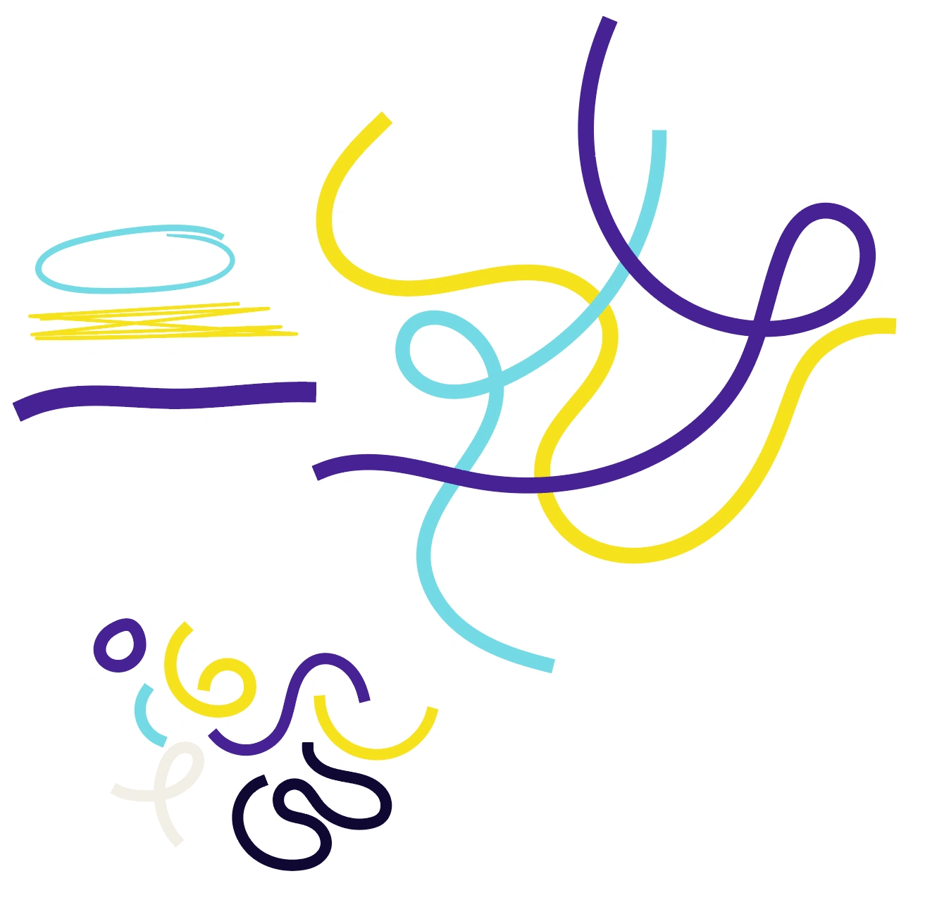
Illustrations, featuring their brand colors, exhibit boldness and a touch of rebelliousness with underlines, circles, and crossed-out text.
🎨 Patterns
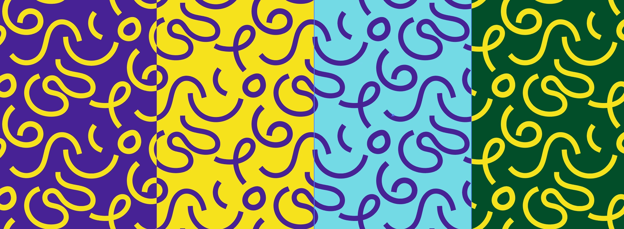
Patterns are always fun to create. Nina wanted something simple and bold, but not plain. With that, I included some of the supporting graphics listed above and put them into a pattern using their brand colors to really make it stand out!
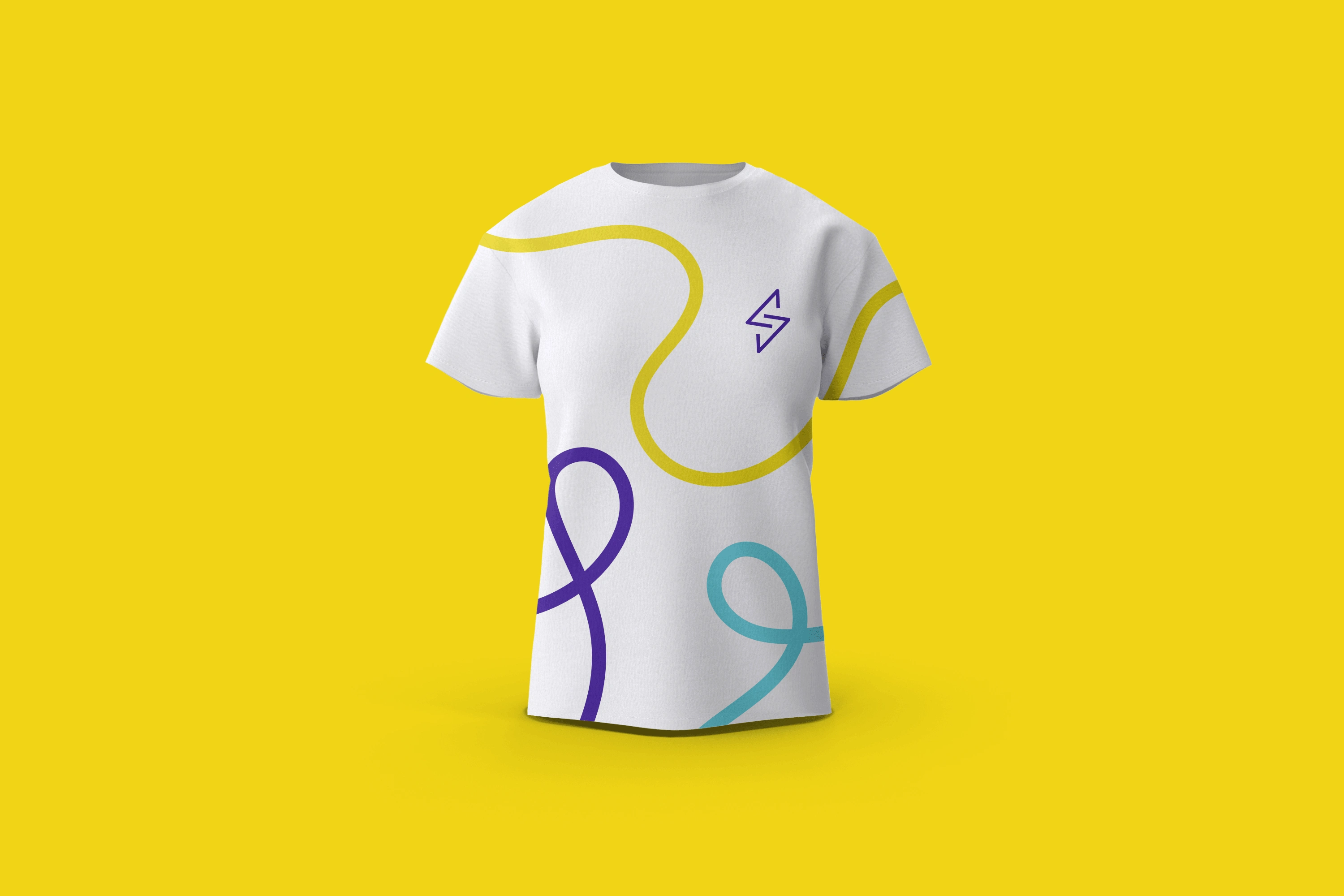
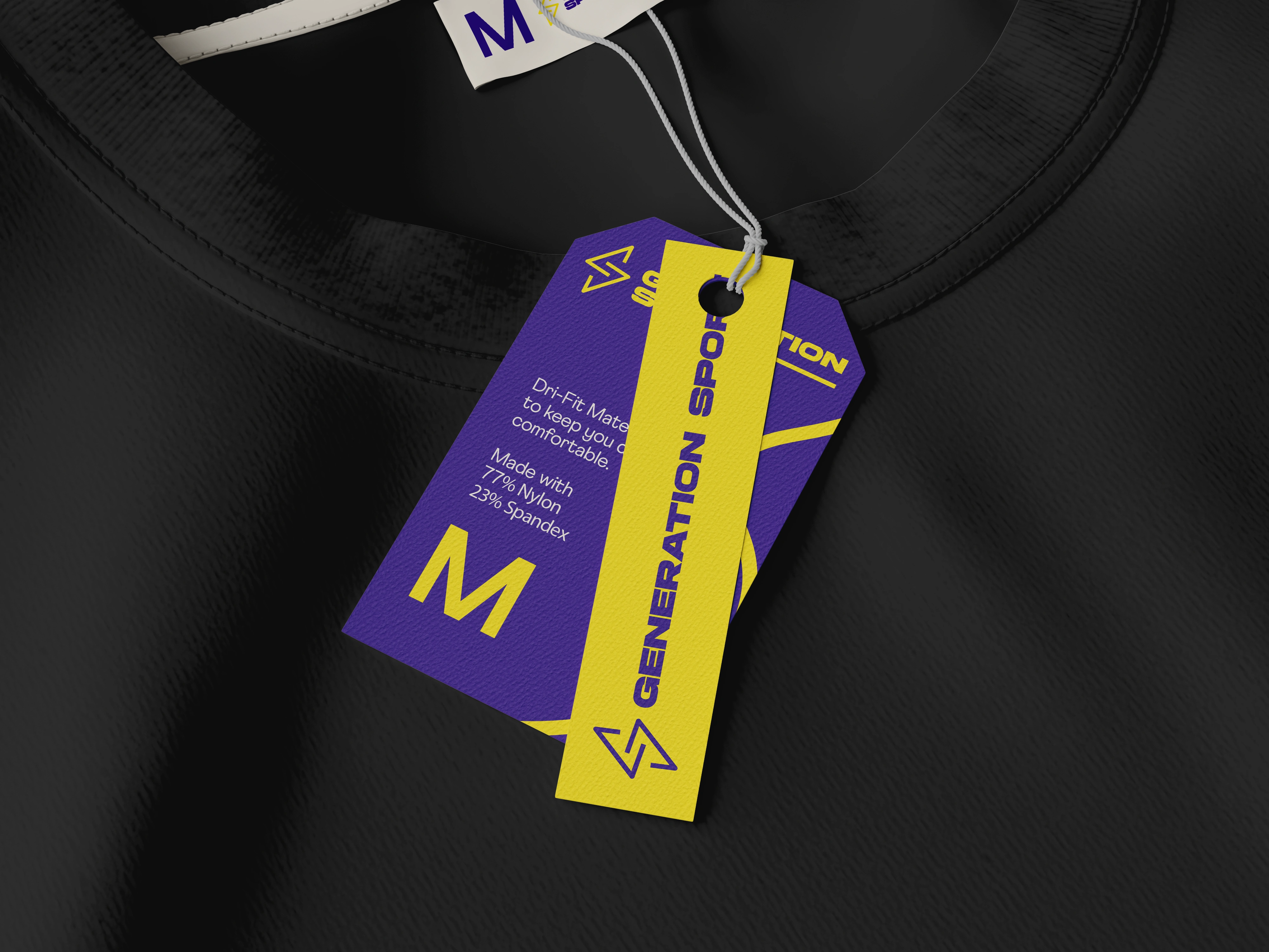
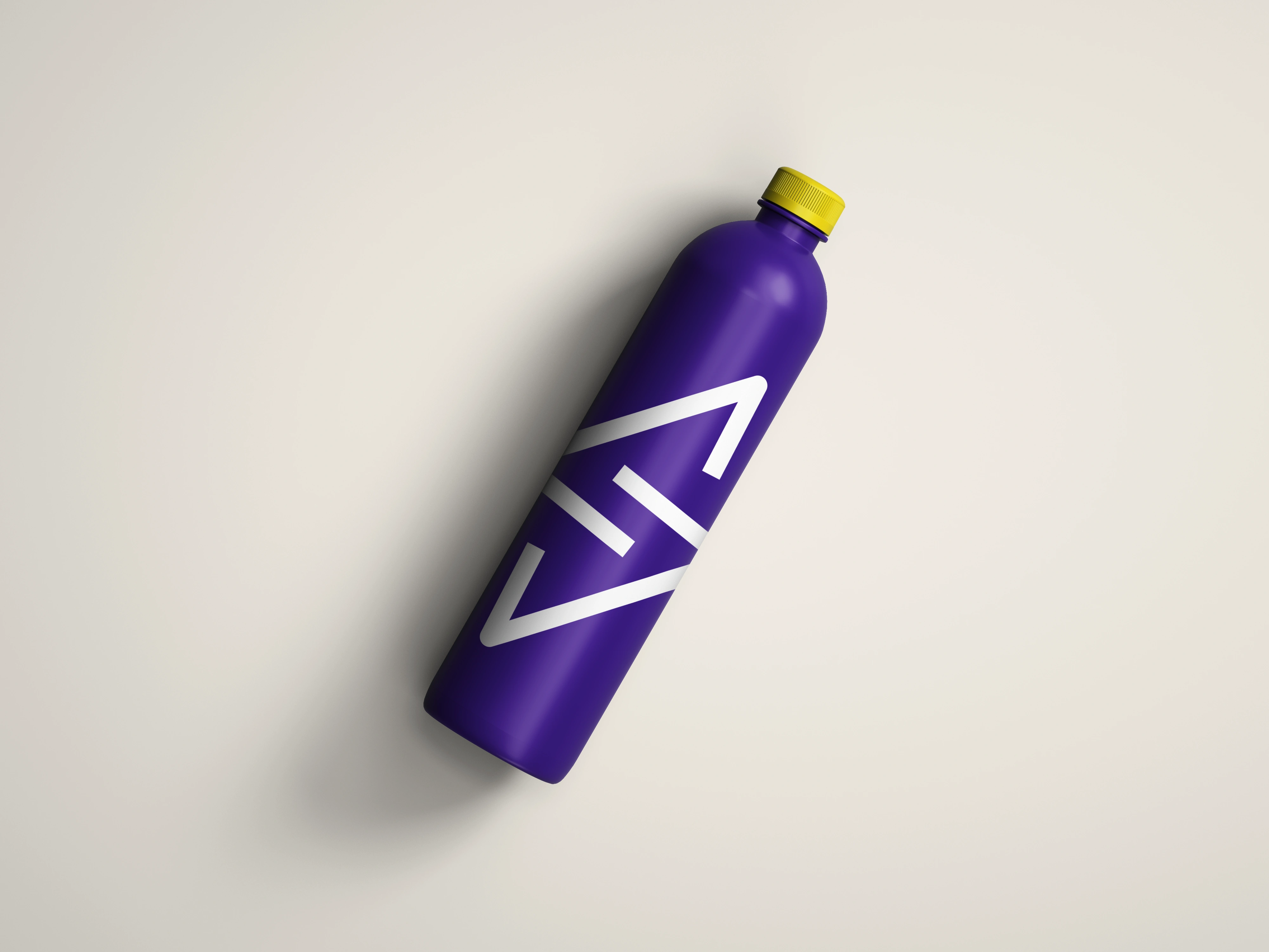
📷 Mockups
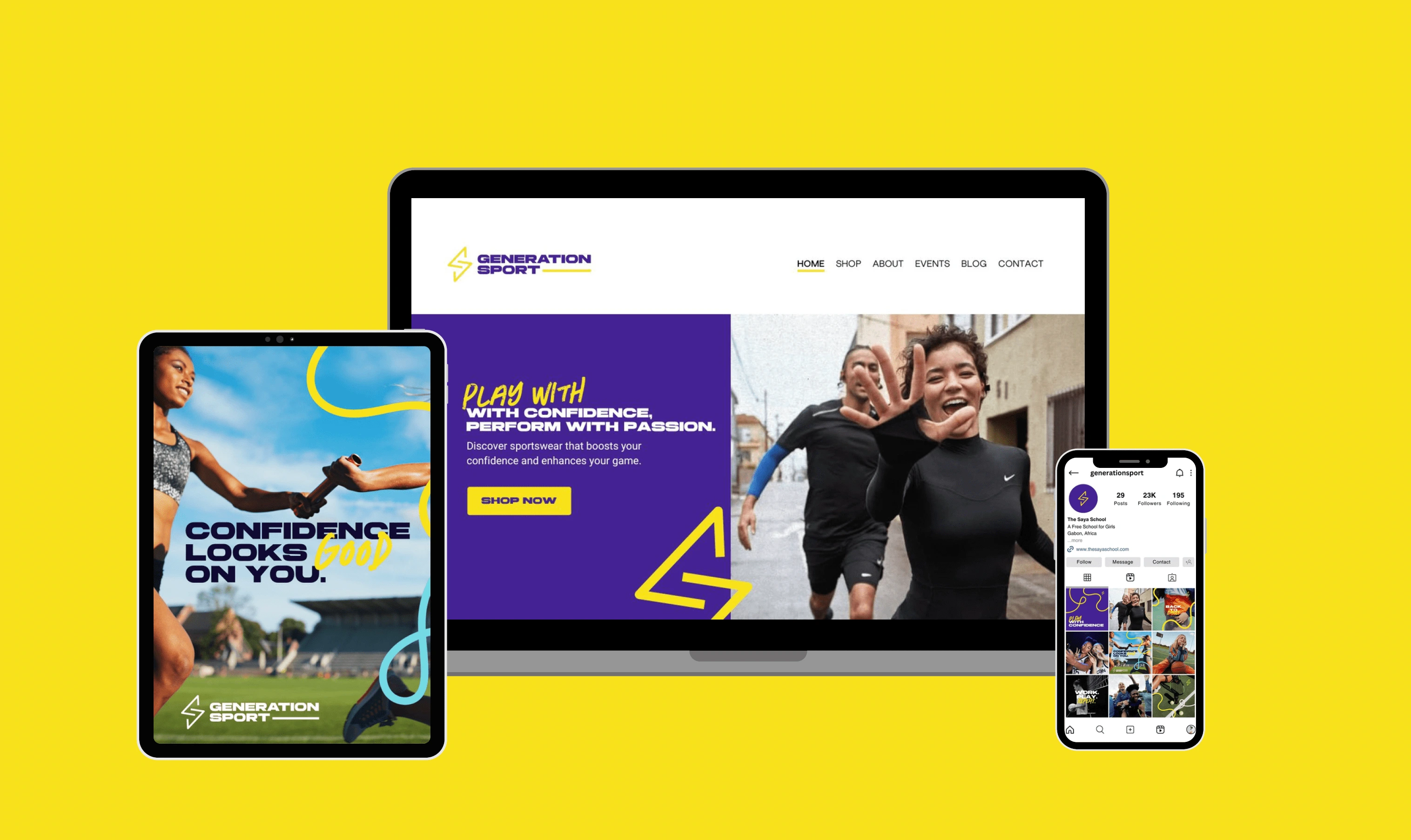
✨ The Final Designs
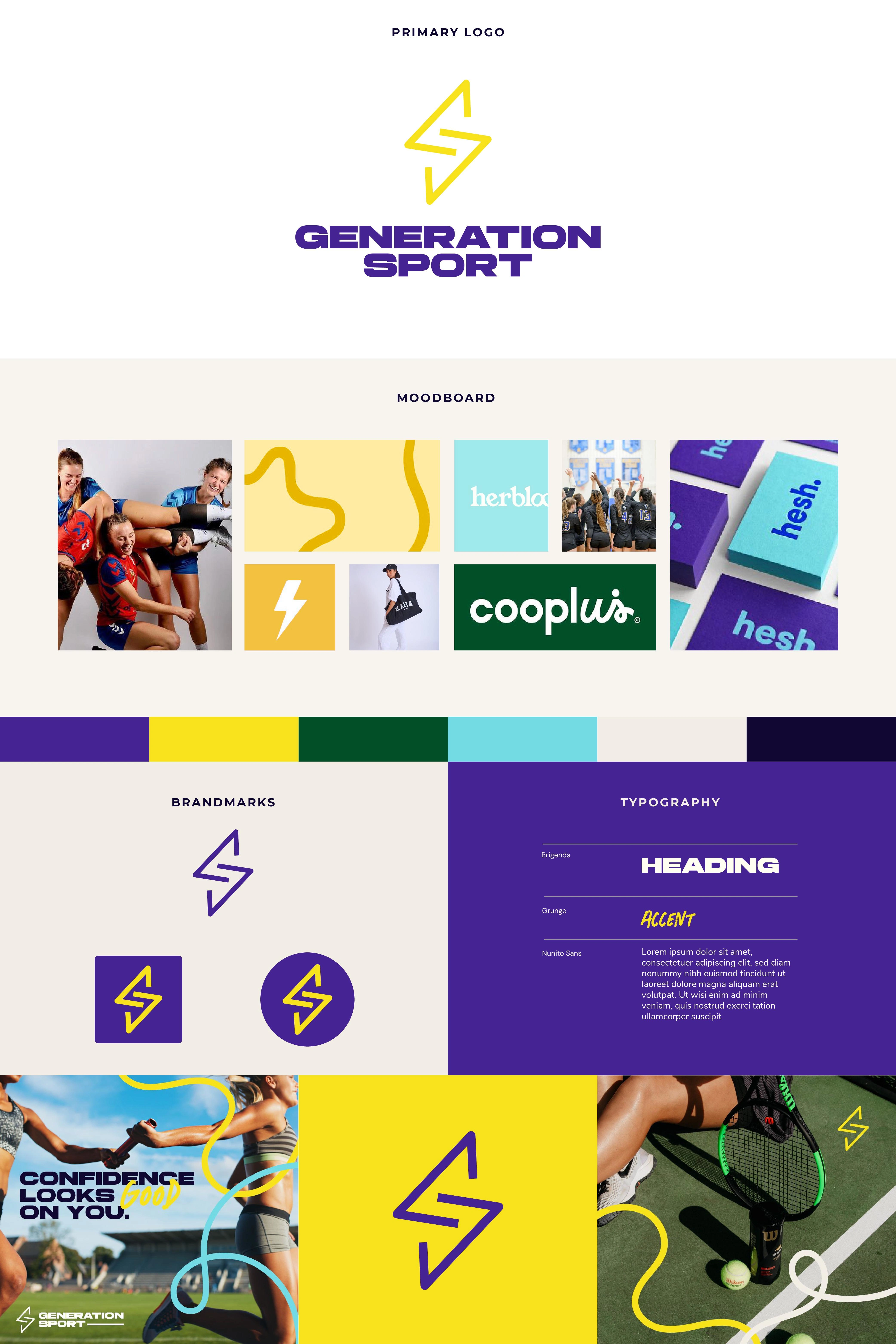
💬 Final Thoughts
When I was a young athlete in school (seems like ages ago!), I would have loved to have a brand like Generation Sport to wear. Nina and her co-founder, Rima, were also athletes and they noticed a gap in the market for clothing that made young female athletes feel comfortable, confident, and able to perform at their best.
They saw that some of the current sportswear brands are too tight and don't fit well, or they don't have sizes that allow the consumer to move freely while playing sports. It was a project I couldn't turn down, and I'm grateful that they chose me to design for them. They are still in the process of building their brand, so keep an eye out for their launch!
Like this project
Posted Sep 23, 2024
A brand identity project for a bold, rebellious, and inclusive sportswear brand for young female athletes.
Likes
6
Views
593

