BlewBird | Web Design and Brand for a Courier Company
Marcus Luis Feliciano
Overview
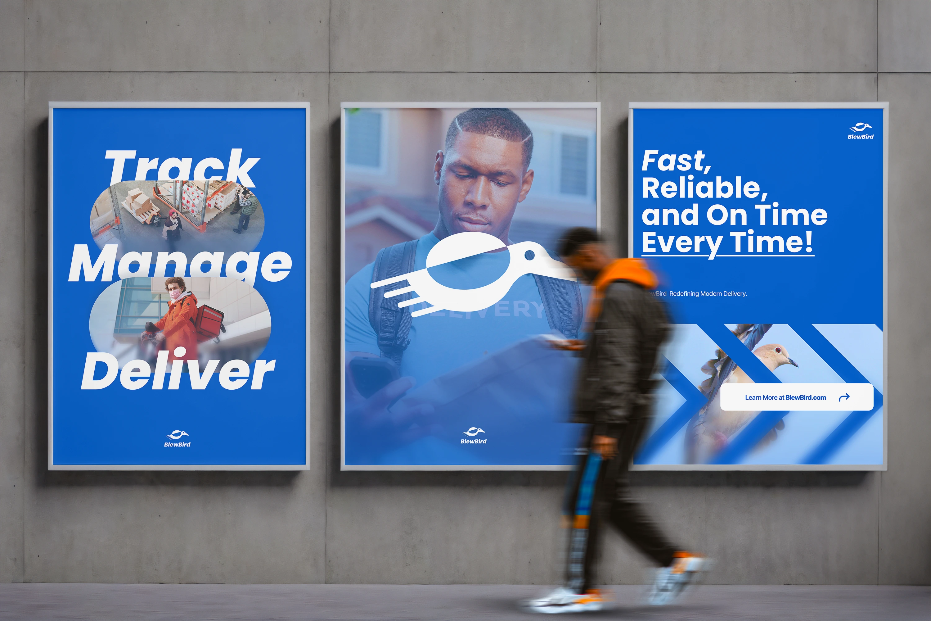
BlewBird is a conceptual courier brand that reimagines delivery services by combining clean branding with intuitive tech.
Designed as a futuristic solution to traditional logistics, BlewBird aims to be the go-to digital courier for a fast-paced, app-driven generation.
The Challenge
Most courier brands are bogged down by outdated interfaces, uninspired visuals, and clunky user experiences.
We needed to craft a brand identity and product design direction that felt advanced, dependable, and refreshingly simple, without losing the speed and hustle of a modern-day delivery service.
The Solution
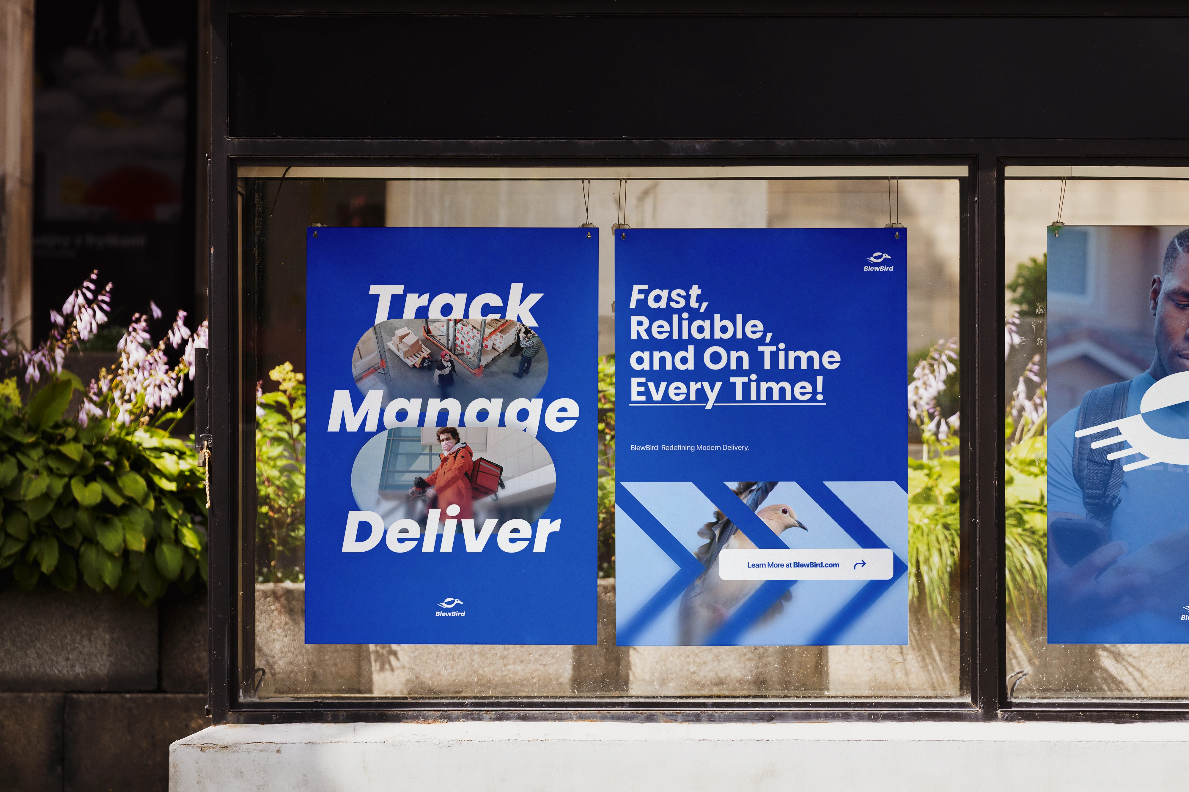
We developed a technology-first courier brand that addresses user frustration through thoughtful design. From app to website, BlewBird’s experience is seamless, intuitive, and sleek. We elevated the courier space by injecting clarity, speed, and sophistication into the brand while maintaining accessibility.
This wasn’t just a branding project; it was about creating a system that users can trust and enjoy navigating. The result: a brand that feels both cutting-edge and human.
The Website
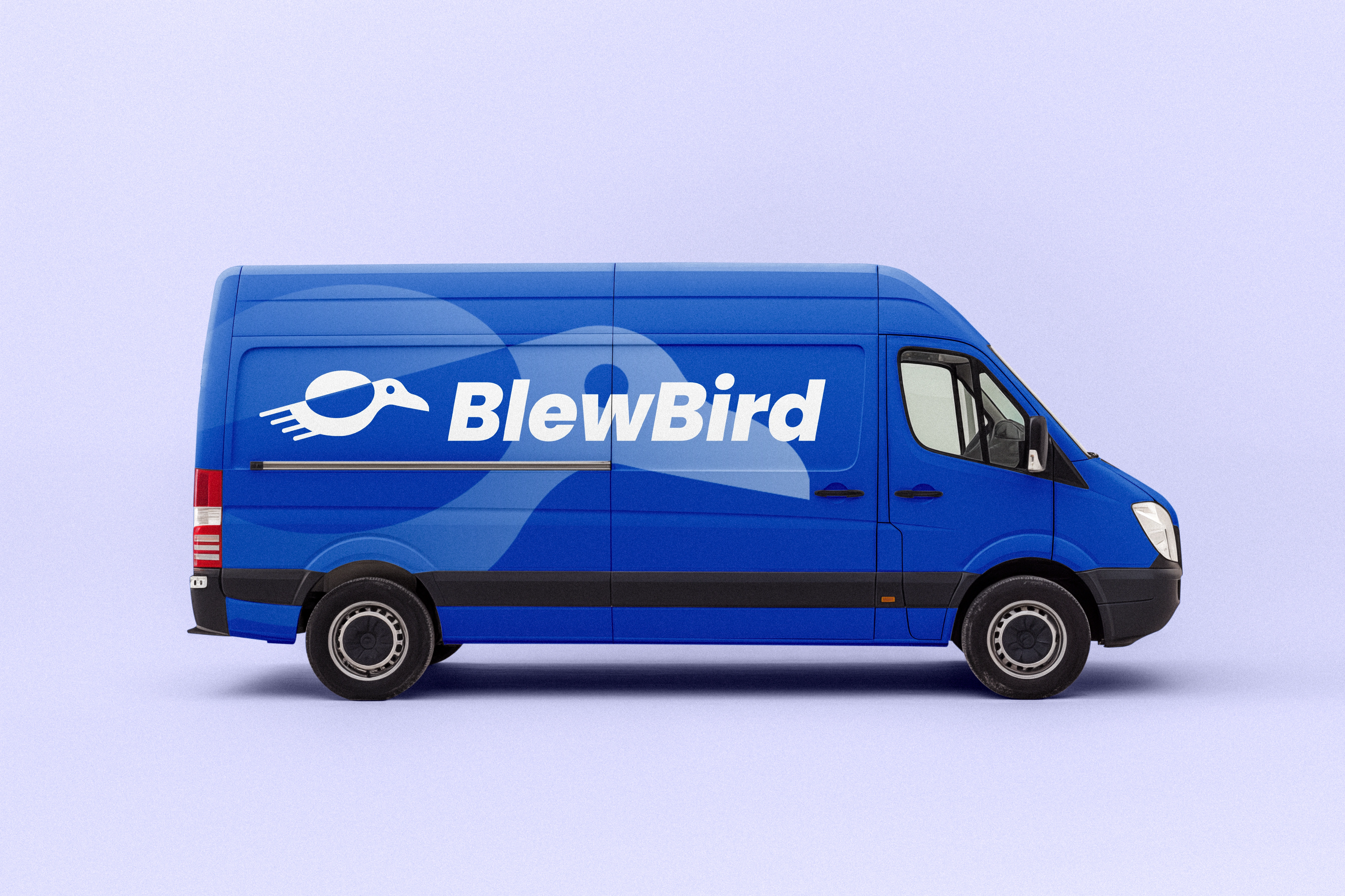
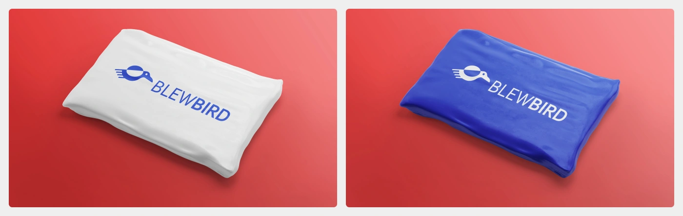
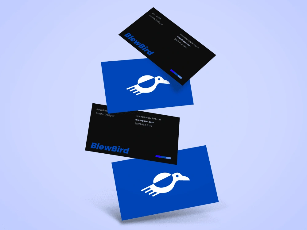
The Brand
The Logo
Inspired by the speed and reliability of pigeons in ancient messaging, the BlewBird logo is a vector-style pigeon, modern, minimalist, and full of movement.
It symbolizes both the brand’s roots in delivery and its leap into tech-powered logistics.
The Colors
Blue (Primary): Conveys trust, speed, and technology.
Bluish White (Secondary): Used for clarity, space, and a clean, digital aesthetic. This color combination reflects reliability and simplicity—perfect for a courier brand that wants to look both tech-forward and trustworthy.
Color Palette and Typography.


Roles
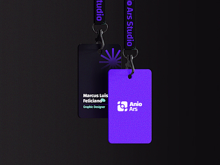
This project was crafted by these members of the Anio Ars Studio:
Jaren Joachim Feliciano as UI / UX Designer, Brand Designer, and Graphic Designer.
Marcus Luis Feliciano as Graphic Designer, and Creative Director.
Like this project
Posted Apr 13, 2025
Bold visuals and eccentric charm, BlewBird blends storytelling with vibrant design, made for brands that dare to stand out and disrupt the ordinary.
Likes
0
Views
7
Timeline
Jan 15, 2025 - Jan 31, 2025