ANIO ARS | LOGO DESIGN & BRAND IDENTITY
Marcus Luis Feliciano
Overview
Anio Ars is a creative design studio built by two brothers who believe that great design is not just about making things look good it’s about strategic adaptability.
We specialize in brand identity, web design, and presentation design, guided by sharp intuition and a high standard for visual storytelling.
Whether it's a sleek interface, a rebellious rebrand, or an immersive pitch deck, we sculpt ideas into forms that fit and break the mold.
Why Anio Ars?
The name Anio Ars is more than a name, it’s a philosophy.
Anio is derived from the Filipino word "Anyo," meaning form.
It’s inspired by Bruce Lee’s famous mantra: “Be formless.” We believe design should shape-shift to meet the needs of culture, business, and time.
Ars, the Latin word for "arts," represents our foundation in creativity and expression.
Together, Anio Ars means the art of adapting form, constantly evolving with the pulse of the world.
The Logo
A fusion of various shapes—circles, triangles, and curves—symbolizing fluidity and form.
At its core is an eye, representing our creative awareness and sharp vision of the design cosmos. It reflects how we don’t just observe trends—we dissect, translate, and innovate.
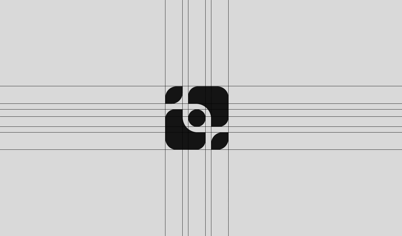
Grid System
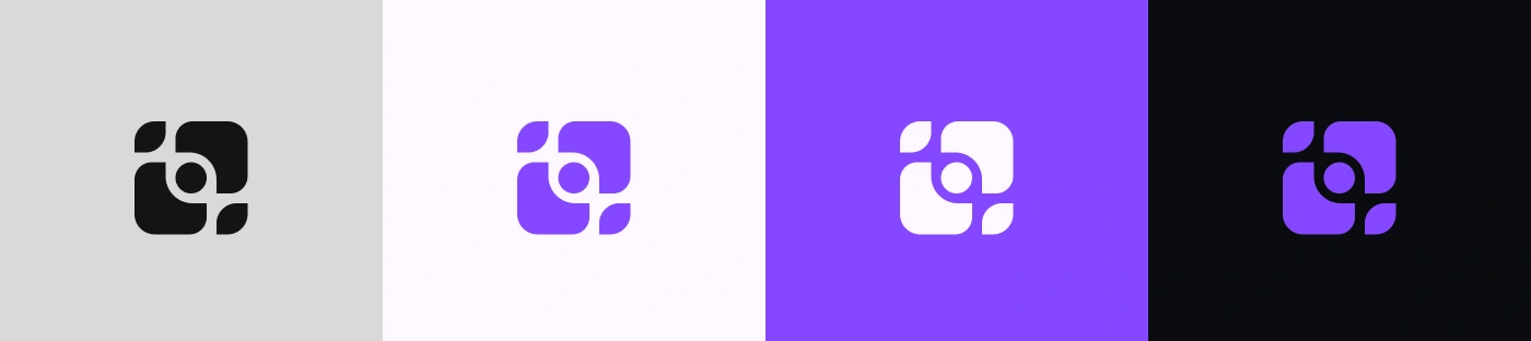
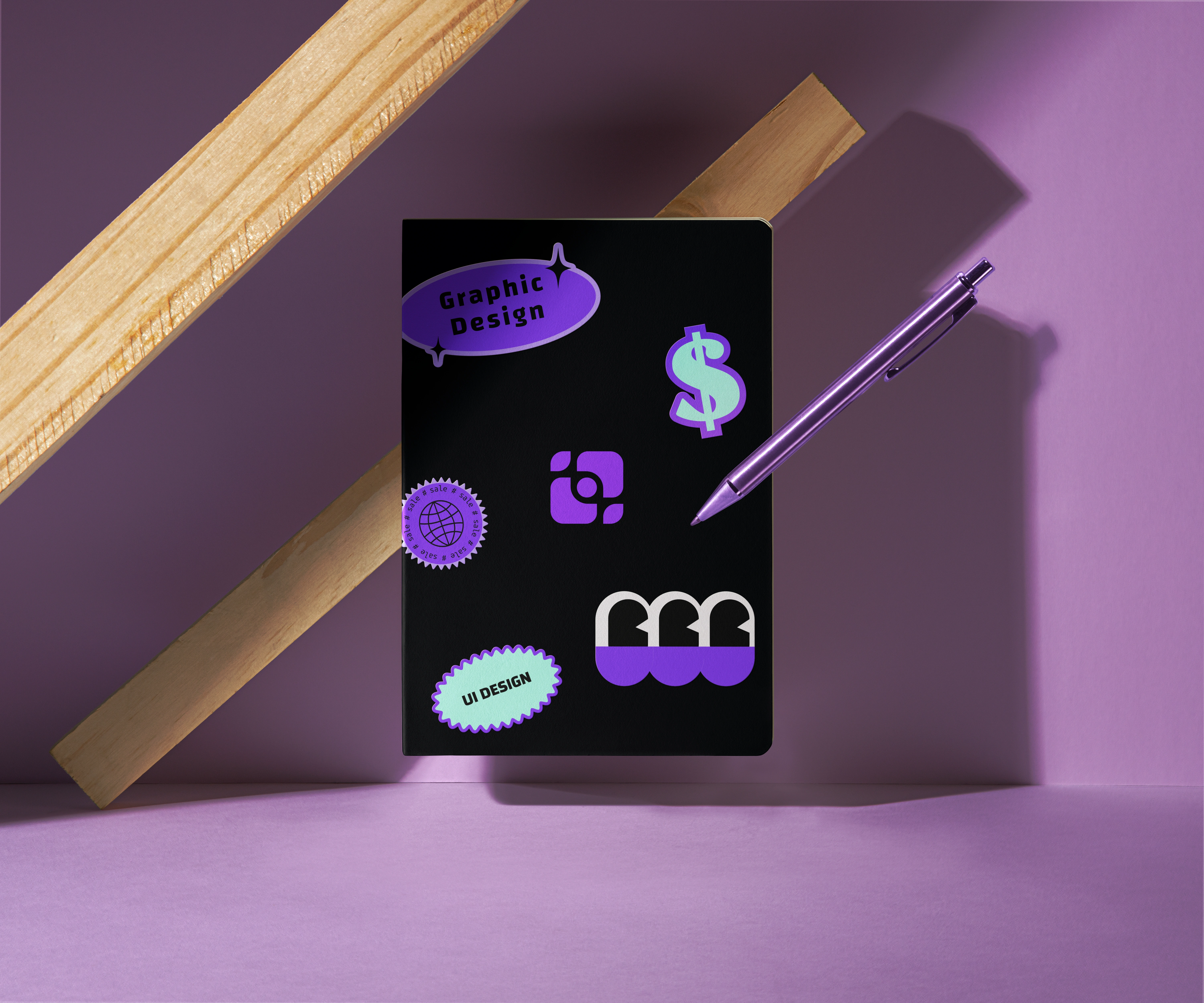
The Colors
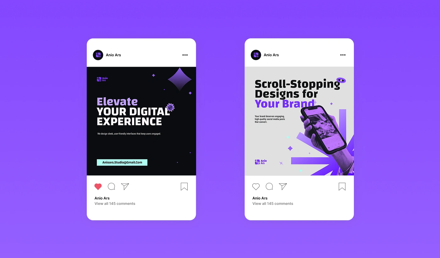
Purple (Primary): The color of creativity, imagination, and mystery perfectly reflecting our bold, forward-thinking spirit.
Teal (Accent): Signifying clarity, freshness, and balance our grounding force in strategic design decisions.
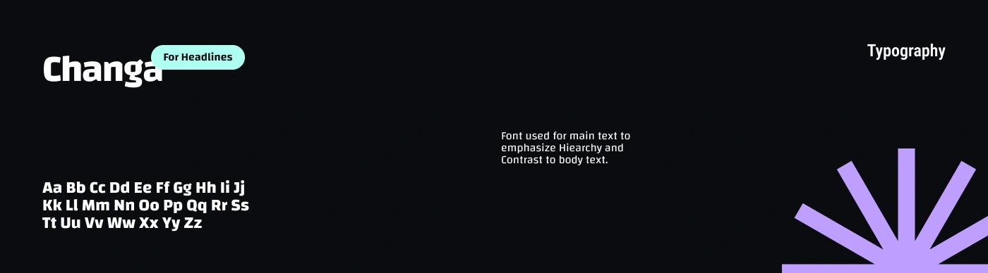
The Typography
We use the Changa typeface bold, expressive, and modular.
It strikes the balance between creativity and structure, just like the way we work.
Roles
This project was crafted by these members of the Anio Ars Studio:
Jaren Joachim Feliciano as UI / UX Designer, Brand Designer, and Graphic Designer.
Marcus Luis Feliciano as Graphic Designer, and Creative Director.
Like this project
Posted Apr 12, 2025
Techy, imaginative, and clean, Anio Ars crafts futuristic, hype-driven visuals that merge innovation with sleek, strategic design thinking.
Likes
2
Views
11
Timeline
Mar 2, 2025 - Mar 8, 2025