Mankay Cerâmica | Branding for a Ceramics Studio

Thayline Vargas


Mankay Cerâmica brand identity
Mankay Cerâmica
Brand redesign and art direction for a ceramics studio in Uberlândia, Minas Gerais.
The brief
Mankay is a ceramics brand from Uberlândia, Minas Gerais. As the business grew beyond its original offering into a studio, school, and community space, it needed a visual identity that could better reflect that expansion.
The redesign was created to strengthen Mankay’s positioning while preserving its artisanal character. The goal was a contemporary, minimalist system with room for the materiality, care, and sensory quality at the heart of the brand.
The idea
Mankay is built around a slower rhythm. In contrast to speed and mass production, the brand offers a pause: a space where clay invites attention to time, presence, and impermanence.
That point of view shaped the identity. Every decision was guided by an organic and human visual language that makes space for touch, imperfection, and the natural pace of the ceramic process.
Visual direction
The identity combines clean compositions, generous whitespace, and simple organic forms. Rather than compete with the pieces, the visual system acts as an extension of the creative process and lets the ceramics remain the focus.

Mankay ceramics illustration and visual language
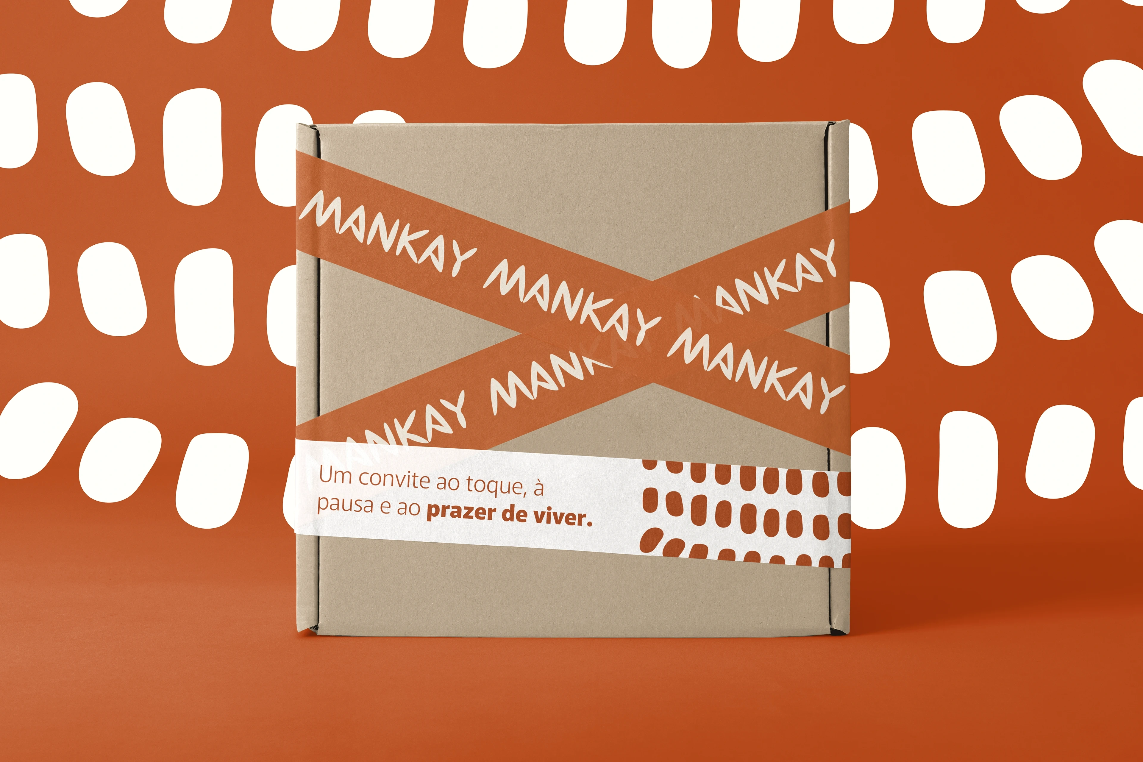
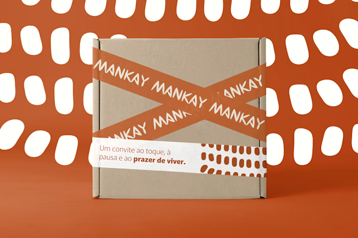
Mankay Cerâmica packaging mockup
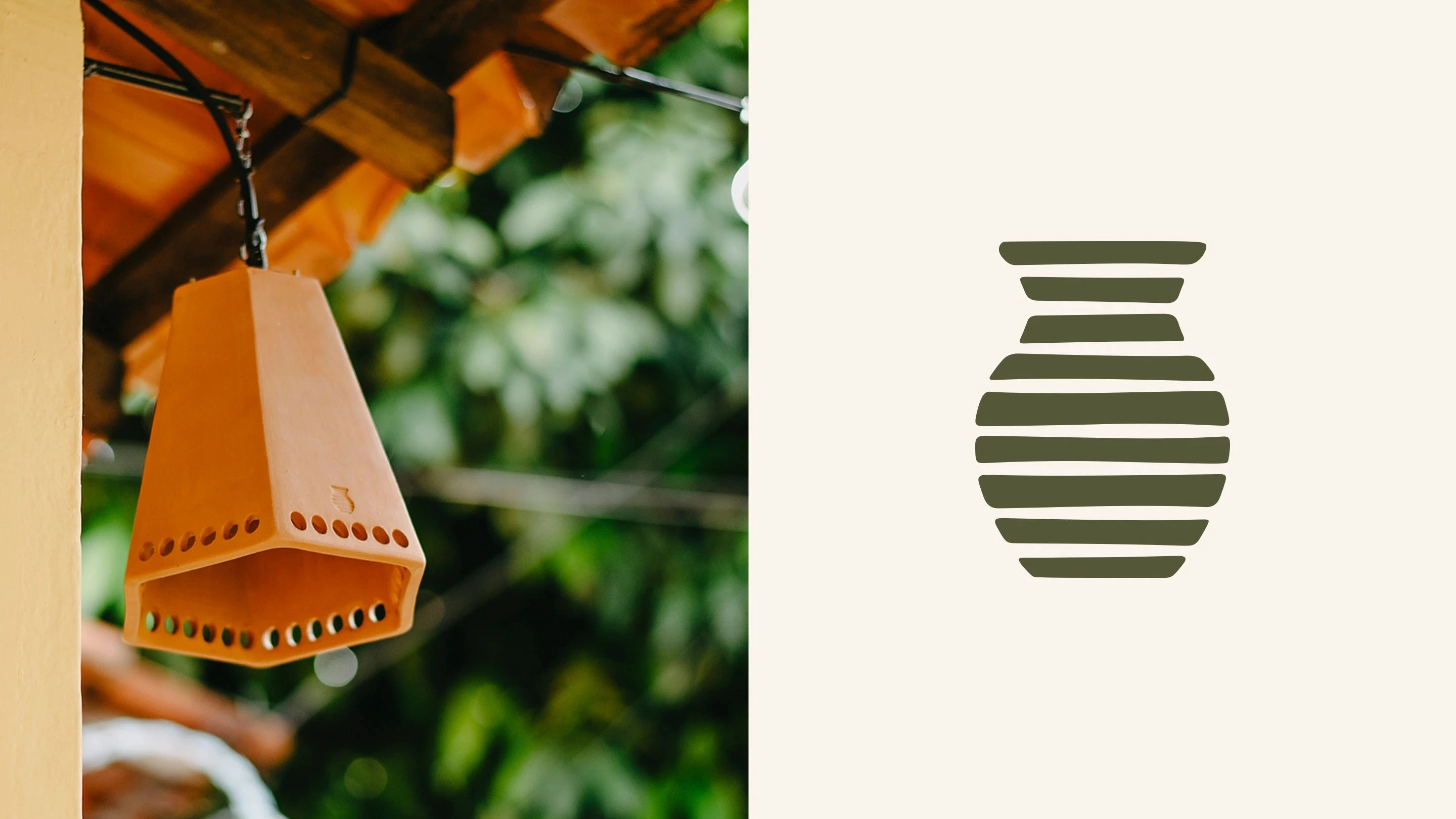
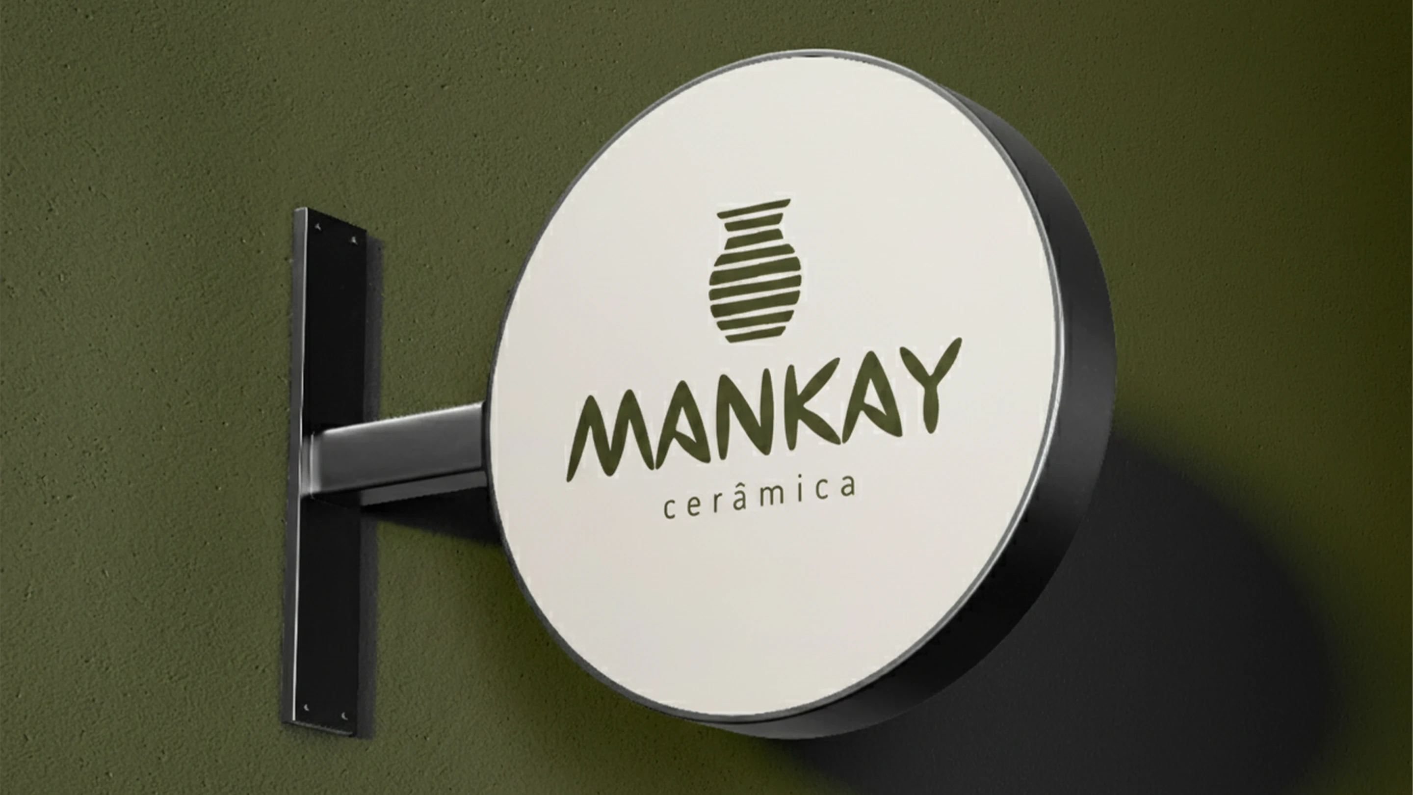
Mankay Cerâmica logo design
The color palette draws from clay, wood, and the studio environment. Warm, earthy tones bring a sense of calm and closeness to the brand while supporting a timeless visual presence.
The result is a cohesive brand identity for a space of making, learning, and connection, where the handmade process becomes part of the experience.
Brand applications
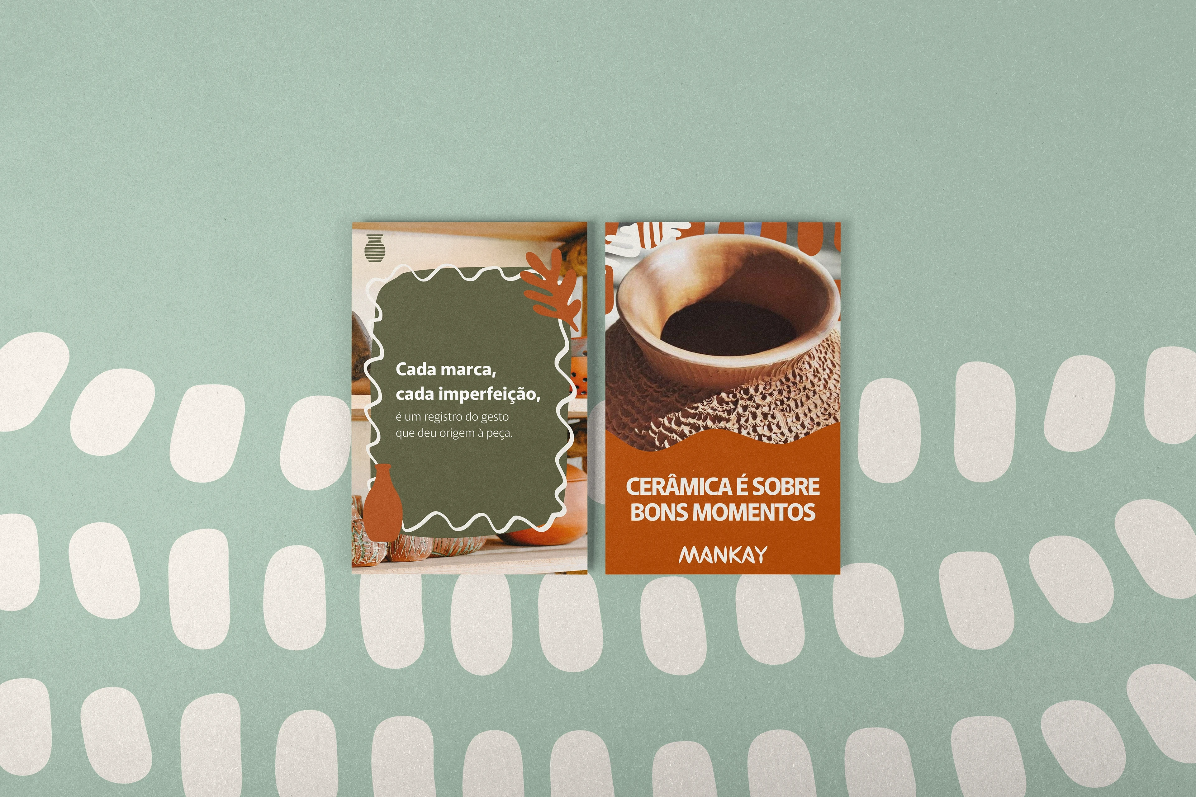
Mankay Cerâmica social media art direction

Mankay Cerâmica branding and product mockup
Project details
Client: Mankay Cerâmica
Location: Minas Gerais, Brazil
Duration: 10 weeks
Scope: Redesign, Art Direction, Visual Identity, Visual Universe
Photography created by and property of Mankay Cerâmica.
Art direction and design: Thayline Vargas
Like this project
Posted Aug 6, 2026
Brand redesign and art direction for Mankay Cerâmica, a ceramics studio in Minas Gerais, Brazil.