Mankay Cerâmica | Brand Identity & Print Design

Thayline Vargas


Mankay Cerâmica
Overview
Mankay Cerâmica is a studio, school, and community hub in Uberlândia, Minas Gerais. As the business grew beyond its original offering, it needed a brand that could hold its handmade character while giving the studio a clearer, more contemporary foundation for its next chapter.
The redesign positions Mankay around the emotional value of making: the time, presence, and transformation held in working with clay.
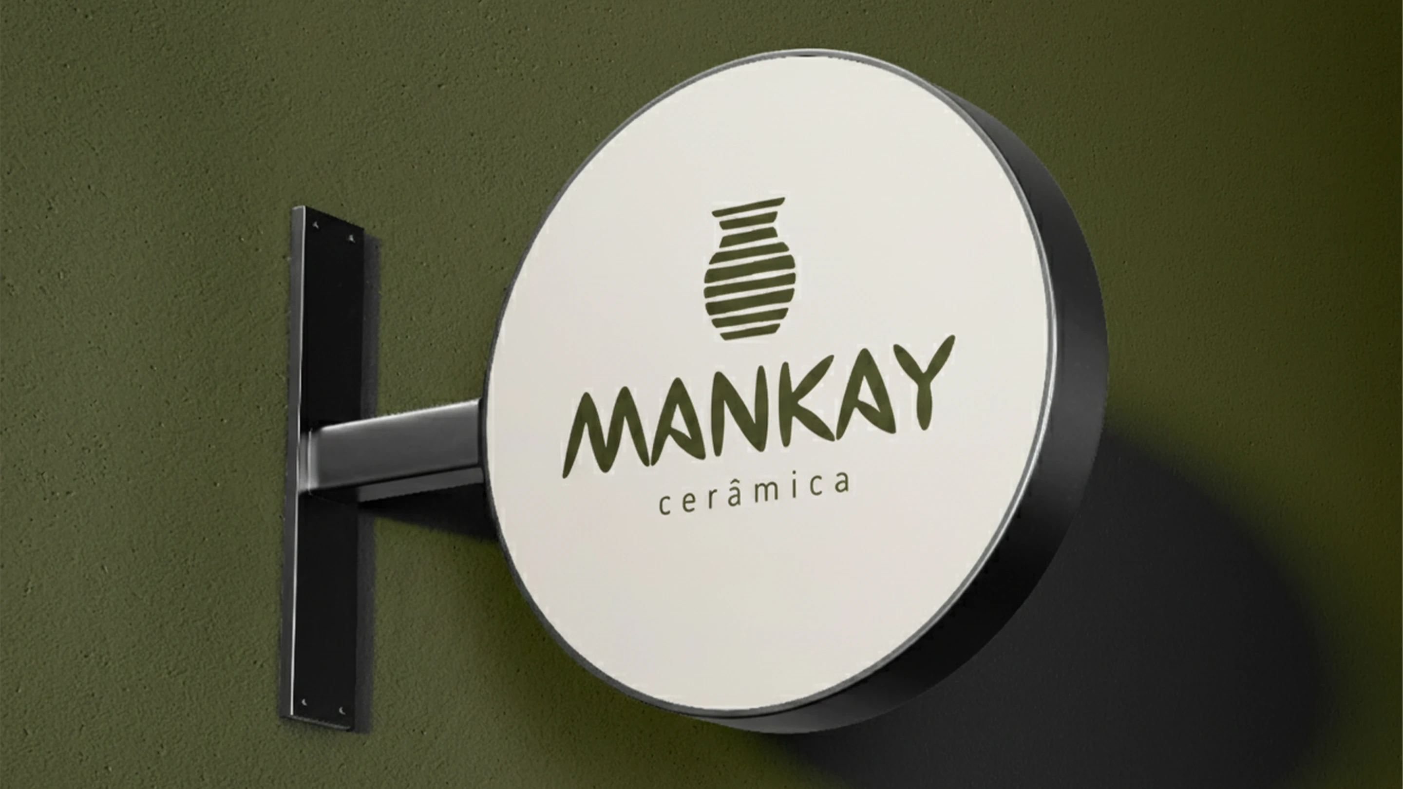
Mankay Cerâmica brand identity
The challenge
Mankay was already trusted for its handmade practice and in-person workshops. The challenge was to evolve that local recognition into an identity system that could support a wider range of touchpoints, including products, classes, digital communication, and future growth.
The work needed to feel tactile and human without becoming nostalgic or overly rustic. It also needed enough clarity and flexibility to let the pieces, the teaching, and the founders’ expertise stay central.
Strategy
The strategic idea began with a slower rhythm. In a culture shaped by speed and mass production, Mankay offers a pause: a place where clay teaches us about time, presence, and transformation.
Three words anchored the identity: time, earth, and touch. Together, they guided a brand world rooted in materiality, natural imperfection, and the human pace of making.
Mankay’s positioning also makes room for the full studio experience. The brand connects objects, learning, and community, bringing manual work back into daily life through the warmth of clay, fire, and the hands behind each process.
The concept
The identity was designed as a flexible system rather than a single mark. It carries the studio’s handmade quality into a contemporary visual language that can move across packaging, social content, education, and physical materials.
The system balances structure with organic expression. Clean compositions and generous whitespace create breathing room, while simple forms and tactile details keep the work close to its material source.

Mankay ceramics illustration and visual language
Visual identity
A warm palette informed by clay, wood, and the studio environment gives the identity its grounded presence. The visual direction stays intentionally restrained, allowing Mankay’s ceramics and their process to lead.
The logo, graphic elements, and art direction work together to create a brand that feels artisanal, welcoming, patient, experimental, educational, and distinctly human.
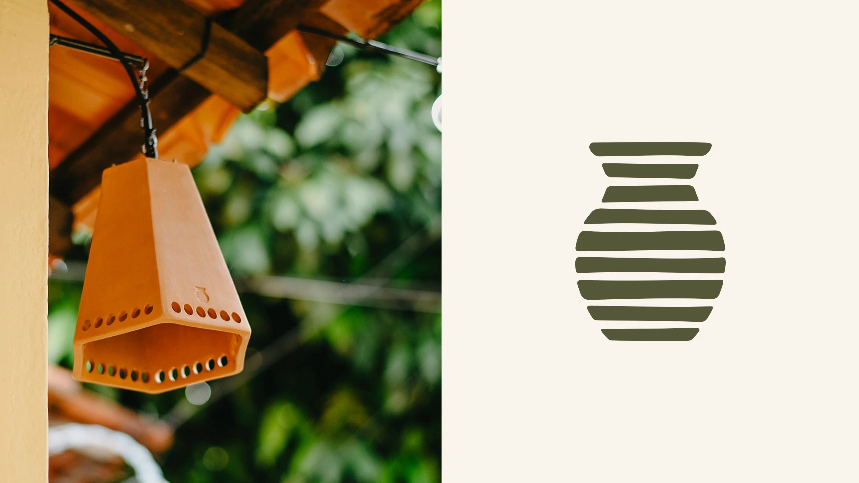
Mankay Cerâmica logo design
Brand applications
The visual system was extended across packaging, product communication, and social media art direction. Each application uses the same balance of warmth, simplicity, and material sensitivity, giving Mankay a cohesive foundation for expansion without losing the integrity of its craft.
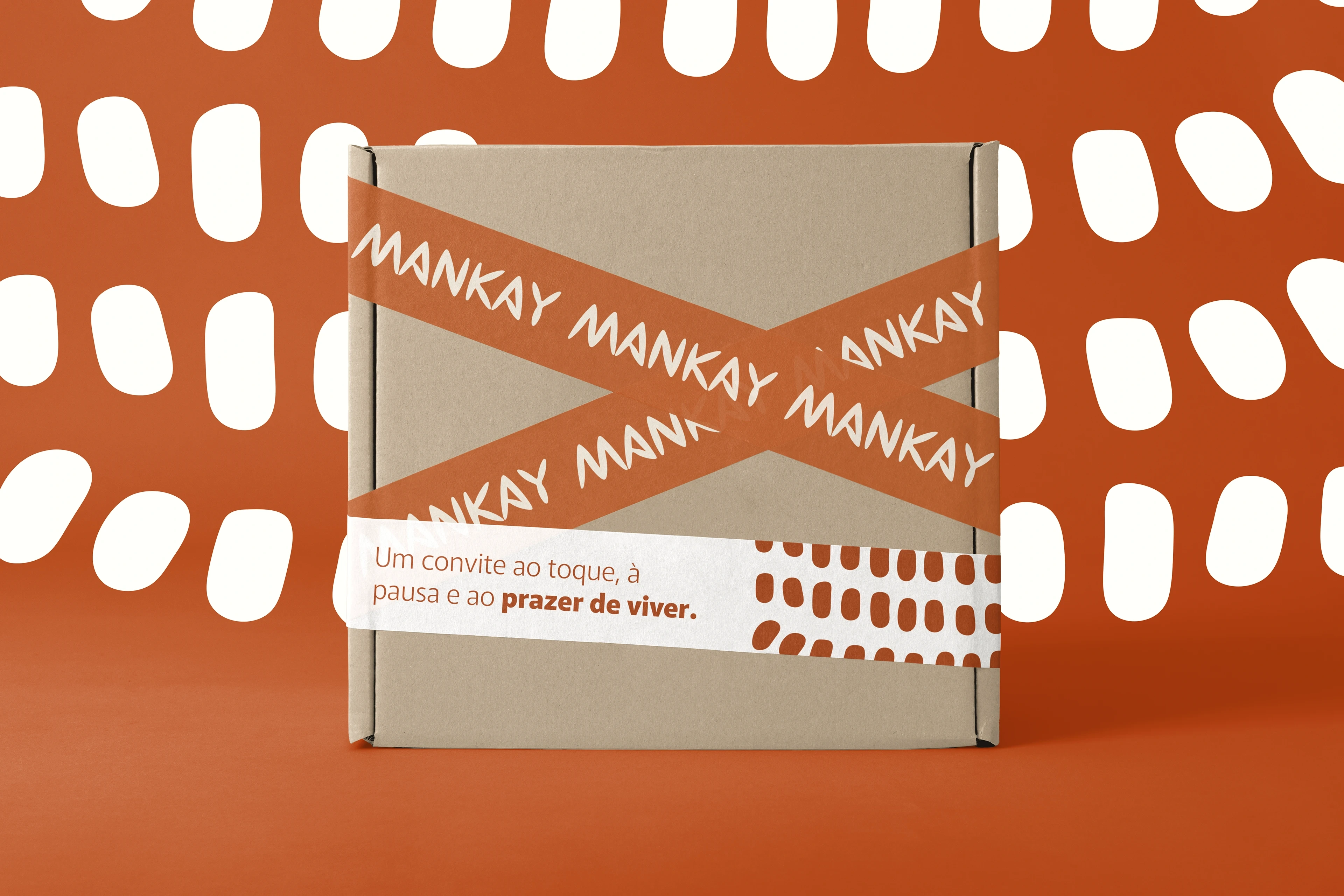
Mankay Cerâmica packaging mockup
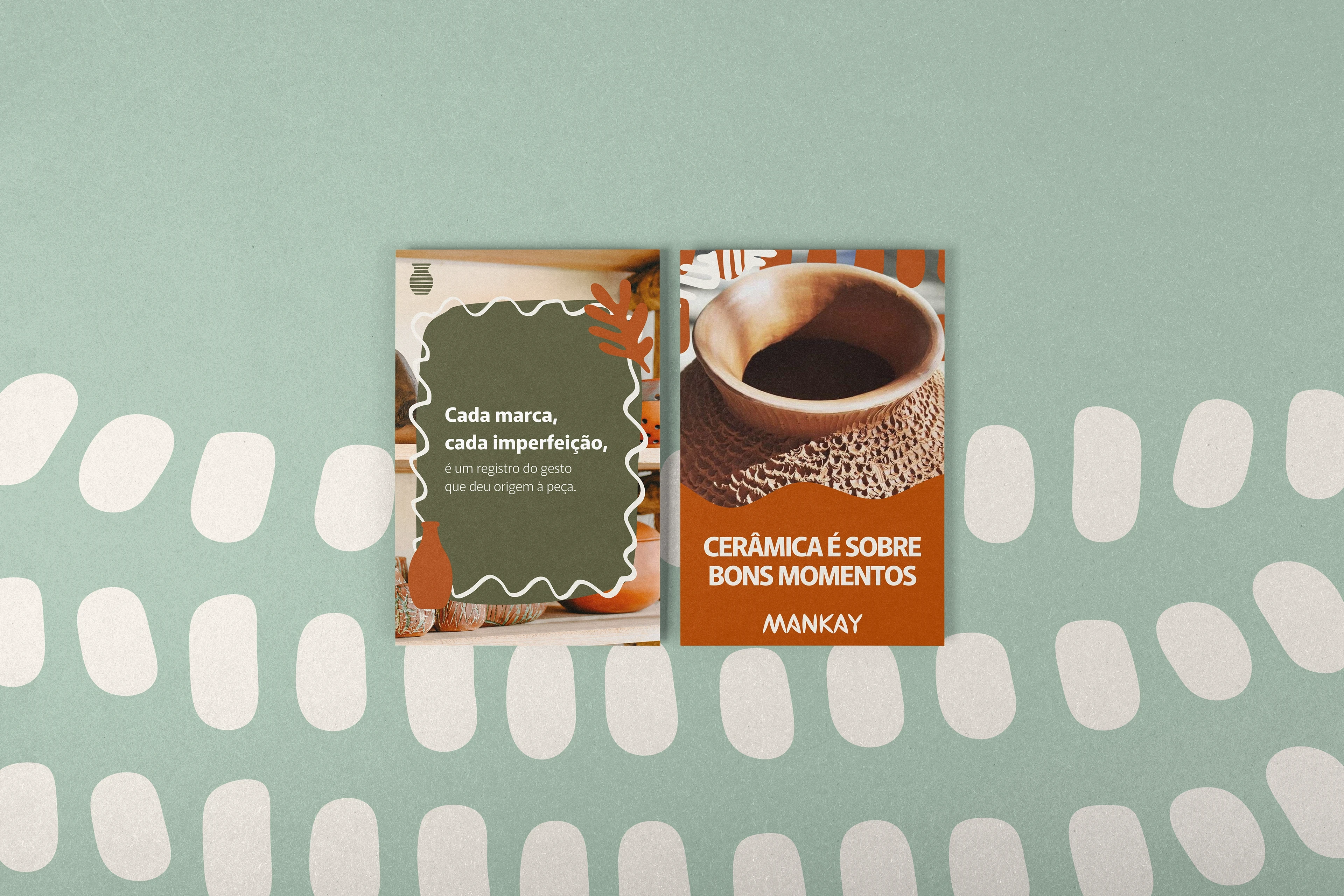
Mankay Cerâmica social media art direction
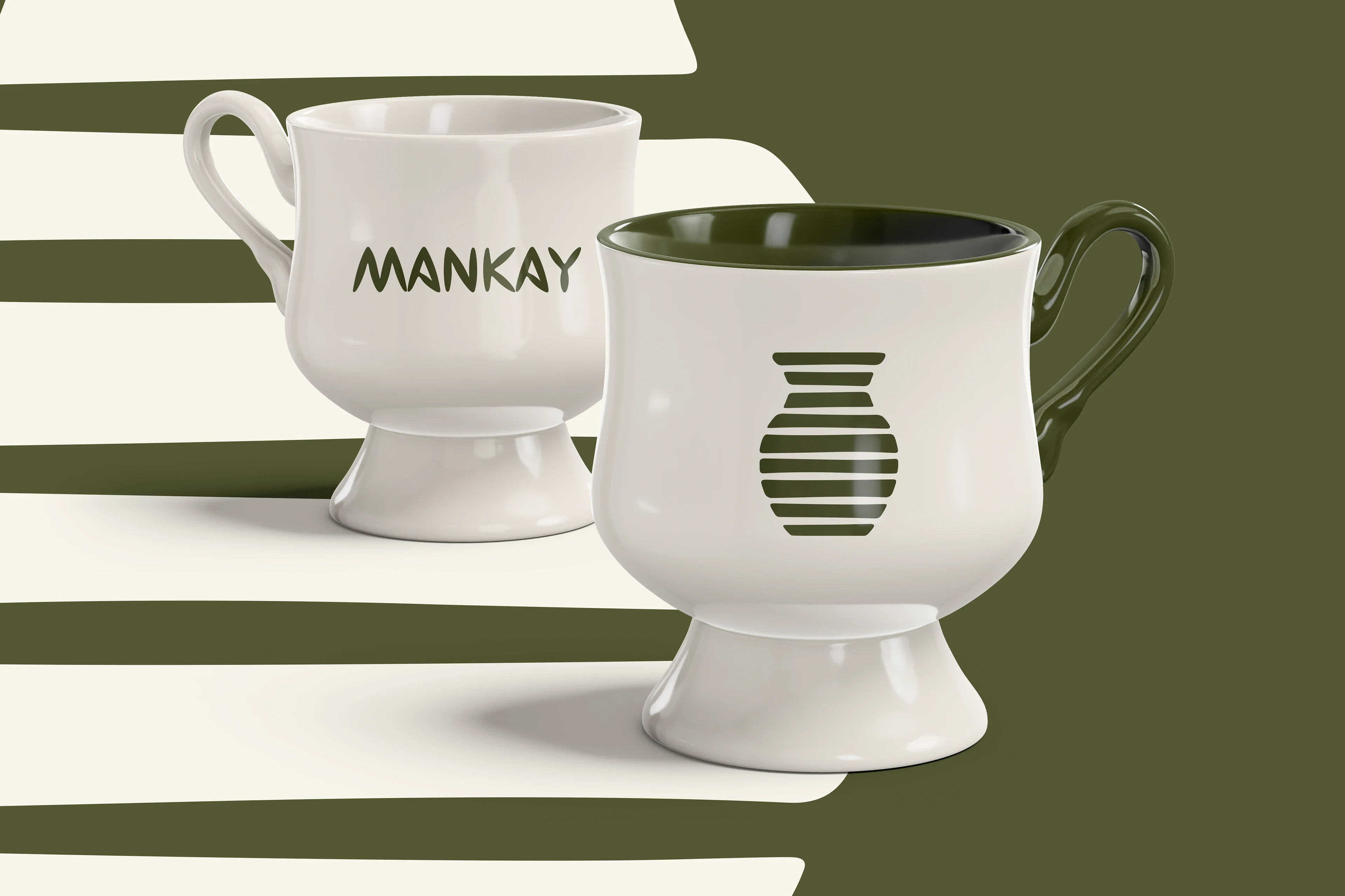
Mankay Cerâmica branding and product mockup
Deliverables
Brand strategy and positioning
Brand redesign and visual identity system
Art direction and visual universe
Logo and graphic elements
Packaging direction
Social media art direction
Brand usage guidance
Project details
Client: Mankay Cerâmica
Location: Uberlândia, Minas Gerais, Brazil
Duration: 10 weeks
Scope: Redesign, art direction, visual identity, and visual universe
Photography created by and property of Mankay Cerâmica.
Art direction and design: Thayline Vargas
Like this project
Posted Aug 6, 2026
Brand redesign and art direction for Mankay Cerâmica, a Brazilian studio where clay, time, and touch shape a contemporary, community-led identity.