Water Filter UX/UI App
Anastasia Voronina
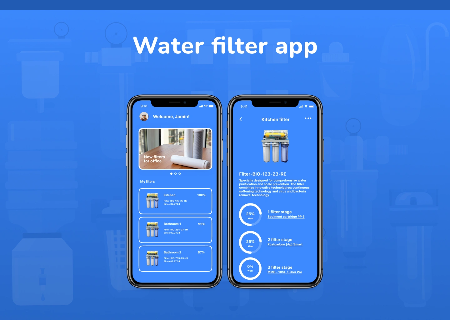
Water Filter App - UX/UI Design
A redesigned mobile experience that helps users easily track water-filter wear, receive timely reminders, and replace components on time. My goal was to simplify the original app’s confusing navigation and create a clear, predictable structure for managing filters.
My role: UX/UI Designer - audit of the existing app, user flows, information architecture, wireframes, and high-fidelity UI.
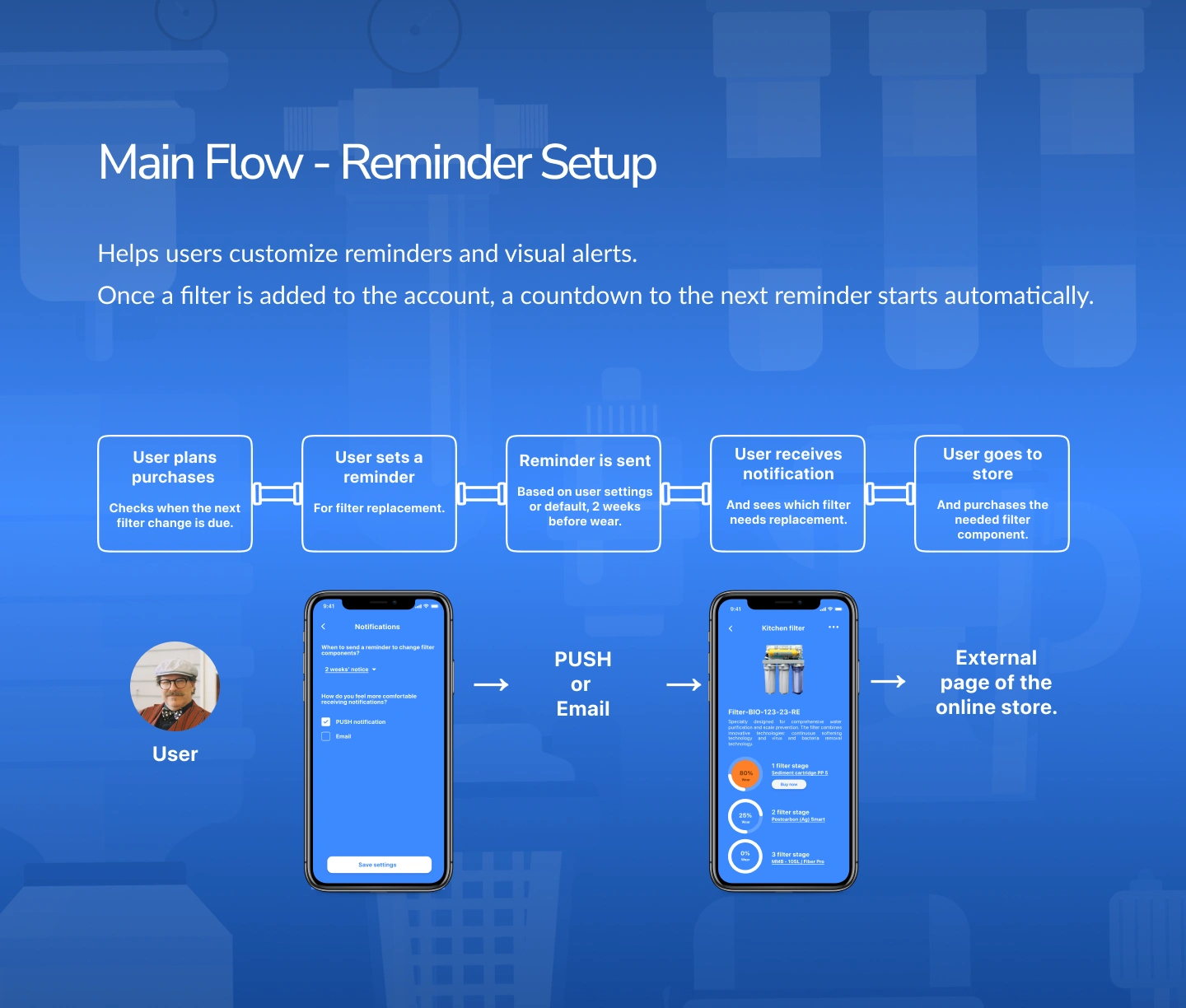
What I delivered: streamlined navigation from Home → My Filters → Filter Details → Checkout, new reminder-setup flow, missed-reminder logic, QR-based filter onboarding, login & signup flows, and supporting screens.
Outcome: a cleaner hierarchy, reduced cognitive load, and an interface that makes filter maintenance intuitive-even for users with multiple installed devices.
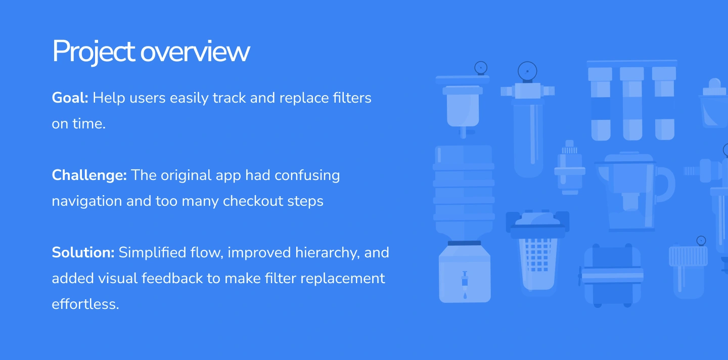
Summary of the app’s goal, main challenges, and design solution: clearer hierarchy, simplified flows, and visual alerts.
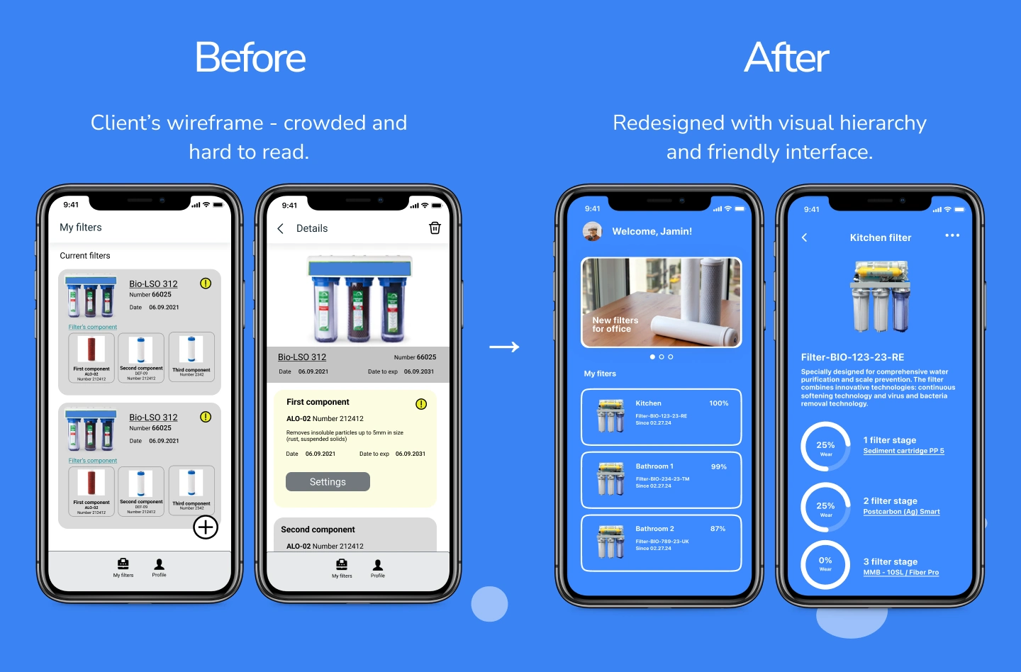
Side-by-side comparison showing the original crowded wireframe and the simplified, modernized redesign
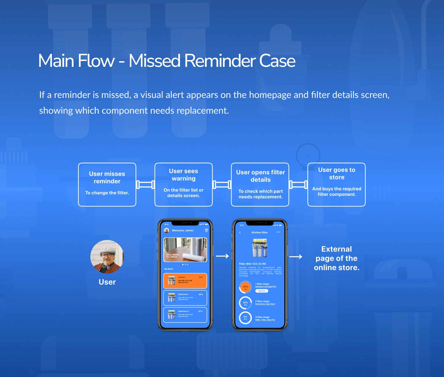
Logic showing how alerts appear if a user ignores a reminder, leading them back into product detail and store purchase.
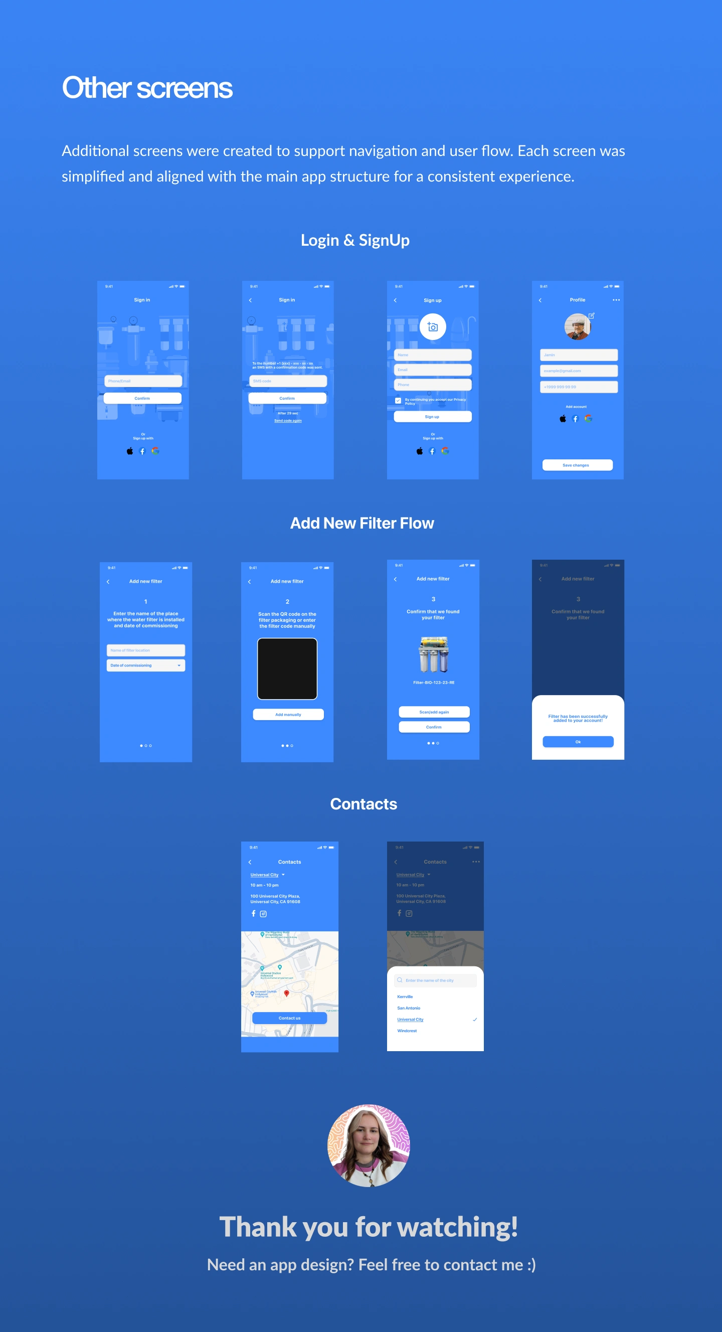
Supporting screens for authentication: email/phone login, SMS verification, and onboarding steps.
Like this project
Posted Jul 19, 2024
Water filter app UI/UX design. I improved user flow, cleaned a heavy prototype, enhanced alerts and reminders, and made part reordering simple and intuitive.
Likes
0
Views
2