Samurice: Logo Identity and Social Media Designs
Lance Lagamayo
Project Overview
Samurice is a takeout-delivery food business concept that sells onigiri or japanese rice balls. They envision their products to remind their customers the taste of authentic and luxurious Japanese cuisine.
Project Duration: June - August 2021 (2 months)
Services Provided: Visual Identity, Packaging Design
My Task: To create a brand identity for Samurice, and a unique packaging design
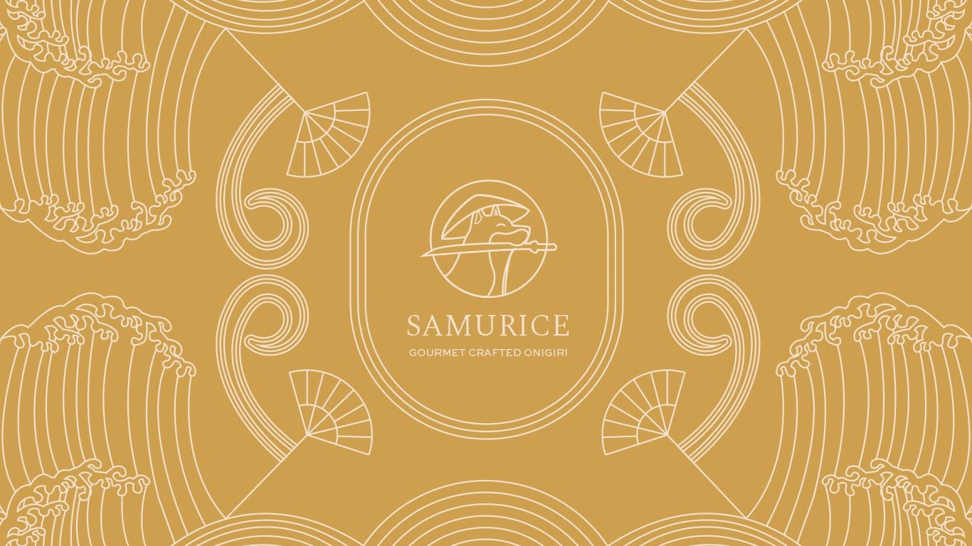
A modern luxurious logo design for Samurice, a brand that sells gourmet crafted onigiri
How might we create an authentic and luxurious brand identity for Samurice?
I begin my design process by setting a call with Jerome (the client, aka Mr. Samurice!) and get to know him and the brand. After the session, we were able to list the brand's competitors, design vision and brand personality. I created a vision board and conducted market research to realign myself and the client.
Finding out what makes brands feel premium or luxurious, competitor scan
Designing a luxurious authentic Japanese food brand with minimalist line art, serif typography and premium-like colors
Me and my client formed three main adjectives for the brand's personality: premium, authentic and amusing. At first, he wanted to focus on the witty and amusing tone of Samurice but in the end, we decided to head for a more luxurious and premium feel since none of his competitors have done this before. From this, I gotten inspiration from Japanese minimalism and how asian graphic design trends make use of line art.
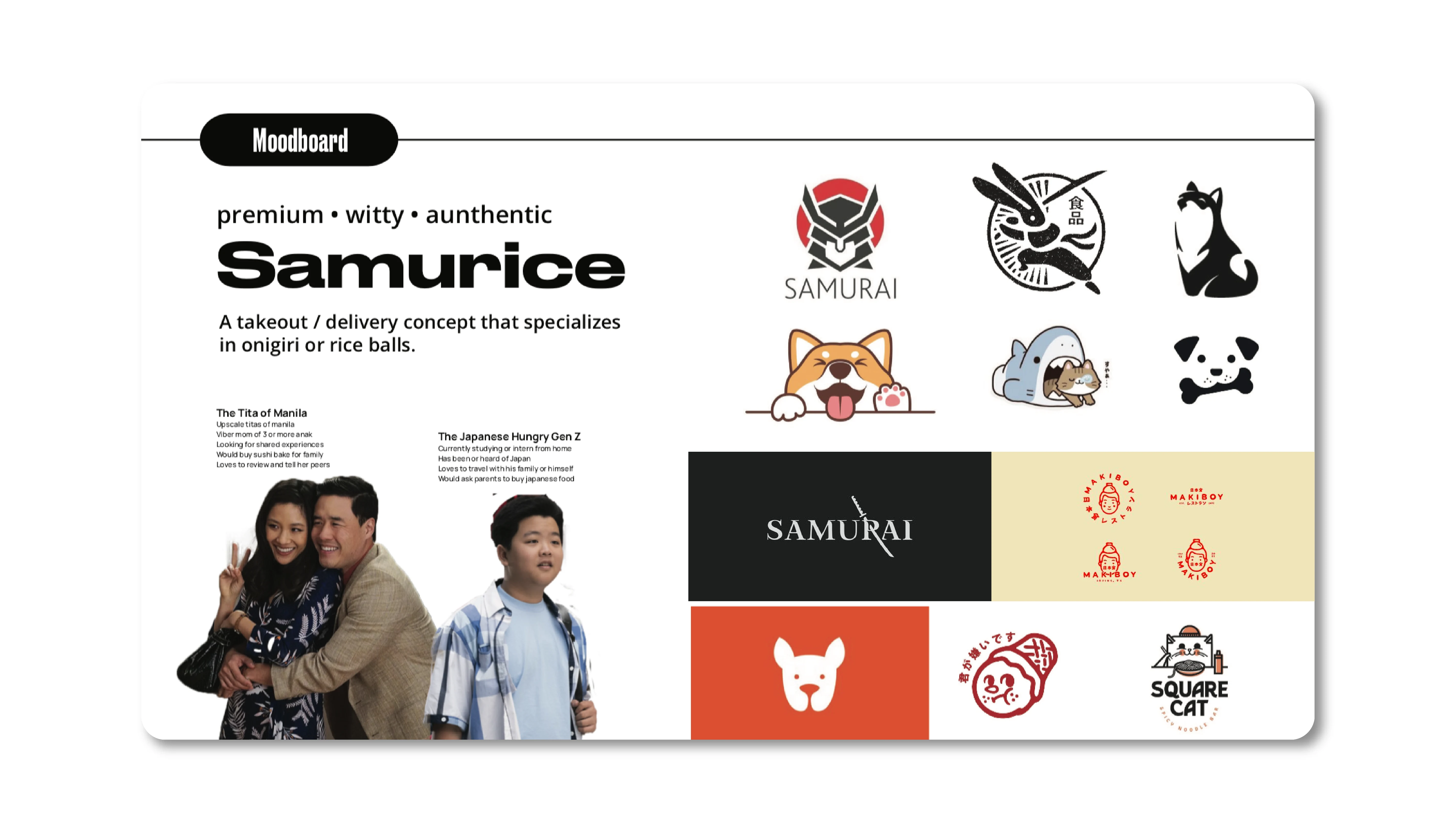
The moodboard for the brand: target audience, pegs, brand personality
Creating a timeless logo design that incorporates the shiba inu
One thing that caught my attention was when Jerome said that his family owns 2 shiba inus and that he wants to incorporate his dogs and a samurai element into his visual identity (so thats why Samurice). They also told me that they're planning to expand to other products aside from onigiris so the logo should only portray onigiri. Hence, I decided to focus on the shiba inu for the logo design.
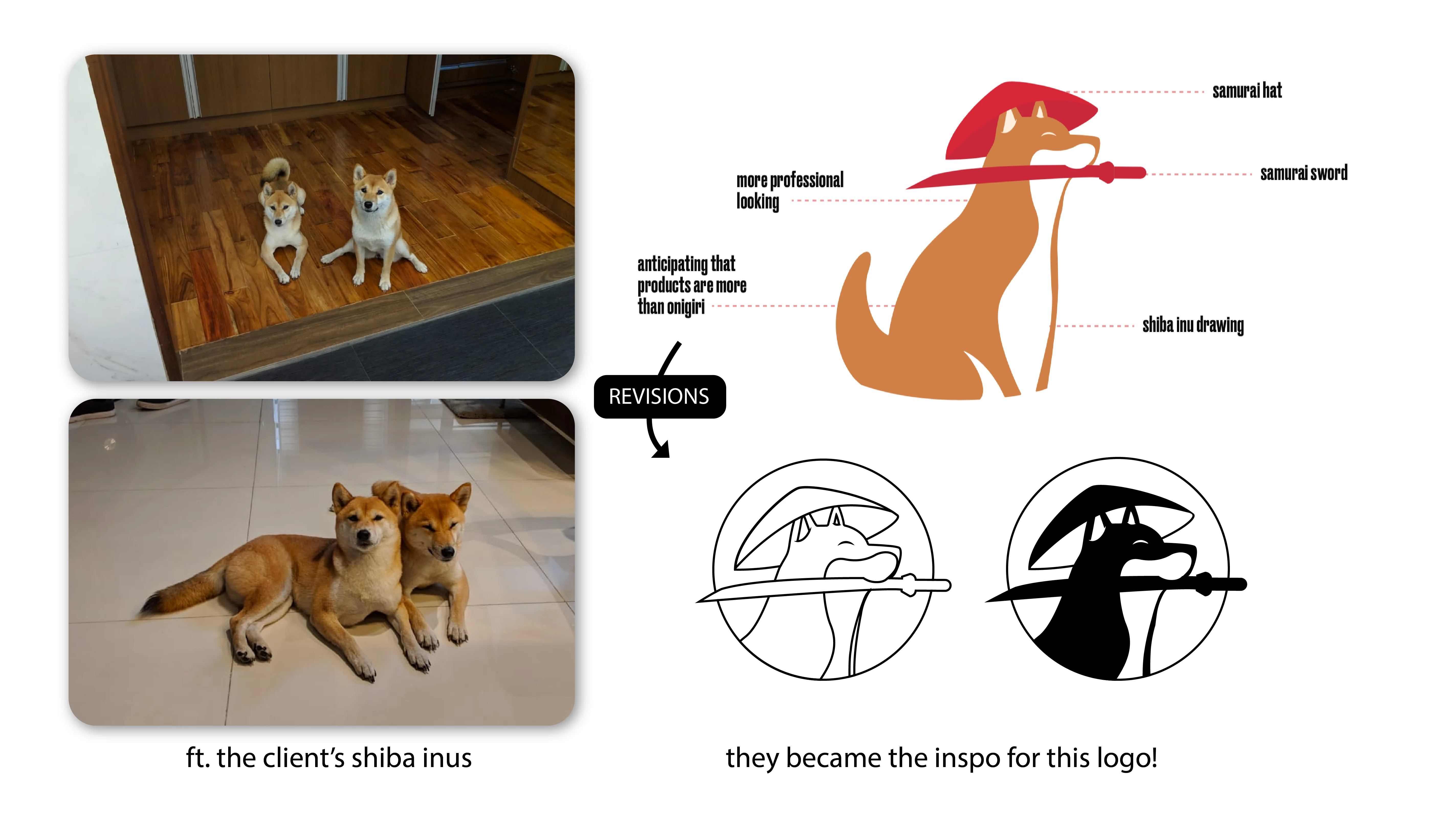
A photo of the client's shiba inus, which became the inspo for the logo design
Samurice: Gourmet Crafted Onigiri Visual Identity and Event Promotions
Too much colors and contrast might lose its luxury feel. Inspired by the flavors that Samurice, I made sure that they wouldn't be too strong for the eyes. Serif typography, Spectral, was used for a traditional and elegance tone.
For the packaging design, they wanted it to look like a toblerone so I decided to go for lined art to keep the daintiness and minimalist tone of the brand. These later became the graphic elements that will be used for social media.
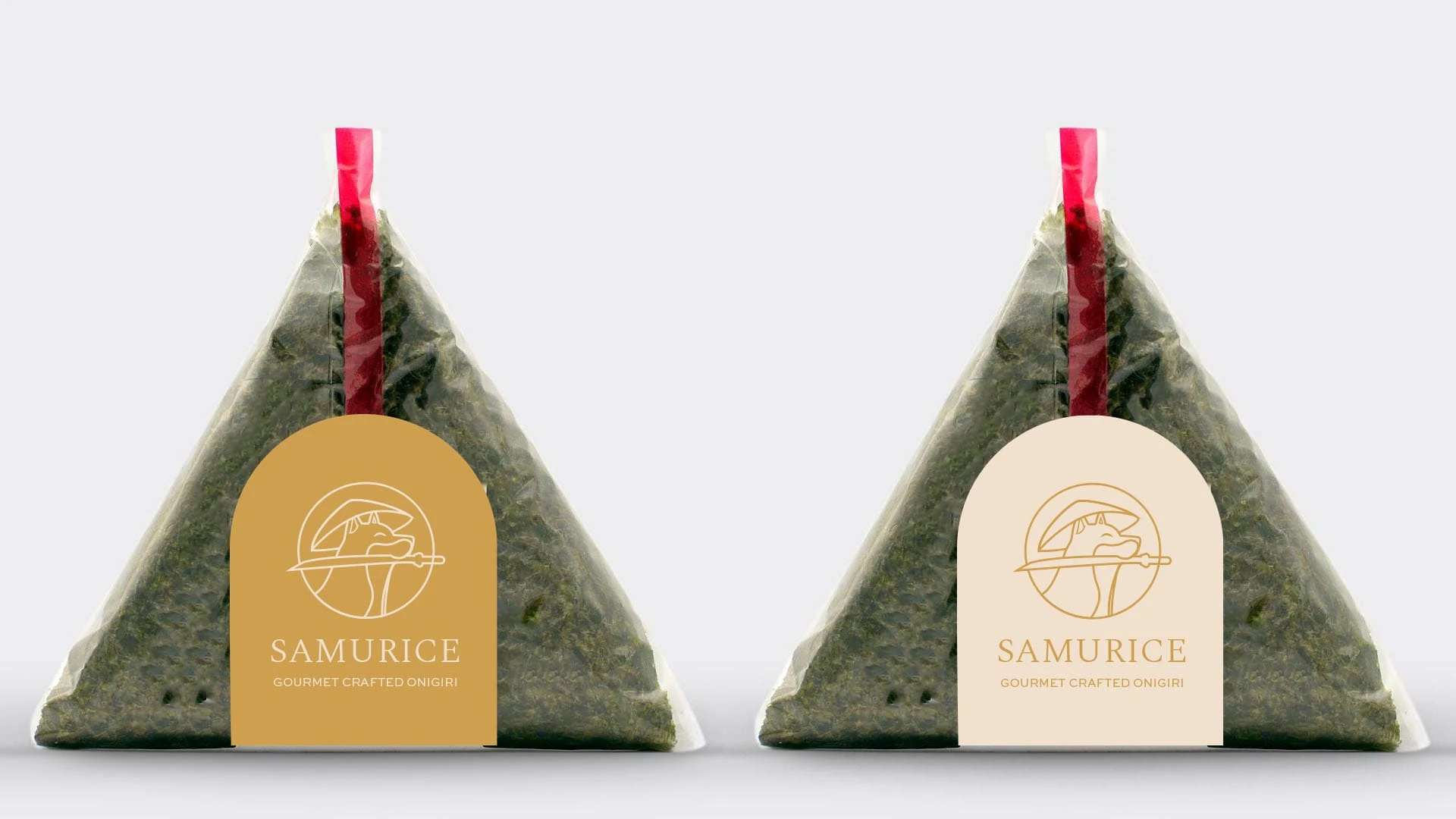
Logo on the packaging
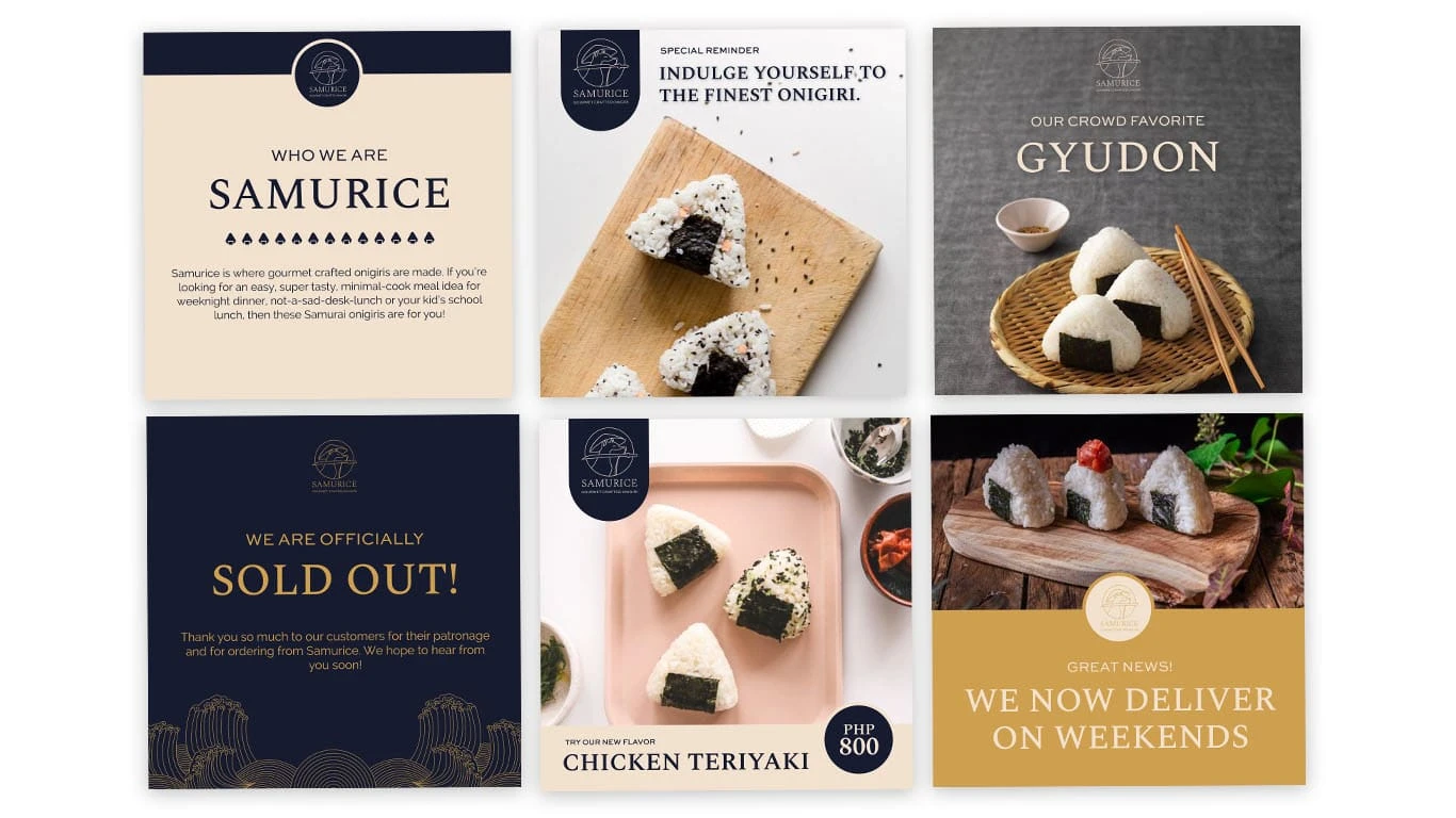
Social media post designs
The brand kit
Like this project
Posted Nov 10, 2021