The Coop: Logo Redesign and Brand Identity
Lance Lagamayo
Project Overview
The Coop: Egg and Buns is a food business stall that opened in a university campus. Having bested 50 other stalls, they were chosen as one of the top food concepts to serve their university for a year.
Project Duration: July 2018 - May 2019 (8 months)
The Task: To create a brand identity for The Coop that showcases its unique selling proposition
Modern logo design for The Coop: Eggs and Buns, a food business that sells egg sandwiches
How might we create brand identity for The Coop that best represents its concept of modern egg sandwiches?
I begin my design process by facilitating a brainstorm session and a SWOT analysis with my partners. I then asked questions on what they want the brand's look, vibe and personality that they want our brand to look like. After laying the foundations of our branding, I created a vision board to visualize what we have finalized on the direction we're going for.
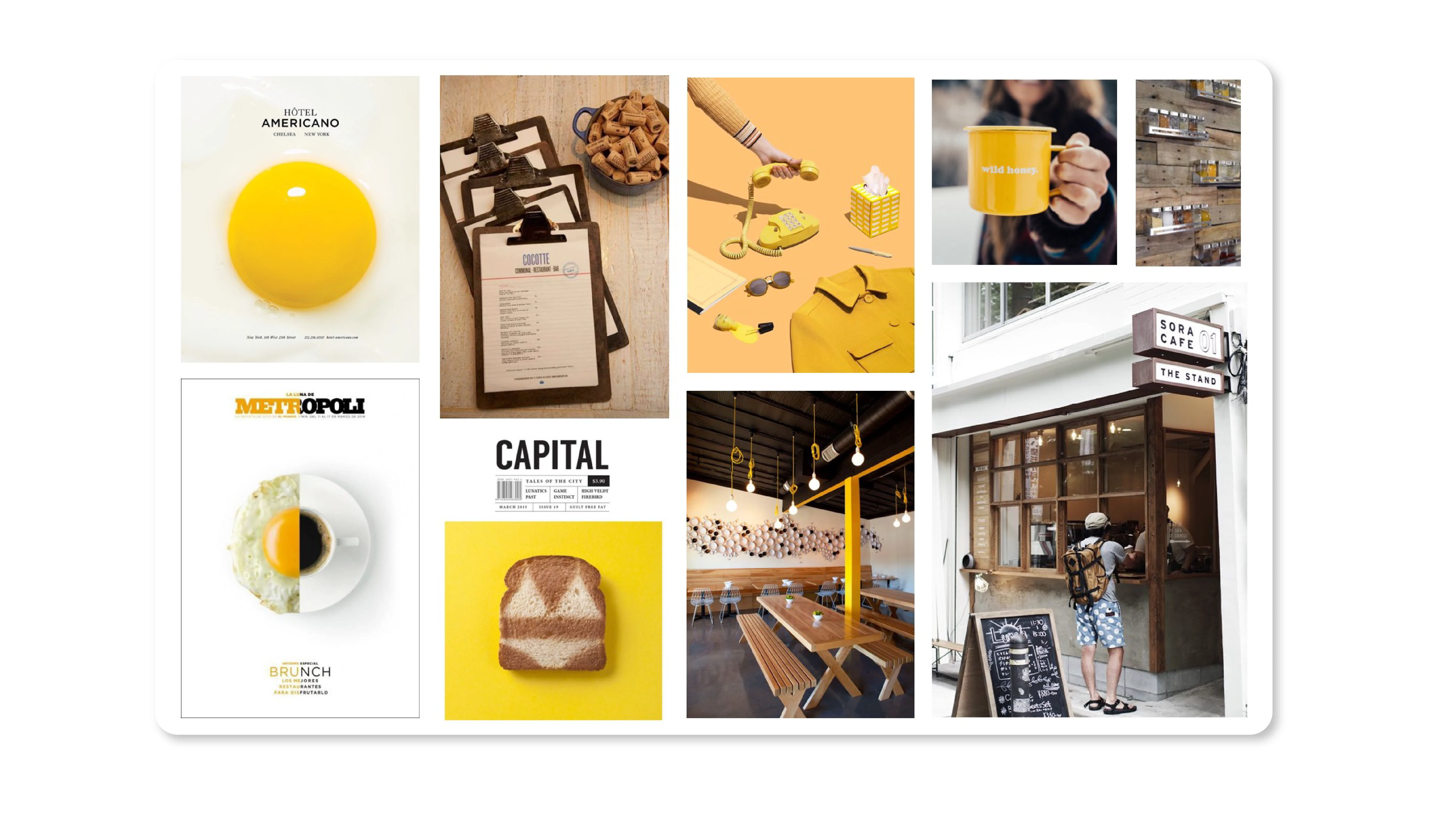
A vision board made for the design direction of the brand
Revisiting the old logo design and finding the points for improvement
The initial logo design that I created was highlighting on the premium and fine-dining feel of the brand. After examination, we found that the student population cannot relate to the sophisticated elite style. Hence, that's why we needed to change the direction of our branding.
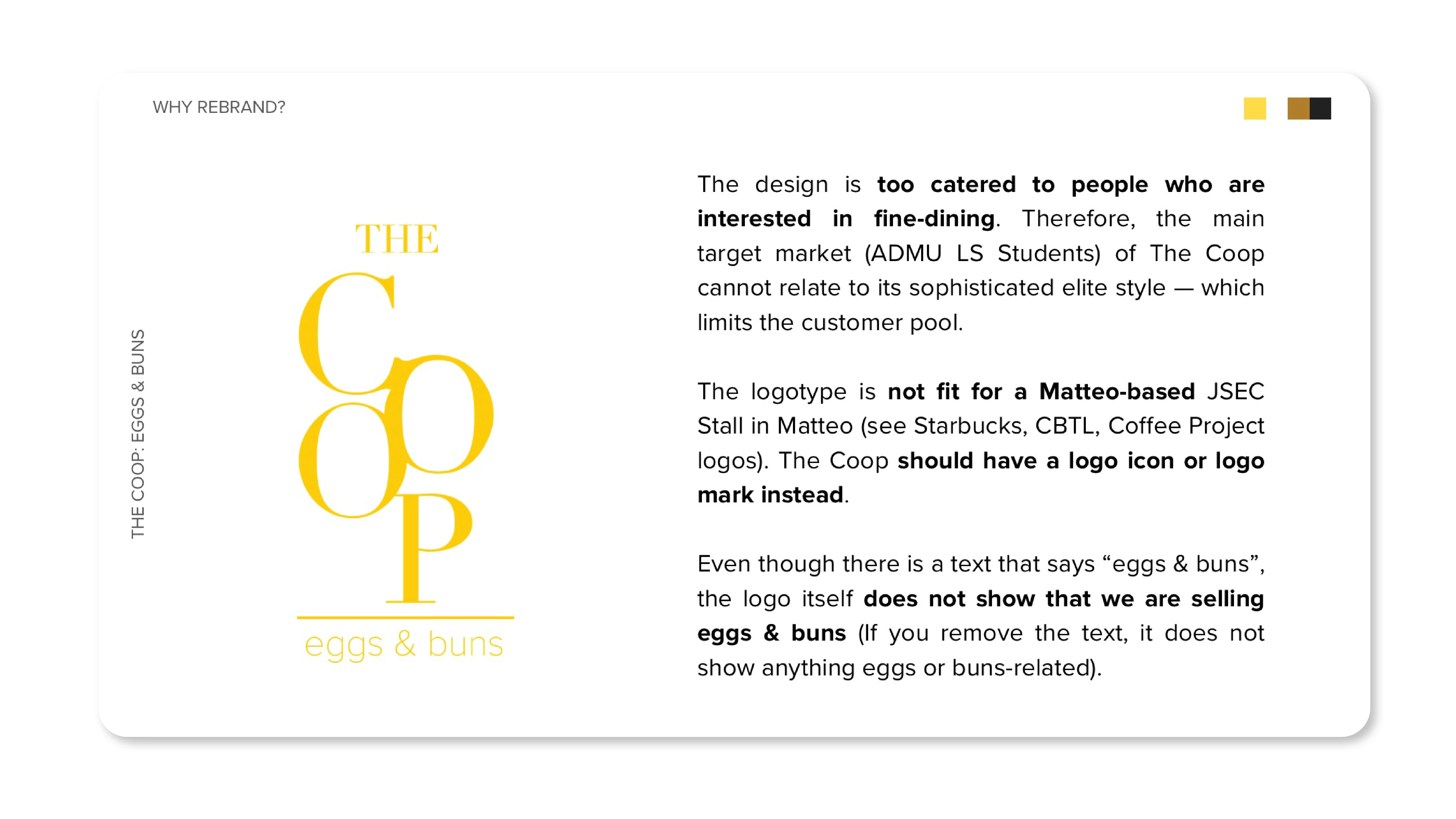
Finding the points of improvement of the old logo
Creating a modern logo design that incorporates the two main ingredients: eggs and buns
I decided to pivot to a logo design that has imagery. Simple text that says "eggs & buns" is not enough; we need to show and tell. We were inspired by breakfast or brunch cafes, diners and restaurants (particularly Eggslut) and how they portray themselves as modern and youthful breakfast brands. I created a design inspiration board and proceeded to sketch a logo design that not only says but also shows our products, eggs and buns.
The logo ideation process behind The Coop: Eggs and Buns
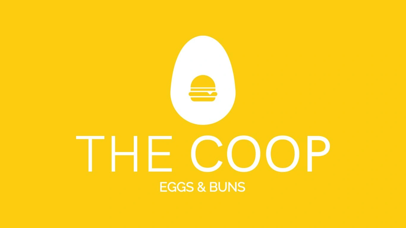
The Coop: Eggs and Buns Redesigned Logo and Visual Identity
The revamped logo design is more relatable to the target audience, as well as bring a casual or comfort food feel to the branding. The logo makes use of a bun inside the egg, symbolizing the importance and impact of the egg in our buns. The bun also resembles a yolk which makes the whole logo look like an egg.
The Logo Reveal, Alternate Versions and Logo Guidelines
Like this project
Posted Nov 10, 2021