Health Registry
Ashwin Bajaj
I worked on the redesign of eFra (formerly TN-PHR®), a public health with over 300,000 beneficiaries in Tamil Nadu. My focus was on crafting a clear design strategy that balanced scalability, accessibility, and adoption. I developed a new visual language and design system, introduced a remote method for discount usability testing, ensured smooth handovers, coordinated across teams, and conducted regular design audits to drive continuous improvement.
In Tamil Nadu, the healthcare system must evolve to meet rising demands for accessible, high-quality care. The challenge is to accelerate digital transformation in a way that ensures personalized, equitable medical support for all, while improving outcomes and addressing local infrastructure limitations.
To understand user needs and contextual challenges in Tamil Nadu’s public health system, I conducted mixed-method research aimed at uncovering behavioral patterns and systemic gaps. Methods like mind mapping and scenario mapping revealed thematic connections and user flows. Diary studies and interviews offered insights into daily routines and deeper motivations, while shadowing captured real-time interactions. Desk research, academic papers, and a precedent study contextualized findings and informed design benchmarks.
These insights grounded the design in real experiences, ensuring it remained empathetic and problem-focused.
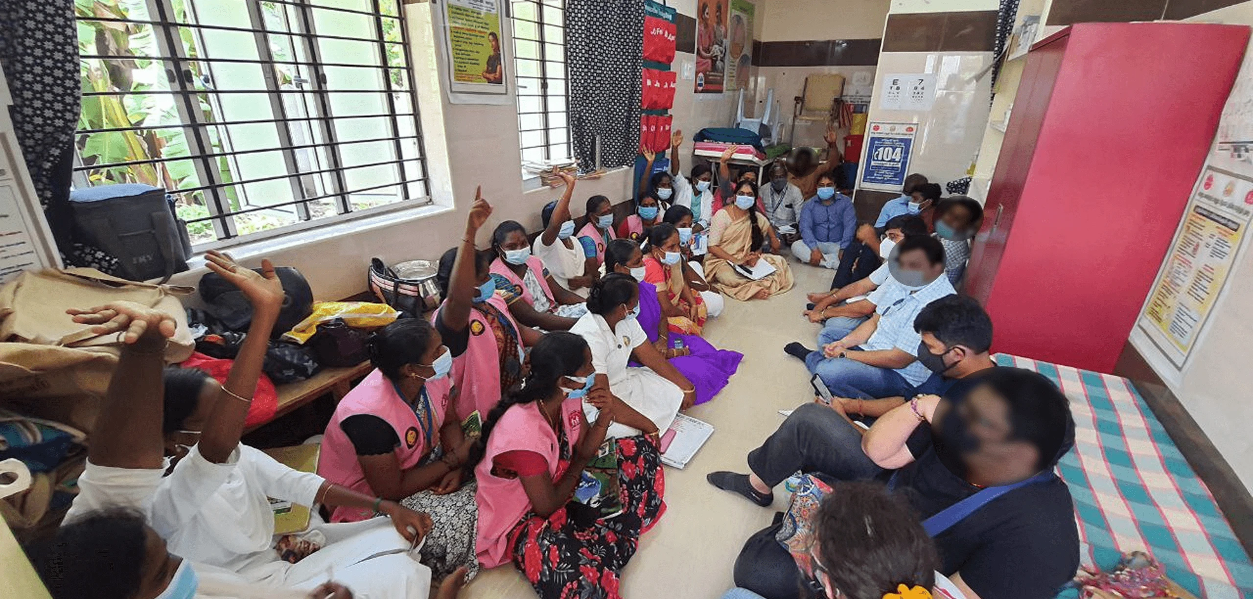
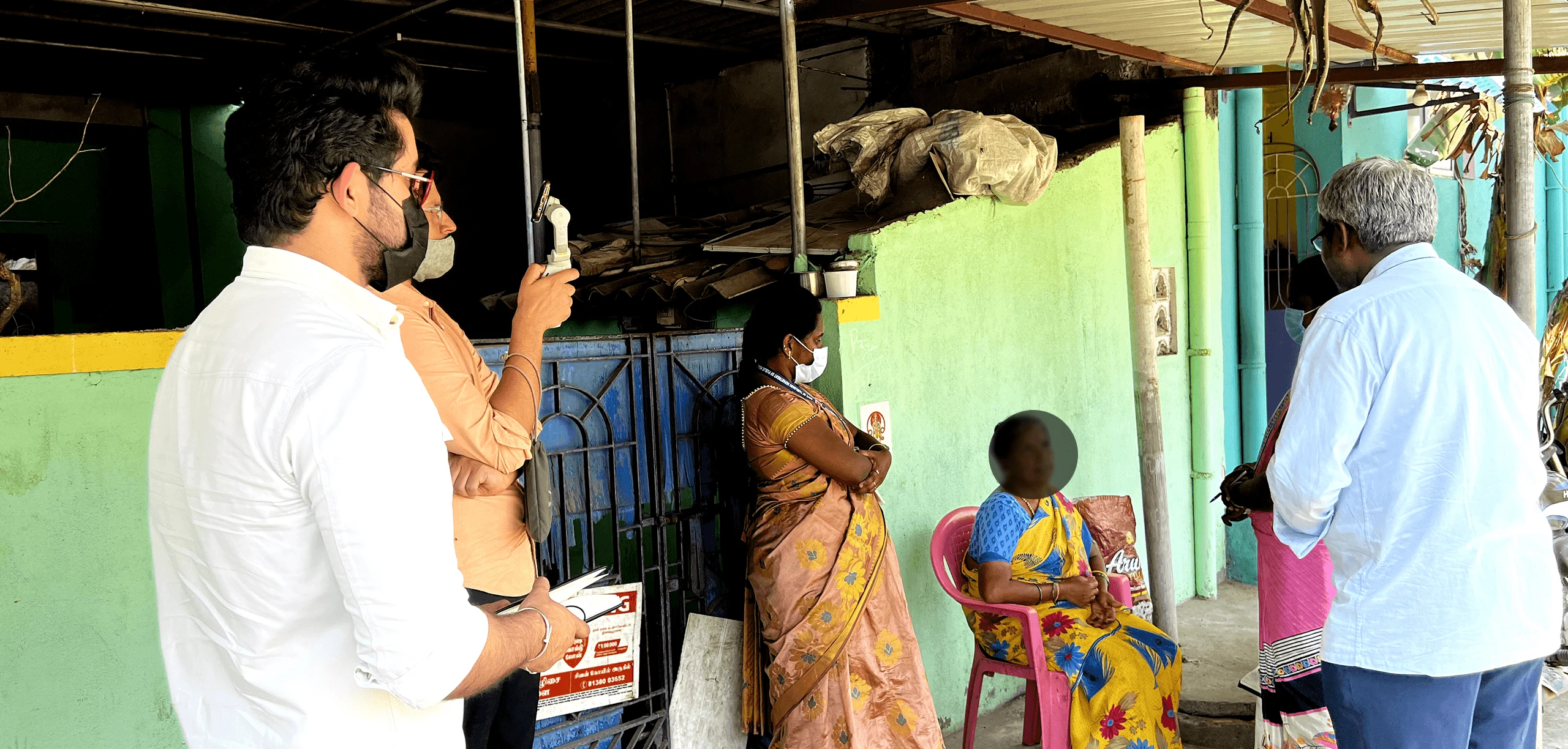
To design a solution that worked for everyone, we engaged closely with WHVs, nurses, doctors, program managers, and policymakers.
difficulty building trust in rural areas,
misunderstood consent flows,
urban user drop-offs, and
the app being seen as a distraction.
Yet their input was clear, health workers needed simple, mobile-first tools, while patients wanted transparency, control, and continuity.
These insights informed clear design priorities and helped align the solution with on-ground realities
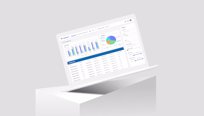
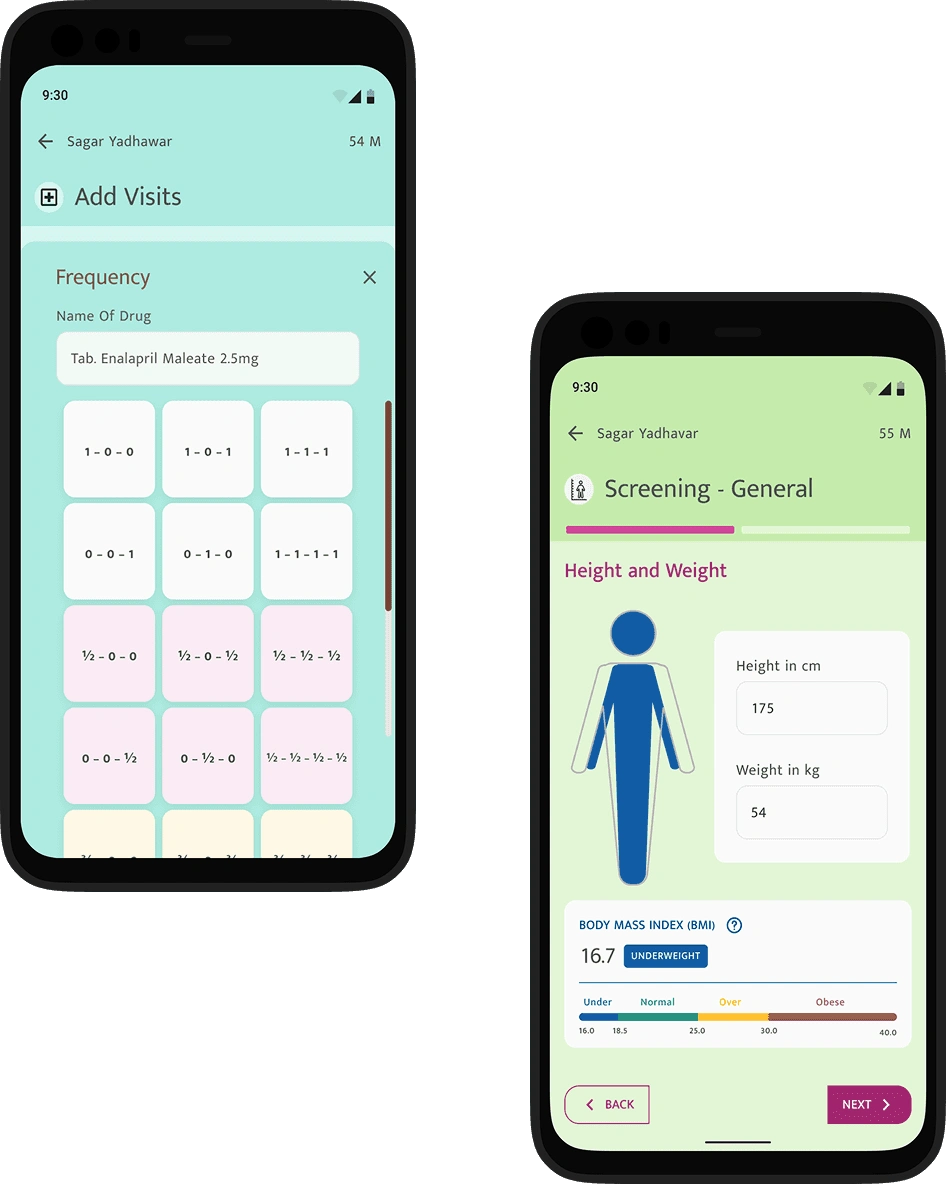
The TNPHR app (now eFRA) was developed to replace time-consuming paper-based processes with a faster, more reliable digital tool. It enabled frontline workers to enter data efficiently while maintaining accuracy and avoiding duplication
🧠 User-friendly – Simple flows designed for easy adoption by WHVs
🔁 No duplication – Smart checks prevent repeated entries
📊 Data integrity – Maintains accuracy for cleaner, more reliable records
📱 Mobile-first – Optimized for on-the-go healthcare delivery
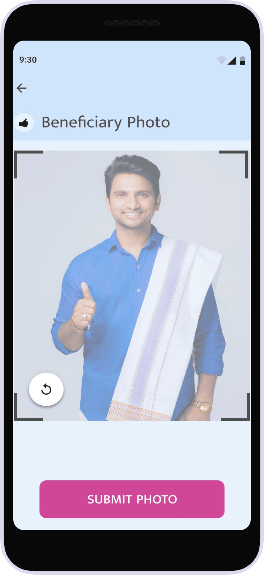
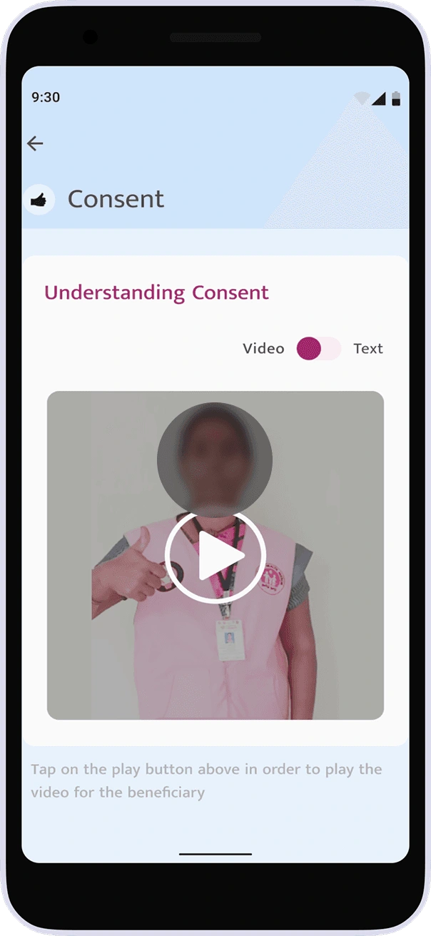
But we quickly realized that for patients to truly benefit from a digital health platform, we had to go a step further, we had to build trust.
This meant taking the time to explain what digital health records are, how their data would be used, and most importantly, why their consent mattered. Many had never encountered the concept of data privacy or ownership before, so we simplified the message: "Your health data is yours. You choose who sees it, and how it's used."
To manage the complexity of a multi-featured public health platform,
we applied the Jobs to Be Done (JTBD) framework to focus on users' real goals.
Job statements like “I want my records easily available” and “I want to know who can access my info” helped align stakeholders, prioritize features, and shape platform flows that were intuitive, secure, and meaningful to both patients and healthcare workers.
🎯 Focused on real outcomes, not just tasks
🧩 Mapped functional and emotional user needs
🛠️ Informed feature prioritization and platform structure
👥 Used job statements to align cross-functional teams
🔒 Highlighted needs for data accessibility, safety, and control
📱 Ensured user flows reflect real-world goals and expectations
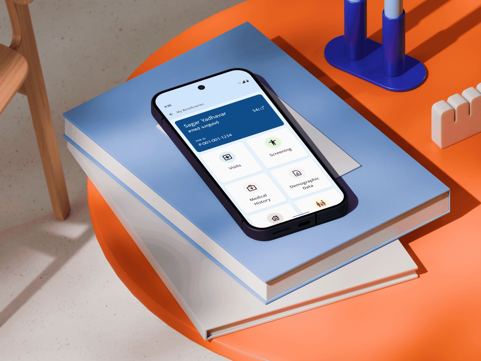
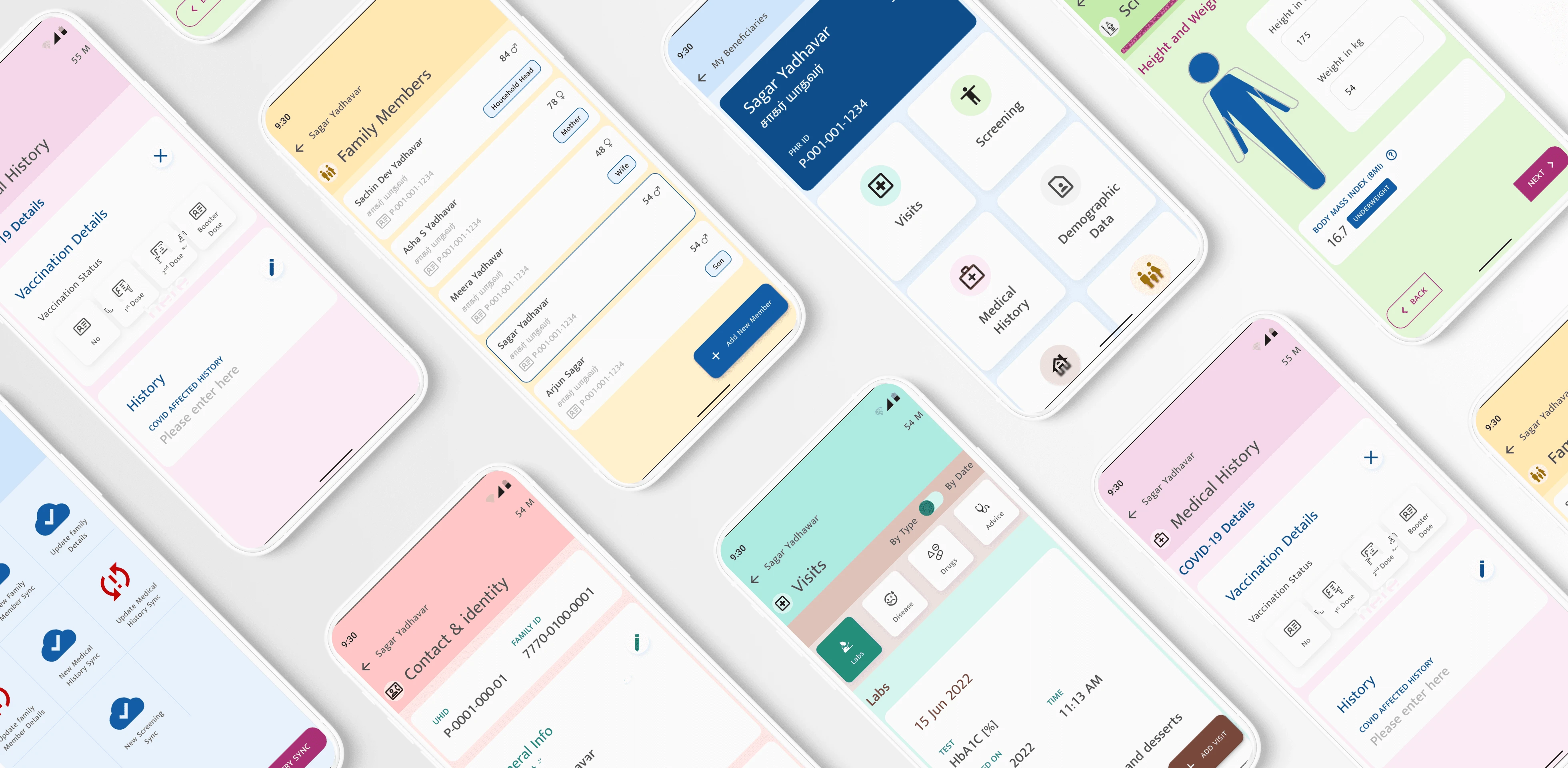
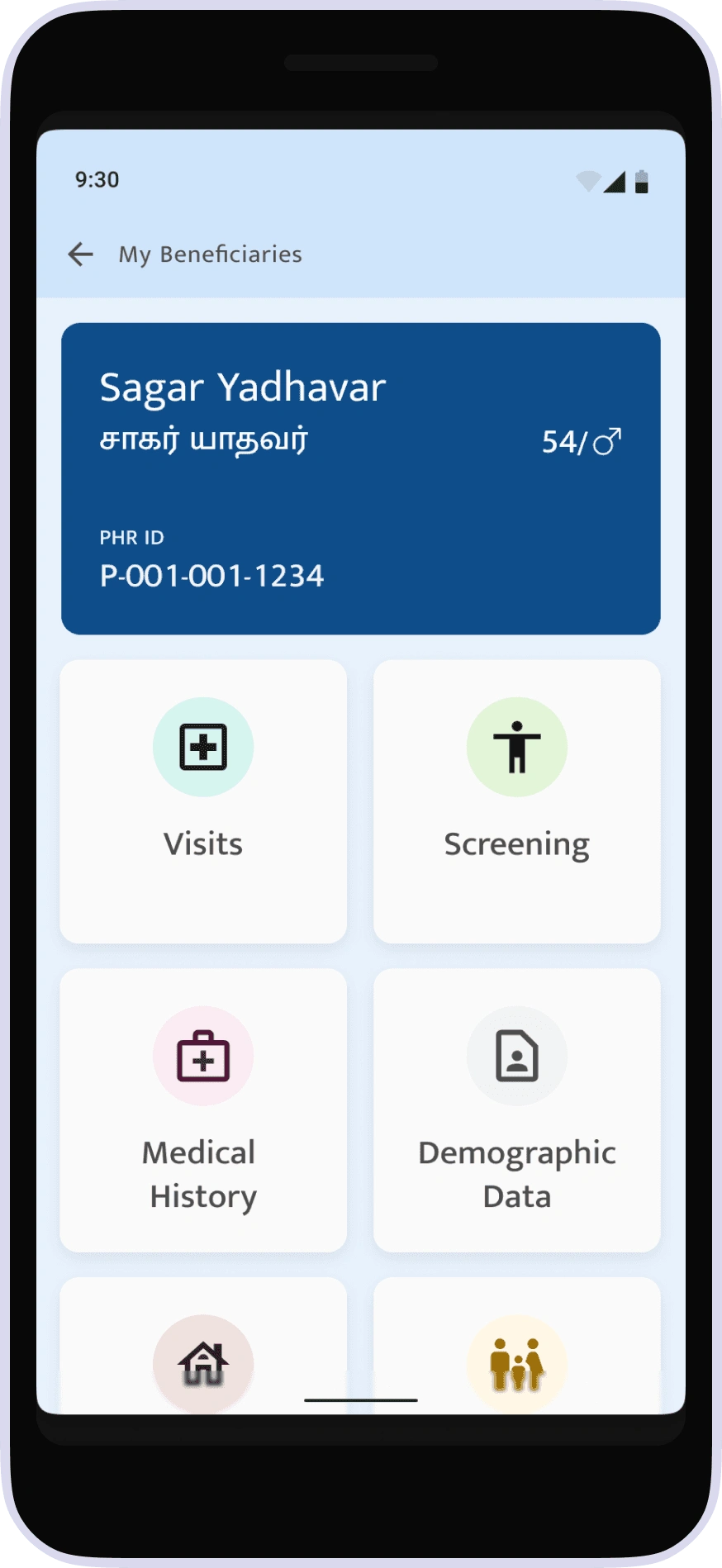
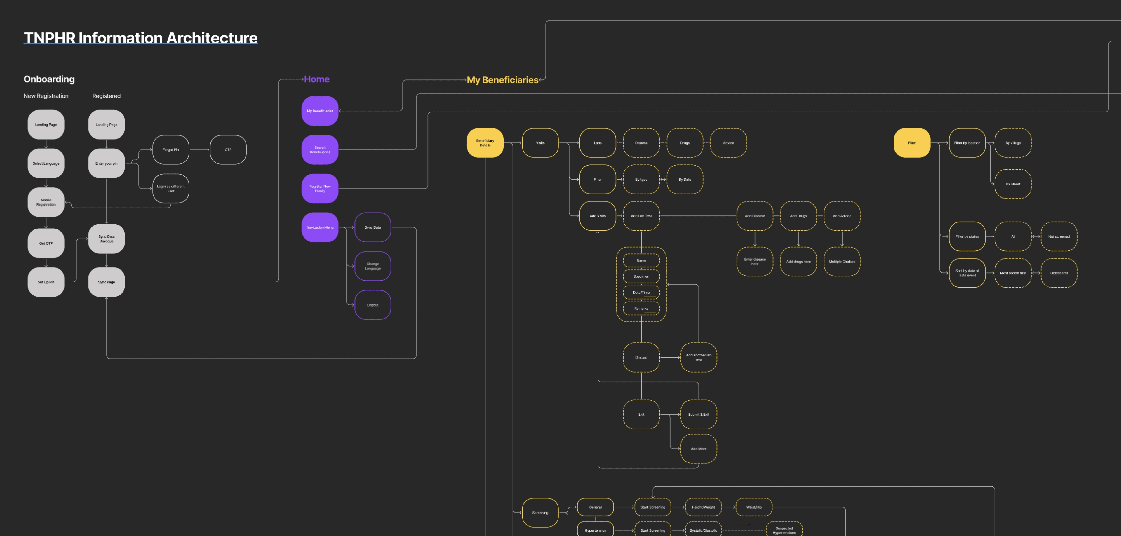
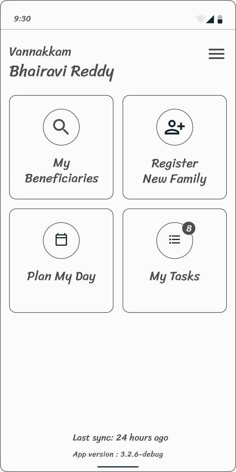
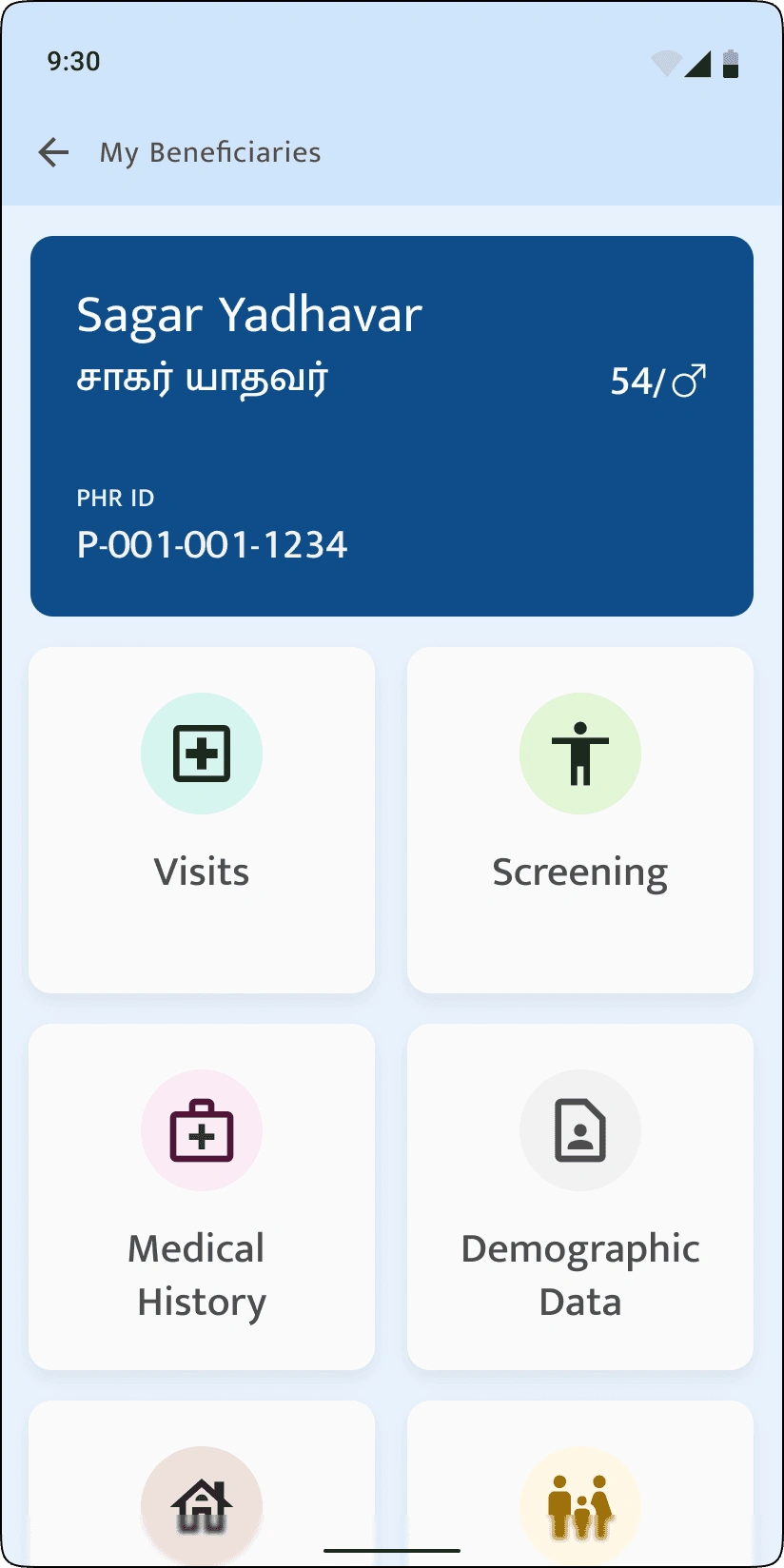
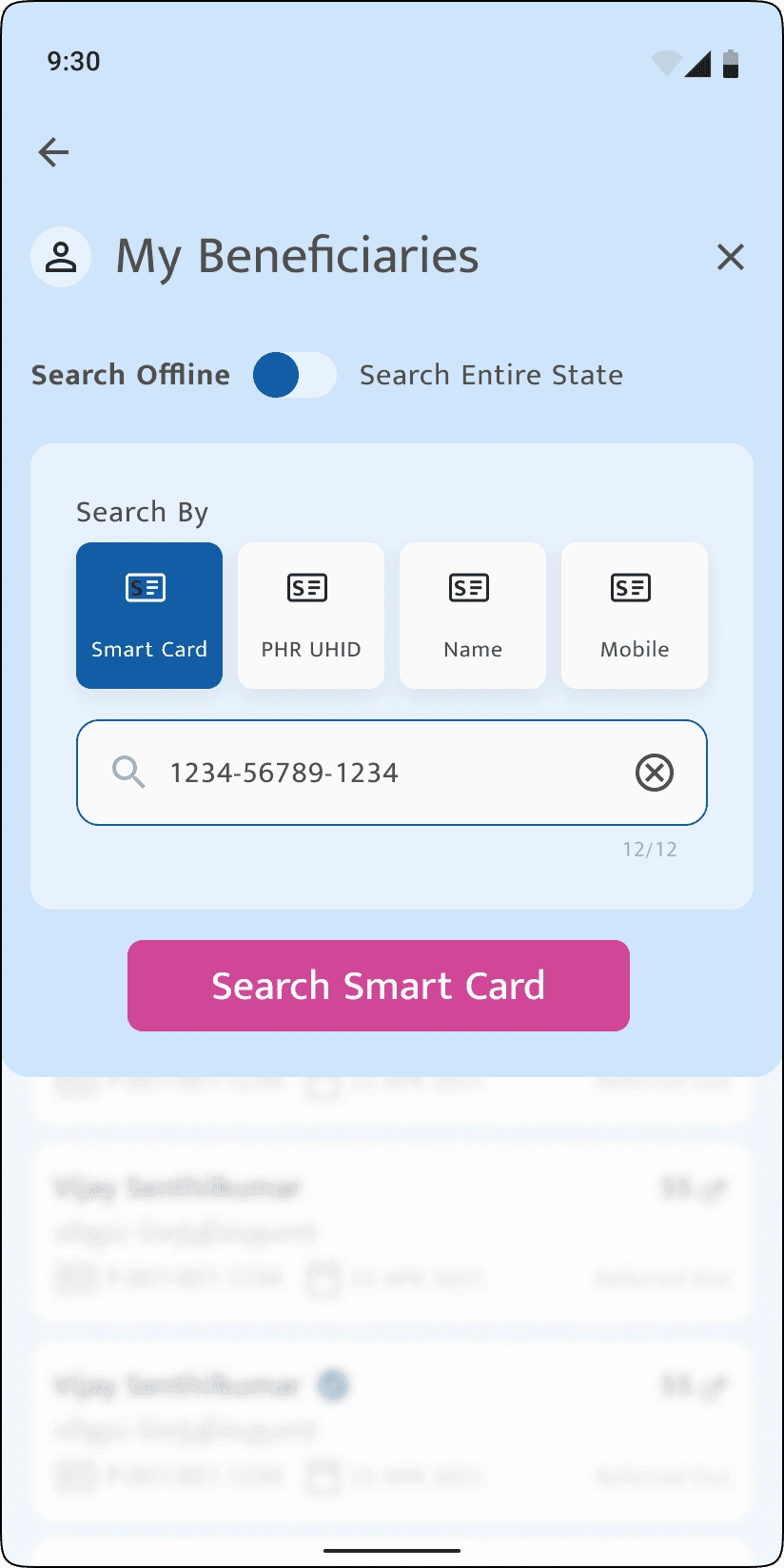
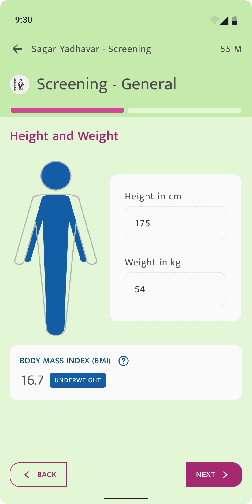
We structured the app to reflect the way real people think not how systems work. Information was grouped around everyday actions like “View My Health Records,” “Update My Details,” and “Give or Withdraw Consent,” making navigation intuitive for both health workers and citizens
Quick, low-fidelity wireframes allowed us to rapidly test and refine layouts that reduced cognitive load. We focused on legibility, minimal text, and clear iconography to ensure usability in low-literacy settings.
Design decisions were made collaboratively, often sitting with health officials and, at times, directly with users to co-create a product that truly worked in context
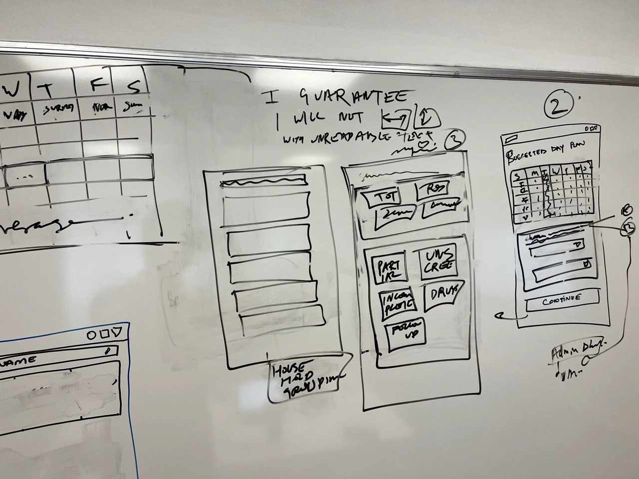
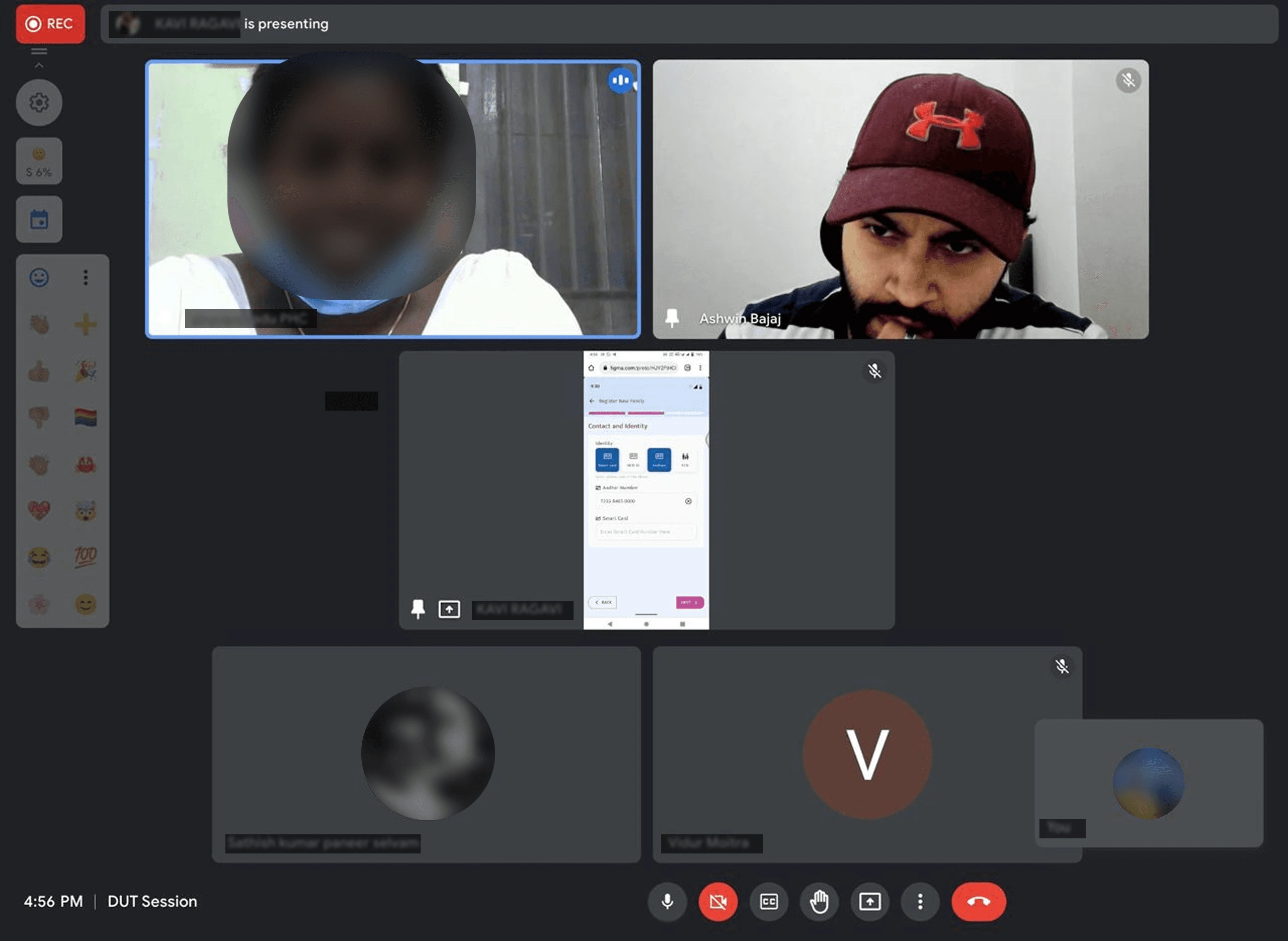
I designed a lightweight testing process both in-field and remote, to validate low- and high-fidelity prototypes with real users. From tappable area sizes and icon clarity to color choices and typography, every detail was stress-tested in real-world contexts.
Feedback from health workers and citizens helped us catch and fix usability issues early, like confusing buttons, unclear labels, or overwhelming flows. These rapid, focused iterations ensured the product was not only functionally sound but genuinely usable in the hands of its intended users.
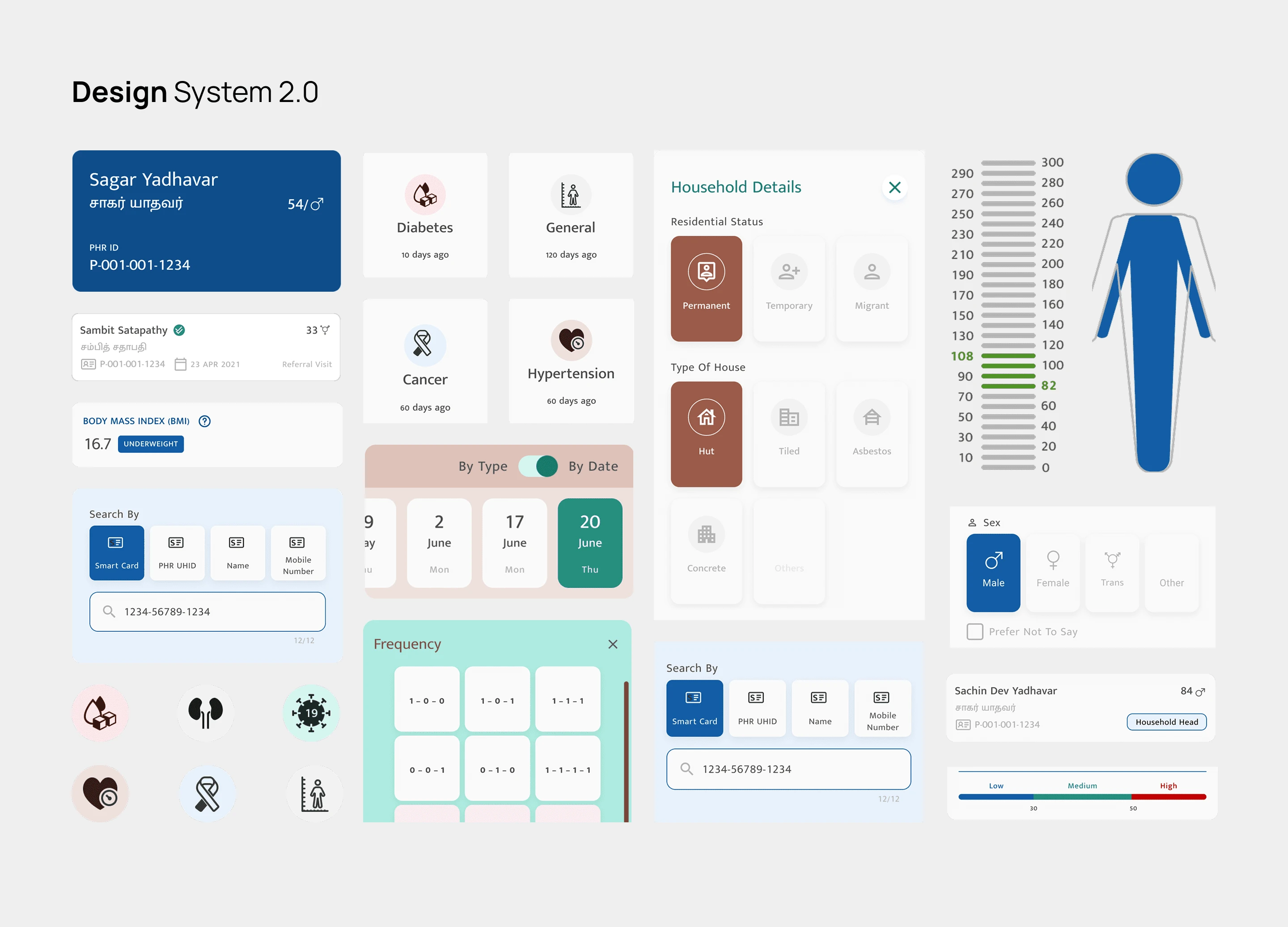
we crafted a high-contrast, culturally sensitive visual language tailored to the real conditions health workers face bright outdoor environments, hurried usage, and minimal device specs.
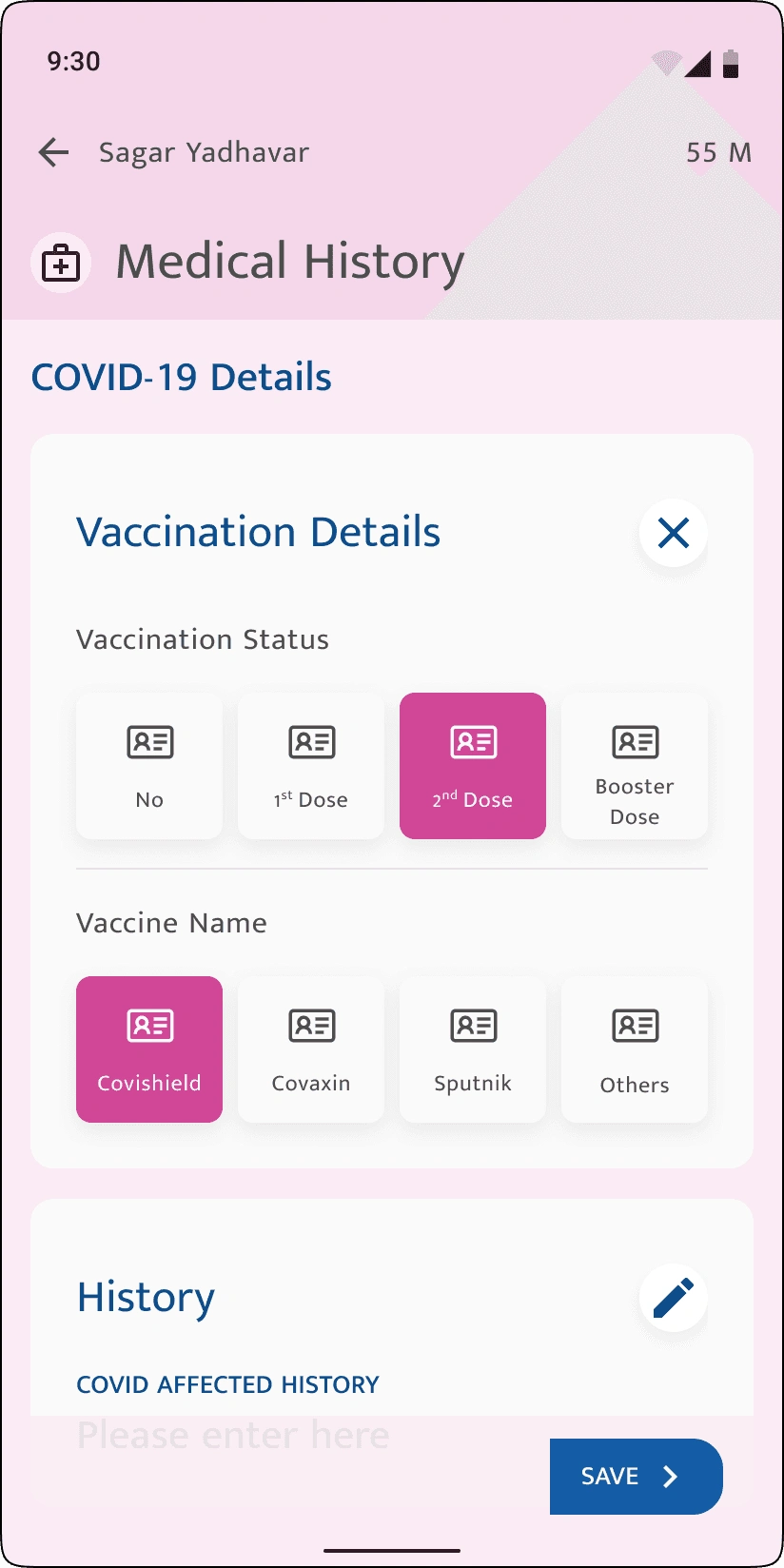
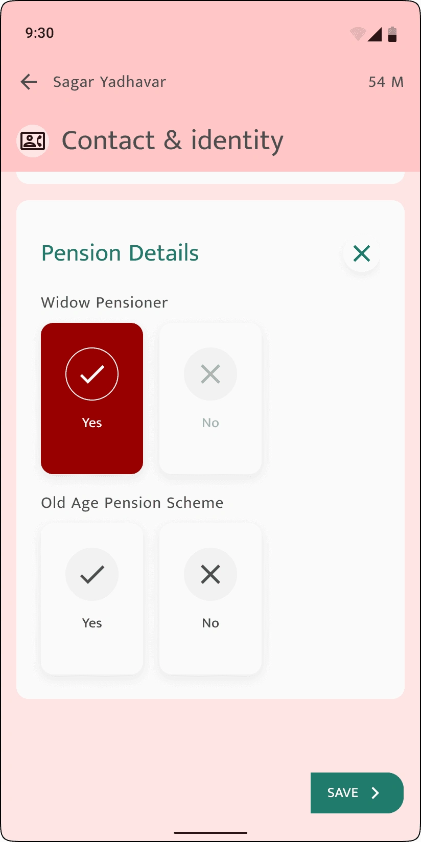
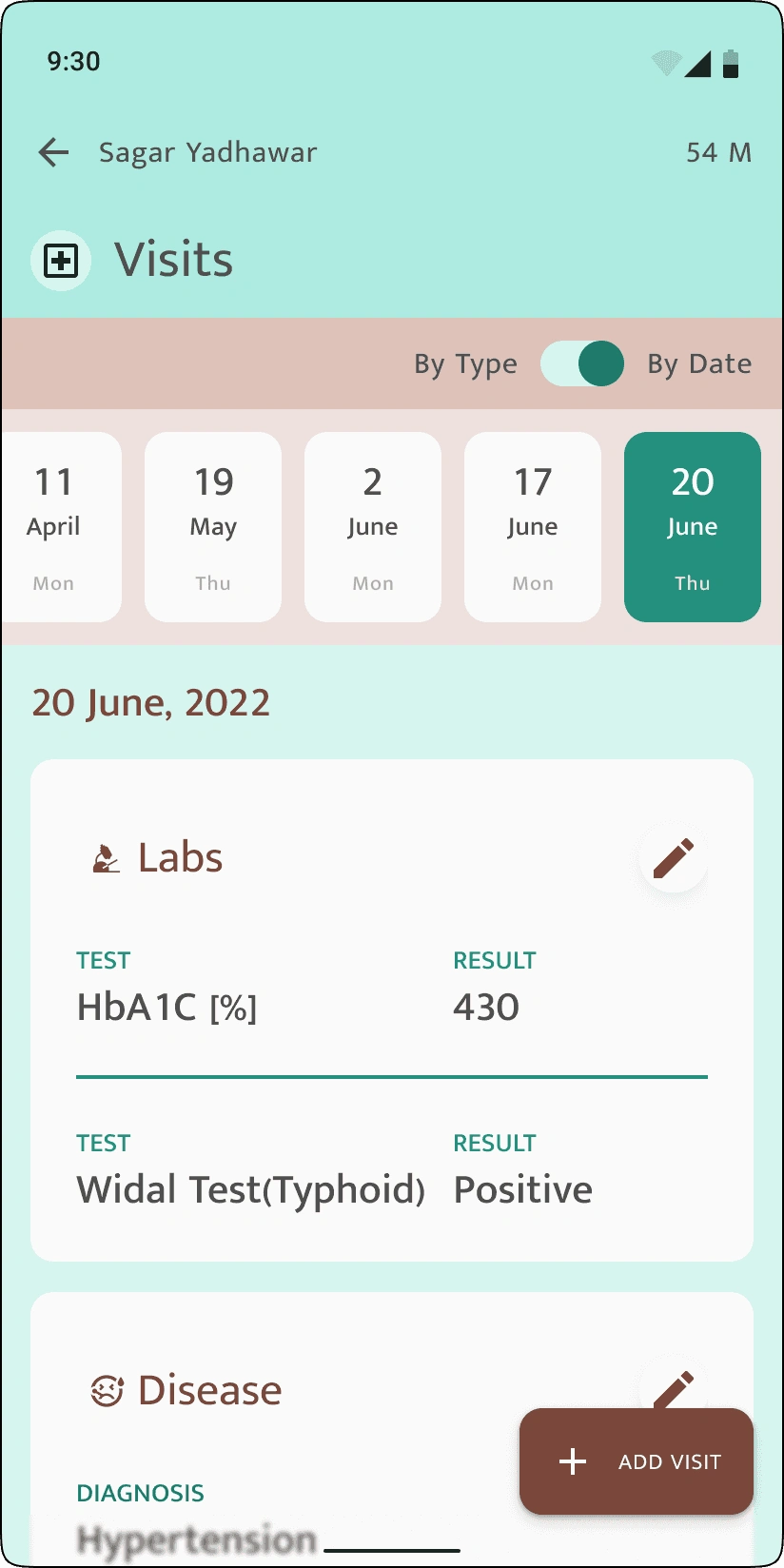
The interface highlights essential details like patient ID, last-visit date, and consent status with a color-coded system for instant recognition and action.
We adopted an atomic design approach to ensure consistency and scalability across modules, while embedding thoughtful choices to meet the unique needs of Tamil Nadu’s public health context
The result was more than just a functional app,
it was a shift in how healthcare was delivered and experienced across Tamil Nadu.
By simplifying data access for frontline workers and empowering citizens with control over their health information, the platform helped reduce redundancies, improved screening efficiency, and built trust in the system.
Thousands of health records were digitized within weeks of rollout, and for many patients, it was the first time they saw their health history in one place clear, accessible, and theirs to own
Like this project
Posted Jul 16, 2025
Redesigned eFra app for scalable, accessible public health
Likes
0
Views
4
Timeline
Jan 8, 2021 - Oct 1, 2023