
Your users can miss a lot in one screen — unless your notifications are designed to stop the scroll.
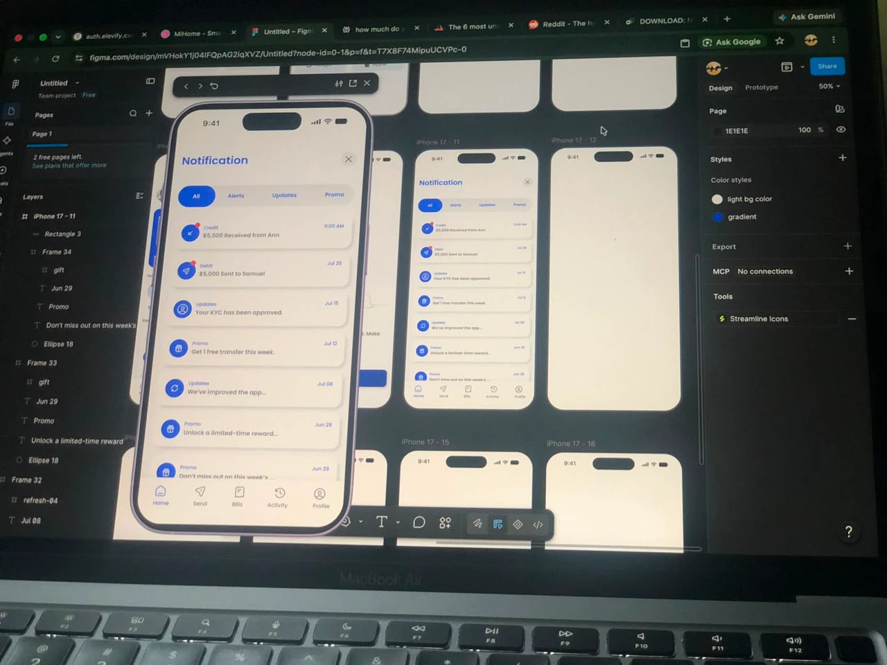
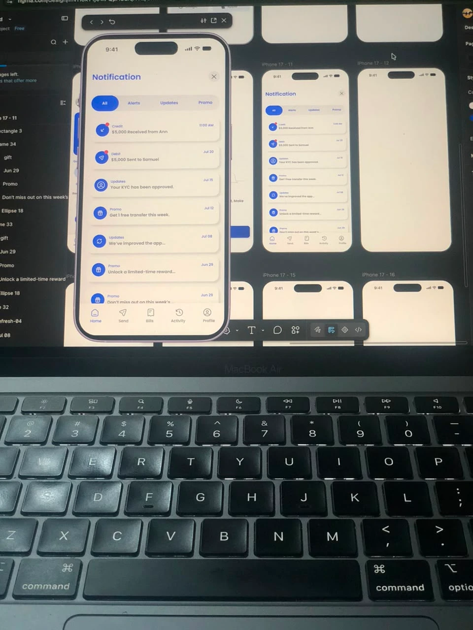
This is the notification screen I designed for Canpay, a fintech dashboard.
It’s not just a list of alerts. It’s a system that keeps users informed, organized, and in control.
What I focused on:
Grouping notifications by type: Transaction alerts, verification updates, promos
Clear visual hierarchy so the most important updates stand out
Icons and timestamps that make scanning effortless
Tap-to-action flows (e.g., alert → transaction details, verification → KYC status)
Why this matters:
A clean notification screen reduces anxiety, builds trust, and makes users more likely to stay engaged with the product. In fintech, clarity = confidence.
I’m sharing this as part of my ongoing work on the complete Canpay wallet/fintech app UI.
If you’re a recruiter or hiring manager, this is the kind of product thinking I bring to teams building financial products.
What’s the one thing you always check in a notifications screen?
What makes a notification UI feel “trustworthy” to you?
Drop your thoughts in the comments.
And if you want to see more screens from this project, follow along here.
#fintech #uxdesign #productdesign #uidesign #mobiledesign #appdesign #designportfolio #canpay
0 likes · 0 views · Jul 25, 2026
Your users can miss a lot in one screen — unless your notifications are designed to stop the scroll. This is the notification screen I designed for Canpay, a...


