66% App Downloads Boost via Crypto Module Redesign
Overview
The client: Kinesis Money, blockchain-based precious metals currency
Kinesis is an innovative monetary system that uses precious metals to digitally back a new form of money, offering secure transactions and debt-free yields through blockchain.
The problem: outdated exchange system compromises competitiveness in the crypto market
The existing exchange system lacked features, falling short of customer expectations. Users faced confusing forms, basic charts, hidden data, and clunky interactions.
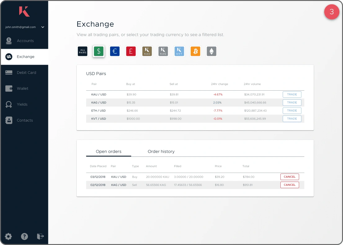
Old version
The Process
Bridging the Gap: From Novices to Pros
We analyzed three months of user feedback on the Kinesis exchange, including data from Hotjar, providing crucial insights into user pain points. Our target audience included both experienced crypto enthusiasts and newcomers to digital currency.
These users shared a common frustration: our existing Kinesis exchange was unintuitive and complex, particularly the buy/sell functionality. Our research revealed a critical insight: users would quickly abandon our exchange if it didn't meet their needs.
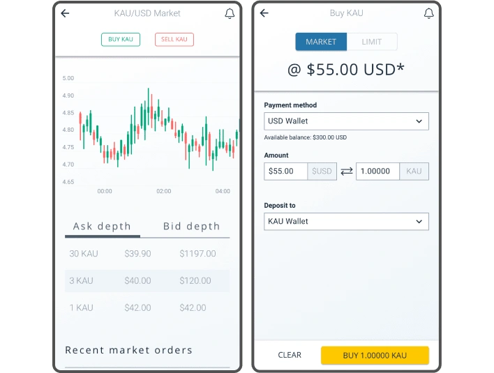
Old Design
Research and Discovery: Diving into the Crypto Deep End
We immersed ourselves in the crypto world, downloading major exchange apps like Binance and Kucoin. We created accounts, made trades, and experienced the highs and lows of trading firsthand. This gave us invaluable user experience insights.
We identified confusing buy/sell forms, a basic main chart lacking essential features, and important data requiring scrolling to access. These findings guided our redesign efforts, focusing on addressing critical pain points and incorporating industry best practices.
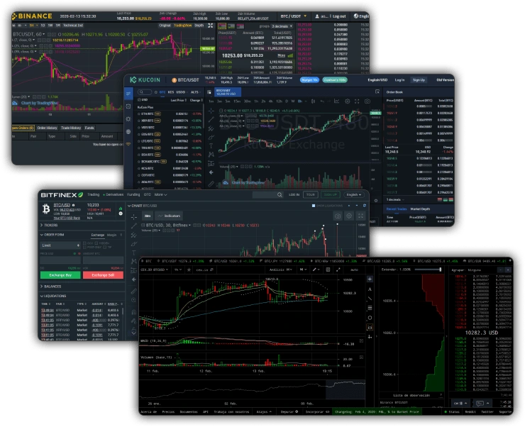
Extensive Market Research
Constructing the Skeleton: From Ideas to Interfaces
With all the necessary data at our fingertips, we dove into the wireframing stage. We began proposing different solutions through low-fidelity wireframes, focusing first on the overall layout of the complete module.
Our primary goal was to allow users a comprehensive view of all information without overwhelming them. We iterated through various layouts, constantly refining our approach to ensure that every essential feature had its place without cluttering the interface.
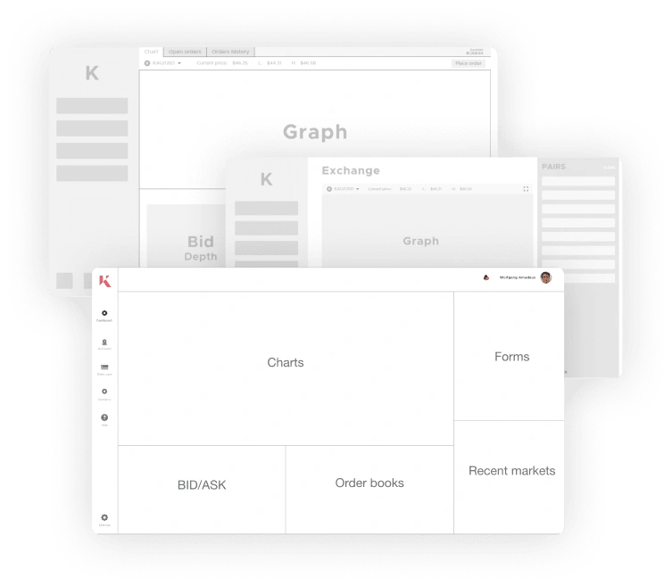
Final designs
Through iterative wireframing and layout adjustments, we identified a design that effectively addressed our HMW questions and user pain points. This process resulted in a solution balancing functionality and enhanced user experience
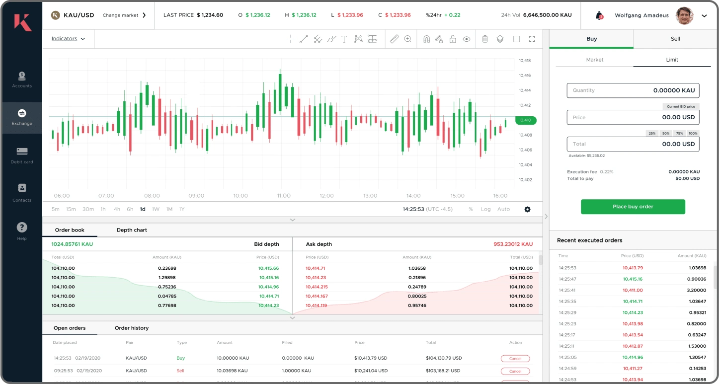
Navbar with relevant market data: We added a navbar where the user can view the basic statistics of the currently selected cryptocurrency, providing more control over their basic analysis.
Form following best design practices for crypto platforms: The form format has been completely redesigned, without altering the data sent and received from the Backend, but using UX best practices.
A smaller menu with an innovative design: The previous side menu was very prominent and occupied a lot of screen space. We reduced it and replaced it with a list of icons, making it more innovative and functional.
Foldable panels that allow you to expand the size of the chart: We implemented a dropdown system for each panel. This allows certain options to be hidden, making the chart progressively larger.
Dropdown with list of all available cryptos to easily change: From the navbar, the user can open a dropdown with all the cryptocurrencies available on the platform and switch between them without leaving the screen.
Updated chart with the necessary tools that every Trader wants to have: Through an implementation with Trading View, multiple options were added for chart analysis and study.
Adaptation to mobile devices - App
Adapting the Exchange for mobile devices introduced a unique set of challenges. We needed to ensure that all critical information was accessible while segmenting it across multiple screens. This approach allowed users the necessary space to perform all required tasks seamlessly, without compromising on usability or functionality.
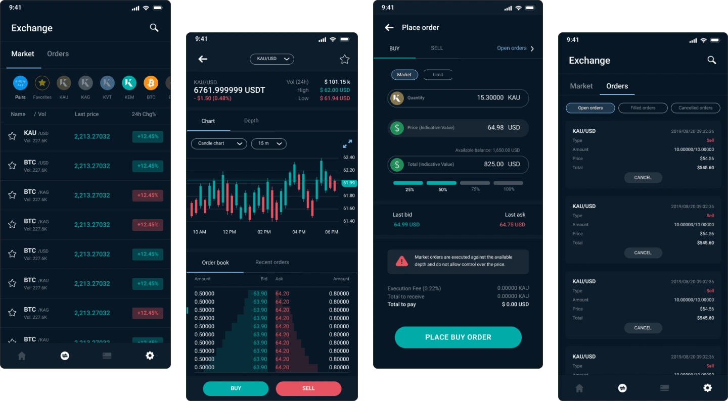
Mobile App
Outcome:
New design increases user time, downloads, and user base significantly
The Exchange redesign dramatically improved key metrics. User time nearly tripled, app downloads increased by 66-85%, and the user base more than doubled, showcasing the redesign's powerful impact.
Like this project
Posted Sep 26, 2024
Increased downloads by 66%, new account creation by 133%, and extended average app usage to 4:09 minutes by completely redesigning Kinesis' crypto chart.
Likes
0
Views
1

