Dynamic Interface
Keelan Miskell
Dynamic Interface
A configurable trading terminal that let power users rebuild the workspace around the signals they actually trade from.
Role: Founder · Head of Product & Design
Year: 2024–2025
Status: Shipped
Case Study · Context
A trading terminal that had to bend around the user, not the other way around.
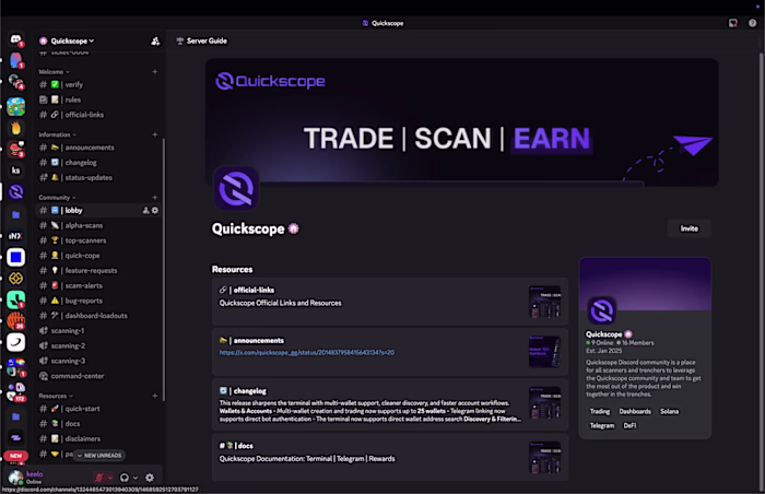
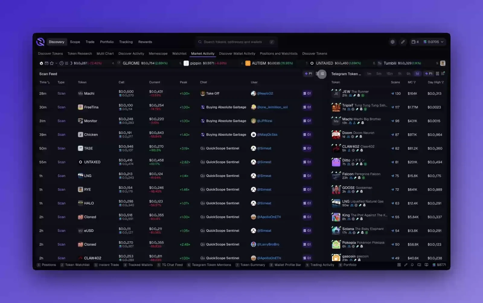
Quickscope is a trading terminal for memecoins. The traders using it were already running a terminal in practice, just not in one window. Charts, wallets, watchlists, socials, alerts, and notes were spread across five to ten tabs, and every context switch cost them time.
The Layout Editor was the attempt to collapse that scattered workflow into one surface the trader could shape around their own rhythm. The goal was not “more customization” as a feature bullet. The goal was fewer beats lost between seeing a signal and acting on it.
Case Study · Problem
Setup work usually feels like friction long before it feels like power.
Traders do not want to become dashboard designers. If the system makes them think too hard about configuration, the feature turns into overhead. But a fixed layout was also the wrong answer, because the power users were already hacking their own workflows together outside the product.
The problem was balancing two very different needs in the same surface: the first-time user who should get to value immediately, and the high-agency user who wants to tear the whole thing apart and rebuild it around their own stack of signals.
Case Study · Insight
The interface had to feel familiar on minute one and feral by day three.
The useful reframing was that flexibility could not read as “blank canvas.” It had to read as “strong default, deeper control underneath.” That meant keeping the first layer obvious while hiding the heavier behavior behind direct manipulation, shortcuts, and editing states that surfaced only when the trader wanted them.
Products like this become whatever the user makes them. The system only works if it can teach a newcomer with the default layout and still reward the person who wants to turn the workspace into something highly personal.
Case Study · Process
Four decisions made the editor feel like part of the terminal instead of a detached builder tool.
Most of the work here lived in interaction design and prototyping. I was pressure-testing the friction in the flow before specs hardened: where edit mode appeared, how much drag affordance was enough, when a tool should stay in the grid, and when it should detach entirely.
The stage below isolates the four decisions that made the concept land without turning the whole route into a motion demo.
Layout Editor
The process stage stays the only pinned moment on the route.
One GSAP timeline, four beats, and no extra kinetic spill into the rest of the case study. Reading comes first; the stage only shows the interaction story where it adds signal.
Beat 01 · Canvas
The grid turns scattered tabs into one working surface.
Beat 02 · Inline editing
Edit mode happens in place, not in a settings detour.
Beat 03 · Floating widgets
The tools that matter most refuse to stay trapped in the grid.
Beat 04 · Saved views
Different trading hours deserve different terminal states.
Beat 01 · Canvas
The grid turns scattered tabs into one working surface.
Every tile answers the same question: what signal does the trader need in reach when the trade is moving? The default layout stays opinionated, but the canvas lets the power-user turn the terminal into their own control room.
Verification note
Drag, drop, resize. Familiar surface first, deeper control underneath.
Beat 02 · Inline editing
Edit mode happens in place, not in a settings detour.
The interaction goal was to keep setup work from feeling like setup. Hold a key, change the tile, let go, and the terminal is live again. No separate builder screen and no mode switch that feels heavier than the change itself.
Verification note
The interface should feel editable without becoming an admin panel.
Beat 03 · Floating widgets
The tools that matter most refuse to stay trapped in the grid.
P&L, quick buy, and alerts needed to follow the trader's attention instead of waiting in a fixed tile. Letting those widgets detach created a faster loop than forcing everything back into the same rigid frame.
Verification note
Priority tools stay available without stealing the whole layout.
Beat 04 · Saved views
Different trading hours deserve different terminal states.
A saved view carries the whole terminal with it: layout, filters, watchlists, and the rhythm of how the user wants to work. That turns the canvas from a novelty into a surface people return to with intent.
Verification note
One-keystroke swaps beat rebuilding the workspace from scratch.
The important part was not any one interaction in isolation. It was how the system kept re-entry cheap. A user could make one change, see the terminal update immediately, and keep trading without feeling like they had entered a separate configuration product.
Case Study · Outcome
The result was a terminal people treated more like a personal rig than a preset dashboard.
The feature shipped to the beta cohort and became part of how the product differentiated itself. I am intentionally not inventing adoption numbers or retention claims here; the signal that mattered most was behavioral. Users who cared about speed and control kept shaping the workspace instead of abandoning the feature after the novelty pass.
The project also clarified a broader product direction for me: the strongest surfaces were the ones that let people bring more of their own workflow into the product without making the product itself feel heavier.
Like this project
Posted May 7, 2026
A trading terminal allowing users to customize their workflow seamlessly.
Likes
0
Views
2