NIP. — POCKET COCKTAIL BRAND IDENTITY & PACKAGING DESIGN

Naledi Sibisi


NIP.
Tiny Can. Full Pour.
THE OBSERVATION
Some of the best nights are the ones nobody planned.
Drinks after work turn into dinner. Dinner becomes a night out. A quick visit becomes an occasion. The way we socialise is often spontaneous, but the products designed around these moments don't always reflect that.
NIP. began with a simple observation about the changing nature of social experiences and the things we choose to carry with us. As our plans become more fluid, convenience increasingly shapes our choices. Yet the experience of enjoying a proper cocktail still tends to depend on a bar, a bartender or a much larger format.
I became interested in the space between those two worlds.
What if the experience of a cocktail could be reimagined around the spontaneity of modern social life?
THE OBSERVATION
Plans have become smaller, faster and more spontaneous — and what we carry has followed. Tiny bags, last-minute drinks, pre-games, dinners that become nights out. But a good cocktail still tends to assume a bar, a bartender or a full-size bottle.
THE CONCEPT
NIP. is a self-initiated brand concept for a range of 150ml, single-serve pocket cocktails.
The idea is intentionally simple: take the familiarity and character of classic cocktails and reimagine them in a compact, ready-to-drink format.
But the ambition extended beyond creating a smaller beverage. I wanted to develop a brand with a personality strong enough to make the format itself desirable.
The central creative tension became the foundation of the identity: a tiny product with an unapologetically big presence.
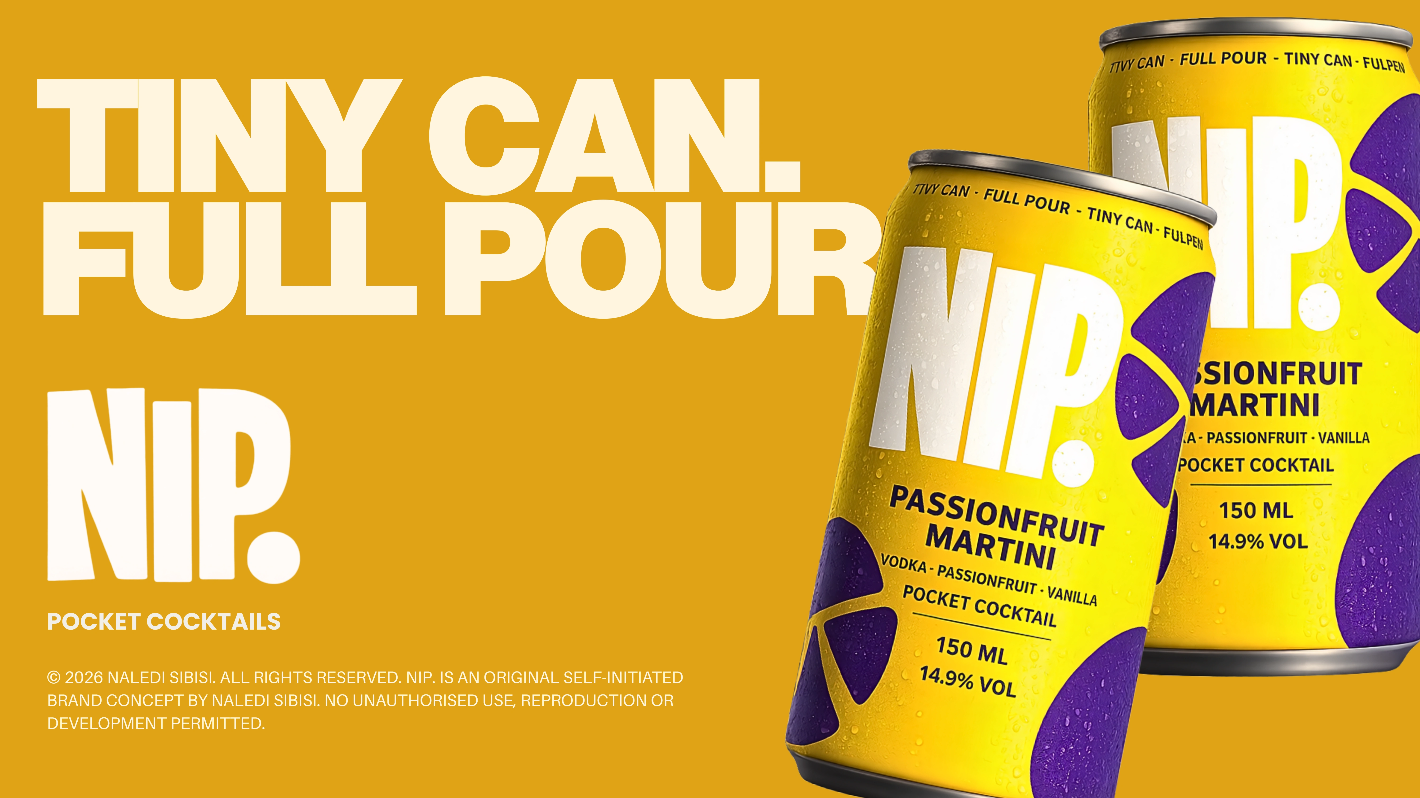
Tiny Can. Full Pour.
This contrast informs everything from the name and packaging proportions to the typography, visual language and campaign messaging.
THE OPPORTUNITY
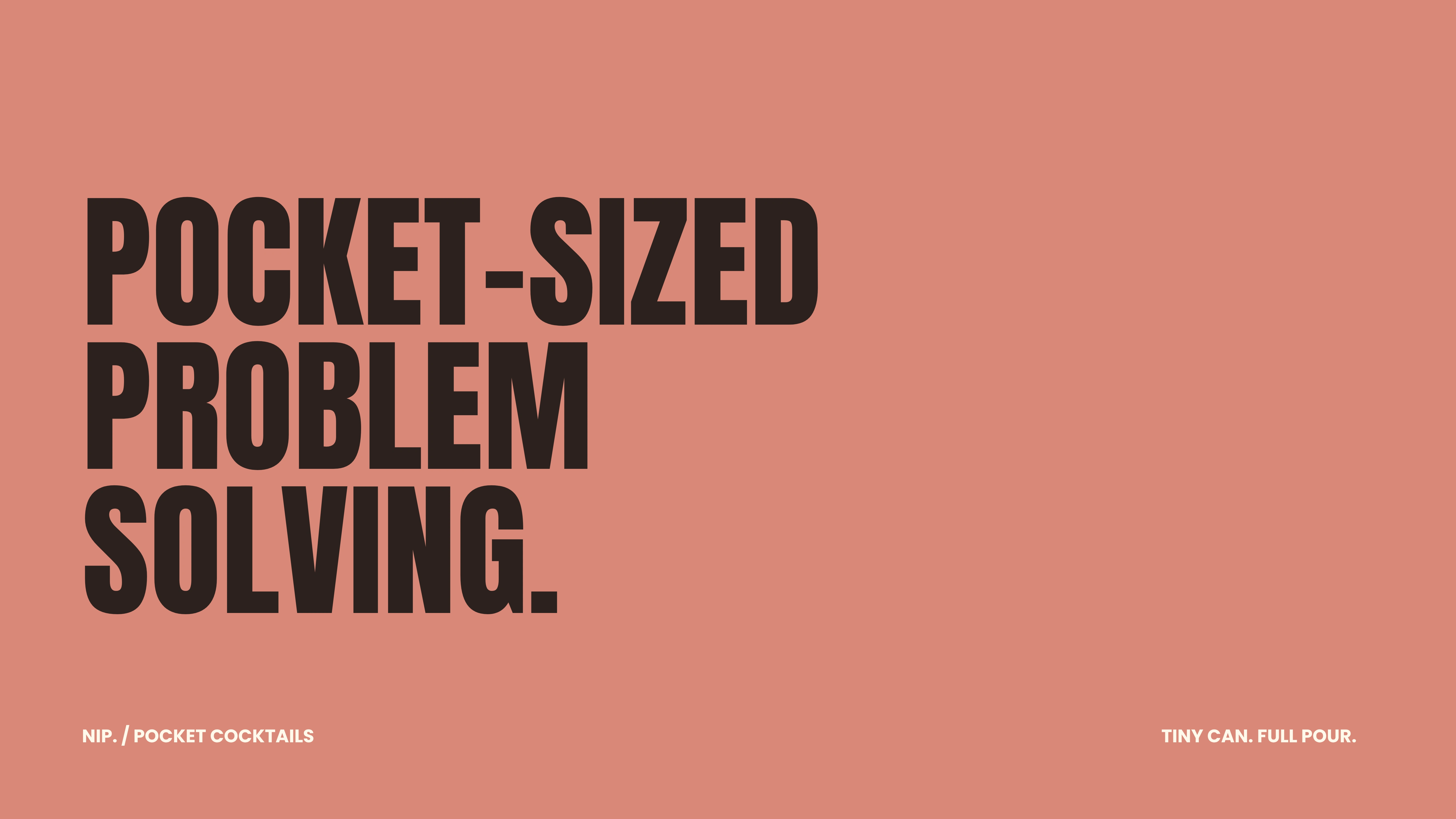
What if a proper cocktail could fit the way people actually go out now?
Something between the convenience of a canned drink and the experience of ordering a real cocktail: small enough to carry, strong enough to count and designed to feel like an object you actually want to pull out of your bag.
THE IDEA
NIP. is a self-initiated concept for 150ml, bar-strength, single-serve pocket cocktails.
Proper cocktails in tiny cans.
TINY CAN. FULL POUR.
BRAND STRATEGY & POSITIONING
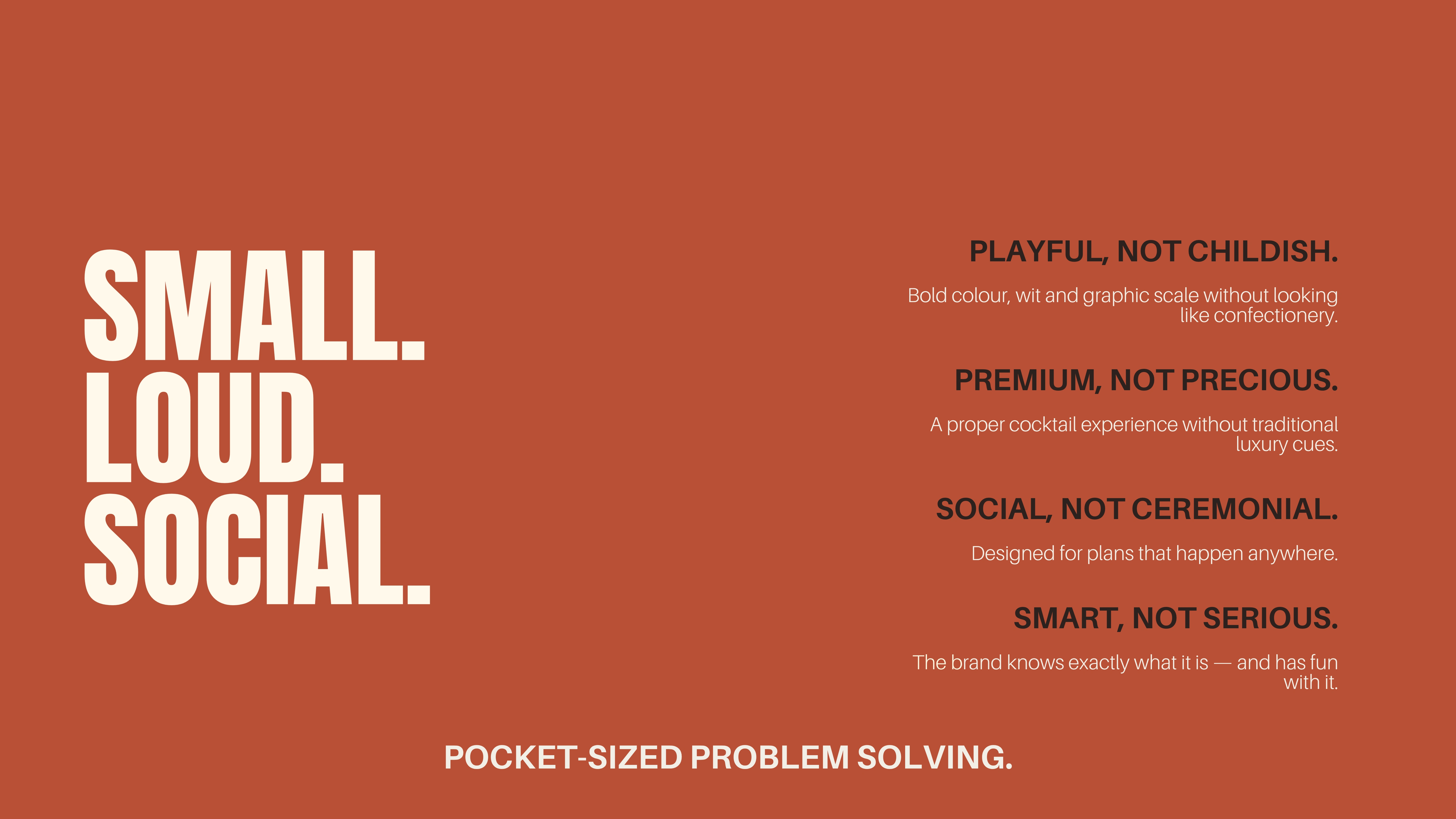
The brand was built around four defining qualities: playful without being childish, premium without being precious, social without being ceremonial, and confident without taking itself too seriously.
These principles informed an identity that feels youthful and expressive without relying on the conventional cues of either luxury spirits or mass-market ready-to-drink beverages.
The intention was to create something recognisable, portable and culturally relevant, a product concept that could sit comfortably in the worlds of nightlife, fashion, hospitality and contemporary social culture.
NIP.'s proposition is as much about behaviour as it is about the product itself. The small format suggests something that can be carried, shared and incorporated into spontaneous occasions.
THE VISUAL IDENTITY
The visual identity was developed around scale, contrast and immediate recognition.
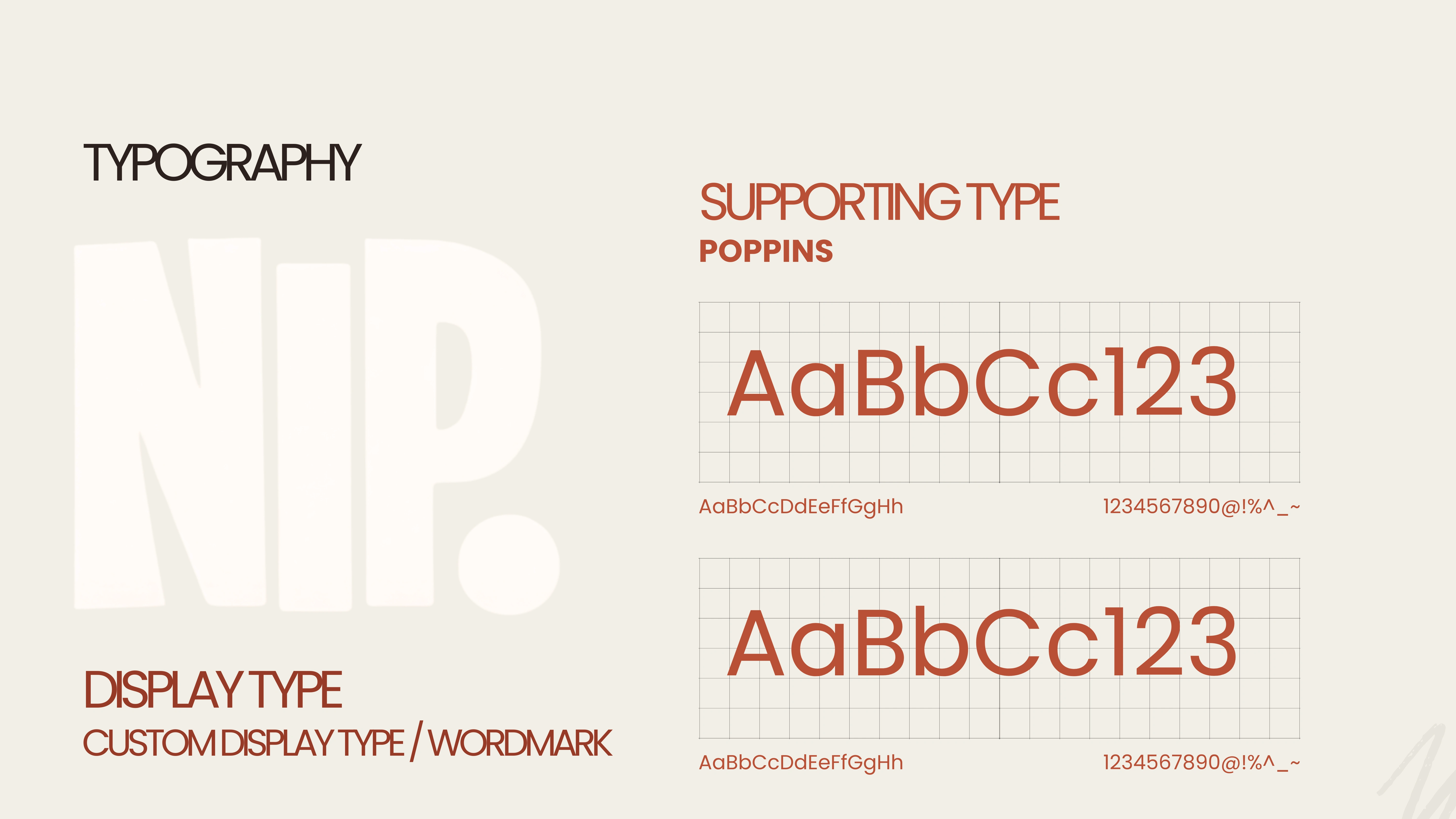
The NIP. wordmark is deliberately oversized, occupying much of the available packaging surface. Its bold, condensed letterforms establish a visual presence that feels larger than the product's physical dimensions.
This relationship between typography and format became one of the defining characteristics of the identity.
A custom display treatment gives the wordmark its distinctive personality, while Poppins provides a functional supporting typeface for product details and brand communication.
The supporting graphic elements draw from the visual language of cocktail garnishes and ingredients, using simplified citrus forms and abstract shapes rather than literal illustrations.
The resulting system is expressive, flexible and immediately recognisable.
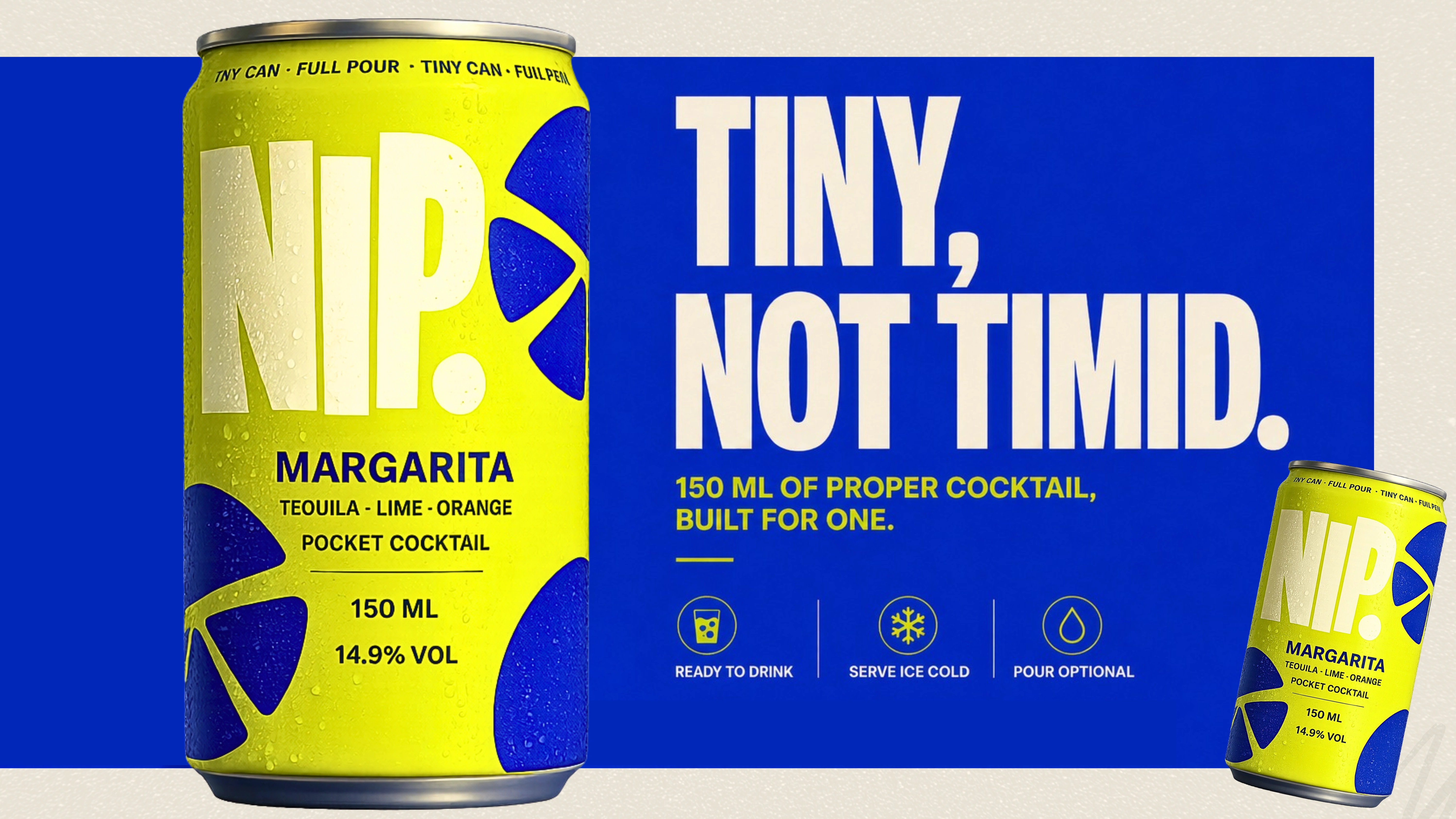
NIP. was built as a compact brand world around the contradiction at its centre: small format, full experience.
Oversized typography gives the tiny cans attitude. Saturated two-colour flavour systems make each serve immediately recognisable, while abstract citrus and garnish forms borrow from cocktail culture without becoming literal.
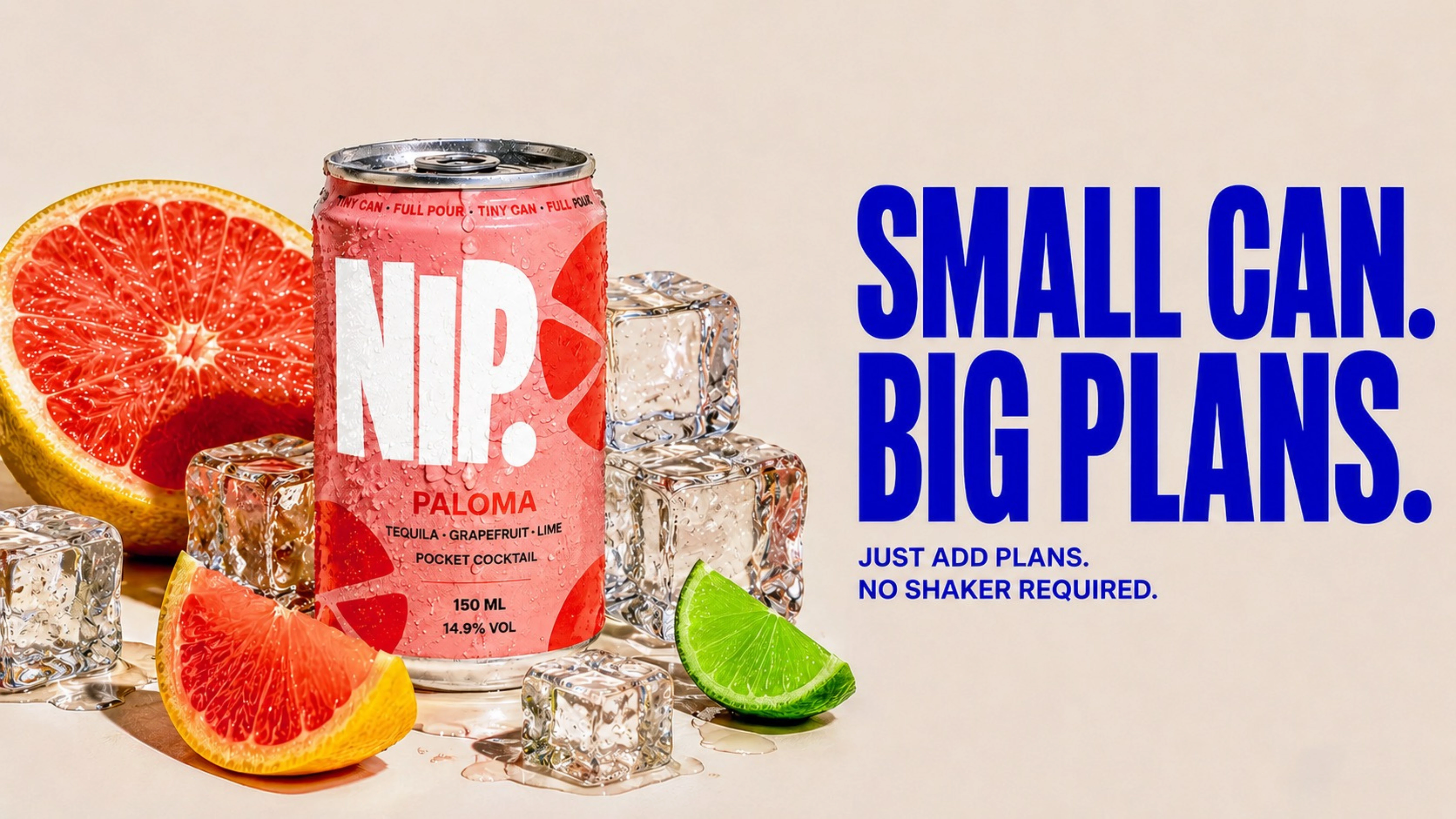
The language follows the same logic — short, confident and playful. SMALL CAN. BIG PLANS.
COLOUR & THE FIVE-FLAVOUR SYSTEM
Colour plays a central role in differentiating the product range.
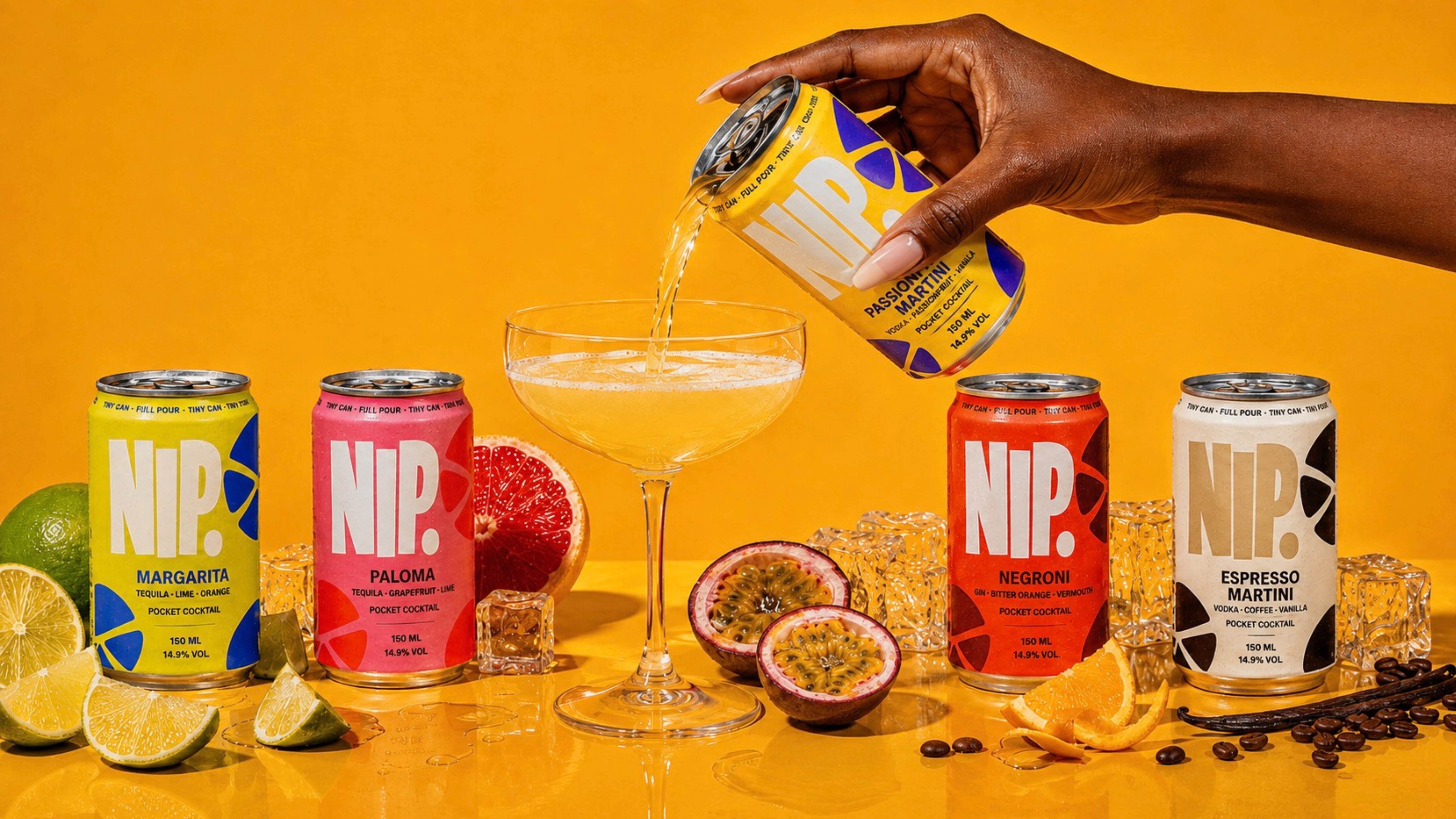
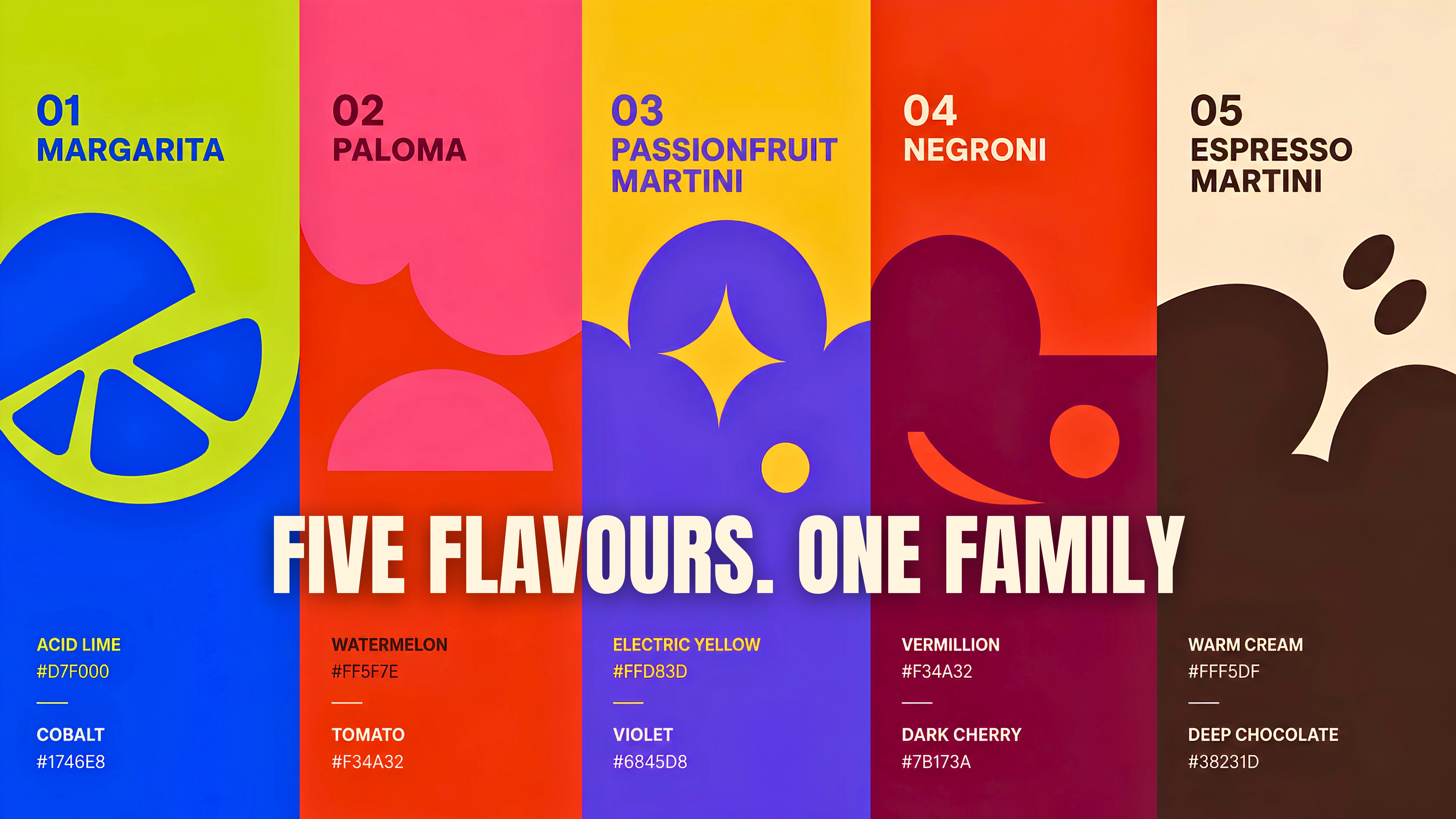
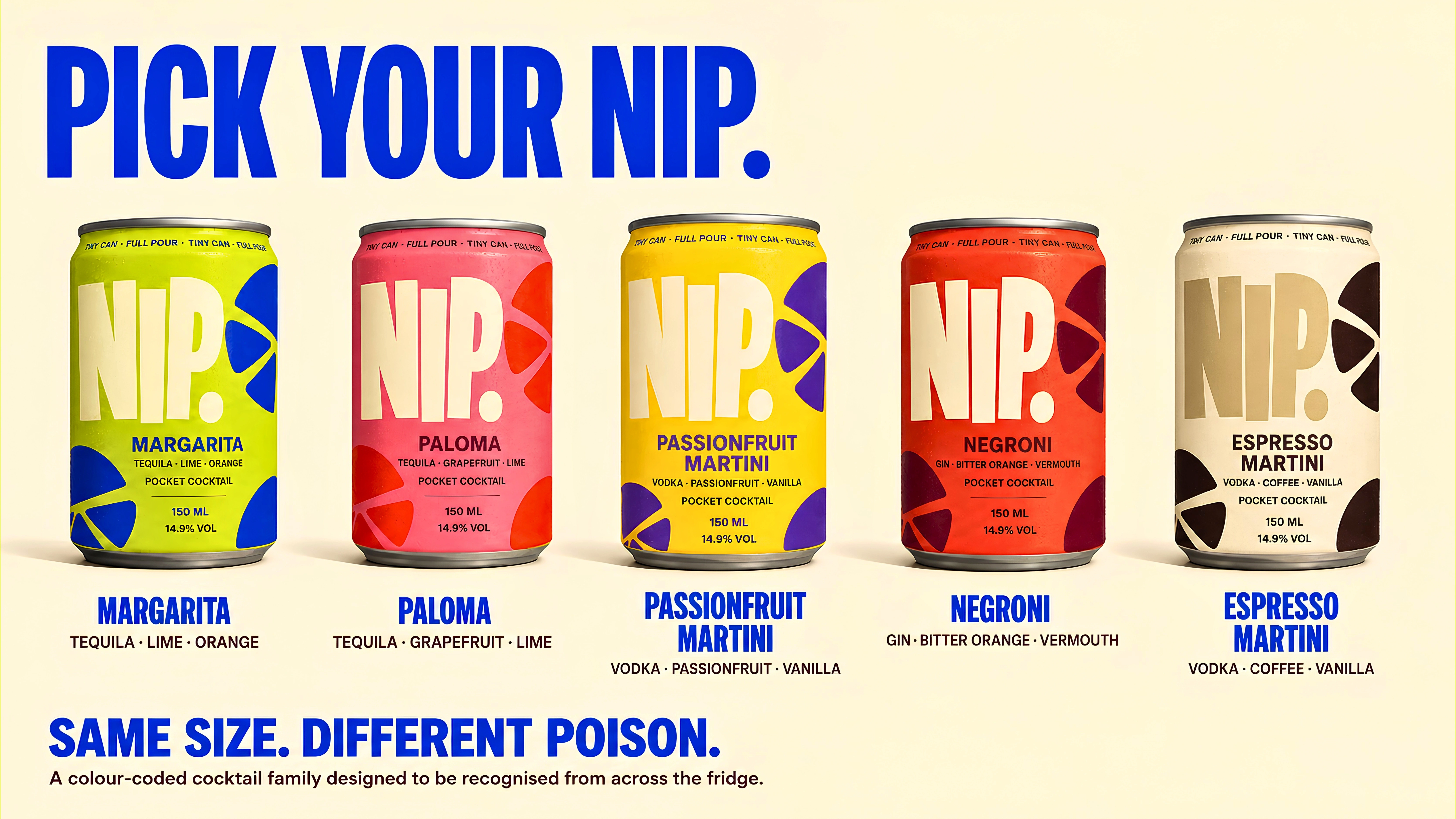
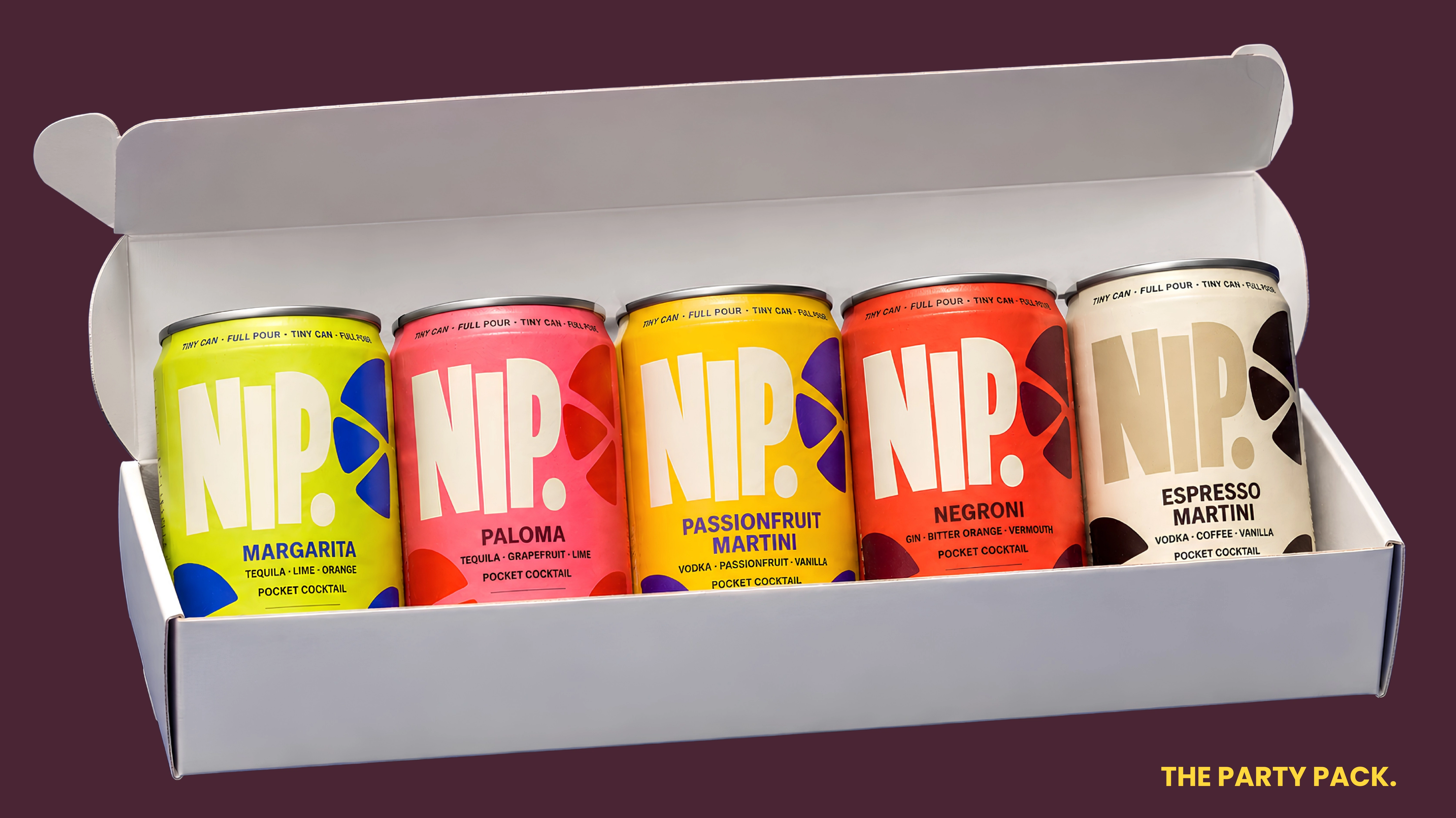
Five cocktails were developed as part of the conceptual identity: Margarita, Paloma, Passionfruit Martini, Negroni and Espresso Martini.
Each flavour receives its own saturated two-colour combination, creating an individual personality while maintaining consistency across the family.
Acid lime and cobalt introduce the Margarita. Watermelon and tomato red distinguish the Paloma. Electric yellow and violet establish the Passionfruit Martini, while vermilion and dark cherry give the Negroni its depth. Warm cream and deep chocolate bring a more restrained character to the Espresso Martini.
These combinations create a system that can function individually or collectively, allowing the product range to remain visually cohesive without making each flavour feel interchangeable.
NIP. was imagined beyond the shelf. The format lends itself naturally to nightlife, hospitality, fashion and cultural partnerships — from limited-edition flavour drops and event serves to hotel minibars, festivals, gifting and collaborations.
Its small format also gives the brand a recognisable physical behaviour of its own: something carried, shared, collected and brought into the night.
PACKAGING & PRODUCT DESIGN
The 150ml can became the central canvas for the identity.
Its compact proportions presented an interesting design challenge: how could a relatively small packaging surface carry an expressive brand identity while remaining clear and functional?
The solution was to prioritise the wordmark and flavour recognition, allowing scale and colour to carry much of the visual communication.
Supporting information was arranged within a consistent hierarchy, establishing clarity across the product family.
The packaging concept was also explored through product photography, lifestyle compositions and a five-can party pack, demonstrating how the identity could extend across individual products and collective formats.
The design treats packaging as both a functional object and an extension of the brand's personality.
CAMPAIGN WORLD & BRAND VOICE
The campaign language follows the same philosophy as the visual identity: short, confident, playful and memorable.
Small Can. Big Plans.
Tiny, Not Timid.
Same Size. Different Poison.
These statements turn the product's defining characteristic into its greatest communication asset.
The art direction combines oversized typography, bold colour, tactile product imagery and playful compositions. Citrus, ice, condensation and sculptural arrangements bring the product into a visual environment that feels energetic and distinctly social.
Beyond the initial range, NIP. was imagined as a brand capable of extending into limited-edition collaborations, cultural events, hospitality partnerships and experiential campaigns.
THE RESPONSE
When I shared NIP. publicly, one response came up repeatedly: “I wish this was real.”
For a speculative concept, that became the most interesting validation of the idea. People weren't only responding to how it looked — they were responding to the proposition itself.
AUDIENCE RESPONSE
One of the most rewarding aspects of developing NIP. came when I shared the concept publicly.
A recurring response was a simple expression of interest: people wished the product actually existed.
For a self-initiated project, that response was particularly meaningful. It suggested that audiences were engaging with more than the visual design. They were responding to the idea behind the brand and imagining how it might fit into their own experiences.
While the concept has not been commercially launched, the response became an encouraging indication of its creative appeal.
THE CREATIVE OUTCOME
NIP. brings together concept development, brand strategy, naming, visual identity, packaging and campaign art direction within a cohesive brand world.
From its initial product proposition to the five-flavour system and supporting campaign executions, the project explores how a clearly defined idea can inform every aspect of a brand's expression.
For me, NIP. represents the relationship between creative thinking and design at its most exciting: identifying an opportunity, developing a point of view and building an identity with enough character to make an imagined product feel tangible.
Tiny Can. Full Pour.
Concept, Creative Direction & Brand Identity: Naledi Sibisi
Project Type: Original, Self-Initiated Brand Concept
Disciplines: Concept Development, Brand Strategy, Naming, Creative Direction, Art Direction, Visual Identity, Packaging Design, Campaign Development
Tools: Adobe Photoshop, Canva, ChatGPT
Disclaimer: NIP. is an original, independent conceptual brand created by Naledi Sibisi. All product formulations, alcohol-strength references, packaging and brand applications are illustrative concepts and do not represent manufactured or commercially available products.
Like this project
Posted Aug 9, 2026
Creative direction, brand identity and packaging concept for NIP., a bold pocket-sized cocktail brand built around the idea: tiny can, full pour.