THE EIGHTEENTH

Naledi Sibisi


THE EIGHTEENTH
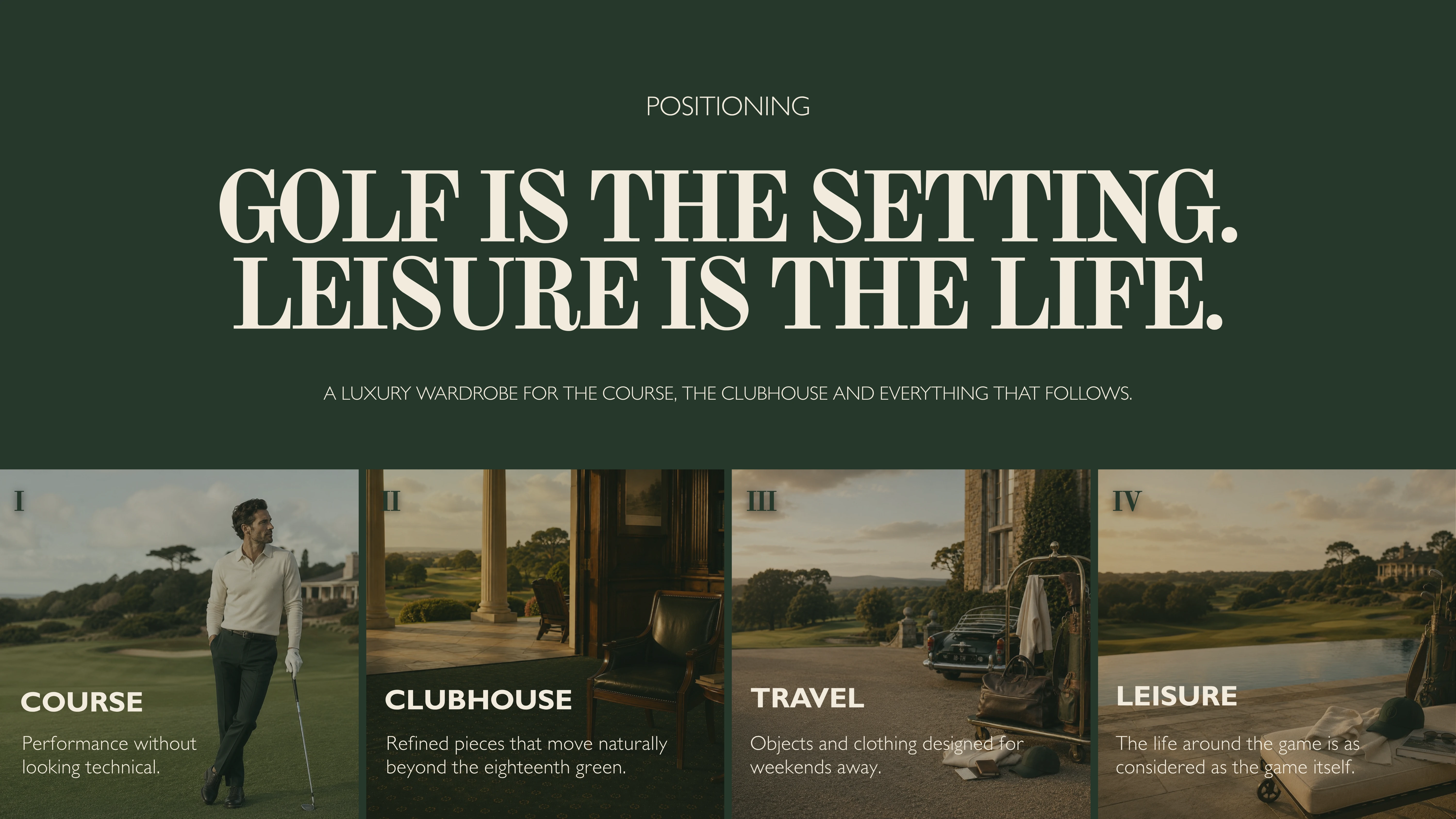
Golf is the setting. Leisure is the life.
THE CONCEPT
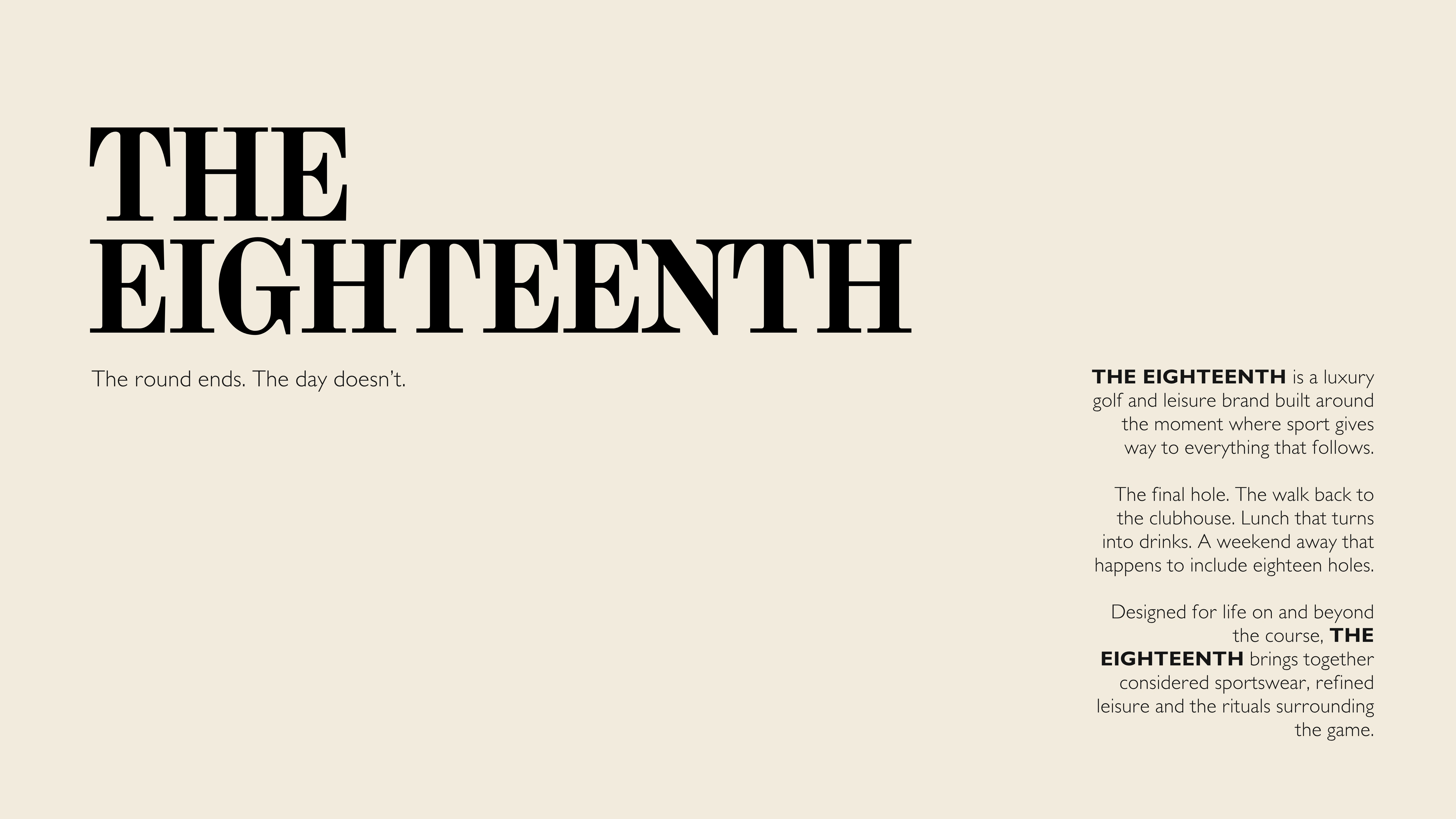
The eighteenth hole marks the end of a round of golf, but rarely the end of the experience. There is the walk back to the clubhouse, the conversations that continue over drinks, the weekends away and the rituals that exist around the game.
THE EIGHTEENTH was conceived around this space between sport and leisure. An independent luxury golf and lifestyle brand exploring what happens when the culture surrounding golf becomes just as important as the game itself.
The ambition was to create an identity that could move effortlessly between the course, the clubhouse and everyday life, without losing its sense of purpose or character.
BRAND STRATEGY & POSITIONING
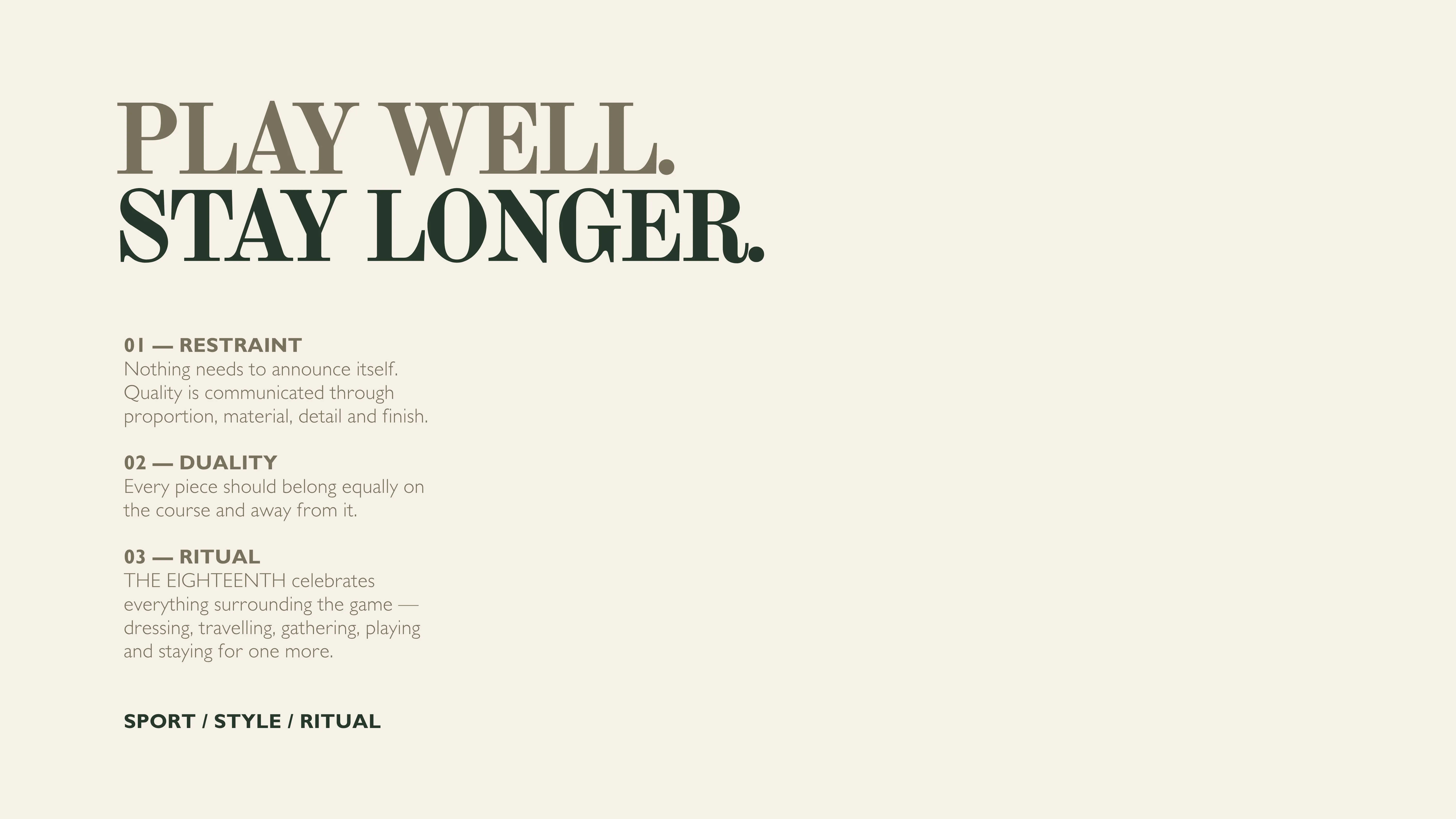
Play Well. Stay Longer.
At the heart of THE EIGHTEENTH is a simple positioning: golf is the setting, but leisure is the lifestyle.
The brand was developed around four interconnected worlds: Course, Clubhouse, Travel and Leisure. Together, they establish a broader vision of golf culture, one that extends beyond performance apparel into considered clothing, accessories and the experiences surrounding the sport.
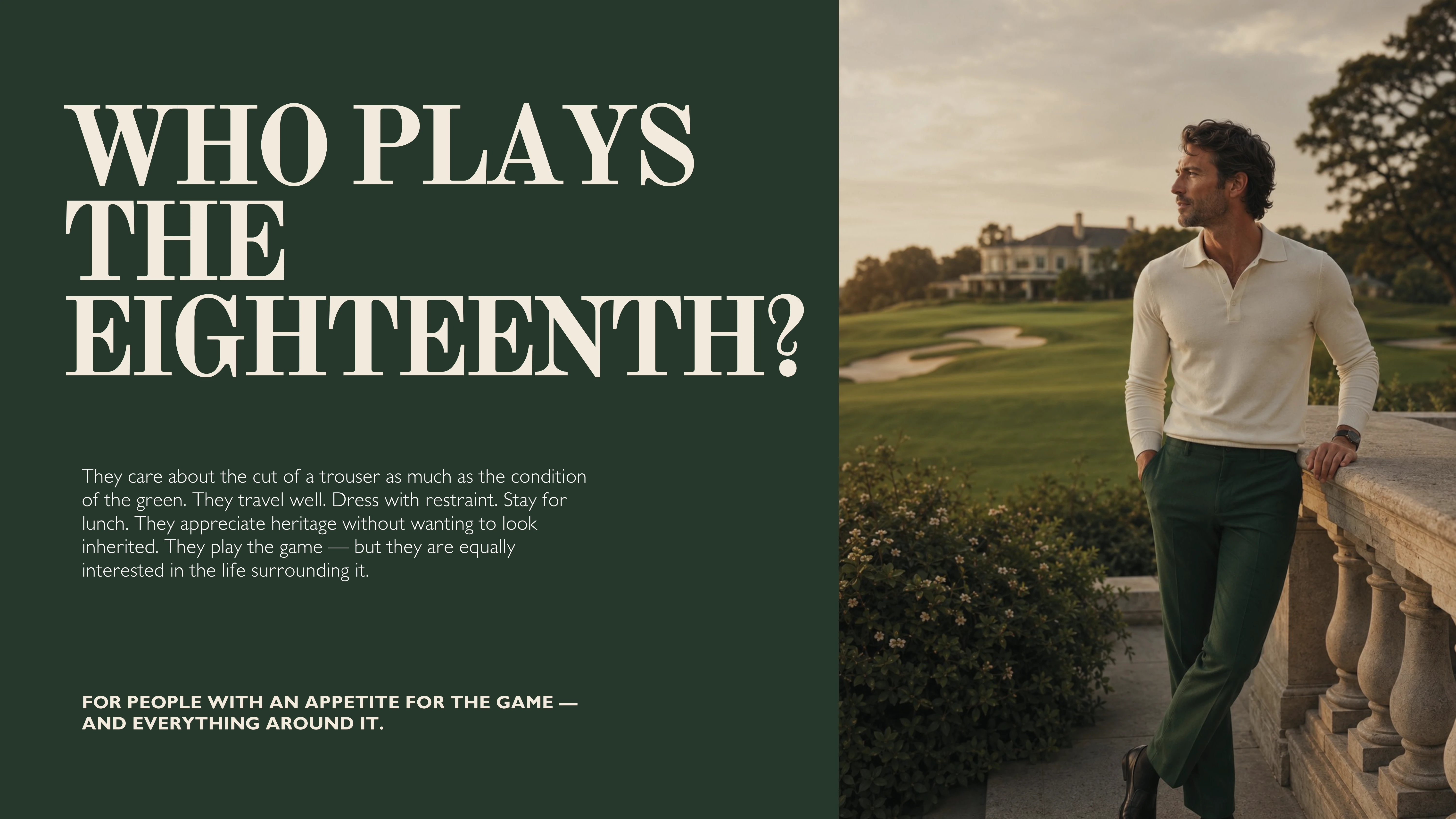
Its audience appreciates quality without unnecessary display. They value heritage, but aren't interested in recreating it for nostalgia's sake. They understand that how something feels, fits and lives within a wardrobe is just as important as how it performs.
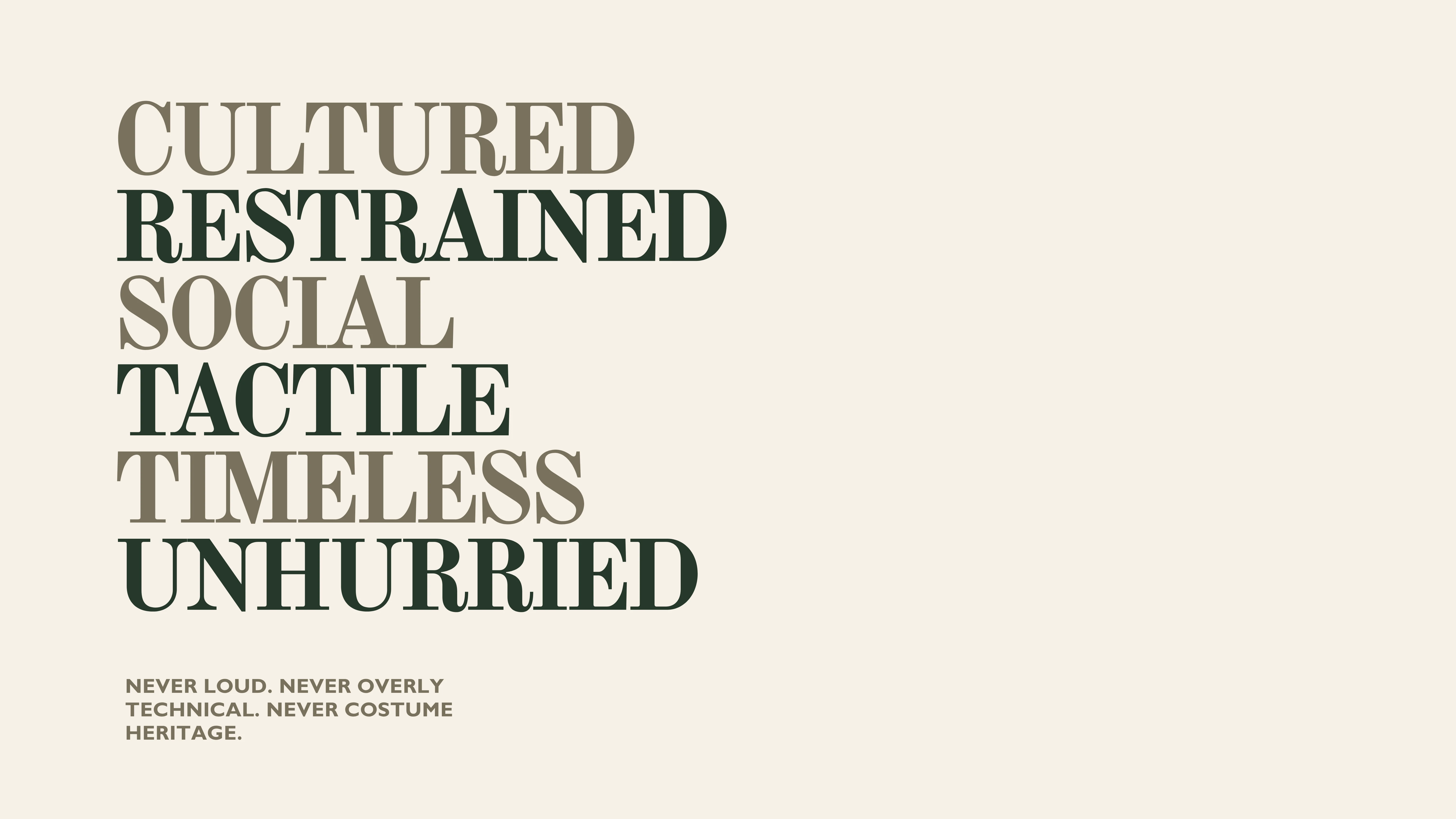
The brand's personality follows naturally from this thinking: cultured, restrained, social, tactile, timeless and unhurried.
THE VISUAL IDENTITY
The identity balances traditional sporting heritage with the sensibilities of contemporary luxury.
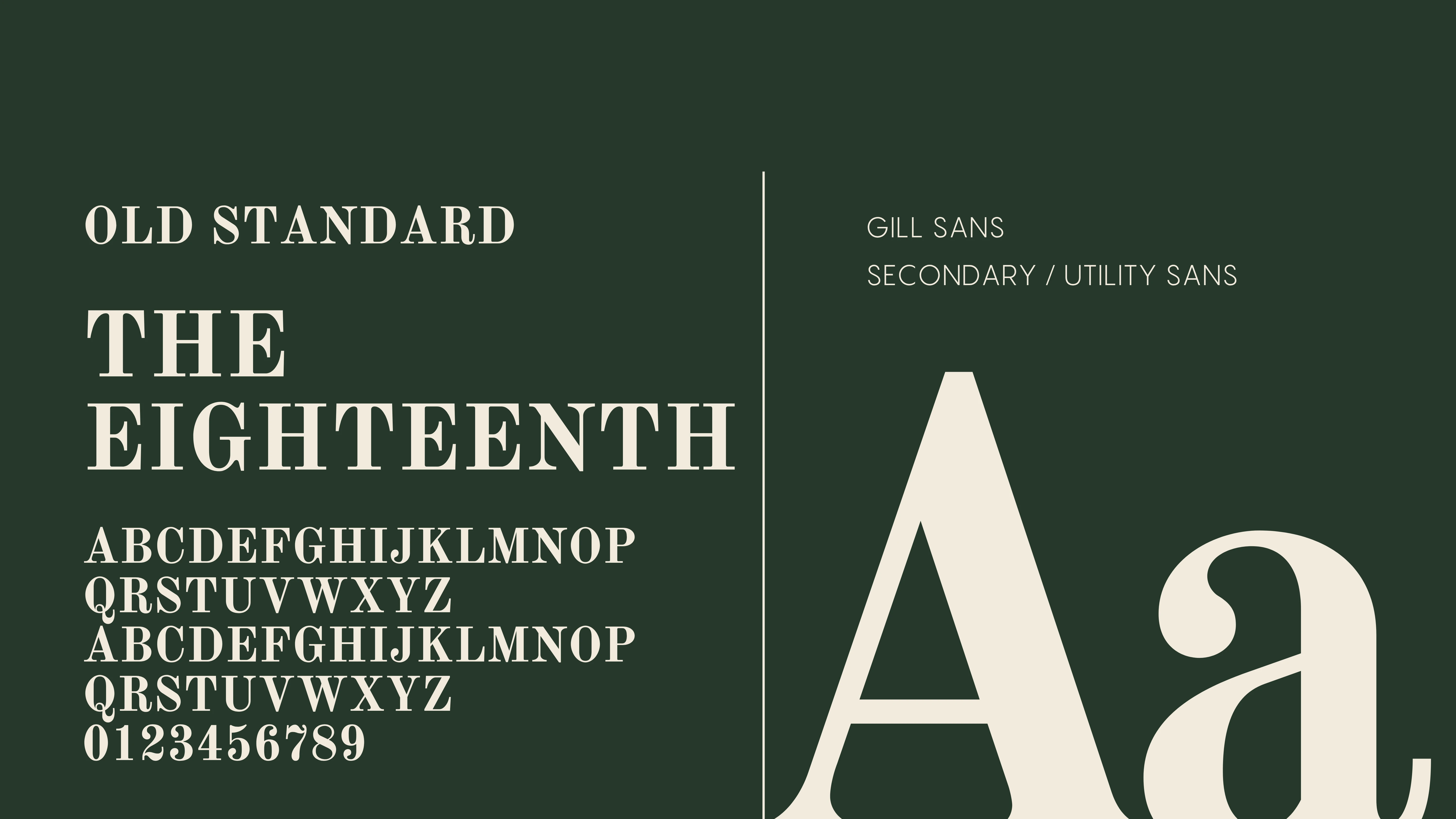
Typography plays a defining role. Old Standard provides the expressive serif foundation, bringing a sense of history and editorial confidence to the primary wordmark. Gill Sans introduces a quieter, functional counterpoint, allowing the identity to move between storytelling and practical applications.
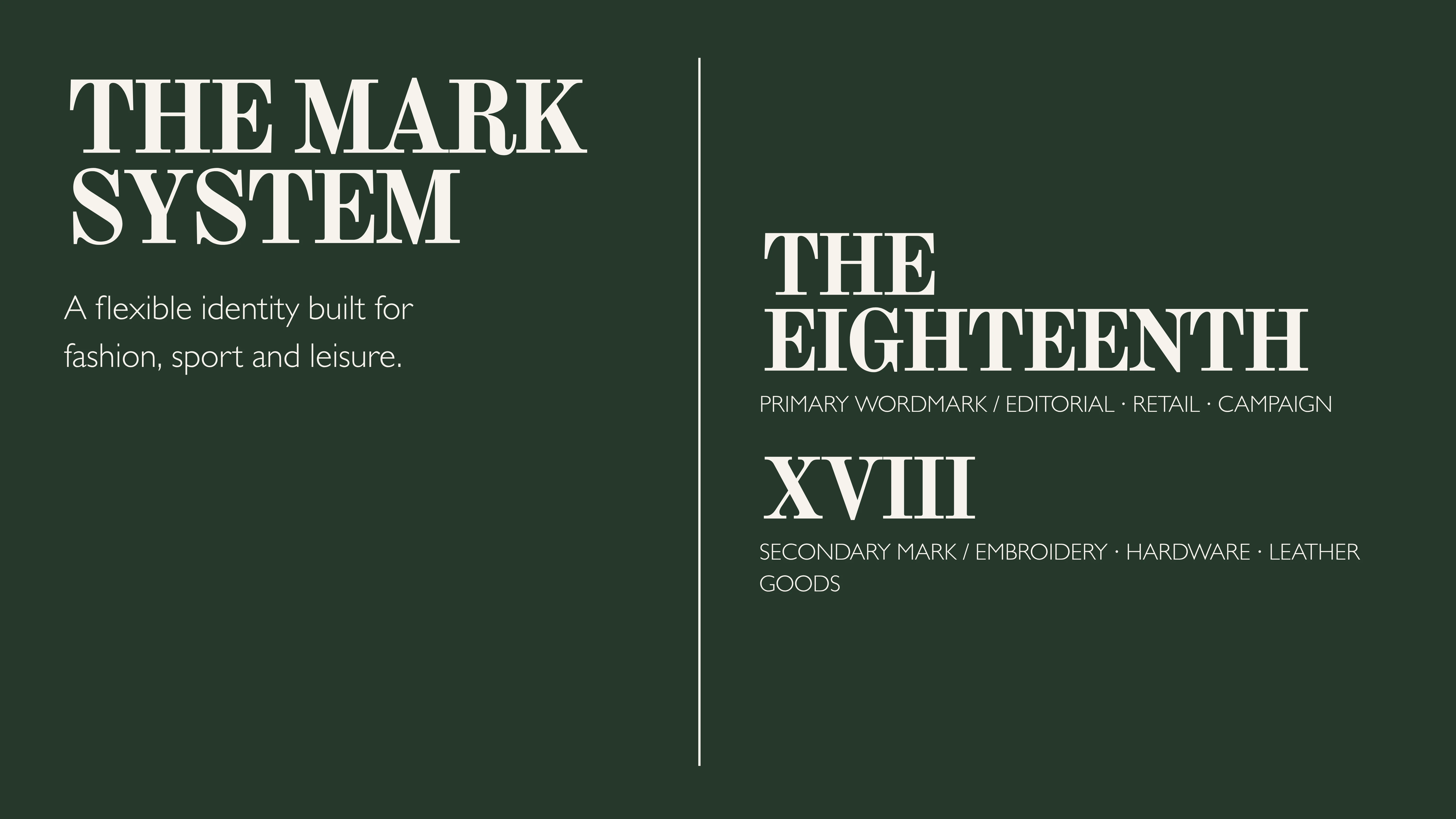
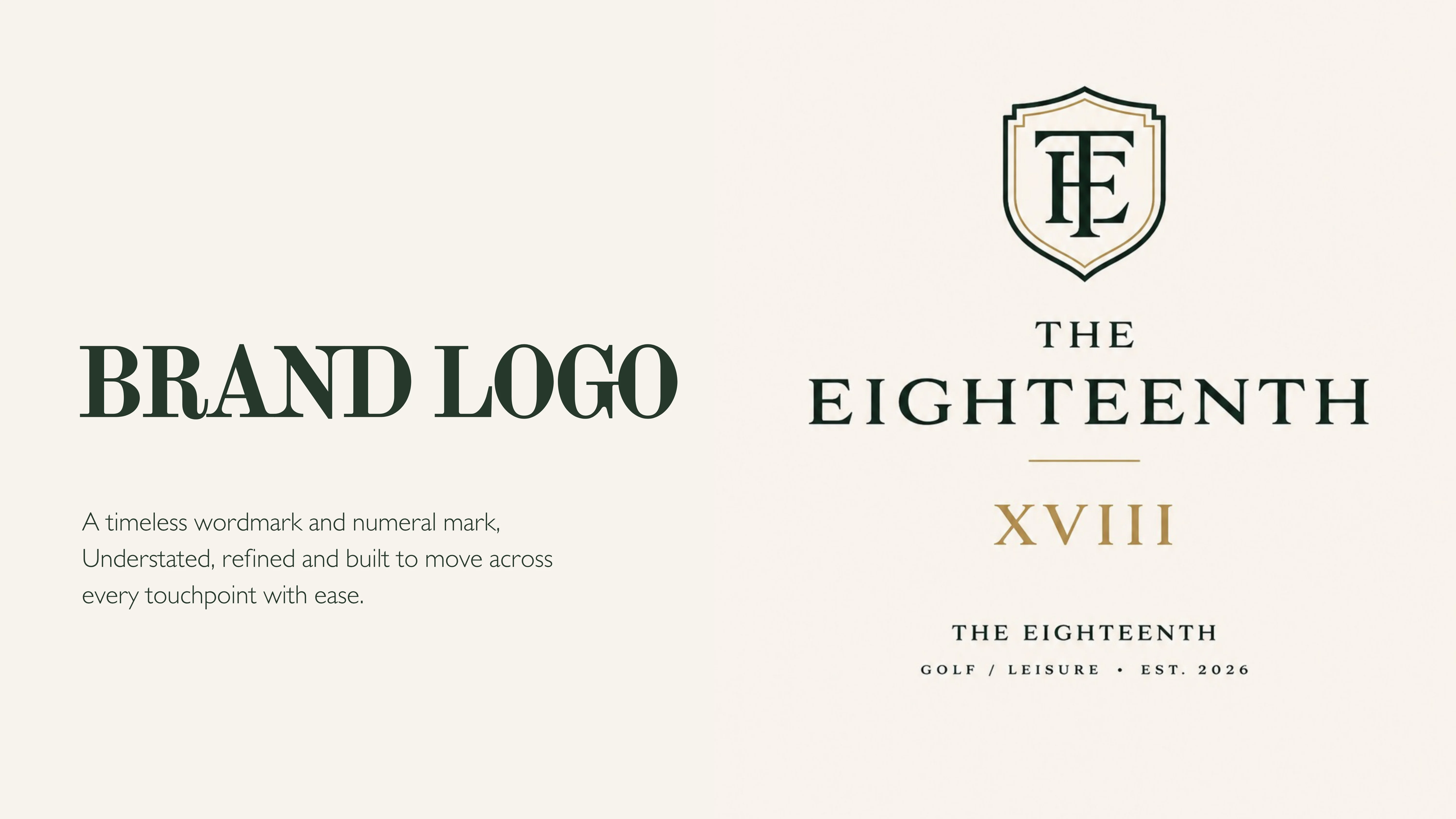
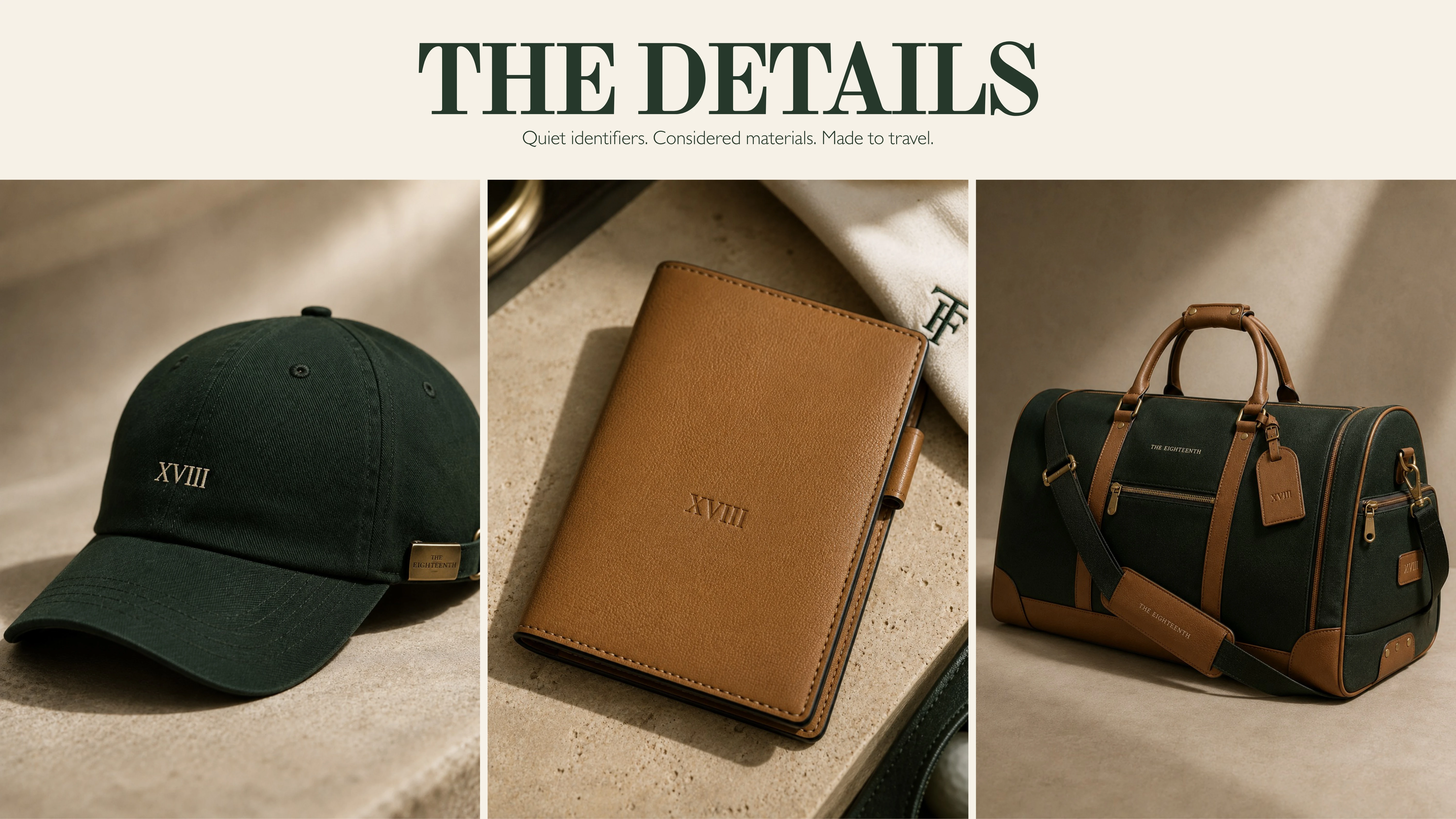
The mark system was developed for flexibility. The full THE EIGHTEENTH wordmark anchors editorial, retail and campaign communications, while the Roman numeral XVIII offers a compact signature for embroidery, leather goods, hardware and accessories.
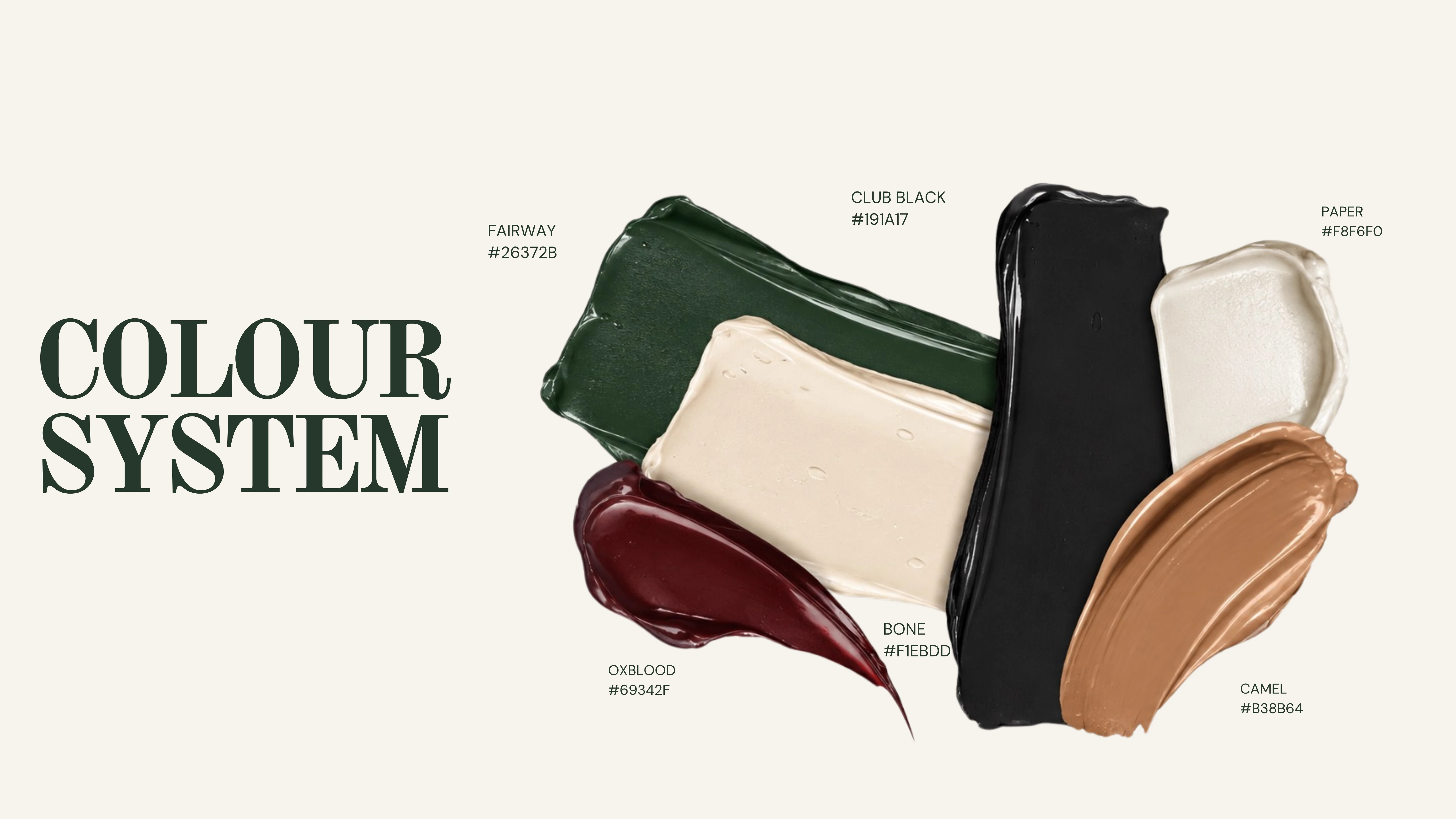
The colour palette draws from the environments and materials associated with golf and considered leisure. Deep Fairway green forms the foundation, complemented by Bone, Club Black, Ox Blood, Camel and Paper. Together, these colours establish a visual language that feels grounded, tactile and quietly luxurious.
BRAND APPLICATION & CREATIVE DIRECTION
The identity was explored beyond its core graphic elements through a series of lifestyle and product applications.
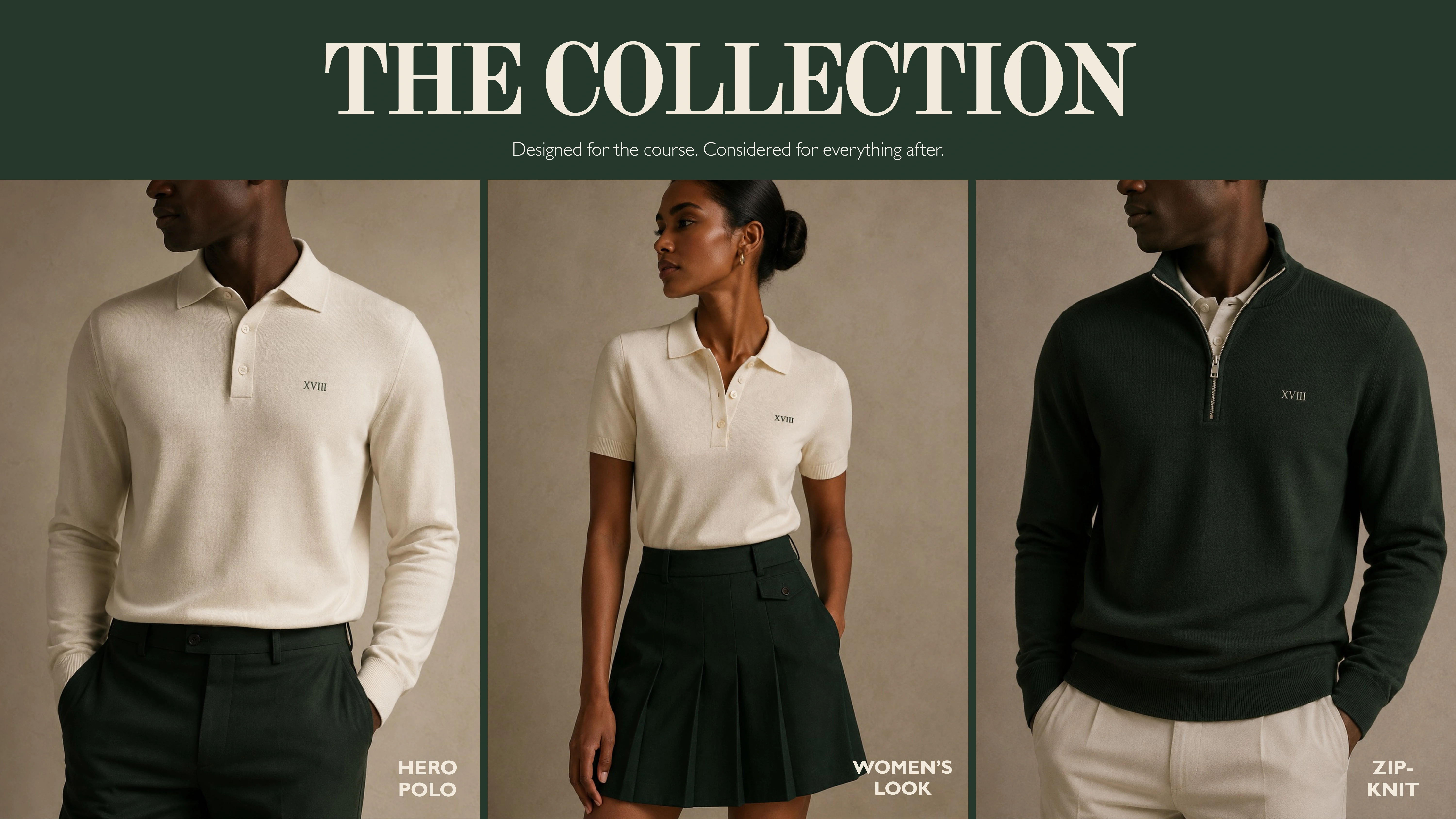
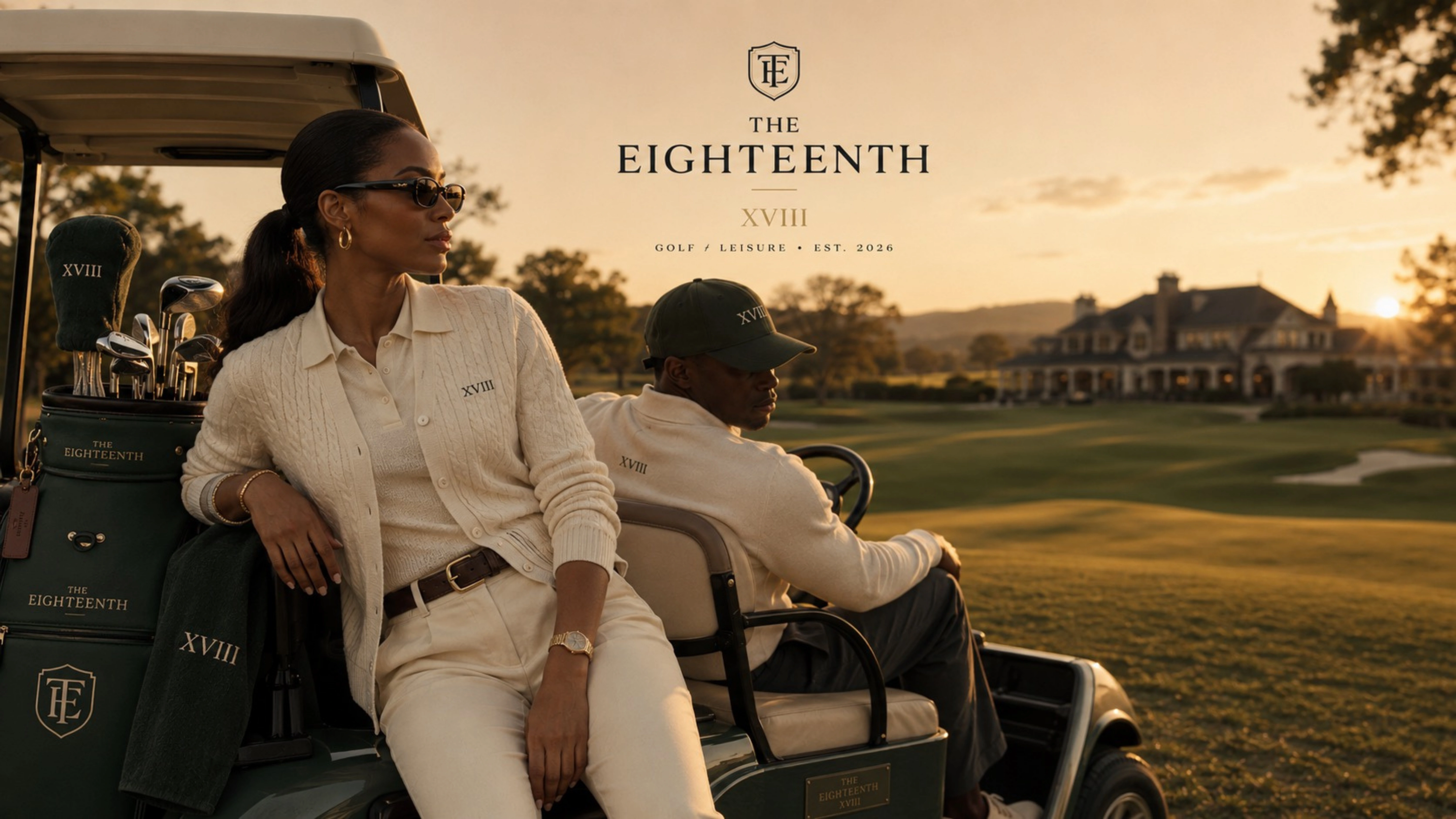
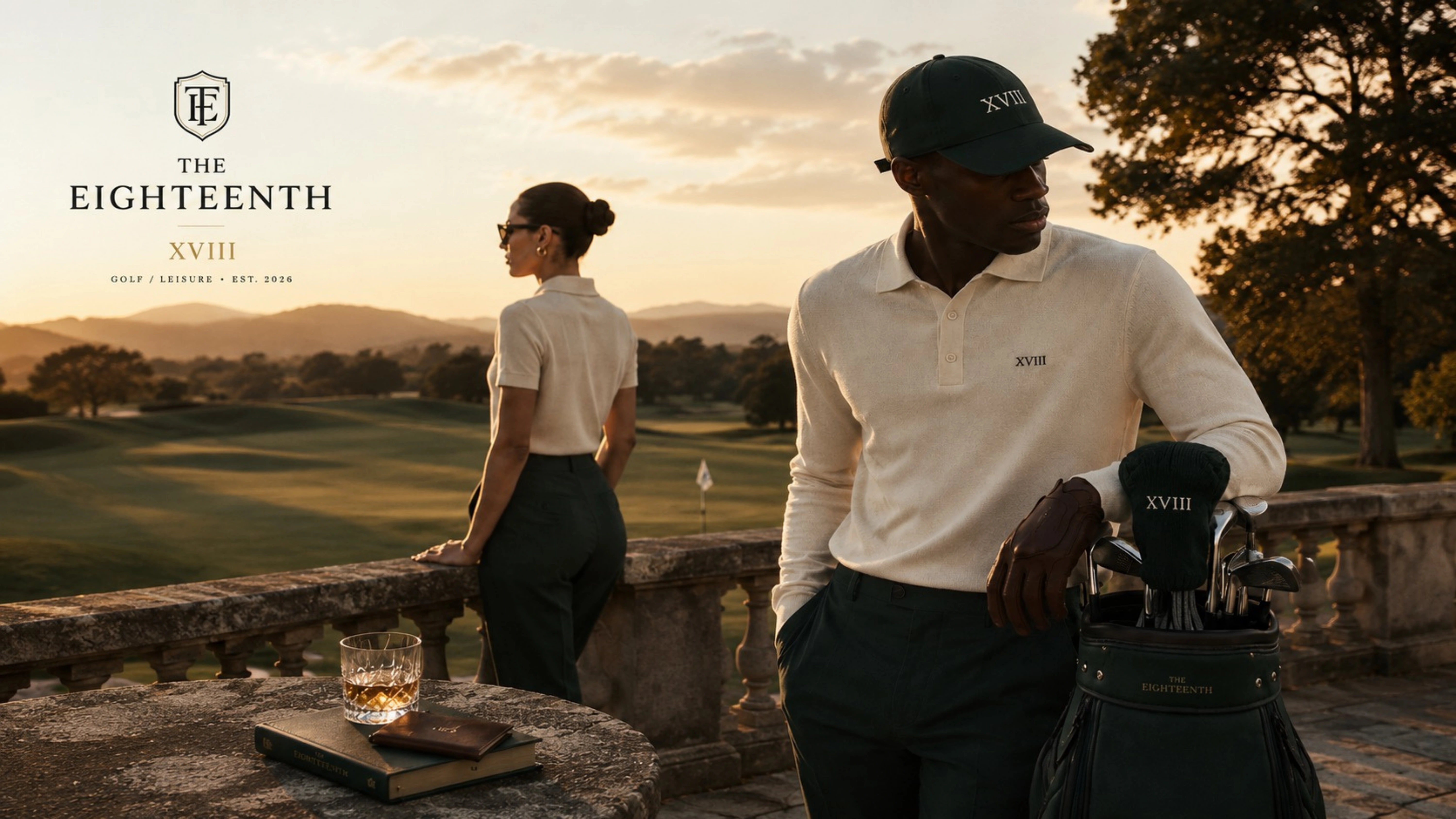
From embroidered headwear and leather accessories to travel bags and campaign imagery, each application considers how the brand would exist in the physical world. The intention was never simply to place a logo onto products, but to establish a visual system that feels consistent across different materials, scales and contexts.
The campaign world carries the same sensibility. Golf courses, refined interiors, travel and moments of leisure become part of a connected visual narrative, positioning THE EIGHTEENTH as a wardrobe and lifestyle rather than solely a sportswear label.
THE CREATIVE OUTCOME
THE EIGHTEENTH demonstrates how brand strategy, identity design and art direction can work together to establish a coherent luxury concept.
From its name and positioning to its typography, product applications and campaign world, the project establishes a foundation for a brand that could extend across fashion, sport, retail and hospitality.
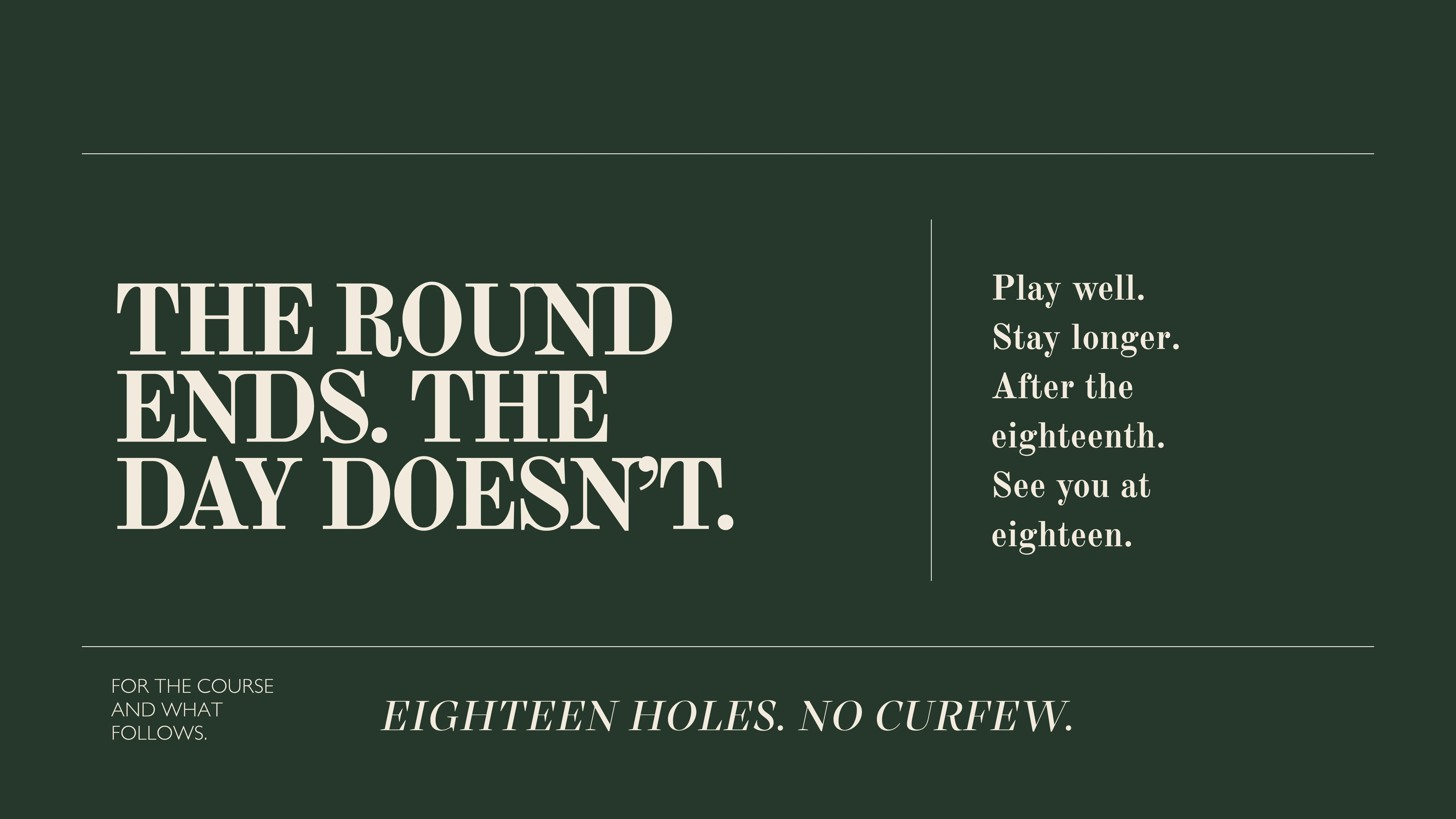
The round ends. The day doesn't.
Creative Direction & Brand Identity: Naledi Sibisi
Project Type: Independent Brand Concept
Disciplines: Brand Strategy, Creative Direction, Art Direction, Visual Identity, Campaign Development
Tools: Adobe Photoshop, Canva, ChatGPT
Disclaimer: THE EIGHTEENTH is an independent concept project and is not affiliated with an existing commercial brand.
Like this project
Posted Aug 9, 2026
Creative direction, brand identity and campaign world for The Eighteenth, a luxury golf and leisure concept built for the course and what follows.