TERRA NOIR — DARK BOTANICAL CAFÉ BRAND IDENTITY

Naledi Sibisi


TERRA NOIR
Rooted in ritual. Designed for the senses.
THE CONCEPT
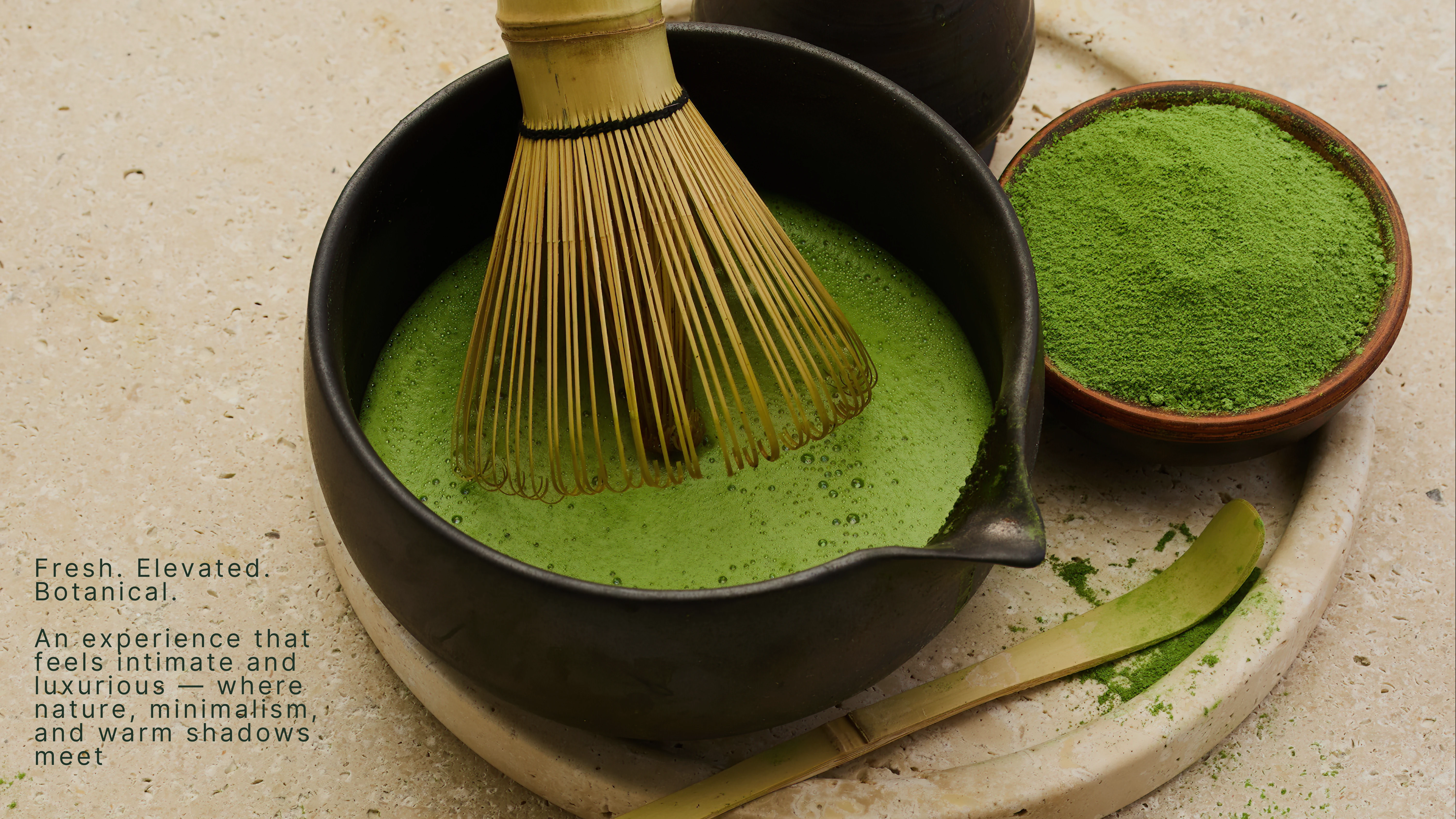
Terra Noir began as an exploration of how visual identity could transform an everyday experience into something more intentional.
Inspired by the rituals surrounding tea and coffee, the concept imagines a contemporary botanical café where the act of preparing and enjoying a drink becomes an opportunity for presence, connection and sensory appreciation.
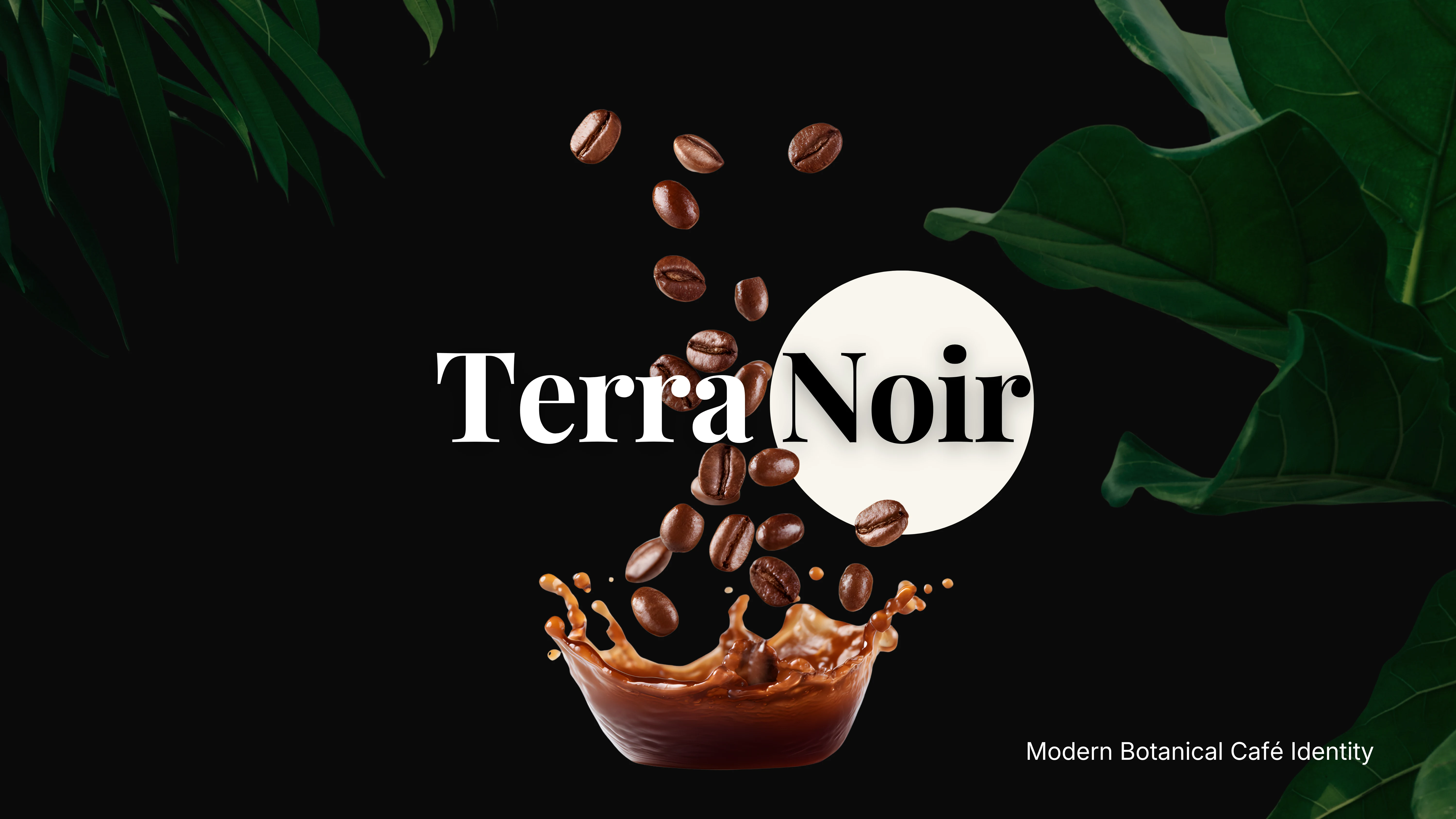
The name itself establishes the creative direction. Terra speaks to the earth, nature and the ingredients from which these rituals begin. Noir introduces darkness, depth and a certain understated sophistication.
Together, they form the foundation of a brand that feels grounded in nature while embracing the visual sensibilities of contemporary luxury.
BRAND POSITIONING
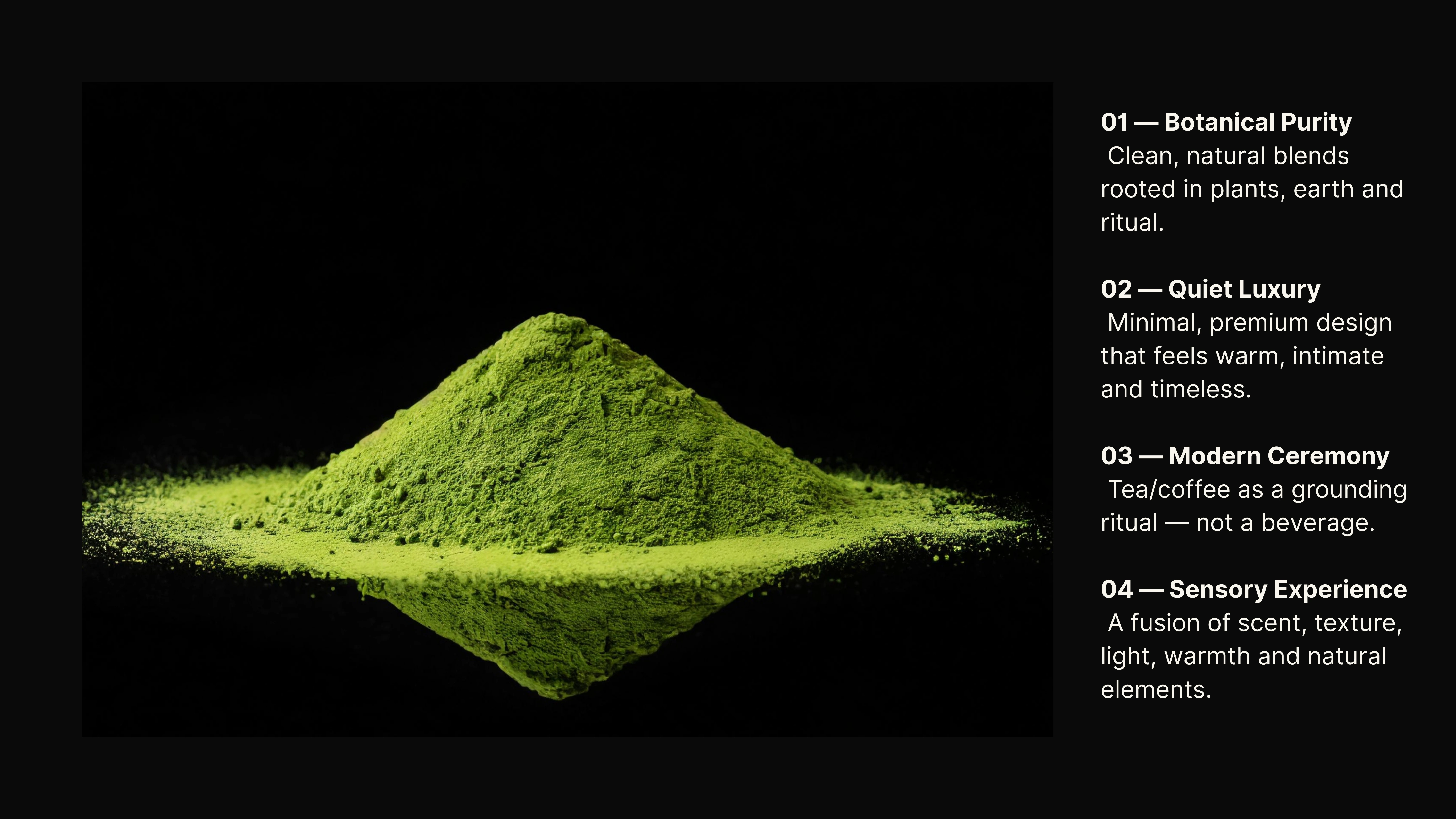
The identity was developed around four guiding principles: Botanical Purity, Quiet Luxury, Modern Ceremony and Sensory Experience.
Rather than approaching tea and coffee as products defined by convenience, Terra Noir considers them as experiences shaped by preparation, environment and ritual.
Botanical Purity connects the brand to natural ingredients and the earth. Quiet Luxury informs its restrained, tactile aesthetic. Modern Ceremony celebrates the gestures and traditions associated with preparing tea and coffee, while Sensory Experience brings these elements together through texture, colour, warmth and atmosphere.
These principles became the foundation for the brand's visual language.
ART DIRECTION & VISUAL LANGUAGE
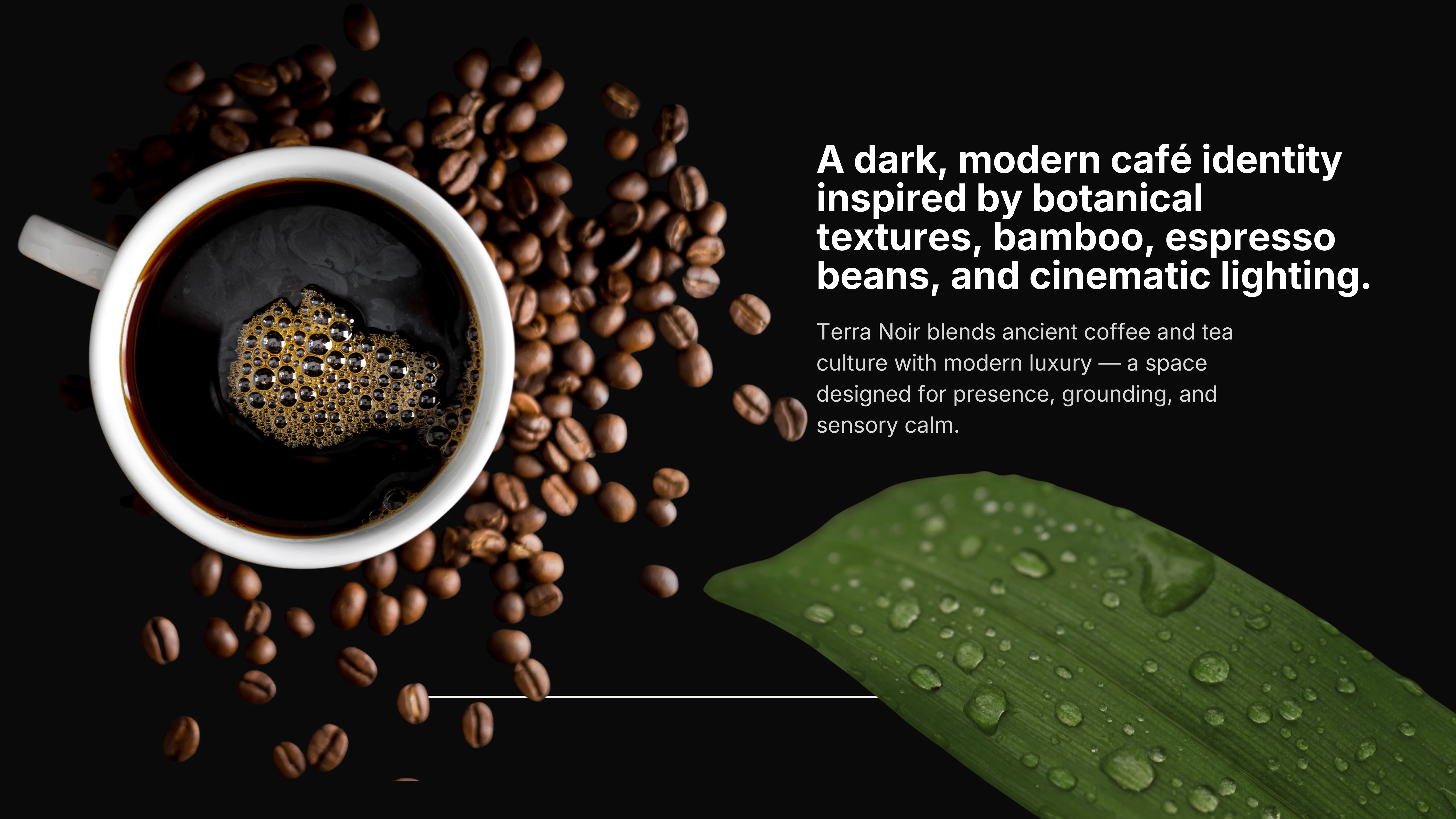
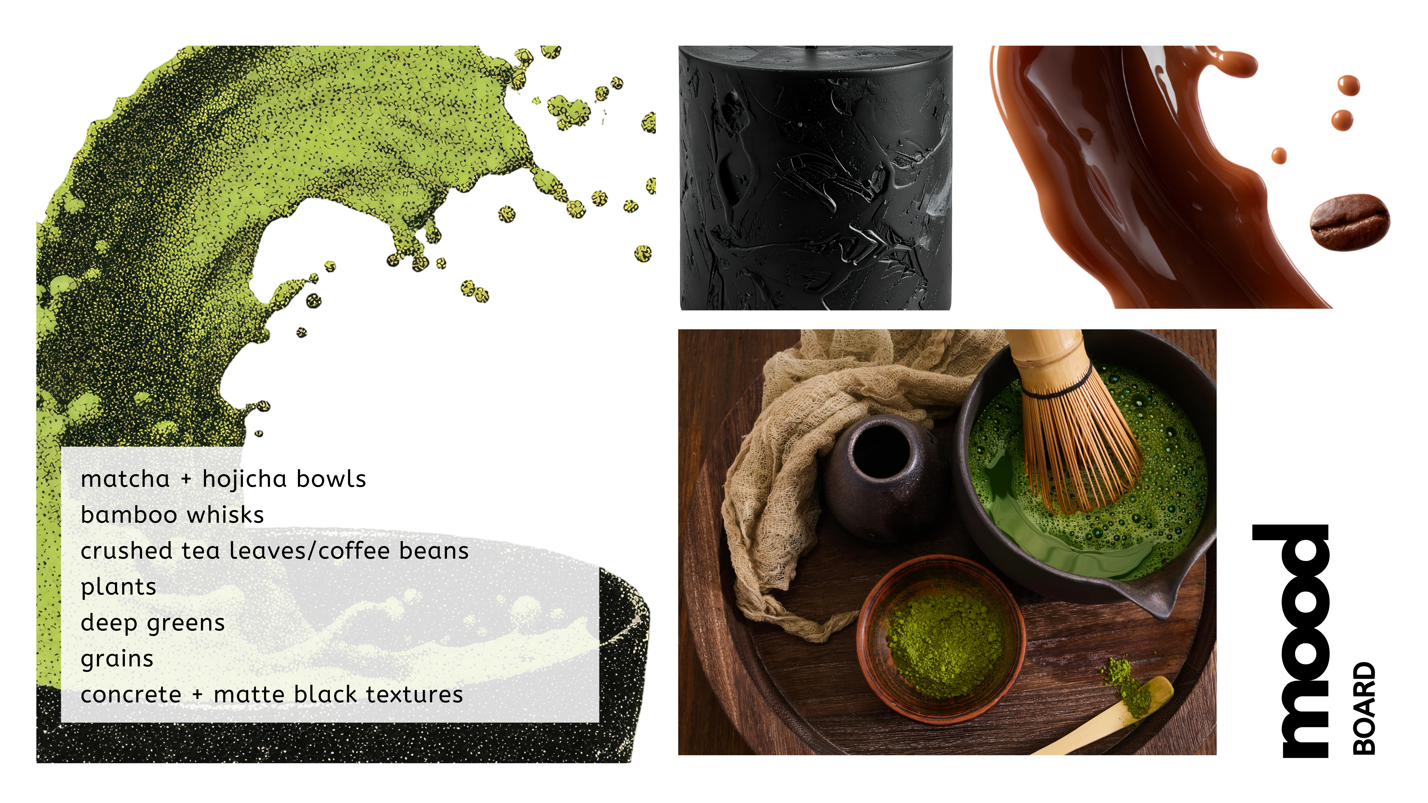
The creative direction draws from the contrasts found in nature: rich botanical greens against deep shadows, the softness of finely milled matcha against matte surfaces, and the warmth of roasted coffee against cooler, darker materials.
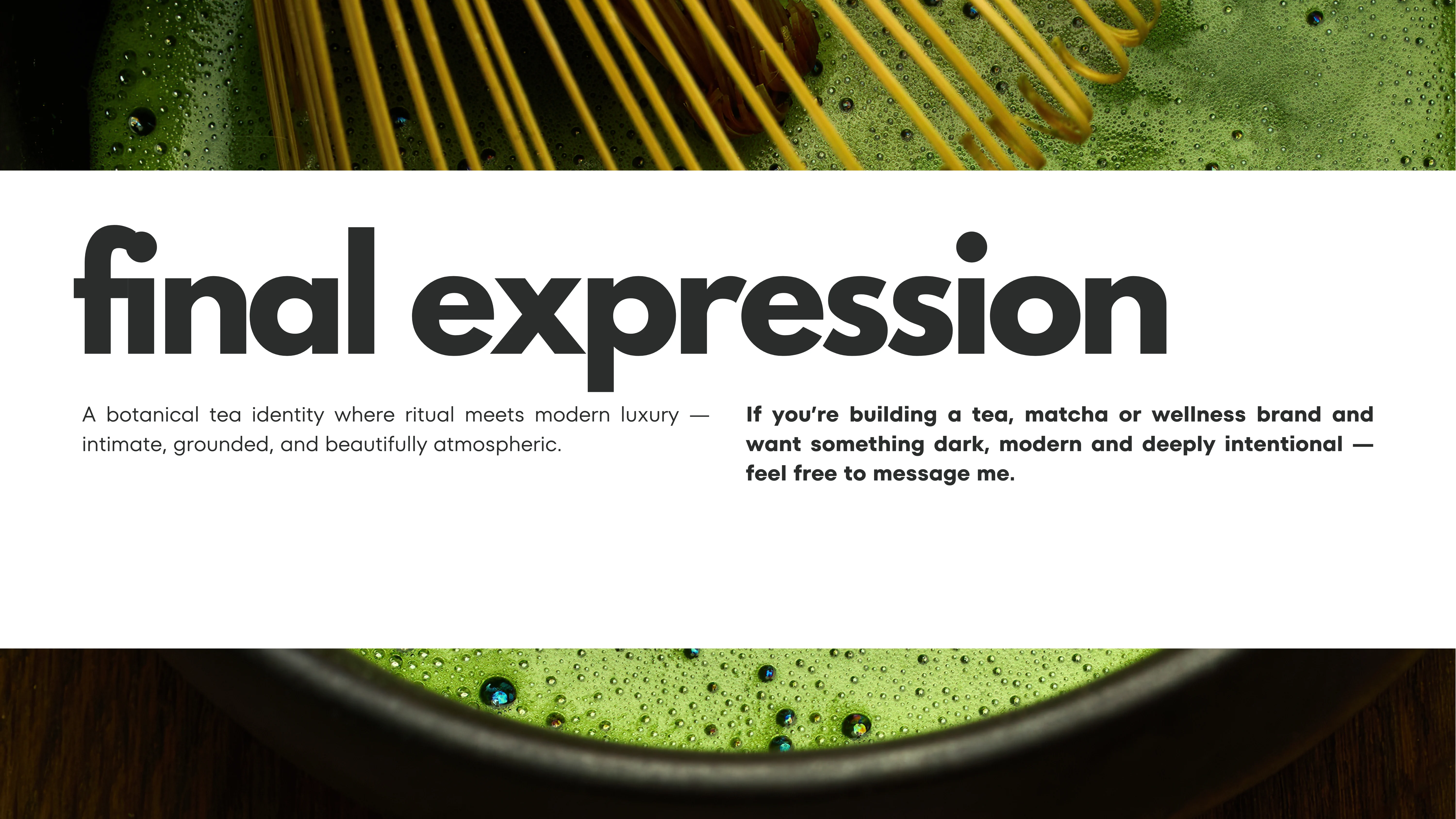
Imagery plays an important role in communicating the brand's atmosphere. Bamboo whisks, ceramic bowls, botanical leaves, coffee beans and liquid textures establish a world that feels tactile and immersive.
Cinematic lighting and considered compositions introduce depth and intimacy, allowing familiar ingredients and objects to take on a more sculptural quality.
The objective was to communicate a feeling of calm and indulgence without relying on the conventional visual language of wellness or café branding.
THE VISUAL IDENTITY
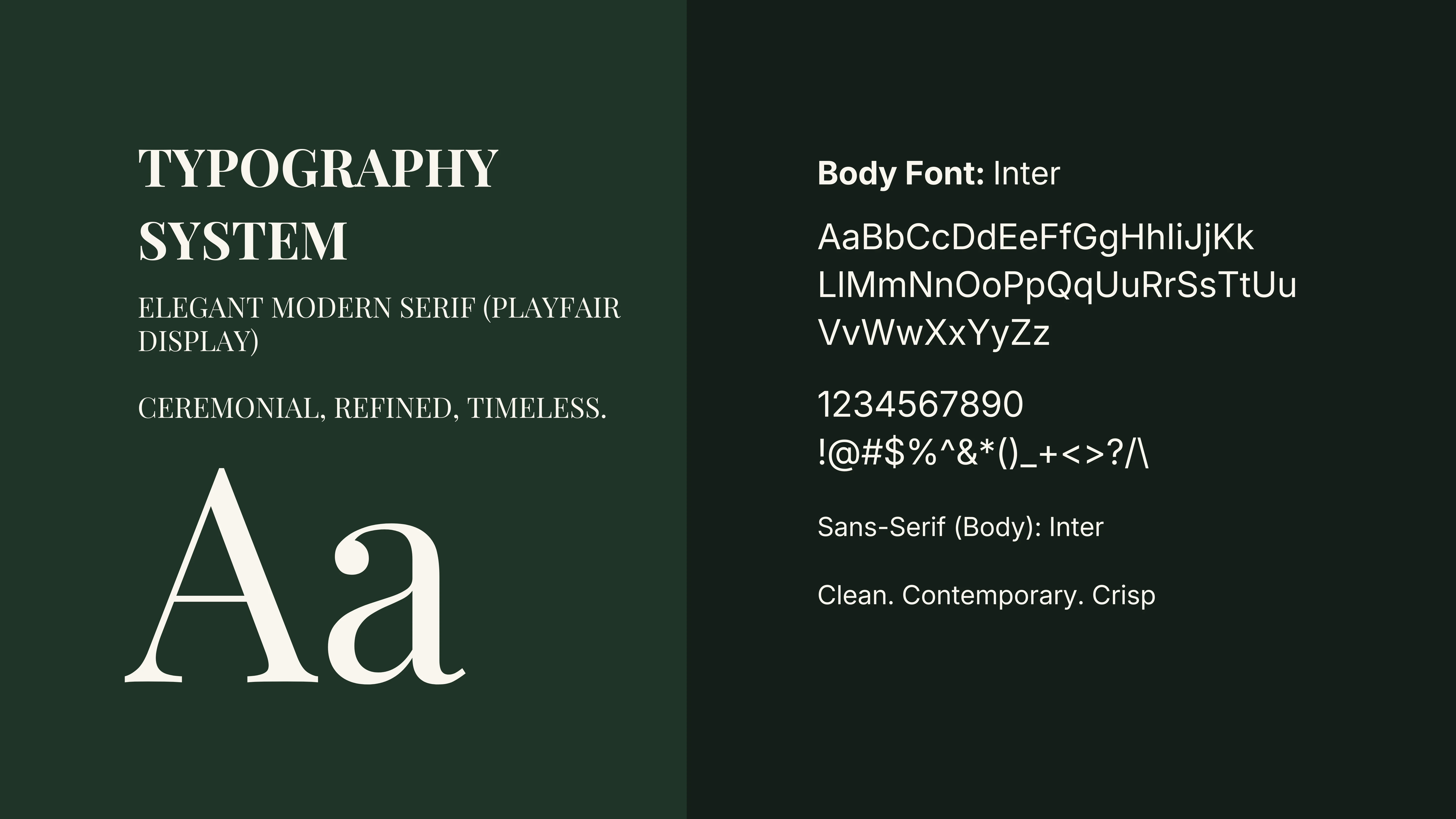
The identity pairs an expressive serif wordmark with a clean, contemporary typographic system.
Playfair Display introduces an element of refinement and ceremony, while Inter provides clarity and functional contrast across supporting brand communications.
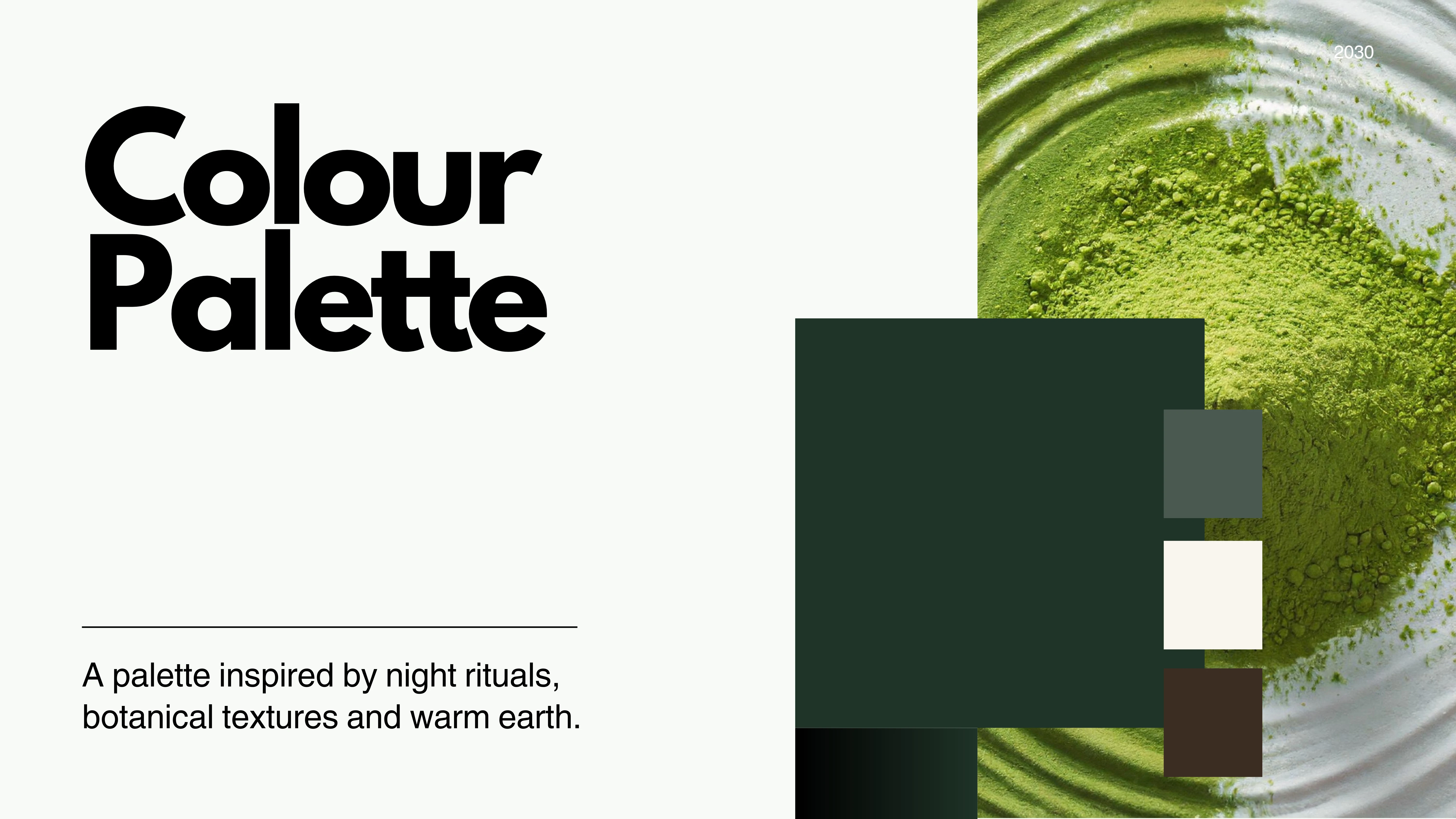
The colour palette brings together forest green, softened neutrals, charcoal and earthy brown tones. Inspired by botanical materials and the warmth of tea and coffee, these colours allow the identity to move between freshness and depth.
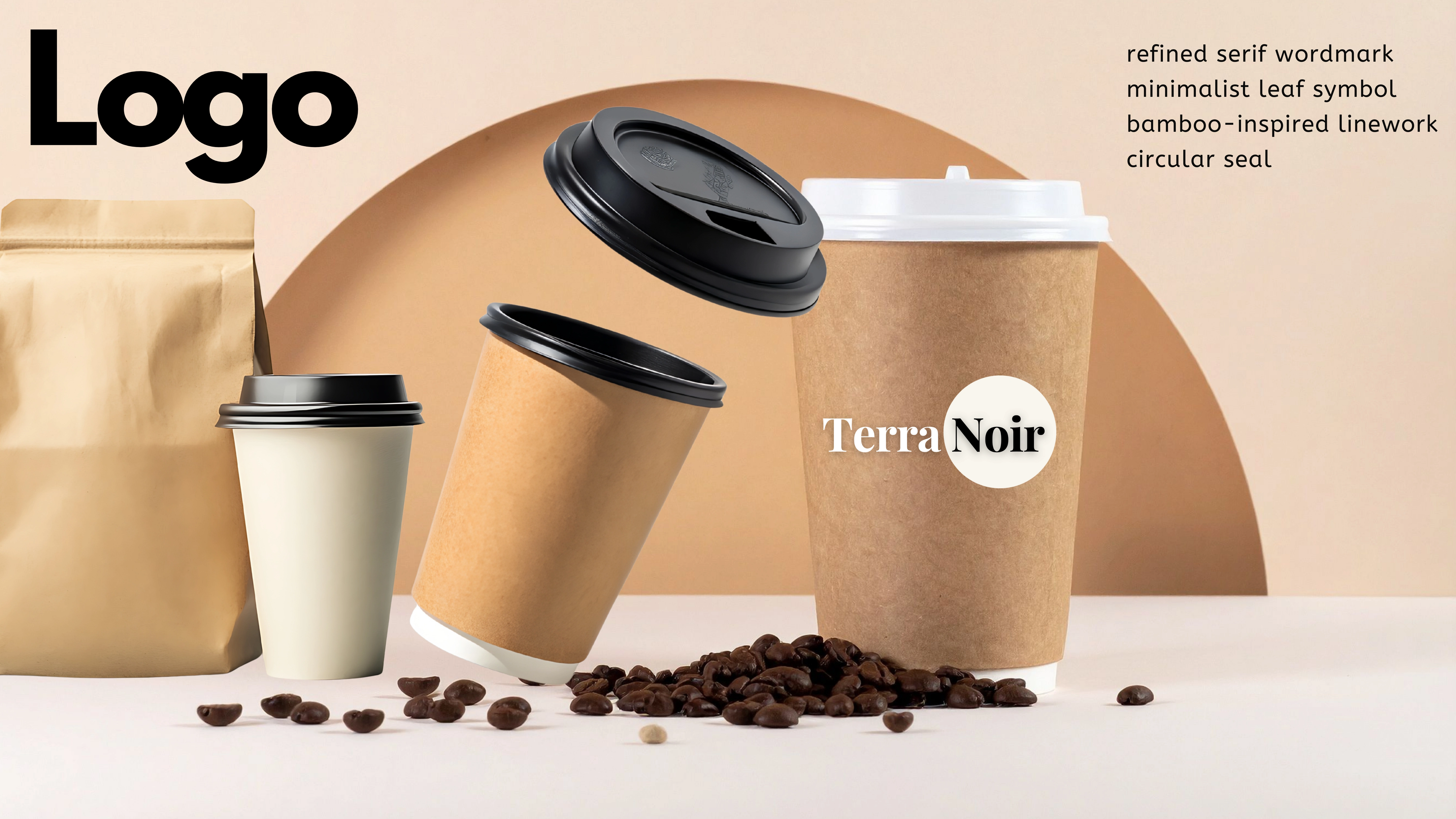
The Terra Noir wordmark and circular seal create a recognisable signature that can be applied across different brand touchpoints, from product packaging to takeaway cups.
BRAND APPLICATION & PACKAGING
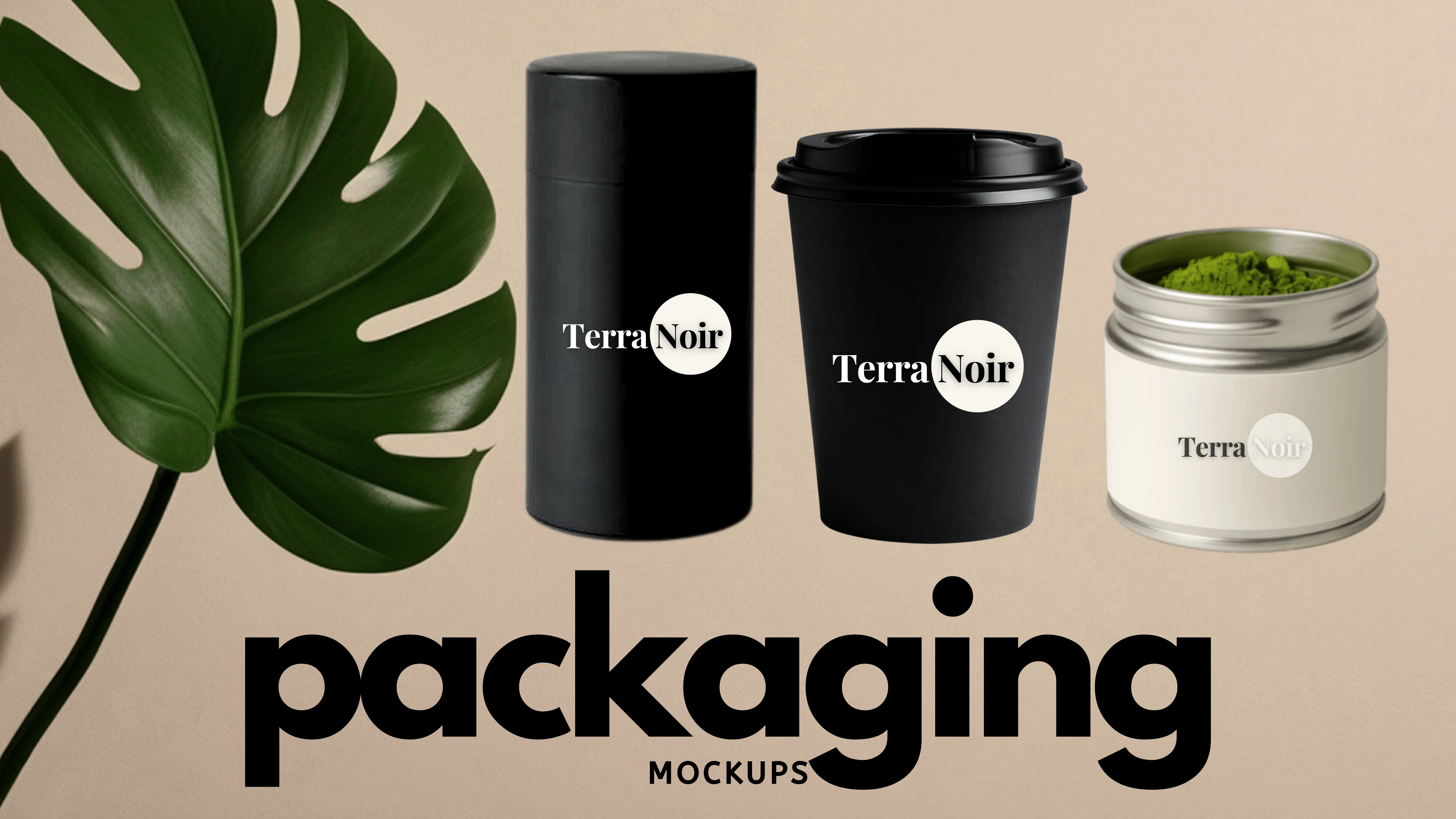
The identity was explored through a series of packaging and product mockups, translating the visual direction into objects that could exist within a contemporary café environment.
Takeaway cups, cylindrical containers and tea packaging demonstrate how the brand could communicate consistently across different formats and materials.
These applications extend the concept beyond its initial moodboard, introducing the practical considerations of scale, placement, colour contrast and brand recognition.
The resulting visual system balances the natural qualities of the ingredients with a more considered, premium presentation.
THE CREATIVE OUTCOME
Terra Noir brings together brand positioning, visual identity, art direction and packaging exploration within a cohesive conceptual world.
The project demonstrates how ordinary rituals can become the starting point for a distinctive brand identity, using typography, colour, photography and materiality to communicate an experience before a customer encounters the product itself.
A PERSONAL REFLECTION
Terra Noir was one of my earliest explorations in visual design, created during a period when I was beginning to experiment more intentionally with the relationship between imagery, typography and brand identity.
Looking back at the project now, I can recognise the beginnings of a creative approach that has continued to develop throughout my work. Even then, I was interested in communicating more than what a brand looked like. I wanted to explore how it might feel.
It remains an important part of my creative journey and a reminder of how much can begin with curiosity and the willingness to experiment.
Like this project
Posted May 2, 2026
Creative direction and brand identity for Terra Noir, a modern botanical café concept blending coffee and tea ritual with quiet, sensory luxury.