LUMIÈRE WELLNESS

Naledi Sibisi


LUMIÈRE WELLNESS
A minimal wellness identity inspired by light and inner clarity.
THE CONCEPT
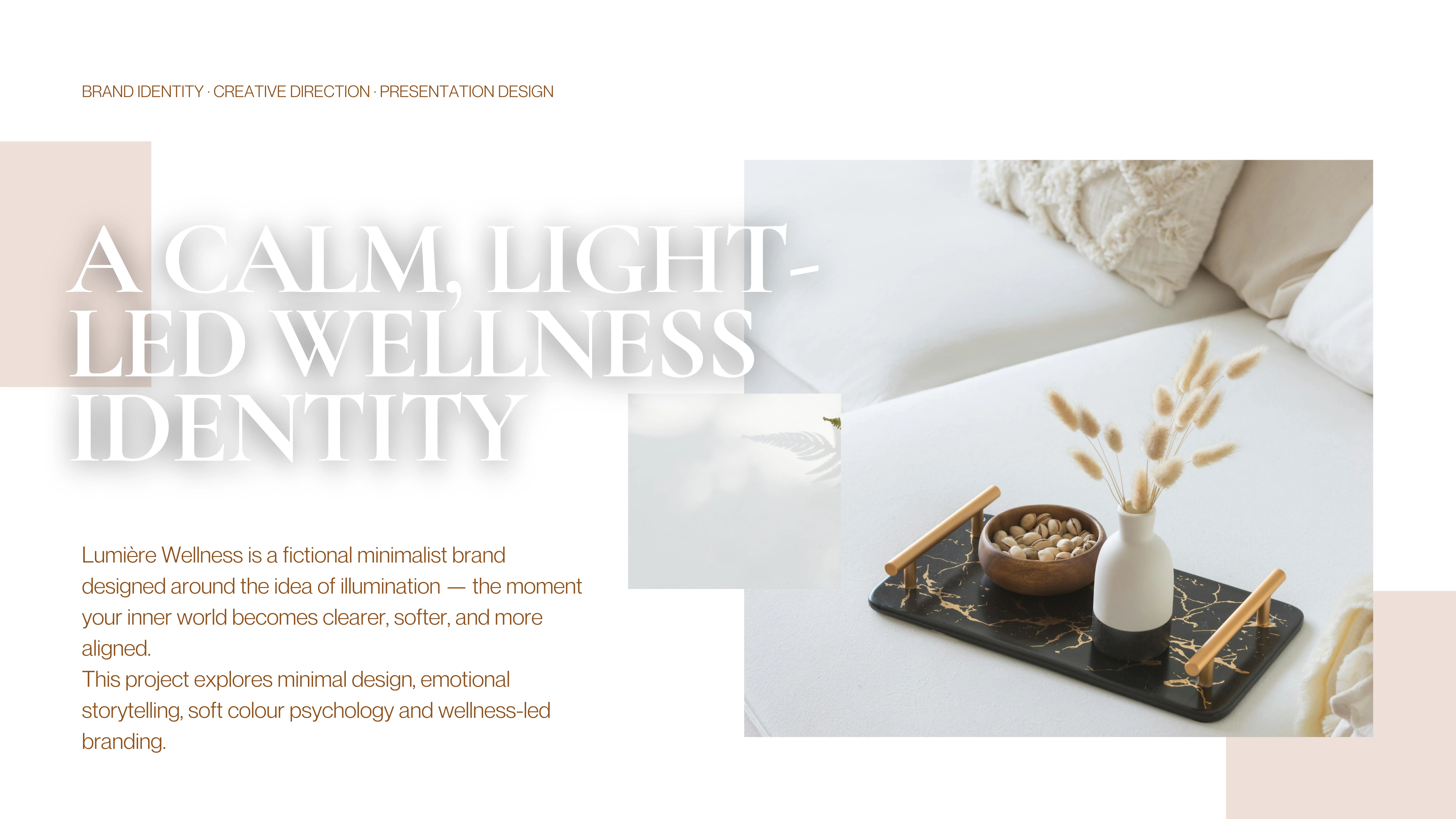
Lumière Wellness began with a question: how can a visual identity communicate a sense of calm before a single word is read?
As my first independent exploration in visual brand design, the project was an opportunity to experiment with the relationship between colour, typography, imagery and emotion. I wanted to understand how relatively simple design decisions could work together to establish a recognisable feeling.
The name Lumière, French for light, became the conceptual foundation. Light represents clarity, warmth, renewal and the possibility of seeing things differently. These associations informed the identity of an imagined wellness brand centred on intentional living and everyday rituals.
The objective was to create something gentle and refined, with a visual language that invited the viewer to slow down.
BRAND PHILOSOPHY & POSITIONING
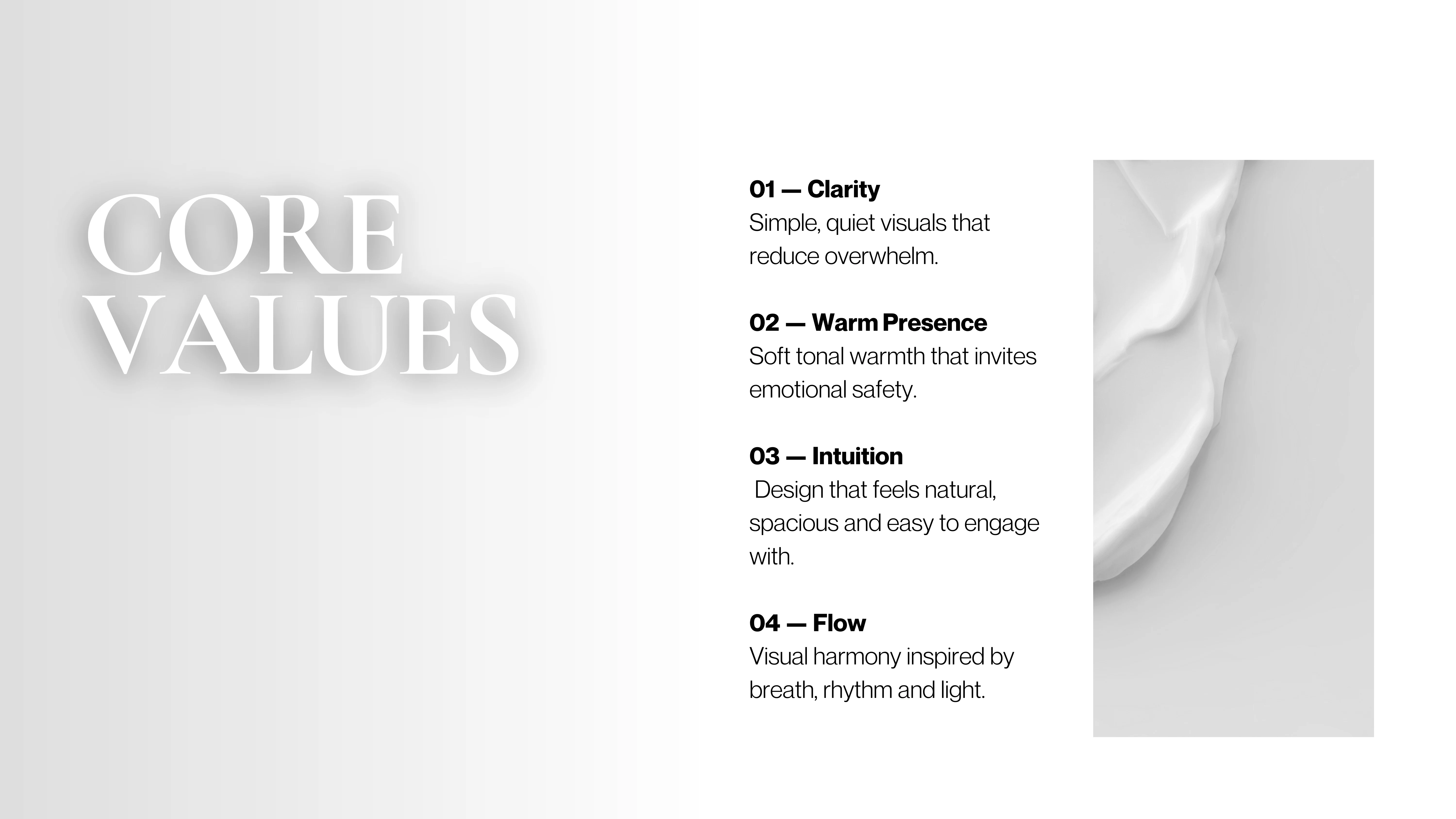
The identity was developed around four guiding values: Clarity, Warm Presence, Intuition and Flow.
Clarity informed the use of uncluttered compositions, generous negative space and straightforward visual communication. Warm Presence introduced the softer, more human qualities of the brand through colour and imagery. Intuition encouraged a natural and accessible approach to the design, while Flow inspired the relationship between individual elements, creating a sense of visual rhythm and continuity.
Together, these principles established the foundation for a wellness identity that feels considered without becoming clinical or impersonal.
ART DIRECTION & VISUAL LANGUAGE
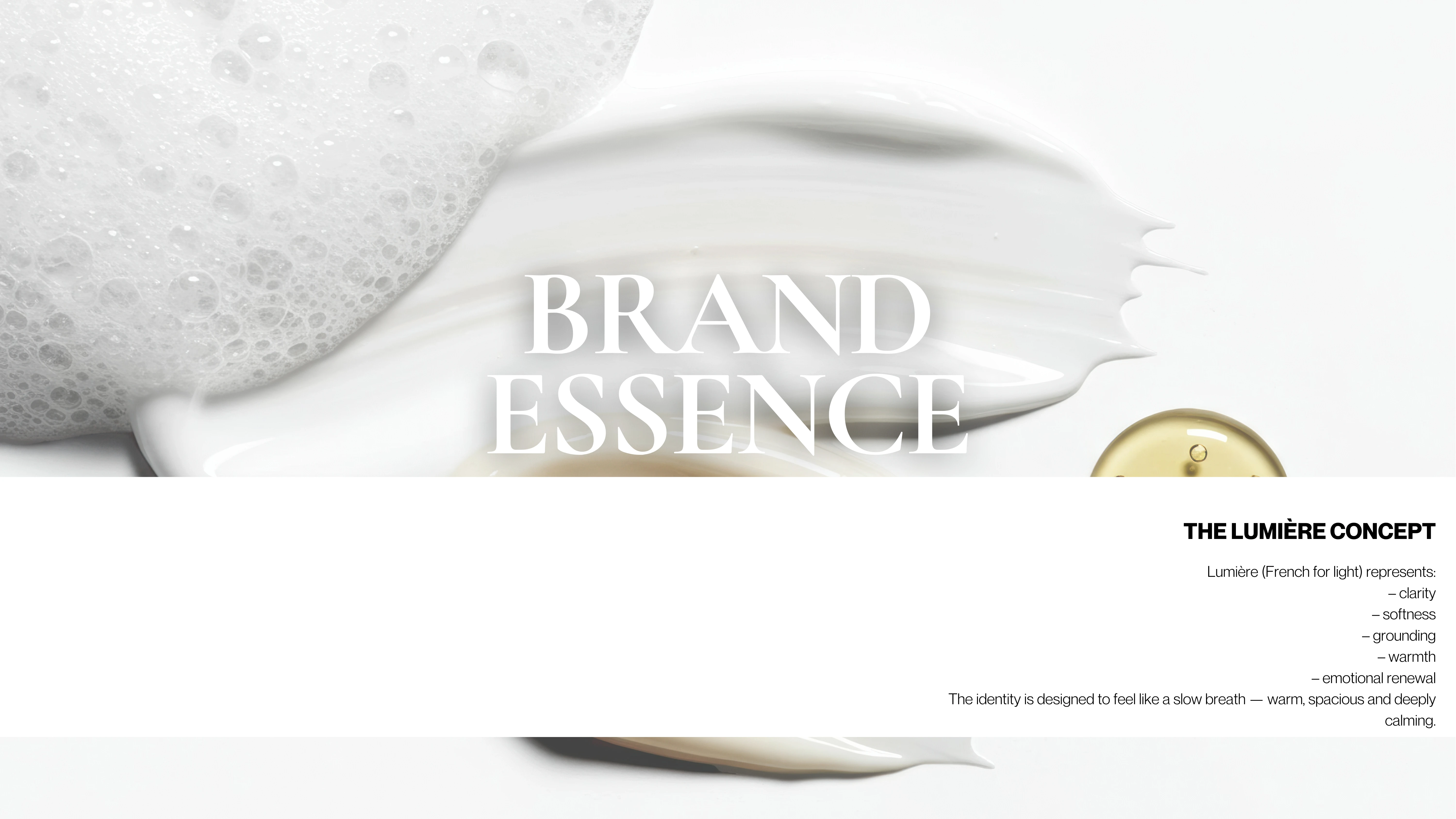
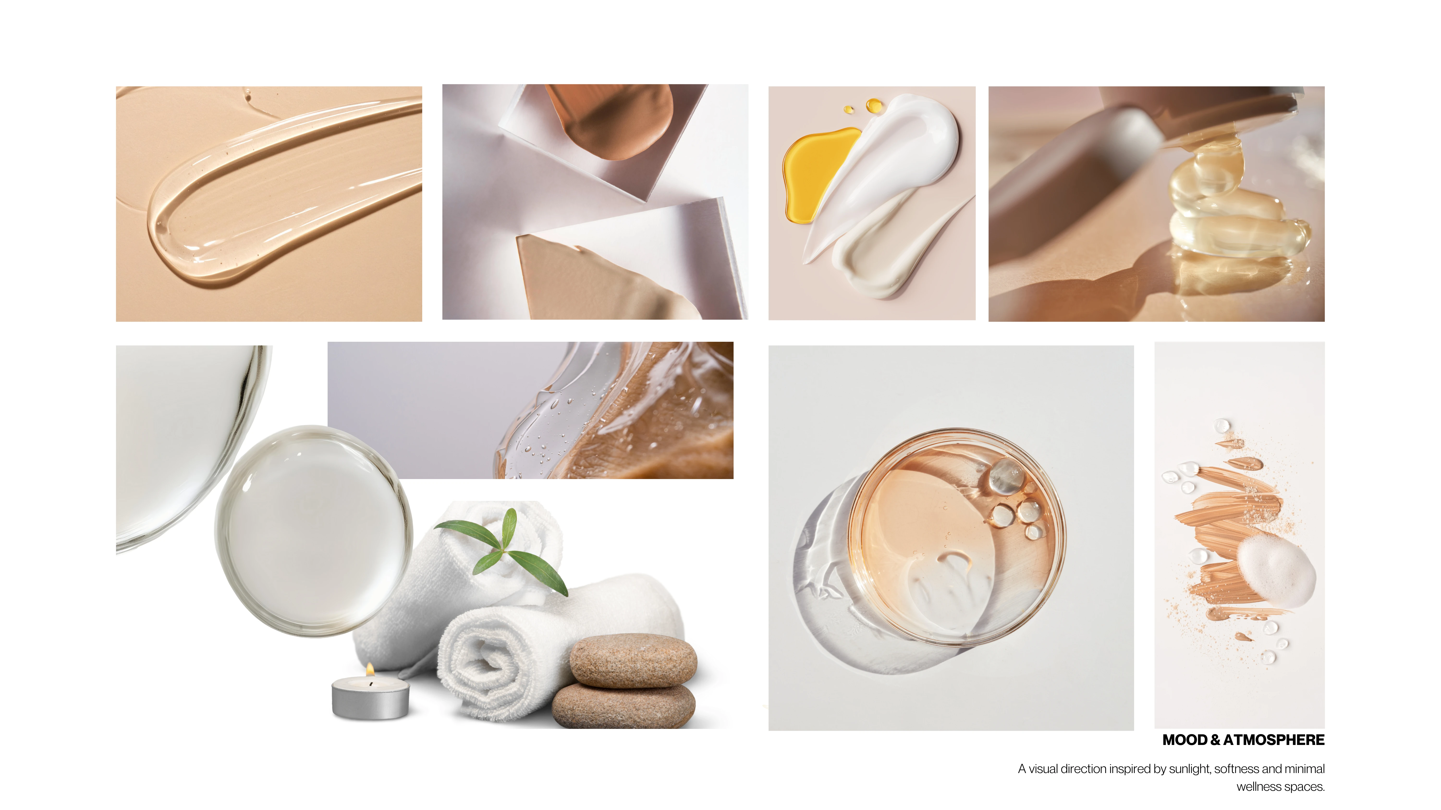
The creative direction draws from the qualities of natural light, softness and tactile simplicity.
A visual world of gentle shadows, translucent textures, botanical details and organic forms was developed to suggest stillness and sensory comfort. Skincare textures, glass, water and natural materials became recurring references, creating an atmosphere that feels both intimate and contemporary.
The compositions favour simplicity over excess, allowing subtle variations in texture, lighting and scale to carry the visual narrative.
This became one of the central explorations of the project: understanding how restraint could create its own form of expression.
COLOUR PSYCHOLOGY & TYPOGRAPHY
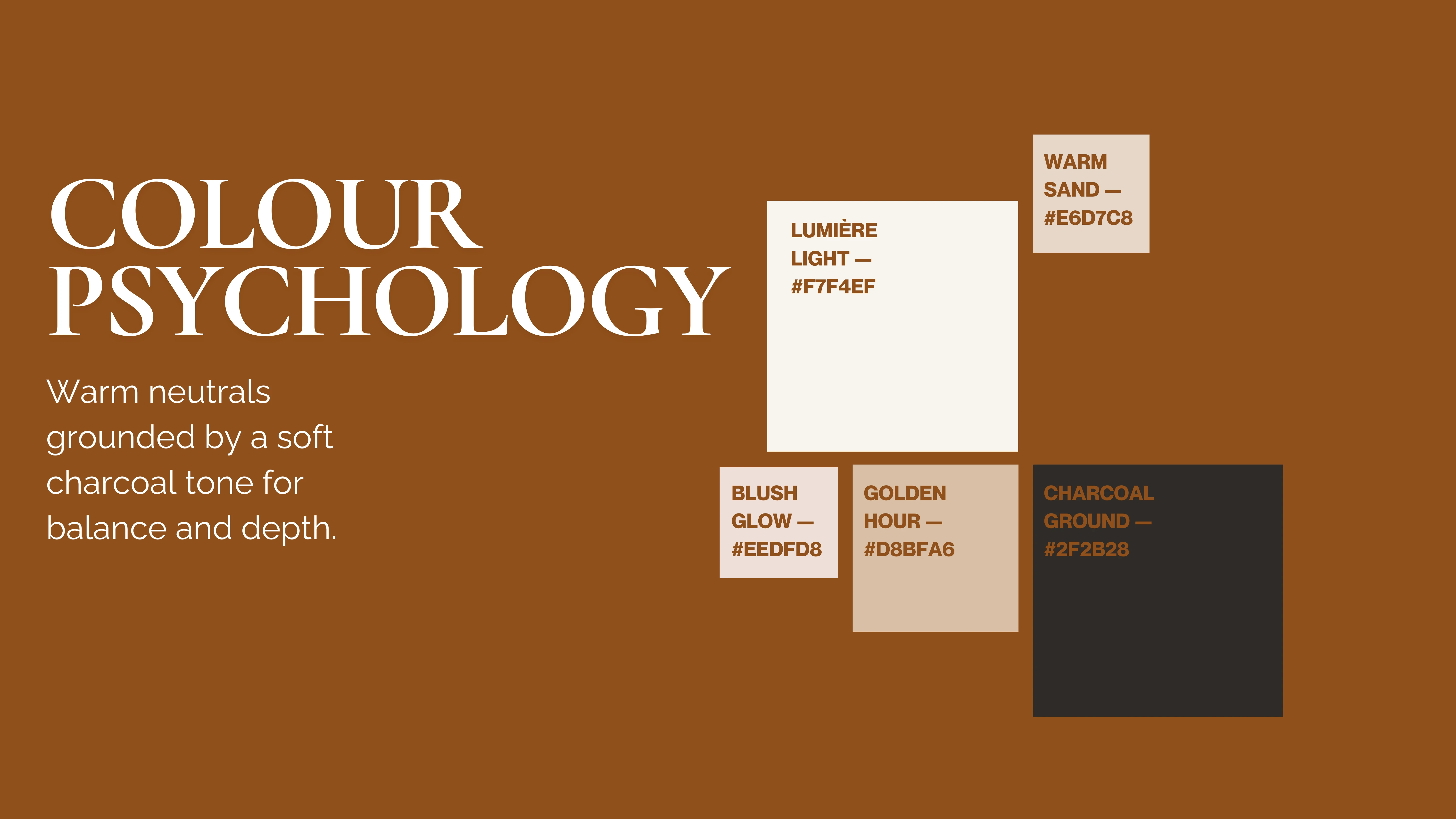
The colour system was developed to communicate warmth, balance and clarity.
Lumière Light provides a soft, luminous foundation, complemented by Warm Sand, Blush Glow and Golden Hour. These muted neutral tones introduce warmth and subtle emotional variation, while Charcoal Ground provides contrast and definition.
Together, the palette creates a sense of softness without losing the structure required of a functional visual identity.
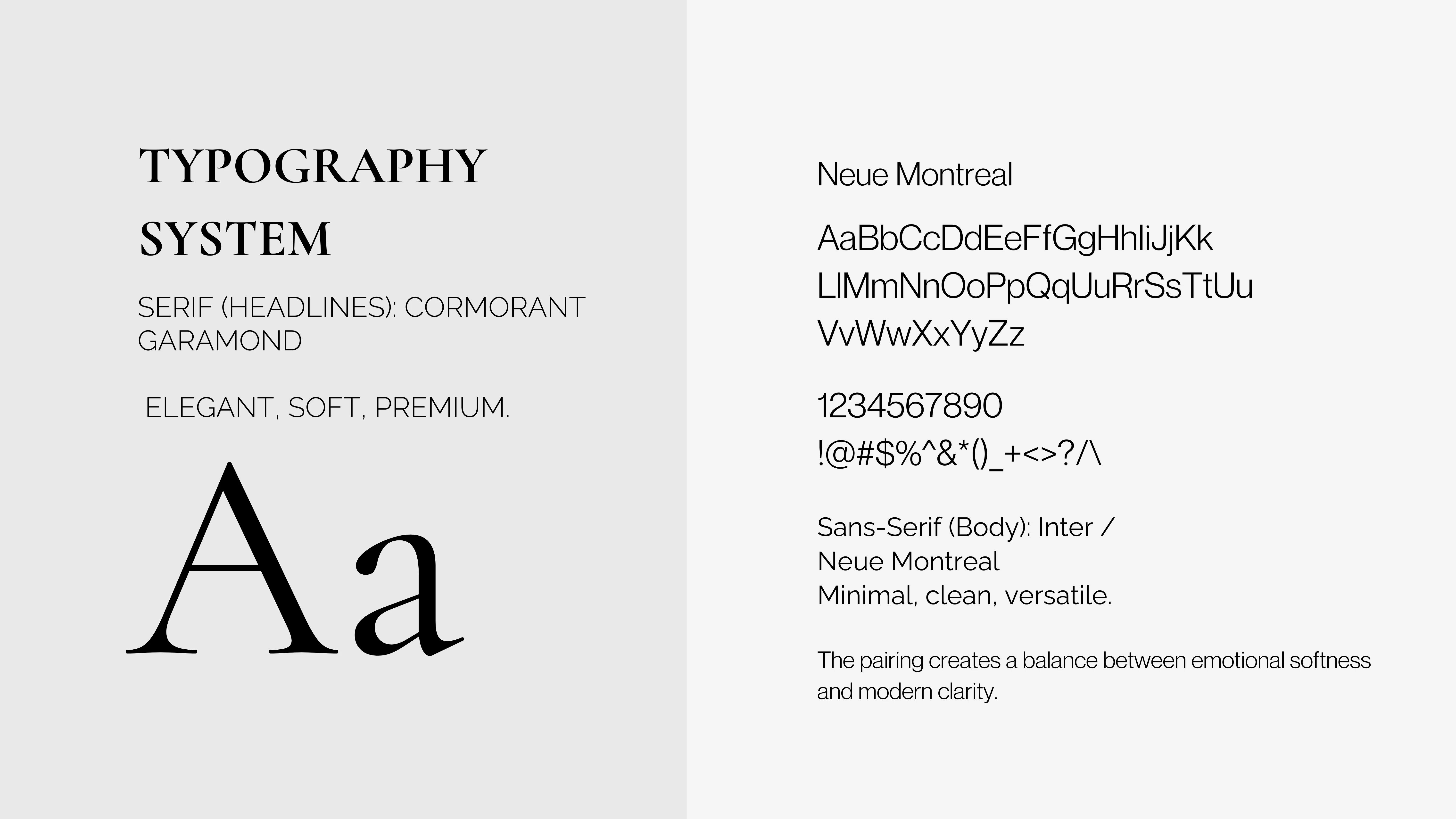
Typography follows the same philosophy.
Cormorant Garamond introduces an elegant serif character, balancing delicacy with a sense of refinement. Inter and Neue Montreal provide contemporary sans-serif alternatives for supporting text and practical brand communications.
The contrast between expressive serif typography and functional sans-serif elements creates a system that feels both personal and accessible.
THE VISUAL IDENTITY
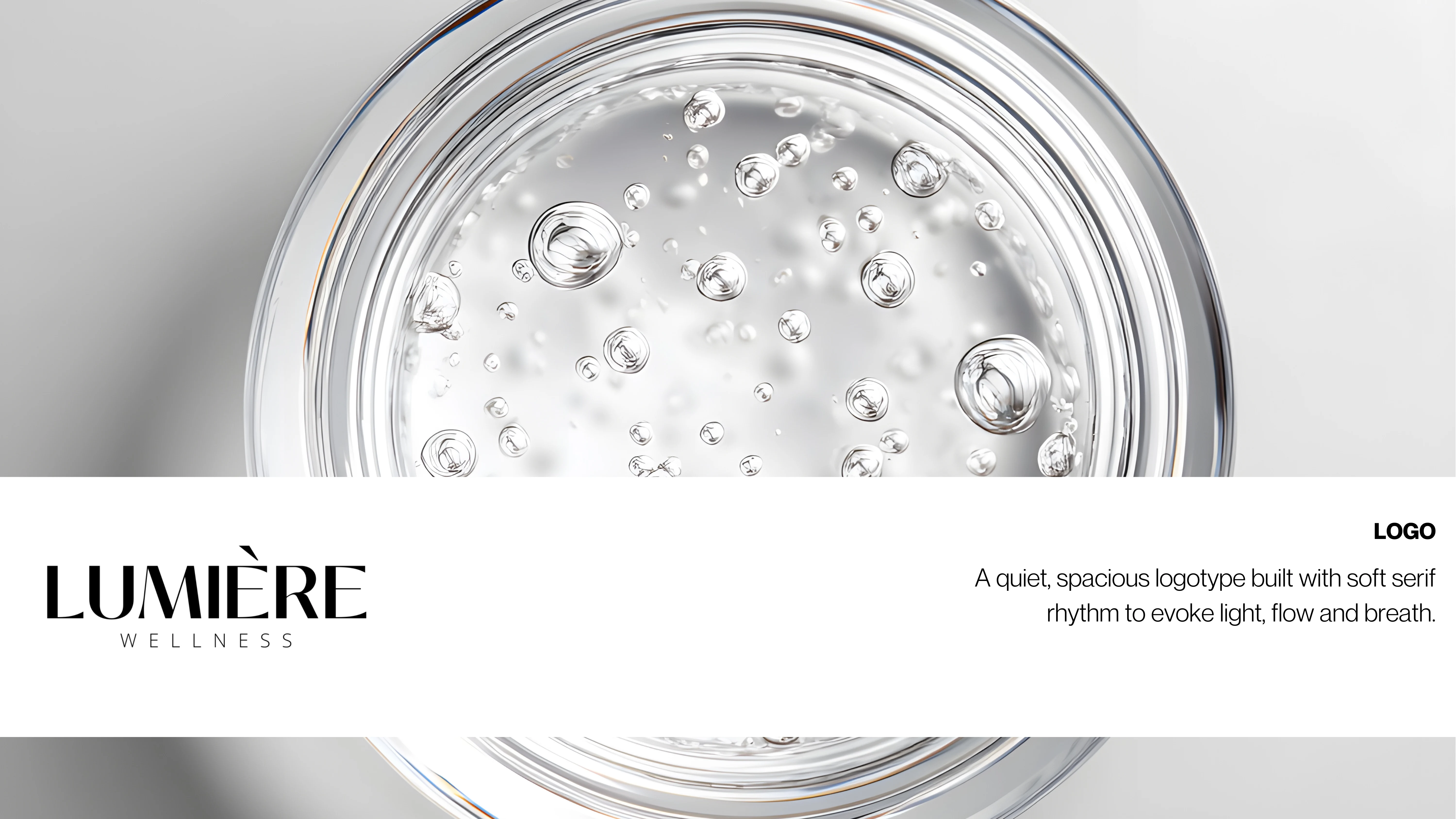
The Lumière wordmark was designed as a quiet, recognisable expression of the brand's personality.
Its serif letterforms establish a sense of elegance, while the spacious treatment of the supporting WELLNESS typography reinforces the ideas of lightness and breathability.
Rather than relying on elaborate symbols or decorative elements, the identity allows typography, proportion and negative space to communicate the brand's character.
The resulting system was intended to feel adaptable across different contexts while maintaining a consistent visual presence.
BRAND APPLICATIONS
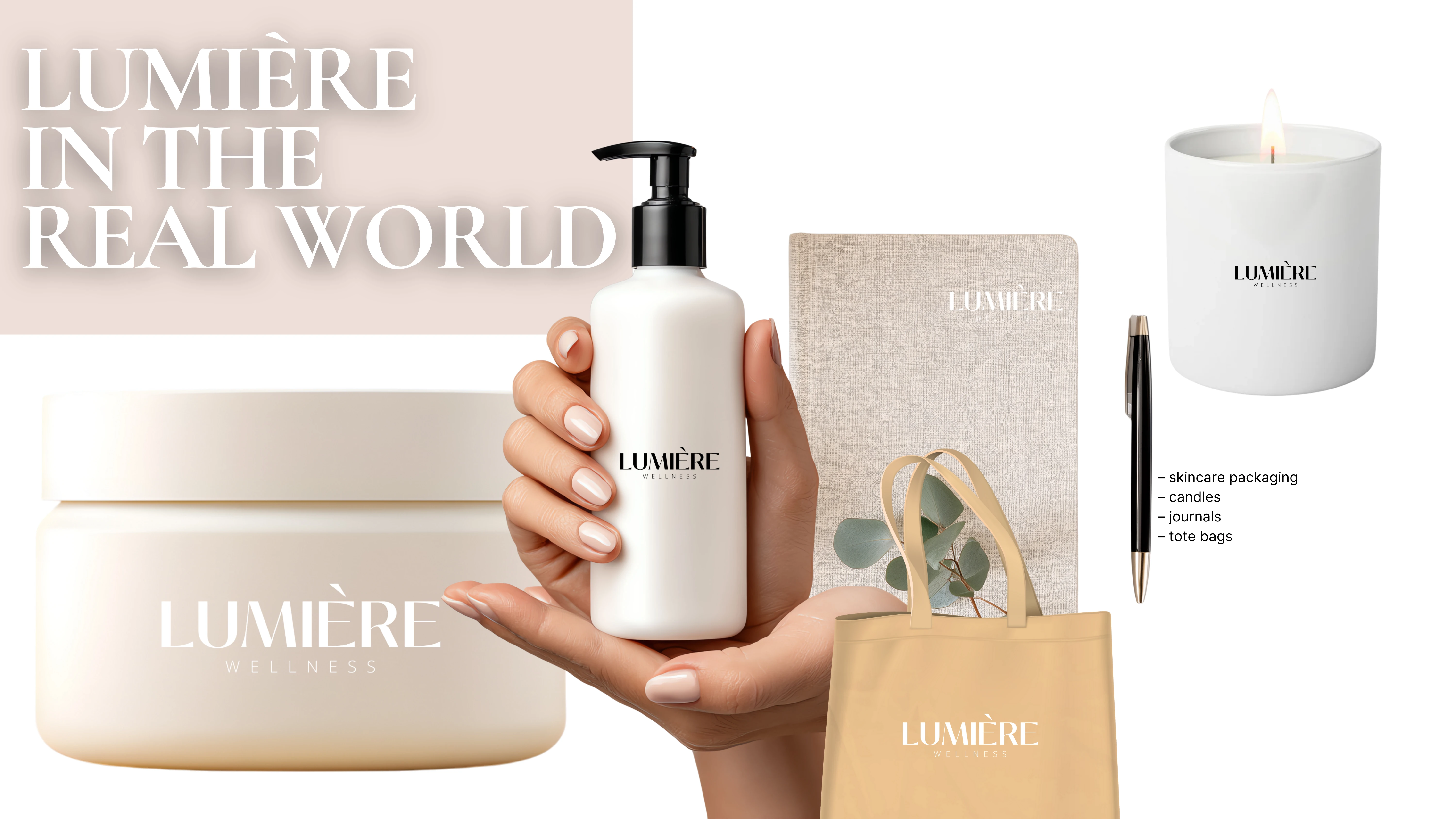
The identity was explored through a series of conceptual product and lifestyle applications, including skincare packaging, candles, journals and tote bags.
These mockups offered an opportunity to consider how the brand might translate from a two-dimensional identity into objects associated with everyday wellness rituals.
The applications also introduced practical design considerations, including logo placement, scale, materiality and visual consistency across different surfaces.
Together, they extend the brand beyond its initial conceptual framework, imagining how Lumière might exist within a contemporary wellness environment.
THE CREATIVE OUTCOME
Lumière Wellness became an exploration of how a brand's emotional identity can inform its visual expression.
Through a considered combination of typography, colour, imagery and packaging applications, the project establishes a cohesive visual world inspired by light, simplicity and intentional living.
As a conceptual project, its outcome was not a commercial launch but the development of a foundational visual identity and the opportunity to experiment with the principles of brand design.
A PERSONAL REFLECTION
Lumière was my very first visual design project, created at a time when I was beginning to explore how my background in writing and editorial storytelling could translate into a different creative language.
I was learning to think through colour, composition, typography and space, and discovering how these elements could communicate ideas that I had previously expressed primarily through words.
Looking back, what stands out to me is how naturally I gravitated towards the emotional experience of a brand. Before I had developed the technical skills and confidence that inform my work today, I was already interested in how design could make someone feel.
Lumière represents the beginning of that exploration. It is a reminder that creative development is an ongoing process, and that sometimes the most important part of an early project is the curiosity that inspired it.
Like this project
Posted May 2, 2026
Brand identity, creative direction and visual world for Lumière Wellness, a minimalist concept inspired by light, clarity and emotional wellbeing.