Designing a keyboard-first platform for enterprise portfolio exp

Clearl io


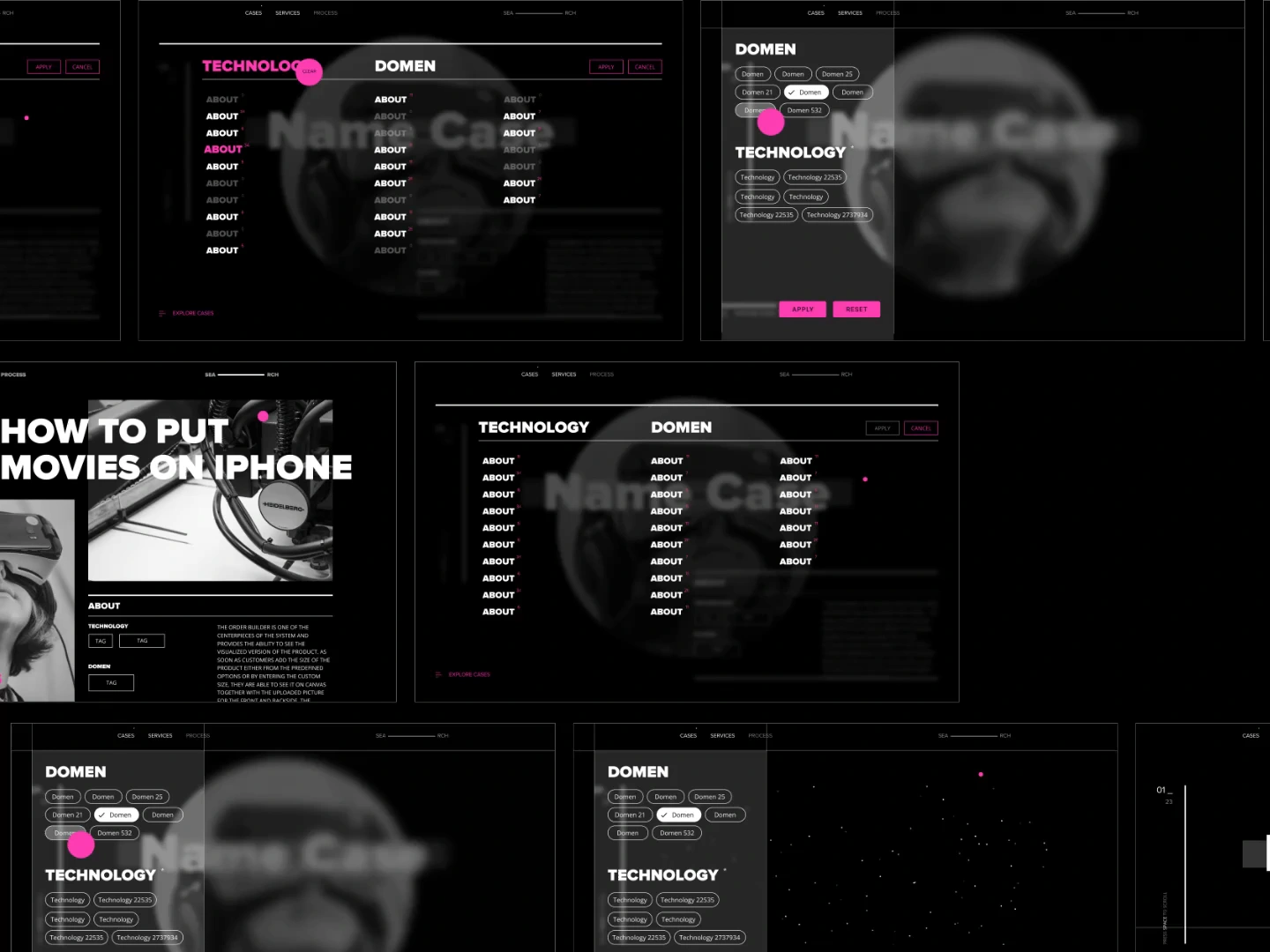
A concept-driven internal platform designed to help enterprise sales teams showcase hundreds of digital projects during client meetings. The experience focused on speed, discoverability, and fully keyboard-driven navigation, allowing users to present work without interrupting conversations.
Overview
Large enterprise organizations often maintain hundreds of case studies across industries, technologies, and service lines. Finding the right project during a client meeting can take valuable time and break the flow of the conversation.
The goal was to rethink how project portfolios are explored, replacing traditional navigation patterns with an experience optimized for speed, focus, and keyboard interaction.
Challenge
The existing experience relied on conventional navigation, filters, and menus that became inefficient as the portfolio continued to grow.
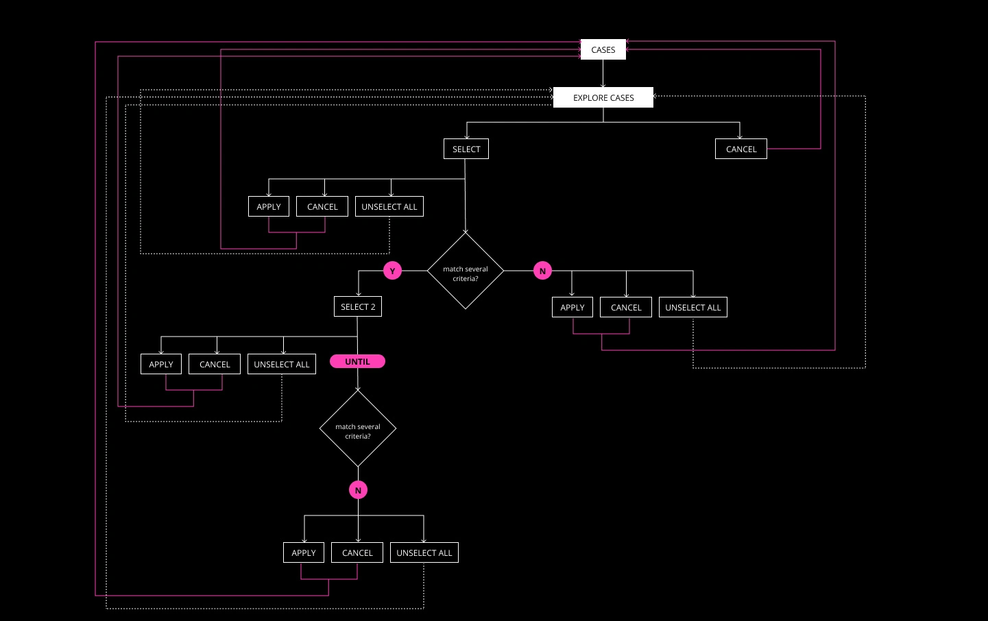
The platform needed to support complex filtering, multiple selection criteria, and instant navigation while remaining intuitive for first-time users and efficient for experienced presenters.
Goals
Create an interface that minimizes interaction cost during presentations, enables rapid discovery of relevant projects, and allows users to navigate almost entirely without touching a mouse.
Research & Discovery
The exploration focused on how designers, sales managers, and solution architects search for projects in real client conversations.
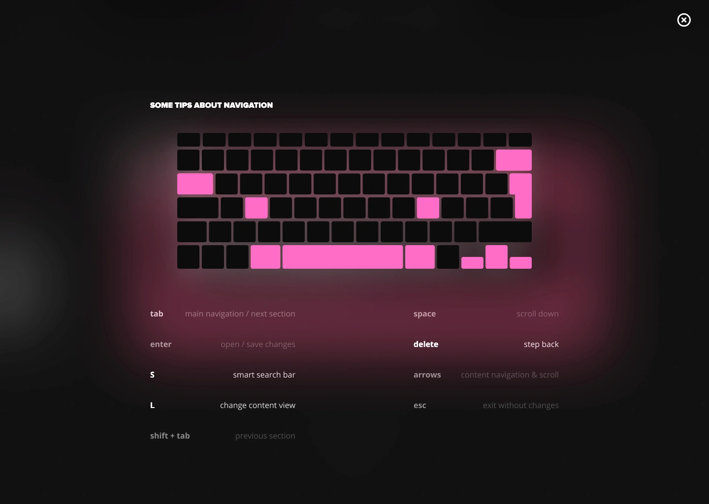
Several interaction models were evaluated, including traditional filtering, contextual navigation, keyboard shortcuts, and command-based workflows. The research showed that keyboard navigation dramatically reduced navigation time once users became familiar with the interface.
Design Direction
Instead of optimizing individual screens, the product was designed around interaction patterns.
Every decision prioritized navigation speed, reducing cognitive load, and minimizing unnecessary clicks.
The interface intentionally removed visual distractions so users could remain focused on presenting relevant work rather than operating the software.
Concept Exploration
One of the most valuable phases of the project involved creating multiple interaction concepts before committing to a final direction.
Different navigation architectures, selection flows, filtering logic, and presentation modes were explored to compare usability, learning curve, and efficiency.
Like this project
Posted Oct 27, 2026