SmashRank UI/UX: Dark-Mode Sports App Design

Shoaib Vohra


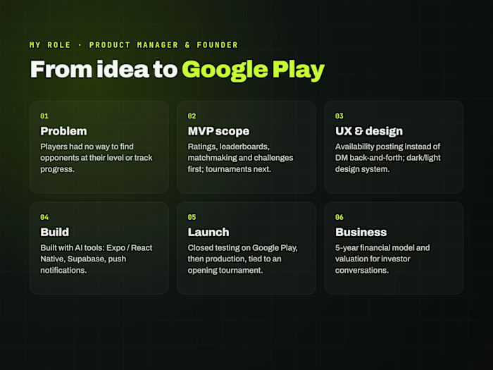
TL;DR. SmashRank is a padel ranking and matchmaking app for Pakistan, live on Google Play. I designed around 69 screens in a dark-first system and built the app with AI. This is the design story: how to make a sports app that reads in one glance between games.
Role: Product designer, PM and founder · Platforms: Android and web (smashrank.pk)
The design problem
Players check the app on court, in the evening, between games. It had to answer two questions in one look: "What's my level?" and "Who do I play next?" And it had to feel like sport, not a spreadsheet.
Key design decisions
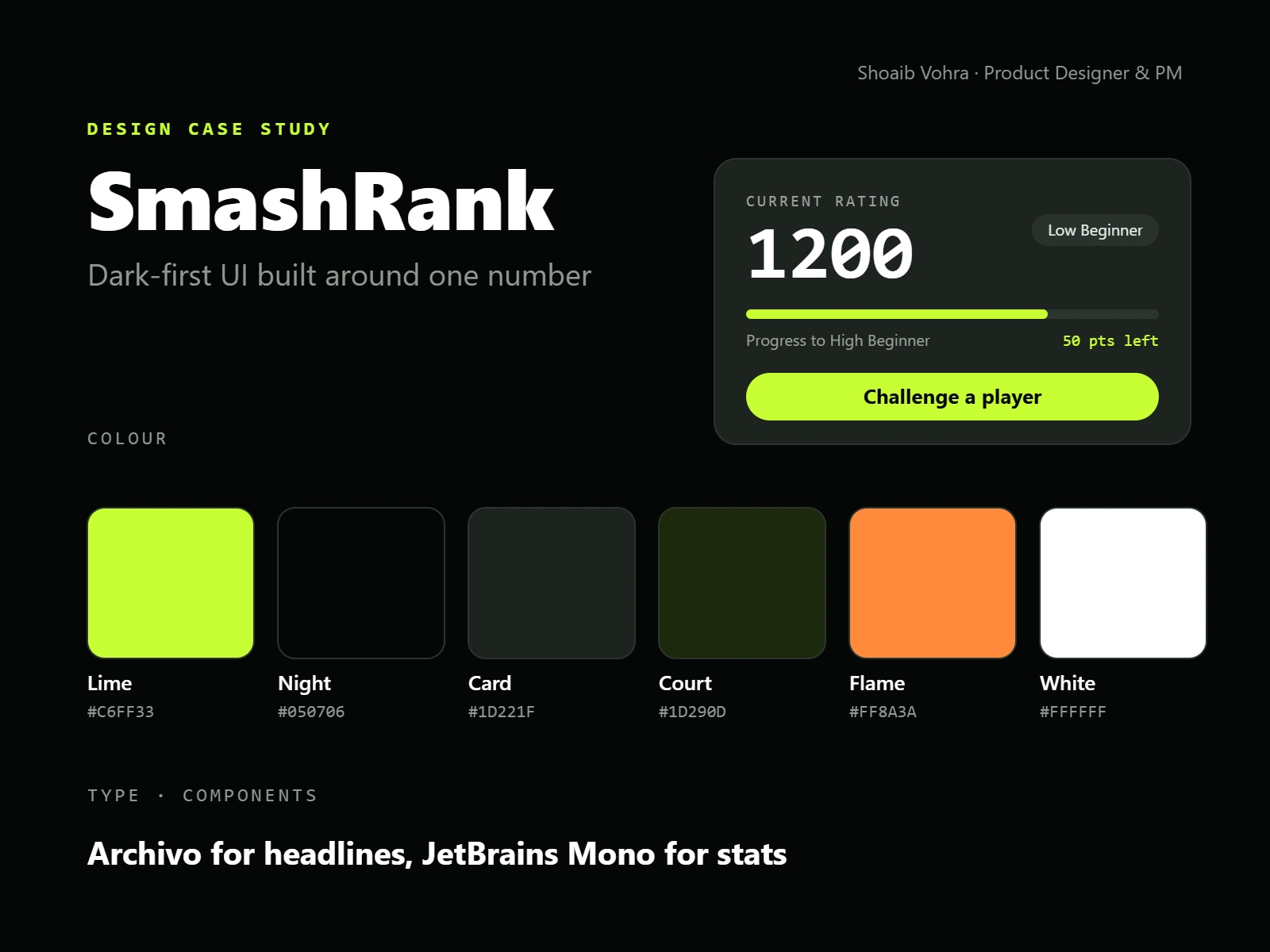
Built around one number. Every player starts at 1200. The rating is the biggest thing on Home, set in monospace like a scoreboard, with the skill tier beside it and a lime progress bar to the next tier ("50 pts left").
Dark first, one loud colour. Near-black backgrounds and lime (#C6FF33) for the single most important action or stat. Lime only ever means "do this" or "this is you".
Two typefaces, clear jobs. Archivo for headlines; JetBrains Mono for ratings, scores and labels, so numbers line up and read as data.
Big targets for the four core jobs. Find Players, Challenge, Nearby Matches and Leaderboard are a 2×2 grid of large cards, easy to hit one-handed.
Tournaments as scannable facts. Each tournament page stacks the date, registration deadline, entry fee in PKR and spots left as separate cards, with one lime "Register our team" button and plain-word urgency ("15 spots left").
A real light mode. I adapted the dark system into a full light-mode colour set instead of just inverting colours.
Empty states that push you to play. "No matches yet, go challenge someone!" turns an empty screen into the next action.
The screens
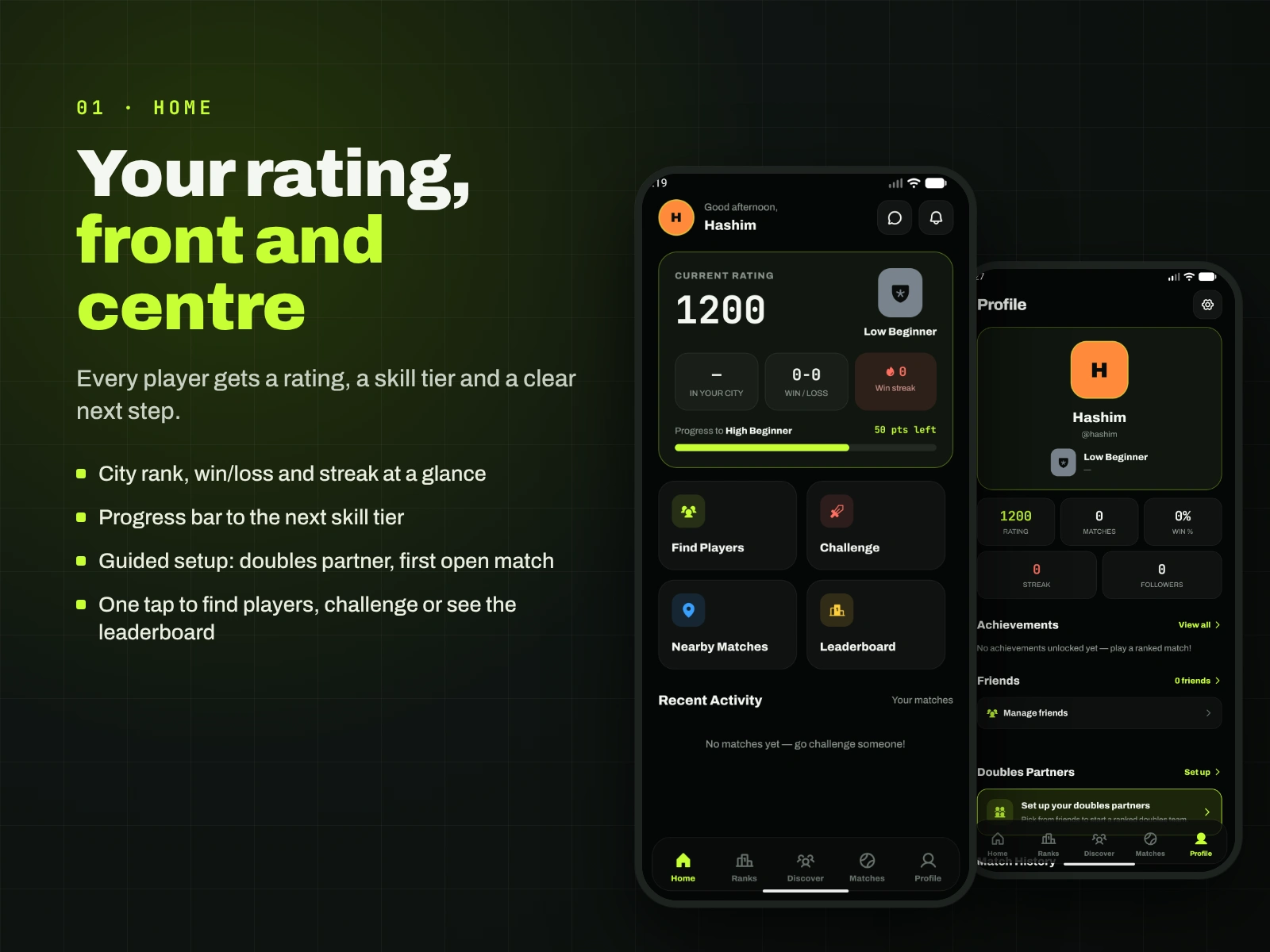
Home and profile: the rating is the hero, with tier and progress to the next level.
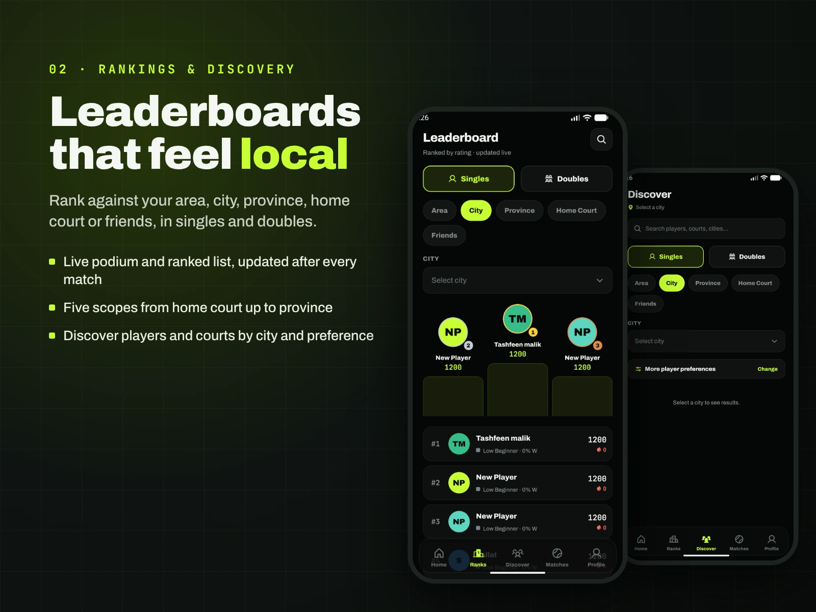
Leaderboards: singles, doubles and city rank.
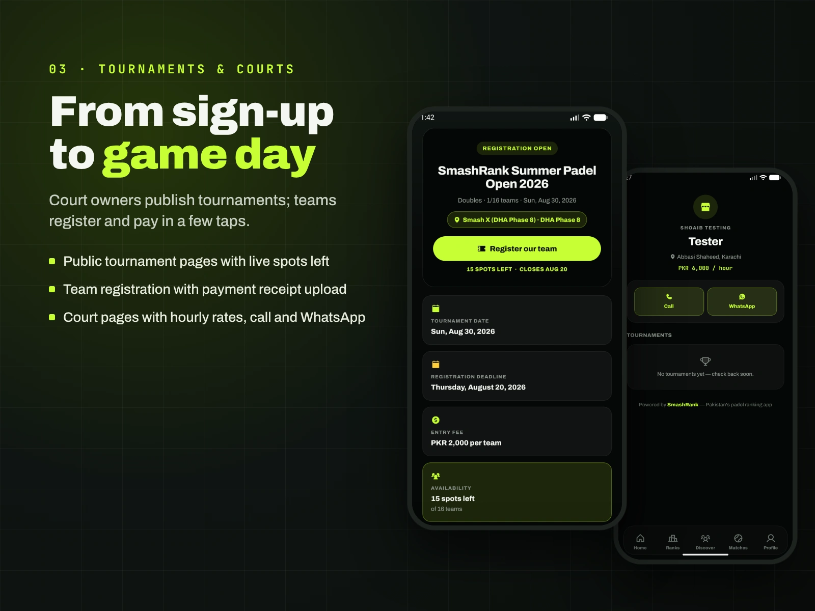
Tournaments: key facts as cards and one lime action.
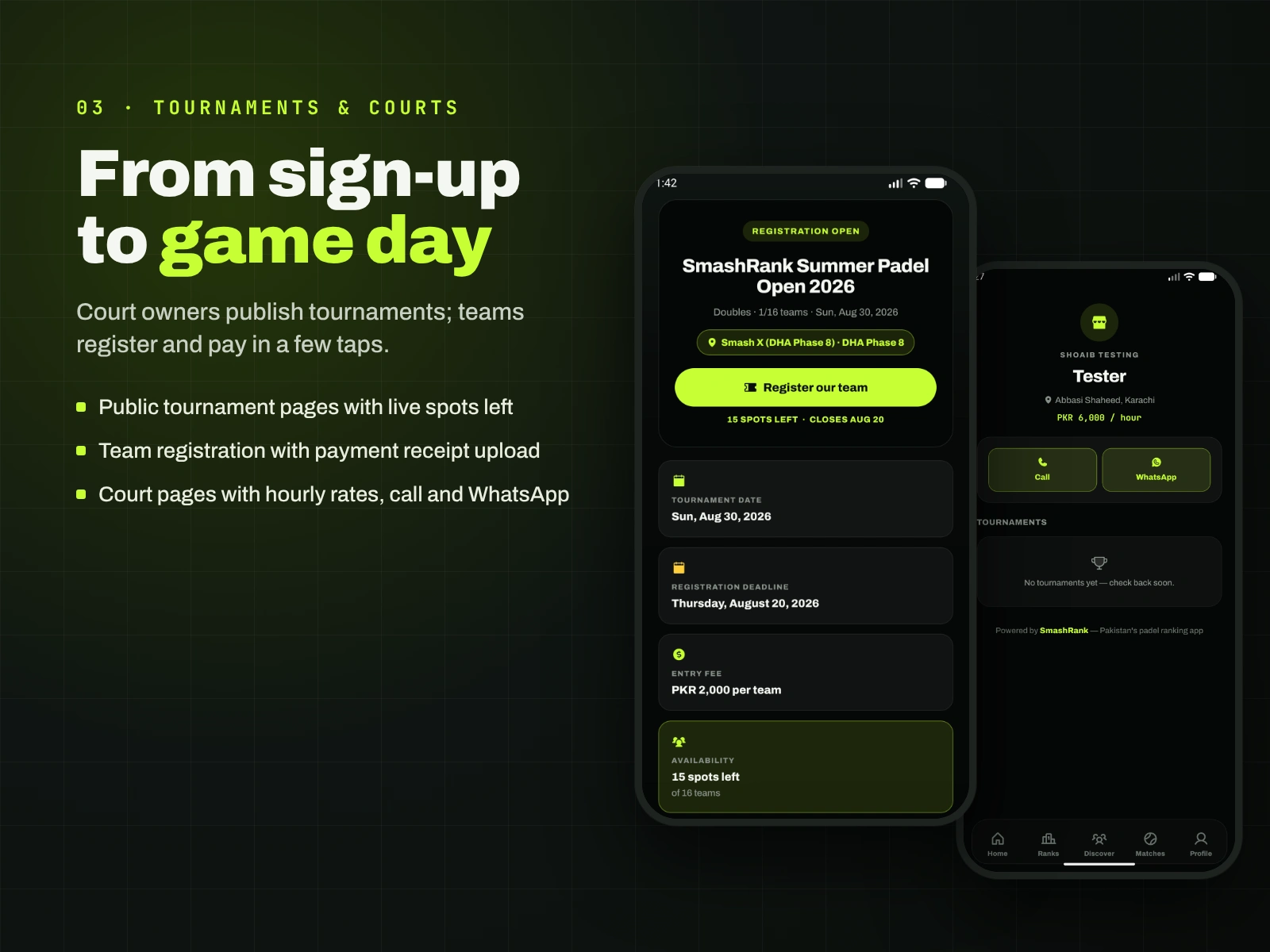
Courts and tournaments: owners publish events and hourly rates; players register in a few taps.
Design review: what I'd improve next
Lime in light mode. Lime can't carry text on white, so light mode needs a darker partner shade for text and small icons. I'd audit every lime use there.
Small phones. Stat rows are dense; I'd test them on budget Android screens, which many players use.
Testing. Next is watching real players use challenges and score confirmation on court.
What this shows
I design mobile apps with a clear visual system and ship them. If you need a consumer app that feels sharp and is easy to use, send me a message.
Like this project
Posted Oct 29, 2026
Design case study: a dark-first visual system, scoreboard-style stats and one-glance screens for a padel ranking app live on Google Play.
Likes
0
Views
0