Wanderly: 0-1 app build for health tech PaaS
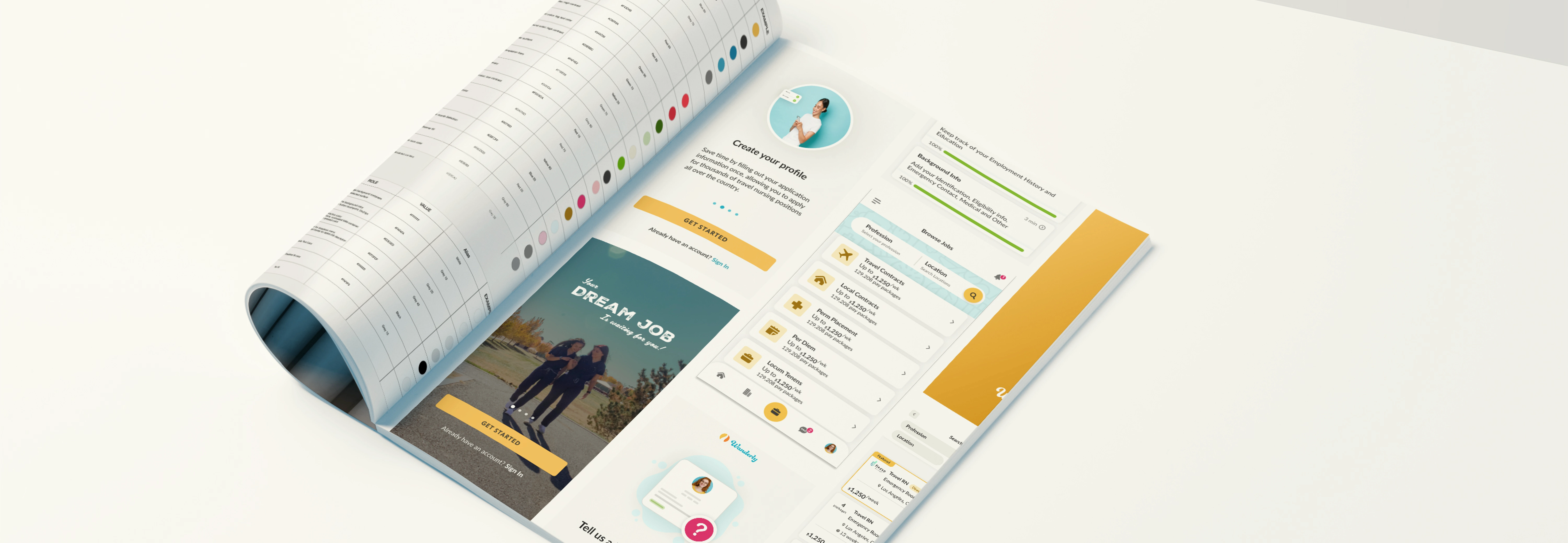
Wanderly is a healthtech platform that offers jobs of different types to traveling nurses predominantly. As it has scaled, the need for a mobile native application created a disconnect with the legacy software. A unified design system was needed.
The Brief
While creating our mobile native application, we need to unify our legacy site to allow users to have a seamless experience from both use cases. This design system should align Product with Eng and Marketing.
Our small team of three had different strengths as our Head of Design was leading the native application build and understood how robust each artifact needed to be. Our Mid level was able to focus on what were our "Must haves" and what were our speed bumps with what existed on legacy and what was in design. I had prior experience working on design systems and lead the build out of this.
FOSTER COLLABORATION | ALIGN TEAMS | ENHANCE BRAND TRUST | IMPROVE ACCESSIBILITY
These were our goals. Our metrics for success were solely based on this.

Prior to the update, Wanderly faced a significant challenge as the outdated documentation left many aspects open to interpretation, causing confusion among our product, brand, and engineering teams.
Due to the absence of a shared foundation encompassing process, design language, guidelines, and UI pattern libraries, each team encountered inefficiencies in their respective tasks. This would not only benefit th
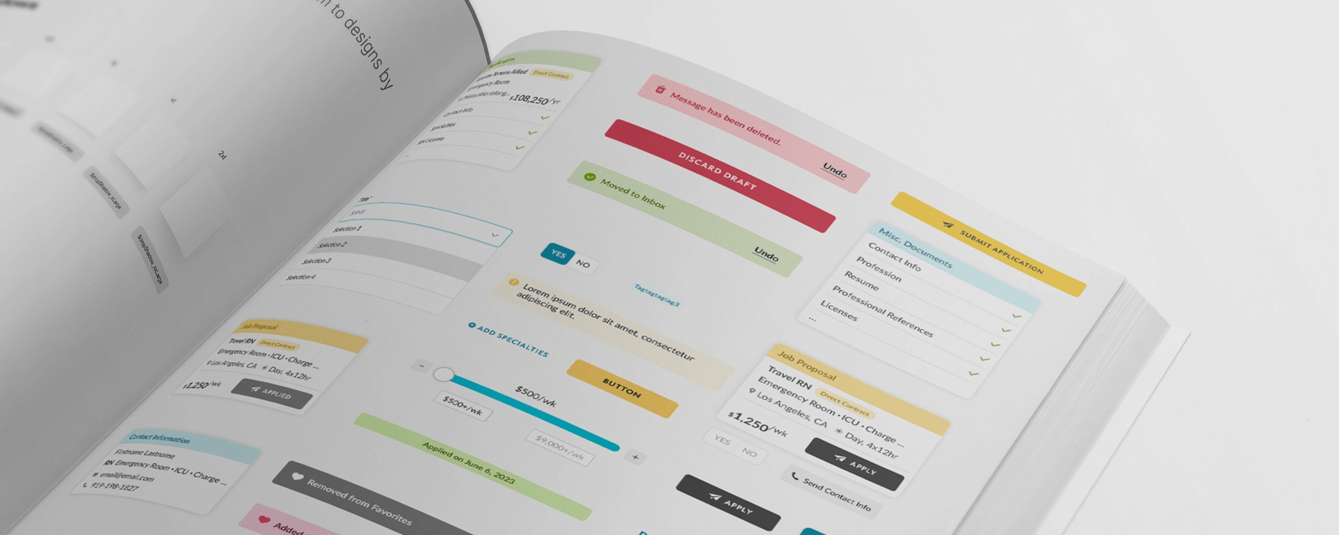
To ensure the success of our design system project, we recognized the importance of getting stakeholders on board from the very beginning. We systematically promoted the initiative through various means, including:
Early Involvement of Engineering: We understood the significance of involving the engineering team in the process as they play a crucial role in implementing the design system. To achieve this, we organized weekly design system meetings and workshops where we actively sought their input and feedback. By doing so, we ensured that their perspectives and expertise were integrated into the design system's development.
Continuous Semantic Thinking: From the onset of the project and as it evolved, we developed the framework of this design system from the two projects that we were creating. As the projects grew larger, our process for developing a more robust system needed to be iterated on.
I knew that a design system is only useful if people, well, use it.

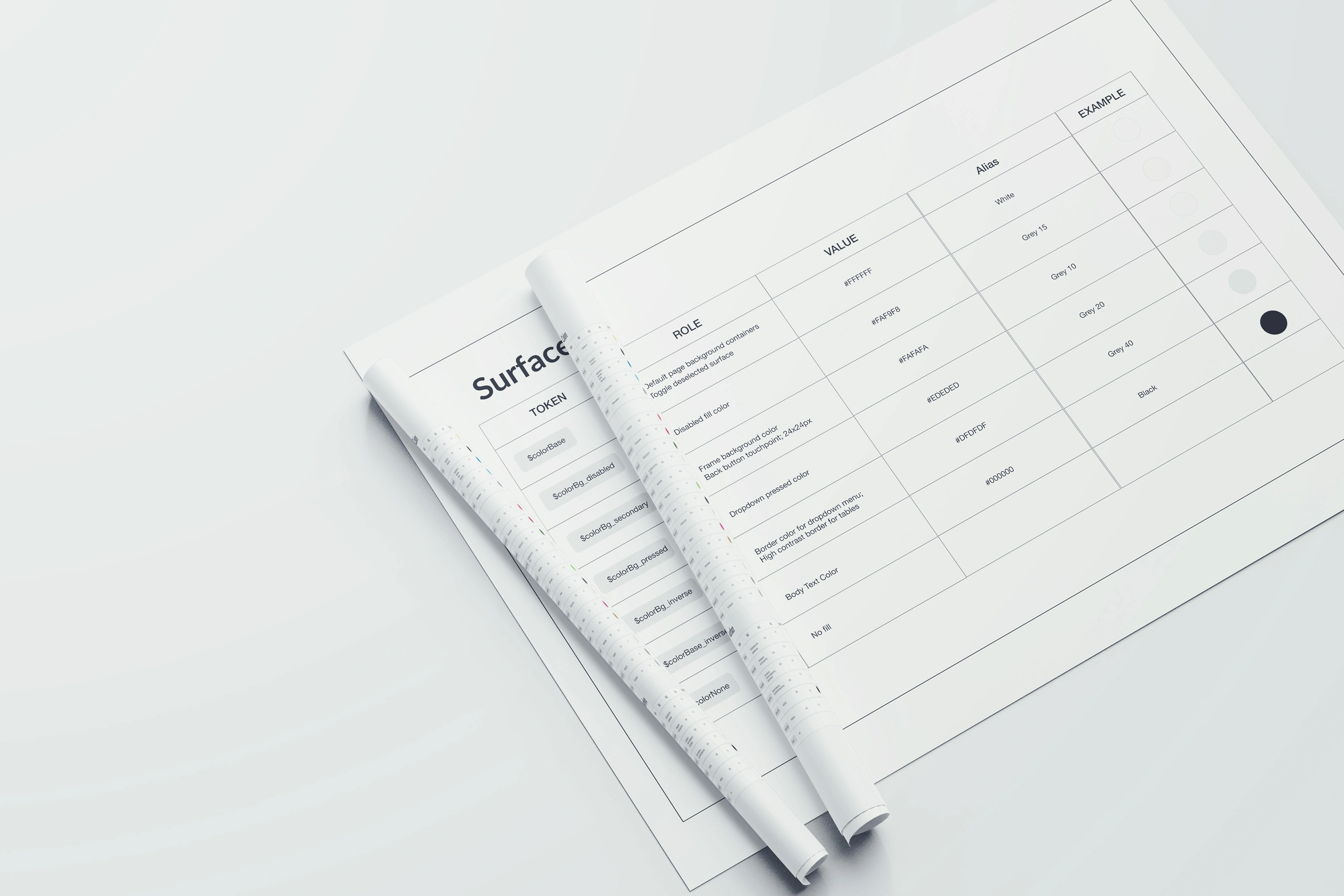
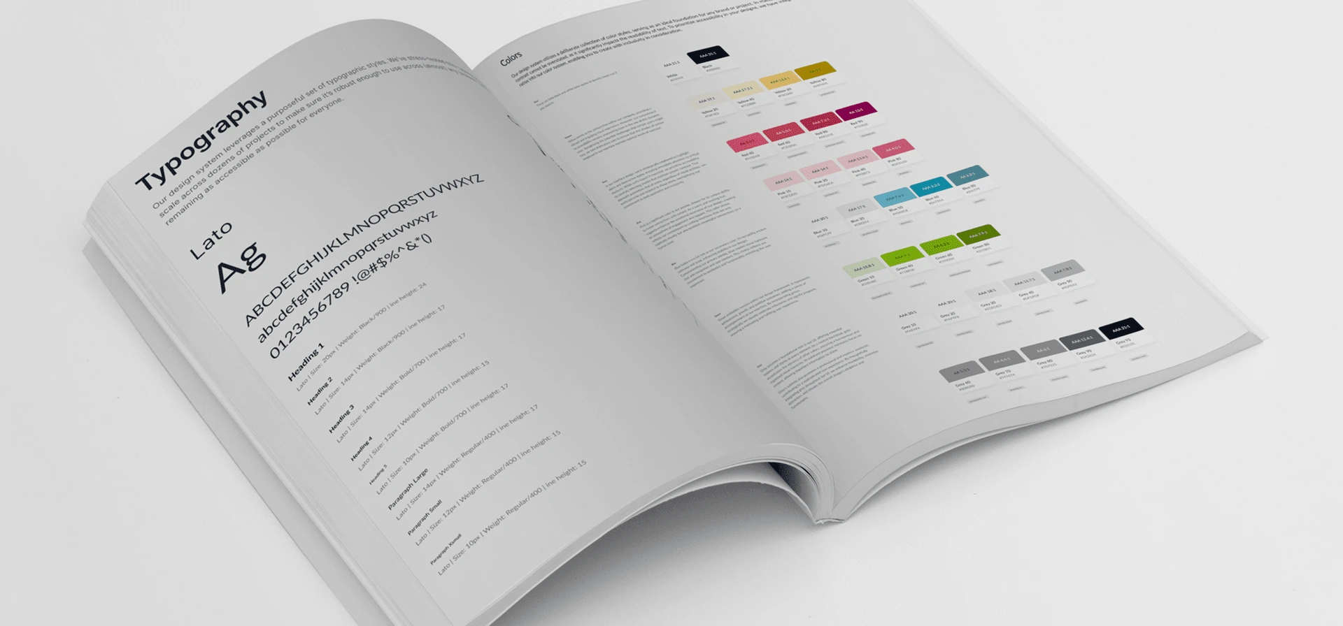
Our core color at Wanderly is Yellow. Specifically: #F8C04D. We deliberately have been working towards using our Wanderly Yellow for decorative placement or for very important details. With this, our semantic naming had to ensure we knew what the repercussion was when choosing to use it.
This turned into Wanderly Yellow being: $colorSpecial
While our primary button color: #303030 as $colorPrimary
This was a big decisions we made because our products heavily utilized dark grey as our primary but we don't want to be married to it forever. We had to make this decision for the betterment of usability for all of our users.
Now, I know that internally, our design team could've made the decision and that was the end of it but from the beginning I wanted to include all of our stakeholders. I wanted to hear what Dev thought about, how leadership and marketing felt with making a decision like this.
Taking the time to include them all meant they had a voice in our discussions and yes it helped the buy-in but more importantly, it set the expectations that this design system is a team effort, even if I am the one building it.
The Outcome
Maintaining comprehensive documentation is paramount, so we will cultivate processes and best practices for its upkeep. Ensuring that the documentation remains up to date and synchronized between design and code will minimize discrepancies and streamline implementation.
To encourage widespread adoption of the design system, we are committed to raising awareness across all teams and promoting active contribution to its development. Feedback from team members will be invaluable for refining the system and incorporating valuable insights from various perspectives.
The Result
1100 Components Created
100% Product Adoption
AA+ Accessibility Standard
Like this project
Posted Jun 28, 2023
Wanderly is a PaaS within the health tech industry. I with a team of 4 built a native application to work alongside our legacy site with a refreshed look.
Likes
0
Views
8

