Legal Brand Identity for Ramos Souza & Nalesso

STEPHEN ALEJI


01. Brand Introduction — Ramos Souza & Nalesso
A refined legal brand identity designed to communicate authority, trust, and professionalism through a distinctive emblem, sophisticated typography, and a confident visual direction.
02. Primary Logo — A Distinctive Identity
The primary logo combines a shield-inspired symbol with elegant typography, creating a recognizable brand signature that reflects stability, integrity, and professional credibility.
03. Reverse Logo — Authority Through Contrast
The reverse logo introduces the identity on a deep forest-green background. The light typography and emblem create contrast while reinforcing the firm's premium and authoritative positioning.
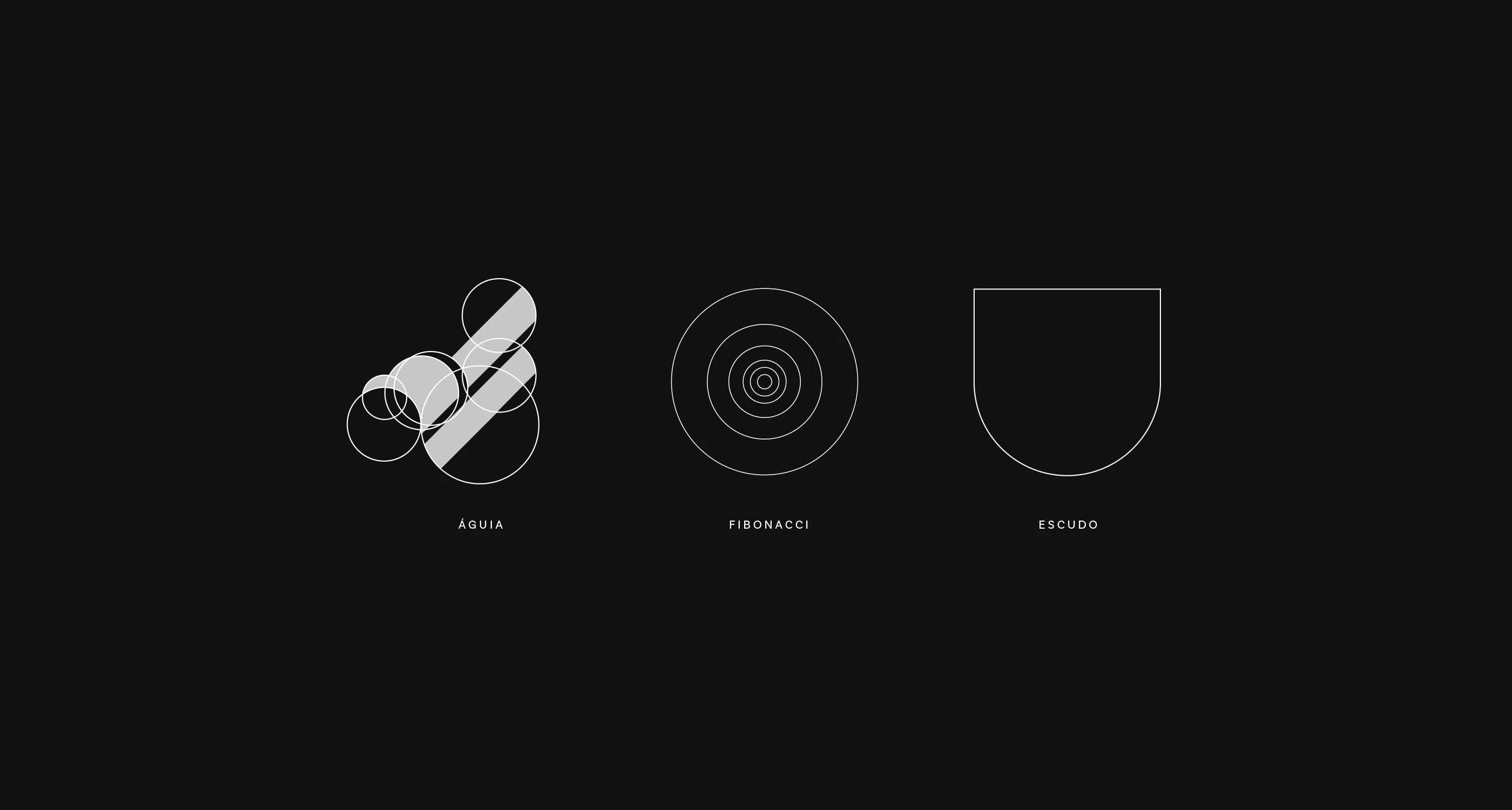
04. Logo Concept — The Meaning Behind the Mark
The logo concept explores three visual foundations: the eagle, Fibonacci geometry, and the shield. Together, they inform a distinctive symbol representing vision, precision, and protection.
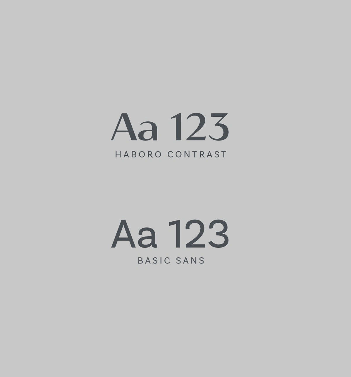
05. Typography System — Tradition Meets Precision
Haboro Contrast and Basic Sans establish a balance between legal tradition and contemporary clarity. The serif typeface adds sophistication, while the sans serif supports readability across brand communications.
06. Brand Values — Clarity, Support, Quality
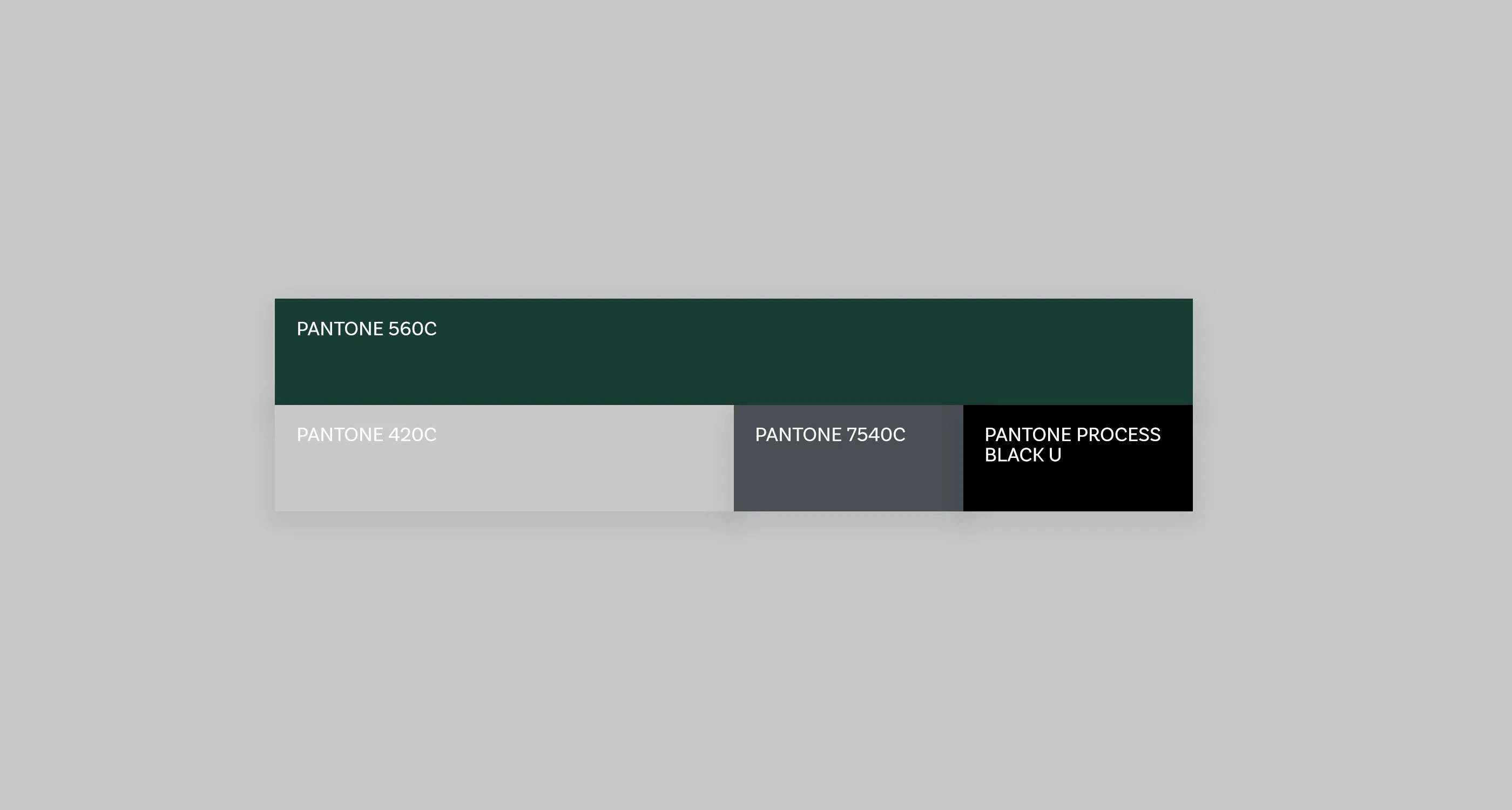
Clarity, support, and quality guide the visual direction. These principles are expressed through deliberate spacing, restrained typography, and a consistent presentation that reflects the firm's professional character.

08. Visual Direction — Strength in the Details
Monochromatic eagle imagery introduces a sense of vision, precision, and strength. The restrained photographic direction complements the identity and reinforces its sophisticated, professional character.
09. Brand Symbolism — Vision and Protection
The eagle imagery and shield motif extend the brand narrative beyond the logo. Together, they reinforce the themes of vision and protection while creating a memorable visual connection to the firm's identity.


10. Document Folder — Professional Presentation
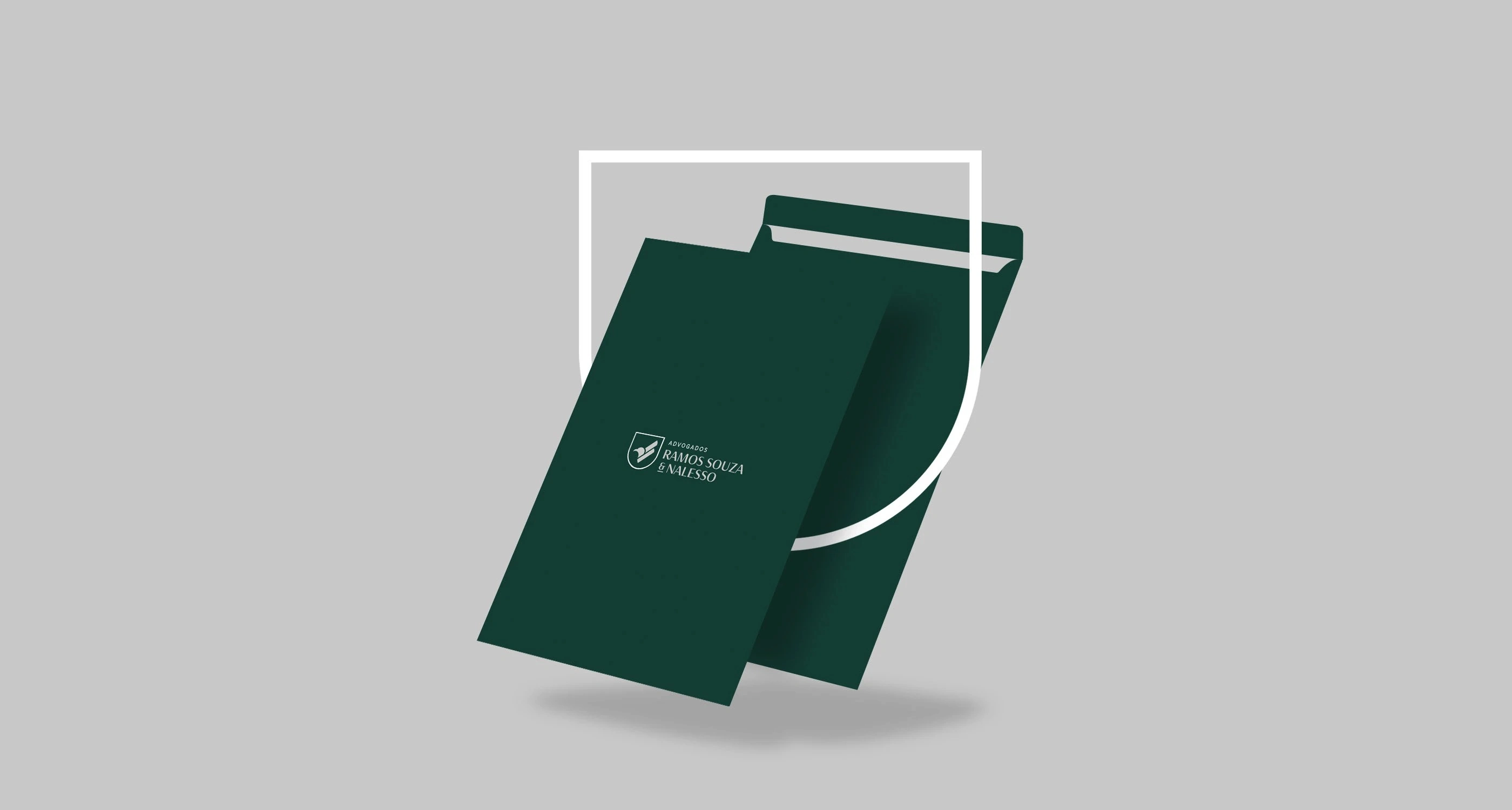
The branded folder translates the identity into a practical client-facing application. Its deep green finish, clean composition, and restrained logo placement create a polished and consistent presentation.
11. Business Cards — A Tangible Brand Experience
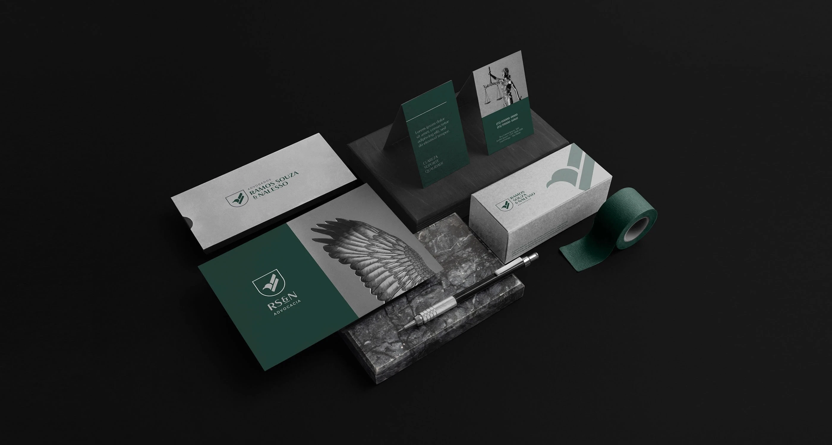
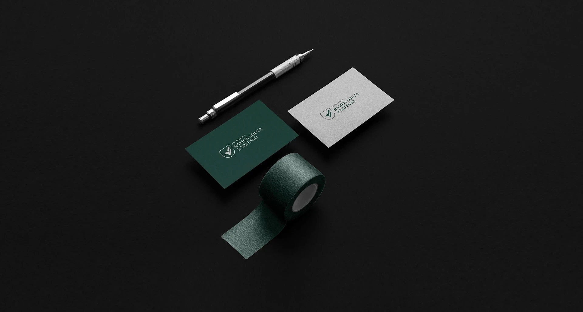
The business card system combines dark green and light neutral surfaces with refined typography and balanced spacing. Each detail reinforces the brand's visual consistency and creates a professional first impression.

12. Brand Collateral — Consistency Across Touchpoints
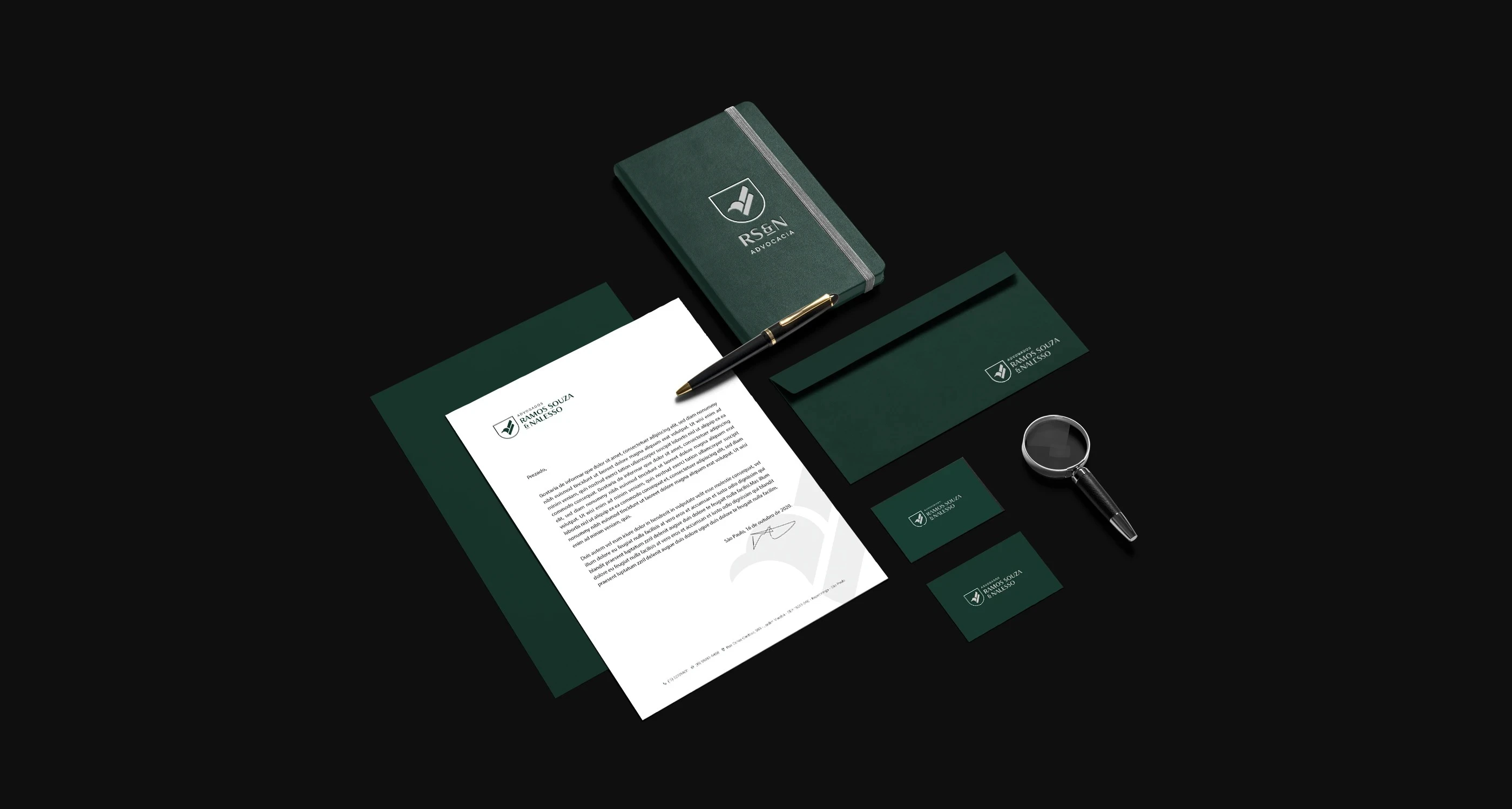
The visual identity extends across branded collateral, packaging, and supporting materials. Consistent use of color, typography, and graphic elements ensures a unified brand experience across different applications.
14. Digital Application — Extending the Identity
The identity transitions into a digital environment through a clean and focused logo presentation. Consistent use of the brand's colors, emblem, and proportions maintains recognition across digital and physical touchpoints.

15. Final Brand System — One Cohesive Identity
The completed brand identity brings together the logo, typography, color palette, stationery, and supporting visual elements into a unified system. The result is a refined legal brand designed to communicate authority, consistency, and professional credibility.
Like this project
Posted Oct 23, 2026
Legal brand identity for Ramos Souza & Nalesso, featuring logo design, visual identity, typography, color palette, and professional stationery branding.