Built with Framer
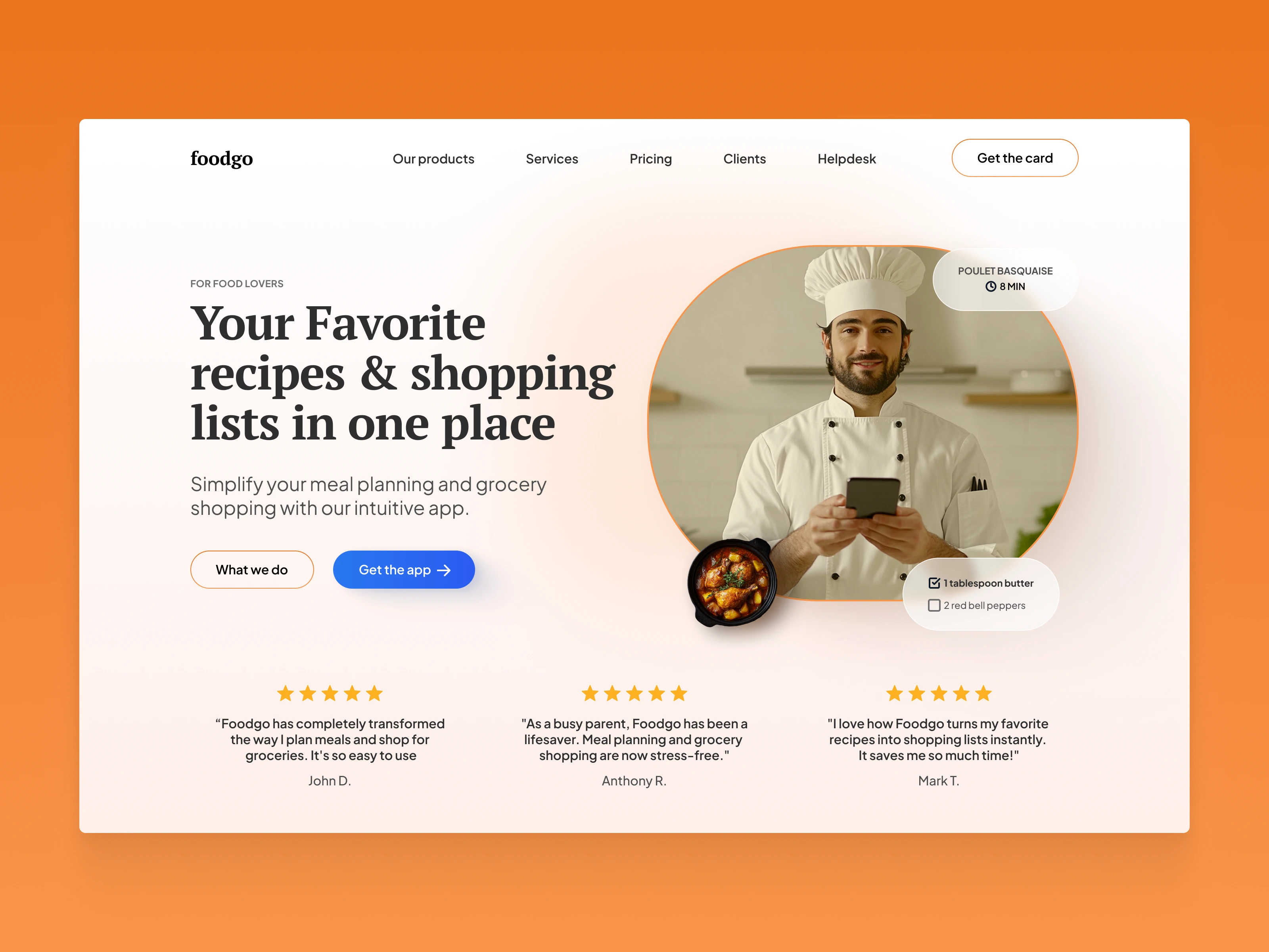
Landing Page for Foodgo
1. Color Scheme
Orange Accent Background: The orange color creates a warm, inviting atmosphere, which is perfect for a food-related app. Orange is known to stimulate appetite, making it a good choice to connect with users emotionally.
White Background for Main Content: The white background in the main content area provides a clean, fresh, and simple canvas that emphasizes readability and focuses attention on the headline, image, and calls-to-action.
Blue CTA Button: The blue button ("Get the app") stands out from the orange background and white content area. Blue is associated with trust and reliability, which complements the overall inviting and user-friendly nature of the app. It also contrasts well with the orange, making it the most noticeable element on the page.
2. Typography
Bold, Serif Font for Headline: The headline uses a bold, serif font that evokes a sense of reliability and stability. It conveys professionalism while still being approachable, which is important for a service aimed at simplifying something as personal as meal planning and grocery shopping.
Sans-serif for Supporting Text: The body text uses a clean, sans-serif font that improves readability and gives the design a modern feel. The smaller, lighter text is used for the supporting message, creating a clear distinction between the main message and supplementary information.
Uppercase Subheading ("For Food Lovers"): The small, uppercase subheading adds a professional touch and acts as a precursor to the larger headline, setting the stage for the main message.
3. Imagery
Circular Image of the Chef: The image of a chef in a circular frame is a powerful visual element. The use of a chef signifies authority in the food space and builds trust in the app. The circular frame softens the image and keeps the focus centralized, while adding a friendly, approachable vibe. The chef holding a smartphone reinforces the idea that the app is easy to use and integrates smoothly into daily life.
Dish Image Overlay: The image of the prepared dish next to the chef adds context and flavor to the design, subtly showing what users can expect from the app: delicious, well-organized recipes and meal preparation support.
Ingredients List: The two small ingredients listed in the lower right corner visually represent the app’s functionality. It’s a subtle way to hint that users will get precise instructions and shopping lists with the app, which adds a practical element to the image.
4. Layout and Spacing
Symmetrical Design: The layout is symmetrical, which provides a clean and organized feel. The text and call-to-action buttons on the left are balanced by the image of the chef on the right, creating a natural flow and preventing the page from feeling cluttered.
Well-Defined Sections: Each section of the page is clearly separated. The testimonial section at the bottom is distinguished by the change in content focus, making it easy to understand where users are and how to find the information they’re looking for.
Ample White Space: The design makes excellent use of white space, allowing each section to breathe. This ensures that the content doesn’t feel overwhelming, making the page easier to scan.
5. Call-to-Action (CTA)
"Get the App" Button: The main CTA is brightly colored in blue, which stands out from the orange and white palette, making it easy to locate. The text "Get the app" is action-oriented and straightforward, directly aligning with the page’s goal of converting users into app downloaders.
Secondary Button "What we do": The secondary button is outlined in orange with a minimalistic design. This serves users who may not be ready to download the app but want to learn more. It is less prominent but still accessible, providing an alternative conversion path without distracting from the primary CTA.
6. Trust Signals
Testimonials with Star Ratings: The three testimonials, complete with 5-star ratings, serve as social proof. By including user reviews, the design reinforces trust and credibility, showcasing that other people have successfully used the app and had positive experiences.
User-Centric Quotes: The quotes focus on how the app has positively impacted users’ lives by making grocery shopping and meal planning easier. This directly addresses pain points that potential customers might have, further driving the decision to download the app.
7. Content and Messaging
Headline Focus: "Your Favorite recipes & shopping lists in one place" is a clear, benefit-driven headline that immediately tells the user what the app does. It emphasizes convenience and efficiency, appealing directly to users looking for time-saving solutions.
Simplified Subheading: The subheading breaks down the key benefit: "Simplify your meal planning and grocery shopping with our intuitive app." The use of the word "intuitive" highlights that the app is easy to use, which is crucial for user retention and engagement.
Clear Value Proposition: The design and copy together focus on one major value proposition: making grocery shopping and meal planning easier and more organized. This direct messaging appeals to busy users looking for an efficient solution.
8. Top Navigation Bar
Navigation Links: The navigation bar at the top (with links to Products, Services, Pricing, Clients, Helpdesk) ensures that users who are seeking more detailed information can easily find it. The links are kept minimal to maintain focus on the page’s primary goal: app downloads.
Get the Card CTA: A secondary CTA button, "Get the card," offers an additional conversion point for users interested in purchasing a product card or membership. Its outlined design in orange keeps it distinct yet secondary to the blue CTA button.
10. Visual Hierarchy
Headline as the Focal Point: The largest text on the page is the headline, ensuring users immediately understand the purpose of the app. The visual hierarchy is supported by the progression from the headline, subheading, CTA buttons, and then the testimonials, guiding users smoothly through the content.
Testimonial Placement: The testimonials are placed near the bottom, after the main value proposition and CTA, which is a strategic placement. By the time users reach this section, they are likely considering downloading the app, and the positive reviews help solidify their decision.
Like this project
Posted Sep 8, 2024
Designed and developed a modern and user-friendly landing page for Foodgo, a meal planning and grocery shopping app.
Likes
0
Views
13

