Built with Framer
A landing Page for SquareUp
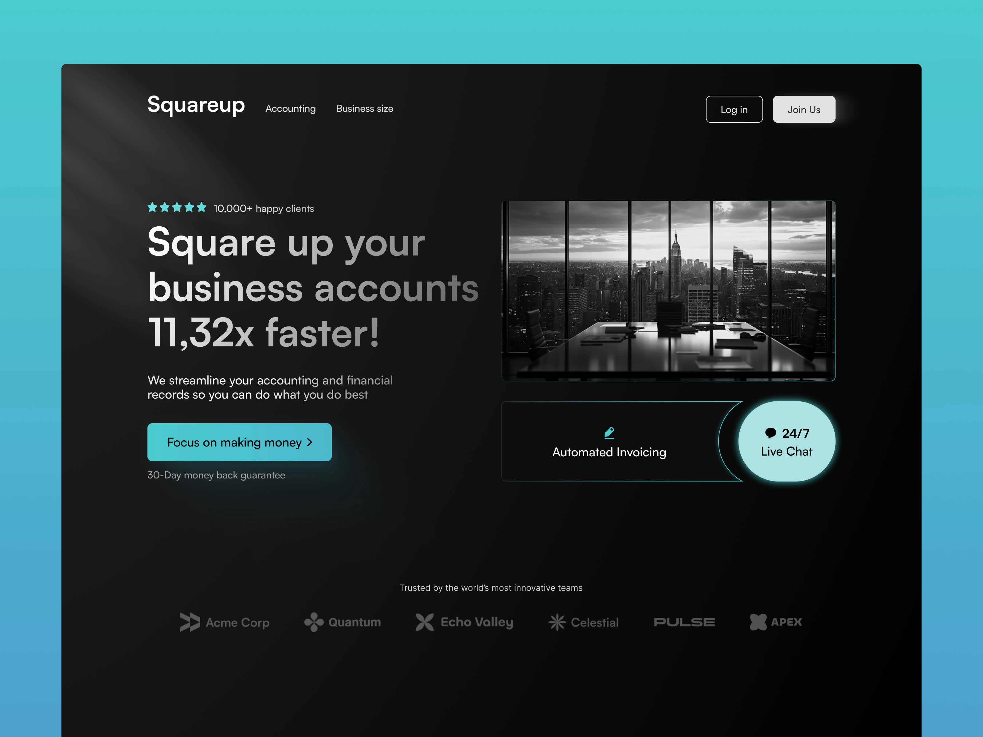
1. Color Palette
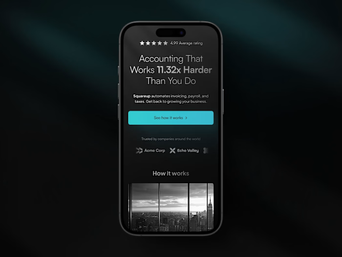
Black and Teal Gradient Background: The dark black background creates a sense of professionalism and luxury, which is suitable for a B2B financial product like Squareup. The teal gradient adds a modern, tech-savvy feel and highlights key sections to draw attention, such as the buttons and important icons.
White Text on Dark Background: White text on the black background ensures high contrast, making it easy to read and visually engaging. This choice emphasizes clarity and allows users to digest information quickly.
2. Typography
Large, Bold Headline: The headline "Square up your business accounts 11.32x faster!" is the primary focal point. Its size and boldness make the message immediately noticeable. The use of a large, sans-serif font gives the design a modern, professional look, while keeping the copy highly legible.
Supporting Text: Smaller text is used for the subheading and additional information, providing context without competing with the headline. This ensures that the user’s attention remains where it’s most needed, while the rest of the text serves as a supporting function.
Call-to-Action Button Text: "Focus on making money" is direct and benefit-driven. It speaks to the core concern of the target audience—businesses that want to focus on growth rather than tedious financial tasks.
3. Imagery
Hero Image (Black & White Office View): The central image of an office with a cityscape view in grayscale projects a sense of corporate strength, authority, and professionalism. Black and white imagery often feels timeless and elegant, which can subtly convey a sense of trustworthiness and reliability.
Iconography: Minimal icons for "Automated Invoicing" and "24/7 Live Chat" simplify the messaging while also breaking up the text. These visual elements act as quick, easy-to-understand representations of the features offered.
4. Layout and Spacing
Centered Hero Section: The main content is centrally aligned, focusing the user's attention toward the headline, product benefits, and call-to-action. This type of design minimizes distractions and helps keep the user journey simple and efficient.
Ample Negative Space: Generous use of negative space between the sections ensures that the design doesn’t feel cramped. This space creates breathing room around the most important elements (headline, CTA, and features), making them more impactful.
Symmetrical Layout: The symmetrical arrangement with the image and call-to-action areas provides balance and visual harmony, which is calming for the user and enhances the user experience by making it easy to navigate.
5. Call-to-Action (CTA)
Primary Button "Focus on making money": The button uses the teal gradient to stand out from the rest of the page. The text is straightforward, focusing on what the audience cares about—making money. The bright color is attention-grabbing without being too flashy.
Button Placement: Positioned directly beneath the key value proposition (11.32x faster), the CTA is easily accessible without requiring scrolling, which improves usability and conversion potential.
6. Trust Indicators
Client Logos: At the bottom of the page, recognized brands or businesses (such as Acme Corp, Quantum, and Apex) are displayed to indicate that well-established companies already trust the service. This kind of social proof is a subtle but powerful way to build credibility.
Star Rating: The "10,000+ happy clients" and 5-star rating near the headline add a layer of social proof that further enhances trust. By showing that many clients are already satisfied, it builds confidence in potential users.
7. User-Friendly Features
24/7 Live Chat Icon: The "24/7 Live Chat" is not only highlighted with a bright color but also placed strategically near the hero image. This assures users that support is always available, which can reduce any hesitations they may have about using the product.
Automated Invoicing: The icon and label for "Automated Invoicing" emphasize the core functionality of the product. It's presented in a digestible way, using a small section of the page to give users a quick understanding of what they can expect.
8. Visual Hierarchy
Top-Down Information Flow: The most important information (value proposition) is at the top in large, bold fonts. Below that, the supporting text explains the service further, and the CTA follows immediately. The eye is drawn to the image and the key feature icons afterward, creating a logical flow.
Multiple CTAs: The inclusion of a "Join Us" button in the top-right corner provides an additional CTA option for users who are further along in the decision-making process.
9. UX/UI Considerations
Log-in and Join Us Buttons: These are placed in the top-right corner for easy access for returning users or users who are ready to sign up. They are designed in simple, minimalistic styles that don’t overshadow the main CTA but still remain noticeable.
10. Promise of Value
30-Day Money-Back Guarantee: The text just below the CTA assures users that there's little risk involved in trying the service, increasing the likelihood of conversions.
Like this project
Posted Sep 8, 2024
Designed and developed a landing page concept for SquareUp to showcase business account features with a sleek and modern design.
Likes
0
Views
6

