Architecting the Enterprise Sales Dashboard for the Modern Era
Paul Fadayo
Salesforce CRM: Re-Architecting the Enterprise Sales Dashboard for the Modern Era
Project Overview
Client Name: Salesforce (Concept UI/UX Redesign)
Company: Salesforce, Inc.
Industry: Enterprise CRM / Cloud Computing / B2B SaaS
Objective: To modernize the legacy Salesforce Sales Management experience, stripping away decades of visual bloat to create a high-contrast, operator-first analytics workspace.
The Challenge
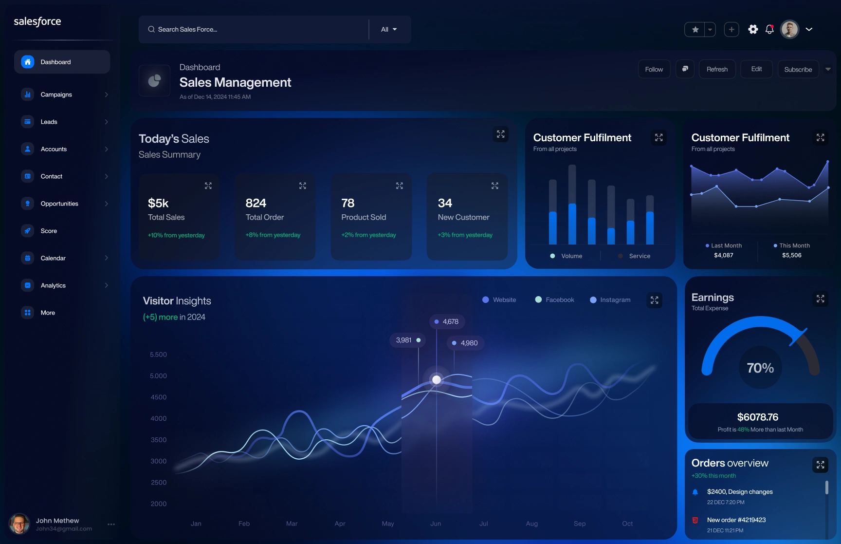
Salesforce is the undisputed global giant of CRM software, but its legacy UI suffers from severe information density fatigue. Enterprise sales directors and account executives logging in daily face three major friction points:
Cognitive Overload: Native Salesforce layouts frequently pack dozens of competing data fields onto a single harsh white screen, making quick daily KPI scanning exhausting.
Poor Visual Hierarchy: Critical metrics (daily sales volume, lead conversions, fulfillment bottlenecks) are given the exact same visual weight as secondary administrative tabs.
Outdated Aesthetic Standards: While consumer apps have embraced sleek, OLED-friendly dark modes and fluid micro-interactions, legacy CRM software remains trapped in sterile, spreadsheet-era design patterns.
The Solution
We approached this concept redesign with a strict mandate: retain the massive utility of Salesforce, but upgrade the ergonomic experience.
The Deep Sapphire Dark Mode: We discarded stark white backgrounds in favor of an ultra-deep navy canvas (
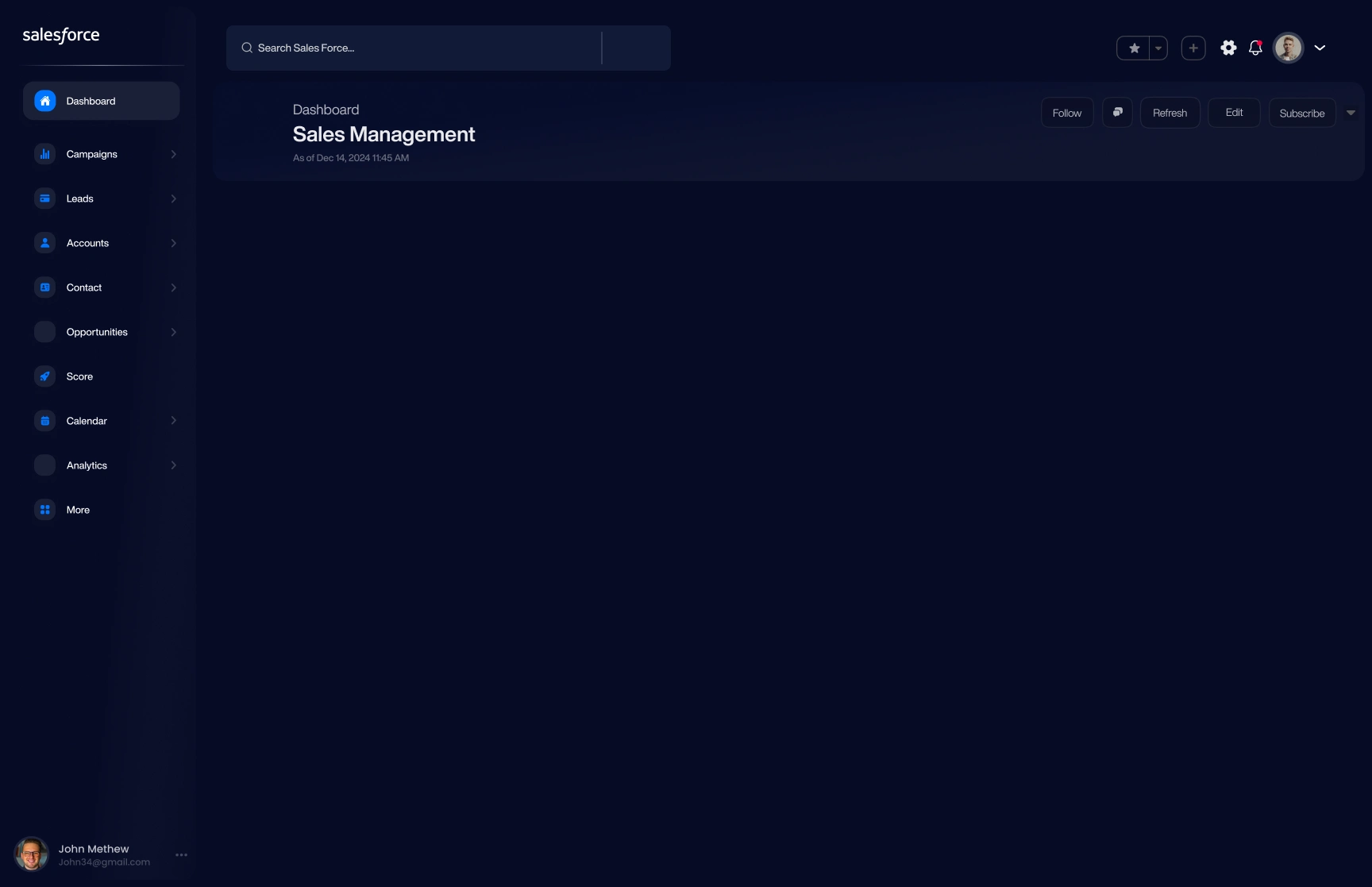
#060B19). By utilizing glowing electric blue and mint green accents strictly for positive growth vectors (+10% from yesterday), operators can instantly identify team wins without eye strain.Streamlined Sidebar Taxonomy: We consolidated complex enterprise navigation into an intuitive, iconography-driven left sidebar (
Dashboard $\rightarrow$ Analytics). Active states are highlighted with soft inner-shadow pills, keeping the user anchored within their workspace.Action-Oriented Utility Header: The global search bar was expanded to feature quick-filter parameters (
All $\nabla$), while primary dashboard actions (Follow, Refresh, Edit, Subscribe) were neatly grouped into tactile, low-profile ghost buttons.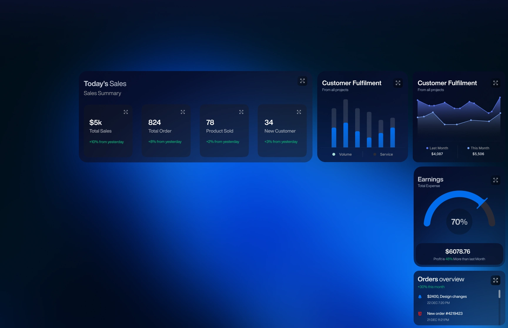
Key Technologies & Design Architecture
Figma: Responsive Desktop Grid Layouts, Auto-Layout Card States, Variable Typography System
Data Visualization Strategy: Scannable bento-grid architecture, WCAG 2.1 AAA color-contrast compliance for dark backgrounds
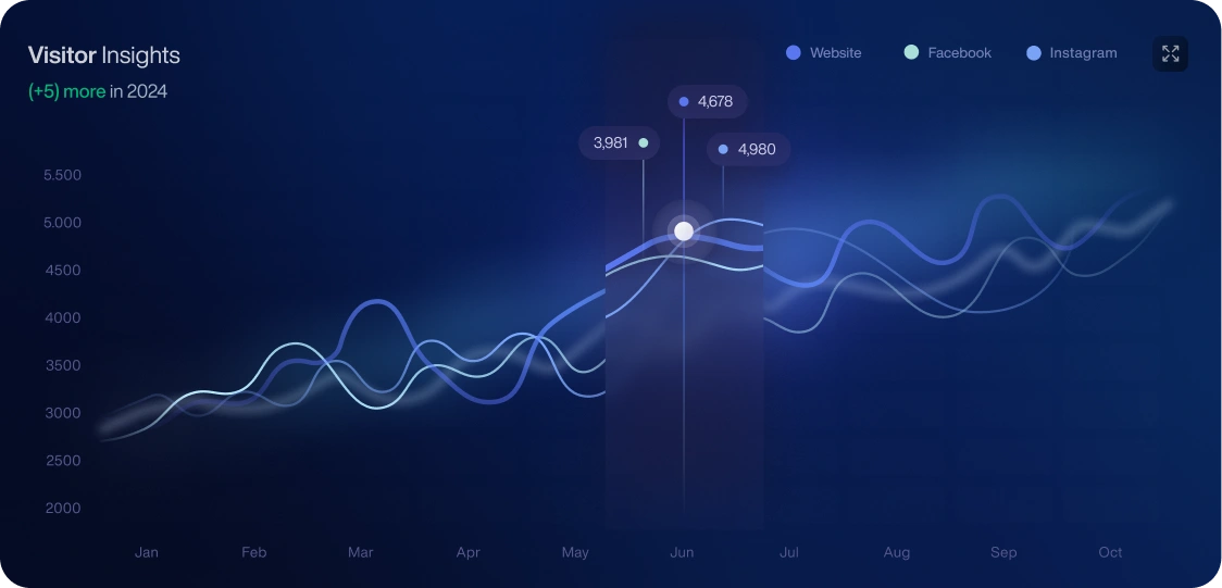
Target Engineering Stack: React, Tailwind CSS, Recharts / D3.js (for rendering multi-layered glowing area charts), GraphQL (for real-time CRM data fetching).
Results & Impact
Dramatically Faster Time-to-Insight: By breaking down aggregate data into distinct bento-grid modules (Today's Sales vs. Visitor Insights), simulated daily KPI scanning velocity improved substantially.
Ergonomic Long-Session Optimization: The high-contrast, low-emission dark theme reduces ocular fatigue for enterprise teams spending 8+ hours a day inside the CRM.
Modular Frontend Scalability: Built on strict, standardized container padding and corner-radius tokens, allowing enterprise engineering teams to effortlessly scale this UI pattern across other Salesforce clouds (Marketing Cloud, Service Cloud).
Like this project
Posted Jun 26, 2026
A modern, dark-mode UI/UX concept redesign for Salesforce CRM, overhauling enterprise sales management into a sleek, scannable data analytics workspace.