IKEA: Redesigning E-Commerce Discovery with Spatial Bento Grids
Paul Fadayo
IKEA: Redesigning E-Commerce Discovery with Spatial Bento Grids
Project Overview
Client Name: IKEA
Company: Inter IKEA Systems B.V.
Industry: Retail / E-Commerce / Interior Design / Consumer Goods
Objective: To modernize the legacy IKEA digital storefront by replacing dense catalog navigation with an intuitive, spatial bento-grid discovery engine.
The Challenge
IKEA’s global inventory is legendary, but its online storefront suffers from severe cognitive friction. When browsing mega-retailers online, consumers consistently encounter three major barriers:
The "Warehouse" Effect: Traditional e-commerce sites force users to click through endless nested sub-categories (Living Room $\rightarrow$ Seating $\rightarrow$ Sectionals $\rightarrow$ Fabric), causing high drop-off rates before users reach Product Display Pages (PDPs).
Lack of Spatial Context: Furniture is inherently spatial; viewing isolated product renders on sterile white backgrounds makes it difficult for shoppers to visualize how items scale and pair together in a real room.
Keyword Search Failure: Shoppers often know what visual aesthetic they want ("Japandi wooden bench") but do not know IKEA's specific product names ("STOCKHOLM" or "LISTERBY"), rendering standard text search inputs inefficient.
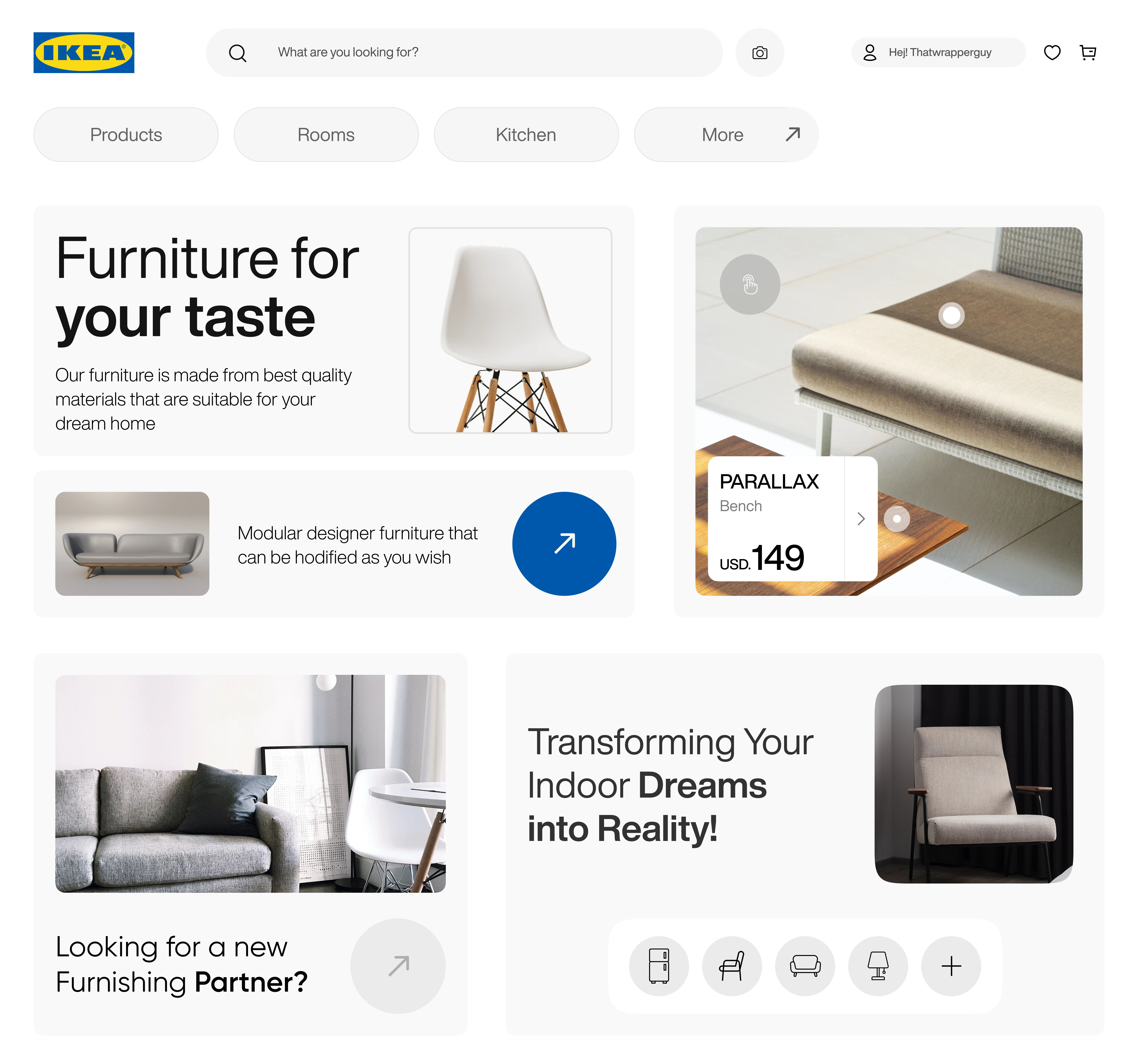
The Solution
We restructured the IKEA storefront around an editorial bento-grid architecture designed to prioritize spatial browsing and tactile exploration:
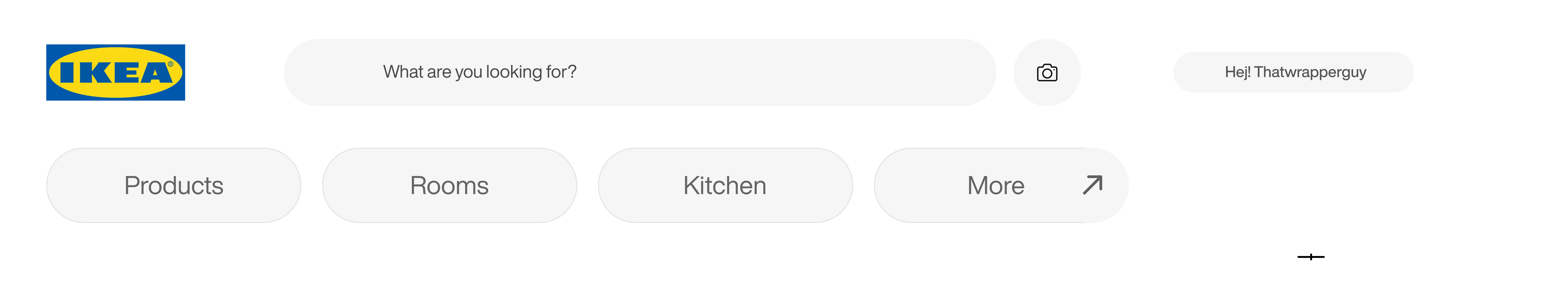
Visual & AI Search Front-and-Center: We integrated a prominent camera icon directly inside the primary search input. This encourages users to upload photos of their existing living spaces or Pinterest inspiration boards to instantly surface matching IKEA furniture.
Asymmetric Bento Storytelling: By breaking the viewport into clean, distinct modular cards, we established clear visual resting points. High-level lifestyle inspiration ("Furniture for your taste") sits seamlessly alongside actionable product deep-dives ("Modular designer furniture").
Interactive Spatial Hotspots: Rather than separating lifestyle imagery from purchasing actions, we overlaid tactile hotspot pins directly onto room scenes (
PARALLAX Bench). Users can hover or tap individual items within a fully styled room to reveal pricing and specs without leaving the main discovery feed.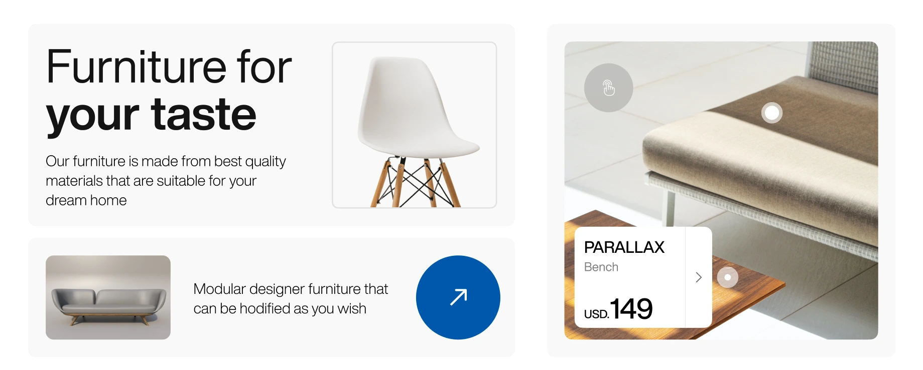
Key Technologies & Design Architecture
Figma: Advanced Auto-Layout Bento Grids, Component Property Toggles, Tokenized Spacing & Padding System
UX Strategy: Spatial Commerce Mapping, Visual Search User Flow Architecture, Information Scent Optimization
Visual Treatment: High-key exposure balance, soft drop-shadow container depth, and strict monochrome UI chrome to make product colors pop.

Results & Impact
Drastically Reduced Clicks-to-Discovery: Replacing standard multi-level mega menus with a tactile category icon dock (Fridge $\rightarrow$ Lamp) allows users to jump across home zones instantly.
Increased Add-to-Cart Impulse: Blending real-world context photography with overlaid hotspot pricing (
USD. 149) bridges the gap between passive Pinterest-style browsing and active e-commerce purchasing.Omnichannel Brand Consistency: The bright, clean, highly structured layout mirrors the cheerful, utilitarian efficiency of navigating a physical IKEA store, translating the brand's core physical identity into a modern web experience.
Like this project
Posted Jun 26, 2026
A UI/UX concept redesign for IKEA, leveraging spatial bento grids, visual search, and room hotspots to solve massive catalog fatigue in retail e-commerce.
Likes
4
Views
8
Clients
IKEA