The Solutions Journal Rebrand
Lauren Leopold
Rebranding & Brand Identity
The Solutions Journal
The client required a rebrand and logo refresh due to readability issues with their existing logo, particularly when overlaid on images. Our objective was to modernize the design while preserving the core concept, typography, and symbol, resulting in a cleaner, more legible logo.

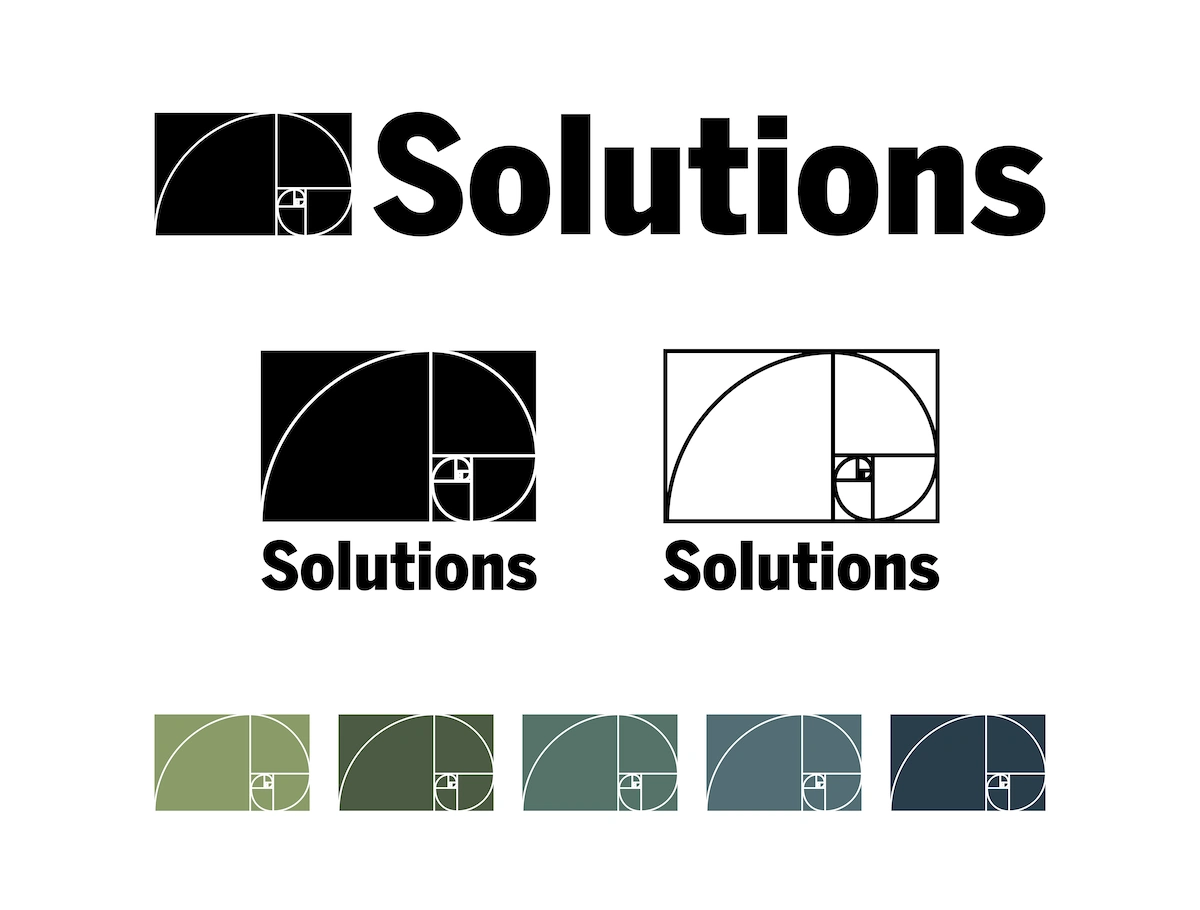
The original logo's design, with type overlaid on the golden ratio symbol, presented significant readability challenges. Furthermore, the multi-colored solid version limited its practicality in single-color applications. Our goal was to simplify the design, enhancing both readability and versatility, particularly for overlay usage.
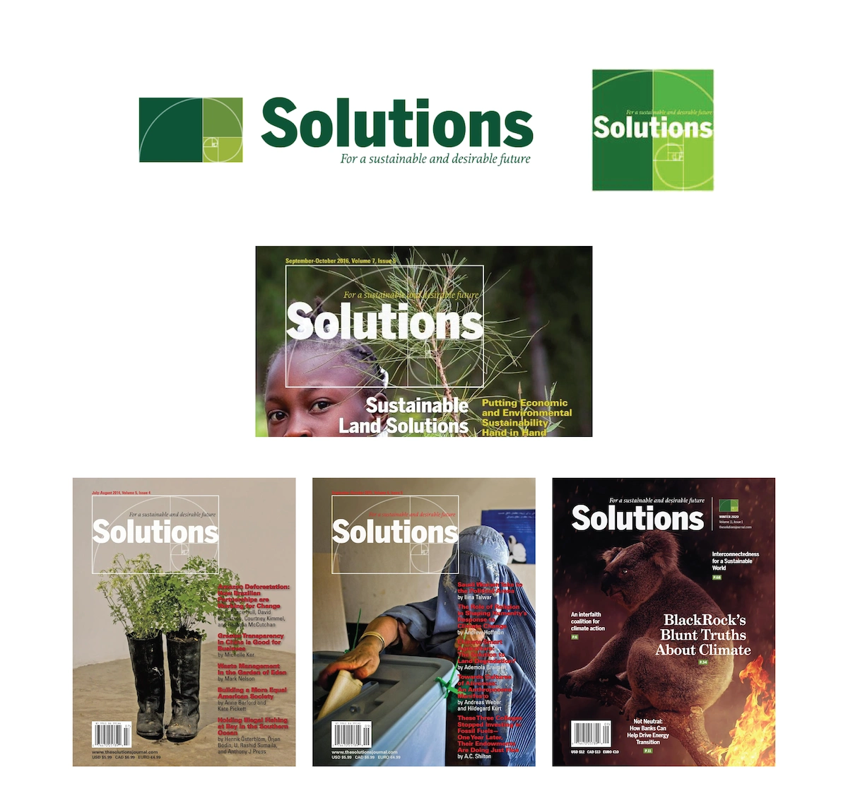
The updated logo features a simplified golden ratio symbol with thicker lines, enhancing legibility when used as an overlay. We retained the existing 'Solutions' typography while removing the tagline for a more streamlined design.
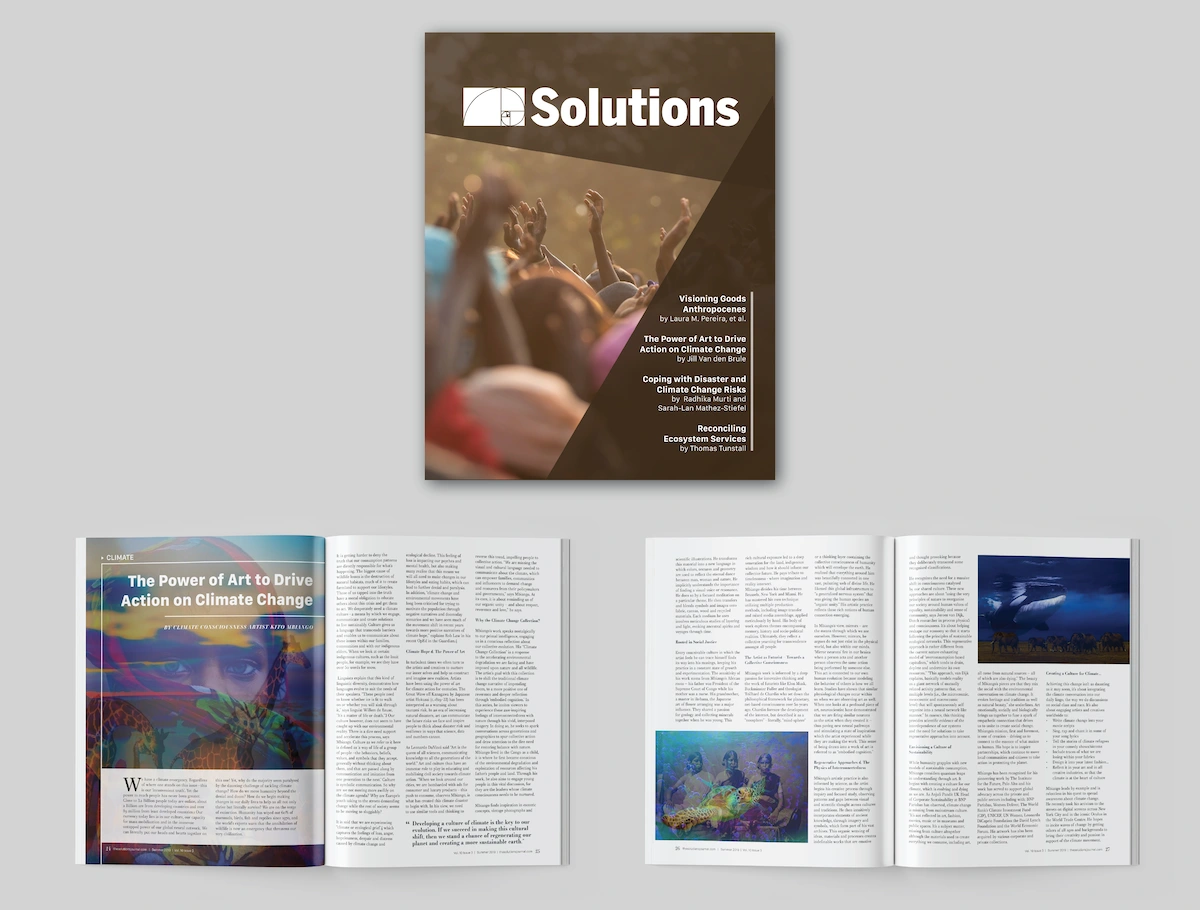
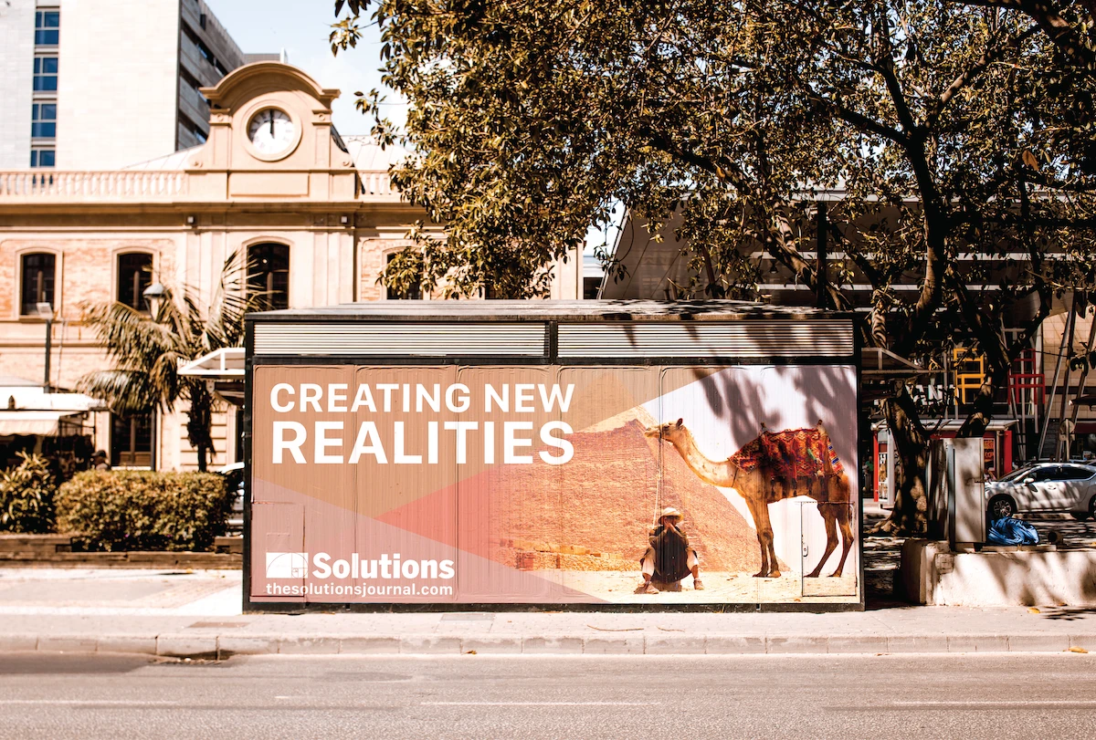
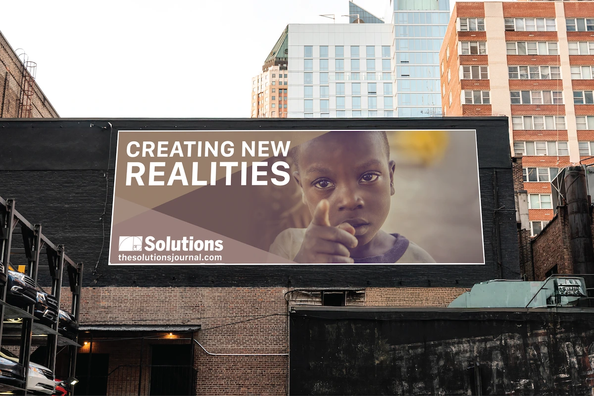
To demonstrate the logo's application, we developed magazine mockups for the Solutions team. We also refined the tagline layout to enhance readability.
Like this project
Posted Aug 30, 2025
Our objective was to modernize the design while preserving the core concept, typography, and symbol, resulting in a cleaner, more legible logo.