BCR George - UX Review for Investments and George Onboarding
🔬 Overview
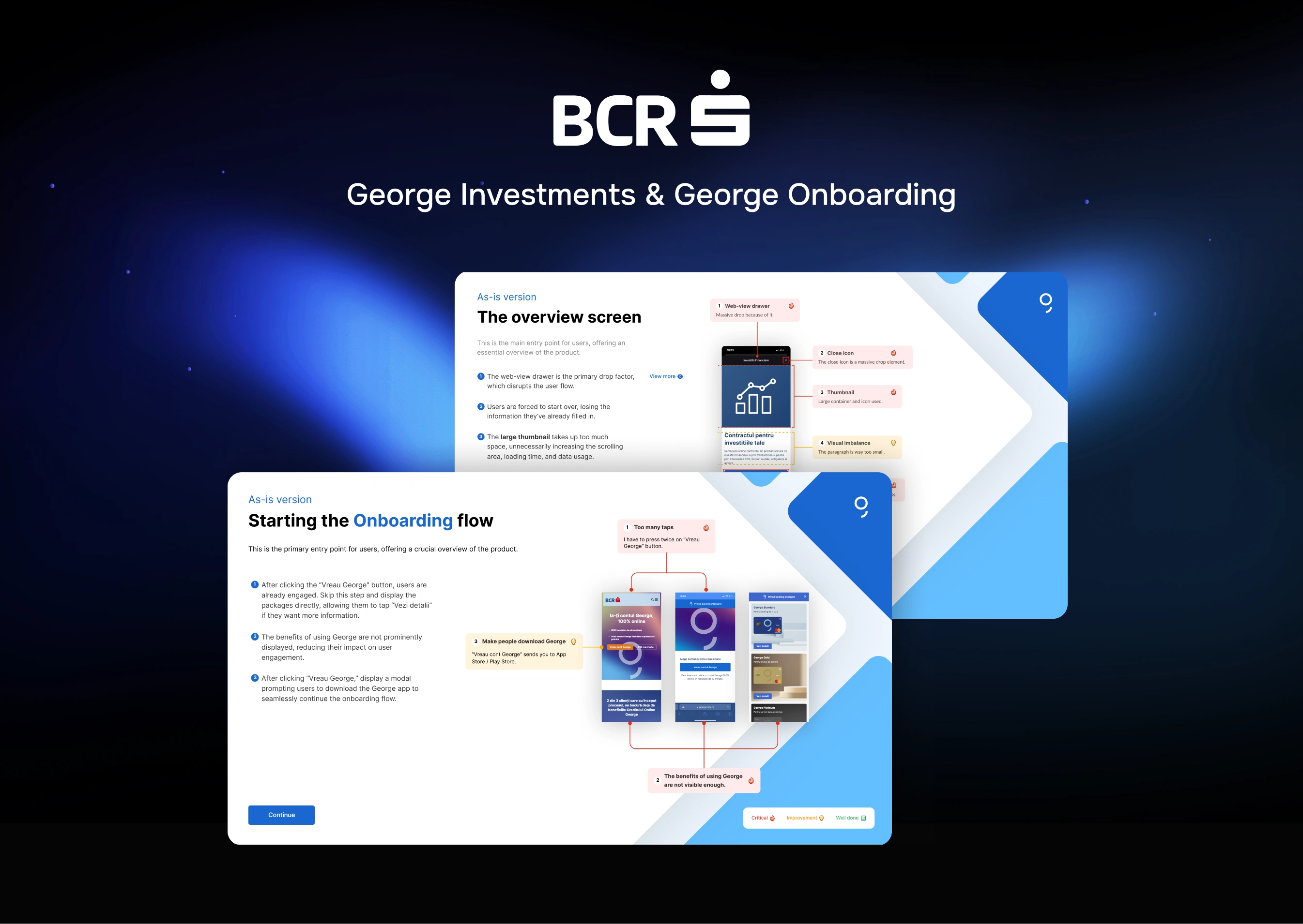
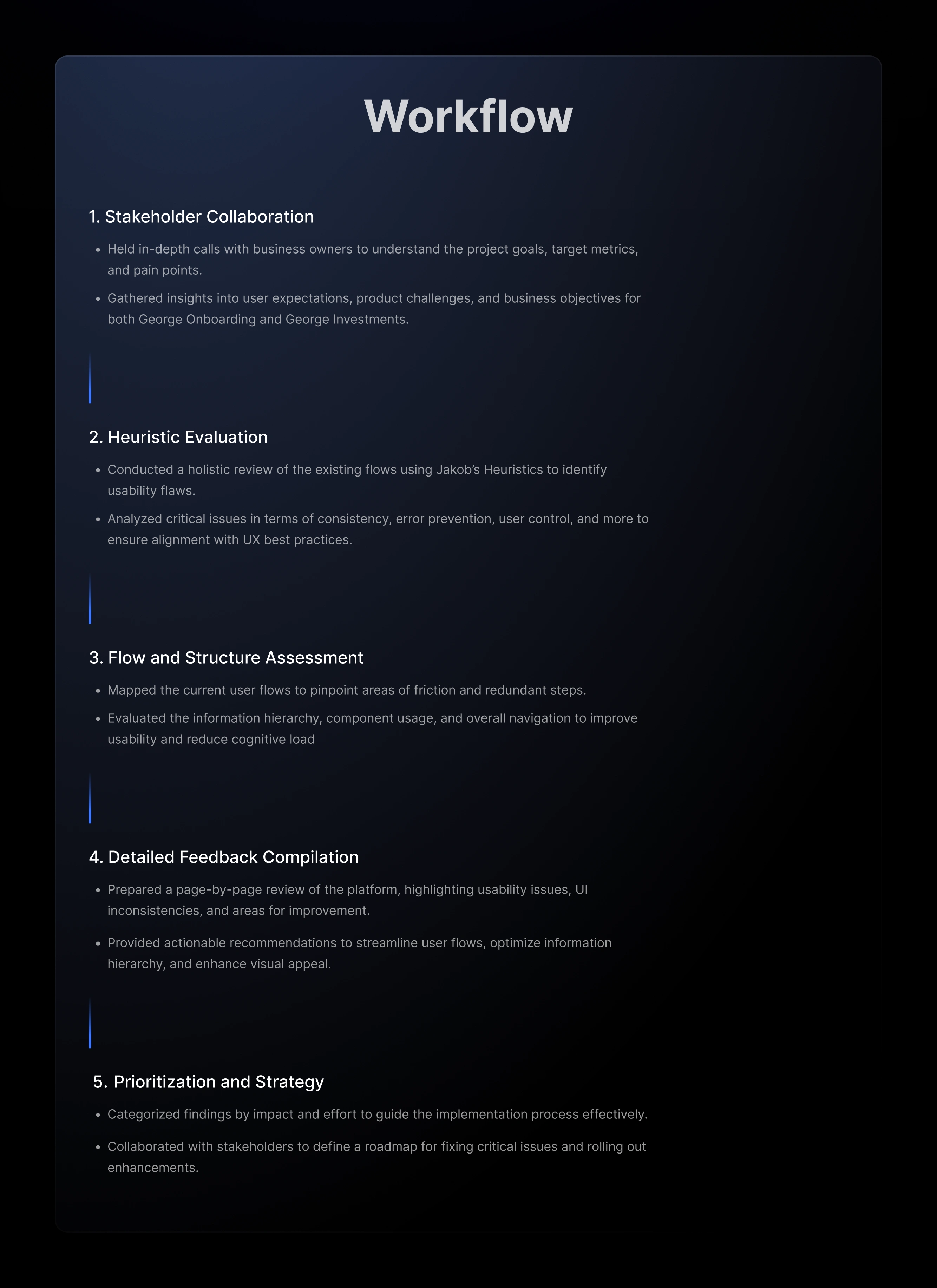
In this case study, I will outline the UX review process I conducted for two distinct projects: George Investments and George Onboarding, both part of BCR’s digital ecosystem.
This review focused on identifying usability issues, enhancing user flows, and providing actionable recommendations to improve the overall user experience.
Below, I detail the methodologies, findings, and proposed solutions for each project while drawing parallels and showcasing the interconnected insights.
Objectives
Goals: George Investments
The primary goal for the George Investments project was to create a seamless and intuitive investment onboarding experience that encourages user engagement and fosters trust. Key objectives included:
Enhance Accessibility and Inclusivity
Ensure the investment platform is accessible to users of all technical levels, offering clear guidance and support throughout the process.
2. Increase Conversion Rates
Simplify the investment onboarding flow to reduce abandonment rates and guide users effortlessly toward completing their investment journey.
3. Streamline Information Presentation
Restructure and prioritize content to ensure users can easily access critical information, like benchmarks, risk levels, and portfolio summaries.
Present investment opportunities and data in a visually engaging and digestible format.
4. Optimize Usability
Minimize user effort by reducing unnecessary steps and leveraging mobile-native patterns for navigation.
Incorporate real-time feedback to guide users and improve their decision-making.
5. Improve User Trust and Confidence
Provide users with tools like risk analysis and portfolio tracking to make informed decisions.
Create a visually appealing UI that conveys reliability and professionalism.
6. Integrate Dynamic Features
Aligned platform features with Romanian legal requirements, such as restrictions on financial advice, data processing rules, and consent management, ensuring compliance while delivering a smooth user experience.
Findings: George Investments UX Review
Get started
High loading times (25 seconds) are a critical issue, leading to user frustration and potential churn. This must be addressed to retain user engagement.
The overview screen
Information hierarchy is lacking, with critical elements below the fold. Merge this screen with the “Contract’s info” screen to streamline the flow.
Contract’s info
Similar content is repeated across multiple screens. Simplify by merging screens, making the call-to-action (CTA) visible
at all times.
Select the risk
Users must swipe excessively to view all risk levels. Propose a layout that displays all options simultaneously to reduce friction.
Bottom drawer confirmation
This screen can be removed if an alternative recommended approach is implemented.
Email confirmation
Include a confirmation email with a unique validation link. Support options (e.g., changing email address) are missing.
Phone confirmation
Establish clear text hierarchy. Support options and alternative confirmation methods are absent.
Validation code
The current design is confusing, making users think the phone number can be edited. Introduce a dedicated validation screen.
Loading screens
Consecutive loading pages create a poor experience. Merge screens and use the waiting time to display helpful, engaging content.
Contract page
The PDF format is unsuitable for mobile. Convert it to a mobile-friendly layout, and simplify actions by allowing users to sign or decline directly on the first screen.
Signing the contract
The numeric keyboard should be displayed automatically with a shortcut for the unique code. Avoid multiple loaders to reduce user frustration.
Final screen
Instead of redirecting users to the George Store, guide them back to the product overview screen to start investing.

Goals: George Onboarding
The primary goal for the George Onboarding project was to optimize the user journey to ensure a seamless, efficient, and user-friendly account creation process. Key objectives included:
Reduce Friction Points
Identify and eliminate unnecessary steps to streamline the onboarding flow, making it faster and more intuitive.
Increase Conversion Rates
Encourage more users to successfully complete the onboarding process by addressing pain points and creating a smoother experience.
Decrease Abandonment Rates
Simplify the flow and provide clear guidance to prevent users from dropping out of the process prematurely.
Enhance Flow Optimization
Redesign the flow to minimize unnecessary actions and taps.
Implement native mobile app patterns that align with user expectations for seamless navigation.
Restructure information logically to improve readability and comprehension.
Improve UI Appeal
Create a visually engaging and modern user interface that instills trust and encourages interaction.
Use context-appropriate components to enhance usability and clarity.
Align with Accessibility Standards
Ensure the onboarding experience is accessible and inclusive, following best practices and guidelines for mobile app accessibility.
By achieving these goals, the onboarding process aimed to provide a smoother, more engaging user experience, resulting in higher account creation success rates.
Summarized Findings from George Onboarding UX Review
Starting the Onboarding Flow
High loading time of 5.3 seconds impacts user experience, causing potential frustration and drop-offs.
Requiring users to press “Vreau George” twice increases friction unnecessarily.
Package Presentation
Users need to select the package twice, creating redundancy.
The “Vezi detalii” button functions as an information button rather than a continuation action, leading to confusion.
Packages Screen
Duplicate screens for selecting packages and cards add unnecessary steps to the process.
Merging the two steps could streamline the flow and improve clarity.
Card Color Selection
Lack of visual differentiation and guidance in the card color selection process.
The flow feels disconnected and could use a more intuitive structure.
Steps Mapping
No visible progress indicator, leaving users uncertain about how many steps remain in the process.
Simplifying step mapping could reduce cognitive load and improve transparency.
Surname and Email Address
Confusing validation errors disrupt the user experience.
Auto-focus on input fields and clearer prompts would enhance usability.
Phone Number Validation
Absence of country code prefix display causes ambiguity for international users.
Real-time error messages interrupt the input process unnecessarily.
ID Capture Guide
Multiple screens for ID capture instructions increase onboarding time unnecessarily.
Combining these screens into a single step would save user time and effort.
ID Capture Screen
Users are required to retake photos due to unclear prompts and feedback.
Providing more explicit instructions would reduce errors.
Selfie Capture
Similar usability issues as ID capture; lacks clear guidance and immediate feedback.
Reducing redundant prompts could improve user satisfaction.
Agreements
Important agreements are placed late in the flow, potentially leading to user frustration.
Moving agreements earlier would improve transparency and trust.
Financial Information
Overwhelming amount of data presented with poor hierarchy.
Prioritizing critical information and reducing unnecessary details could enhance usability.
BCR Employee Information
Unclear if the employee information provides value to the user or is primarily for BCR’s benefit.
Making the purpose and benefits explicit could improve user perception.
Card Delivery Address
Users struggle to edit or verify their address due to unclear prompts.
Streamlining the address input process would enhance clarity.
Multi-Protect Insurance
Insurance options are presented without sufficient explanation or context.
Clearer descriptions and benefits could help users make informed decisions.
Video Call
Long waiting times for the video call process deter users.
Adding progress indicators or estimated wait times would manage expectations better.
Signing Documents
Users find it difficult to locate or understand the purpose of document signing steps.
Simplifying the signing process and ensuring documents are mobile-friendly could reduce frustration.


Like this project
Posted Sep 15, 2025
In this case study, I will outline the UX review process I conducted for two distinct projects: George Investments and George Onboarding, both part of BCR’s dig
Likes
0
Views
15

