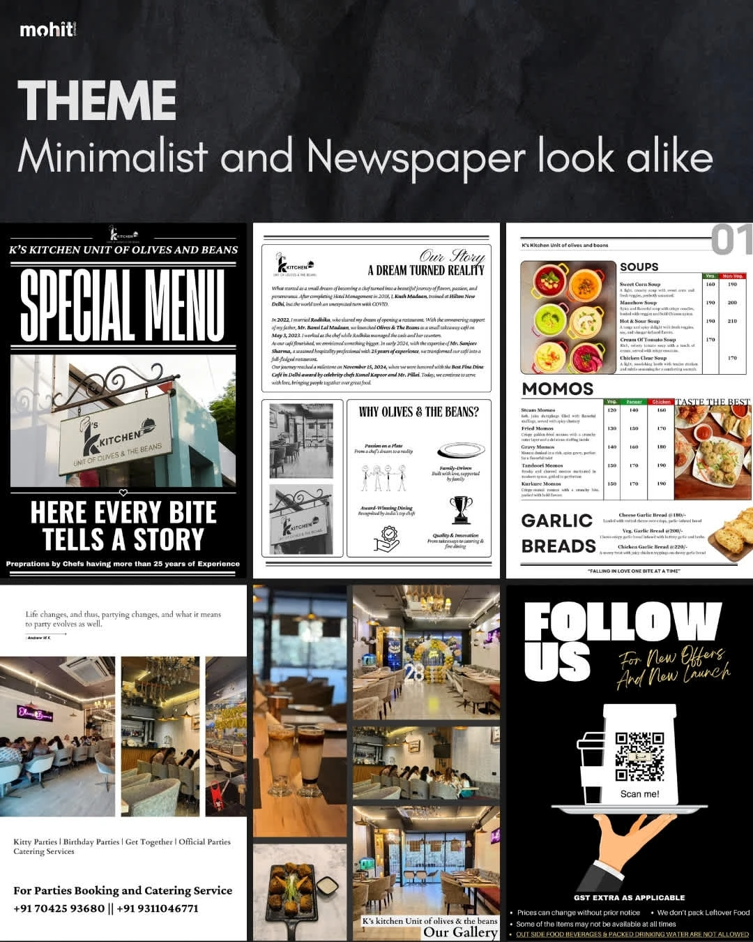
K’s Kitchen Menu Design
MOHIT KUMAR
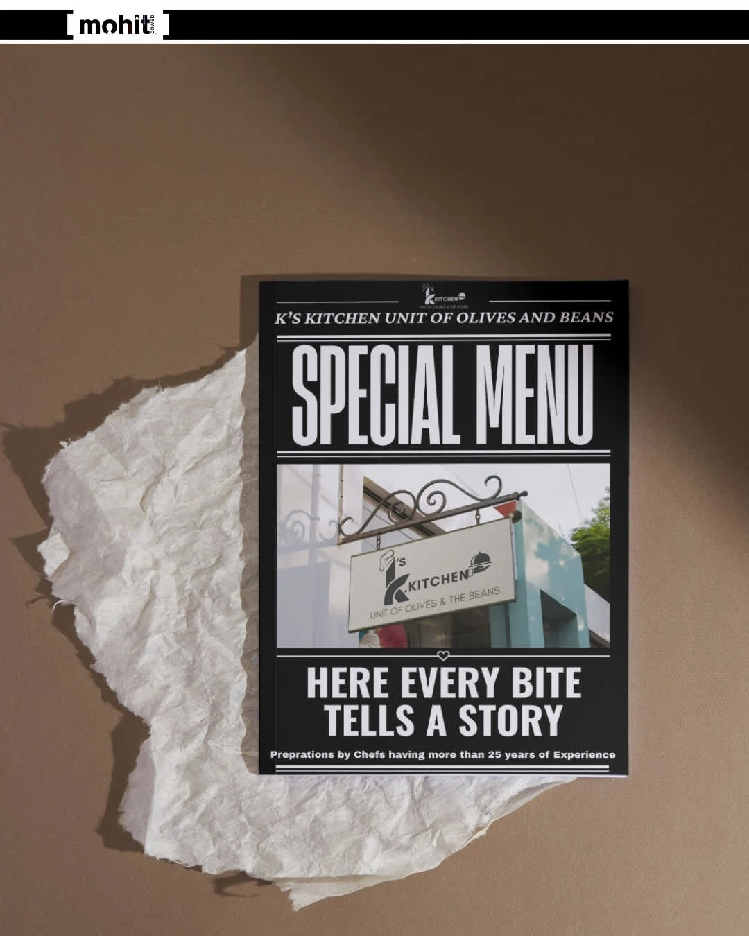
K’s Kitchen Menu Design
Inspired by classic newspapers, this menu design for K’s Kitchen evokes a sense of comfort, familiarity, and storytelling.
Theme: Vintage Newspaper
Core Identity: Authentic · Nostalgic · Conversational
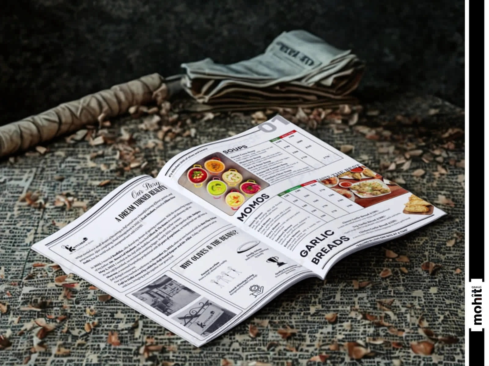
The theme brings a vintage editorial aesthetic to life
Layout Principles
Grid-based, multi-column structure (like a newspaper page)
Use of pull quotes, faux advertisements, or chef notes for character
Segmented sections (e.g., “From the Frying Pan,” “Today’s Specials”)
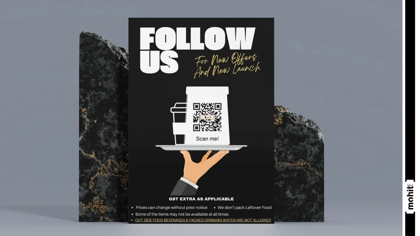
The cover, in a deep charcoal black (#1E1E1E)
Tone of Voice
Language Style: Informal but intelligent
Menu Tone: Conversational, with witty dish descriptions
Brand Personality: Friendly, nostalgic, knowledgeable
Grid-based, multi-column structure
Light version on dark backgrounds (#FFFFFF on #1E1E1E)
Dark version for lighter backgrounds (Pure black or #1E1E1E)
Like this project
Posted May 8, 2025
The theme brings a vintage editorial aesthetic to life, with monochromatic tones, column-style layouts, and custom food illustrations.