0 -> 1 educational & collaborative responsive web platform

Xenia Marova

User Researcher
Product Designer
Product Strategist
FigJam
Figma
Google Analytics
qlark

qlark Overview

The qlark platform is a community-driven infrastructure for orthodontists that helps them share their expertise and collaborate with each other. It allows them to instantly learn and share skills and techniques from anywhere at any time, bringing collaborative care delivery to their practices and patient care.

Main problem

Doctors are limited in their ability to provide the most advanced and efficient orthodontic treatments because they rely on their own experience instead of sharing knowledge and keeping up with best practices. This is due to outdated systems and processes that prioritize managing the business of their practices over patient care.

Main goal

qlark was an early-stage start-up, and my goal was to help them find their product market fit and develop a 0→1 product for all touch-points by creating a valuable and intuitive end-to-end customer experience.

My role

Being the only designer on the project means strategy, UX, UI, visual, interaction, web, brand, emails, design system, process, hand-off, leadership, pm, team building, being in the mix of everything and try to make it delightful.
Our team

1 product manager, 1 product designer (me), 6 engineers, and 2 stakeholders.

Timeline

3 years (May 2019 – Feb 2022), leading all design efforts from ideation to delivery.

Process and project stages

We ran 2-weeks design sprints with weekly progress update client meetings to showcase new mockups and gather valuable feedback. We reviewed and iterated along with running some tests with prototypes and mockups — but in most cases, it ended up going to engineering for an early proof-of-concept implementation. All of the stages weren’t linear but interconnected and intertwined during our work on the project.

Discover phase

1st month: User and market research, setting product goals.

Our goal was to take a deep dive into the product and get an in-depth understanding of all platform use cases for immediate improvements that would drive the business further. During this step, we had to learn and understand many medical principles behind the orthodontic treatment, along with the doctors and their current legacy systems.

The initial version of the platform right before I joined the team in May 2019.

Define phase

2nd – 3rd months: Inspiration and creating unified design language.

Our initial focus was addressing the inconsistency on the platform due to the lack of a designer in the previous team. We conducted an inventory check to consolidate components and reduce their count. This allowed us to create a simplified style guide that served as a baseline for defining and evolving our goals.

Consolidated color scheme and updated information architecture
Information hierarchy and layers of content to make it easier to navigate

Design phase

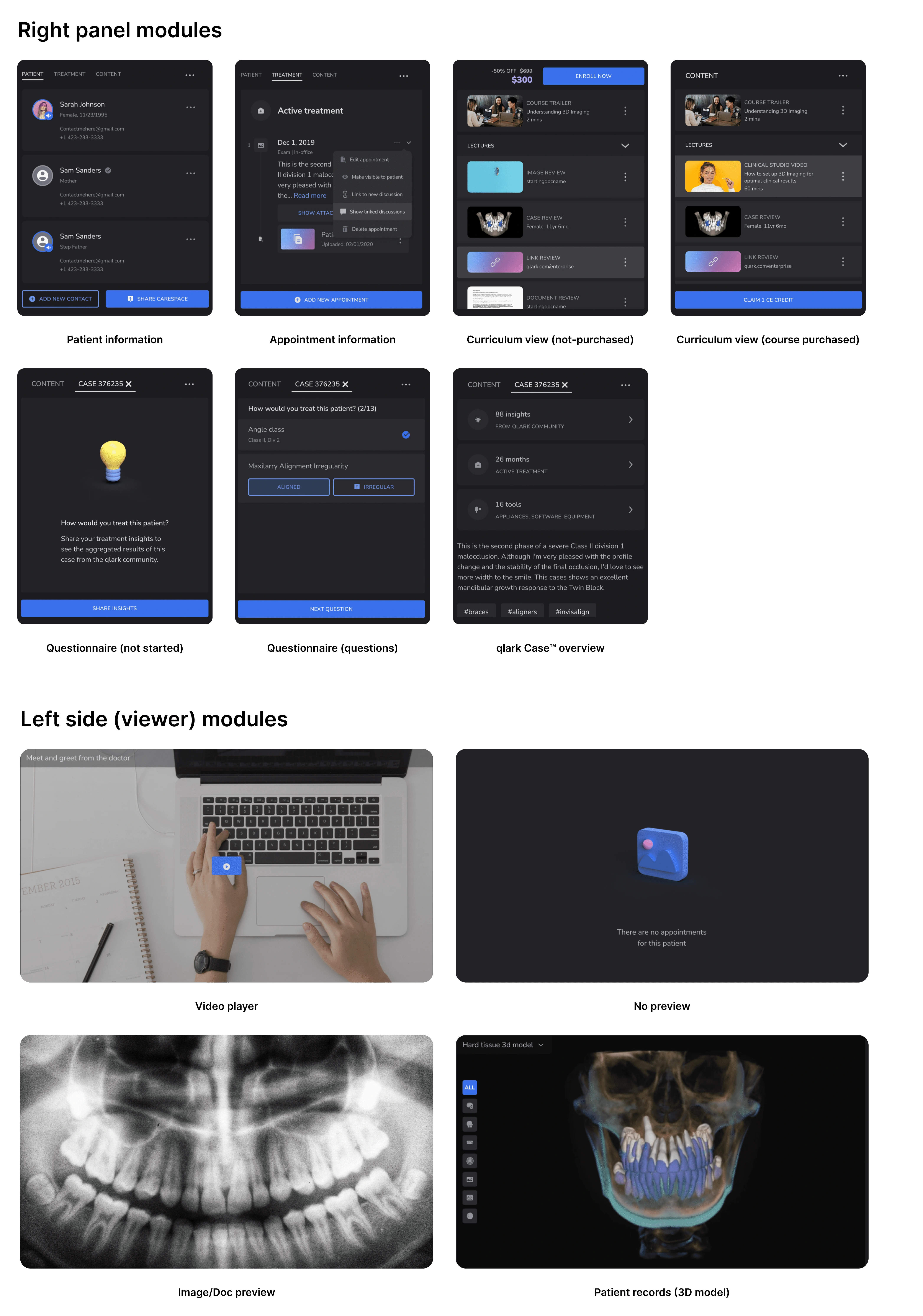
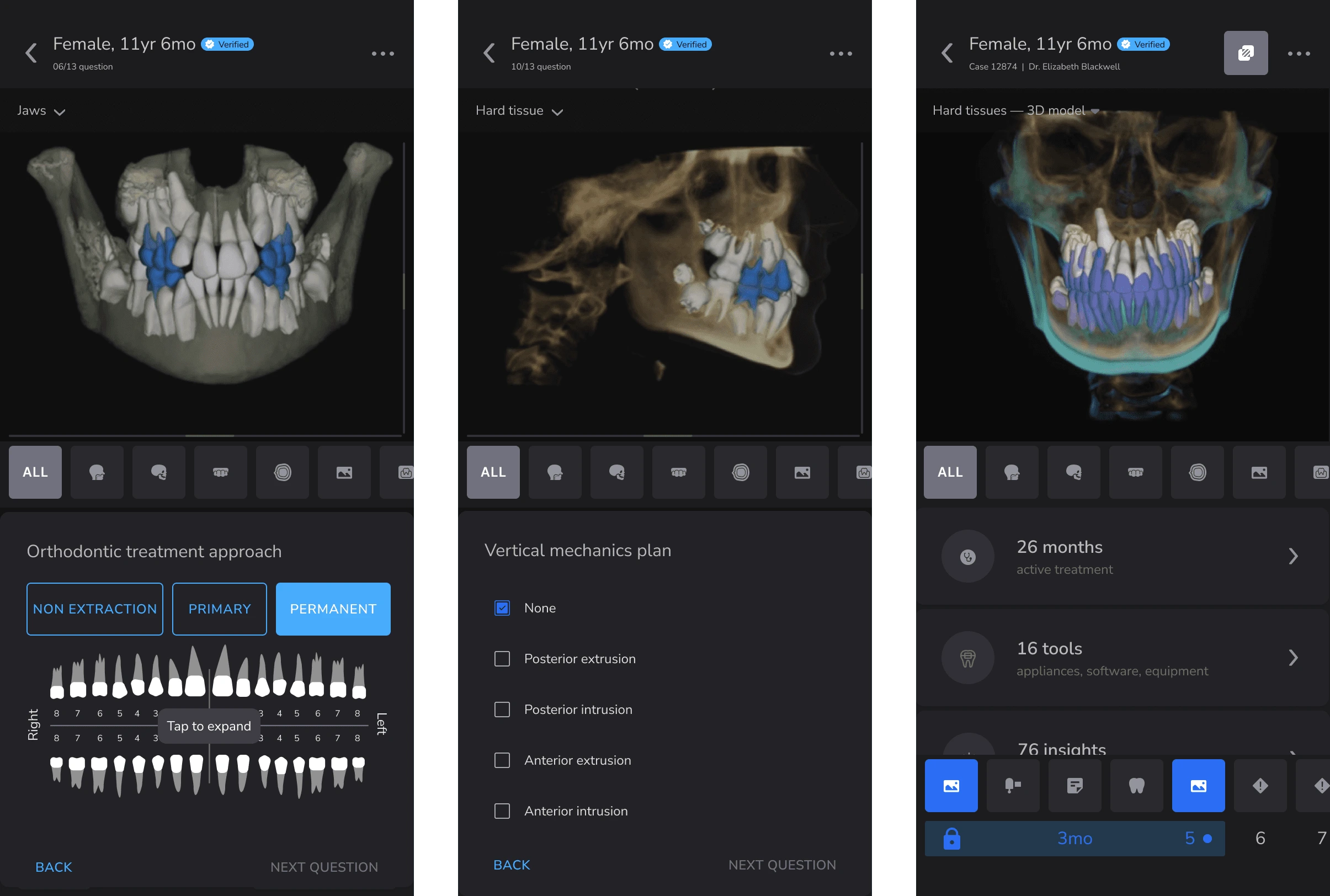
Over the next ~20 months, we followed an iterative process that included creating a reusable widgets and modules system, conducting a rebranding exercise, reworking the usability of key features, and making the platform fully responsive.

In order to ensure that we were achieving our goals, we took a step-by-step approach to this stage, constantly reevaluating our progress and making adjustments as needed. This iterative process allowed us to thoroughly explore all possible avenues and ultimately arrive at the best possible outcome for our project.

Reusable widgets and components

We introduced personalized widgets to help users focus on relevant information across the platform. These widgets vary by user type (e.g., doctors, residents, staff) and include four key types: 1. Highlight trending content for better discoverability and engagement. 2. Show related topics for more context. 3. Provide tips, guidelines, and feature overviews to enhance interaction. 4. Promote sponsored content like tools and courses.

Widgets system and internal logic

Rebranding

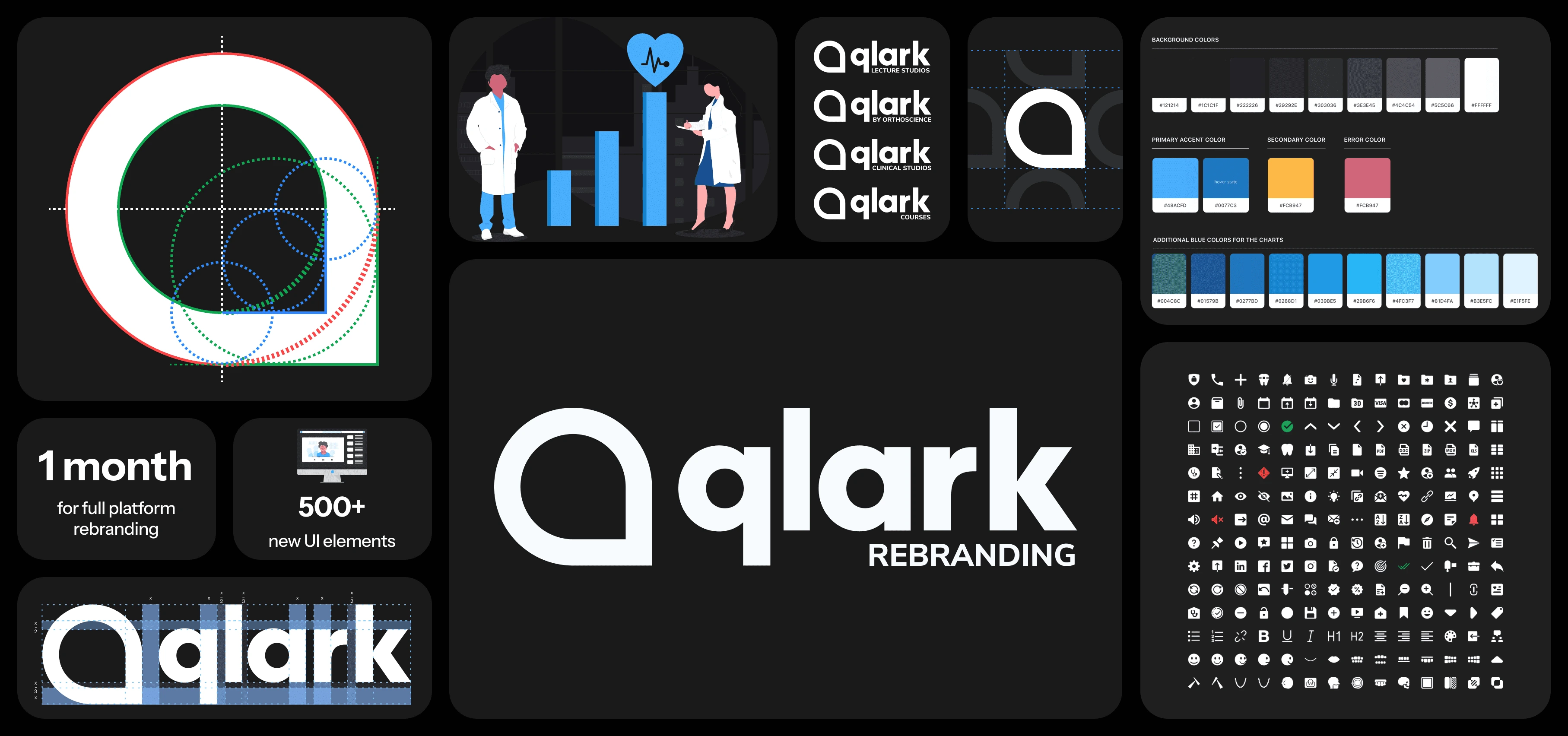
The platform was originally called "Polaris," not "qlark." During refinement, we realized the brand and marketing were outdated and misaligned with the product’s direction. We led a rebranding, updating the name, logo, and design language to unify the brand and align its clean, simple essence with the product.
Treatment timeline and navigation

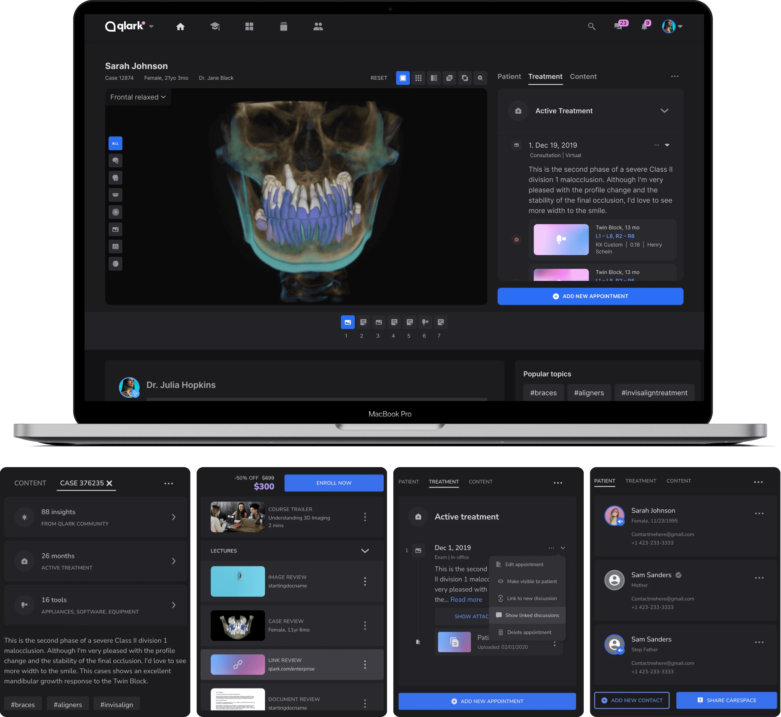
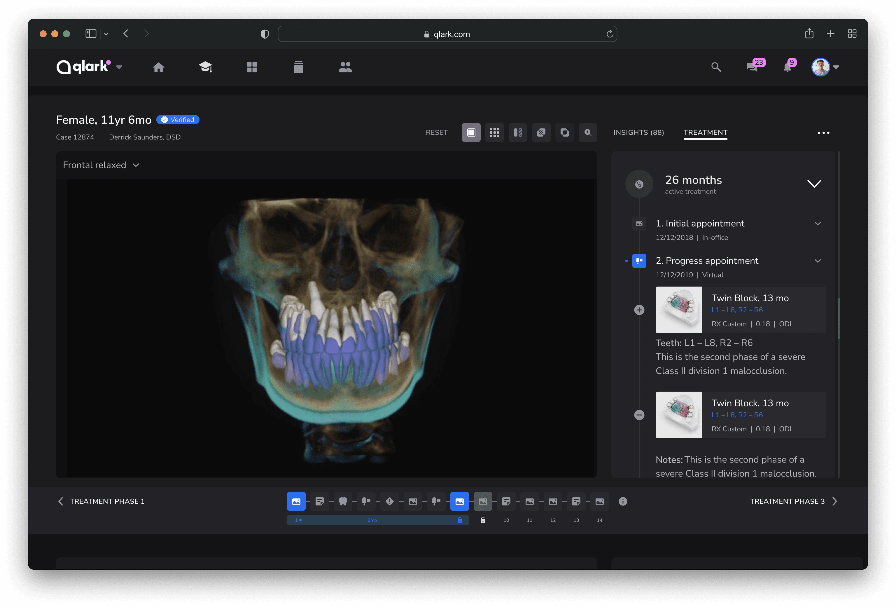
This stage improved our navigation and patient record viewer by adding multiple time points and phases. We made the treatment data more flexible by allowing doctors to slice it in various ways. Users can now track all appointments, including notes, appliance replacement, emergency appointments, referrals, and records. The timeline on the bottom also shows more information about each appointment and all available information, from doctor's notes to tool modifications.
Updated patient record viewer
Flexible modular system for patient record viewer
Modular system for our courses and patient viewer
Mobile version
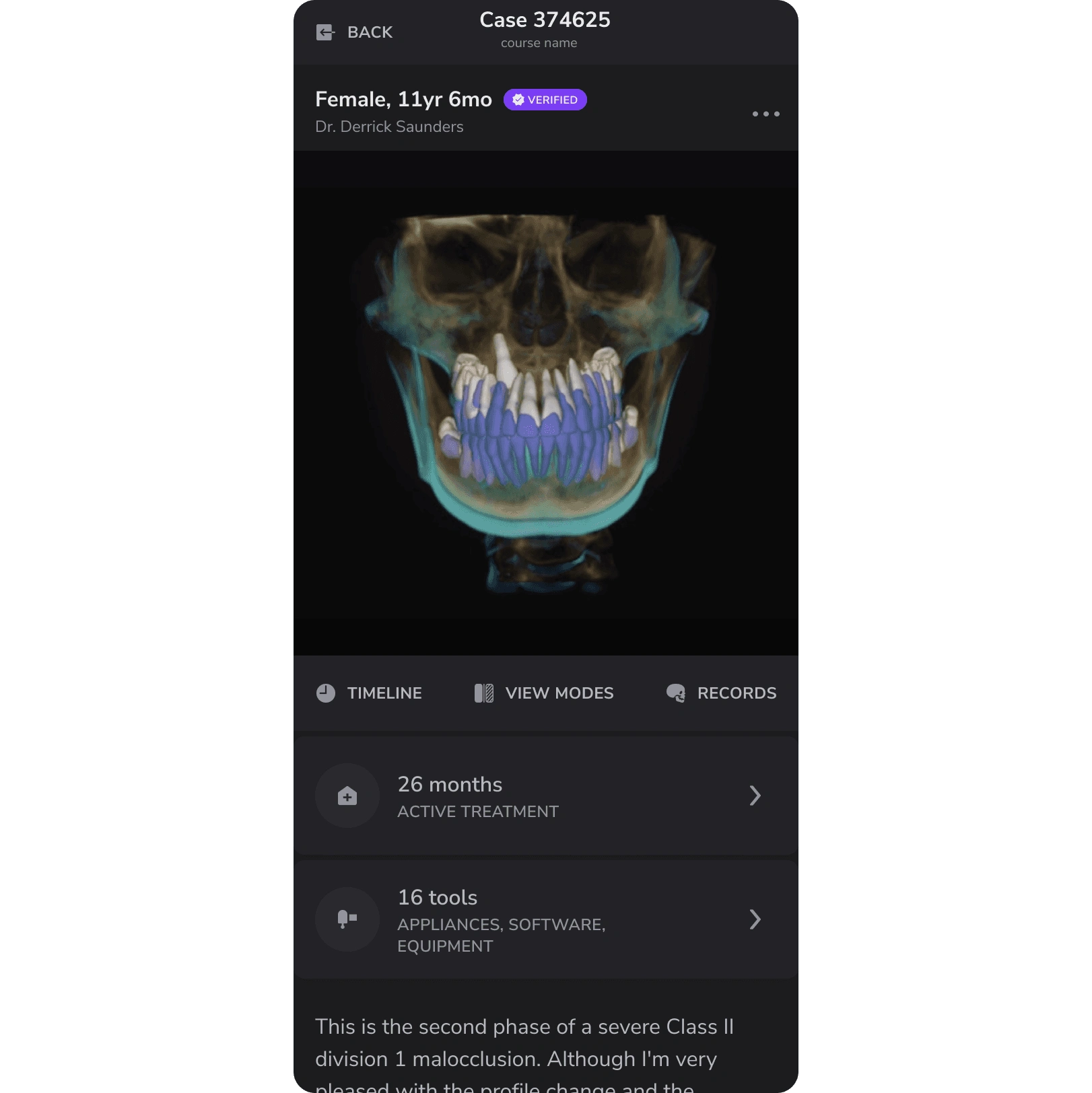
Mobile version
Mobile version
Mobile version

Documentation phase

Before joining the project, there was no proper documentation source in place. I took the initiative to create a single source of truth that would outline the project's processes and functions. We eventually settled on using Confluence, and later transitioned to Coda.

Project documentation

Confluence and Coda

We have extensively documented the main logic, constraints, and limitations of every feature on the qlark platform. This allows for a comprehensive understanding of the functionality of each feature and how they can be best utilized. Every team member was able to contribute to the documentation, and we had a review process in place.

Zeplin

Additionally, we established a process for handing off design files on Zeplin, organizing everything in style guides, and coming up with a commenting system to make it easier to collaborate with the engineering team. This eliminated the mess in Figma files and prevented the implementation of unfinished design mockups.

Zeplin handoff system

Results

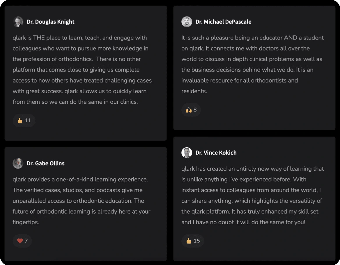
The qlark platform was very eagerly welcomed by our users. We've proven that it is a viable solution for our target audience. It allowed doctors not only to look at the treatment information but also to understand the context, which opened up a new realm of possibilities for them on how to use patient records and data.

10.000+ verified orthodontists using the platform daily

100k+ submitted patient records from doctors across the globe

4 direct integrations with leading EMR providers

1.000+ courses and lectures from leading dental educators

50k+ learning hours from top practicing doctors
Learn more about this project here:

Partner With Xenia
View Services

More Projects by Xenia