Anti-Overwhelmed ADHD Planner Design
Frida Ayunda
Most digital planners fail not because they look bad, but because they’re too complex to use consistently.
This project documents my entire process from research to design, showing how I turned real user pain points into a focused, minimalist planner that works for the ADHD community.
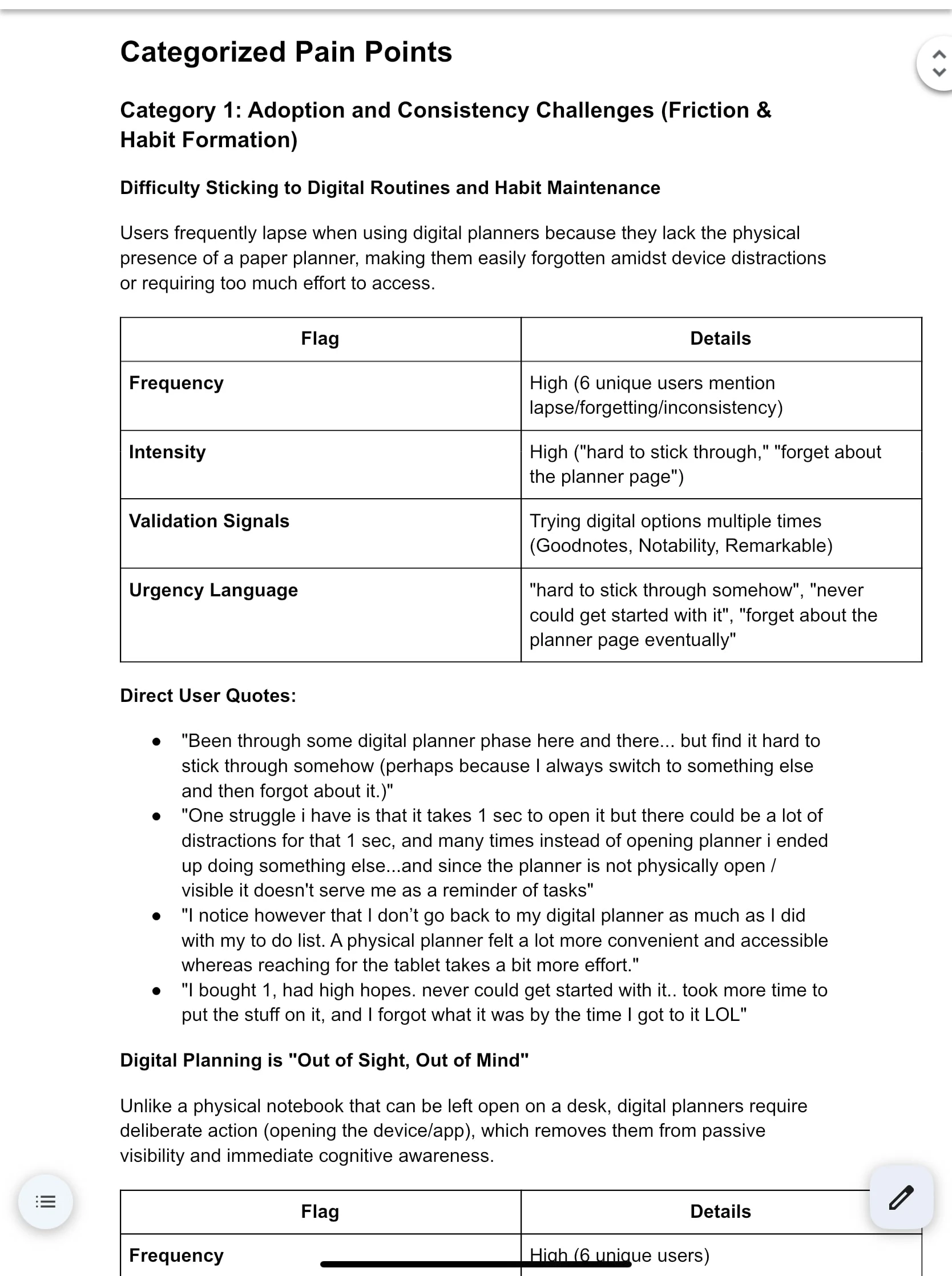
Phase 1: Market & Pain Point Research
Analyzed 30+ Reddit threads and ADHD planning communities.
Identified 8 core pain categories
Found that 90% of users abandon digital planners within 2 weeks due to complexity.
👉 Insight: The ADHD planner market doesn’t need more features, it needs less friction.
Reddit discussion analysis
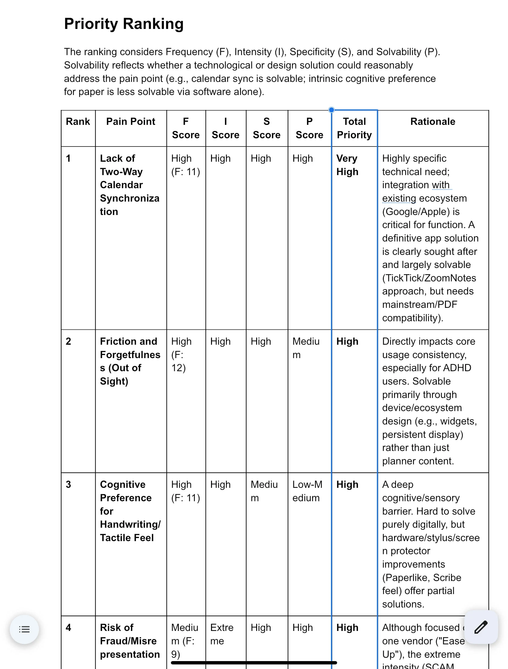
Problem priority ranking
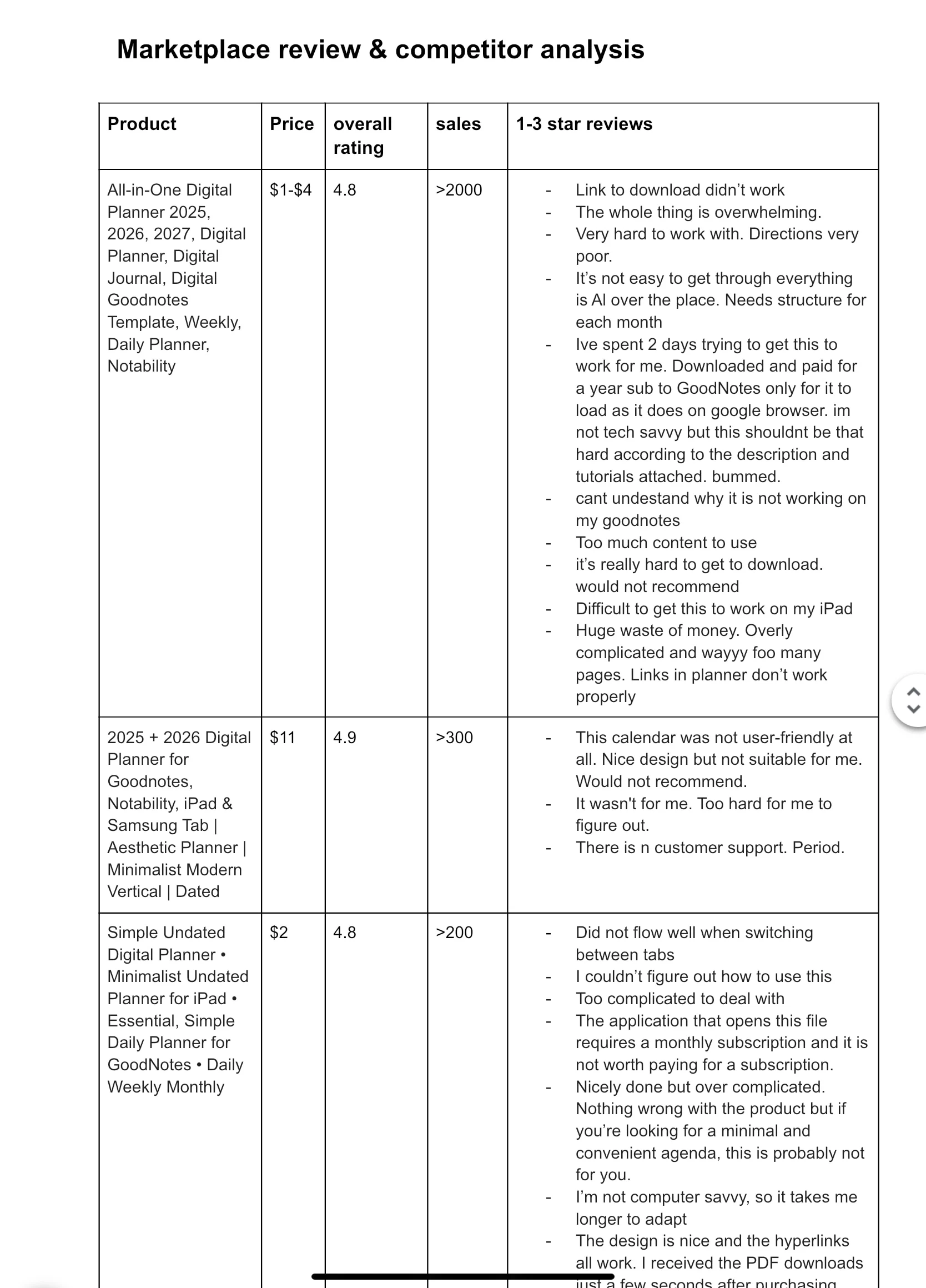
Phase 2: Competitor & Market Validation
Researched top 15 ADHD planners on Etsy.
Found clear market demand ($15–27 range, thousands of monthly sales).
👉 Market exists, but simplicity is the missing value.
Phase 3: Gap Analysis → Product Opportunity
Negative reviews reveal frustration with setup, device issues, and overwhelm.
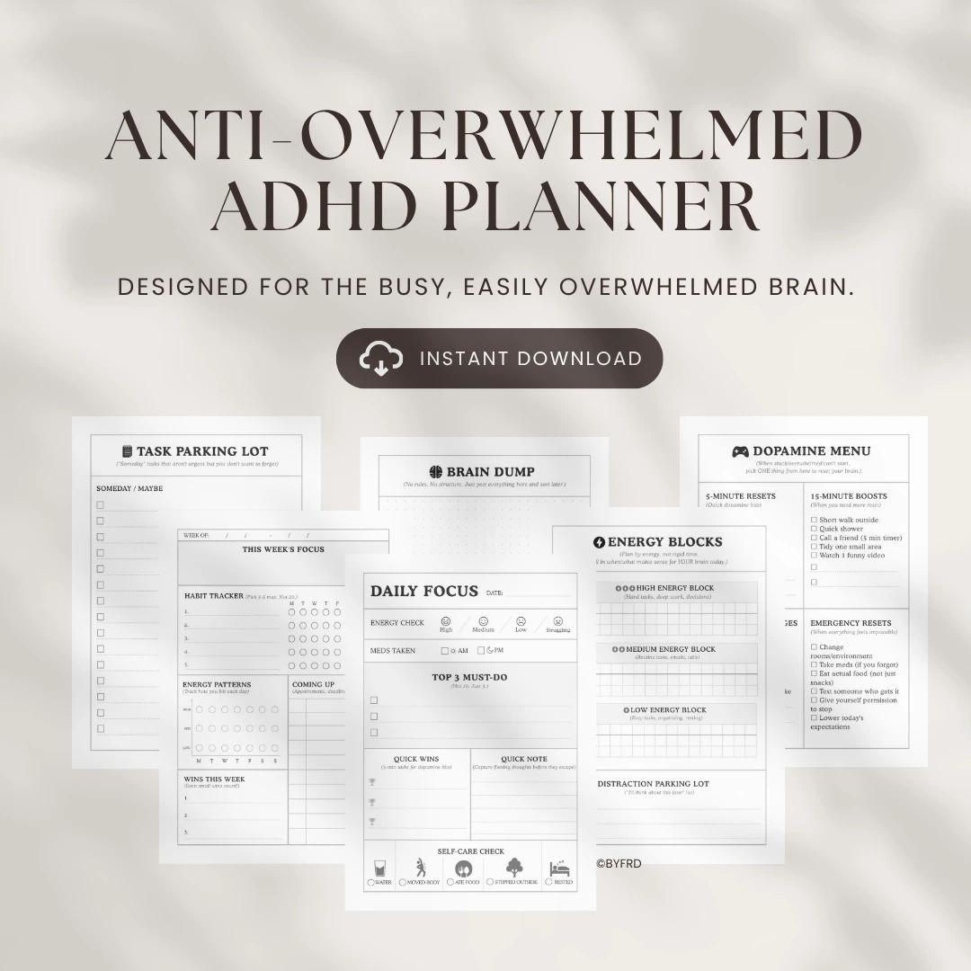
👉 Proposed concept: “The 6-Page Anti- Overwhelmed ADHD Planner” — simple, visual, no setup anxiety.
Phase 4: Design Development
From insights → to layout decisions:
Focused on visual clarity and reduced cognitive load
Added Dopamine Menu, Energy-Based Planning, and Focus Mode layouts
Each design decision tied directly to research finding
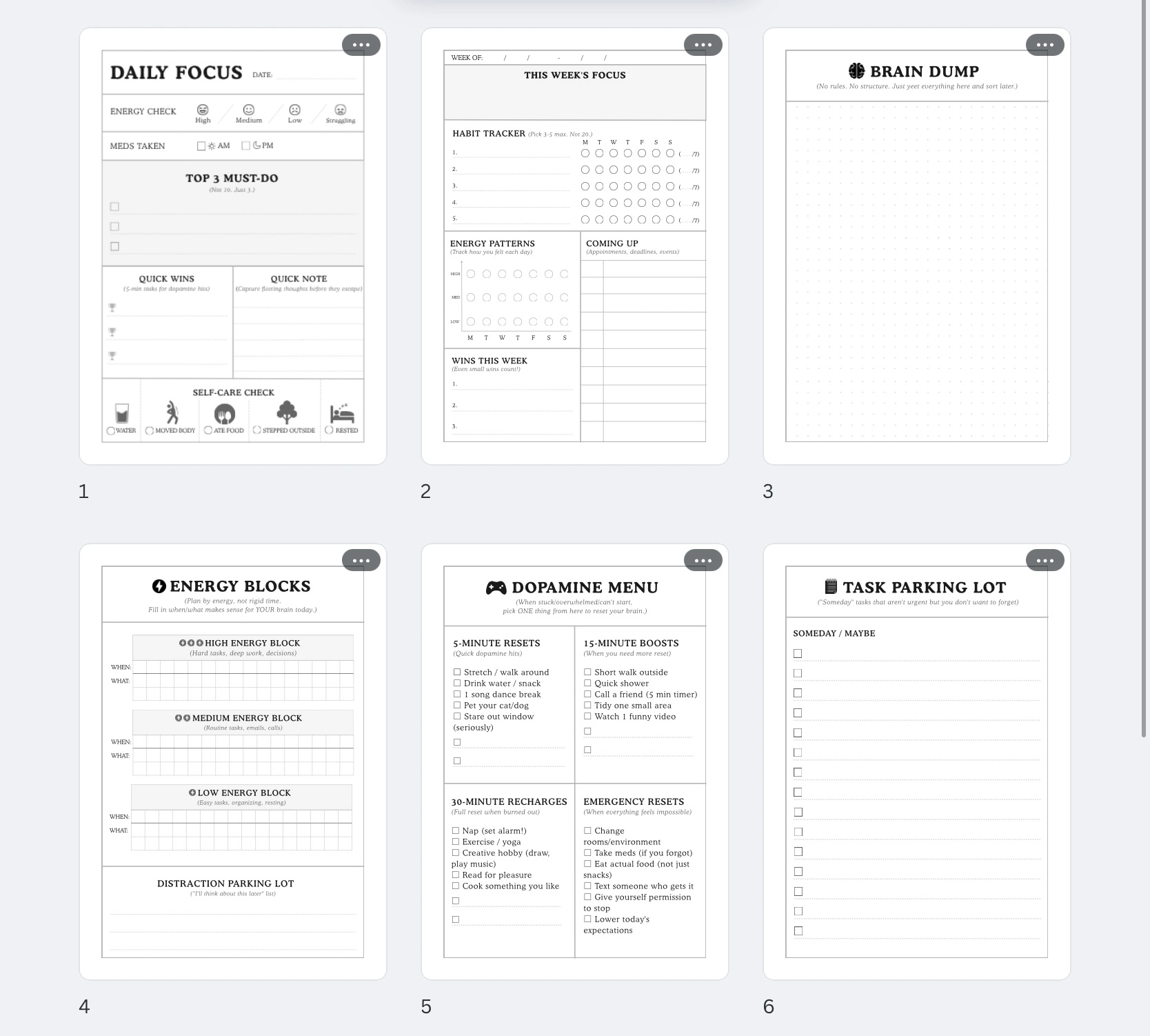
Focus mode (B&W version)
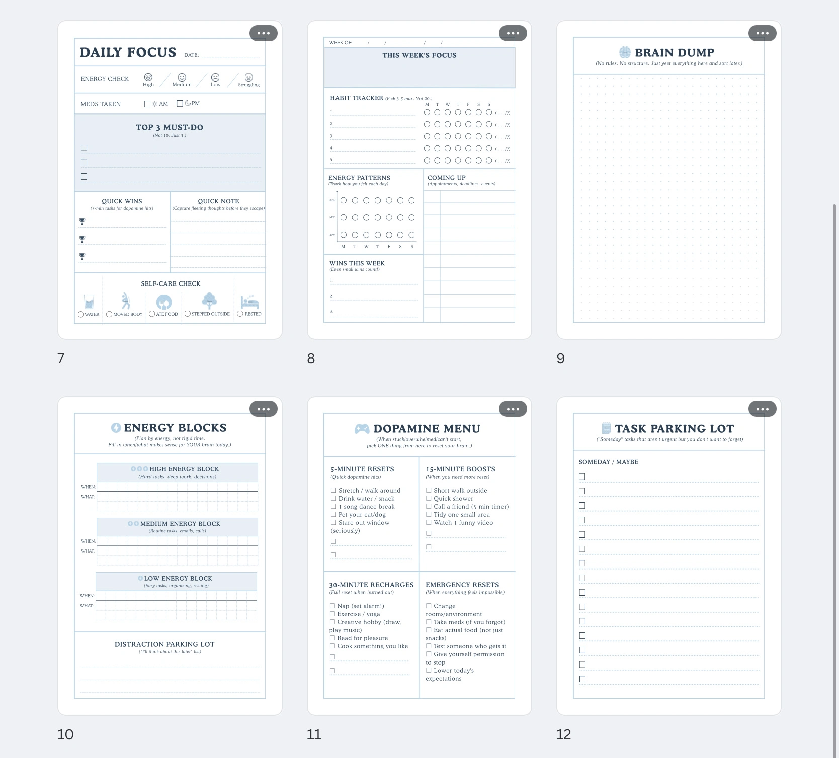
Calm Dopamine (blue version)
Takeaway
This project taught me how design is not about adding more, but about removing what overwhelms the user.
By grounding design decisions in real data, we can build digital products that are not just beautiful, but truly usable and sustainable.
Like this project
Posted Nov 4, 2025
Designed a minimalist ADHD planner focusing on simplicity and usability.
Likes
0
Views
5